Visualize the large number of coronavirus cases and deaths in the US each day/hour in about 10 seconds
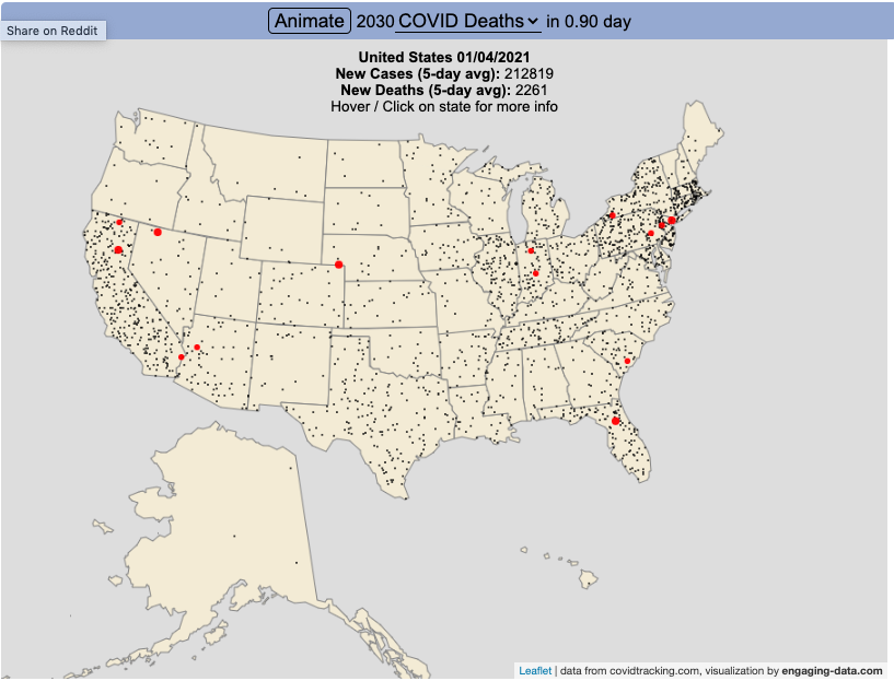
The rate of COVID-19 deaths and cases in the US is crazy high after the 2020 winter holidays and maybe still be going up. This visualization shows the number of COVID cases that occur in one hour or the COVID deaths that occur in one day based on the average of the last five days. This is another attempt to show the true scale of how many cases and deaths the US is dealing with, since it is often hard to understand large numbers. I have also attempted to show the scale of US deaths/cases here and here. Unfortunately, there are so many people getting sick and dying, it’s hard to fathom just how many people this actually is.
The 5-day averaging was done to smooth out any peaks and troughs in data reporting due to weekends/holidays, since I noticed that some states were literally reporting zero COVID cases some days while reporting many hundreds or thousands of cases other days.
The dots shown on the animation are located in the state that the cases or deaths occur but are randomly spread out within the state. This is done for visual clarity since if they were shown in their actual location, most of the dots would be overlapping in urban, high density areas. This approach lets you see which states have high COVID instances but still locate them by state.
You can share this animation by putting ?cat=deaths or ?cat=cases behind the url or copying and sharing one of these links:
Sources and Tools:
The coronavirus data comes from the covidtracking.com API. The data is parsed daily using a custom python script and visualizations are made using the open-source Leaflet javascript mapping library and the interface and animation are made using HTML/CSS/javascript.
Related Posts
No Comments »
