Posts for Tag: map
Snake on a Globe

Navigate the globe to the specified cities eating as many apples as you can
I coded a unique twist on the classic snake game, Snake on a Globe, where your mission is to eat as many apples as you can when given their location and find the best ways to navigate the globe.
The game includes the largest cities in the world and tests your geographical knowledge about country and city locations. Your challenge is to move to the next apple and city in the most efficient manner, moving only along lines of longitude or latitude. But remember you are on a sphere so you can move around the globe in any of four directions: over the poles and east and west.
Instructions
Use the arrow keys (or WASD or IJKL) to move up, down, left and right along the lines of longitude and latitude to try to get to the named city.
The score increases for each apple you eat and there are extra bonus points for the largest cities. For each apple you eat, your body gets longer
The game calculates the least number of steps to move between one apple and the next and your score will start to decline once you exceed this number of steps. The game will remind you that your score is going down because it will be shown in red.
The game ends when your score goes to zero (i.e. you took too long to eat an apple) or if you collide with your own body. One caveat is that you can cross over the poles without hitting your own body if you are on a different line of longitude.
See how many apples you can eat and whether you can get a high score.
Sources and Tools:
The list of cities and their population is from Simplemaps. The game is coded with Three Globe and Three.js, 3D javascript libraries in javascript and HTML and CSS.

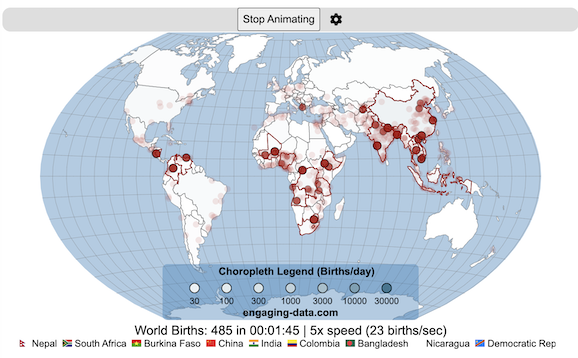
Global Birth Map

Where in the world are babies being born and how fast?
This interactive, animated map shows the where births are happening across the globe. It doesn’t actually show births in real-time, because data isn’t actually available to do that. However, the map does show the frequency of births that are occurring in different locations across the world. And you can see it in two ways, by country and also geo-referenced to specific locations (along a 1degree grid across the globe). There are many different ways to view this global birth map and these options are laid out in the controls at the top of the map. The scrolling list across the bottom also shows the country of each of the dots on the map.
Instructions
- Speed – change the slider to change the rate at which births show up on the map from real-speed to 25x faster
- Map projection – change the map projection
- Highlight country – an outline around the country when a birth occurs
- Choropleth – Build – as each birth occurs, the background color of the country will slowly change to reflect the number of births in the country
- Choropleth – Show – this option colors all the countries to show the number of births per day that occur in the country
- Dots – Show – this is the main feature that shows where each birth is occurring at the frequency that it does occur.
- Dots – Persist – this feature shows where previous births have occurred and the dots get darker as more births happen in that location.
If you hover (or click on mobile) on a country during the animation, it will display how many births have occurred since the animation stared.
Population distribution data combined with country birthrates
I used data that divided and aggregated the world’s population into 1 degree grid spacing across the globe and I assigned the center of each of these grid locations to a country. Then the country’s annual births (i.e. the country’s population times its birthrate) were distributed across all of the populated locations in each country, weighted by the population distribution (i.e. more populated areas got a greater fraction of the births).
Data Sources and Tools
Population and birthrate data for 2023 was obtained from Wikipedia (Population and birth rates). Population distribution across the globe was obtained from Socioeconomic Data and Applications Center (sedac) at Columbia University.
I used python to process country, population distribution data and parse the data into the probability of a birth at each 1 degree x 1 degree location. Then I used javascript to make random draws and predict the number of births for each map location. D3.js was used to create the map elements and html, css and javascript were used to create the user interface.
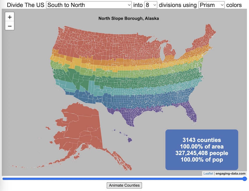
Splitting the US by Population

This visualization lets you divide the US into 1,2,3,4,5,8 and 10 different segments with equal population and across different dimensions. The divisions are made using counties as the building blocks (of which there are 3143 in the US). There are numerous different ways to make the divisions. This lets you make the divisions by different types of geographic directions and divisions by population density.
Instructions
- Select a dimension on which to divide up the country – there are geographic dimensions, like north to south or east to west, or by population density
- For some geographic divisions (concentric rings or pie slices), you can choose the geographic center of the divisions
- You can also choose the number and color scheme of the divisions
- To show the divisions, either click the Animate Counties button or use the slider to add counties
If you can think of other interesting ways to divide up the US, please let me know and I can try to add them to this visualization.
Sources and Tools:
2018 county population data is from US Census Bureau. The map visualization is created using the Leaflet javascript mapping library and the data wrangling and user interface and interactivity are created using HTML, CSS and Javascript code.
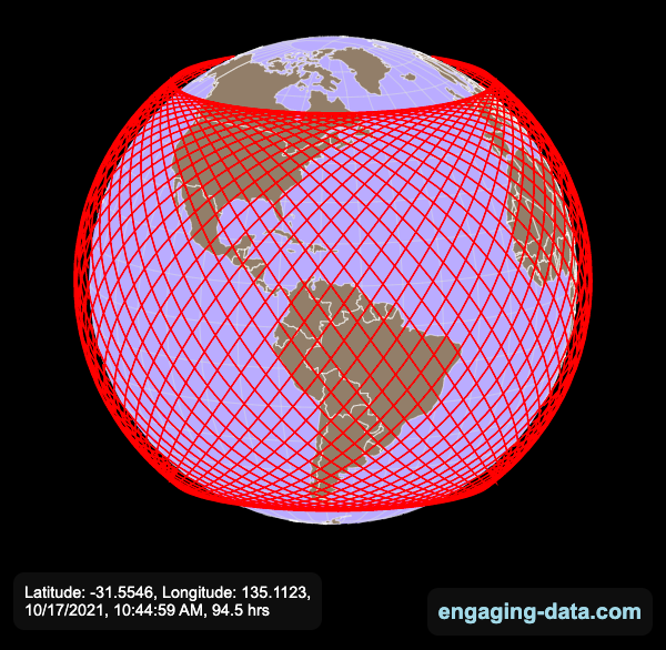
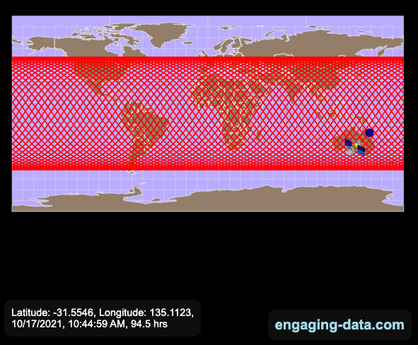
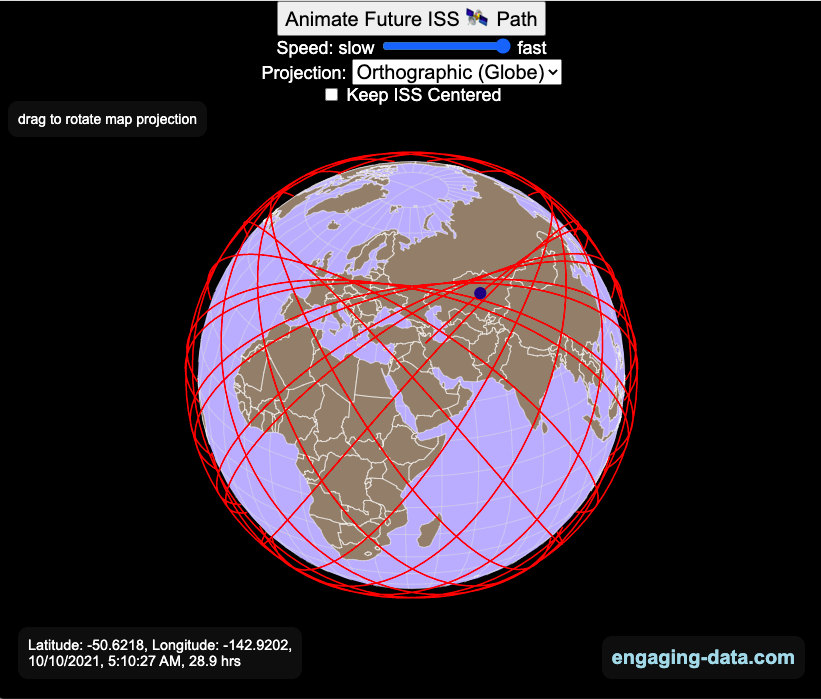
Visualizing the Orbit of the International Space Station (ISS)
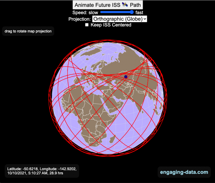
Where is the International Space Station currently? And what pattern does it make as it orbits around the Earth?
This visualization shows the current location of the International Space Station (ISS), actually the point above the Earth that the station is closest to. It is approximately 260 miles (420 km) above the Earth’s surface The station began construction in 1998 and had its first long term residents in 2000.
The visualization can also show the animated future orbital path of the ISS using ephemeris calculations, which makes a nice, cool pattern over an approximately 3.9 day cycle, where it starts to repeat. The animation allows you to view the orbital patterns on the globe (orthographic projection) or a mercator or equirectangular projection.
One of the cooler features is to drag and rotate the globe view while the orbital paths are being drawn. You can also adjust the speed of the orbit as well as keep the ISS centered in your view while the globe spins around underneath it. If you select the “rotate earth” checkbox, it becomes apparent that the ISS is in a circular orbit around the earth and that the pattern being made is simply a function of the earth’s rotation underneath the orbit.
This visualization only shows the approximate location of the ISS as there are several confounding factors that are not represented here. The speed of the ISS changes somewhat over time as the station experiences a small amount of atmospheric drag, which slows the station over time. But it still goes over 7000 meters per second or about 17000 miles per hour. As it slows, its orbit decays so it falls closer to earth and it experiences even more atmospheric drag. Occasionally, the station is boosted up to a higher orbit to counteract this decay. Secondly the earth is not a perfect sphere and this also causes the calculations to be only approximately correct.
Some other cool facts about the International Space Station:
- the angle the orbit makes relative to the equator is 51.6 degrees (i.e. this means the highest and lowest latitudes it will reach are 51.6 degrees North and South and doesn’t orbit over the poles
- the circular orbit around the earth makes a sin wave pattern on 2D map projections (shown on the mercator and equirectangular projections
- one orbit takes about 90 minutes. This means there are approximately 16 orbits per day and astronauts aboard the ISS will see 16 sunrises and sunsets
Other cool space-related orbital art can be seen at the inner planet spirographs.
Here are a couple of images showing the final pattern made by the ISS on different map projections.
Sources and Tools:
I used the satellite.js javascript package and the ISS TLE file to calculate the position of the ISS.
The visualization was made using the d3.js open source graphing library and HTML/CSS/Javascript code for the interactivity and UI.
National Park 3D Elevation Models
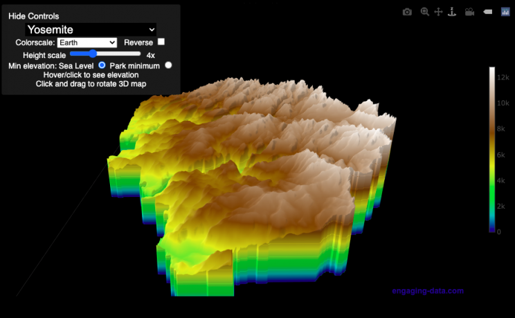
Play with an interactive 3D model of some popular National Parks in the US
I wanted to try my hand at creating 3D elevation models and thought trying to model some of the popular (and some of my favorite) national parks would be a good starting point.
Instructions
Once a 3D elevation model is selected and shown you can manipulated it in multiple ways:
- Zoom – You can zoom in and out, though the method depends on the device you are using. Try scrolling or pinch to zoom. You can also select the magnifying glass in the toolbar and drag to zoom.
- Rotate – You can rotate and change the angle of the model using by clicking and dragging on the model. This is the default selection in the toolbar (circular arrow around z axis)
- Pan – You can move the model around with if you select the panning tool from the toolbar (arrows going in all directions)
- Show contours – if you hover or click on part of the map, it can show all the areas of the model with the same elevation and the tooltip will show the geographic coordinates and elevation (you can toggle showing the tool tip if you select the tooltip bar)
- Save image – click on the camera icon in the toolbar to save as png
- Colors – you can change the color scale used to show elevation. You can also reverse the color scale.
- Change vertical exaggeration – you can select whether the vertical height is exaggerated using the ‘Height Scale’ slider. You can change between 1 (no exaggeration) to 11 (vertical scale is exaggerated by factor of 11).
- Change min elevation – you can select whether the minimum elevation is sea level or the lowest elevation in the park.
You can select a number of different parks from the drop down menu. If you have suggestions for additional parks, I may be able to add them to the list.
Note: the elevation files are data intensive since the visualization is downloading the elevation across in some cases, many hundreds or thousands of square miles. To keep the data needs down, I’ve reduced the resolution of the elevation data. Though the original data is 90 meter resolution (elevation is specified across every 90 x 90 m square in each park, I’ve averaged these squares together so that each park model only has about tens of thousands of these squares, regardless of the actual area of the park. This improves data loading and rendering times and makes the improves the responsiveness of the model.
Sources and Tools:
This visualization is written in HTML/CSS/Javascript. Digital elevation data is obtained from Open Topography and uses Shuttle Radar Topography Mission GL3 (90 meter resolution). The elevation data is downloaded using the opentopography API and parsed in a python script which downsamples the data to limit the number of elevation cells. The script also determines if a point is inside or outside of the park boundaries in order to create the elevation model. The 3D model is rendered using the Plotly open-source javascript graphing library.

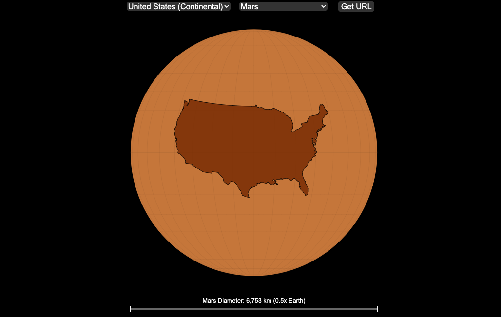
Countries Mapped onto Solar System Bodies
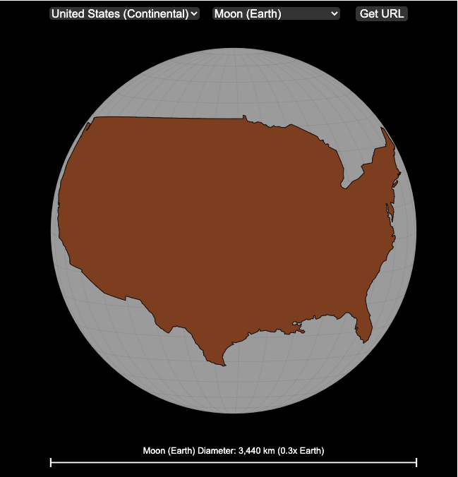
We can compare the sizes of countries and continents to planets and moons by projecting a map of a specific country onto another planet. Select a country and planet or moon to find out.
In one of my kid’s favorite books, there’s a picture demonstrating how Pluto is the same size as Australia. It has a satellite image of the country and an image of the former ninth planet superimposed on top as if it were hovering above the country. That image has stuck with me and I thought it would be interesting to see how other countries would compare with other planets and bodies in our solar system. As I’ve been working with javascript graphing/mapping library, D3.js and making maps/globes, I realized I should try to “project” individual countries onto these planets to see what they looked like.
Instructions
This visualization should be pretty self explanatory. You can select a country or continent and a planet or moon (or the sun) in the solar system. The visualization will then project the land onto the body and you have a simple visual comparison of the size of the country/continent and the planet or moon. You can drag on the visualization to rotate the planet.
There are some combinations that are not possible because the country/continent is too large to be projected onto the body without overlap. In these cases, the planet or country will be greyed out in the selection menu. You can click the “Get URL” button and share a specific map combination (country and planet) by copying the address in the url address bar.
The visualization also displays the area of the country/continent and the surface area of the planet or body. In some cases, the percentage may not look correct but remember that you can only see half of the planet surface and that it’s actually a hemisphere (half a sphere and not just a circle). It becomes clearer if you draw the surface of the planet around.
Calculations
The calculations to project a country onto another body involves starting with a set of coordinates (made up of longitude and latitude values) which define the border of the country, in the geojson format. To display them on Earth, the coordinates are modified so that the center of the country is centered at the intersection between the equator and prime meridian [0 deg latitude, 0 deg longitude].
To display them projected on a different planet or moon, it is necessary to change the latitude and longitude values of each point of the polygon country border so that it represents the same distance away from the polygon center. I used the Haversine formula to calculate the distance and bearing between two points on a sphere and then used the inverse to find the coordinates that were that distance and bearing from the center point on a sphere of a different size. These formulas can be found here. The main idea is that the distance representing one degree of latitude on Earth will be half as large on a planet that is half the size of Earth (like Mars). Thus, the distance between the center of a country and a point on the border will be a different number of degrees latitude and longitude from the center point on a different planet than on Earth. And this calculatin is done using these formulae.
Sources and Tools:
This visualization was made using the open-source, d3 javascript dataviz library and UI are made using HTML, CSS and javascript.
Snake on a Globe
Navigate the globe to the specified cities eating as many apples as you can
I coded a unique twist on the classic snake game, Snake on a Globe, where your mission is to eat as many apples as you can when given their location and find the best ways to navigate the globe.
The game includes the largest cities in the world and tests your geographical knowledge about country and city locations. Your challenge is to move to the next apple and city in the most efficient manner, moving only along lines of longitude or latitude. But remember you are on a sphere so you can move around the globe in any of four directions: over the poles and east and west.
Instructions
Sources and Tools:
The list of cities and their population is from Simplemaps. The game is coded with Three Globe and Three.js, 3D javascript libraries in javascript and HTML and CSS.
Global Birth Map
Where in the world are babies being born and how fast?
This interactive, animated map shows the where births are happening across the globe. It doesn’t actually show births in real-time, because data isn’t actually available to do that. However, the map does show the frequency of births that are occurring in different locations across the world. And you can see it in two ways, by country and also geo-referenced to specific locations (along a 1degree grid across the globe). There are many different ways to view this global birth map and these options are laid out in the controls at the top of the map. The scrolling list across the bottom also shows the country of each of the dots on the map.
Instructions
- Speed – change the slider to change the rate at which births show up on the map from real-speed to 25x faster
- Map projection – change the map projection
- Highlight country – an outline around the country when a birth occurs
- Choropleth – Build – as each birth occurs, the background color of the country will slowly change to reflect the number of births in the country
- Choropleth – Show – this option colors all the countries to show the number of births per day that occur in the country
- Dots – Show – this is the main feature that shows where each birth is occurring at the frequency that it does occur.
- Dots – Persist – this feature shows where previous births have occurred and the dots get darker as more births happen in that location.
If you hover (or click on mobile) on a country during the animation, it will display how many births have occurred since the animation stared.
Population distribution data combined with country birthrates
I used data that divided and aggregated the world’s population into 1 degree grid spacing across the globe and I assigned the center of each of these grid locations to a country. Then the country’s annual births (i.e. the country’s population times its birthrate) were distributed across all of the populated locations in each country, weighted by the population distribution (i.e. more populated areas got a greater fraction of the births).
Data Sources and Tools
Population and birthrate data for 2023 was obtained from Wikipedia (Population and birth rates). Population distribution across the globe was obtained from Socioeconomic Data and Applications Center (sedac) at Columbia University.
I used python to process country, population distribution data and parse the data into the probability of a birth at each 1 degree x 1 degree location. Then I used javascript to make random draws and predict the number of births for each map location. D3.js was used to create the map elements and html, css and javascript were used to create the user interface.
Splitting the US by Population
This visualization lets you divide the US into 1,2,3,4,5,8 and 10 different segments with equal population and across different dimensions. The divisions are made using counties as the building blocks (of which there are 3143 in the US). There are numerous different ways to make the divisions. This lets you make the divisions by different types of geographic directions and divisions by population density.
Instructions
- Select a dimension on which to divide up the country – there are geographic dimensions, like north to south or east to west, or by population density
- For some geographic divisions (concentric rings or pie slices), you can choose the geographic center of the divisions
- You can also choose the number and color scheme of the divisions
- To show the divisions, either click the Animate Counties button or use the slider to add counties
If you can think of other interesting ways to divide up the US, please let me know and I can try to add them to this visualization.
Sources and Tools:
2018 county population data is from US Census Bureau. The map visualization is created using the Leaflet javascript mapping library and the data wrangling and user interface and interactivity are created using HTML, CSS and Javascript code.
Visualizing the Orbit of the International Space Station (ISS)
Where is the International Space Station currently? And what pattern does it make as it orbits around the Earth?
This visualization shows the current location of the International Space Station (ISS), actually the point above the Earth that the station is closest to. It is approximately 260 miles (420 km) above the Earth’s surface The station began construction in 1998 and had its first long term residents in 2000.
The visualization can also show the animated future orbital path of the ISS using ephemeris calculations, which makes a nice, cool pattern over an approximately 3.9 day cycle, where it starts to repeat. The animation allows you to view the orbital patterns on the globe (orthographic projection) or a mercator or equirectangular projection.
One of the cooler features is to drag and rotate the globe view while the orbital paths are being drawn. You can also adjust the speed of the orbit as well as keep the ISS centered in your view while the globe spins around underneath it. If you select the “rotate earth” checkbox, it becomes apparent that the ISS is in a circular orbit around the earth and that the pattern being made is simply a function of the earth’s rotation underneath the orbit.
This visualization only shows the approximate location of the ISS as there are several confounding factors that are not represented here. The speed of the ISS changes somewhat over time as the station experiences a small amount of atmospheric drag, which slows the station over time. But it still goes over 7000 meters per second or about 17000 miles per hour. As it slows, its orbit decays so it falls closer to earth and it experiences even more atmospheric drag. Occasionally, the station is boosted up to a higher orbit to counteract this decay. Secondly the earth is not a perfect sphere and this also causes the calculations to be only approximately correct.
Some other cool facts about the International Space Station:
- the angle the orbit makes relative to the equator is 51.6 degrees (i.e. this means the highest and lowest latitudes it will reach are 51.6 degrees North and South and doesn’t orbit over the poles
- the circular orbit around the earth makes a sin wave pattern on 2D map projections (shown on the mercator and equirectangular projections
- one orbit takes about 90 minutes. This means there are approximately 16 orbits per day and astronauts aboard the ISS will see 16 sunrises and sunsets
Other cool space-related orbital art can be seen at the inner planet spirographs.
Here are a couple of images showing the final pattern made by the ISS on different map projections.
Sources and Tools:
I used the satellite.js javascript package and the ISS TLE file to calculate the position of the ISS.
The visualization was made using the d3.js open source graphing library and HTML/CSS/Javascript code for the interactivity and UI.
National Park 3D Elevation Models
Play with an interactive 3D model of some popular National Parks in the US
I wanted to try my hand at creating 3D elevation models and thought trying to model some of the popular (and some of my favorite) national parks would be a good starting point.
Instructions
Once a 3D elevation model is selected and shown you can manipulated it in multiple ways:
- Zoom – You can zoom in and out, though the method depends on the device you are using. Try scrolling or pinch to zoom. You can also select the magnifying glass in the toolbar and drag to zoom.
- Rotate – You can rotate and change the angle of the model using by clicking and dragging on the model. This is the default selection in the toolbar (circular arrow around z axis)
- Pan – You can move the model around with if you select the panning tool from the toolbar (arrows going in all directions)
- Show contours – if you hover or click on part of the map, it can show all the areas of the model with the same elevation and the tooltip will show the geographic coordinates and elevation (you can toggle showing the tool tip if you select the tooltip bar)
- Save image – click on the camera icon in the toolbar to save as png
- Colors – you can change the color scale used to show elevation. You can also reverse the color scale.
- Change vertical exaggeration – you can select whether the vertical height is exaggerated using the ‘Height Scale’ slider. You can change between 1 (no exaggeration) to 11 (vertical scale is exaggerated by factor of 11).
- Change min elevation – you can select whether the minimum elevation is sea level or the lowest elevation in the park.
You can select a number of different parks from the drop down menu. If you have suggestions for additional parks, I may be able to add them to the list.
Note: the elevation files are data intensive since the visualization is downloading the elevation across in some cases, many hundreds or thousands of square miles. To keep the data needs down, I’ve reduced the resolution of the elevation data. Though the original data is 90 meter resolution (elevation is specified across every 90 x 90 m square in each park, I’ve averaged these squares together so that each park model only has about tens of thousands of these squares, regardless of the actual area of the park. This improves data loading and rendering times and makes the improves the responsiveness of the model.
Sources and Tools:
This visualization is written in HTML/CSS/Javascript. Digital elevation data is obtained from Open Topography and uses Shuttle Radar Topography Mission GL3 (90 meter resolution). The elevation data is downloaded using the opentopography API and parsed in a python script which downsamples the data to limit the number of elevation cells. The script also determines if a point is inside or outside of the park boundaries in order to create the elevation model. The 3D model is rendered using the Plotly open-source javascript graphing library.
Countries Mapped onto Solar System Bodies
We can compare the sizes of countries and continents to planets and moons by projecting a map of a specific country onto another planet. Select a country and planet or moon to find out.
In one of my kid’s favorite books, there’s a picture demonstrating how Pluto is the same size as Australia. It has a satellite image of the country and an image of the former ninth planet superimposed on top as if it were hovering above the country. That image has stuck with me and I thought it would be interesting to see how other countries would compare with other planets and bodies in our solar system. As I’ve been working with javascript graphing/mapping library, D3.js and making maps/globes, I realized I should try to “project” individual countries onto these planets to see what they looked like.
Instructions
This visualization should be pretty self explanatory. You can select a country or continent and a planet or moon (or the sun) in the solar system. The visualization will then project the land onto the body and you have a simple visual comparison of the size of the country/continent and the planet or moon. You can drag on the visualization to rotate the planet.
There are some combinations that are not possible because the country/continent is too large to be projected onto the body without overlap. In these cases, the planet or country will be greyed out in the selection menu. You can click the “Get URL” button and share a specific map combination (country and planet) by copying the address in the url address bar.
The visualization also displays the area of the country/continent and the surface area of the planet or body. In some cases, the percentage may not look correct but remember that you can only see half of the planet surface and that it’s actually a hemisphere (half a sphere and not just a circle). It becomes clearer if you draw the surface of the planet around.
Calculations
The calculations to project a country onto another body involves starting with a set of coordinates (made up of longitude and latitude values) which define the border of the country, in the geojson format. To display them on Earth, the coordinates are modified so that the center of the country is centered at the intersection between the equator and prime meridian [0 deg latitude, 0 deg longitude].
To display them projected on a different planet or moon, it is necessary to change the latitude and longitude values of each point of the polygon country border so that it represents the same distance away from the polygon center. I used the Haversine formula to calculate the distance and bearing between two points on a sphere and then used the inverse to find the coordinates that were that distance and bearing from the center point on a sphere of a different size. These formulas can be found here. The main idea is that the distance representing one degree of latitude on Earth will be half as large on a planet that is half the size of Earth (like Mars). Thus, the distance between the center of a country and a point on the border will be a different number of degrees latitude and longitude from the center point on a different planet than on Earth. And this calculatin is done using these formulae.
Sources and Tools:
This visualization was made using the open-source, d3 javascript dataviz library and UI are made using HTML, CSS and javascript.
Recent Comments