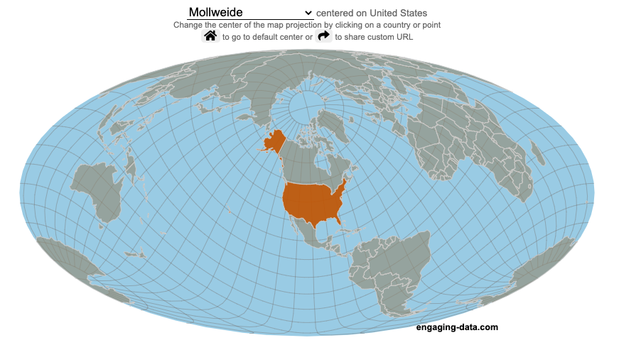
What does it look like if you center a map on a specific country? Click on a country to find out.
World maps are used to show the geographic relationships between the countries and regions of the world. Their design shapes our perception of the world and those relationships. Two of the important aspects of map design are the choice of map projection and what is centered in the map. The idea for this map dataviz is to let users create their own country centered map by centering the map where you choose (on a country of your choice or a specific point) and the map projection.
As discussed in my real country size mercator map, there aren’t any perfect map projections as you try to represent the 3-dimensional surface of a sphere on a 2-dimensional map. Each map projection has advantages and disadvantages.
Instructions
Click on a country or point on the ocean to center the map projection onto this area
You can choose between the following map projections:
Orthographic (globe) – a map projection that looks like a globe
Mercator – a very common cylindrical map projection used in many web maps which expands sizes of land near the top and bottom edges
Mollweide – a pseudocylindrical projection that maintains equal area of land masses. Areas near the top and bottom edges can be distorted
Equirectangular – another cylindrical projection but latitude lines are kept equidistant. Areas near top and bottom edges of map are wider than in reality.
Gall Peters – an equal area cylindrical projection that stretches shapes vertically at the equator and shrinks shapes vertically at the poles.
In addition, you can:
Rotate the map in increments of 45 degrees using the ⟲ and ⟳ buttons.
Share maps of your home country, chosen map projection and rotation by clicking on the share button (and copying the URL).
The number of different maps you can create is quite large and will give you a different and often unusual perspective on the world. If you choose the cylindrical projections (Mercator, equirectangular, Gall Peters) you will see some interesting distortions when you focus on different countries or regions. The reasoning is that because the map is rectangular (i.e. the longitude lines are kept parallel on the map, while in reality longitude lines converge at the poles), land masses near the top and bottom of the map will grow as they are widened (and in the case of the Mercator, made taller) to accommodate the map projection. Because the Orthographic and Mollweide projections have converging longitude lines, they do not exhibit the same level of distortion.
If you are interested in map projections, they are described in this wikipedia article. For a cylindrical projections, you can think of it as encircling the globe with a rolled surface which forms the side of a cylinder. See this image from wikipedia.
In the standard projection, the globe is touching this cylinder at the equator, but this map lets you move any country or point to the place where it intersects the cylinder and then projects the land masses onto the cylinder. Land masses at the top and bottom of the sphere in this orientation will be more distorted at top and bottom of the map projections in these cylindrical projections.
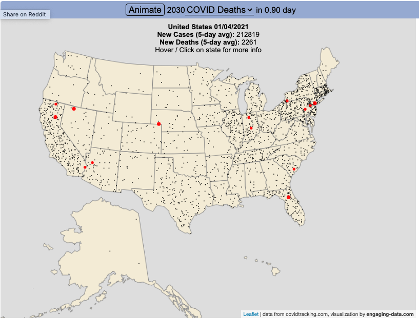
Visualize the large number of coronavirus cases and deaths in the US each day/hour in about 10 seconds
The rate of COVID-19 deaths and cases in the US is crazy high after the 2020 winter holidays and maybe still be going up. This visualization shows the number of COVID cases that occur in one hour or the COVID deaths that occur in one day based on the average of the last five days. This is another attempt to show the true scale of how many cases and deaths the US is dealing with, since it is often hard to understand large numbers. I have also attempted to show the scale of US deaths/cases here and here. Unfortunately, there are so many people getting sick and dying, it’s hard to fathom just how many people this actually is.
The 5-day averaging was done to smooth out any peaks and troughs in data reporting due to weekends/holidays, since I noticed that some states were literally reporting zero COVID cases some days while reporting many hundreds or thousands of cases other days.
The dots shown on the animation are located in the state that the cases or deaths occur but are randomly spread out within the state. This is done for visual clarity since if they were shown in their actual location, most of the dots would be overlapping in urban, high density areas. This approach lets you see which states have high COVID instances but still locate them by state.
You can share this animation by putting ?cat=deaths or ?cat=cases behind the url or copying and sharing one of these links:
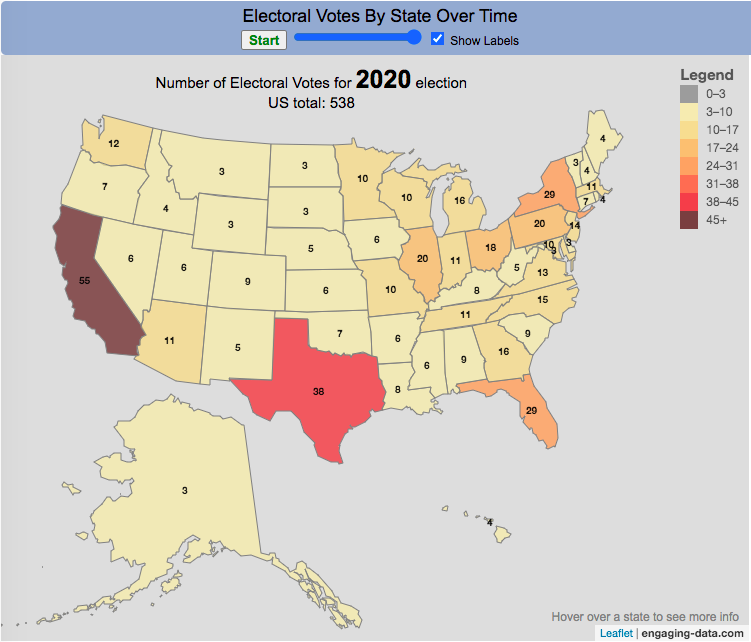
How many electoral votes did each state have across two centuries of elections?
This animation shows the number of electoral votes each state had during each of the 59 presidential elections in US history between 1788 and 2020. It’s interesting to see the number of US states and their relative population sizes (in terms of electoral votes) over many different presidential elections. The population is counted every 10 years in the census so if a presidential election occurs between a census, it likely will not see any difference in numbers of electoral votes, unless something else happens (such as addition of a new state to the country).
Instructions
You can use the slider to control the election year to focus on a specific election and toggle the animation by hitting the Start/Stop button. Hovering over each state will tell you the number of electoral votes and the percentage of the total number of electoral votes in that election.
In the elections during and immediately after the US Civil War, we also see some states whose electoral votes for president are not counted (shown in purple). Wyoming, the state with the lowest population in the US, has the highest number of electoral votes per person in the state, while the three most populous states, California, Florida and Texas have the least number of electoral votes per person. Wyoming has four times the number of electors per capita than these 3 states have (i.e. accounting for their population sizes). That will be the subject of another map dataviz.
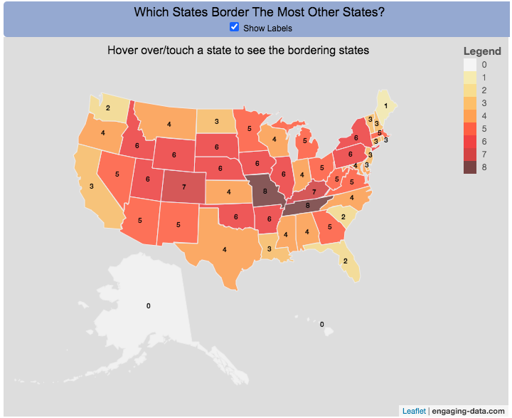
Interactive Choropleth of the Number of States That Border Each State
This is a fun little map that shows the number of states that border each state. I’m working on improving the interactivity of maps and this was a good project to try this with. The base map is a choropleth map which color codes each state by the number of states it shares a border with. If you hover over (or touch on mobile) a state, it will highlight the state and show you (and list) the bordering states.
It’s important to note that officially New York and Rhode Island share a water border (between Rhode Island and Long Island, NY) and that Michigan and Minnesota also share a border (in Lake Superior).
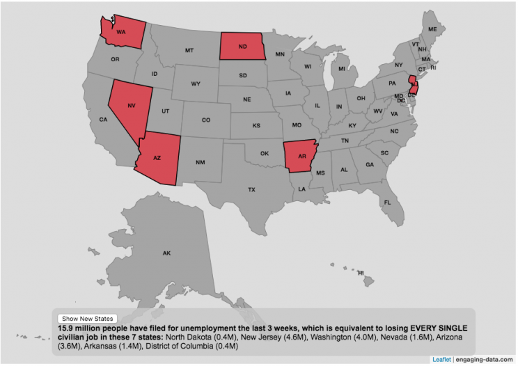
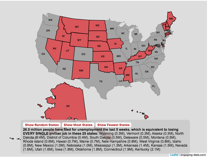
The number of Americans who have recently filed for unemployment due to the coronavirus pandemic is equal to the entire labor force of several states put together.
click on the button below to see a new set of states.
A record 16 million Americans just filed for unemployment due to the coronavirus pandemic at the end of March and early April 2020. This is an amazingly large number of people and I wanted to visualize how many people this actually is. For context, the US Department of Labor statistics states that in February 2020 (before the pandemic hit the United State) there were 164.2 million workers in the Civilian Labor Force.
The Bureau of Labor Statistics (BLS) site defines “Civilian Labor Force” as such:
“The labor force includes all people age 16 and older who are classified as either employed and unemployed, as defined below. Conceptually, the labor force level is the number of people who are either working or actively looking for work.”
This basically means that approximately 10% of the entire workforce of people (both employed and unemployed in Feb 2020) are now out of a job. While 10% is a large, unprecedented number in our lifetimes, comparing these number to the size of the workforce in several states helps to provide more context. The visualization shows a random collection of states whose total labor force is equal to the latest unemployment numbers. If you click the button you can see a different set of states that have the same total labor force.
Predictions are that the number of unemployed will grow as the shutdowns and social distancing measures to contain the virus continue through April and into May. I will update this graph to reflect new numbers as they come out.
And we can only hope that people will be able to manage these tough economic times until we contain the virus and the economy rebounds.
Stay safe out there: stay away from people and wash your hands!
The coronavirus (SARS-CoV-2) is literally affecting the entire globe right now and changing the way we live our lives here in the US and all over the world.
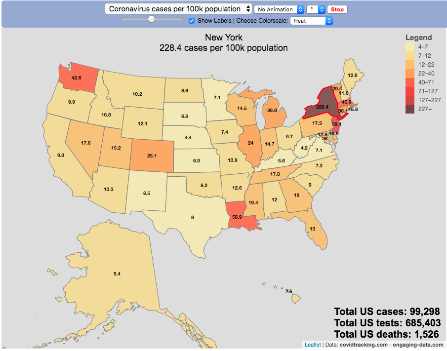
There are quite a number of different coronavirus-related dataviz out there, but as we shelter-in-place I wanted to add a map that looked at a number of different metrics that tell us about the coronavirus pandemic by US states and look at those metrics on a population basis.
There are a number of data sources that I’ve found that publish data about the coronavirus and the resulting disease (Covid-19) in the United States:
This map is based on the data compiled from covidtracking.com, partly because it has a good API and also lists testing, cases and deaths. The data I’ve included on the map is:
Numbers of coronavirus cases – i.e. tested positive for virus
Numbers of coronavirus tests administered
Numbers of deaths due to coronavirus
Each of these is also calculated per 100,000 population in the state:
Numbers of coronavirus cases per 100k people- i.e. tested positive for virus
Numbers of coronavirus tests administered per 100k people
Numbers of deaths due to coronavirus per 100k people
These latter metrics are important because numbers of cases or deaths can be obscured by small or large populations but per capita data (or per 100k capita data) can point out interesting outliers.
It is important to note that the data is far from perfect. There is probably significant underreporting of tests, cases and deaths. The data is a collection for the various local and state agencies that are working hard to deal with the medical, social and political ramifications of the pandemic, while also collecting data. We don’t know how many Americans have coronavirus because of lack of testing.
Also important is that the number of positive cases is a function of how much testing is taking place so cases does not necessarily represent the exact prevalence of the virus, though there will probably be good correlation between cases and actual coronavirus infections. Luckily it sounds like tests are becoming more widely available so hopefully those numbers will go up sharply.
For more information about the virus and the disease and data collection, you can find good information on the CDC website.


Recent Comments