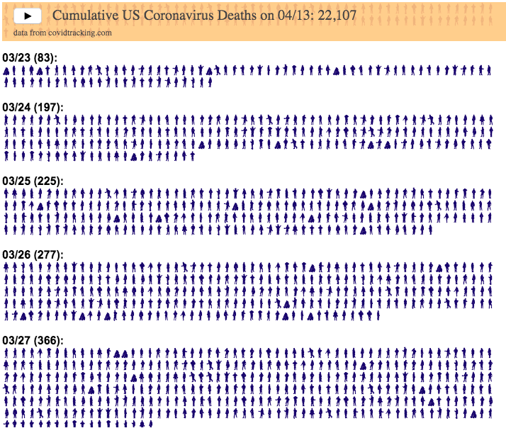
This visualization is meant to demonstrate the exponential growth of coronavirus deaths in the United States starting in early March when the first confirmed deaths took place. Some reports indicate that the first deaths may have been as early as early February, though that is not shown in this data.
In the animation, each day is about 1 second long so on days with fewer deaths, the figures show up more slowly, while on days with greater deaths, the figures come very, very quickly.
Deaths stop growing exponentially in early April and start to level off and plateau. However, they haven’t yet started to decline significantly so we are still seeing thousands of deaths each day (as of late April).
The data and visualization will be updated daily with data from Covidtracking.com.
For more information about the virus and the disease and data collection, you can find good information on the CDC website.
Sources and Tools:
Coronavirus cases are obtained from covidtracking.com. And the visualization was created using javascript and the font with people figures is called Wee People and was created by Albert Cairo and Propublica.

No Comments »