Posts for Tag: US
Understanding Tax Brackets: Interactive Income Tax Visualization and Calculator
Please check out the newer version of this visualization
How is your income distributed across tax brackets?
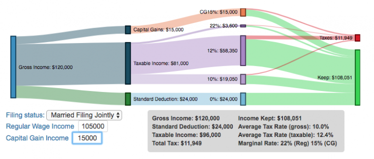
I previously made a graphical visualization of income and marginal tax rates to show how tax brackets work. That graph tried to show alot of info on the same graph, i.e. the breakdown of income tax brackets for incomes ranging from $10,000 to $3,000,000. It was nice looking, but I think several people were confused about how to read the graph. This Sankey graph is a more detailed look at the tax breakdown for one specific income. You can enter your (or any other) profile and see how taxes are distributed across the different brackets. It can help (as the other tried) to better understand marginal and average tax rates. This tool only looks at US Federal Income taxes and ignores state, local and Social Security/Medicare taxes.
– Use this button to generate a URL that you can share a specific set of inputs and graphs. Just copy the URL in the address bar at the top of your browser (after pressing the button).
Instructions for using the visual tax calculator:
- Select filing status: Single, Married Filing Jointly or Head of Household. For more info on these filing categories see the IRS website
- Enter your regular income and capital gains income. Regular income is wage or employment income and is taxed at a higher rate than capital gains income. Capital gains income is typically investment income from the sale of stocks or dividends and taxed at a lower rate than regular income.
- Move your cursor or click on the Sankey graph to select a specific link. This will give you more information about how income in a specific tax bracket is being taxed.
**Click Here to view other financial-related tools and data visualizations from engaging-data**
As seen with the marginal rates graph, there is a big difference in how regular income and capital gains are taxed. Capital gains are taxed at a lower rate and generally have larger bracket sizes. Generally, wealthier households earn a greater fraction of their income from capital gains and as a result of the lower tax rates on capital gains, these household pay a lower effective tax rate than those making an order of magnitude less in overall income.
Tax Brackets By Year
This table lets you choose to view the thresholds for each income and capital gains tax bracket for the last few years. You can see that tax rates are much lower for capital gains in the table below than for regular income.
For those not visually inclined, here is a written description of how to apply marginal tax rates. The first thing to note is that the income shown here in the graphs is taxable income, which simply speaking is your gross income with deductions removed. The standard deduction for 2018 range from $12,000 for Single filers to $24,000 for Married filers.
- If you are single, all of your regular taxable income between 0 and $9,525 is taxed at a 10% rate. This means that your all of your gross income below $12,000 is not taxed and your gross income between $12,000 and $21,525 is taxed at 10%.
- If you have more income, you move up a marginal tax bracket. Any taxable income in excess of $9,525 but below $38,700 will be taxed at the 12% rate. It is important to note that not all of your income is taxed at the marginal rate, just the income between these amounts.
- Income between $38,700 and $82,500 is taxed at 24% and so on until you have income over $500,000 and are in the 37% marginal tax rate . . .
- Thus, different parts of your income are taxed at different rates and you can calculate an average or effective rate (which is shown in the summary table).
- Capital gains income complicates things slightly as it is taxed after regular income. Thus any amount of capital gains taxes you make are taxed at a rate that corresponds to starting after you regular income. If you made $100,000 in regular income, and only $100 in capital gains income, that $100 dollars would be taxed at the 15% rate and not at the 0% rate, because the $100,000 in regular income pushes you into the 2nd marginal tax bracket for capital gains (between $38,700 and $426,700).
Data and Tools:
Tax brackets and rates were obtained from the IRS website and calculations were made using javascript and code modified from the Sankeymatic plotting website.
California is World’s 4th Largest Economy

This is one of an ongoing series of visualizations about the state of California. This one is about the state’s economy, which recently moved into 4th place (2024), if California were its own country. It is, however, still part of the United States.
The visualization shows the relative sizes of the top 10 world economies (including the US, with California removed for context). California has the smallest population of any of the top 10, with #9 Canada just barely larger than California in population, though with a significantly smaller sized economy (about 1/2 the size).
Hover over the countries to see their GDP and population. California is behind the United States, China and Germany in total economic output (in nominal terms), but ahead of much larger countries Japan and India and the United Kingdom.
The state’s economy produces $4.1 Trillion dollars of economic output, driven by a range of industries including technology, real estate, manufacturing, agriculture and health care. It is a hub for innovation and entrepreneurship. California is also the leading agricultural state in the United States. Immigration is a huge part of the state’s workforce.
Sources and Tools:
2024 economic data was downloaded from the International Monetary Fund (IMF). This visualization is made using d3.js, an open-source javascript visualization library.

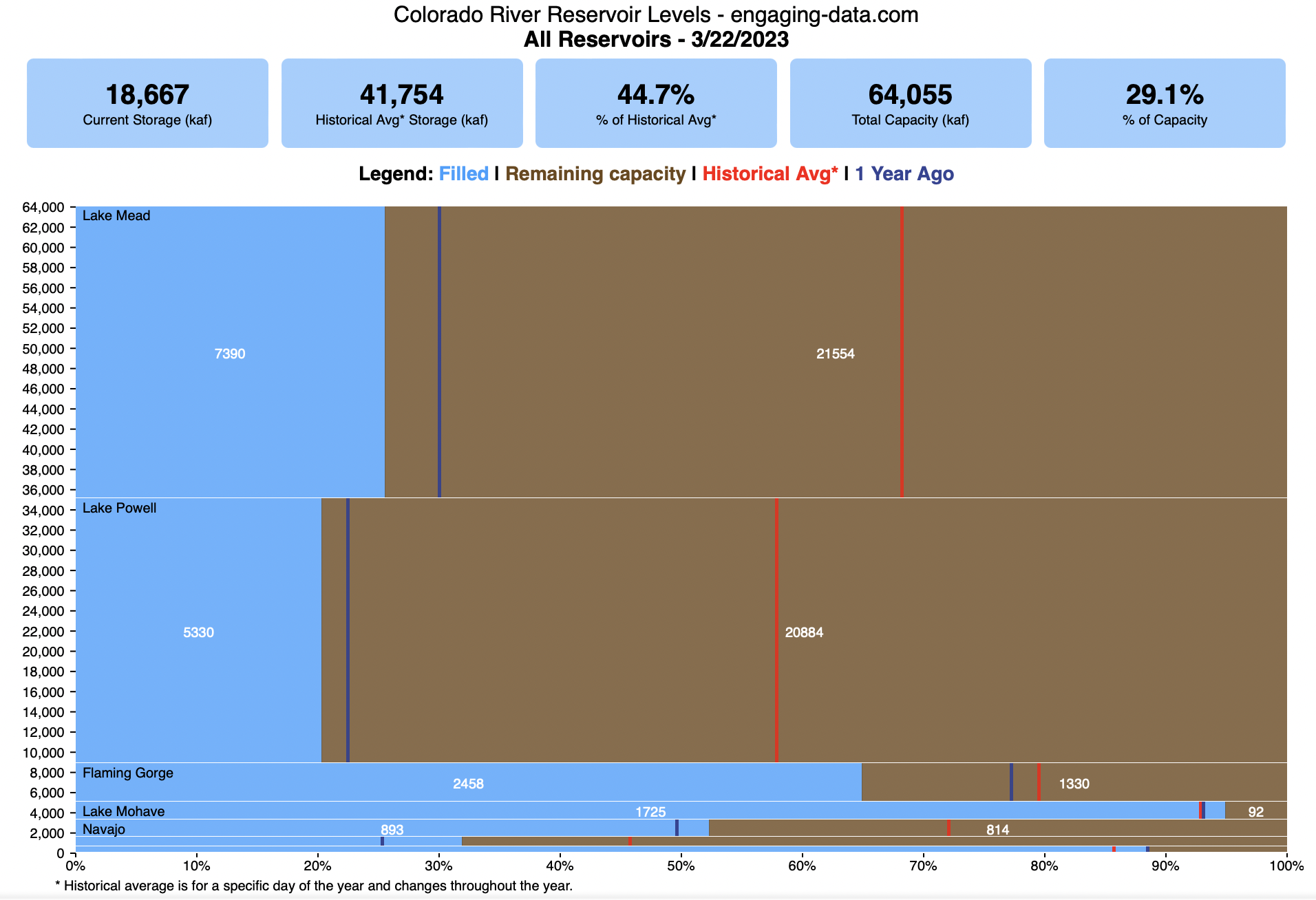
Colorado River Reservoir Levels
How much water is in the main Colorado River reservoirs?
Check out my California Reservoir Levels Dashboard
I based this graph off of my California Reservoir marimekko graph, because many folks were interested in seeing a similar figure for the Colorado river reservoirs.
This is a marimekko (or mekko) graph which may take some time to understand if you aren’t used to seeing them. Each “row” represents one reservoir, with bars showing how much of the reservoir is filled (blue) and unfilled (brown). The height of the “row” indicates how much water the reservoir could hold. Lake Mead is the reservoir with the largest capacity (at almost 29,000 kaf) and so it is the tallest row. The proportion of blue to brown will show how full it is. As with the California version of this graph, there are also lines that represent historical levels, including historical median level for the day of the year (in red) and the 1 year ago level, which is shown as a dark blue line. I also added the “Deadpool” level for the two largest reservoirs. This is the level at which water cannot flow past the dam and is stuck in the reservoir.
Lake Mead and Lake Powell are by far the largest of these reservoirs and also included are several smaller reservoirs (relative to these two) so the bars will be very thin to the point where they are barely a sliver or may not even show up.
Historical Data
Historical data comes from https://www.water-data.com/ and differs for each reservoir.
- Lake Mead – 1941 to 2015
- Lake Powell – 1964 to 2015
- Flaming Gorge – 1972 to 2015
- Lake Mohave – 1952 to 2015
- Lake Navajo – 1969 to 2015
- Blue Mesa – 1969 to 2015
- Lake Havasu – 1939 to 2015
The daily data for each reservoir was captured in this time period and median value for each day of the calendar year was calculated and this is shown as the red line on the graph.
Instructions:
If you are on a computer, you can hover your cursor over a reservoir and the dashboard at the top will provide information about that individual reservoir. If you are on a mobile device you can tap the reservoir to get that same info. It’s not possible to see or really interact with the tiniest slivers. The main goal of this visualization is to provide a quick overview of the status of the main reservoirs along the Colorado River (or that provide water to the Colorado).
Units are in kaf, thousands of acre feet. 1 kaf is the amount of water that would cover 1 acre in one thousand feet of water (or 1000 acres in water in 1 foot of water). It is also the amount of water in a cube that is 352 feet per side (about the length of a football field). Lake Mead is very large and could hold about 35 cubic kilometers of water at full (but not flood) capacity.
Data and Tools
The data on water storage comes from the US Bureau of Reclamation’s Lower Colorado River Water Operations website. Historical reservoir levels comes from the water-data.com website. Python is used to extract the data and wrangle the data in to a clean format, using the Pandas data analysis library. Visualization was done in javascript and specifically the D3.js visualization library.
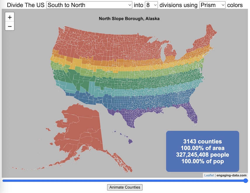
Splitting the US by Population

This visualization lets you divide the US into 1,2,3,4,5,8 and 10 different segments with equal population and across different dimensions. The divisions are made using counties as the building blocks (of which there are 3143 in the US). There are numerous different ways to make the divisions. This lets you make the divisions by different types of geographic directions and divisions by population density.
Instructions
- Select a dimension on which to divide up the country – there are geographic dimensions, like north to south or east to west, or by population density
- For some geographic divisions (concentric rings or pie slices), you can choose the geographic center of the divisions
- You can also choose the number and color scheme of the divisions
- To show the divisions, either click the Animate Counties button or use the slider to add counties
If you can think of other interesting ways to divide up the US, please let me know and I can try to add them to this visualization.
Sources and Tools:
2018 county population data is from US Census Bureau. The map visualization is created using the Leaflet javascript mapping library and the data wrangling and user interface and interactivity are created using HTML, CSS and Javascript code.
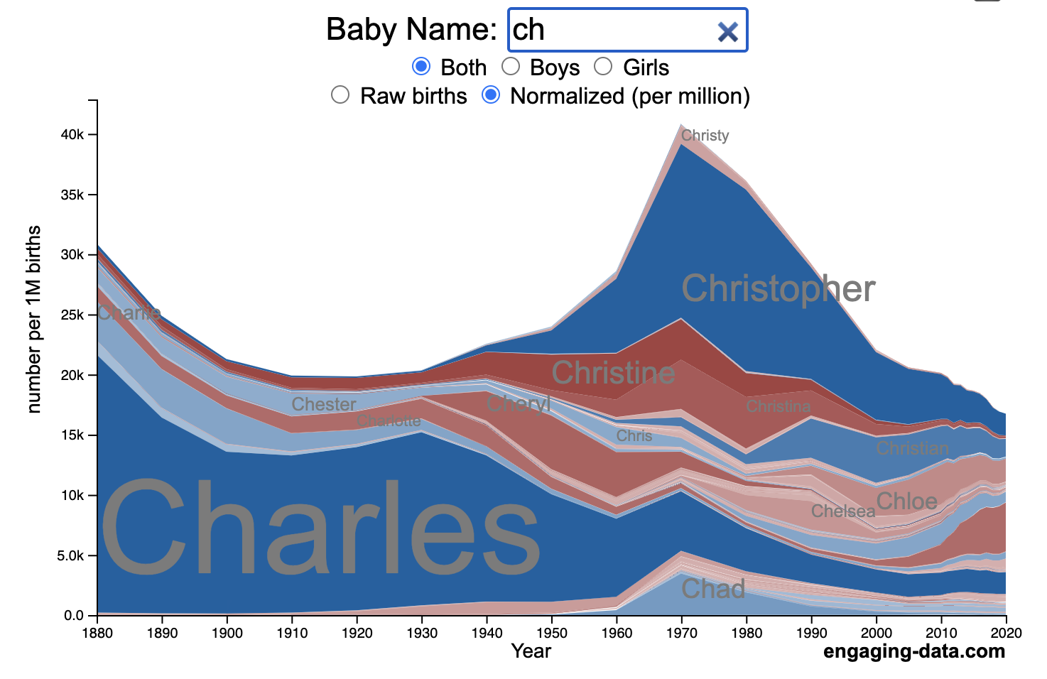
US Baby Name Popularity Visualizer

I added a share button (arrow button) that lets you send a graph with specific name. It copies a custom URL to your clipboard which you can paste into a message/tweet/email.
How popular is your name in US history?
Use this visualization to explore statistics about names, specifically the popularity of different names throughout US history (1880 until 2020). This is a useful tool for seeing the rise (and fall) of popularity of names. Look at names that we think of as old-fashioned, and names that are more modern.
Instructions
- Start typing a name into the input box above and the visualization will show all the names that begin with those letters. The graph will show the historical popularity of all these names as an area graph.
- You can hover (or click on mobile) to bring up a tooltip (popup) that shows you the exact number of births with that name for different years (or decades) and the names rank in that time period.
- It’s best used on computer (rather than a mobile or tablet device) so you can see the graph more clearly and also, if you click on a name wedge, it will zoom into names that begin with those letters.
- You can select different views, Boy names, Girl names or both, as well as looking at the raw number of births or a normalized popularity that accounts for the differential number of births throughout the period between 1880 and 2020.
- If you click the share (arrow) button, it will copy the parameters of the current graph you are looking at and create a custom URL to share with others. It copes the link into your clipboard and your browser’s address (URL) bar.
Isn’t there something out there like this already? Baby Name Wizard and Baby Name Voyager
This visualization is not my original idea, but rather a re-creation of the Baby Name Voyager (from the Baby Name Wizard website) created by Laura Wattenberg. The original visualization disappeared (for some unknown reason) from the web, and I thought it was a shame that we should be deprived of such a fun resource.
It started about a week ago, when I saw on twitter that the Baby Name Wizard website was gone. Here’s the blog post from Laura. I hadn’t used it in probably a decade, but it flashed me back to many years ago well before I got into web programming and dataviz and I remember seeing the Baby Name Voyager and thinking how amazing it was that someone could even make such a thing. Everyone I knew played with it quite a bit when it first came out. It got me thinking that it should still be around and that I could probably make it now with my programming skills and how cool that would be.
So I downloaded the frequency data for Baby Names from the US Social Security Administration and set to work trying to create a stacked area graph of baby names vs time. I started with my go to library for fast dataviz (Plotly.js) but eventually ended up creating the visualization in d3.js which is harder for me, but made it very responsive. I’m not an expert in d3, but know enough that using some similar examples and with lots of googling and stack overflow, I could create what I wanted.
I emailed Laura after creating a sample version, just to make sure it was okay to re-create it as a tribute to the Baby Name Wizard / Voyager and got the okay from her.
Where does the data come from?
Some info about Data (from SSA Baby Names Website):
All names are from Social Security card applications for births that occurred in the United States after 1879. Note that many people born before 1937 never applied for a Social Security card, so their names are not included in our data.
Name data are tabulated from the “First Name” field of the Social Security Card Application. Hyphens and spaces are removed, thus Julie-Anne, Julie Anne, and Julieanne will be counted as a single entry.
Name data are not edited. For example, the sex associated with a name may be incorrect.
Different spellings of similar names are not combined. For example, the names Caitlin, Caitlyn, Kaitlin, Kaitlyn, Kaitlynn, Katelyn, and Katelynn are considered separate names and each has its own rank.
All data are from a 100% sample of our records on Social Security card applications as of March 2021.
I did notice that there was a significant under-representation of male names in the early data (before 1910) relative to female names. In the normalized data, I set the data for each sex to 500,000 male and 500,000 female births per million total births, instead of the actual data which shows approximately double the number of female names than male names. Not sure why females would have higher rates of social security applications in the early 20th century. Update: A helpful Redditor pointed me to this blog post which explains some of the wonkiness of the early data. The gist of it is that Social Security cards and numbers weren’t really a thing until 1935. Thus the names of births in 1880 are actually 55 year olds who applied for Social Security numbers and since they weren’t mandatory, they don’t include everyone. My correction basically makes the assumption that this data is actually a survey and we got uneven samples from males and female respondents. It’s not perfect (like the later data) but it’s a decent representation of name distribution.
Sources and Tools:
The biggest source of inspiration was of course, Laura Wattenberg’s original Baby Name Explorer.
I downloaded the baby names from the Social Security website. Thanks to Michael W. Shackleford at the SSA for starting their name data reporting. I used a python script to parse and organize the historical data into the proper format my javascript. The visualization is created using HTML, CSS and Javascript code (and the d3.js visualization library) to create interactivity and UI. Curran Kelleher’s area label d3 javascript library was a huge help for adding the names to the graph.
National Park 3D Elevation Models
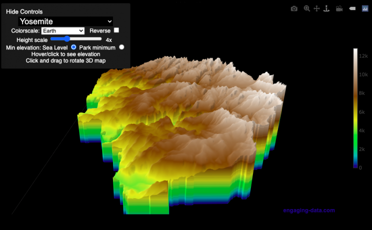
Play with an interactive 3D model of some popular National Parks in the US
I wanted to try my hand at creating 3D elevation models and thought trying to model some of the popular (and some of my favorite) national parks would be a good starting point.
Instructions
Once a 3D elevation model is selected and shown you can manipulated it in multiple ways:
- Zoom – You can zoom in and out, though the method depends on the device you are using. Try scrolling or pinch to zoom. You can also select the magnifying glass in the toolbar and drag to zoom.
- Rotate – You can rotate and change the angle of the model using by clicking and dragging on the model. This is the default selection in the toolbar (circular arrow around z axis)
- Pan – You can move the model around with if you select the panning tool from the toolbar (arrows going in all directions)
- Show contours – if you hover or click on part of the map, it can show all the areas of the model with the same elevation and the tooltip will show the geographic coordinates and elevation (you can toggle showing the tool tip if you select the tooltip bar)
- Save image – click on the camera icon in the toolbar to save as png
- Colors – you can change the color scale used to show elevation. You can also reverse the color scale.
- Change vertical exaggeration – you can select whether the vertical height is exaggerated using the ‘Height Scale’ slider. You can change between 1 (no exaggeration) to 11 (vertical scale is exaggerated by factor of 11).
- Change min elevation – you can select whether the minimum elevation is sea level or the lowest elevation in the park.
You can select a number of different parks from the drop down menu. If you have suggestions for additional parks, I may be able to add them to the list.
Note: the elevation files are data intensive since the visualization is downloading the elevation across in some cases, many hundreds or thousands of square miles. To keep the data needs down, I’ve reduced the resolution of the elevation data. Though the original data is 90 meter resolution (elevation is specified across every 90 x 90 m square in each park, I’ve averaged these squares together so that each park model only has about tens of thousands of these squares, regardless of the actual area of the park. This improves data loading and rendering times and makes the improves the responsiveness of the model.
Sources and Tools:
This visualization is written in HTML/CSS/Javascript. Digital elevation data is obtained from Open Topography and uses Shuttle Radar Topography Mission GL3 (90 meter resolution). The elevation data is downloaded using the opentopography API and parsed in a python script which downsamples the data to limit the number of elevation cells. The script also determines if a point is inside or outside of the park boundaries in order to create the elevation model. The 3D model is rendered using the Plotly open-source javascript graphing library.

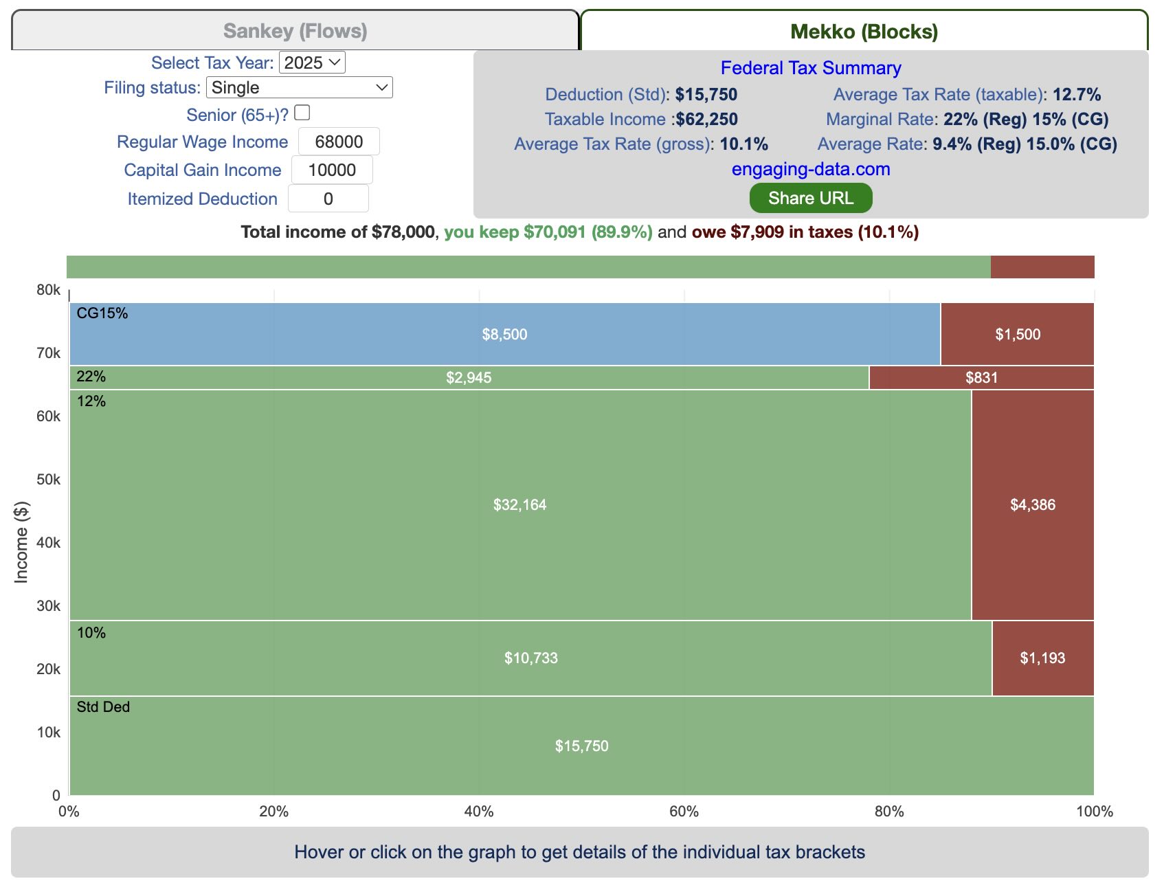
Understanding Tax Brackets: Interactive Income Tax Visualization and Calculator
Please check out the newer version of this visualization
How is your income distributed across tax brackets?
I previously made a graphical visualization of income and marginal tax rates to show how tax brackets work. That graph tried to show alot of info on the same graph, i.e. the breakdown of income tax brackets for incomes ranging from $10,000 to $3,000,000. It was nice looking, but I think several people were confused about how to read the graph. This Sankey graph is a more detailed look at the tax breakdown for one specific income. You can enter your (or any other) profile and see how taxes are distributed across the different brackets. It can help (as the other tried) to better understand marginal and average tax rates. This tool only looks at US Federal Income taxes and ignores state, local and Social Security/Medicare taxes.
– Use this button to generate a URL that you can share a specific set of inputs and graphs. Just copy the URL in the address bar at the top of your browser (after pressing the button).
- Select filing status: Single, Married Filing Jointly or Head of Household. For more info on these filing categories see the IRS website
- Enter your regular income and capital gains income. Regular income is wage or employment income and is taxed at a higher rate than capital gains income. Capital gains income is typically investment income from the sale of stocks or dividends and taxed at a lower rate than regular income.
- Move your cursor or click on the Sankey graph to select a specific link. This will give you more information about how income in a specific tax bracket is being taxed.
**Click Here to view other financial-related tools and data visualizations from engaging-data**
As seen with the marginal rates graph, there is a big difference in how regular income and capital gains are taxed. Capital gains are taxed at a lower rate and generally have larger bracket sizes. Generally, wealthier households earn a greater fraction of their income from capital gains and as a result of the lower tax rates on capital gains, these household pay a lower effective tax rate than those making an order of magnitude less in overall income.
Tax Brackets By Year
This table lets you choose to view the thresholds for each income and capital gains tax bracket for the last few years. You can see that tax rates are much lower for capital gains in the table below than for regular income.
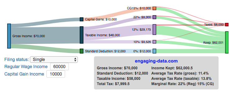
- If you are single, all of your regular taxable income between 0 and $9,525 is taxed at a 10% rate. This means that your all of your gross income below $12,000 is not taxed and your gross income between $12,000 and $21,525 is taxed at 10%.
- If you have more income, you move up a marginal tax bracket. Any taxable income in excess of $9,525 but below $38,700 will be taxed at the 12% rate. It is important to note that not all of your income is taxed at the marginal rate, just the income between these amounts.
- Income between $38,700 and $82,500 is taxed at 24% and so on until you have income over $500,000 and are in the 37% marginal tax rate . . .
- Thus, different parts of your income are taxed at different rates and you can calculate an average or effective rate (which is shown in the summary table).
- Capital gains income complicates things slightly as it is taxed after regular income. Thus any amount of capital gains taxes you make are taxed at a rate that corresponds to starting after you regular income. If you made $100,000 in regular income, and only $100 in capital gains income, that $100 dollars would be taxed at the 15% rate and not at the 0% rate, because the $100,000 in regular income pushes you into the 2nd marginal tax bracket for capital gains (between $38,700 and $426,700).
Data and Tools:
Tax brackets and rates were obtained from the IRS website and calculations were made using javascript and code modified from the Sankeymatic plotting website.
California is World’s 4th Largest Economy
This is one of an ongoing series of visualizations about the state of California. This one is about the state’s economy, which recently moved into 4th place (2024), if California were its own country. It is, however, still part of the United States.
The visualization shows the relative sizes of the top 10 world economies (including the US, with California removed for context). California has the smallest population of any of the top 10, with #9 Canada just barely larger than California in population, though with a significantly smaller sized economy (about 1/2 the size).
Hover over the countries to see their GDP and population. California is behind the United States, China and Germany in total economic output (in nominal terms), but ahead of much larger countries Japan and India and the United Kingdom.
The state’s economy produces $4.1 Trillion dollars of economic output, driven by a range of industries including technology, real estate, manufacturing, agriculture and health care. It is a hub for innovation and entrepreneurship. California is also the leading agricultural state in the United States. Immigration is a huge part of the state’s workforce.
Sources and Tools:
2024 economic data was downloaded from the International Monetary Fund (IMF). This visualization is made using d3.js, an open-source javascript visualization library.
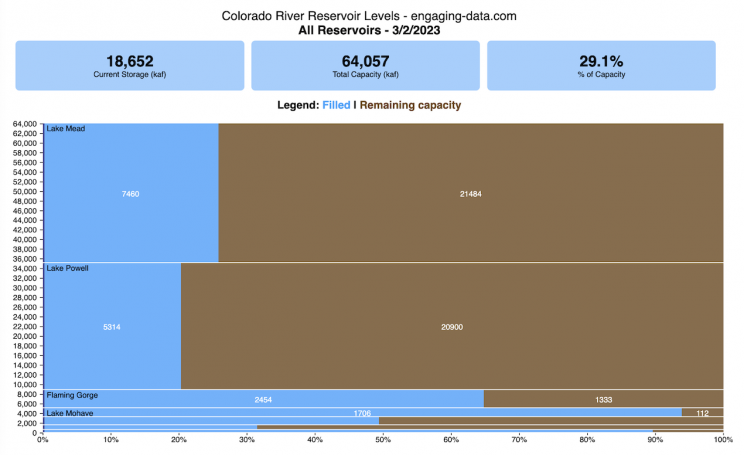
Colorado River Reservoir Levels
How much water is in the main Colorado River reservoirs?
Check out my California Reservoir Levels Dashboard
I based this graph off of my California Reservoir marimekko graph, because many folks were interested in seeing a similar figure for the Colorado river reservoirs.
This is a marimekko (or mekko) graph which may take some time to understand if you aren’t used to seeing them. Each “row” represents one reservoir, with bars showing how much of the reservoir is filled (blue) and unfilled (brown). The height of the “row” indicates how much water the reservoir could hold. Lake Mead is the reservoir with the largest capacity (at almost 29,000 kaf) and so it is the tallest row. The proportion of blue to brown will show how full it is. As with the California version of this graph, there are also lines that represent historical levels, including historical median level for the day of the year (in red) and the 1 year ago level, which is shown as a dark blue line. I also added the “Deadpool” level for the two largest reservoirs. This is the level at which water cannot flow past the dam and is stuck in the reservoir.
Lake Mead and Lake Powell are by far the largest of these reservoirs and also included are several smaller reservoirs (relative to these two) so the bars will be very thin to the point where they are barely a sliver or may not even show up.
Historical Data
Historical data comes from https://www.water-data.com/ and differs for each reservoir.
- Lake Mead – 1941 to 2015
- Lake Powell – 1964 to 2015
- Flaming Gorge – 1972 to 2015
- Lake Mohave – 1952 to 2015
- Lake Navajo – 1969 to 2015
- Blue Mesa – 1969 to 2015
- Lake Havasu – 1939 to 2015
The daily data for each reservoir was captured in this time period and median value for each day of the calendar year was calculated and this is shown as the red line on the graph.
Instructions:
If you are on a computer, you can hover your cursor over a reservoir and the dashboard at the top will provide information about that individual reservoir. If you are on a mobile device you can tap the reservoir to get that same info. It’s not possible to see or really interact with the tiniest slivers. The main goal of this visualization is to provide a quick overview of the status of the main reservoirs along the Colorado River (or that provide water to the Colorado).
Units are in kaf, thousands of acre feet. 1 kaf is the amount of water that would cover 1 acre in one thousand feet of water (or 1000 acres in water in 1 foot of water). It is also the amount of water in a cube that is 352 feet per side (about the length of a football field). Lake Mead is very large and could hold about 35 cubic kilometers of water at full (but not flood) capacity.
Data and Tools
The data on water storage comes from the US Bureau of Reclamation’s Lower Colorado River Water Operations website. Historical reservoir levels comes from the water-data.com website. Python is used to extract the data and wrangle the data in to a clean format, using the Pandas data analysis library. Visualization was done in javascript and specifically the D3.js visualization library.
Splitting the US by Population
This visualization lets you divide the US into 1,2,3,4,5,8 and 10 different segments with equal population and across different dimensions. The divisions are made using counties as the building blocks (of which there are 3143 in the US). There are numerous different ways to make the divisions. This lets you make the divisions by different types of geographic directions and divisions by population density.
Instructions
- Select a dimension on which to divide up the country – there are geographic dimensions, like north to south or east to west, or by population density
- For some geographic divisions (concentric rings or pie slices), you can choose the geographic center of the divisions
- You can also choose the number and color scheme of the divisions
- To show the divisions, either click the Animate Counties button or use the slider to add counties
If you can think of other interesting ways to divide up the US, please let me know and I can try to add them to this visualization.
Sources and Tools:
2018 county population data is from US Census Bureau. The map visualization is created using the Leaflet javascript mapping library and the data wrangling and user interface and interactivity are created using HTML, CSS and Javascript code.
US Baby Name Popularity Visualizer
I added a share button (arrow button) that lets you send a graph with specific name. It copies a custom URL to your clipboard which you can paste into a message/tweet/email.
How popular is your name in US history?
Use this visualization to explore statistics about names, specifically the popularity of different names throughout US history (1880 until 2020). This is a useful tool for seeing the rise (and fall) of popularity of names. Look at names that we think of as old-fashioned, and names that are more modern.
Instructions
- Start typing a name into the input box above and the visualization will show all the names that begin with those letters. The graph will show the historical popularity of all these names as an area graph.
- You can hover (or click on mobile) to bring up a tooltip (popup) that shows you the exact number of births with that name for different years (or decades) and the names rank in that time period.
- It’s best used on computer (rather than a mobile or tablet device) so you can see the graph more clearly and also, if you click on a name wedge, it will zoom into names that begin with those letters.
- You can select different views, Boy names, Girl names or both, as well as looking at the raw number of births or a normalized popularity that accounts for the differential number of births throughout the period between 1880 and 2020.
- If you click the share (arrow) button, it will copy the parameters of the current graph you are looking at and create a custom URL to share with others. It copes the link into your clipboard and your browser’s address (URL) bar.
Isn’t there something out there like this already? Baby Name Wizard and Baby Name Voyager
This visualization is not my original idea, but rather a re-creation of the Baby Name Voyager (from the Baby Name Wizard website) created by Laura Wattenberg. The original visualization disappeared (for some unknown reason) from the web, and I thought it was a shame that we should be deprived of such a fun resource.
It started about a week ago, when I saw on twitter that the Baby Name Wizard website was gone. Here’s the blog post from Laura. I hadn’t used it in probably a decade, but it flashed me back to many years ago well before I got into web programming and dataviz and I remember seeing the Baby Name Voyager and thinking how amazing it was that someone could even make such a thing. Everyone I knew played with it quite a bit when it first came out. It got me thinking that it should still be around and that I could probably make it now with my programming skills and how cool that would be.
So I downloaded the frequency data for Baby Names from the US Social Security Administration and set to work trying to create a stacked area graph of baby names vs time. I started with my go to library for fast dataviz (Plotly.js) but eventually ended up creating the visualization in d3.js which is harder for me, but made it very responsive. I’m not an expert in d3, but know enough that using some similar examples and with lots of googling and stack overflow, I could create what I wanted.
I emailed Laura after creating a sample version, just to make sure it was okay to re-create it as a tribute to the Baby Name Wizard / Voyager and got the okay from her.
Where does the data come from?
Some info about Data (from SSA Baby Names Website):
All names are from Social Security card applications for births that occurred in the United States after 1879. Note that many people born before 1937 never applied for a Social Security card, so their names are not included in our data.
Name data are tabulated from the “First Name” field of the Social Security Card Application. Hyphens and spaces are removed, thus Julie-Anne, Julie Anne, and Julieanne will be counted as a single entry.
Name data are not edited. For example, the sex associated with a name may be incorrect.Different spellings of similar names are not combined. For example, the names Caitlin, Caitlyn, Kaitlin, Kaitlyn, Kaitlynn, Katelyn, and Katelynn are considered separate names and each has its own rank.
All data are from a 100% sample of our records on Social Security card applications as of March 2021.
I did notice that there was a significant under-representation of male names in the early data (before 1910) relative to female names. In the normalized data, I set the data for each sex to 500,000 male and 500,000 female births per million total births, instead of the actual data which shows approximately double the number of female names than male names. Not sure why females would have higher rates of social security applications in the early 20th century. Update: A helpful Redditor pointed me to this blog post which explains some of the wonkiness of the early data. The gist of it is that Social Security cards and numbers weren’t really a thing until 1935. Thus the names of births in 1880 are actually 55 year olds who applied for Social Security numbers and since they weren’t mandatory, they don’t include everyone. My correction basically makes the assumption that this data is actually a survey and we got uneven samples from males and female respondents. It’s not perfect (like the later data) but it’s a decent representation of name distribution.
Sources and Tools:
The biggest source of inspiration was of course, Laura Wattenberg’s original Baby Name Explorer.
I downloaded the baby names from the Social Security website. Thanks to Michael W. Shackleford at the SSA for starting their name data reporting. I used a python script to parse and organize the historical data into the proper format my javascript. The visualization is created using HTML, CSS and Javascript code (and the d3.js visualization library) to create interactivity and UI. Curran Kelleher’s area label d3 javascript library was a huge help for adding the names to the graph.
National Park 3D Elevation Models
Play with an interactive 3D model of some popular National Parks in the US
I wanted to try my hand at creating 3D elevation models and thought trying to model some of the popular (and some of my favorite) national parks would be a good starting point.
Instructions
Once a 3D elevation model is selected and shown you can manipulated it in multiple ways:
- Zoom – You can zoom in and out, though the method depends on the device you are using. Try scrolling or pinch to zoom. You can also select the magnifying glass in the toolbar and drag to zoom.
- Rotate – You can rotate and change the angle of the model using by clicking and dragging on the model. This is the default selection in the toolbar (circular arrow around z axis)
- Pan – You can move the model around with if you select the panning tool from the toolbar (arrows going in all directions)
- Show contours – if you hover or click on part of the map, it can show all the areas of the model with the same elevation and the tooltip will show the geographic coordinates and elevation (you can toggle showing the tool tip if you select the tooltip bar)
- Save image – click on the camera icon in the toolbar to save as png
- Colors – you can change the color scale used to show elevation. You can also reverse the color scale.
- Change vertical exaggeration – you can select whether the vertical height is exaggerated using the ‘Height Scale’ slider. You can change between 1 (no exaggeration) to 11 (vertical scale is exaggerated by factor of 11).
- Change min elevation – you can select whether the minimum elevation is sea level or the lowest elevation in the park.
You can select a number of different parks from the drop down menu. If you have suggestions for additional parks, I may be able to add them to the list.
Note: the elevation files are data intensive since the visualization is downloading the elevation across in some cases, many hundreds or thousands of square miles. To keep the data needs down, I’ve reduced the resolution of the elevation data. Though the original data is 90 meter resolution (elevation is specified across every 90 x 90 m square in each park, I’ve averaged these squares together so that each park model only has about tens of thousands of these squares, regardless of the actual area of the park. This improves data loading and rendering times and makes the improves the responsiveness of the model.
Sources and Tools:
This visualization is written in HTML/CSS/Javascript. Digital elevation data is obtained from Open Topography and uses Shuttle Radar Topography Mission GL3 (90 meter resolution). The elevation data is downloaded using the opentopography API and parsed in a python script which downsamples the data to limit the number of elevation cells. The script also determines if a point is inside or outside of the park boundaries in order to create the elevation model. The 3D model is rendered using the Plotly open-source javascript graphing library.
Recent Comments