Update: June 2025 – bug fix in how tax rate on additional income is applied. If you have a lot of additional income, your success rate will likely go down.
Updated Shiller returns and inflation dataset through beginning of 2024
Rich, Broke or Dead?
One of the key issues with retiring is ensuring that the money you have saved will not be exhausted during your retirement. This is also known as Longevity Risk and is especially important if you want to retire early, since your retirement could be 50 years long (or more). This interactive post-retirement fire calculator and visualization looks at the question of whether your retirement savings can last long enough to support your retirement spending and combines it with average US life expectancy values to get a fuller picture of the likelihood of running out of money before you die.
It helps to answer the question: If I start out with $X dollars at the beginning of my retirement, will I run out of money before I die?
– Use this button to generate a URL that you can share a specific set of inputs and graphs. Just copy the URL in the address bar at the top of your browser (after pressing the button).
– Use this button to download the data from the simulation. It will show the yearly data from all the historical cycle (i.e. it will be a fair amount of data).
Probabilities based on historical cycles
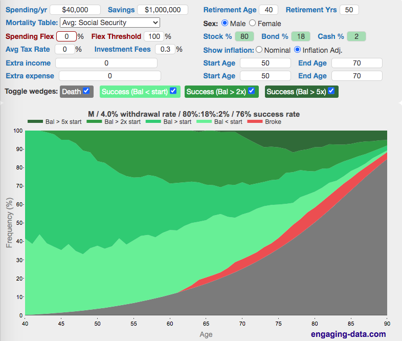
The graph shows the likelihood of your balance being at different levels during each year of your retirement (and compares it to the probability of dying during this time). Red indicates failure (i.e. you’ve run out of money) and green indicates success (i.e. you haven’t run out of money). The probabilities are calculated based upon looking at stock, bond and cash returns from historical cycles between 1871 and 2023. If you expect to retire for 50 years, one historical cycle would be from 1871 to 1922, another one from 1872 to 1923, and so on until 1972 to 2023. Thus 101 different historical cycles are considered (in this case). It is important to note that these frequencies in the past are not the same as actual probabilities. Just because an outcome happened once in history doesn’t mean that there is a one in 101 chance (0.99%) of this same thing happening in the future. However, if your retirement portfolio survives most historical cycles, there is a good chance that it’ll survive in the future without any major black swan events. If something crazy occurs (e.g. a major nuclear war), your retirement balance may be the least of your worries, so we can safely ignore this, since there’s very little way to prepare for it financially. If you look over all these historical cycles, we find that a 4% withdrawal rate will generally last through a long retirement, though there are occasional cycles that are “failures”, i.e. you run out of money. See here for more info on the 4% rule and how historical simulations of withdrawal rate are performed.
Instructions (updated)
The fields are all pre-filled but you should modify the numbers to suit your situation or to explore other options. Press ‘Enter’ or ‘tab’ after you enter the value into the input box in order to update the calculation.
- Hover over the input labels for more info.
- Enter your expected spending per year in retirement and the savings amount you expect to have at retirement.
- Enter your age at retirement and how long you expect to live (you can estimate on the longer side since the calculator will include life expectancy).
- You can now choose between three different mortality tables (an average American lifespan based on the Social Security Administration mortality table, or a low and high life expectancy table from the Society of Actuaries)
- Enter your target asset allocation for retirement.
- Enter your sex.
- If you think you’ll have some flexibility in your spending post-retirement, you can enter the percentage reduction in spending that will happen if your portfolio is below a certain threshold, as a percentage of your inflation-adjusted starting balance (see next point).
- You should enter the percentage of your initial balance at which the spending flexibility will kick in. If you set it to 90% you will reduce spending when your portfolio balance is below 90% of your inflation adjusted starting balance.
- Enter your average expected tax rate (not your marginal rate) – this will be applied to your annual spending and any additional income.
- Enter your average investment fees (e.g. expense ratios).
- Enter any additional income sources or expenses that aren’t applicable for the entire model period, and indicate both the starting and ending ages. If you have multiple income or expense streams, you can enter them all separated by a semi-colon (;). If you want some of these income or expense streams to remain constant in nominal dollars, i.e. a mortgage payment, then type an asterisk (*) after the number. Otherwise these streams will be adjusted for inflation annually.
You can also modify a few graph elements (to help you focus on different parts of the graph):
- Show or hide the death probability wedge. Hiding it helps you investigate the portfolio balances with greater resolution for later years.
- Show or hide different categories of success (green wedges). Success is defined as any outcome where you are not broke (i.e. balance <0). Additional categories of success include balances that are below your initial retirement balance (but still above zero) and balances that are more than double and five times your initial retirement balance.
- You can download an PNG image of your graph (click on the camera icon in the lower right).
How Taxes Are Accounted For
Your average tax rate specified is applied to your required spending to determine how much money needs to be withdrawn from your investments. For example, if you have a 20% tax rate, and need to spend $100,000. Then the following equations are used:
Taxes = Withdrawal Amount x 0.20

Spending amount = Withdrawal Amount x (1-0.2) = Withdrawal Amount x 0.8
Solving for withdrawal amount:
Withdrawal Amount = Spending amount / 0.8 = $100,000 / 0.8 = $125,000

Taxes = Withdrawal Amount x 0.20 = $125,000 x 0.2 = $25,000

Spending amount = Withdrawal Amount x 0.8 = $125,000 x 0.8 = $100,000
Huge tip of the hat to maizeman who first developed this type of graph and was helpful in putting these graphs together. Thanks! Here is maizeman’s github repo. It is also inspired by many hours of playing with cFIREsim and FIRECalc.
Visualizing Longevity Risk
One of the most valuable things about these sorts of interactive graphs is that it allows you to understand how the results vary as you modify the inputs (asset allocation and length of retirement). So I encourage you to play with the inputs to calculator and the ways to visualize and see how the results and hopefully your understanding of the processes change.
One of the key takeaways from this is how large the ‘Wedge of Death’ gets as you get older and how the likelihood of dying is much higher than running out of money.
Another important takeaway is that if your retirement has a large likelihood of success (e.g. 4% or lower withdrawal rate), your retirement balance is most likely to be large (more than 2x your initial balance).
As mentioned earlier, it is important to remember that past performance does not predict future performance.
Data source and Tools Historical Stock/Bond and Inflation data comes from Prof. Robert Shiller. Average life expectancy data is from the Social Security Administration. High and low life expectancy mortality tables are from the Society of Actuaries Standard Ordinary Tables. Javascript is used to process and aggregate the retirement balance results over all historical cycles and graphed using Plot.ly javascript graphing library.
Update: – I’ve gotten alot of really good feedback on this tool. I’m really happy that people find it useful and informative. I’ve also gotten a long list of suggested additions to the calculator, so come back and check to see if I’ve implemented any.
First update: I added the ability to toggle between looking at nominal and inflation-adjusted success values. i.e. if we are looking at 2x the original starting balance, 2x can be in nominal dollars (i.e. $2 million on a $1M starting balance) or 2x in inflation adjusted dollars (i.e. more than $2M, whose exact value depends on the historical inflation for a particular cycle). You’ll notice that the success bands look worse when comparing to the inflation-adjusted (real) starting balance rather than the nominal starting balance.
2nd update: I added a few requested features. The first two are the ability to specify you annual tax rate on income and also fees (like expense ratios) on your investments. The main addition is the ability to add multiple income and expense streams with specified starting and end dates to the calculation. This is useful for adding income streams like social security or pensions and temporary expenses like a mortgage or childrens’ college expenses.
3rd update: I added a 5x category just because in many cases (especially less than 4% withdrawal rate), you see huge growth in your portfolio in many/most cases. I also added a button to generate a URL that you can share specific parameters and scenarios with other folks.
4th update: I added a simple spending flexibility parameter that allows you to specify how much you could reduce spending when your portfolio is below a certain threshold (in this case, your original retirement amount (inflation adjusted)).
5th update: I’ve updated the market data to include annual data up to and including 2023 (annual data through the beginning of 2024).
I also fixed a small bug which affected real stock market returns so you may see a very slight reduction in real average returns and success rates.
6th update: I added two new features:
(1) is the ability to include income and expense streams that are not adjusted for inflation. To make an income or expense stream constant in nominal dollars, you will need to add an asterisk ‘*’ after the number.
(2) You can download all the yearly data on income, spending and portfolio balance for all historical cycles by pressing the download CSV button.
192 Comments »
192 Responses to Rich, Broke or Dead? Post-Retirement FIRE Calculator: Visualizing Early Retirement Success and Longevity Risk
Wow, I’m blown away by the visualizations in this post! As someone considering early retirement, it’s really helpful to see the data represented in such a clear and concise way. I’m bookmarking this page for future reference and will be sharing it with my friends who are also thinking about retiring early.
This is such a fantastic calculator!! Thank you so much for putting the time and effort into this. It’s a great resource.
Question: for future inflation adjusted income, does the calculator assume the first payment will be the number I put into the calculator or does it add in XX years of inflation automatically. Like, let’s say I estimate I’ll bring in $30,000/year in social security in 20 years, does the calculator factor my income in 2043 as $30k or $30k+20 years of inflation?
There’s a bug in the calculator if you put in multiple income streams in the “Extra Income” field (separated by a “;”, as documented). This bug becomes pretty obvious if I set the start age to 100. When I set the start age to 100, it barely makes a difference in the results shown, when instead, the results should be identical to if I put in $0 extra income. (At least up to the age of 100.)
What’s going wrong seems to be that the Start Age is only being applied to the first income stream and any additional income streams are starting immediately. E.g., if I put “$0; $100,000” into the Extra Income box, then the value in the Start Age box has absolutely no effect on the results shown.
P.S. As a workaround, it seems that I can enter two different input streams by putting a negative value into the “Extra Expense” box.
If you have multiple income streams then you should also include multiple start dates (also separated by a “;”). Then it should behave as you expect.
Ah yes, that works. Thanks!
I’m confused as to why mortality estimate is not charted as a separate line because it seems orthogonal to one’s finances.
e.g., I could die with a lot of money, some money, or no money (which’d make a difference for my heirs!).
So having this as part of the set that adds up to 100% just doesn’t compute for me.
What am I missing here?
this is about your likelihood of running out of money. If you simply click off the “death” button, it will show you your percentages conditional on living all the way to the end or whatever year you are looking at. This may be more valuable if you care a lot about your legacy.
For most people, it’s probably worthwhile to consider both possibilities. A small chance of running out of money very near the end of a long retirement may really be a very tiny chance since it’s conditional on being alive, which may only be a 10-20% chance at 90-95 for most people.
It would be good to add a “current age” field, since the (remaining) life expectancy is highly dependent on one’s current age.
For instance, once you have made it to 60, your chances of reaching 70 are much higher than if you are an average 20-year old.
I suspect that for us older folks, this would greatly affect the “dead” wedge…
Excellent tool overall!
I would love to have a few extra income / expense rows for when there are multiple expected events, e.g. paying off a mortgage, inheritance, kids college expenses, etc.
If you have multiple income or expense streams, you can enter them all separated by a semi-colon (;). If you want some of these income or expense streams to remain constant in nominal dollars, i.e. a mortgage payment, then type an asterisk (*) after the number.
Just make sure you also add additional start and end ages (also separated by “;”) so it works properly
Cool, thanks! For clarity, it would be helpful if we could do one row per income / expense and have an text label on the row to remind us of what the row does, but the semicolon thing will work for now. Thanks for working on this!
I am not sure if this is a bug or I have misunderstood….
Leaving everything as default i.e. as the page loads when first visited we have “spending per year” at $40K (4%).
If I then download the csv I see the “annual spending” column do this (for 1871, first few years shown)
40000
40917
39115
36395
34308
If this is the income per year then these figures are neither $40K per year or even 4% of the current valuation.
Have I misunderstood something?
The list of numbers you are seeing are the inflation numbers applied to the $40,000 annually to get the same purchasing power as $40,000. Each historical cycle has a different set of inflation numbers.
I was confused by this as well. After some digging this appears to be due to negative inflation in the late 1800s (only 2 positive years of inflation from 1871 – 1892). It might be a nice modification if the author allowed the user to pick the starting model year. This would mean if the user picked 1900 (for example) all the negative years of inflation before 1900 would be excluded from the model. I’m more certain that the earth is flat than I am that we will ever see negative inflation again.
I am not good with probability. Would it be correct to think of the percentages as a special die that when thrown with the different %’s as the odds of it happening. For example if at 80 years old death was calculated to be 20% then the die would land on that side 1/5 of the time?
Great calculator. I really love the “Or Dead” part of the calculator. Its easy to get caught up assuming that living till retirement is a sure thing. Its a good reminder that there is a 25% chance I don’t even make it to the traditional retirement age. Life is precious.
if you want to save the url as male just type:
sex=
(with no argument, leave it blank)
One of the best, if not the best, such calculator. Kudos for this gift to all.
One element that may be too hard to add, but would be helpful if possible, is to account for couples. The best way I can describe the issue is the probability of at least one spouse living to 95 is ~25% (same age, right at retirement, age 66). Expenses change little, effective tax rate generally goes up, income goes down (loss of one social security check, possibly pension). Dissimilar aged couples face a high change of one spouse greatly outliving the other, especially if the woman is younger.
The actuarial data is available, but the complexity it imposes on the calculations might be intense.
This calculator is absolutely brilliant. I’ve been using it for around 2 years now. Regarding Nic’s comment in Oct 2021, I have a similar question. Is it possible to add on the y-axis (or be able to change the y-axis to) instead of a probability, a percentage of returns from investments. As far as I understand, where the frequency is 50% this would approximately correlate with a 7.2% investment return. Of course I think each cycle would be likely to give a different probability, perhaps it might be possible to add a percentage return axis as a rough guide?
Thanks
Great tool, thanks for this. What if I don’t believe that the average real stock (or bond) returns of the past will repeat going forward? What if I want to use an expected annual real stock return of say 3.5% and an exp. ann. real bond return of -1% (using Monte Carlo), instead of historical cycles with real returns of 8.1% and 2.4% respectively? I notice that you already allow this in your pre-retirement calculator (under “Monte Carlo simulation”), which I appreciate.
The saved URL still does not present “male” when you reload the page. No matter if sex is set to 0 or 1 in the URL, it always default back to female on page load. Not a big deal but others have mentioned it months ago and it’s still a problem.
Love the tool! Its really useful & helpful. Thanks for creating this! Shared this in the family and this showed some great options for us.
I saved “my data” with the “generate url” link. Whenever I click on the link and come back to the data, it it messes it up as in the “bond %” the value is changed. I need to correct the value to my initial input and back we are on track. No idea why this happens but might be a small bug.
What does the line of info above the chart legend represent? Mine starts with M / 16% ………..
Fantastic tool. Thanks for building. One suggestion regarding spending/yr. This field should represent the $/yr in expenses you project in the year you plan to retire (inflation adjusted). It would be great if we could enter our current age or the year in which we plan to retire so that we can enter projected expense in today’s dollars and then have the tool adjust to future dollars. I think this would make the tool more intuitive.
The way I handle this now is to use today as my retirement date, and add in my expected income until retirement as one of the “Extra Income” flows.
What is the “sex=” setting in the URL for Male? Saving a report and then reloading it always sets the report to Female. Not a big deal, but followed the “Generate URL” steps and everything else works but that.
Great tool. Thanks for it.
Is the “Spending/yr” the amount that is withdrawn from “Savings” every year (adjusted for inflation), or is that the amount that you wind up with after the savings is withdrawn and then taxed? For example, if Savings is 1,000,000, Spending/yr is 50,000, and the Tax Rate is 20%, is 50,000 withdrawn and 10,000 applied to taxes, leaving you with 40,000 that can be spent? Or is 62,500 withdrawn, so that 12,500 goes to taxes and you’re left with \$50,000 to spend?
Quick question. Is “spending” my actual TOTAL spending? Or is it the amount spent from the portfolio? That is …does this calculator somehow take into account Social Security, and other sources of income? I think not. My guess is that the “spending” entry is in reality the “withdrawal from savings” amount. Can you verify that please? Thanks!
spending normally represents total spending (except if you include “other expenses”). It is the amount of money spent on goods and services that needs to come from one source or another. If you have a non-zero tax rate, then the amount of money withdrawn from your portfolio will be higher than this spending amount. This calculator only includes things like social security or other sources of income if you include it in the “Other Income” text input box.
Why does the download CSV button not work?
This is a fine tool to help with one’s retirement planning. I’d like to be able to map out another couple of “one time” cash gains. I’m 66 and in ten years, then twelve years, I or my heirs will have a large amount due. I’d like to be able to show the receipt of $116,000+ then $69,000+ two years later. How could I show this?
I kept playing with the tool nd finally saw the answer to my question.. DUH!
Hi, the download feature is incredible and really shows you the scenarios where your plan could fail. Just one suggestion, on my CSV file it cuts off at 1962 presumably due to column / data width limitations. Is it possible to do a vertical table with the years running down as rows instead? I think for all datasets under 200 years that would work.
Maybe it’s because you are modeling a 57 year retirement? 1962 + 57 is 2019. The year shown across the column headings is the cycle start year.
When I model a 50 year cycle, the columns go up to cycle start year 1969 and you can’t have a 50+ year cycle that starts in 1990 since we don’t have market data for 50 years after 1990.
I don’t think it’s a CSV file issue, but if it was it could be due to the software you are using to view the CSV. Some older versions of Excel only allow 256 columns, but recent ones and google spreadsheets allow over 65000 columns.
However
There is a bug with these settings: https://engaging-data.com/will-money-last-retire-early/?spend=40000&initsav=80000&age=40&yrs=50&stockpct=0&bondpct=0&cashpct=100&sex=0&infl=1&taxrate=0&fees=0&income=100000&incstart=50&incend=70&expense=0&expstart=50&expend=70&showdeath=1&showlow=1&show2x=1&show5x=1&flexpct=10&spendthreshold=100&mort=ss
If extra income is greater than spending, it should be impossible to go broke.
Looks like the input says retiring at 40 with 80K in the bank and no income until 50.
Your extra income doesn’t kick in until you are 50. Your expenses outstrip your savings between 40 and 50. After 50, you’re fine, and the probability of going broke declines to zero.
You can go broke if your extra income doesn’t start until 10 years into retirement.
Shouldn’t this calculator have three separate entry fields for 1. pre-tax (IRA/401k), 2. ordinary investments (subject to capital gains), and 3. tax-free (Roth) savings?
Why do the annual spending values vary in the downloaded csv file? Seems random but it grows in columns based on later years. It changes weather or not nominal or inflation adjusted is selected?
Annual spending varies because of inflation. The idea is that your spending will stay constant on a real dollar basis, but on a nominal basis it needs to increase to maintain your purchasing power (since prices of everything is increasing due to inflation).
Spending will vary between cycle runs because inflation varies in each year. In all cases, the first cycle is 1871, and if year 0 spending is 40000, year 1 spending will be 40000 * (1+ inflation rate in 1872) and year 2 spending will be year 1 spending * (1 + inflation rate in 1873), year n spending will be year n-1 spending * (1 + inflation rate in year 1871+n).
The next cycle starting in 1872 will have different spending amounts because you are starting with a different year.
This is an excellent calculator, and your other visualizations are cool, too.
I have one question / feature request: does the calculator assume periodic asset reallocation? If so, how often? If not, I think it would be a great feature to add.
Thanks!
The calculator keeps the asset allocation the same each year so that would amount to reallocation every year.
Chris, Fantastic tool. Your work definitely accelerate my early retirement goals and provide guidance on maximize spend vs minimize risks. Great job!
I have couple of questions.
1. Spending Flex and Flex Threshold variables – Does the Withdrawal amount go back to inflation adjusted original value ( value prior to applying flex spend reduction) or continue inflation adjusted reduced value once the portfolio value rise above inflation adjusted starting value. I am trying to understand whether my spend amount permanently impacted or it is just temporary and I can resume planned higher spend after portfolio reach certain level.
2. It would be great if you can provide a feature to display spend table in tabular format. It will help us to see the actual spend and portfolio values year 1 through retirement end year .
Again great work! You are making huge difference in the personal finance world.
Thanks for your kind words. Glad that I can be of help.
1. Spending goes back to the normal level (inflation-adjusted) when portfolio balance goes above the threshold.
2. I will look into how to add the option of downloading output tables
Great tool! Thanks for all of your hard work. Can you consider adding a non-inflation adjusted income box? Most private pensions are fixed and that would allow them to “shrink” over time as opposed with keeping up with inflation (like SS does).
Thanks. Sure, that suggestion has been made before. I will try to get to it soon.
Good tool, but i am not sure i am using it correctly. The model seems to assume your spending per year is your withdrawal rate. But if your investments generate dividends, you don’t need to withdrawal as much. Example: $1 million in savings generates $30,000 in dividends (3% return). If my spending is $50,000 per year, then i only need to need to withdrawal $20,000 because the dividends cover the rest. How do i account for this in the tool?
The stock returns include dividends and so dividends would need to be withdrawn from your portfolio each year.
Thus you can’t explicitly model a dividend portfolio that returns a certain dividend percentage per year.
Does this model account for dividends?
Yes, the stock returns are adjusted to include dividends.
This is awesome!!!! I wish it had 2 additional lines for additional income. Wife pulls a pension at 56, but soc sec could kick in at different ages. Well done overall.
Thanks. You can add additional income streams separated by a ‘;’ i.e. a semicolon. See the instructions below for more info.
I’ve added up to 7 or 8 additional income streams in some of my models using the semi-colons. I don’t know how much you can get in there before it breaks, but it’s clearly more than almost anybody needs.
Its quite possible that I may be missing something, but I see something strange.
If I put Savings = 1 and Spending/yr = 60,000, I still get a 100% success rate, without any additional income.
Only if I change Savings = 0, then it shows me as broke.
That sounds very odd. Can you copy the URL and paste it in the comments so I can see the exact issue?
The percentages for being broke and the different balances (but not chance of being dead) changes for a fixed age when just the Retirement Yrs parameter is changed. I wouldn’t think that the Retirement Yrs input should change anything other than how far out the chart extends.
The percentages could change a little because the number of cycles changes. There are 150 years between 1871 and 2020. If you want a 40 year retirement, there will be 110 different cycles (1871-1910 . . . to 1981-2020). If you want a 50 year year retirement, there are 10 less cycles (1871-1920 . . . to 1971-2020). With fewer cycles the percentages can change.
This tool is simply amazing. Please never take it down!
Great tool! Very informative.
One suggestion is to put more nuance on “fail” to be not just “broke” but also “close to broke”.
Maybe easiest is a fraction of starting savings, since you already have wedges for Balstart, Bal>2xstart, Bal>5xstart, can you add another for 0<Bal<[p%]xstart where p% is a user-input field.
I’m a bit confused by the tax rate with regards to my real spending power. If I put my spending in as $40k with a tax rate of 10% then I have success, but does that actually mean I only have $36k (40 – (40*.1) = 36) in spending after tax? Or will I need to adjust my withdraw up?
It seems like there needs to be a separate box for spending and withdraws. I feel like spending is the amount I have after-tax and withdraw is the amount I actually need to pull out of my accounts each year pre-tax.
Looks like it auto formatted with the dollar sign. I mean “40k with a tax rate of 10 percent do I actually have 36K in spending after tax?”
I have the same question. Playing around with the numbers it looks like the “Spending/yr” needs to include your living expenses + what you expect to “spend” on the IRS since the tax percentage entered doesn’t seem to have any effect on the Withdrawal Rate calculation below.
Thank you so much for the website! Hate to ask for additional clarification on this but to follow up on your June 8, 2019, clarification to an earlier question. If the “spending/yr” figure is meant to be an after-tax figure, and I have a 20% tax rate, that means behind the curtain somewhere the calculator is adding 20% to whatever my “spending/yr” figure is as the withdrawn amount from my savings?
Can my annual budget equal my “spending/year” plus “extra income”?
What is a good number for “Avg tax rate” ? I live in a no state income tax state.
Hello. Great Retirement calculator! I love it. Just one question though. Where would one put acquired real estate assets, eg rental properties? If you have say $1.5 million in investments one year, then spend say 400K on rental properties for thee cash flow, does that 400K stay in savings, or not? They can still be sold relatively easily worst comes to worst to realize their inherent value.
agreed, this needs a bit more.
I would not include the value of real estate assets. I would include their expected net cash flow in the income.
There really isn’t the ability to switch back between lump sum assets and cash flow assets so you need to pick one and go with it.
THIS IS AWESOME! Great tool to use throughout retirement as well to make sure you are still on track! I am modeling a bunch of special circumstances with multiple income/expense streams at varying timeframes. It would be great to have a description box for each of these two fields where I can document to keep track of multiple onetime income events and recurring events with different timelines
ie for income: rental income; pension; ss me; ss hubby; sale of rental 1; sale of rental 2…etc
ie for expense: lumpsum at 60; lumpsum at 65 (to simulate cashing out an amount to buy a car or another big expense)
First, this is a great tool. I have spent hours playing with the numbers.
I have one question: Does your tool include Social Security payments (for those of us in the US)?
I assume not and I can add that in the “extra income” section.
Thank you
Chris, thank you very much for making this calculator available. It’s super useful for doing comparisons of different financial scenarios.
One thing I’d like to be able to visualize better is in the “Bal < start" wedge when no "Broke" wedge exists; what's the worst-case percentage that remains? It would be a very different thing to see that my balance is at 50% of what I started with (I'm more than fine with that) vs. 1% (oops) at my target end of life.
For now I have been either iteratively increasing my annual spending or adding in more extra expense until I see a tiny "Broke" wedge at the end. Then I know the worst-case remaining is around 0%. But it doesn't answer what the min percentage is in non-Broke scenarios.
Cheers!
I’d love to be able to define ‘success’ a little more conservatively. While completely running out of money is certainly failure, I’d like to be able to define failure along the lines of ‘savings are less than N years of expenses’. I would find living the last few years of my retirement with just a 1-2 years of expenses in savings quite troubling, and I’d love a way to see these cases in this visualization.
I’ll agree, it would be great if we could set a percentage of initial portfolio to see another shading line, similar to the ones for 2x and 5x, Either at something like 50%, or even better, user defined. I’m actually much more intersted in striations below 100% than multiples above. For instance, how often do I get scared early on (maybe 60-70%), or how often do I cut it close or leave almost no legacy at the end (20-30%). It looks like the download feature allows you to look at this in the data, but the advantage of the visual graph is big for something like that.
I love that you’ve implemented 2 features that I asked for a couple years ago, and some others I didn’t even think of that are very helpful. So maybe if you ever go at it again, you’ll put this one in too!
Thank you!
My apologies but I am having great difficulty understanding the tool. I expect a pre tax need of $75k/yr with lumpy expenses avg of $6k/yr. Tax rate expected is 10%. Social Security and pension expected at $60k annually. So this gives a A withdrawal rate of close to 1.7%. The. App reflects a 4.7% withdrawal rate. So it appears the app is not accounting for pension and SS income and pulling all spend from assets. Am I missing something or not using inputs correctly?
The withdrawal rate is calculated from the initial spending and portfolio amounts. Adding income or expenses do not change the reported withdrawal rate because it may not be consistent over all years. For example, if you have kids college expenses 5-9 years into retirement, should that be included in the WR calculation or not. I left all “extra expenses” out of the calculation and it may be best just to remove the reported withdrawal rate. However, that doesn’t matter for the simulation which tracks your spending for each year across each historical cycle and just counts up the various outcomes.
Awesome website and tool! Thank you so much for making it available to everyone.
Quick observation/question:
I noticed that using the same inputs for the 4% and Post-retirement calculators yield slightly different success probabilities. For example, using a 2.8% WR with 45-years retirement duration and 35% stocks / 0% bonds / 65% cash shows 100% success on the 4% calculator but only 96% success for this one (and with same defaults for both calculators, e.g., 0% tax rate, 0.3% expense ratio, etc). Perhaps I did something wrong but double-checked it. Any idea why the success results would differ?
Hmm, that’s a good question. I’ll look into it.
Fantastic planning aid. Many thanks.
How do I get to “Ave Tax Rate” ? Should I use sales tax rate?
It is what you expect to pay in taxes on the money used to fund your spending. If all your retirement is in a Roth IRA, you can expect to pay zero taxes. If it is in a 401k it’ll be taxed as ordinary income but the average tax rate will depend on the amount you spend. Since it’s complicated, you can use the tax bracket calculator (https://engaging-data.com/tax-brackets/) as a way to figure out your average tax rate.
Great app. Best in class. I plan to introduce it to my children.
I have a suggestion to consider, but I realize it would be a lot of work, and is difficult to ask of somebody who has done all of this for free.
How about a secondary y-axis on the right edge that indicated the imputed withdrawal rate as a percentage for each year, and have that withdrawal trend signified each year by a solid line?
Something to consider.
Thanks again for the great tool.
Very nice tool. It would be good if there were multiple extra income lines. For example I have a fixed benefit pension , social security, my wife’s pension and her social security. All of which can start at different ages, where the amount depends on age started at. I imagine there could also be case for extra expenses like nursing care starting at different ages for spouses etc.
you can add multiple income streams. just separate the amounts (and ages) by a semicolon (;).
Can someone please answer this question. This is the only thing I do not understand about this calculator.
Can someone please answer this question below that was posted? This is the only thing I do not understand about this calculator.
Hi,
How does this calculation handle the “Extra Income”?
Example- 100K spending/2M in savings yield 5% WR. If I add $50k in extra yearly income (SS, pension), this still shows 5% WR. I would think in this case the WR would have reduced to 2.5%?
The graphs however do show the effect of the extra income as if the WR is reduced.
Can I visualise the actual spending per year if I am using the Flex? For example if I start at $50k and set a 10% flex I really have no idea if that means I am successful because I have dropped the spend by 10% Per year every year (I assume that its cumulative for each year that the balance is below the flex threshold?).
Just to be clear… is the amount you enter in the Savings field equal to your current total portfolio of stocks, 401k, bonds and cash savings? For example 100K in individual stocks that I manage, 150k in my current 401k, 0 bonds, and 50k cash savings… I would enter 300k in the savings box?
Thanks for sharing this calculator – really cool.
yes savings is the total of those items and the percentages will split that amount into the different categories.
Thanks very much… really an awesome tool.
Formatting issue: The “Start Age/End Age” rows are not properly aligned with the “Extra Income” and “Extra Expense” rows. The “Show inflation” row needs an empty row beside it to push the “Extra Income/Expense” rows down one so that they’re in line with the “Start/End” rows. I’m in Waterfox.
Thanks for this calculator and the others you’ve posted.
Hi,
How does this calculation handle the “Extra Income”?
Example- $100K spending/yr, $2M in savings yield 5% WR. If I add $50k in extra yearly income (SS, pension), this still shows 5% WR. I would think in this case the WR would have reduced to 2.5%?
The graphs however do show the effect of the extra income as if the WR is reduced.
Hi,
This is very useful, thanks so much for making this available! Could you add an output statistic showing how often the spending flexibility would need to be invoked in order to hit the calculated success probability? For example, if I set my Spending Flex to 25% that means in rough years I’d need to cut my spending by up to 25%, but how often would I need to do that for a given simulation? Would that need to happen once every 4 years, once every 10 years etc? Could keep track as you run simulations of how often the spending flex is used and how much of it is used?
The reason I ask is that I expect spending patterns will develop a habit, travel etc. So if I have to invoke spending flex fairly often and much of my spending is on travel, this could become kind of a pain to cancel trips etc. So I’d rather just spend less for less hassle in budgeting when retired.
Would it be possible to add that? 🙂
Thanks!
You can add Social security by just adding it to the extra income portion.
Is it possible to add a custom value for the average annual return of investment for stocks while keeping the cycles of the market? I believe that I will be able to maintain an average of 15-20% per year. It would be really helpful being able to calculate this with the cycles included!
Thanks!
Hey Gary,
I don’t think that this would be possible as when you pick your stocks the volatility of your portfolio is much different than that of the broader stock market. Especially if you’d like to calculate with a return of above 15% you’ll need a portfolio that is concentrated on fewer stocks, which under typical circumstances increases the volatility of your portfolio and the possibility that you’ll run out of money during a market crash.
So use your return numbers to calculate your total savings until retirement, but once you quit your job stick to the data embedded in the calculator.
All the best
This calculator is absolutely brilliant! Captures your probabilities of financial outcomes in retirement in one graphic based on hard data, including your chance of dying at any point in time, which you don’t see elsewhere. You can results immediately based on changing inputs.
chris, huge thanks for your attention to detail, many many hours spent and deep skills!
Not nearly so helpful to the ~10% of the population with red/green color blindness.
[…] respond, “Sort of.” This calculator from Engaging Data is pretty […]
On a separate graph, it would be nice to have only the outcomes if you are alive. As you get older, the chances of becoming broke increase for many people and it would be nice to be able to compare that to having less than starting balance, 1x starting balance, 2x starting balance, etc. I know you can scroll the cursor horizontally and see those for different ages, but having it represented visually, without ‘death’ being factored in, would be helpful. It’s nice to see ‘death’ factored in as it helps to keep that in mind as a relative factor, but most people don’t care if they run out of money after death 🙂
Incredible tool, so simple and effective. Thank you for the time and effort you have put in, I will be using this a lot!
Very happy to see these updates! Looks like you took both of my suggestions. For me, this looks like the clearly best tool on the net for this now, unless you need to do more detailed variable spending modeling (but this is sufficient for me and I’m picky).
Thank you for getting back to this!
Please calculate the withdrawal rate with the inclusion of the extra income field.
It appears that the withdrawal rate is calculated solely from the Spending/Yr and the Savings entries and does not take into account the Extra Income values.
So does that mean if a person inputs spending (living) expenses at $40k, they need to add and additional amount to the 40k to compensate for the 4% of their savings withdraw rate?
For example.
Based on the following assumptions.
Portfolio valuee = $100K
28 years in retirement.
Living expenses – $35k
4% of savings yearly withdraw = $4000k/yr
equals $39k should be entered into the “spending” box.
I agree, tho, with most that another box needs to be added to account for 401k withdraws.
At any rate, Chris. This is an amazing tool and thank you for managing it. I’m surprised how little one needs to have saved upon retirement to live comfortably.
Awesome calculator. Much thanks for making this available.
Is there a way to run similar simulation for another financial market?
Thanks for making this. Looks like there might be a bug in the “Generate URL” button.
1. Enter 80% as the Flex threshold
2. Click Generate URL
3. Refresh the page
Expected: Flex threshold contains 80%
Observed: Flex threshold contains “NaN”
A great calculator. I would really like to see 3 extra incomes to allow you to put in your SS, your wife SS and a pension. You can gain an extra income by putting a negative number in the expense instead of a positive one.
You can put unlimited numbers of incomes into the box (just keep them separated by a semi-colon), same as the age box.
[…] article on the topic: again, Big ERN’s “you are a pension fund of One“. Bonus: this amazing calculator, with a visual representation of odds of ending up rich, broke or dead over […]
[…] Calculadora: Quanto tempo meu dinheiro vai durar? […]
Hey thanks for the great Calculator.
There is just one curious thing I don’t quite get. When increasing the Retirement Yrs. and leaving everything else identical, the success rate increases from 93% to 98%. The chance of being broke at 90 years is 7% if Retirement Yrs is set to 50, but only 1.1% if set to 60. How can living to 100 instead of to 90 increase my chance of not going broke at 90?
These are the settings used (just change Retirement Yrs to 50 to see the effect): https://engaging-data.com/will-money-last-retire-early/?spend=22000&initsav=700000&age=40&yrs=60&stockpct=90&bondpct=8&cashpct=2&sex=1&infl=1&taxrate=27.5&fees=0.3&income=0&incstart=65&incend=90&expense=0&expstart=50&expend=70&showdeath=0&showlow=1&show2x=1&show5x=1&flexpct=20
Thanks and BR
This is my favorite FIRE calculator — thank you!!!!
Great tool- just wanted to say Thank you so much!!
Great tool and visualization. Is there anything like based on UK data or Europe for us Non US people?
This is by far the most useful retirement calculator I’ve come across. Thank you! A few questions:
1) It doesn’t appear that the tax rate affects the withdrawal rate. Is this correct?
2) If I enter “100,000” for expenditures and “25%” for tax rate, and compare this to “125,000” for expenditures and “0%” for tax rate, the results don’t match. Neither does “133,333” and “25%” match “100,000” and “0%”. To what basis is the tax rate applied?
3) Is there source code you can share for those of us who would like to better understand the implementation details?
Thanks!
Great calculator. Why doesn’t the withdrawal rate take into account the “extra income”? Wouldn’t the extra income reduce the amount withdrawn from savings?
Love the tool, especially the spending flexibility component!
I have something similar built into my master spreadsheet to “gross up” our SWR from FIRECalc, by a percent that represents a portion of our discretionary spending. A signifiant portion of our annual expenses are discretionary and having the ability to factor that into the calculated results, particularly in determining a SWR, is huge. The results from your calculator confirm the results from my methodology in my spreadsheet.
I read a lot of Kitces materials and it’s just as likely that a favorable sequence of returns could impact a portfolio. He also points out that picking a very conservative SWR early in retirement, and not periodically reviewing/updating that rate, has the potential to leave a very large estate. For us this calculator acknowledges the reality when the market does go south, that we will trim our spending accordingly (travel expenses, dining out, random shopping, etc). I have no problem leaving money to the kids, but at the same time we amassed this portfolio to have a comfortable and enjoyable retirement…
Thanks!
Love the spending flexibility option! Needless to say a significant percentage of our annual spending is discretionary, and having the ability to have that reflected in the projection is incredibly valuable. If there is a really bad year down the road, then obviously vacations, dining out, hobbies and various other expenditures would get reduced as needed…
I like the calculator, I do have a question though. I can add my projected SS benefit under extra income, but how do I add my wife’s projected SS benefit? She is younger than me and will not receive hers until 7 yrs after mine.
I do not see a way to model that correctly. Any suggestions?
Is the spending amount reflect actual spending or the yearly withdrawal amount from your savings.
A tabular format would be interesting.
Also it would be nice to be able to adjust extra income, e.g., Social Security with a Cost of Living Adjustment.
Also to be able to add a series of expenses and/or a series of incomes per year or month.
I _really_ like the % chance of death. Also the ability to add different mortality tables based on health, e.g, see opensocialsecurity.com.
did i miss something? Did this calculator figure in social security? Do you enter that under extra income?
:–)
Post retirement Calculator…
Thank you
Hey Vic- I entered SS as extra income. This makes sense because SS benefit varies from person to person (as does the age you intend to begin), and the tool couldn’t know that.
Vic- I just double checked in the directions, also, to confirm this: “The main addition is the ability to add multiple income and expense streams with specified starting and end dates to the calculation. This is useful for adding income streams like social security or pensions and temporary expenses like a mortgage or childrens’ college expenses.”
This is THE BEST retirement calculator I’ve ever seen. Absolutely love it! Is there a place to donate to you,brother, because this is incredible.
Thanks!
Josh- Thanks for showing this site on your YouTube channel. This calculator is very comforting to me as I look at semi-retirement in a few years. I think I can do this. And THANK YOU to the person who created this site.
Josh, thanks for this recommendation. This calculator is awesome!
Tim
[…] look again at some charts from Engaging Data. Here are sample results for the early retirement scenario at 4% withdrawal rate at age 40 ($40k […]
[…] for dying. (Ever notice how many of those we have?) In another neat tool from Engaging-Data.com, Will Your Money Last If You Retire Early? adds some helpful nuance to this analysis. You input the same types of information, but now in any […]
This is a great tool! I love this visualization including the likelihood of death (even if the ssa table is a bit too aggressive for most people doing this, since income and wealth both correlate with longevity, the average person using this tool will probably live a couple years longer than the SSA estimates).
I love the way you put in the ability to model a bunch of income/expense streams with semicolons without cluttering up the interface for those who don’t care.
I have no idea if you’re considering working on this more, but I have a few suggestions if you are:
The spending cut is a great addition as well, but I think it would model most people’s willingness to cut better if it was triggered at threshold below the initial portfolio size, say somewhere around 75-80% Or even 90%. I doubt most people are going to cut their spending because of some minor correction or flat year. But after 10-20% down, it makes sense. It would be good to see the model where the spending cut gets activated somewhere most people would really do it, after a significant correction or bear, or a few low/flat years in a row. In addition, in the graph, it would be really helpful to see how often you dip into danger territory, not just what percent you’re below 1x initial. Having a couple more zones under 1x like 75% (or whatever you use for spending cut threshold), 50% and 25% would be really helpful. Maybe you can even code the 50/25 as light pink :).
Anyway, I hope you agree with my suggestions if you work on this again, and generally great idea and brilliant work!
If I have flexibility in spending what is meant by “the inflation adjusted starting balance”? Is this the balance you started with in year 1 of withdrawals? If I am in year 20 do I need to reduce spending based on the year 1 balance? I am basing my withdrawals on a 30 year retirement.
Thanks so much for making this tool – I especially love the risk of death – I sometimes forget that the risks are not just running out of money.
I heard Carl (Mr 1500) on a What’s Up Next Podcast saying something like “You might run out of money, but you’re definitely going to run out of time” It’s so great to see it in the graph – when your risk of dying is three times the risk of going broke it really makes you think about risk differently!
Actually thanks for your whole awesome website.
We have 2 financial advisors at 2 different firms. This completely supports the financial plans they have both provided. However, your graph makes it so clear, simple to understand, and easy to modify. Most importantly, since I am 65 and my Hubby is 72, it provides me with comfort of “seeing” that I can take the big leap into retirement without fear of living in a cardboard box and eating cat food when I’m 90. Predicated, of course, on the assumption that this country regains it’s sanity and can recover from the last 3 years.
Thank you so much for your excellent work, and the comfort it brings.
[…] Engaging Data creates absolutely amazing data visualizations and one of them struck me right in the heart (see below). It shows the possibility of my portfolio balance being at different levels during each year of retirement and compares it to the probability of me dying during that time. That grey ‘death’ section sure is large and imposing – and I suspect this longevity data is based on white female numbers – from everything I’ve read, me being a black female decreases my long living prospects further. […]
Great tool!!
Please can you confirm that the balances graphed are year end values. Also is it correct that “Extra income” (and/or “Extra expenses”) are paid/deducted from the birthday – which I assume is effectively the start of the year in question?
Also, can you explain a bit more about how the Spending/Year is taken from the various assets – e.g. is it deducted monthly or annually; is the spend pro-rated across the assets or do you always re-balance the assets after deduction of the spend to maintain the initial asset ratios, e.g. 60/40, or ….?
I do not understand why the inflation perimeter gives me worse odds when using “Nominal” than my inflation-adjusted odds of survival
I got it: I was using the Spending Flexibility parameter.
Can you explain this please? I struggle to understand that. Is the flexibility only enabled for inflation adjusted and disregarded for the nominal?
Great tool! One question, when filling in the “extra income” section, should I include my expected annual dividends? Or are those already factored into the appreciation of stocks/bonds?
Thank you for this.
(A) It’d be great to have a version of this for couples! Tricky not to make it too complicated, but at the same time the odds of *one of you* surviving to a ripe old age do increase.
(B) It might be nice to be able to have an absolute “lifespan increase” field. For those using the calculator, they probably have increased longevity risk than average because wealthier, more educated people live longer. And my partner is an Asian female, so she has a substantially longer life expectancy than the averages would suggest.
The spending flexibility parameter is a game changer, thanks. Most of the calculators are too static and don’t replicate the fact that we can make real-time adjustments.
An interesting feature would be to display the opposite: “when your inf-adj-balance is superior to e.g. 150% of your initial balance, you can spend 15% more this year and reevaluate next year”
Fantastic tool; I’ve seen a lot of Monte Carlo retirement simulators but this one makes the visualization process much easier. Thanks for making it and keep up the good work.
[…] wanted to share a really cool retirement visualization tool. The following charts are all via the Post-Retirement Calculator on Engaging-Data.com. I use a 90/10 stock/bond portfolio with 0.05% expense ratio […]
It would be useful to have extra income/expenses which are and are not inflation adjusted. For instance, many pensions and annuities are not adjusted for inflation and expenses like mortgages are not either. But college costs and SS should be adjusted.
Great tool.
I have enjoyed playing with it.
One addition you could add is for expected lump sum like a sale of an asset or an inheritance. I worked around it by adding it as a year of income in a place where I expect it might happen by.
Nice tool! We have spreadsheets with various retirement scenarios, but this is so much easier.
thanks. Spreadsheets do offer more flexibility in some ways (and I’ve made alot of them) but I wanted to make something that was easy to share and helpful for educating people.
Hi, is the annual spending amount pre or post tax? Is it my annual withdrawal amount from accounts before considering taxes (cap gains, income, etc.)? Or is it post-tax spending (liquid funds)?
seriously nice web tool for seeing how the likelihood of having different amounts of money change as you change the numbers and over time. Knowing the probability of dying is scary and eye-opening at the same time.
Interesting tool. Couple of questions on the calculations:
I’m trying to figure out why the calculated probability values (for everything except the life expectancy) jump around from one predicted year to the next. For example, using the default figures, the probability of being in the “success balance < start" zone has two prominent spikes, 13 and 16 years after the start. There's nothing inherently different about the 13th and 16th years of retirement, so the "real" graph (whatever that means) should be smoother than the tool shows. I'm guessing it's an artefact of the historical investment data. But shouldn't a "bad investment year" feed in to the figures once as "year 1", once as "year 2" and so on and therefore affect years 14 and 15 just as much as years 13 and 16 ? Maybe it's caused by unusual years near the start and end of the datasets ? Depends how you're doing the calculations, would be nice to know a bit more.
Also: I don;t see why my estimate of my "retirement years" should affect any of these figures – it doesn't change either the historical investment returns or my life expectancy – but it does change the results in the calculator. E.g, again with the default values, and a 50 retirement years estimate, I have a 33.7% chance of being in the light green zone after 20 years. But with the same assumptions and a 20 retirement years estimate, I have a 32.8% chance. Why the difference ? It's the same 20 years of investment.
(the 33.7% and 32.8% figures are after excluding the “dead” option, just to be clear.)
Excellent work and visualization.
I’m wondering: are you using life expectancy at birth? If so, the results may look much different for life expectancy at say, 50 or 60.
In any case, thanks!
No, this uses data from the US Social Security Administration. It is a conditional death probability for each age. https://www.ssa.gov/oact/STATS/table4c6.html
Wow, then that’s perfect. Thanks
If I understand correctly, if I have two sets of Extra Income: coming in at ages 55 ($20,000) and 63 ($11,000), I would enter as follows – does this look correct?
Extra Income: 20,000;11,000 Start Age:55;100 End Age:63;100
Yup that’s correct.
Edit: oops that’s not correct. Put the two start ages in the same box and two end ages in the end box.
*** Duh, I just look at what I originally wrote (above). Actually, I think I have it wrong?
For two sets of Extra Income: coming in at ages 55 ($20,000) and 63 ($11,000), both with End Age: 100
Instead of:
a. Extra Income: 20,000;11,000 Start Age:55;100 End Age:63;100
Should it actually be:
b. Extra Income: 20,000;11,000 Start Age:55;63 End Age:100;100
===============
A second question, regarding common Start Age: and End Age:
Assuming that b. (above) were correct, If the end dates or the start dates of multiple Extra Income (and multiple Expenses) are the same, would we still need to enter all the dates?
For example –
Extra Expense coming in at ages 51 ($12,000), 55 ($15,000) and 62 ($7,000), all ending at a common age of 87 young, we would enter as follows:
c. Extra expense: 12000;15000;7000 Start Age:51;55;62 End Age:87;87;87
But could we also enter as follows? :
d. Extra expense: 12000;15000;7000 Start Age:51;55;62 End Age:87
Similarly, if Start Age were common (let’s say age 51) but End Age were different (e.g. 76,85, and 87), would writing as follows also be correct? :
e. Extra expense: 12000;15000;7000 Start Age:51 End Age:76;85;87
Multiple “Extra Income” and “Extra Expense” lines would take the format tedium out of typing the semicolons and ordering corresponding ages correctly. I would think three of each line would be good.
Only problem I’ve seen from casual use is the generate the URL for my data, upon reload, changes my sex from M to F. Its OK as I realize its not really happening!
Great tool to compare with the Fidelity calculator that I have access to. Thanks
This is the most useful chart i’ve ever seen. Thank you
Can you please constrain the stock/bond/cash percentages to add up to 100%? I made the mistake of investing 105% and it took me a while to notice why the results were overly optimistic.
Chris, this tool is terrific. Thanks so much for taking the time to put it together.
Question about retirement years and % probability of death. If I start retirement at 55 and assume a 30 year retirement, I would assume the tool to return a 100% chance of death at 85, based on the inputs. But in my case it displays 65.6%. Is this because people are woefully poor about determining their longevity and tend to estimate on the low side? If that’s the case, then shouldn’t the tool keep calculating the %’s for the 34.4% chance I have for living past age 85?
Thanks again
[…] simulate the post-retirement period when you start to draw down your savings. That can be done on this post-retirement calculator (Rich, Broke or Dead) which compares the frequency of various outcomes in retirement (running out of money, ending up […]
Nice job. can you integrate a change of investment from start to finish. could be simple linear move from high stock to high bonds or what ever. its unrealistic for the average investor to keep 80% stock to age 90 thats a lot of risk to carry for most people.
Very nice tool. I’ve created very similar things using homemade monte carlo simulators, but mine haven’t had the nice graphics. This is great for visualizing and thinking through scenarios. If, for example, you retire at 45, and are trending toward the bottom of the graph, it is probably worth jumping back into the workforce to reduce the risk of failure. It’s one thing to read about sequence of returns risk, but another to be able to visualize it. Thanks!
Hi Martin,
I’m assuming that if expect SSI payments in the future (crossing my fingers on that) we could simply lower our spending/year plan? Is there a way to have a two tiered spending plan on your tool? Say, one for before SSI payments and one for after? thanks in advance… nice tool and article btw… thumbs up
[…] This post has a built-in FIRE calculator with a graph that changes with the inputs. From Engaging Data, Will Your Money Last If You Retire Early? Visualizing Longevity Risk. […]
This is a really cool visualization! I haven’t used plot.ly before, but have some D3/Tableau experience. How have you liked working with plot.ly? I’d be curious about trying it.
Thanks for your kind words. I like plotly and have used other versions of JavaScript maps like amcharts, zing charts, etc. they have a set of built in chart types which makes it quick to get a chart up though I find I can spend a fair amount of time tweaking them to be just right.
I haven’t used D3 though I’d like to learn at some point. I hear it’s very flexible and powerful but takes a bit of work and learning.
I never put much faith in these calculators. I think we are in unprecedented times that we have never been in before. Quantitative easing did that. It will be interesting
This is one of the most insightful illustrations of retirement planning that I’ve seen. Thank you!
A couple questions:
(1) Is “Spending/yr” intended to be pre-tax or post-tax?
(2) Is “Spending/yr” adjusted up over time factoring in inflation? $100,000 today isn’t going to go as far in 15-20yrs from now.
(3) Ideas to factor in:
a) Social Security payments
b) Annuities, IRAs, 401Ks – these don’t kick in at the same time so adjusting for these would be helpful
(4) Is there any way we can get access to the underlying data – xls download?
Same here, like to see some of the underlying fingers in a spreadsheet format. Also, are the expenditures before or after tax?
Expenditures are after tax.
Dear Engaging Data,
Thank you for posting this very useful simulator. One question – is the amount spent annually increased with inflation (what rate used?) or is it a nominal, fixed amount which will lose its purchasing power over time?
Spending is increased annually to account for inflation and is based on the annual inflation rate in each historical cycle.
Can you please fix this so that it doesn’t break at 150 years of retirement?
Many of us in the longevity community expect to have life & excellent health FAR past age 100. Many of us into the multiple hundreds.
If you are going to liv te that long then you have plenty of time to learn how to do this yourself. You will need a hobby to stave off the depression arising from outliving all your friends and any children/grandchildren you might have.
Love the calculator. But it assumes that you will spend the same amount per year the whole time. That seems unrealistic. Are there calculators that let you vary the annual spending? For example, I want to retire when I am 53 and I expect to spend way more early on than when I am older. How could I figure out what the implications are for that?
I just put in $20,000 extra expenses for years 55 – 75 to reflect travel during those years, since most folks slow way down or stop after that. You could also add several tiers by putting semicolons in between expense tiers, (i.e. Extra Expense:20,000;10,000 Start Age:55;75 End Age:75;80) to reflect +$20,000 years 55-75 and +10,000 for years 75-80….
…. I should have specified the 2nd tier of expenses at 76-80 instead of 75-80….
It would be nice to also be able to adjust the withdrawal rate, perhaps to 3.5%, instead of using the fixed 4% amount.
The withdrawal rate is changeable. Just modify the annual spending or beginning savings amount.
Hope that helps.
I don’t understand why at age 90 it says my red zone (broke), is 2.3%, but when I uncheck the Death Zone part, it shoots up to 8.2% for the same exact age, age 90. Shouldn’t it remain the same?
The percentage goes down when you include the wedge of death because the percentages have to add up to 100%.
So if you remove the death wedge the three green and one red wedges add up to 100%. And 8.2% of your survival percentage at age 90 is 2.3%.
Hope that is helpful.
[…] for dying. (Ever notice how many of those we have?) In another neat tool from Engaging-Data.com, Will Your Money Last If You Retire Early? adds some helpful nuance to this analysis. You input the same types of information, but now in any […]
That’s interesting article for me..
I added your website into my bookmarks!
🙂 Looking forward for new updates.
Best regards,
Michael
Good tool just needs the ability to include Social Security to the forcast.
I just entered our Social Security Income + Pension Income in the “Extra Income” line, along with start date, and end date at the end of my retirement period. Seems to work.
I found that you can enter a negative number for “extra expenses” if you want to add extra income that doesn’t fall in the exact timeline of your other added income.
You can enter multiple amounts and timelines separated by semicolon. ie: income 40000;20000 start: 50;60 end: 60;90 = 40,000 between 50 and 60 and 20000 between 60 and 90.
This is very cool. Thank you for making it!
great web tool for understanding how the liklihood of different outcomes change as you change the numbers. This is great for planning for our ER in 5-7 years!