Whenever there’s been an extended bull run, one question that comes to mind “Should I invest in the market now, or wait until a pullback?” The question comes about because of fear and loss aversion: fear that the market will drop right after they invest and the observation that people want to avoid losses more than they value gains. However, historically, the correct answer, at least over the last 70+ years, has been to invest and not to try to time the market.
This was also demonstrated in the Market Timing Game; that people are pretty bad at predicting the direction of the markets and given the upward trend of the market, it’s simpler and more likely than not, better to just stay invested in the market. The corollary to this is that when you have additional money to invest (e.g. from regular savings from your paycheck or a one-time event like the sale of a house), it makes sense to invest the money and not worry about whether the market is at a high or low point. Some graphs that look at the distribution of returns when the market is at an all time high (ATH) can help answer this question of whether you expect to see worse returns than investing at other times.
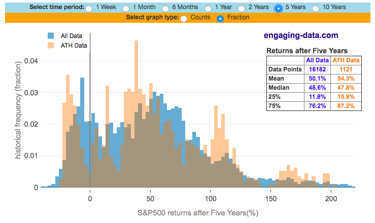
The graph below shows two histograms plotted together. The first histogram (in blue) shows the distribution of returns for the S&P500 over a specified period (one week to ten years) for every single day between 1950 and 2024 (74 years). The second histogram (in orange) shows a similar distribution of returns for the S&P500 but only from days in which the S&P500 index was at an all-time-high (i.e. the index was higher than any previous day). There have been over 1400 days where the index was at an all-time-high, out of the more than 18000 market trading days since 1950.
You can select which periods you’d like to investigate and also whether to look at the histogram in terms of raw counts of data points or fraction of the distribution.
What is remarkable about the graph for any period you choose, is that the returns after hitting an all-time-high are very similar to the returns for all days in the market. In most cases the statistics about the two distributions are very similar (mean, median and 25th to 75th percentile vales). In some cases, the distribution of returns are actually higher starting from an all time high point compared to starting from a random point.
**Click Here to view other financial-related tools and data visualizations from engaging-data**
It is important to note that this distribution is not a probability moving forward (i.e. if the market is at an all time high, you don’t know if your more likely in the future to get this set of returns). All it tells you is that this is what happened in the past. If you think the markets in the future will resemble those of the past (with bull markets and recessions and recoveries) then it’s reasonable to assume that you should have results that are at least within the range of what’s happened in the past. If you think there’ll be a nuclear war with Russia or North Korea, then obviously all bets are off and why are you reading this site in the first place.
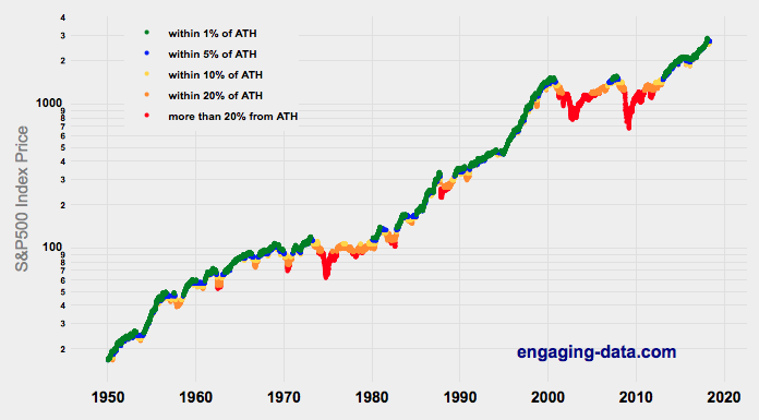
The second graph shows the S&P500 market index price over the past 74 years (1950-2024), with color coding to indicate how close to the all-time-high (ATH) the index is. There is, of course, only one point where the price is highest for any given period, but in this case, the ATH is when the index price is higher than any point before it (i.e. if you were invested in the market at that time, the index would be the highest it had been in history). You can resize the graph (click and drag) to zoom in to look at a specific period/point in history as well.
What you can see is that the S&P500 has risen quite a bit in the last 70+ years and as a result, much of the time the index is at or near its ATH (over 20% of the 18,000+ days when the index is within 1% of the ATH). There are also always some dips thrown in there where can drop 10%, 20% or even more, accounting for less than 50% of market days.
The key takeaway is that in the past several generations of investing, the market has done well and most of the time, the market is within 5% of its ATH. If you waited for a large dip to invest, you could be waiting for a long time and you would have missed out on a large amount of the gains.
Data and Tools: the data is the same as used for the Market Timing Game, daily, historical dividend adjusted prices for the S&P500 stock index are downloaded from Yahoo! Finance daily using a python script. The data for the visualizations and graphs were calculated using a program written in Javascript using the Plot.ly engine to create the graphs.
Related Posts
5 Comments »

5 Responses to Should You Invest Or Wait When The Stock Market Is At An All-Time-High?
[…] Should You Invest (Or Wait) When The Stock Market Is At An All-Time-High? at Engaging-Data.com. Here is another interesting interactive tool that lets you pick any subsequent time period and see how the distribution of future returns compared if you invested at an all-time high (ATH) during that period. The market tends to spend a lot of time near all-time highs. […]
Yes it would be interesting to run the histograms for future returns when say the S&P p/e was above say 20 and see the future returns from that point, rather than an ATH which really doesn’t mean anything. It’s the price of the market in relation to cash flows to equity (of which some proxy with earnings) that is important, not price itself. Price is what you pay, value is what you get.
People often confuse market timing with buying at market highs. Although you do not want to sell all your stocks when the market is highly priced, it does not help to keep buying stocks when market valuations are known to be excessive. There are many measures of valuation: Shiller CAPE, Market Cap to GDP, P/S, Tobins Q.
Currently all these valuation measures indicate that future returns will be low.
Adding new money to less volatile asset classes, and rebalancing to your normal allocation level or even a bit lower, can result in better returns.
The FIRE Calculator is a very nice tool. Everyone should try it.
Most important is to: Define your long term goals.
Determine how much income you will need in retirement.
Evaluate your cash flow to find investable funds to get you to your goal.
Dennis,
With all due respect since you made this comment the S&P500 had a return of 31%. If you are an investor and buying and holding for the long term, then it is always a good time to buy.
[…] Should You Invest (Or Wait) When The Stock Market Is At An All-Time-High? at Engaging-Data.com. Here is another interesting interactive tool that lets you pick any subsequent time period and see how the distribution of future returns compared if you invested at an all-time high (ATH) during that period. The market tends to spend a lot of time near all-time highs. […]