Posts for Tag: interactive
Understanding Tax Brackets: Interactive Income Tax Visualization and Calculator
Please check out the newer version of this visualization
How is your income distributed across tax brackets?
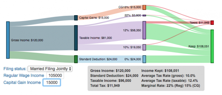
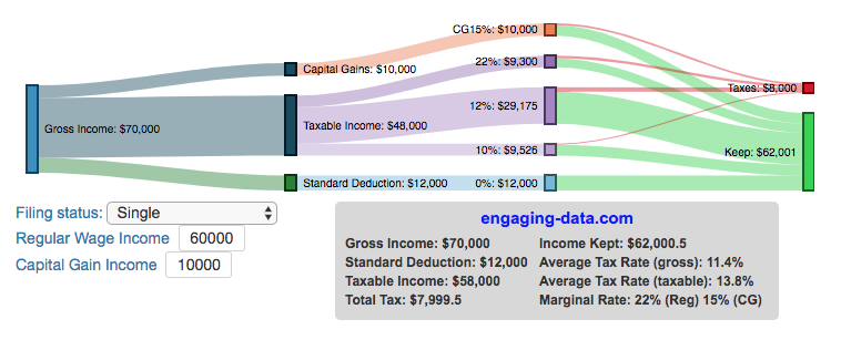
I previously made a graphical visualization of income and marginal tax rates to show how tax brackets work. That graph tried to show alot of info on the same graph, i.e. the breakdown of income tax brackets for incomes ranging from $10,000 to $3,000,000. It was nice looking, but I think several people were confused about how to read the graph. This Sankey graph is a more detailed look at the tax breakdown for one specific income. You can enter your (or any other) profile and see how taxes are distributed across the different brackets. It can help (as the other tried) to better understand marginal and average tax rates. This tool only looks at US Federal Income taxes and ignores state, local and Social Security/Medicare taxes.
– Use this button to generate a URL that you can share a specific set of inputs and graphs. Just copy the URL in the address bar at the top of your browser (after pressing the button).
Instructions for using the visual tax calculator:
- Select filing status: Single, Married Filing Jointly or Head of Household. For more info on these filing categories see the IRS website
- Enter your regular income and capital gains income. Regular income is wage or employment income and is taxed at a higher rate than capital gains income. Capital gains income is typically investment income from the sale of stocks or dividends and taxed at a lower rate than regular income.
- Move your cursor or click on the Sankey graph to select a specific link. This will give you more information about how income in a specific tax bracket is being taxed.
**Click Here to view other financial-related tools and data visualizations from engaging-data**
As seen with the marginal rates graph, there is a big difference in how regular income and capital gains are taxed. Capital gains are taxed at a lower rate and generally have larger bracket sizes. Generally, wealthier households earn a greater fraction of their income from capital gains and as a result of the lower tax rates on capital gains, these household pay a lower effective tax rate than those making an order of magnitude less in overall income.
Tax Brackets By Year
This table lets you choose to view the thresholds for each income and capital gains tax bracket for the last few years. You can see that tax rates are much lower for capital gains in the table below than for regular income.
For those not visually inclined, here is a written description of how to apply marginal tax rates. The first thing to note is that the income shown here in the graphs is taxable income, which simply speaking is your gross income with deductions removed. The standard deduction for 2018 range from $12,000 for Single filers to $24,000 for Married filers.
- If you are single, all of your regular taxable income between 0 and $9,525 is taxed at a 10% rate. This means that your all of your gross income below $12,000 is not taxed and your gross income between $12,000 and $21,525 is taxed at 10%.
- If you have more income, you move up a marginal tax bracket. Any taxable income in excess of $9,525 but below $38,700 will be taxed at the 12% rate. It is important to note that not all of your income is taxed at the marginal rate, just the income between these amounts.
- Income between $38,700 and $82,500 is taxed at 24% and so on until you have income over $500,000 and are in the 37% marginal tax rate . . .
- Thus, different parts of your income are taxed at different rates and you can calculate an average or effective rate (which is shown in the summary table).
- Capital gains income complicates things slightly as it is taxed after regular income. Thus any amount of capital gains taxes you make are taxed at a rate that corresponds to starting after you regular income. If you made $100,000 in regular income, and only $100 in capital gains income, that $100 dollars would be taxed at the 15% rate and not at the 0% rate, because the $100,000 in regular income pushes you into the 2nd marginal tax bracket for capital gains (between $38,700 and $426,700).
Data and Tools:
Tax brackets and rates were obtained from the IRS website and calculations were made using javascript and code modified from the Sankeymatic plotting website.
California is World’s 4th Largest Economy

This is one of an ongoing series of visualizations about the state of California. This one is about the state’s economy, which recently moved into 4th place (2024), if California were its own country. It is, however, still part of the United States.
The visualization shows the relative sizes of the top 10 world economies (including the US, with California removed for context). California has the smallest population of any of the top 10, with #9 Canada just barely larger than California in population, though with a significantly smaller sized economy (about 1/2 the size).
Hover over the countries to see their GDP and population. California is behind the United States, China and Germany in total economic output (in nominal terms), but ahead of much larger countries Japan and India and the United Kingdom.
The state’s economy produces $4.1 Trillion dollars of economic output, driven by a range of industries including technology, real estate, manufacturing, agriculture and health care. It is a hub for innovation and entrepreneurship. California is also the leading agricultural state in the United States. Immigration is a huge part of the state’s workforce.
Sources and Tools:
2024 economic data was downloaded from the International Monetary Fund (IMF). This visualization is made using d3.js, an open-source javascript visualization library.

Snake on a Globe

Navigate the globe to the specified cities eating as many apples as you can
I coded a unique twist on the classic snake game, Snake on a Globe, where your mission is to eat as many apples as you can when given their location and find the best ways to navigate the globe.
The game includes the largest cities in the world and tests your geographical knowledge about country and city locations. Your challenge is to move to the next apple and city in the most efficient manner, moving only along lines of longitude or latitude. But remember you are on a sphere so you can move around the globe in any of four directions: over the poles and east and west.
Instructions
Use the arrow keys (or WASD or IJKL) to move up, down, left and right along the lines of longitude and latitude to try to get to the named city.
The score increases for each apple you eat and there are extra bonus points for the largest cities. For each apple you eat, your body gets longer
The game calculates the least number of steps to move between one apple and the next and your score will start to decline once you exceed this number of steps. The game will remind you that your score is going down because it will be shown in red.
The game ends when your score goes to zero (i.e. you took too long to eat an apple) or if you collide with your own body. One caveat is that you can cross over the poles without hitting your own body if you are on a different line of longitude.
See how many apples you can eat and whether you can get a high score.
Sources and Tools:
The list of cities and their population is from Simplemaps. The game is coded with Three Globe and Three.js, 3D javascript libraries in javascript and HTML and CSS.

University of California Admission Rates by Major

Which majors are most competitive across the University of California system?
The University of California consists of nine campuses with undergraduate programs and they are all ranked among the best universities in the US (according to US News). All nine rank within the top 45 public schools including #1 and #2 and top 85 national universities in the US.
This data visualization focuses on the acceptance rates for students based on their indicated preferred majors in their application to the various University of California campuses in the Fall of 2023 admissions cycle. When you apply to a given university campus, you need to specify a major and this choice can affect the student’s chances of getting accepted, especially if the major is very sought after. Subjects like computer science are very popular and as a result, the data shows that most campuses have a lower acceptance rate for computer science as compared to the university as a whole.
Data visualization
The graph shown in the data visualization is a marimekko graph which shows a percentage based bar graph showing the acceptance rate (in blue) for a given major at a given university. The height of each horizontal bar is proportional to the number of applicants to that major, so taller bars have more applicants vs bars that are shorter. If you hover over (or click on mobile) a bar, it provides more information about the acceptance rate, enrollment rate (i.e. yield rate) and the GPA of accepted students. You can choose to sort the graph by subject name, admit rate or number of applicants.
The data visualization can help you explore different campuses and major categories. If you are viewing “School View“, you can see how the various disciplines compare for a single university at one time. Whereas if you view “Subject View” you can see the comparison of a single discipline across the University campuses that offer those majors.
The University of California has over 240,000 undergraduate students and extends about 140,000 acceptances to fill out 42,000 slots for first year students. There is a significant amount of overlap as most students applying for admission apply to several campuses, and many students get accepted to multiple campuses.
The broad disciplines used in the visualization are composed of a number of individual majors and these are detailed in the table below.
GPA calculation
The University of California only considers grades from 10th grade and 11th grade for admissions decisions, and uses a weighted system where honors and AP classes are given an extra point in GPA calculations above the normal A=4, B=3, C=2, etc. . GPA calculation. So for an honors math class, for example, an A would be worth 5 points.
Sources and Tools:
Data comes directly from the University of California website for the fall of 2023, which has quite a bit of interesting data about students and admissions. I downloaded the data and processed it with python to organize it. The webtool is made using javascript, HTML and CSS and graphed using the open-source plotly graphing library.
Table of Disciplines to majors
This table lists the specific areas and majors that make up the broad disciplines shown in the data visualization.
Broad discipline
CIP Family Title
CIP Subfamily Title
Architecture
ARCHITECTURE AND RELATED SERVICES
Architecture.
Architecture
ARCHITECTURE AND RELATED SERVICES
City/Urban, Community, and Regional Planning.
Architecture
ARCHITECTURE AND RELATED SERVICES
Environmental Design.
Architecture
ARCHITECTURE AND RELATED SERVICES
Landscape Architecture.
Architecture
ARCHITECTURE AND RELATED SERVICES
Real Estate Development.
Arts & Humanities
FOREIGN LANGUAGES, LITERATURES, AND LINGUISTICS
Linguistic, Comparative, and Related Language Studies and Services.
Arts & Humanities
FOREIGN LANGUAGES, LITERATURES, AND LINGUISTICS
African Languages, Literatures, and Linguistics.
Arts & Humanities
FOREIGN LANGUAGES, LITERATURES, AND LINGUISTICS
East Asian Languages, Literatures, and Linguistics.
Arts & Humanities
FOREIGN LANGUAGES, LITERATURES, AND LINGUISTICS
Slavic, Baltic and Albanian Languages, Literatures, and Linguistics.
Arts & Humanities
FOREIGN LANGUAGES, LITERATURES, AND LINGUISTICS
Germanic Languages, Literatures, and Linguistics.
Arts & Humanities
FOREIGN LANGUAGES, LITERATURES, AND LINGUISTICS
Romance Languages, Literatures, and Linguistics.
Arts & Humanities
FOREIGN LANGUAGES, LITERATURES, AND LINGUISTICS
Middle/Near Eastern and Semitic Languages, Literatures, and Linguistics.
Arts & Humanities
FOREIGN LANGUAGES, LITERATURES, AND LINGUISTICS
Classics and Classical Languages, Literatures, and Linguistics.
Arts & Humanities
FOREIGN LANGUAGES, LITERATURES, AND LINGUISTICS
Celtic Languages, Literatures, and Linguistics.
Arts & Humanities
FOREIGN LANGUAGES, LITERATURES, AND LINGUISTICS
Foreign Languages, Literatures, and Linguistics, Other.
Arts & Humanities
ENGLISH LANGUAGE AND LITERATURE/LETTERS
English Language and Literature, General.
Arts & Humanities
ENGLISH LANGUAGE AND LITERATURE/LETTERS
Rhetoric and Composition/Writing Studies.
Arts & Humanities
ENGLISH LANGUAGE AND LITERATURE/LETTERS
Literature.
Arts & Humanities
ENGLISH LANGUAGE AND LITERATURE/LETTERS
English Language and Literature/Letters, Other.
Arts & Humanities
LIBERAL ARTS AND SCIENCES, GENERAL STUDIES AND HUMANITIES
Liberal Arts and Sciences, General Studies and Humanities.
Arts & Humanities
PHILOSOPHY AND RELIGIOUS STUDIES
Philosophy.
Arts & Humanities
PHILOSOPHY AND RELIGIOUS STUDIES
Religion/Religious Studies.
Arts & Humanities
VISUAL AND PERFORMING ARTS
Visual and Performing Arts, General.
Arts & Humanities
VISUAL AND PERFORMING ARTS
Dance.
Arts & Humanities
VISUAL AND PERFORMING ARTS
Design and Applied Arts.
Arts & Humanities
VISUAL AND PERFORMING ARTS
Drama/Theatre Arts and Stagecraft.
Arts & Humanities
VISUAL AND PERFORMING ARTS
Film/Video and Photographic Arts.
Arts & Humanities
VISUAL AND PERFORMING ARTS
Fine and Studio Arts.
Arts & Humanities
VISUAL AND PERFORMING ARTS
Music.
Arts & Humanities
VISUAL AND PERFORMING ARTS
Arts, Entertainment, and Media Management.
Arts & Humanities
VISUAL AND PERFORMING ARTS
Visual and Performing Arts, Other.
Arts & Humanities
HISTORY
History.
Broad discipline
CIP Family Title
CIP Subfamily Title
Business
BUSINESS, MANAGEMENT, MARKETING, AND RELATED SUPPORT SERVICES
Business Administration, Management and Operations.
Business
BUSINESS, MANAGEMENT, MARKETING, AND RELATED SUPPORT SERVICES
Business/Managerial Economics.
Business
BUSINESS, MANAGEMENT, MARKETING, AND RELATED SUPPORT SERVICES
Human Resources Management and Services.
Business
BUSINESS, MANAGEMENT, MARKETING, AND RELATED SUPPORT SERVICES
Management Information Systems and Services.
Business
BUSINESS, MANAGEMENT, MARKETING, AND RELATED SUPPORT SERVICES
Management Sciences and Quantitative Methods.
Computer Science
COMPUTER AND INFORMATION SCIENCES AND SUPPORT SERVICES
Computer and Information Sciences, General.
Computer Science
COMPUTER AND INFORMATION SCIENCES AND SUPPORT SERVICES
Computer Programming.
Computer Science
COMPUTER AND INFORMATION SCIENCES AND SUPPORT SERVICES
Information Science/Studies.
Computer Science
COMPUTER AND INFORMATION SCIENCES AND SUPPORT SERVICES
Computer Science.
Computer Science
COMPUTER AND INFORMATION SCIENCES AND SUPPORT SERVICES
Computer Software and Media Applications.
Computer Science
COMPUTER AND INFORMATION SCIENCES AND SUPPORT SERVICES
Computer/Information Technology Administration and Management.
Education
EDUCATION
Education, General.
Education
EDUCATION
Social and Philosophical Foundations of Education.
Education
EDUCATION
Special Education and Teaching.
Education
EDUCATION
Teacher Education and Professional Development, Specific Subject Areas.
Engineering
ENGINEERING
Engineering, General.
Engineering
ENGINEERING
Aerospace, Aeronautical, and Astronautical/Space Engineering.
Engineering
ENGINEERING
Agricultural Engineering.
Engineering
ENGINEERING
Biomedical/Medical Engineering.
Engineering
ENGINEERING
Chemical Engineering.
Engineering
ENGINEERING
Civil Engineering.
Engineering
ENGINEERING
Computer Engineering.
Engineering
ENGINEERING
Electrical, Electronics, and Communications Engineering.
Engineering
ENGINEERING
Engineering Physics.
Engineering
ENGINEERING
Engineering Science.
Engineering
ENGINEERING
Environmental/Environmental Health Engineering.
Engineering
ENGINEERING
Materials Engineering.
Engineering
ENGINEERING
Mechanical Engineering.
Engineering
ENGINEERING
Nuclear Engineering.
Engineering
ENGINEERING
Operations Research.
Engineering
ENGINEERING
Geological/Geophysical Engineering.
Engineering
ENGINEERING
Mechatronics, Robotics, and Automation Engineering.
Engineering
ENGINEERING
Biochemical Engineering.
Engineering
ENGINEERING
Biological/Biosystems Engineering.
Engineering
ENGINEERING
Engineering, Other.
Life Sciences
AGRICULTURAL/ ANIMAL/ PLANT/ VETERINARY SCIENCE AND RELATED FIELDS
Animal Sciences.
Life Sciences
AGRICULTURAL/ ANIMAL/ PLANT/ VETERINARY SCIENCE AND RELATED FIELDS
Food Science and Technology.
Life Sciences
AGRICULTURAL/ ANIMAL/ PLANT/ VETERINARY SCIENCE AND RELATED FIELDS
Plant Sciences.
Life Sciences
NATURAL RESOURCES AND CONSERVATION
Natural Resources Conservation and Research.
Life Sciences
NATURAL RESOURCES AND CONSERVATION
Forestry.
Life Sciences
NATURAL RESOURCES AND CONSERVATION
Wildlife and Wildlands Science and Management.
Life Sciences
NATURAL RESOURCES AND CONSERVATION
Natural Resources and Conservation, Other.
Life Sciences
BIOLOGICAL AND BIOMEDICAL SCIENCES
Biology, General.
Life Sciences
BIOLOGICAL AND BIOMEDICAL SCIENCES
Biochemistry, Biophysics and Molecular Biology.
Life Sciences
BIOLOGICAL AND BIOMEDICAL SCIENCES
Botany/Plant Biology.
Life Sciences
BIOLOGICAL AND BIOMEDICAL SCIENCES
Cell/Cellular Biology and Anatomical Sciences.
Life Sciences
BIOLOGICAL AND BIOMEDICAL SCIENCES
Microbiological Sciences and Immunology.
Life Sciences
BIOLOGICAL AND BIOMEDICAL SCIENCES
Zoology/Animal Biology.
Life Sciences
BIOLOGICAL AND BIOMEDICAL SCIENCES
Genetics.
Life Sciences
BIOLOGICAL AND BIOMEDICAL SCIENCES
Physiology, Pathology and Related Sciences.
Life Sciences
BIOLOGICAL AND BIOMEDICAL SCIENCES
Pharmacology and Toxicology.
Life Sciences
BIOLOGICAL AND BIOMEDICAL SCIENCES
Biomathematics, Bioinformatics, and Computational Biology.
Life Sciences
BIOLOGICAL AND BIOMEDICAL SCIENCES
Biotechnology.
Life Sciences
BIOLOGICAL AND BIOMEDICAL SCIENCES
Ecology, Evolution, Systematics, and Population Biology.
Life Sciences
BIOLOGICAL AND BIOMEDICAL SCIENCES
Neurobiology and Neurosciences.
Life Sciences
BIOLOGICAL AND BIOMEDICAL SCIENCES
Biological and Biomedical Sciences, Other.
Broad discipline
CIP Family Title
CIP Subfamily Title
Nursing
HEALTH PROFESSIONS AND RELATED PROGRAMS
Registered Nursing, Nursing Administration, Nursing Research and Clinical
Other Health Science
HEALTH PROFESSIONS AND RELATED PROGRAMS
Pharmacy, Pharmaceutical Sciences, and Administration.
Other Health Science
HEALTH PROFESSIONS AND RELATED PROGRAMS
Public Health.
Other/ Interdisciplinary
AGRICULTURAL/ ANIMAL/ PLANT/ VETERINARY SCIENCE AND RELATED FIELDS
Agricultural Business and Management.
Other/ Interdisciplinary
AGRICULTURAL/ ANIMAL/ PLANT/ VETERINARY SCIENCE AND RELATED FIELDS
Agricultural Production Operations.
Other/ Interdisciplinary
AGRICULTURAL/ ANIMAL/ PLANT/ VETERINARY SCIENCE AND RELATED FIELDS
International Agriculture.
Other/ Interdisciplinary
COMMUNICATION, JOURNALISM, AND RELATED PROGRAMS
Communication and Media Studies.
Other/ Interdisciplinary
COMMUNICATION, JOURNALISM, AND RELATED PROGRAMS
Journalism.
Other/ Interdisciplinary
LEGAL PROFESSIONS AND STUDIES
Non-Professional Legal Studies.
Other/ Interdisciplinary
MULTI/INTERDISCIPLINARY STUDIES
Peace Studies and Conflict Resolution.
Other/ Interdisciplinary
MULTI/INTERDISCIPLINARY STUDIES
Mathematics and Computer Science.
Other/ Interdisciplinary
MULTI/INTERDISCIPLINARY STUDIES
Medieval and Renaissance Studies.
Other/ Interdisciplinary
MULTI/INTERDISCIPLINARY STUDIES
Science, Technology and Society.
Other/ Interdisciplinary
MULTI/INTERDISCIPLINARY STUDIES
Nutrition Sciences.
Other/ Interdisciplinary
MULTI/INTERDISCIPLINARY STUDIES
International/Globalization Studies.
Other/ Interdisciplinary
MULTI/INTERDISCIPLINARY STUDIES
Classical and Ancient Studies.
Other/ Interdisciplinary
MULTI/INTERDISCIPLINARY STUDIES
Cognitive Science.
Other/ Interdisciplinary
MULTI/INTERDISCIPLINARY STUDIES
Human Biology.
Other/ Interdisciplinary
MULTI/INTERDISCIPLINARY STUDIES
Marine Sciences.
Other/ Interdisciplinary
MULTI/INTERDISCIPLINARY STUDIES
Sustainability Studies.
Other/ Interdisciplinary
MULTI/INTERDISCIPLINARY STUDIES
Geography and Environmental Studies.
Other/ Interdisciplinary
MULTI/INTERDISCIPLINARY STUDIES
Data Science.
Other/ Interdisciplinary
MULTI/INTERDISCIPLINARY STUDIES
Multi/Interdisciplinary Studies, Other.
Pharmacy
HEALTH PROFESSIONS AND RELATED PROGRAMS
Pharmacy, Pharmaceutical Sciences, and Administration.
Physical Sciences/Math
MATHEMATICS AND STATISTICS
Mathematics.
Physical Sciences/Math
MATHEMATICS AND STATISTICS
Applied Mathematics.
Physical Sciences/Math
MATHEMATICS AND STATISTICS
Statistics.
Physical Sciences/Math
PHYSICAL SCIENCES
Astronomy and Astrophysics.
Physical Sciences/Math
PHYSICAL SCIENCES
Atmospheric Sciences and Meteorology.
Physical Sciences/Math
PHYSICAL SCIENCES
Chemistry.
Physical Sciences/Math
PHYSICAL SCIENCES
Geological and Earth Sciences/Geosciences.
Physical Sciences/Math
PHYSICAL SCIENCES
Physics.
Physical Sciences/Math
PHYSICAL SCIENCES
Materials Sciences.
Physical Sciences/Math
PHYSICAL SCIENCES
Physical Sciences, Other.
Broad discipline
CIP Family Title
CIP Subfamily Title
Public Admin
PUBLIC ADMINISTRATION AND SOCIAL SERVICE PROFESSIONS
Community Organization and Advocacy.
Public Admin
PUBLIC ADMINISTRATION AND SOCIAL SERVICE PROFESSIONS
Public Administration.
Public Admin
PUBLIC ADMINISTRATION AND SOCIAL SERVICE PROFESSIONS
Public Policy Analysis.
Public Admin
PUBLIC ADMINISTRATION AND SOCIAL SERVICE PROFESSIONS
Social Work.
Public Admin
PUBLIC ADMINISTRATION AND SOCIAL SERVICE PROFESSIONS
Public Administration and Social Service Professions, Other.
Public Health
HEALTH PROFESSIONS AND RELATED PROGRAMS
Public Health.
Social Sciences
AGRICULTURAL/ANIMAL/ PLANT/VETERINARY SCIENCE AND RELATED FIELDS
Agricultural Business and Management.
Social Sciences
AREA, ETHNIC, CULTURAL, GENDER, AND GROUP STUDIES
Area Studies.
Social Sciences
AREA, ETHNIC, CULTURAL, GENDER, AND GROUP STUDIES
Ethnic, Cultural Minority, Gender, and Group Studies.
Social Sciences
AREA, ETHNIC, CULTURAL, GENDER, AND GROUP STUDIES
Area, Ethnic, Cultural, Gender, and Group Studies, Other.
Social Sciences
FAMILY AND CONSUMER SCIENCES/HUMAN SCIENCES
Human Development, Family Studies, and Related Services.
Social Sciences
FAMILY AND CONSUMER SCIENCES/HUMAN SCIENCES
Apparel and Textiles.
Social Sciences
PSYCHOLOGY
Psychology, General.
Social Sciences
PSYCHOLOGY
Research and Experimental Psychology.
Social Sciences
PSYCHOLOGY
Clinical, Counseling and Applied Psychology.
Social Sciences
PSYCHOLOGY
Psychology, Other.
Social Sciences
SOCIAL SCIENCES
Social Sciences, General.
Social Sciences
SOCIAL SCIENCES
Anthropology.
Social Sciences
SOCIAL SCIENCES
Archeology.
Social Sciences
SOCIAL SCIENCES
Criminology.
Social Sciences
SOCIAL SCIENCES
Economics.
Social Sciences
SOCIAL SCIENCES
Geography and Cartography.
Social Sciences
SOCIAL SCIENCES
International Relations and National Security Studies.
Social Sciences
SOCIAL SCIENCES
Political Science and Government.
Social Sciences
SOCIAL SCIENCES
Sociology.
Social Sciences
SOCIAL SCIENCES
Urban Studies/Affairs.
Social Sciences
SOCIAL SCIENCES
Social Sciences, Other.

Stylish Textifier (𝕊𝕥𝕪𝕝𝕚𝕤𝕙 𝑻𝒆𝒙𝒕𝒊𝒇𝒊𝒆𝒓 ) Font Generator

This stylish font generator tool (𝕤𝕥𝕪𝕝𝕚𝕤𝕙 𝕗𝕠𝕟𝕥 𝕘𝕖𝕟𝕖𝕣𝕒𝕥𝕠𝕣 𝕥𝕠𝕠𝕝) allows you to easily convert your ordinary text into a variety of stylish formats. Just type your text below and the transformed styles appear instantly in the output fields. Click the clipboard on the right side to copy the stylized text to your clipboard. Explore all of the creative options (ꉓꋪꍟꍏ꓄ꀤꃴꍟ ꂦꉣ꓄ꀤꂦꈤꌗ).
Use this styled text generator in any circumstances where plain text is generally used and you don’t have control over fonts or styling (i.e. in text messages and social media posts).
Note: While using Stylish Textifier, please be aware that stylized text created through Unicode may not be accessible to all users. This is not for use where accessibility is important stylized text looks like letters but screen readers will not be able to read this text. Screen readers and other assistive technologies may struggle to interpret non-standard text formats, potentially hindering the experience for individuals with visual impairments.
To ensure inclusivity, consider providing a plain text alternative for critical information and avoid using stylized text for essential communication. Always prioritize clarity and accessibility in your content.
Sources and Tools: This tool and interface was made using HTML/Javascript/CSS. Python was used to convert plain text into various unicode variations that are read by the
Interactive Spirograph
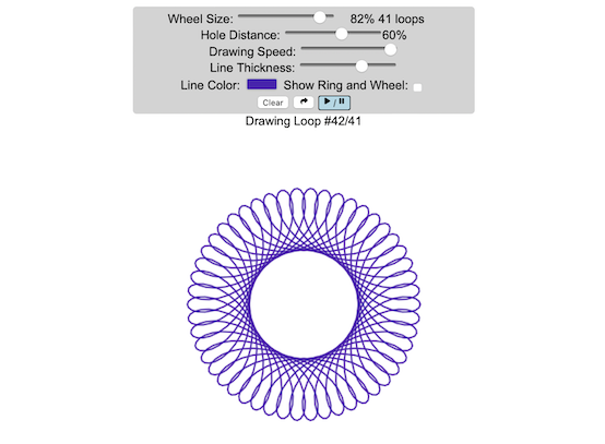
Play with an interactive spirograph and share your creations with your friends. Just play around with the controls at the top and see what interesting designs you can come up with.
Instructions
– Wheel Size controls the size of the wheel inside the ring
– Hole Distance controls the distance from the center of the wheel and the edge
– Drawing Speed controls the speed at which the spirograph is spins
– Line Thickness controls the thickness of the line on the drawing
– Line Color is a color picker letting you change the color of the lines
– Show Ring and Wheel lets you toggle whether the Ring and Wheel are showing
– Clear erases the design
– generates a custom URL and copies it to the clipboard so you can share this exact design with your friends.
– / allows you to start and stop the spirograph animation
Equations
The spirographs shown here are hypotrochoids, which is described as a curve generated by tracing a point attached to a circle that rolls around the interior of a larger circle. The equations for the curve are:
\begin{aligned}&x(\theta )=(R-r)\cos \theta +d\cos \left({R-r \over r}\theta \right)\\&y(\theta )=(R-r)\sin \theta -d\sin \left({R-r \over r}\theta \right)\end{aligned}
Sources and Tools
The equations for the spirograph hypotrochoids are from Wikipedia. The drawings and UI are made using canvas and HTML/Javascript and CSS.

Understanding Tax Brackets: Interactive Income Tax Visualization and Calculator
Please check out the newer version of this visualization
How is your income distributed across tax brackets?
I previously made a graphical visualization of income and marginal tax rates to show how tax brackets work. That graph tried to show alot of info on the same graph, i.e. the breakdown of income tax brackets for incomes ranging from $10,000 to $3,000,000. It was nice looking, but I think several people were confused about how to read the graph. This Sankey graph is a more detailed look at the tax breakdown for one specific income. You can enter your (or any other) profile and see how taxes are distributed across the different brackets. It can help (as the other tried) to better understand marginal and average tax rates. This tool only looks at US Federal Income taxes and ignores state, local and Social Security/Medicare taxes.
– Use this button to generate a URL that you can share a specific set of inputs and graphs. Just copy the URL in the address bar at the top of your browser (after pressing the button).
- Select filing status: Single, Married Filing Jointly or Head of Household. For more info on these filing categories see the IRS website
- Enter your regular income and capital gains income. Regular income is wage or employment income and is taxed at a higher rate than capital gains income. Capital gains income is typically investment income from the sale of stocks or dividends and taxed at a lower rate than regular income.
- Move your cursor or click on the Sankey graph to select a specific link. This will give you more information about how income in a specific tax bracket is being taxed.
**Click Here to view other financial-related tools and data visualizations from engaging-data**
As seen with the marginal rates graph, there is a big difference in how regular income and capital gains are taxed. Capital gains are taxed at a lower rate and generally have larger bracket sizes. Generally, wealthier households earn a greater fraction of their income from capital gains and as a result of the lower tax rates on capital gains, these household pay a lower effective tax rate than those making an order of magnitude less in overall income.
Tax Brackets By Year
This table lets you choose to view the thresholds for each income and capital gains tax bracket for the last few years. You can see that tax rates are much lower for capital gains in the table below than for regular income.
- If you are single, all of your regular taxable income between 0 and $9,525 is taxed at a 10% rate. This means that your all of your gross income below $12,000 is not taxed and your gross income between $12,000 and $21,525 is taxed at 10%.
- If you have more income, you move up a marginal tax bracket. Any taxable income in excess of $9,525 but below $38,700 will be taxed at the 12% rate. It is important to note that not all of your income is taxed at the marginal rate, just the income between these amounts.
- Income between $38,700 and $82,500 is taxed at 24% and so on until you have income over $500,000 and are in the 37% marginal tax rate . . .
- Thus, different parts of your income are taxed at different rates and you can calculate an average or effective rate (which is shown in the summary table).
- Capital gains income complicates things slightly as it is taxed after regular income. Thus any amount of capital gains taxes you make are taxed at a rate that corresponds to starting after you regular income. If you made $100,000 in regular income, and only $100 in capital gains income, that $100 dollars would be taxed at the 15% rate and not at the 0% rate, because the $100,000 in regular income pushes you into the 2nd marginal tax bracket for capital gains (between $38,700 and $426,700).
Data and Tools:
Tax brackets and rates were obtained from the IRS website and calculations were made using javascript and code modified from the Sankeymatic plotting website.
California is World’s 4th Largest Economy
This is one of an ongoing series of visualizations about the state of California. This one is about the state’s economy, which recently moved into 4th place (2024), if California were its own country. It is, however, still part of the United States.
The visualization shows the relative sizes of the top 10 world economies (including the US, with California removed for context). California has the smallest population of any of the top 10, with #9 Canada just barely larger than California in population, though with a significantly smaller sized economy (about 1/2 the size).
Hover over the countries to see their GDP and population. California is behind the United States, China and Germany in total economic output (in nominal terms), but ahead of much larger countries Japan and India and the United Kingdom.
The state’s economy produces $4.1 Trillion dollars of economic output, driven by a range of industries including technology, real estate, manufacturing, agriculture and health care. It is a hub for innovation and entrepreneurship. California is also the leading agricultural state in the United States. Immigration is a huge part of the state’s workforce.
Sources and Tools:
2024 economic data was downloaded from the International Monetary Fund (IMF). This visualization is made using d3.js, an open-source javascript visualization library.
Snake on a Globe
Navigate the globe to the specified cities eating as many apples as you can
I coded a unique twist on the classic snake game, Snake on a Globe, where your mission is to eat as many apples as you can when given their location and find the best ways to navigate the globe.
The game includes the largest cities in the world and tests your geographical knowledge about country and city locations. Your challenge is to move to the next apple and city in the most efficient manner, moving only along lines of longitude or latitude. But remember you are on a sphere so you can move around the globe in any of four directions: over the poles and east and west.
Instructions
Sources and Tools:
The list of cities and their population is from Simplemaps. The game is coded with Three Globe and Three.js, 3D javascript libraries in javascript and HTML and CSS.
University of California Admission Rates by Major
Which majors are most competitive across the University of California system?
The University of California consists of nine campuses with undergraduate programs and they are all ranked among the best universities in the US (according to US News). All nine rank within the top 45 public schools including #1 and #2 and top 85 national universities in the US.
This data visualization focuses on the acceptance rates for students based on their indicated preferred majors in their application to the various University of California campuses in the Fall of 2023 admissions cycle. When you apply to a given university campus, you need to specify a major and this choice can affect the student’s chances of getting accepted, especially if the major is very sought after. Subjects like computer science are very popular and as a result, the data shows that most campuses have a lower acceptance rate for computer science as compared to the university as a whole.
Data visualization
The graph shown in the data visualization is a marimekko graph which shows a percentage based bar graph showing the acceptance rate (in blue) for a given major at a given university. The height of each horizontal bar is proportional to the number of applicants to that major, so taller bars have more applicants vs bars that are shorter. If you hover over (or click on mobile) a bar, it provides more information about the acceptance rate, enrollment rate (i.e. yield rate) and the GPA of accepted students. You can choose to sort the graph by subject name, admit rate or number of applicants.
The data visualization can help you explore different campuses and major categories. If you are viewing “School View“, you can see how the various disciplines compare for a single university at one time. Whereas if you view “Subject View” you can see the comparison of a single discipline across the University campuses that offer those majors.
The University of California has over 240,000 undergraduate students and extends about 140,000 acceptances to fill out 42,000 slots for first year students. There is a significant amount of overlap as most students applying for admission apply to several campuses, and many students get accepted to multiple campuses.
The broad disciplines used in the visualization are composed of a number of individual majors and these are detailed in the table below.
GPA calculation
The University of California only considers grades from 10th grade and 11th grade for admissions decisions, and uses a weighted system where honors and AP classes are given an extra point in GPA calculations above the normal A=4, B=3, C=2, etc. . GPA calculation. So for an honors math class, for example, an A would be worth 5 points.
Sources and Tools:
Data comes directly from the University of California website for the fall of 2023, which has quite a bit of interesting data about students and admissions. I downloaded the data and processed it with python to organize it. The webtool is made using javascript, HTML and CSS and graphed using the open-source plotly graphing library.
Table of Disciplines to majors
This table lists the specific areas and majors that make up the broad disciplines shown in the data visualization.
| Broad discipline | CIP Family Title | CIP Subfamily Title |
|---|---|---|
| Architecture | ARCHITECTURE AND RELATED SERVICES | Architecture. |
| Architecture | ARCHITECTURE AND RELATED SERVICES | City/Urban, Community, and Regional Planning. |
| Architecture | ARCHITECTURE AND RELATED SERVICES | Environmental Design. |
| Architecture | ARCHITECTURE AND RELATED SERVICES | Landscape Architecture. |
| Architecture | ARCHITECTURE AND RELATED SERVICES | Real Estate Development. |
| Arts & Humanities | FOREIGN LANGUAGES, LITERATURES, AND LINGUISTICS | Linguistic, Comparative, and Related Language Studies and Services. |
| Arts & Humanities | FOREIGN LANGUAGES, LITERATURES, AND LINGUISTICS | African Languages, Literatures, and Linguistics. |
| Arts & Humanities | FOREIGN LANGUAGES, LITERATURES, AND LINGUISTICS | East Asian Languages, Literatures, and Linguistics. |
| Arts & Humanities | FOREIGN LANGUAGES, LITERATURES, AND LINGUISTICS | Slavic, Baltic and Albanian Languages, Literatures, and Linguistics. |
| Arts & Humanities | FOREIGN LANGUAGES, LITERATURES, AND LINGUISTICS | Germanic Languages, Literatures, and Linguistics. |
| Arts & Humanities | FOREIGN LANGUAGES, LITERATURES, AND LINGUISTICS | Romance Languages, Literatures, and Linguistics. |
| Arts & Humanities | FOREIGN LANGUAGES, LITERATURES, AND LINGUISTICS | Middle/Near Eastern and Semitic Languages, Literatures, and Linguistics. |
| Arts & Humanities | FOREIGN LANGUAGES, LITERATURES, AND LINGUISTICS | Classics and Classical Languages, Literatures, and Linguistics. |
| Arts & Humanities | FOREIGN LANGUAGES, LITERATURES, AND LINGUISTICS | Celtic Languages, Literatures, and Linguistics. |
| Arts & Humanities | FOREIGN LANGUAGES, LITERATURES, AND LINGUISTICS | Foreign Languages, Literatures, and Linguistics, Other. |
| Arts & Humanities | ENGLISH LANGUAGE AND LITERATURE/LETTERS | English Language and Literature, General. |
| Arts & Humanities | ENGLISH LANGUAGE AND LITERATURE/LETTERS | Rhetoric and Composition/Writing Studies. |
| Arts & Humanities | ENGLISH LANGUAGE AND LITERATURE/LETTERS | Literature. |
| Arts & Humanities | ENGLISH LANGUAGE AND LITERATURE/LETTERS | English Language and Literature/Letters, Other. |
| Arts & Humanities | LIBERAL ARTS AND SCIENCES, GENERAL STUDIES AND HUMANITIES | Liberal Arts and Sciences, General Studies and Humanities. |
| Arts & Humanities | PHILOSOPHY AND RELIGIOUS STUDIES | Philosophy. |
| Arts & Humanities | PHILOSOPHY AND RELIGIOUS STUDIES | Religion/Religious Studies. |
| Arts & Humanities | VISUAL AND PERFORMING ARTS | Visual and Performing Arts, General. |
| Arts & Humanities | VISUAL AND PERFORMING ARTS | Dance. |
| Arts & Humanities | VISUAL AND PERFORMING ARTS | Design and Applied Arts. |
| Arts & Humanities | VISUAL AND PERFORMING ARTS | Drama/Theatre Arts and Stagecraft. |
| Arts & Humanities | VISUAL AND PERFORMING ARTS | Film/Video and Photographic Arts. |
| Arts & Humanities | VISUAL AND PERFORMING ARTS | Fine and Studio Arts. |
| Arts & Humanities | VISUAL AND PERFORMING ARTS | Music. |
| Arts & Humanities | VISUAL AND PERFORMING ARTS | Arts, Entertainment, and Media Management. |
| Arts & Humanities | VISUAL AND PERFORMING ARTS | Visual and Performing Arts, Other. |
| Arts & Humanities | HISTORY | History. |
| Broad discipline | CIP Family Title | CIP Subfamily Title |
|---|---|---|
| Business | BUSINESS, MANAGEMENT, MARKETING, AND RELATED SUPPORT SERVICES | Business Administration, Management and Operations. |
| Business | BUSINESS, MANAGEMENT, MARKETING, AND RELATED SUPPORT SERVICES | Business/Managerial Economics. |
| Business | BUSINESS, MANAGEMENT, MARKETING, AND RELATED SUPPORT SERVICES | Human Resources Management and Services. |
| Business | BUSINESS, MANAGEMENT, MARKETING, AND RELATED SUPPORT SERVICES | Management Information Systems and Services. |
| Business | BUSINESS, MANAGEMENT, MARKETING, AND RELATED SUPPORT SERVICES | Management Sciences and Quantitative Methods. |
| Computer Science | COMPUTER AND INFORMATION SCIENCES AND SUPPORT SERVICES | Computer and Information Sciences, General. |
| Computer Science | COMPUTER AND INFORMATION SCIENCES AND SUPPORT SERVICES | Computer Programming. |
| Computer Science | COMPUTER AND INFORMATION SCIENCES AND SUPPORT SERVICES | Information Science/Studies. |
| Computer Science | COMPUTER AND INFORMATION SCIENCES AND SUPPORT SERVICES | Computer Science. |
| Computer Science | COMPUTER AND INFORMATION SCIENCES AND SUPPORT SERVICES | Computer Software and Media Applications. |
| Computer Science | COMPUTER AND INFORMATION SCIENCES AND SUPPORT SERVICES | Computer/Information Technology Administration and Management. |
| Education | EDUCATION | Education, General. |
| Education | EDUCATION | Social and Philosophical Foundations of Education. |
| Education | EDUCATION | Special Education and Teaching. |
| Education | EDUCATION | Teacher Education and Professional Development, Specific Subject Areas. |
| Engineering | ENGINEERING | Engineering, General. |
| Engineering | ENGINEERING | Aerospace, Aeronautical, and Astronautical/Space Engineering. |
| Engineering | ENGINEERING | Agricultural Engineering. |
| Engineering | ENGINEERING | Biomedical/Medical Engineering. |
| Engineering | ENGINEERING | Chemical Engineering. |
| Engineering | ENGINEERING | Civil Engineering. |
| Engineering | ENGINEERING | Computer Engineering. |
| Engineering | ENGINEERING | Electrical, Electronics, and Communications Engineering. |
| Engineering | ENGINEERING | Engineering Physics. |
| Engineering | ENGINEERING | Engineering Science. |
| Engineering | ENGINEERING | Environmental/Environmental Health Engineering. |
| Engineering | ENGINEERING | Materials Engineering. |
| Engineering | ENGINEERING | Mechanical Engineering. |
| Engineering | ENGINEERING | Nuclear Engineering. |
| Engineering | ENGINEERING | Operations Research. |
| Engineering | ENGINEERING | Geological/Geophysical Engineering. |
| Engineering | ENGINEERING | Mechatronics, Robotics, and Automation Engineering. |
| Engineering | ENGINEERING | Biochemical Engineering. |
| Engineering | ENGINEERING | Biological/Biosystems Engineering. |
| Engineering | ENGINEERING | Engineering, Other. |
| Life Sciences | AGRICULTURAL/ ANIMAL/ PLANT/ VETERINARY SCIENCE AND RELATED FIELDS | Animal Sciences. |
| Life Sciences | AGRICULTURAL/ ANIMAL/ PLANT/ VETERINARY SCIENCE AND RELATED FIELDS | Food Science and Technology. |
| Life Sciences | AGRICULTURAL/ ANIMAL/ PLANT/ VETERINARY SCIENCE AND RELATED FIELDS | Plant Sciences. |
| Life Sciences | NATURAL RESOURCES AND CONSERVATION | Natural Resources Conservation and Research. |
| Life Sciences | NATURAL RESOURCES AND CONSERVATION | Forestry. |
| Life Sciences | NATURAL RESOURCES AND CONSERVATION | Wildlife and Wildlands Science and Management. |
| Life Sciences | NATURAL RESOURCES AND CONSERVATION | Natural Resources and Conservation, Other. |
| Life Sciences | BIOLOGICAL AND BIOMEDICAL SCIENCES | Biology, General. |
| Life Sciences | BIOLOGICAL AND BIOMEDICAL SCIENCES | Biochemistry, Biophysics and Molecular Biology. |
| Life Sciences | BIOLOGICAL AND BIOMEDICAL SCIENCES | Botany/Plant Biology. |
| Life Sciences | BIOLOGICAL AND BIOMEDICAL SCIENCES | Cell/Cellular Biology and Anatomical Sciences. |
| Life Sciences | BIOLOGICAL AND BIOMEDICAL SCIENCES | Microbiological Sciences and Immunology. |
| Life Sciences | BIOLOGICAL AND BIOMEDICAL SCIENCES | Zoology/Animal Biology. |
| Life Sciences | BIOLOGICAL AND BIOMEDICAL SCIENCES | Genetics. |
| Life Sciences | BIOLOGICAL AND BIOMEDICAL SCIENCES | Physiology, Pathology and Related Sciences. |
| Life Sciences | BIOLOGICAL AND BIOMEDICAL SCIENCES | Pharmacology and Toxicology. |
| Life Sciences | BIOLOGICAL AND BIOMEDICAL SCIENCES | Biomathematics, Bioinformatics, and Computational Biology. |
| Life Sciences | BIOLOGICAL AND BIOMEDICAL SCIENCES | Biotechnology. |
| Life Sciences | BIOLOGICAL AND BIOMEDICAL SCIENCES | Ecology, Evolution, Systematics, and Population Biology. |
| Life Sciences | BIOLOGICAL AND BIOMEDICAL SCIENCES | Neurobiology and Neurosciences. |
| Life Sciences | BIOLOGICAL AND BIOMEDICAL SCIENCES | Biological and Biomedical Sciences, Other. |
| Broad discipline | CIP Family Title | CIP Subfamily Title |
|---|---|---|
| Nursing | HEALTH PROFESSIONS AND RELATED PROGRAMS | Registered Nursing, Nursing Administration, Nursing Research and Clinical |
| Other Health Science | HEALTH PROFESSIONS AND RELATED PROGRAMS | Pharmacy, Pharmaceutical Sciences, and Administration. |
| Other Health Science | HEALTH PROFESSIONS AND RELATED PROGRAMS | Public Health. |
| Other/ Interdisciplinary | AGRICULTURAL/ ANIMAL/ PLANT/ VETERINARY SCIENCE AND RELATED FIELDS | Agricultural Business and Management. |
| Other/ Interdisciplinary | AGRICULTURAL/ ANIMAL/ PLANT/ VETERINARY SCIENCE AND RELATED FIELDS | Agricultural Production Operations. |
| Other/ Interdisciplinary | AGRICULTURAL/ ANIMAL/ PLANT/ VETERINARY SCIENCE AND RELATED FIELDS | International Agriculture. |
| Other/ Interdisciplinary | COMMUNICATION, JOURNALISM, AND RELATED PROGRAMS | Communication and Media Studies. |
| Other/ Interdisciplinary | COMMUNICATION, JOURNALISM, AND RELATED PROGRAMS | Journalism. |
| Other/ Interdisciplinary | LEGAL PROFESSIONS AND STUDIES | Non-Professional Legal Studies. |
| Other/ Interdisciplinary | MULTI/INTERDISCIPLINARY STUDIES | Peace Studies and Conflict Resolution. |
| Other/ Interdisciplinary | MULTI/INTERDISCIPLINARY STUDIES | Mathematics and Computer Science. |
| Other/ Interdisciplinary | MULTI/INTERDISCIPLINARY STUDIES | Medieval and Renaissance Studies. |
| Other/ Interdisciplinary | MULTI/INTERDISCIPLINARY STUDIES | Science, Technology and Society. |
| Other/ Interdisciplinary | MULTI/INTERDISCIPLINARY STUDIES | Nutrition Sciences. |
| Other/ Interdisciplinary | MULTI/INTERDISCIPLINARY STUDIES | International/Globalization Studies. |
| Other/ Interdisciplinary | MULTI/INTERDISCIPLINARY STUDIES | Classical and Ancient Studies. |
| Other/ Interdisciplinary | MULTI/INTERDISCIPLINARY STUDIES | Cognitive Science. |
| Other/ Interdisciplinary | MULTI/INTERDISCIPLINARY STUDIES | Human Biology. |
| Other/ Interdisciplinary | MULTI/INTERDISCIPLINARY STUDIES | Marine Sciences. |
| Other/ Interdisciplinary | MULTI/INTERDISCIPLINARY STUDIES | Sustainability Studies. |
| Other/ Interdisciplinary | MULTI/INTERDISCIPLINARY STUDIES | Geography and Environmental Studies. |
| Other/ Interdisciplinary | MULTI/INTERDISCIPLINARY STUDIES | Data Science. |
| Other/ Interdisciplinary | MULTI/INTERDISCIPLINARY STUDIES | Multi/Interdisciplinary Studies, Other. |
| Pharmacy | HEALTH PROFESSIONS AND RELATED PROGRAMS | Pharmacy, Pharmaceutical Sciences, and Administration. |
| Physical Sciences/Math | MATHEMATICS AND STATISTICS | Mathematics. |
| Physical Sciences/Math | MATHEMATICS AND STATISTICS | Applied Mathematics. |
| Physical Sciences/Math | MATHEMATICS AND STATISTICS | Statistics. |
| Physical Sciences/Math | PHYSICAL SCIENCES | Astronomy and Astrophysics. |
| Physical Sciences/Math | PHYSICAL SCIENCES | Atmospheric Sciences and Meteorology. |
| Physical Sciences/Math | PHYSICAL SCIENCES | Chemistry. |
| Physical Sciences/Math | PHYSICAL SCIENCES | Geological and Earth Sciences/Geosciences. |
| Physical Sciences/Math | PHYSICAL SCIENCES | Physics. |
| Physical Sciences/Math | PHYSICAL SCIENCES | Materials Sciences. |
| Physical Sciences/Math | PHYSICAL SCIENCES | Physical Sciences, Other. |
| Broad discipline | CIP Family Title | CIP Subfamily Title |
|---|---|---|
| Public Admin | PUBLIC ADMINISTRATION AND SOCIAL SERVICE PROFESSIONS | Community Organization and Advocacy. |
| Public Admin | PUBLIC ADMINISTRATION AND SOCIAL SERVICE PROFESSIONS | Public Administration. |
| Public Admin | PUBLIC ADMINISTRATION AND SOCIAL SERVICE PROFESSIONS | Public Policy Analysis. |
| Public Admin | PUBLIC ADMINISTRATION AND SOCIAL SERVICE PROFESSIONS | Social Work. |
| Public Admin | PUBLIC ADMINISTRATION AND SOCIAL SERVICE PROFESSIONS | Public Administration and Social Service Professions, Other. |
| Public Health | HEALTH PROFESSIONS AND RELATED PROGRAMS | Public Health. |
| Social Sciences | AGRICULTURAL/ANIMAL/ PLANT/VETERINARY SCIENCE AND RELATED FIELDS | Agricultural Business and Management. |
| Social Sciences | AREA, ETHNIC, CULTURAL, GENDER, AND GROUP STUDIES | Area Studies. |
| Social Sciences | AREA, ETHNIC, CULTURAL, GENDER, AND GROUP STUDIES | Ethnic, Cultural Minority, Gender, and Group Studies. |
| Social Sciences | AREA, ETHNIC, CULTURAL, GENDER, AND GROUP STUDIES | Area, Ethnic, Cultural, Gender, and Group Studies, Other. |
| Social Sciences | FAMILY AND CONSUMER SCIENCES/HUMAN SCIENCES | Human Development, Family Studies, and Related Services. |
| Social Sciences | FAMILY AND CONSUMER SCIENCES/HUMAN SCIENCES | Apparel and Textiles. |
| Social Sciences | PSYCHOLOGY | Psychology, General. |
| Social Sciences | PSYCHOLOGY | Research and Experimental Psychology. |
| Social Sciences | PSYCHOLOGY | Clinical, Counseling and Applied Psychology. |
| Social Sciences | PSYCHOLOGY | Psychology, Other. |
| Social Sciences | SOCIAL SCIENCES | Social Sciences, General. |
| Social Sciences | SOCIAL SCIENCES | Anthropology. |
| Social Sciences | SOCIAL SCIENCES | Archeology. |
| Social Sciences | SOCIAL SCIENCES | Criminology. |
| Social Sciences | SOCIAL SCIENCES | Economics. |
| Social Sciences | SOCIAL SCIENCES | Geography and Cartography. |
| Social Sciences | SOCIAL SCIENCES | International Relations and National Security Studies. |
| Social Sciences | SOCIAL SCIENCES | Political Science and Government. |
| Social Sciences | SOCIAL SCIENCES | Sociology. |
| Social Sciences | SOCIAL SCIENCES | Urban Studies/Affairs. |
| Social Sciences | SOCIAL SCIENCES | Social Sciences, Other. |
Stylish Textifier (𝕊𝕥𝕪𝕝𝕚𝕤𝕙 𝑻𝒆𝒙𝒕𝒊𝒇𝒊𝒆𝒓 ) Font Generator
This stylish font generator tool (𝕤𝕥𝕪𝕝𝕚𝕤𝕙 𝕗𝕠𝕟𝕥 𝕘𝕖𝕟𝕖𝕣𝕒𝕥𝕠𝕣 𝕥𝕠𝕠𝕝) allows you to easily convert your ordinary text into a variety of stylish formats. Just type your text below and the transformed styles appear instantly in the output fields. Click the clipboard on the right side to copy the stylized text to your clipboard. Explore all of the creative options (ꉓꋪꍟꍏ꓄ꀤꃴꍟ ꂦꉣ꓄ꀤꂦꈤꌗ).
Use this styled text generator in any circumstances where plain text is generally used and you don’t have control over fonts or styling (i.e. in text messages and social media posts).
Note: While using Stylish Textifier, please be aware that stylized text created through Unicode may not be accessible to all users. This is not for use where accessibility is important stylized text looks like letters but screen readers will not be able to read this text. Screen readers and other assistive technologies may struggle to interpret non-standard text formats, potentially hindering the experience for individuals with visual impairments.
To ensure inclusivity, consider providing a plain text alternative for critical information and avoid using stylized text for essential communication. Always prioritize clarity and accessibility in your content.
Sources and Tools: This tool and interface was made using HTML/Javascript/CSS. Python was used to convert plain text into various unicode variations that are read by the
Interactive Spirograph
Play with an interactive spirograph and share your creations with your friends. Just play around with the controls at the top and see what interesting designs you can come up with.
Instructions
– Wheel Size controls the size of the wheel inside the ring
– Hole Distance controls the distance from the center of the wheel and the edge
– Drawing Speed controls the speed at which the spirograph is spins
– Line Thickness controls the thickness of the line on the drawing
– Line Color is a color picker letting you change the color of the lines
– Show Ring and Wheel lets you toggle whether the Ring and Wheel are showing
– Clear erases the design
– generates a custom URL and copies it to the clipboard so you can share this exact design with your friends.
– / allows you to start and stop the spirograph animation
Equations
The spirographs shown here are hypotrochoids, which is described as a curve generated by tracing a point attached to a circle that rolls around the interior of a larger circle. The equations for the curve are:
\begin{aligned}&x(\theta )=(R-r)\cos \theta +d\cos \left({R-r \over r}\theta \right)\\&y(\theta )=(R-r)\sin \theta -d\sin \left({R-r \over r}\theta \right)\end{aligned}
Sources and Tools
The equations for the spirograph hypotrochoids are from Wikipedia. The drawings and UI are made using canvas and HTML/Javascript and CSS.
Recent Comments