How does the current California snowpack compare with Historical Averages?
If you are looking at this it’s probably winter in California and hopefully snowy in the mountains. In the winter, snow is one of the primary ways that water is stored in California and is on the same order of magnitude as the amount of water in reservoirs.
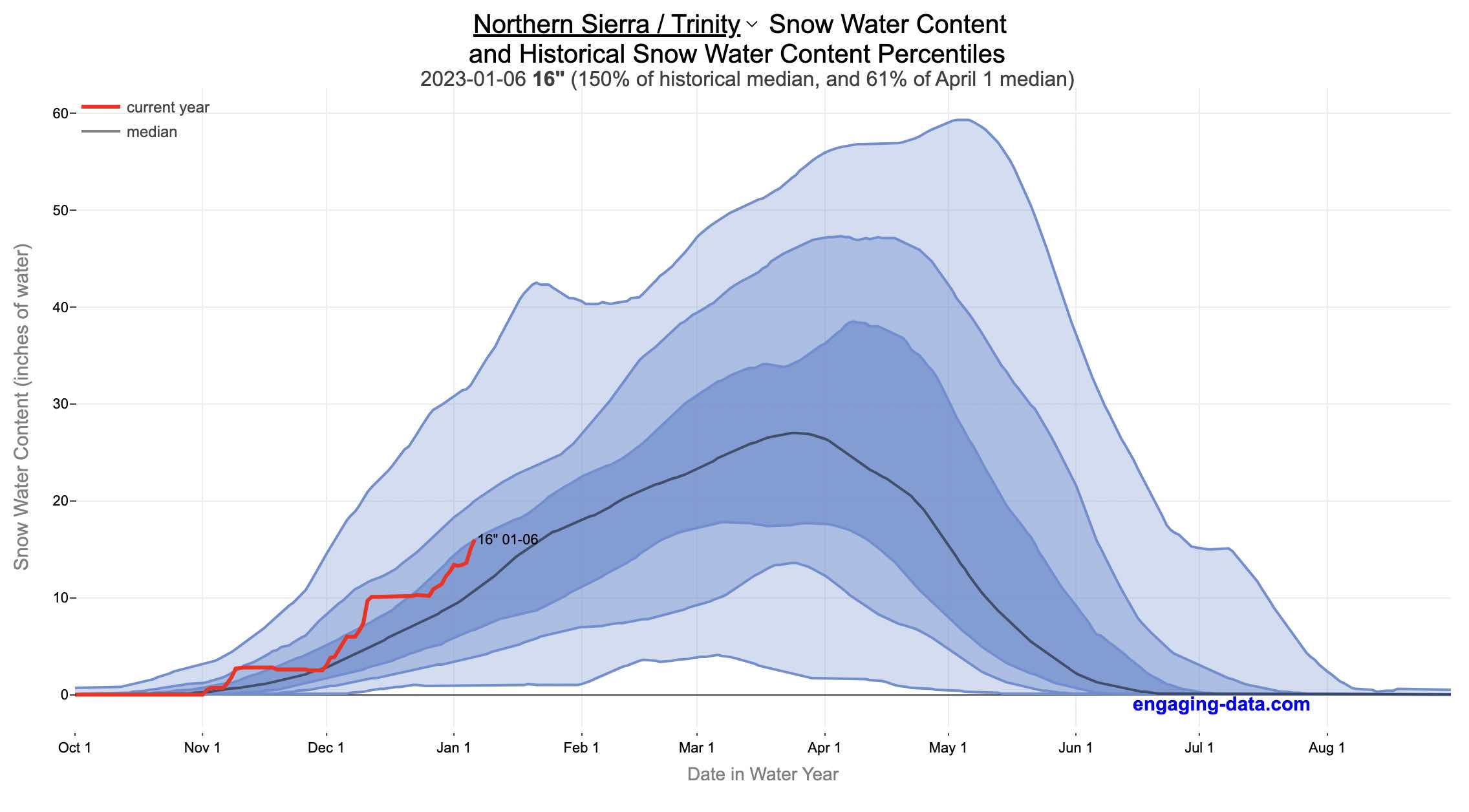
When I made this graph of California snowpack levels (Jan 2023) we’ve had quite a bit of rain and snow so far and so I wanted to visualize how this year compares with historical levels for this time of year. This graph will provide a constantly updated way to keep tabs on the water content in the Sierra snowpack.
Snow water content is just what it sounds like. It is an estimate of the water content of the snow. Since snow can have be relatively dry or moist, and can be fluffy or compacted, measuring snow depth is not as accurate as measuring the amount of water in the snow. There are multiple ways of measuring the water content of snow, including pads under the snow that measure the weight of the overlying snow, sensors that use sound waves and weighing snow cores.
I used data for California snow water content totals from the California Department of Water Resources. Other California water-related visualizations include reservoir levels in the state as well.
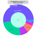
There are three sets of stations (and a state average) that are tracked in the data and these plots:
- Northern Sierra/Trinity – (32 snow sensors)
- Central Sierra – (57 snow sensors)
- Southern Sierra – (36 snow sensors)
- State-wide average – (125 snow sensors)
Here is a map showing these three regions.
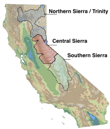
These stations are tracked because they provide important information about the state’s water supply (most of which originates from the Sierra Nevada Mountains). Winter and spring snowpack forms an important reservoir of water storage for the state as this melting snow will eventually flow into the state’s rivers and reservoirs to serve domestic and agricultural water needs.
The visualization consists of a graph that shows the range of historical values for snow water content as a function of the day of the year. This range is split into percentiles of snow, spreading out like a cone from the start of the water year (October 1) ramping up to the peak in April and then converging back to zero in summertime. You can see the current water year plotted on this in red to show how it compares to historical values.
My numbers may differ slightly from the numbers reported on the state’s website. The historical percentiles that I calculated are from 1970 until 2022 while I notice the state’s average is between 1990 and 2020.
You can hover (or click) on the graph to audit the data a little more clearly.
Sources and Tools
Data is downloaded from the California Data Exchange Center website of the California Department of Water Resources using a python script. The data is processed in javascript and visualized here using HTML, CSS and javascript and the open source Plotly javascript graphing library.
27 Comments »
27 Responses to California Snowpack Levels Visualization
Looks like your timeline skipped 2/29 and dates are now off
I fixed this in the last couple days by just ignoring 2/29. Sometimes the cache doesn’t refresh for a little while. You can always try opening the link in incognito mode to see if that works.
Can you add the dates which correspond to the historical percentiles so that they are visible when you hover over (click) the graph? It would be cool (pun intended) to see the year(s) in which the max and lowest recorded snowpack depths occurred. For instance, hovering over the 100 percentile reveals the max depth (60.2”) was apparently on or around May 2, but in what year(s) was that depth reached? BTW, your visualizations are top notch!
To avoid confusing anyone, the 100 percentile example I was referencing came from the Central Sierra SWC graph.
Is there a new link to this year’s CA snowpack level chart? This one is still showing last year’s levels. Thank you!
Sorry, one of the California snow websites wasn’t showing any current data so it affected my code for pulling down the data and parsing it. I fixed the issue and now the site should be updated.
I think the level is fixed but the date is still showing 2022 fyi
When will the snowpack levels chart be reset for the current 2023-2024 period?
It might be interesting to have a “Numbers Person” calculate the evaporation levels/amount for the huge water exposure sending water through the aqueduct system and surface area of California reservoirs. It is clear that temperature, humidity, and surface area play an extremely large role in what happens in the real world of water. E.g.Lake Mead can clearly be seen to have vastly less surface area in 2022 (~1040′ than at its height in 1941 and late 1990s ~1200+’).
It may be a bit too deep, pun intended, however, if we want to “really” know about what the life-giving fluid is doing in our world this is crucial. Just to peak your, and any thinking person’s curiosity… really deep into it. What would be the humidity index in the Sacramento Valley if the aqueducts were not full and the temperature is 100+? Let’s say the crops were watered nights instead of billions of acre-feet sitting in the sun on the way to Southern CA.
Have you considered calculating water release during rainy season to highlight the need for more storage. It should be stunning vs. actual available storage this year.
It’s looking inevitable at this point that the 100 line is getting redrawn this year for everywhere but the north, and even there it’s a strong possibility.
do you have any data specific to the 1950s that could lend some more context to larger snow packs and any possible comparisons today?
I also ran across another article that had a pretty eye-catching graph, it’s too bad I couldn’t find an updated version of it because I think it could be informative if it was kept up-to-date:
https://www.preventionweb.net/news/drought-over-reflections-californias-recent-flood-drought-combo
in any case I hope they find ways to use this water more beneficially than flushing it out the delta and bay otherwise unused except for managing their water quality problems that are a direct result of their decades of neglect of several area wastewater treatment facilities.
as for any excess water, I think we have a home for a lot of it if it could be directed back to the old Tulare lake bottom and fill that back up, which would help and solve part of the farm water issues as well as provide badly needed ground water and aquifer recharge for many communities here in the valley whose wells have gone dry, at least until we can construct or expand more Reservoir capacity.
thank you for producing and maintaining such a valuable resource for easily monitoring snow and Reservoir water levels by the way, I share it with almost everyone I meet.
Just wondering if there was a reason the snowpack levels haven’t updated for a few days? I’m interested to see how this last storm impacted things.
It was due to the CDEC website (https://cdec.water.ca.gov) not updating. But it seems like it’s back up to date now.
If the 100 line is a single year, why is the curve so much smoother than the red curve? I guess getting 40% of an average year of snow in just 3-4 weeks would be pretty rare.
Good question. The 100th percentile line is not necessarily a single year since it just shows the highest amount of snow for each day of the year, not the highest year of snow. However, that’s not why the curve is smooth. It’s smooth because I put a smoothing function (a 10 day moving average) on all the percentile curves to make them look less jagged, which I think detracted from the visuals.
*I meant 40% of a RECORD year, not average.
Seeing the 100% line dip below the 90% line might be confusing so I think you made the right play.
Do you know if each sensor is given the same weight for the state-wide average?
Very nice display. What I would really love to see is a chart that shows the snow pack and the lake level for a year from say November 1st to the next November 1st. Last year, for example we got a great December and then nothing. The result was a pretty minimal rise in lake level. The year before we just had nothing. You could even show a few years on the same graph with different colors. Snow pack a solid line and lake level a dashed one. This would give you some idea how a certain snow pack might result in a certain change in lake level. That’s always a question on my mind.
Was talking about Lake Tahoe!
Can you convert this to a total volume of water stored in the snowpack?
Yes, this is the latest graph that I am working on.
What does the peak of the graph represent… the 100?
The 100 refers to the 100th percentile of the historical period, i.e. the maximum reached during that period. So in several regions, the snow water content is higher than it ever was from 1970 to 2022.
How easy is it to get historical data? I would love to answer this question: Of the years where the SWC on January 15 was more than 100 percent of the median April 1 value, what was the April 1 SWC?
This is an excellent question! I’ll look into it and see what I can find.
I’m a retired numbers guy and this is an absolutely fabulous display of data. It’s perfect. Thank you for this.
Thank you. This gives we less to worry about.