Posts for Tag: precipitation
California Snowpack Levels Visualization
How does the current California snowpack compare with Historical Averages?
If you are looking at this it’s probably winter in California and hopefully snowy in the mountains. In the winter, snow is one of the primary ways that water is stored in California and is on the same order of magnitude as the amount of water in reservoirs.
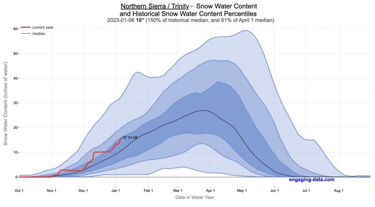
When I made this graph of California snowpack levels (Jan 2023) we’ve had quite a bit of rain and snow so far and so I wanted to visualize how this year compares with historical levels for this time of year. This graph will provide a constantly updated way to keep tabs on the water content in the Sierra snowpack.
Snow water content is just what it sounds like. It is an estimate of the water content of the snow. Since snow can have be relatively dry or moist, and can be fluffy or compacted, measuring snow depth is not as accurate as measuring the amount of water in the snow. There are multiple ways of measuring the water content of snow, including pads under the snow that measure the weight of the overlying snow, sensors that use sound waves and weighing snow cores.
I used data for California snow water content totals from the California Department of Water Resources. Other California water-related visualizations include reservoir levels in the state as well.
There are three sets of stations (and a state average) that are tracked in the data and these plots:
- Northern Sierra/Trinity – (32 snow sensors)
- Central Sierra – (57 snow sensors)
- Southern Sierra – (36 snow sensors)
- State-wide average – (125 snow sensors)
Here is a map showing these three regions.
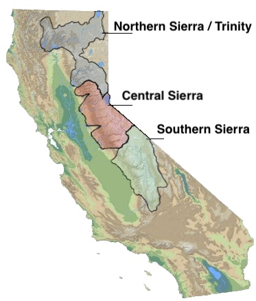
These stations are tracked because they provide important information about the state’s water supply (most of which originates from the Sierra Nevada Mountains). Winter and spring snowpack forms an important reservoir of water storage for the state as this melting snow will eventually flow into the state’s rivers and reservoirs to serve domestic and agricultural water needs.
The visualization consists of a graph that shows the range of historical values for snow water content as a function of the day of the year. This range is split into percentiles of snow, spreading out like a cone from the start of the water year (October 1) ramping up to the peak in April and then converging back to zero in summertime. You can see the current water year plotted on this in red to show how it compares to historical values.
My numbers may differ slightly from the numbers reported on the state’s website. The historical percentiles that I calculated are from 1970 until 2022 while I notice the state’s average is between 1990 and 2020.
You can hover (or click) on the graph to audit the data a little more clearly.
Sources and Tools
Data is downloaded from the California Data Exchange Center website of the California Department of Water Resources using a python script. The data is processed in javascript and visualized here using HTML, CSS and javascript and the open source Plotly javascript graphing library.
California Rainfall Totals

How do current California rainfall and precipitation totals compare with Historical Averages?
If you are lookin at this visualization, it’s likely winter in California and that means the rainy season (snowy in the mountains). I wanted to visualize how the current year compares with historical levels for this time of year. I used data for California rainfall totals from the California Department of Water Resources. Other California water-related visualizations include reservoir levels in the state as well.
There are three sets of stations that are tracked in the data and these plots:
- Northern Sierra 8-station index
- Tulare Basin 6-station index
- San Joaquin 5-station index
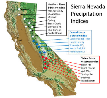
These stations are tracked because they provide important information about the state’s water supply (most of which originates from the Sierra Nevada Mountains). Data from the CDEC website appears to be updated at around 8:30am PST each day.
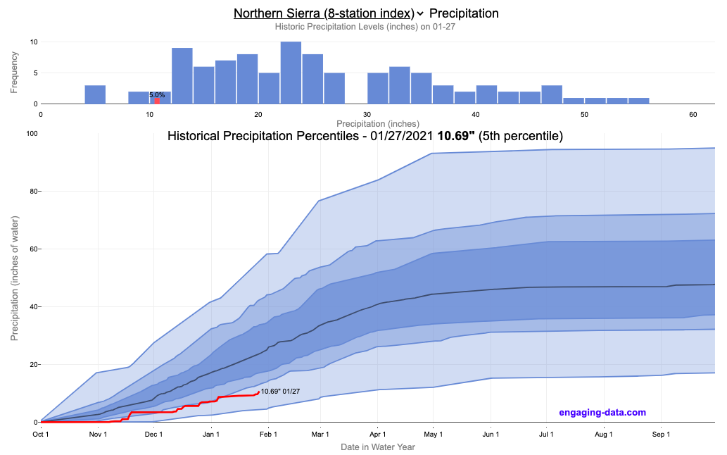
The visualization consists of two primary graphs both of which show the range of historical values for precipitation. The top graph is a histogram of water year precipitation totals on the specified date (in blue) as well as the precipitation total for the current water year in red.
The second graph shows the percentiles of precipitation over the course of the historical water year, spreading out like a cone from the start of the water year (October 1). You can see the current water year plotted on this to show how it compares to historical values. It also shows the present precipitation level and its percentile within the historical data for the day of the water year.
You can hover (or click) on the graph to audit the data a little more clearly.
Sources and Tools
Data is downloaded from the California Data Exchange Center website of the California Department of Water Resources using a python script. The data is processed in javascript and visualized here using HTML, CSS and javascript and the open source Plotly javascript graphing library.
California Snowpack Levels Visualization
How does the current California snowpack compare with Historical Averages?
If you are looking at this it’s probably winter in California and hopefully snowy in the mountains. In the winter, snow is one of the primary ways that water is stored in California and is on the same order of magnitude as the amount of water in reservoirs.
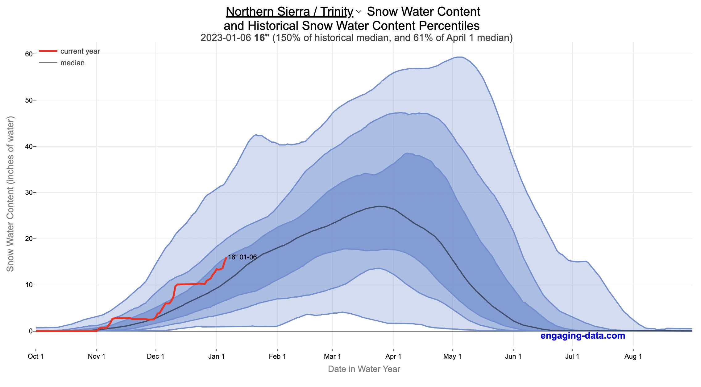
When I made this graph of California snowpack levels (Jan 2023) we’ve had quite a bit of rain and snow so far and so I wanted to visualize how this year compares with historical levels for this time of year. This graph will provide a constantly updated way to keep tabs on the water content in the Sierra snowpack.
Snow water content is just what it sounds like. It is an estimate of the water content of the snow. Since snow can have be relatively dry or moist, and can be fluffy or compacted, measuring snow depth is not as accurate as measuring the amount of water in the snow. There are multiple ways of measuring the water content of snow, including pads under the snow that measure the weight of the overlying snow, sensors that use sound waves and weighing snow cores.
I used data for California snow water content totals from the California Department of Water Resources. Other California water-related visualizations include reservoir levels in the state as well.
There are three sets of stations (and a state average) that are tracked in the data and these plots:
- Northern Sierra/Trinity – (32 snow sensors)
- Central Sierra – (57 snow sensors)
- Southern Sierra – (36 snow sensors)
- State-wide average – (125 snow sensors)
Here is a map showing these three regions.
These stations are tracked because they provide important information about the state’s water supply (most of which originates from the Sierra Nevada Mountains). Winter and spring snowpack forms an important reservoir of water storage for the state as this melting snow will eventually flow into the state’s rivers and reservoirs to serve domestic and agricultural water needs.
The visualization consists of a graph that shows the range of historical values for snow water content as a function of the day of the year. This range is split into percentiles of snow, spreading out like a cone from the start of the water year (October 1) ramping up to the peak in April and then converging back to zero in summertime. You can see the current water year plotted on this in red to show how it compares to historical values.
My numbers may differ slightly from the numbers reported on the state’s website. The historical percentiles that I calculated are from 1970 until 2022 while I notice the state’s average is between 1990 and 2020.
You can hover (or click) on the graph to audit the data a little more clearly.
Sources and Tools
Data is downloaded from the California Data Exchange Center website of the California Department of Water Resources using a python script. The data is processed in javascript and visualized here using HTML, CSS and javascript and the open source Plotly javascript graphing library.
California Rainfall Totals
How do current California rainfall and precipitation totals compare with Historical Averages?
If you are lookin at this visualization, it’s likely winter in California and that means the rainy season (snowy in the mountains). I wanted to visualize how the current year compares with historical levels for this time of year. I used data for California rainfall totals from the California Department of Water Resources. Other California water-related visualizations include reservoir levels in the state as well.
There are three sets of stations that are tracked in the data and these plots:
- Northern Sierra 8-station index
- Tulare Basin 6-station index
- San Joaquin 5-station index
These stations are tracked because they provide important information about the state’s water supply (most of which originates from the Sierra Nevada Mountains). Data from the CDEC website appears to be updated at around 8:30am PST each day.
The visualization consists of two primary graphs both of which show the range of historical values for precipitation. The top graph is a histogram of water year precipitation totals on the specified date (in blue) as well as the precipitation total for the current water year in red.
The second graph shows the percentiles of precipitation over the course of the historical water year, spreading out like a cone from the start of the water year (October 1). You can see the current water year plotted on this to show how it compares to historical values. It also shows the present precipitation level and its percentile within the historical data for the day of the water year.
You can hover (or click) on the graph to audit the data a little more clearly.
Sources and Tools
Data is downloaded from the California Data Exchange Center website of the California Department of Water Resources using a python script. The data is processed in javascript and visualized here using HTML, CSS and javascript and the open source Plotly javascript graphing library.
Recent Comments