Posts for Tag: graphics
University of California Admission Rates by Major

Which majors are most competitive across the University of California system?
The University of California consists of nine campuses with undergraduate programs and they are all ranked among the best universities in the US (according to US News). All nine rank within the top 45 public schools including #1 and #2 and top 85 national universities in the US.
This data visualization focuses on the acceptance rates for students based on their indicated preferred majors in their application to the various University of California campuses in the Fall of 2023 admissions cycle. When you apply to a given university campus, you need to specify a major and this choice can affect the student’s chances of getting accepted, especially if the major is very sought after. Subjects like computer science are very popular and as a result, the data shows that most campuses have a lower acceptance rate for computer science as compared to the university as a whole.
Data visualization
The graph shown in the data visualization is a marimekko graph which shows a percentage based bar graph showing the acceptance rate (in blue) for a given major at a given university. The height of each horizontal bar is proportional to the number of applicants to that major, so taller bars have more applicants vs bars that are shorter. If you hover over (or click on mobile) a bar, it provides more information about the acceptance rate, enrollment rate (i.e. yield rate) and the GPA of accepted students. You can choose to sort the graph by subject name, admit rate or number of applicants.
The data visualization can help you explore different campuses and major categories. If you are viewing “School View“, you can see how the various disciplines compare for a single university at one time. Whereas if you view “Subject View” you can see the comparison of a single discipline across the University campuses that offer those majors.
The University of California has over 240,000 undergraduate students and extends about 140,000 acceptances to fill out 42,000 slots for first year students. There is a significant amount of overlap as most students applying for admission apply to several campuses, and many students get accepted to multiple campuses.
The broad disciplines used in the visualization are composed of a number of individual majors and these are detailed in the table below.
GPA calculation
The University of California only considers grades from 10th grade and 11th grade for admissions decisions, and uses a weighted system where honors and AP classes are given an extra point in GPA calculations above the normal A=4, B=3, C=2, etc. . GPA calculation. So for an honors math class, for example, an A would be worth 5 points.
Sources and Tools:
Data comes directly from the University of California website for the fall of 2023, which has quite a bit of interesting data about students and admissions. I downloaded the data and processed it with python to organize it. The webtool is made using javascript, HTML and CSS and graphed using the open-source plotly graphing library.
Table of Disciplines to majors
This table lists the specific areas and majors that make up the broad disciplines shown in the data visualization.
Broad discipline
CIP Family Title
CIP Subfamily Title
Architecture
ARCHITECTURE AND RELATED SERVICES
Architecture.
Architecture
ARCHITECTURE AND RELATED SERVICES
City/Urban, Community, and Regional Planning.
Architecture
ARCHITECTURE AND RELATED SERVICES
Environmental Design.
Architecture
ARCHITECTURE AND RELATED SERVICES
Landscape Architecture.
Architecture
ARCHITECTURE AND RELATED SERVICES
Real Estate Development.
Arts & Humanities
FOREIGN LANGUAGES, LITERATURES, AND LINGUISTICS
Linguistic, Comparative, and Related Language Studies and Services.
Arts & Humanities
FOREIGN LANGUAGES, LITERATURES, AND LINGUISTICS
African Languages, Literatures, and Linguistics.
Arts & Humanities
FOREIGN LANGUAGES, LITERATURES, AND LINGUISTICS
East Asian Languages, Literatures, and Linguistics.
Arts & Humanities
FOREIGN LANGUAGES, LITERATURES, AND LINGUISTICS
Slavic, Baltic and Albanian Languages, Literatures, and Linguistics.
Arts & Humanities
FOREIGN LANGUAGES, LITERATURES, AND LINGUISTICS
Germanic Languages, Literatures, and Linguistics.
Arts & Humanities
FOREIGN LANGUAGES, LITERATURES, AND LINGUISTICS
Romance Languages, Literatures, and Linguistics.
Arts & Humanities
FOREIGN LANGUAGES, LITERATURES, AND LINGUISTICS
Middle/Near Eastern and Semitic Languages, Literatures, and Linguistics.
Arts & Humanities
FOREIGN LANGUAGES, LITERATURES, AND LINGUISTICS
Classics and Classical Languages, Literatures, and Linguistics.
Arts & Humanities
FOREIGN LANGUAGES, LITERATURES, AND LINGUISTICS
Celtic Languages, Literatures, and Linguistics.
Arts & Humanities
FOREIGN LANGUAGES, LITERATURES, AND LINGUISTICS
Foreign Languages, Literatures, and Linguistics, Other.
Arts & Humanities
ENGLISH LANGUAGE AND LITERATURE/LETTERS
English Language and Literature, General.
Arts & Humanities
ENGLISH LANGUAGE AND LITERATURE/LETTERS
Rhetoric and Composition/Writing Studies.
Arts & Humanities
ENGLISH LANGUAGE AND LITERATURE/LETTERS
Literature.
Arts & Humanities
ENGLISH LANGUAGE AND LITERATURE/LETTERS
English Language and Literature/Letters, Other.
Arts & Humanities
LIBERAL ARTS AND SCIENCES, GENERAL STUDIES AND HUMANITIES
Liberal Arts and Sciences, General Studies and Humanities.
Arts & Humanities
PHILOSOPHY AND RELIGIOUS STUDIES
Philosophy.
Arts & Humanities
PHILOSOPHY AND RELIGIOUS STUDIES
Religion/Religious Studies.
Arts & Humanities
VISUAL AND PERFORMING ARTS
Visual and Performing Arts, General.
Arts & Humanities
VISUAL AND PERFORMING ARTS
Dance.
Arts & Humanities
VISUAL AND PERFORMING ARTS
Design and Applied Arts.
Arts & Humanities
VISUAL AND PERFORMING ARTS
Drama/Theatre Arts and Stagecraft.
Arts & Humanities
VISUAL AND PERFORMING ARTS
Film/Video and Photographic Arts.
Arts & Humanities
VISUAL AND PERFORMING ARTS
Fine and Studio Arts.
Arts & Humanities
VISUAL AND PERFORMING ARTS
Music.
Arts & Humanities
VISUAL AND PERFORMING ARTS
Arts, Entertainment, and Media Management.
Arts & Humanities
VISUAL AND PERFORMING ARTS
Visual and Performing Arts, Other.
Arts & Humanities
HISTORY
History.
Broad discipline
CIP Family Title
CIP Subfamily Title
Business
BUSINESS, MANAGEMENT, MARKETING, AND RELATED SUPPORT SERVICES
Business Administration, Management and Operations.
Business
BUSINESS, MANAGEMENT, MARKETING, AND RELATED SUPPORT SERVICES
Business/Managerial Economics.
Business
BUSINESS, MANAGEMENT, MARKETING, AND RELATED SUPPORT SERVICES
Human Resources Management and Services.
Business
BUSINESS, MANAGEMENT, MARKETING, AND RELATED SUPPORT SERVICES
Management Information Systems and Services.
Business
BUSINESS, MANAGEMENT, MARKETING, AND RELATED SUPPORT SERVICES
Management Sciences and Quantitative Methods.
Computer Science
COMPUTER AND INFORMATION SCIENCES AND SUPPORT SERVICES
Computer and Information Sciences, General.
Computer Science
COMPUTER AND INFORMATION SCIENCES AND SUPPORT SERVICES
Computer Programming.
Computer Science
COMPUTER AND INFORMATION SCIENCES AND SUPPORT SERVICES
Information Science/Studies.
Computer Science
COMPUTER AND INFORMATION SCIENCES AND SUPPORT SERVICES
Computer Science.
Computer Science
COMPUTER AND INFORMATION SCIENCES AND SUPPORT SERVICES
Computer Software and Media Applications.
Computer Science
COMPUTER AND INFORMATION SCIENCES AND SUPPORT SERVICES
Computer/Information Technology Administration and Management.
Education
EDUCATION
Education, General.
Education
EDUCATION
Social and Philosophical Foundations of Education.
Education
EDUCATION
Special Education and Teaching.
Education
EDUCATION
Teacher Education and Professional Development, Specific Subject Areas.
Engineering
ENGINEERING
Engineering, General.
Engineering
ENGINEERING
Aerospace, Aeronautical, and Astronautical/Space Engineering.
Engineering
ENGINEERING
Agricultural Engineering.
Engineering
ENGINEERING
Biomedical/Medical Engineering.
Engineering
ENGINEERING
Chemical Engineering.
Engineering
ENGINEERING
Civil Engineering.
Engineering
ENGINEERING
Computer Engineering.
Engineering
ENGINEERING
Electrical, Electronics, and Communications Engineering.
Engineering
ENGINEERING
Engineering Physics.
Engineering
ENGINEERING
Engineering Science.
Engineering
ENGINEERING
Environmental/Environmental Health Engineering.
Engineering
ENGINEERING
Materials Engineering.
Engineering
ENGINEERING
Mechanical Engineering.
Engineering
ENGINEERING
Nuclear Engineering.
Engineering
ENGINEERING
Operations Research.
Engineering
ENGINEERING
Geological/Geophysical Engineering.
Engineering
ENGINEERING
Mechatronics, Robotics, and Automation Engineering.
Engineering
ENGINEERING
Biochemical Engineering.
Engineering
ENGINEERING
Biological/Biosystems Engineering.
Engineering
ENGINEERING
Engineering, Other.
Life Sciences
AGRICULTURAL/ ANIMAL/ PLANT/ VETERINARY SCIENCE AND RELATED FIELDS
Animal Sciences.
Life Sciences
AGRICULTURAL/ ANIMAL/ PLANT/ VETERINARY SCIENCE AND RELATED FIELDS
Food Science and Technology.
Life Sciences
AGRICULTURAL/ ANIMAL/ PLANT/ VETERINARY SCIENCE AND RELATED FIELDS
Plant Sciences.
Life Sciences
NATURAL RESOURCES AND CONSERVATION
Natural Resources Conservation and Research.
Life Sciences
NATURAL RESOURCES AND CONSERVATION
Forestry.
Life Sciences
NATURAL RESOURCES AND CONSERVATION
Wildlife and Wildlands Science and Management.
Life Sciences
NATURAL RESOURCES AND CONSERVATION
Natural Resources and Conservation, Other.
Life Sciences
BIOLOGICAL AND BIOMEDICAL SCIENCES
Biology, General.
Life Sciences
BIOLOGICAL AND BIOMEDICAL SCIENCES
Biochemistry, Biophysics and Molecular Biology.
Life Sciences
BIOLOGICAL AND BIOMEDICAL SCIENCES
Botany/Plant Biology.
Life Sciences
BIOLOGICAL AND BIOMEDICAL SCIENCES
Cell/Cellular Biology and Anatomical Sciences.
Life Sciences
BIOLOGICAL AND BIOMEDICAL SCIENCES
Microbiological Sciences and Immunology.
Life Sciences
BIOLOGICAL AND BIOMEDICAL SCIENCES
Zoology/Animal Biology.
Life Sciences
BIOLOGICAL AND BIOMEDICAL SCIENCES
Genetics.
Life Sciences
BIOLOGICAL AND BIOMEDICAL SCIENCES
Physiology, Pathology and Related Sciences.
Life Sciences
BIOLOGICAL AND BIOMEDICAL SCIENCES
Pharmacology and Toxicology.
Life Sciences
BIOLOGICAL AND BIOMEDICAL SCIENCES
Biomathematics, Bioinformatics, and Computational Biology.
Life Sciences
BIOLOGICAL AND BIOMEDICAL SCIENCES
Biotechnology.
Life Sciences
BIOLOGICAL AND BIOMEDICAL SCIENCES
Ecology, Evolution, Systematics, and Population Biology.
Life Sciences
BIOLOGICAL AND BIOMEDICAL SCIENCES
Neurobiology and Neurosciences.
Life Sciences
BIOLOGICAL AND BIOMEDICAL SCIENCES
Biological and Biomedical Sciences, Other.
Broad discipline
CIP Family Title
CIP Subfamily Title
Nursing
HEALTH PROFESSIONS AND RELATED PROGRAMS
Registered Nursing, Nursing Administration, Nursing Research and Clinical
Other Health Science
HEALTH PROFESSIONS AND RELATED PROGRAMS
Pharmacy, Pharmaceutical Sciences, and Administration.
Other Health Science
HEALTH PROFESSIONS AND RELATED PROGRAMS
Public Health.
Other/ Interdisciplinary
AGRICULTURAL/ ANIMAL/ PLANT/ VETERINARY SCIENCE AND RELATED FIELDS
Agricultural Business and Management.
Other/ Interdisciplinary
AGRICULTURAL/ ANIMAL/ PLANT/ VETERINARY SCIENCE AND RELATED FIELDS
Agricultural Production Operations.
Other/ Interdisciplinary
AGRICULTURAL/ ANIMAL/ PLANT/ VETERINARY SCIENCE AND RELATED FIELDS
International Agriculture.
Other/ Interdisciplinary
COMMUNICATION, JOURNALISM, AND RELATED PROGRAMS
Communication and Media Studies.
Other/ Interdisciplinary
COMMUNICATION, JOURNALISM, AND RELATED PROGRAMS
Journalism.
Other/ Interdisciplinary
LEGAL PROFESSIONS AND STUDIES
Non-Professional Legal Studies.
Other/ Interdisciplinary
MULTI/INTERDISCIPLINARY STUDIES
Peace Studies and Conflict Resolution.
Other/ Interdisciplinary
MULTI/INTERDISCIPLINARY STUDIES
Mathematics and Computer Science.
Other/ Interdisciplinary
MULTI/INTERDISCIPLINARY STUDIES
Medieval and Renaissance Studies.
Other/ Interdisciplinary
MULTI/INTERDISCIPLINARY STUDIES
Science, Technology and Society.
Other/ Interdisciplinary
MULTI/INTERDISCIPLINARY STUDIES
Nutrition Sciences.
Other/ Interdisciplinary
MULTI/INTERDISCIPLINARY STUDIES
International/Globalization Studies.
Other/ Interdisciplinary
MULTI/INTERDISCIPLINARY STUDIES
Classical and Ancient Studies.
Other/ Interdisciplinary
MULTI/INTERDISCIPLINARY STUDIES
Cognitive Science.
Other/ Interdisciplinary
MULTI/INTERDISCIPLINARY STUDIES
Human Biology.
Other/ Interdisciplinary
MULTI/INTERDISCIPLINARY STUDIES
Marine Sciences.
Other/ Interdisciplinary
MULTI/INTERDISCIPLINARY STUDIES
Sustainability Studies.
Other/ Interdisciplinary
MULTI/INTERDISCIPLINARY STUDIES
Geography and Environmental Studies.
Other/ Interdisciplinary
MULTI/INTERDISCIPLINARY STUDIES
Data Science.
Other/ Interdisciplinary
MULTI/INTERDISCIPLINARY STUDIES
Multi/Interdisciplinary Studies, Other.
Pharmacy
HEALTH PROFESSIONS AND RELATED PROGRAMS
Pharmacy, Pharmaceutical Sciences, and Administration.
Physical Sciences/Math
MATHEMATICS AND STATISTICS
Mathematics.
Physical Sciences/Math
MATHEMATICS AND STATISTICS
Applied Mathematics.
Physical Sciences/Math
MATHEMATICS AND STATISTICS
Statistics.
Physical Sciences/Math
PHYSICAL SCIENCES
Astronomy and Astrophysics.
Physical Sciences/Math
PHYSICAL SCIENCES
Atmospheric Sciences and Meteorology.
Physical Sciences/Math
PHYSICAL SCIENCES
Chemistry.
Physical Sciences/Math
PHYSICAL SCIENCES
Geological and Earth Sciences/Geosciences.
Physical Sciences/Math
PHYSICAL SCIENCES
Physics.
Physical Sciences/Math
PHYSICAL SCIENCES
Materials Sciences.
Physical Sciences/Math
PHYSICAL SCIENCES
Physical Sciences, Other.
Broad discipline
CIP Family Title
CIP Subfamily Title
Public Admin
PUBLIC ADMINISTRATION AND SOCIAL SERVICE PROFESSIONS
Community Organization and Advocacy.
Public Admin
PUBLIC ADMINISTRATION AND SOCIAL SERVICE PROFESSIONS
Public Administration.
Public Admin
PUBLIC ADMINISTRATION AND SOCIAL SERVICE PROFESSIONS
Public Policy Analysis.
Public Admin
PUBLIC ADMINISTRATION AND SOCIAL SERVICE PROFESSIONS
Social Work.
Public Admin
PUBLIC ADMINISTRATION AND SOCIAL SERVICE PROFESSIONS
Public Administration and Social Service Professions, Other.
Public Health
HEALTH PROFESSIONS AND RELATED PROGRAMS
Public Health.
Social Sciences
AGRICULTURAL/ANIMAL/ PLANT/VETERINARY SCIENCE AND RELATED FIELDS
Agricultural Business and Management.
Social Sciences
AREA, ETHNIC, CULTURAL, GENDER, AND GROUP STUDIES
Area Studies.
Social Sciences
AREA, ETHNIC, CULTURAL, GENDER, AND GROUP STUDIES
Ethnic, Cultural Minority, Gender, and Group Studies.
Social Sciences
AREA, ETHNIC, CULTURAL, GENDER, AND GROUP STUDIES
Area, Ethnic, Cultural, Gender, and Group Studies, Other.
Social Sciences
FAMILY AND CONSUMER SCIENCES/HUMAN SCIENCES
Human Development, Family Studies, and Related Services.
Social Sciences
FAMILY AND CONSUMER SCIENCES/HUMAN SCIENCES
Apparel and Textiles.
Social Sciences
PSYCHOLOGY
Psychology, General.
Social Sciences
PSYCHOLOGY
Research and Experimental Psychology.
Social Sciences
PSYCHOLOGY
Clinical, Counseling and Applied Psychology.
Social Sciences
PSYCHOLOGY
Psychology, Other.
Social Sciences
SOCIAL SCIENCES
Social Sciences, General.
Social Sciences
SOCIAL SCIENCES
Anthropology.
Social Sciences
SOCIAL SCIENCES
Archeology.
Social Sciences
SOCIAL SCIENCES
Criminology.
Social Sciences
SOCIAL SCIENCES
Economics.
Social Sciences
SOCIAL SCIENCES
Geography and Cartography.
Social Sciences
SOCIAL SCIENCES
International Relations and National Security Studies.
Social Sciences
SOCIAL SCIENCES
Political Science and Government.
Social Sciences
SOCIAL SCIENCES
Sociology.
Social Sciences
SOCIAL SCIENCES
Urban Studies/Affairs.
Social Sciences
SOCIAL SCIENCES
Social Sciences, Other.

NYT Digits Solver
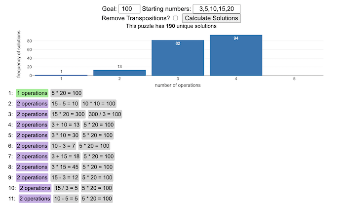
You can play new daily Digits puzzles
Calculate the solution to any digits puzzle
This tool lets you view all of the potential solutions to a Digits puzzle. Enter the goal number and the five starting numbers separated by a comma like “1,2,3,4,5” and hit the “Calculate Solutions” button to see all of the possible solutions to the puzzle. The list is likely quite long so you’ll probably need to scroll through all of the solutions in the list.
There is also a checkbox that lets you remove transpositions, which are operations that occur in different orders but the same set of operations are used to achieve the final number. For example, where the first two operations appear in reverse order and then are added together in the 3rd operation to hit the target.
e.g. these two solutions are an example of a transposition.
5 + 10 = 15 15 / 3 = 5 5 * 20 = 100
vs
15 / 3 = 5 5 + 10 = 15 5 * 20 = 100
Tools
A version of the solution code is written in Python code and is used to generate the puzzles. This code is re-written in javascript so it is solved inside the browser and the visuals are made with javascript, CSS and HTML and the graphs are made using the open source Plotly javascript graphing library.

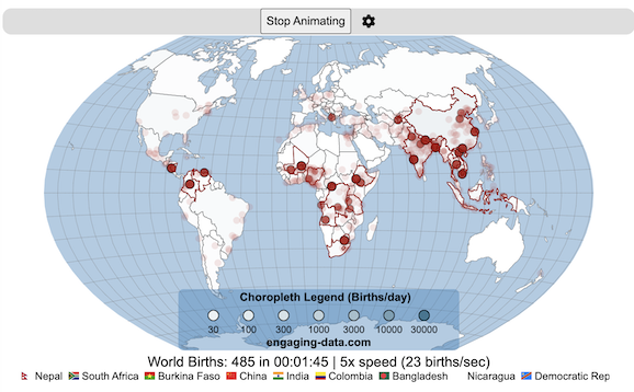
Global Birth Map

Where in the world are babies being born and how fast?
This interactive, animated map shows the where births are happening across the globe. It doesn’t actually show births in real-time, because data isn’t actually available to do that. However, the map does show the frequency of births that are occurring in different locations across the world. And you can see it in two ways, by country and also geo-referenced to specific locations (along a 1degree grid across the globe). There are many different ways to view this global birth map and these options are laid out in the controls at the top of the map. The scrolling list across the bottom also shows the country of each of the dots on the map.
Instructions
- Speed – change the slider to change the rate at which births show up on the map from real-speed to 25x faster
- Map projection – change the map projection
- Highlight country – an outline around the country when a birth occurs
- Choropleth – Build – as each birth occurs, the background color of the country will slowly change to reflect the number of births in the country
- Choropleth – Show – this option colors all the countries to show the number of births per day that occur in the country
- Dots – Show – this is the main feature that shows where each birth is occurring at the frequency that it does occur.
- Dots – Persist – this feature shows where previous births have occurred and the dots get darker as more births happen in that location.
If you hover (or click on mobile) on a country during the animation, it will display how many births have occurred since the animation stared.
Population distribution data combined with country birthrates
I used data that divided and aggregated the world’s population into 1 degree grid spacing across the globe and I assigned the center of each of these grid locations to a country. Then the country’s annual births (i.e. the country’s population times its birthrate) were distributed across all of the populated locations in each country, weighted by the population distribution (i.e. more populated areas got a greater fraction of the births).
Data Sources and Tools
Population and birthrate data for 2023 was obtained from Wikipedia (Population and birth rates). Population distribution across the globe was obtained from Socioeconomic Data and Applications Center (sedac) at Columbia University.
I used python to process country, population distribution data and parse the data into the probability of a birth at each 1 degree x 1 degree location. Then I used javascript to make random draws and predict the number of births for each map location. D3.js was used to create the map elements and html, css and javascript were used to create the user interface.
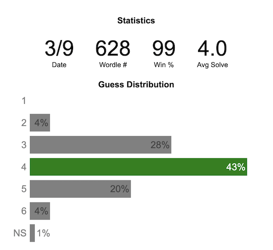
Wordle Stats – How Hard is Today’s Wordle?

Update: Added a histogram below main graph to view the difficulty of today’s puzzle in context of historical data (compared to a number of previous puzzles)
What is today’s Wordle difficulty?
NY Times’ Wordle is a game of highs and lows. Sometimes your guesses are lucky (I mean, highly skilled) and you can solve the puzzle easily and sometimes you barely get it in 6 guesses. When the latter happens, sometimes you want validation that that day’s puzzle was hard. This dataviz lets you see how difficult today’s wordle puzzle was for other NY Times Wordle players did.
The graph shows the distribution of guesses needed to solve today’s Wordle puzzle, rounded to the nearest whole percent. It also colors the most common number of guesses to solve the puzzle in green and calculates the average number of guesses. “NS” stands for Not Solved. The lower histogram provides some context for how difficult the day’s puzzle is compared to many other puzzles in the past based on average number of guesses needed to solve the puzzle. It doesn’t include the entire history of wordle, but a subset of days that I was able to gather data on.
Even over 1 year later, I still enjoy playing Wordle. I even made a few Wordle games myself – Wordguessr – Tridle – Scrabwordle. I’ve been enjoying the Wordlebot which does a daily analysis of your game. I especially enjoy how it indicates how “lucky” your guesses were and how they eliminated possible answers until you arrive at the puzzle solution. One thing it also provides is data on the frequency of guesses that are made which provides information on the number of guesses it took to solve each puzzle.
Instructions
Click on the eye to get the answer to the day’s puzzle.
Select “Hard Mode” from the dropdown menu in order to see the statistics for hard mode
Data and Tools
The data comes from playing NY Times Wordle game and using their Wordlebot. Python is used to extract the data and wrangle the data into a clean format. Visualization was done in javascript and specifically the plotly visualization library.
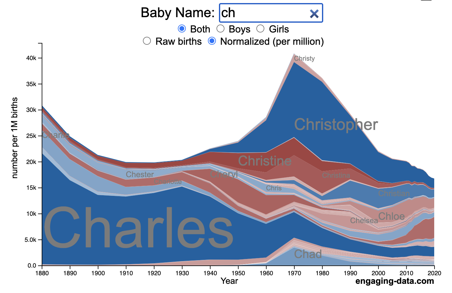
US Baby Name Popularity Visualizer

I added a share button (arrow button) that lets you send a graph with specific name. It copies a custom URL to your clipboard which you can paste into a message/tweet/email.
How popular is your name in US history?
Use this visualization to explore statistics about names, specifically the popularity of different names throughout US history (1880 until 2020). This is a useful tool for seeing the rise (and fall) of popularity of names. Look at names that we think of as old-fashioned, and names that are more modern.
Instructions
- Start typing a name into the input box above and the visualization will show all the names that begin with those letters. The graph will show the historical popularity of all these names as an area graph.
- You can hover (or click on mobile) to bring up a tooltip (popup) that shows you the exact number of births with that name for different years (or decades) and the names rank in that time period.
- It’s best used on computer (rather than a mobile or tablet device) so you can see the graph more clearly and also, if you click on a name wedge, it will zoom into names that begin with those letters.
- You can select different views, Boy names, Girl names or both, as well as looking at the raw number of births or a normalized popularity that accounts for the differential number of births throughout the period between 1880 and 2020.
- If you click the share (arrow) button, it will copy the parameters of the current graph you are looking at and create a custom URL to share with others. It copes the link into your clipboard and your browser’s address (URL) bar.
Isn’t there something out there like this already? Baby Name Wizard and Baby Name Voyager
This visualization is not my original idea, but rather a re-creation of the Baby Name Voyager (from the Baby Name Wizard website) created by Laura Wattenberg. The original visualization disappeared (for some unknown reason) from the web, and I thought it was a shame that we should be deprived of such a fun resource.
It started about a week ago, when I saw on twitter that the Baby Name Wizard website was gone. Here’s the blog post from Laura. I hadn’t used it in probably a decade, but it flashed me back to many years ago well before I got into web programming and dataviz and I remember seeing the Baby Name Voyager and thinking how amazing it was that someone could even make such a thing. Everyone I knew played with it quite a bit when it first came out. It got me thinking that it should still be around and that I could probably make it now with my programming skills and how cool that would be.
So I downloaded the frequency data for Baby Names from the US Social Security Administration and set to work trying to create a stacked area graph of baby names vs time. I started with my go to library for fast dataviz (Plotly.js) but eventually ended up creating the visualization in d3.js which is harder for me, but made it very responsive. I’m not an expert in d3, but know enough that using some similar examples and with lots of googling and stack overflow, I could create what I wanted.
I emailed Laura after creating a sample version, just to make sure it was okay to re-create it as a tribute to the Baby Name Wizard / Voyager and got the okay from her.
Where does the data come from?
Some info about Data (from SSA Baby Names Website):
All names are from Social Security card applications for births that occurred in the United States after 1879. Note that many people born before 1937 never applied for a Social Security card, so their names are not included in our data.
Name data are tabulated from the “First Name” field of the Social Security Card Application. Hyphens and spaces are removed, thus Julie-Anne, Julie Anne, and Julieanne will be counted as a single entry.
Name data are not edited. For example, the sex associated with a name may be incorrect.
Different spellings of similar names are not combined. For example, the names Caitlin, Caitlyn, Kaitlin, Kaitlyn, Kaitlynn, Katelyn, and Katelynn are considered separate names and each has its own rank.
All data are from a 100% sample of our records on Social Security card applications as of March 2021.
I did notice that there was a significant under-representation of male names in the early data (before 1910) relative to female names. In the normalized data, I set the data for each sex to 500,000 male and 500,000 female births per million total births, instead of the actual data which shows approximately double the number of female names than male names. Not sure why females would have higher rates of social security applications in the early 20th century. Update: A helpful Redditor pointed me to this blog post which explains some of the wonkiness of the early data. The gist of it is that Social Security cards and numbers weren’t really a thing until 1935. Thus the names of births in 1880 are actually 55 year olds who applied for Social Security numbers and since they weren’t mandatory, they don’t include everyone. My correction basically makes the assumption that this data is actually a survey and we got uneven samples from males and female respondents. It’s not perfect (like the later data) but it’s a decent representation of name distribution.
Sources and Tools:
The biggest source of inspiration was of course, Laura Wattenberg’s original Baby Name Explorer.
I downloaded the baby names from the Social Security website. Thanks to Michael W. Shackleford at the SSA for starting their name data reporting. I used a python script to parse and organize the historical data into the proper format my javascript. The visualization is created using HTML, CSS and Javascript code (and the d3.js visualization library) to create interactivity and UI. Curran Kelleher’s area label d3 javascript library was a huge help for adding the names to the graph.
Compound Interest and Stock Returns Calculator
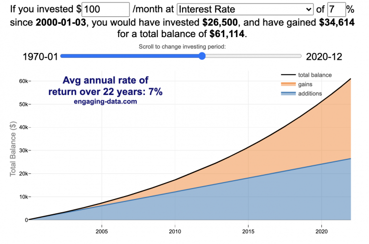
Calculate returns on regular, periodic investments
This calculator lets you visualize the value of investing regularly. It lets you calculate the compounding from a simple interest rate or looking at specific returns from the stock market indexes or a few different individual stocks.
Instructions
- Enter the amount of money to be invested monthly
- Choose to use an interest rate (and enter a specific rate) or
- Choose a stock market index or individual stock
- Use the slider to change the initial starting date of your periodic investments – You can go as far back as 1970 or the IPO date of the stock if it is later than that.
- Use the “Generate URL to Share” button to create a special URL with the specific parameters of your choice to share with others – the URL will appear in your browser’s address bar.
You can hover over the graph to see the split between the money you invested and the gains from the investment. In most cases (unless returns are very high), initially the investments are the large majority of the total balance, but over time the gains compound and eventually, it is those gains rather than the initial investments that become the majority of the total.
Some of the tech stocks included in the dropdown list have very high annualized returns and thus the gains quickly overtake the additions as the dominant component of the balance and you can make a great deal of money fairly quickly.
It becomes clearer as you move the slider around, that longer investing time periods are the key to increasing your balance, so building financial prosperity through investing is generally more of a marathon and not really a sprint. However, if you invest in individual stocks and pick a good one, you can speed up that process, though it’s not necessarily the most advisable way to proceed. Lots of people underperform the market (i.e. index funds) or even lose money by trying to pick big winners.
Understanding the Calculations
Calculating compound returns is relatively easy and is just a matter of consecutively multiplying the return. If the return is 7% for 5 years, that is equal to multiplying 1.07 five times, i.e. 1.075 = 1.402 (or a 40.2% gain).
In this case, we are adding additional investments each month but the idea is the same. Take the amount of money (or value of shares) and multiply by the return (>1 if positive or <1 for negative returns) after each period of the analysis.
Sources and Tools:
Stock and index monthly data is downloaded from Yahoo! finance is downloaded regularly using a python script.
The graph is created using the open-source Plotly javascript visualization library, as well as HTML, CSS and Javascript code to create interactivity and UI.

University of California Admission Rates by Major
Which majors are most competitive across the University of California system?
The University of California consists of nine campuses with undergraduate programs and they are all ranked among the best universities in the US (according to US News). All nine rank within the top 45 public schools including #1 and #2 and top 85 national universities in the US.
This data visualization focuses on the acceptance rates for students based on their indicated preferred majors in their application to the various University of California campuses in the Fall of 2023 admissions cycle. When you apply to a given university campus, you need to specify a major and this choice can affect the student’s chances of getting accepted, especially if the major is very sought after. Subjects like computer science are very popular and as a result, the data shows that most campuses have a lower acceptance rate for computer science as compared to the university as a whole.
Data visualization
The graph shown in the data visualization is a marimekko graph which shows a percentage based bar graph showing the acceptance rate (in blue) for a given major at a given university. The height of each horizontal bar is proportional to the number of applicants to that major, so taller bars have more applicants vs bars that are shorter. If you hover over (or click on mobile) a bar, it provides more information about the acceptance rate, enrollment rate (i.e. yield rate) and the GPA of accepted students. You can choose to sort the graph by subject name, admit rate or number of applicants.
The data visualization can help you explore different campuses and major categories. If you are viewing “School View“, you can see how the various disciplines compare for a single university at one time. Whereas if you view “Subject View” you can see the comparison of a single discipline across the University campuses that offer those majors.
The University of California has over 240,000 undergraduate students and extends about 140,000 acceptances to fill out 42,000 slots for first year students. There is a significant amount of overlap as most students applying for admission apply to several campuses, and many students get accepted to multiple campuses.
The broad disciplines used in the visualization are composed of a number of individual majors and these are detailed in the table below.
GPA calculation
The University of California only considers grades from 10th grade and 11th grade for admissions decisions, and uses a weighted system where honors and AP classes are given an extra point in GPA calculations above the normal A=4, B=3, C=2, etc. . GPA calculation. So for an honors math class, for example, an A would be worth 5 points.
Sources and Tools:
Data comes directly from the University of California website for the fall of 2023, which has quite a bit of interesting data about students and admissions. I downloaded the data and processed it with python to organize it. The webtool is made using javascript, HTML and CSS and graphed using the open-source plotly graphing library.
Table of Disciplines to majors
This table lists the specific areas and majors that make up the broad disciplines shown in the data visualization.
| Broad discipline | CIP Family Title | CIP Subfamily Title |
|---|---|---|
| Architecture | ARCHITECTURE AND RELATED SERVICES | Architecture. |
| Architecture | ARCHITECTURE AND RELATED SERVICES | City/Urban, Community, and Regional Planning. |
| Architecture | ARCHITECTURE AND RELATED SERVICES | Environmental Design. |
| Architecture | ARCHITECTURE AND RELATED SERVICES | Landscape Architecture. |
| Architecture | ARCHITECTURE AND RELATED SERVICES | Real Estate Development. |
| Arts & Humanities | FOREIGN LANGUAGES, LITERATURES, AND LINGUISTICS | Linguistic, Comparative, and Related Language Studies and Services. |
| Arts & Humanities | FOREIGN LANGUAGES, LITERATURES, AND LINGUISTICS | African Languages, Literatures, and Linguistics. |
| Arts & Humanities | FOREIGN LANGUAGES, LITERATURES, AND LINGUISTICS | East Asian Languages, Literatures, and Linguistics. |
| Arts & Humanities | FOREIGN LANGUAGES, LITERATURES, AND LINGUISTICS | Slavic, Baltic and Albanian Languages, Literatures, and Linguistics. |
| Arts & Humanities | FOREIGN LANGUAGES, LITERATURES, AND LINGUISTICS | Germanic Languages, Literatures, and Linguistics. |
| Arts & Humanities | FOREIGN LANGUAGES, LITERATURES, AND LINGUISTICS | Romance Languages, Literatures, and Linguistics. |
| Arts & Humanities | FOREIGN LANGUAGES, LITERATURES, AND LINGUISTICS | Middle/Near Eastern and Semitic Languages, Literatures, and Linguistics. |
| Arts & Humanities | FOREIGN LANGUAGES, LITERATURES, AND LINGUISTICS | Classics and Classical Languages, Literatures, and Linguistics. |
| Arts & Humanities | FOREIGN LANGUAGES, LITERATURES, AND LINGUISTICS | Celtic Languages, Literatures, and Linguistics. |
| Arts & Humanities | FOREIGN LANGUAGES, LITERATURES, AND LINGUISTICS | Foreign Languages, Literatures, and Linguistics, Other. |
| Arts & Humanities | ENGLISH LANGUAGE AND LITERATURE/LETTERS | English Language and Literature, General. |
| Arts & Humanities | ENGLISH LANGUAGE AND LITERATURE/LETTERS | Rhetoric and Composition/Writing Studies. |
| Arts & Humanities | ENGLISH LANGUAGE AND LITERATURE/LETTERS | Literature. |
| Arts & Humanities | ENGLISH LANGUAGE AND LITERATURE/LETTERS | English Language and Literature/Letters, Other. |
| Arts & Humanities | LIBERAL ARTS AND SCIENCES, GENERAL STUDIES AND HUMANITIES | Liberal Arts and Sciences, General Studies and Humanities. |
| Arts & Humanities | PHILOSOPHY AND RELIGIOUS STUDIES | Philosophy. |
| Arts & Humanities | PHILOSOPHY AND RELIGIOUS STUDIES | Religion/Religious Studies. |
| Arts & Humanities | VISUAL AND PERFORMING ARTS | Visual and Performing Arts, General. |
| Arts & Humanities | VISUAL AND PERFORMING ARTS | Dance. |
| Arts & Humanities | VISUAL AND PERFORMING ARTS | Design and Applied Arts. |
| Arts & Humanities | VISUAL AND PERFORMING ARTS | Drama/Theatre Arts and Stagecraft. |
| Arts & Humanities | VISUAL AND PERFORMING ARTS | Film/Video and Photographic Arts. |
| Arts & Humanities | VISUAL AND PERFORMING ARTS | Fine and Studio Arts. |
| Arts & Humanities | VISUAL AND PERFORMING ARTS | Music. |
| Arts & Humanities | VISUAL AND PERFORMING ARTS | Arts, Entertainment, and Media Management. |
| Arts & Humanities | VISUAL AND PERFORMING ARTS | Visual and Performing Arts, Other. |
| Arts & Humanities | HISTORY | History. |
| Broad discipline | CIP Family Title | CIP Subfamily Title |
|---|---|---|
| Business | BUSINESS, MANAGEMENT, MARKETING, AND RELATED SUPPORT SERVICES | Business Administration, Management and Operations. |
| Business | BUSINESS, MANAGEMENT, MARKETING, AND RELATED SUPPORT SERVICES | Business/Managerial Economics. |
| Business | BUSINESS, MANAGEMENT, MARKETING, AND RELATED SUPPORT SERVICES | Human Resources Management and Services. |
| Business | BUSINESS, MANAGEMENT, MARKETING, AND RELATED SUPPORT SERVICES | Management Information Systems and Services. |
| Business | BUSINESS, MANAGEMENT, MARKETING, AND RELATED SUPPORT SERVICES | Management Sciences and Quantitative Methods. |
| Computer Science | COMPUTER AND INFORMATION SCIENCES AND SUPPORT SERVICES | Computer and Information Sciences, General. |
| Computer Science | COMPUTER AND INFORMATION SCIENCES AND SUPPORT SERVICES | Computer Programming. |
| Computer Science | COMPUTER AND INFORMATION SCIENCES AND SUPPORT SERVICES | Information Science/Studies. |
| Computer Science | COMPUTER AND INFORMATION SCIENCES AND SUPPORT SERVICES | Computer Science. |
| Computer Science | COMPUTER AND INFORMATION SCIENCES AND SUPPORT SERVICES | Computer Software and Media Applications. |
| Computer Science | COMPUTER AND INFORMATION SCIENCES AND SUPPORT SERVICES | Computer/Information Technology Administration and Management. |
| Education | EDUCATION | Education, General. |
| Education | EDUCATION | Social and Philosophical Foundations of Education. |
| Education | EDUCATION | Special Education and Teaching. |
| Education | EDUCATION | Teacher Education and Professional Development, Specific Subject Areas. |
| Engineering | ENGINEERING | Engineering, General. |
| Engineering | ENGINEERING | Aerospace, Aeronautical, and Astronautical/Space Engineering. |
| Engineering | ENGINEERING | Agricultural Engineering. |
| Engineering | ENGINEERING | Biomedical/Medical Engineering. |
| Engineering | ENGINEERING | Chemical Engineering. |
| Engineering | ENGINEERING | Civil Engineering. |
| Engineering | ENGINEERING | Computer Engineering. |
| Engineering | ENGINEERING | Electrical, Electronics, and Communications Engineering. |
| Engineering | ENGINEERING | Engineering Physics. |
| Engineering | ENGINEERING | Engineering Science. |
| Engineering | ENGINEERING | Environmental/Environmental Health Engineering. |
| Engineering | ENGINEERING | Materials Engineering. |
| Engineering | ENGINEERING | Mechanical Engineering. |
| Engineering | ENGINEERING | Nuclear Engineering. |
| Engineering | ENGINEERING | Operations Research. |
| Engineering | ENGINEERING | Geological/Geophysical Engineering. |
| Engineering | ENGINEERING | Mechatronics, Robotics, and Automation Engineering. |
| Engineering | ENGINEERING | Biochemical Engineering. |
| Engineering | ENGINEERING | Biological/Biosystems Engineering. |
| Engineering | ENGINEERING | Engineering, Other. |
| Life Sciences | AGRICULTURAL/ ANIMAL/ PLANT/ VETERINARY SCIENCE AND RELATED FIELDS | Animal Sciences. |
| Life Sciences | AGRICULTURAL/ ANIMAL/ PLANT/ VETERINARY SCIENCE AND RELATED FIELDS | Food Science and Technology. |
| Life Sciences | AGRICULTURAL/ ANIMAL/ PLANT/ VETERINARY SCIENCE AND RELATED FIELDS | Plant Sciences. |
| Life Sciences | NATURAL RESOURCES AND CONSERVATION | Natural Resources Conservation and Research. |
| Life Sciences | NATURAL RESOURCES AND CONSERVATION | Forestry. |
| Life Sciences | NATURAL RESOURCES AND CONSERVATION | Wildlife and Wildlands Science and Management. |
| Life Sciences | NATURAL RESOURCES AND CONSERVATION | Natural Resources and Conservation, Other. |
| Life Sciences | BIOLOGICAL AND BIOMEDICAL SCIENCES | Biology, General. |
| Life Sciences | BIOLOGICAL AND BIOMEDICAL SCIENCES | Biochemistry, Biophysics and Molecular Biology. |
| Life Sciences | BIOLOGICAL AND BIOMEDICAL SCIENCES | Botany/Plant Biology. |
| Life Sciences | BIOLOGICAL AND BIOMEDICAL SCIENCES | Cell/Cellular Biology and Anatomical Sciences. |
| Life Sciences | BIOLOGICAL AND BIOMEDICAL SCIENCES | Microbiological Sciences and Immunology. |
| Life Sciences | BIOLOGICAL AND BIOMEDICAL SCIENCES | Zoology/Animal Biology. |
| Life Sciences | BIOLOGICAL AND BIOMEDICAL SCIENCES | Genetics. |
| Life Sciences | BIOLOGICAL AND BIOMEDICAL SCIENCES | Physiology, Pathology and Related Sciences. |
| Life Sciences | BIOLOGICAL AND BIOMEDICAL SCIENCES | Pharmacology and Toxicology. |
| Life Sciences | BIOLOGICAL AND BIOMEDICAL SCIENCES | Biomathematics, Bioinformatics, and Computational Biology. |
| Life Sciences | BIOLOGICAL AND BIOMEDICAL SCIENCES | Biotechnology. |
| Life Sciences | BIOLOGICAL AND BIOMEDICAL SCIENCES | Ecology, Evolution, Systematics, and Population Biology. |
| Life Sciences | BIOLOGICAL AND BIOMEDICAL SCIENCES | Neurobiology and Neurosciences. |
| Life Sciences | BIOLOGICAL AND BIOMEDICAL SCIENCES | Biological and Biomedical Sciences, Other. |
| Broad discipline | CIP Family Title | CIP Subfamily Title |
|---|---|---|
| Nursing | HEALTH PROFESSIONS AND RELATED PROGRAMS | Registered Nursing, Nursing Administration, Nursing Research and Clinical |
| Other Health Science | HEALTH PROFESSIONS AND RELATED PROGRAMS | Pharmacy, Pharmaceutical Sciences, and Administration. |
| Other Health Science | HEALTH PROFESSIONS AND RELATED PROGRAMS | Public Health. |
| Other/ Interdisciplinary | AGRICULTURAL/ ANIMAL/ PLANT/ VETERINARY SCIENCE AND RELATED FIELDS | Agricultural Business and Management. |
| Other/ Interdisciplinary | AGRICULTURAL/ ANIMAL/ PLANT/ VETERINARY SCIENCE AND RELATED FIELDS | Agricultural Production Operations. |
| Other/ Interdisciplinary | AGRICULTURAL/ ANIMAL/ PLANT/ VETERINARY SCIENCE AND RELATED FIELDS | International Agriculture. |
| Other/ Interdisciplinary | COMMUNICATION, JOURNALISM, AND RELATED PROGRAMS | Communication and Media Studies. |
| Other/ Interdisciplinary | COMMUNICATION, JOURNALISM, AND RELATED PROGRAMS | Journalism. |
| Other/ Interdisciplinary | LEGAL PROFESSIONS AND STUDIES | Non-Professional Legal Studies. |
| Other/ Interdisciplinary | MULTI/INTERDISCIPLINARY STUDIES | Peace Studies and Conflict Resolution. |
| Other/ Interdisciplinary | MULTI/INTERDISCIPLINARY STUDIES | Mathematics and Computer Science. |
| Other/ Interdisciplinary | MULTI/INTERDISCIPLINARY STUDIES | Medieval and Renaissance Studies. |
| Other/ Interdisciplinary | MULTI/INTERDISCIPLINARY STUDIES | Science, Technology and Society. |
| Other/ Interdisciplinary | MULTI/INTERDISCIPLINARY STUDIES | Nutrition Sciences. |
| Other/ Interdisciplinary | MULTI/INTERDISCIPLINARY STUDIES | International/Globalization Studies. |
| Other/ Interdisciplinary | MULTI/INTERDISCIPLINARY STUDIES | Classical and Ancient Studies. |
| Other/ Interdisciplinary | MULTI/INTERDISCIPLINARY STUDIES | Cognitive Science. |
| Other/ Interdisciplinary | MULTI/INTERDISCIPLINARY STUDIES | Human Biology. |
| Other/ Interdisciplinary | MULTI/INTERDISCIPLINARY STUDIES | Marine Sciences. |
| Other/ Interdisciplinary | MULTI/INTERDISCIPLINARY STUDIES | Sustainability Studies. |
| Other/ Interdisciplinary | MULTI/INTERDISCIPLINARY STUDIES | Geography and Environmental Studies. |
| Other/ Interdisciplinary | MULTI/INTERDISCIPLINARY STUDIES | Data Science. |
| Other/ Interdisciplinary | MULTI/INTERDISCIPLINARY STUDIES | Multi/Interdisciplinary Studies, Other. |
| Pharmacy | HEALTH PROFESSIONS AND RELATED PROGRAMS | Pharmacy, Pharmaceutical Sciences, and Administration. |
| Physical Sciences/Math | MATHEMATICS AND STATISTICS | Mathematics. |
| Physical Sciences/Math | MATHEMATICS AND STATISTICS | Applied Mathematics. |
| Physical Sciences/Math | MATHEMATICS AND STATISTICS | Statistics. |
| Physical Sciences/Math | PHYSICAL SCIENCES | Astronomy and Astrophysics. |
| Physical Sciences/Math | PHYSICAL SCIENCES | Atmospheric Sciences and Meteorology. |
| Physical Sciences/Math | PHYSICAL SCIENCES | Chemistry. |
| Physical Sciences/Math | PHYSICAL SCIENCES | Geological and Earth Sciences/Geosciences. |
| Physical Sciences/Math | PHYSICAL SCIENCES | Physics. |
| Physical Sciences/Math | PHYSICAL SCIENCES | Materials Sciences. |
| Physical Sciences/Math | PHYSICAL SCIENCES | Physical Sciences, Other. |
| Broad discipline | CIP Family Title | CIP Subfamily Title |
|---|---|---|
| Public Admin | PUBLIC ADMINISTRATION AND SOCIAL SERVICE PROFESSIONS | Community Organization and Advocacy. |
| Public Admin | PUBLIC ADMINISTRATION AND SOCIAL SERVICE PROFESSIONS | Public Administration. |
| Public Admin | PUBLIC ADMINISTRATION AND SOCIAL SERVICE PROFESSIONS | Public Policy Analysis. |
| Public Admin | PUBLIC ADMINISTRATION AND SOCIAL SERVICE PROFESSIONS | Social Work. |
| Public Admin | PUBLIC ADMINISTRATION AND SOCIAL SERVICE PROFESSIONS | Public Administration and Social Service Professions, Other. |
| Public Health | HEALTH PROFESSIONS AND RELATED PROGRAMS | Public Health. |
| Social Sciences | AGRICULTURAL/ANIMAL/ PLANT/VETERINARY SCIENCE AND RELATED FIELDS | Agricultural Business and Management. |
| Social Sciences | AREA, ETHNIC, CULTURAL, GENDER, AND GROUP STUDIES | Area Studies. |
| Social Sciences | AREA, ETHNIC, CULTURAL, GENDER, AND GROUP STUDIES | Ethnic, Cultural Minority, Gender, and Group Studies. |
| Social Sciences | AREA, ETHNIC, CULTURAL, GENDER, AND GROUP STUDIES | Area, Ethnic, Cultural, Gender, and Group Studies, Other. |
| Social Sciences | FAMILY AND CONSUMER SCIENCES/HUMAN SCIENCES | Human Development, Family Studies, and Related Services. |
| Social Sciences | FAMILY AND CONSUMER SCIENCES/HUMAN SCIENCES | Apparel and Textiles. |
| Social Sciences | PSYCHOLOGY | Psychology, General. |
| Social Sciences | PSYCHOLOGY | Research and Experimental Psychology. |
| Social Sciences | PSYCHOLOGY | Clinical, Counseling and Applied Psychology. |
| Social Sciences | PSYCHOLOGY | Psychology, Other. |
| Social Sciences | SOCIAL SCIENCES | Social Sciences, General. |
| Social Sciences | SOCIAL SCIENCES | Anthropology. |
| Social Sciences | SOCIAL SCIENCES | Archeology. |
| Social Sciences | SOCIAL SCIENCES | Criminology. |
| Social Sciences | SOCIAL SCIENCES | Economics. |
| Social Sciences | SOCIAL SCIENCES | Geography and Cartography. |
| Social Sciences | SOCIAL SCIENCES | International Relations and National Security Studies. |
| Social Sciences | SOCIAL SCIENCES | Political Science and Government. |
| Social Sciences | SOCIAL SCIENCES | Sociology. |
| Social Sciences | SOCIAL SCIENCES | Urban Studies/Affairs. |
| Social Sciences | SOCIAL SCIENCES | Social Sciences, Other. |
NYT Digits Solver
You can play new daily Digits puzzles
Calculate the solution to any digits puzzle
This tool lets you view all of the potential solutions to a Digits puzzle. Enter the goal number and the five starting numbers separated by a comma like “1,2,3,4,5” and hit the “Calculate Solutions” button to see all of the possible solutions to the puzzle. The list is likely quite long so you’ll probably need to scroll through all of the solutions in the list.
There is also a checkbox that lets you remove transpositions, which are operations that occur in different orders but the same set of operations are used to achieve the final number. For example, where the first two operations appear in reverse order and then are added together in the 3rd operation to hit the target.
e.g. these two solutions are an example of a transposition.
5 + 10 = 15 15 / 3 = 5 5 * 20 = 100
vs
15 / 3 = 5 5 + 10 = 15 5 * 20 = 100
Tools
A version of the solution code is written in Python code and is used to generate the puzzles. This code is re-written in javascript so it is solved inside the browser and the visuals are made with javascript, CSS and HTML and the graphs are made using the open source Plotly javascript graphing library.
Global Birth Map
Where in the world are babies being born and how fast?
This interactive, animated map shows the where births are happening across the globe. It doesn’t actually show births in real-time, because data isn’t actually available to do that. However, the map does show the frequency of births that are occurring in different locations across the world. And you can see it in two ways, by country and also geo-referenced to specific locations (along a 1degree grid across the globe). There are many different ways to view this global birth map and these options are laid out in the controls at the top of the map. The scrolling list across the bottom also shows the country of each of the dots on the map.
Instructions
- Speed – change the slider to change the rate at which births show up on the map from real-speed to 25x faster
- Map projection – change the map projection
- Highlight country – an outline around the country when a birth occurs
- Choropleth – Build – as each birth occurs, the background color of the country will slowly change to reflect the number of births in the country
- Choropleth – Show – this option colors all the countries to show the number of births per day that occur in the country
- Dots – Show – this is the main feature that shows where each birth is occurring at the frequency that it does occur.
- Dots – Persist – this feature shows where previous births have occurred and the dots get darker as more births happen in that location.
If you hover (or click on mobile) on a country during the animation, it will display how many births have occurred since the animation stared.
Population distribution data combined with country birthrates
I used data that divided and aggregated the world’s population into 1 degree grid spacing across the globe and I assigned the center of each of these grid locations to a country. Then the country’s annual births (i.e. the country’s population times its birthrate) were distributed across all of the populated locations in each country, weighted by the population distribution (i.e. more populated areas got a greater fraction of the births).
Data Sources and Tools
Population and birthrate data for 2023 was obtained from Wikipedia (Population and birth rates). Population distribution across the globe was obtained from Socioeconomic Data and Applications Center (sedac) at Columbia University.
I used python to process country, population distribution data and parse the data into the probability of a birth at each 1 degree x 1 degree location. Then I used javascript to make random draws and predict the number of births for each map location. D3.js was used to create the map elements and html, css and javascript were used to create the user interface.
Wordle Stats – How Hard is Today’s Wordle?
Update: Added a histogram below main graph to view the difficulty of today’s puzzle in context of historical data (compared to a number of previous puzzles)
What is today’s Wordle difficulty?
NY Times’ Wordle is a game of highs and lows. Sometimes your guesses are lucky (I mean, highly skilled) and you can solve the puzzle easily and sometimes you barely get it in 6 guesses. When the latter happens, sometimes you want validation that that day’s puzzle was hard. This dataviz lets you see how difficult today’s wordle puzzle was for other NY Times Wordle players did.
The graph shows the distribution of guesses needed to solve today’s Wordle puzzle, rounded to the nearest whole percent. It also colors the most common number of guesses to solve the puzzle in green and calculates the average number of guesses. “NS” stands for Not Solved. The lower histogram provides some context for how difficult the day’s puzzle is compared to many other puzzles in the past based on average number of guesses needed to solve the puzzle. It doesn’t include the entire history of wordle, but a subset of days that I was able to gather data on.
Even over 1 year later, I still enjoy playing Wordle. I even made a few Wordle games myself – Wordguessr – Tridle – Scrabwordle. I’ve been enjoying the Wordlebot which does a daily analysis of your game. I especially enjoy how it indicates how “lucky” your guesses were and how they eliminated possible answers until you arrive at the puzzle solution. One thing it also provides is data on the frequency of guesses that are made which provides information on the number of guesses it took to solve each puzzle.
Instructions
Data and Tools
The data comes from playing NY Times Wordle game and using their Wordlebot. Python is used to extract the data and wrangle the data into a clean format. Visualization was done in javascript and specifically the plotly visualization library.
US Baby Name Popularity Visualizer
I added a share button (arrow button) that lets you send a graph with specific name. It copies a custom URL to your clipboard which you can paste into a message/tweet/email.
How popular is your name in US history?
Use this visualization to explore statistics about names, specifically the popularity of different names throughout US history (1880 until 2020). This is a useful tool for seeing the rise (and fall) of popularity of names. Look at names that we think of as old-fashioned, and names that are more modern.
Instructions
- Start typing a name into the input box above and the visualization will show all the names that begin with those letters. The graph will show the historical popularity of all these names as an area graph.
- You can hover (or click on mobile) to bring up a tooltip (popup) that shows you the exact number of births with that name for different years (or decades) and the names rank in that time period.
- It’s best used on computer (rather than a mobile or tablet device) so you can see the graph more clearly and also, if you click on a name wedge, it will zoom into names that begin with those letters.
- You can select different views, Boy names, Girl names or both, as well as looking at the raw number of births or a normalized popularity that accounts for the differential number of births throughout the period between 1880 and 2020.
- If you click the share (arrow) button, it will copy the parameters of the current graph you are looking at and create a custom URL to share with others. It copes the link into your clipboard and your browser’s address (URL) bar.
Isn’t there something out there like this already? Baby Name Wizard and Baby Name Voyager
This visualization is not my original idea, but rather a re-creation of the Baby Name Voyager (from the Baby Name Wizard website) created by Laura Wattenberg. The original visualization disappeared (for some unknown reason) from the web, and I thought it was a shame that we should be deprived of such a fun resource.
It started about a week ago, when I saw on twitter that the Baby Name Wizard website was gone. Here’s the blog post from Laura. I hadn’t used it in probably a decade, but it flashed me back to many years ago well before I got into web programming and dataviz and I remember seeing the Baby Name Voyager and thinking how amazing it was that someone could even make such a thing. Everyone I knew played with it quite a bit when it first came out. It got me thinking that it should still be around and that I could probably make it now with my programming skills and how cool that would be.
So I downloaded the frequency data for Baby Names from the US Social Security Administration and set to work trying to create a stacked area graph of baby names vs time. I started with my go to library for fast dataviz (Plotly.js) but eventually ended up creating the visualization in d3.js which is harder for me, but made it very responsive. I’m not an expert in d3, but know enough that using some similar examples and with lots of googling and stack overflow, I could create what I wanted.
I emailed Laura after creating a sample version, just to make sure it was okay to re-create it as a tribute to the Baby Name Wizard / Voyager and got the okay from her.
Where does the data come from?
Some info about Data (from SSA Baby Names Website):
All names are from Social Security card applications for births that occurred in the United States after 1879. Note that many people born before 1937 never applied for a Social Security card, so their names are not included in our data.
Name data are tabulated from the “First Name” field of the Social Security Card Application. Hyphens and spaces are removed, thus Julie-Anne, Julie Anne, and Julieanne will be counted as a single entry.
Name data are not edited. For example, the sex associated with a name may be incorrect.Different spellings of similar names are not combined. For example, the names Caitlin, Caitlyn, Kaitlin, Kaitlyn, Kaitlynn, Katelyn, and Katelynn are considered separate names and each has its own rank.
All data are from a 100% sample of our records on Social Security card applications as of March 2021.
I did notice that there was a significant under-representation of male names in the early data (before 1910) relative to female names. In the normalized data, I set the data for each sex to 500,000 male and 500,000 female births per million total births, instead of the actual data which shows approximately double the number of female names than male names. Not sure why females would have higher rates of social security applications in the early 20th century. Update: A helpful Redditor pointed me to this blog post which explains some of the wonkiness of the early data. The gist of it is that Social Security cards and numbers weren’t really a thing until 1935. Thus the names of births in 1880 are actually 55 year olds who applied for Social Security numbers and since they weren’t mandatory, they don’t include everyone. My correction basically makes the assumption that this data is actually a survey and we got uneven samples from males and female respondents. It’s not perfect (like the later data) but it’s a decent representation of name distribution.
Sources and Tools:
The biggest source of inspiration was of course, Laura Wattenberg’s original Baby Name Explorer.
I downloaded the baby names from the Social Security website. Thanks to Michael W. Shackleford at the SSA for starting their name data reporting. I used a python script to parse and organize the historical data into the proper format my javascript. The visualization is created using HTML, CSS and Javascript code (and the d3.js visualization library) to create interactivity and UI. Curran Kelleher’s area label d3 javascript library was a huge help for adding the names to the graph.
Compound Interest and Stock Returns Calculator
Calculate returns on regular, periodic investments
This calculator lets you visualize the value of investing regularly. It lets you calculate the compounding from a simple interest rate or looking at specific returns from the stock market indexes or a few different individual stocks.
Instructions
- Enter the amount of money to be invested monthly
- Choose to use an interest rate (and enter a specific rate) or
- Choose a stock market index or individual stock
- Use the slider to change the initial starting date of your periodic investments – You can go as far back as 1970 or the IPO date of the stock if it is later than that.
- Use the “Generate URL to Share” button to create a special URL with the specific parameters of your choice to share with others – the URL will appear in your browser’s address bar.
You can hover over the graph to see the split between the money you invested and the gains from the investment. In most cases (unless returns are very high), initially the investments are the large majority of the total balance, but over time the gains compound and eventually, it is those gains rather than the initial investments that become the majority of the total.
Some of the tech stocks included in the dropdown list have very high annualized returns and thus the gains quickly overtake the additions as the dominant component of the balance and you can make a great deal of money fairly quickly.
It becomes clearer as you move the slider around, that longer investing time periods are the key to increasing your balance, so building financial prosperity through investing is generally more of a marathon and not really a sprint. However, if you invest in individual stocks and pick a good one, you can speed up that process, though it’s not necessarily the most advisable way to proceed. Lots of people underperform the market (i.e. index funds) or even lose money by trying to pick big winners.
Understanding the Calculations
Calculating compound returns is relatively easy and is just a matter of consecutively multiplying the return. If the return is 7% for 5 years, that is equal to multiplying 1.07 five times, i.e. 1.075 = 1.402 (or a 40.2% gain).
In this case, we are adding additional investments each month but the idea is the same. Take the amount of money (or value of shares) and multiply by the return (>1 if positive or <1 for negative returns) after each period of the analysis.
Sources and Tools:
Stock and index monthly data is downloaded from Yahoo! finance is downloaded regularly using a python script.
The graph is created using the open-source Plotly javascript visualization library, as well as HTML, CSS and Javascript code to create interactivity and UI.
Recent Comments