Posts for Tag: graphics
How much wealth do the world’s richest billionaires have?
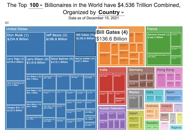
This dataviz compares how rich the world’s top billionaires are, showing their wealth as a treemap. The treemap is used to show the relative size of their wealth as boxes and is organized in order from largest to smallest.
User controls let you change the number of billionaires shown on the graph as well as group each person by their country or industry. If you group by country or industry, you can also click on a specific grouping to isolate that group and zoom in to see the contents more clearly. Hovering over each of the boxes (especially the smaller ones) will give you a popup that lets you see their name, ranking and net worth more clearly.
The popup shows how much total wealth the top billionaires control and for context compare it to the wealth of a certain number of households in the US. The comparison isn’t ideal as many of the billionaires are not from the US, but I think it still provides a useful point of comparison.
This visualization uses the same data that I needed in order to create my “How Rich is Elon Musk?” visualization. Since I had all this data, I figured I could crank out another related graph.
Sources and Tools:
Data from Bloomberg’s Billionaire’s index is downloaded regularly using a python script. Data on US household net worth is from DQYDJ’s net worth percentile calculator.
The treemap is created using the open-source Plotly javascript visualization library, as well as HTML, CSS and Javascript code to create interactivity and UI.

How Rich is Elon Musk? – Visualization of Extreme Wealth
See related visualization: How much wealth do the world’s richest billionaires have?
Visualizing Elon Musk net worth in 2024
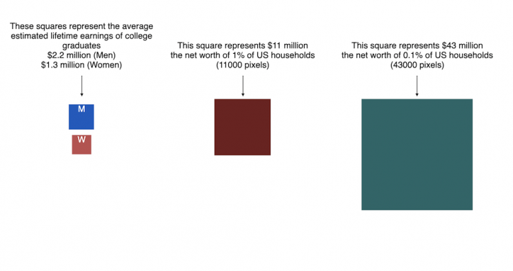
This visualization attempts to represent how much money Elon Musk, the richest person in the world, has. It gives context on this extreme amount of wealth by showing other very large sums of money that are somehow less than his net worth.
Each pixel on the screen represents a very modest amount of money (from $ 500 to $ 4000). As you scroll to the right, you will start to understand how incredibly large one billion dollars is, let alone hundreds of billions. You can change the amount of scrolling needed to get to the end of the visualization by selecting the amount represented by one pixel in the drop down menu.
This visualization was inspired heavily by a similar visualization made by Matt Korostoff for Jeff Bezos (when he was the richest person in the world) called “Wealth shown to scale”.
If you have any ideas about other items that could be added to the money chart, please leave them in the comments, and I will see if I can add it.
Mega-billionaires such as Musk or Jeff Bezos are not just extremely rich, the wealth they possess is unimaginably large. There are some extremely rich folks shown in the visualization who can buy pretty much whatever they could ever possibly need and yet their wealth is closer to that of the average person than they are to that of Elon Musk.
Sources and Tools:
The full list of data sources for the various money amounts are listed below. Most data is from 2021 though networth data for billionaires is updated regularly. The visualization was made using HTML, CSS and Javascript code to create interactivity and UI. Data from Bloomberg’s Billionaire’s index , which is the source of Musk’s (and others) estimated wealth, is updated regularly.
Full List of Data Sources:
- Cost of a supertanker’s worth of oil (at $70/barrel): https://en.wikipedia.org/wiki/Oil_tanker
- Cost of a Boeing 777-200ER Airplane: https://en.wikipedia.org/wiki/Boeing_777
- Lebron James and Cristiano Ronaldo Net Worth: https://wealthygorilla.com/top-20-richest-athletes-world/
- Tiger Woods Net Worth: https://wealthygorilla.com/top-20-richest-athletes-world/
- It’s alot of money, but we’ve still got a long way to go:
- Cost of building the Burj Khalifa (world’s tallest building in Dubai): https://en.wikipedia.org/wiki/Burj_Khalifa
- Total Ad Revenue for CNN, Fox News and MSNBC: https://www.pewresearch.org/journalism/fact-sheet/cable-news/
- Ophrah Winfrey Net Worth: https://www.celebritynetworth.com/richest-celebrities/actors/oprah-net-worth/
- Tuition for all 280,000 University of California Students: https://www.ucop.edu/operating-budget/_files/rbudget/2021-22-budget-detail.pdf
- One 40-Foot Shipping Container Full of $100 Bills: self-calculation
- Net Worth of Bottom 33% of Americans: https://dqydj.com/average-median-top-net-worth-percentiles/
- George Lucas Net Worth: https://www.bloomberg.com/billionaires/
- Cost of 2020 Tokyo Olympics: https://www.usnews.com/news/business/articles/2021-08-06/tokyo-olympics-cost-154-billion-what-else-could-that-buy
- Annual Budget of the US Department of Energy: https://en.wikipedia.org/wiki/United_States_Department_of_Energy
- Worldwide Box Office Revenue for Marvel Cinematic Universe (2008-2021): https://www.the-numbers.com/movies/franchise/Marvel-Cinematic-Universe#tab=summary
- Total Amount Spent of Gasoline in the State of Texas in one year: https://www.eia.gov/state/seds/data.php?incfile=/state/seds/sep_fuel/html/fuel_mg.html&sid=US
- Size of Harvard University’s Endowment: https://www.thecrimson.com/article/2021/10/15/endowment-returns-soar-2021/
- Annual Budget of the US Department of Transportation: https://en.wikipedia.org/wiki/United_States_Department_of_Transportation
- Total Gross State Product of Hawaii in 2021: https://en.wikipedia.org/wiki/List_of_states_and_territories_of_the_United_States_by_GDP
- Warren Buffet Net Worth: https://www.bloomberg.com/billionaires/
- State of Texas Operating Budget: https://en.wikipedia.org/wiki/List_of_U.S._state_budgets
- Total Value of all National Football League (NFL) Teams: https://www.profootballnetwork.com/nfl-franchise-values/
- Total Annual Income of 2 Million Residents of Silicon Valley (San Jose-Sunnyvale-Santa Clara CA Metro Area): https://censusreporter.org/profiles/31000US41940-san-jose-sunnyvale-santa-clara-ca-metro-area/
- Total Dollar Value of All US Agricultural Production: https://www.ers.usda.gov/data-products/ag-and-food-statistics-charting-the-essentials/ag-and-food-sectors-and-the-economy/
- Bill Gates Net Worth: https://www.bloomberg.com/billionaires/
- Total Tesla Revenue Since Founding (2008-2021): https://www.statista.com/statistics/272120/revenue-of-tesla/
- Annual Advertising Revenue for Google: https://www.cnbc.com/2021/05/18/how-does-google-make-money-advertising-business-breakdown-.html
- Total Amount Spent on US Residential Electricity In A Year: https://www.eia.gov/state/seds/data.php?incfile=/state/seds/sep_fuel/html/fuel_pr_es.html&sid=US
- Jeff Bezos Net Worth: https://www.bloomberg.com/billionaires/
- Annual Federal Taxes paid in Florida: https://en.wikipedia.org/wiki/Federal_tax_revenue_by_state
- Global Electric Vehicle Market Size in 2020: https://www.globenewswire.com/en/news-release/2021/09/06/2291730/0/en/Electric-Vehicle-Market-Size-Is-Anticipated-to-Grow-USD-1-318-22-Billion-in-2028-at-a-CAGR-of-24-3.html
- Value (i.e. Market Capitalization) of Walt Disney Company: https://www.google.com/finance/quote/DIS:NYSE
- Annual Revenue of Toyota Motor Corporation: https://money.cnn.com/quote/financials/financials.html?symb=TM
- Annual Health Care Expenditures for the entire State of California: https://www.kff.org/other/state-indicator/health-care-expenditures-by-state-of-residence-in-millions/?currentTimeframe=0&sortModel=%7B%22colId%22:%22Location%22,%22sort%22:%22asc%22%7D
- Total Annual Income for 100,000 Average US Households: https://www.census.gov/library/publications/2021/demo/p60-273.html
- Cost of one Gerald Ford Class Aircraft Carrier: https://en.wikipedia.org/wiki/Gerald_R._Ford-class_aircraft_carrier
- Cost to Build California High Speed Rail System: https://en.wikipedia.org/wiki/California_High-Speed_Rail
- Inflation Adjusted Cost of NASA’s Apollo Program: https://www.forbes.com/sites/alexknapp/2019/07/20/apollo-11-facts-figures-business/
- Total Annual Housing and Utilities Expenditures For All 6.6 Million Households in Los Angeles Metro Area: https://www.bls.gov/cex/tables/geographic/mean/cu-msa-west-2-year-average-2020.pdf
- Annual Amount Spent on the Purchase of iPhones: https://www.businessofapps.com/data/apple-statistics/
- Annual Aggregate Salaries of US Workers in 2023 (various occupations): BLS Website: https://www.bls.gov/oes/current/oes_nat.htm
- Consumer Purchases: BEA Website: https://apps.bea.gov/
- Welfare Spending: Pew Research: https://www.pewresearch.org/short-reads/2023/07/19/what-the-data-says-about-food-stamps-in-the-u-s/
- Market Cap or Revenue for large companies : Stock Analysis: https://stockanalysis.com/list/sp-500-stocks/
- Elon Musk Net Worth: https://www.bloomberg.com/billionaires/

Using up our carbon budget
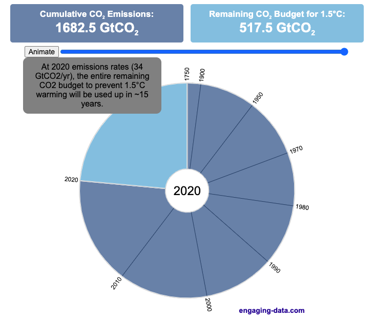
How much more CO2 can we emit if we want to keep the global temperature rise below 1.5°C or 2°C?
Every bit of CO2 we release is one step closer to using up our carbon budget.
Click on the animate button (or use the slider) to see how we have used up our carbon budget to limit global warming to 1.5°C or 2°C.
Climate change is the result of greenhouse gases such as CO2 and methane from human activities. The amount of CO2 and other greenhouse gases in the atmosphere determines how much of the incoming solar radiation is trapped as heat. Since CO2 is the most common greenhouse gas and very long lived in the atmosphere, there’s a good correlation between the total amount of human CO2 emissions and the amount of warming that the earth will experience. This leads to the concept of a carbon budget.
What is the carbon budget?
For every ton of CO2 that is emitted into the atmosphere about half a ton becomes part of the atmosphere for the long term, assuming there’s no massive new program to remove CO2 from the atmosphere. And there’s a direct correlation between the atmospheric concentration of CO2 and the earth’s temperature. Scientists tend to look at milestones of 2°C or 1.5°C when thinking about potential future warming. There is some uncertainty, but the total amount of human CO2 emissions that will lead to a 1.5°C warming from pre-industrial levels is around 2200 billion metric tonnes of CO2 plus or minus a few hundred billion tons (or 460 billion metric tonnes from 2020). This unit is also written as GtCO2 or gigatonnes of CO2. The values for the budget for 2°C warming are 1310 GtCO2 from 2020 or 2993 GtCO2 from pre-industrial levels.
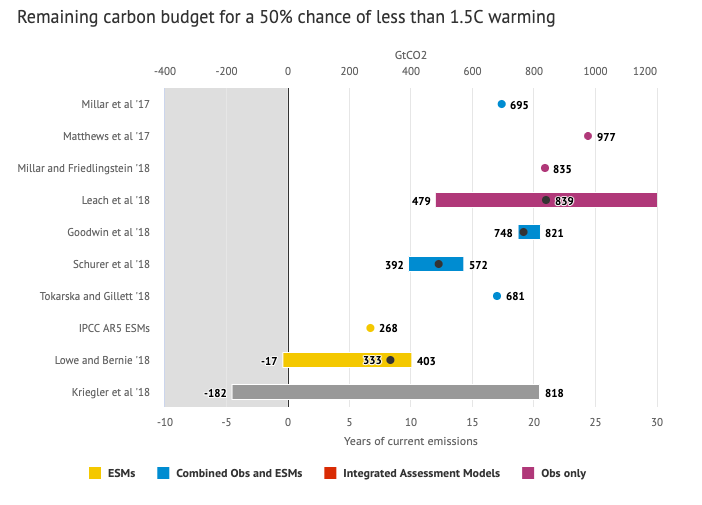
Shown below is a graph from the Carbon Brief that shows the uncertainty in estimates for the remaining carbon budget (from 2018) before having a 50% chance of exceeding 1.5°C warming. As you can see there’s a fairly large range.
Update: The article’s author Zeke Hausfather pointed me to an updated article with newer IPCC estimates for the carbon budget of these two warming milestones. I have updated the code to account for these two new values.
What may happen at 1.5 degrees of warming?
1.5°C (2.7°F) doesn’t sound like alot, but there are some pretty serious potential consequences that we’ll be dealing with. These include increasing the amount or frequency of the following:
- extreme heatwaves
- droughts
- extreme storms and precipitation events
- loss of wildlife and biodiversity
- sea level rise
- and impacts of human health
This NASA article has much more info on the specific issues related to this temperature rise. Ideally we’d keep warming to under 1.5°C but it looks likely that we may exceed 2°C unless we take fairly dramatic action to reduce or CO2 emissions from fossil fuel combustion and use cleaner/lower-carbon sources of energy, like renewables and nuclear power.
From 1750 to 2020, humans have emitted approximately 1683 GtCO2. The IPCC estimates that 460 GtCO2 would put us at 1.5°C warming and 1310 GtCO2 would put us at 2°C warming. These values give us an estimated total carbon budget of 2143 GtCO2 for 1.5°C and 2993 GtCO2 for 2°C warming.
You can really see how we are getting close to using up all of our 1.5°C carbon budget and the speed at which we are using it up, especially in the last few decades.
Sources and Tools:
Annual emissions data is from the Global Carbon Project. The visualization was made using the plotly.js open source graphing library and HTML/CSS/Javascript code for the interactivity and UI.

National Park 3D Elevation Models
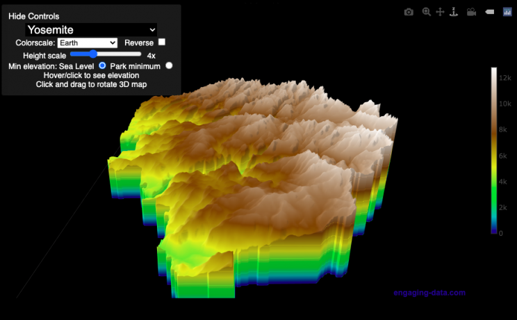
Play with an interactive 3D model of some popular National Parks in the US
I wanted to try my hand at creating 3D elevation models and thought trying to model some of the popular (and some of my favorite) national parks would be a good starting point.
Instructions
Once a 3D elevation model is selected and shown you can manipulated it in multiple ways:
- Zoom – You can zoom in and out, though the method depends on the device you are using. Try scrolling or pinch to zoom. You can also select the magnifying glass in the toolbar and drag to zoom.
- Rotate – You can rotate and change the angle of the model using by clicking and dragging on the model. This is the default selection in the toolbar (circular arrow around z axis)
- Pan – You can move the model around with if you select the panning tool from the toolbar (arrows going in all directions)
- Show contours – if you hover or click on part of the map, it can show all the areas of the model with the same elevation and the tooltip will show the geographic coordinates and elevation (you can toggle showing the tool tip if you select the tooltip bar)
- Save image – click on the camera icon in the toolbar to save as png
- Colors – you can change the color scale used to show elevation. You can also reverse the color scale.
- Change vertical exaggeration – you can select whether the vertical height is exaggerated using the ‘Height Scale’ slider. You can change between 1 (no exaggeration) to 11 (vertical scale is exaggerated by factor of 11).
- Change min elevation – you can select whether the minimum elevation is sea level or the lowest elevation in the park.
You can select a number of different parks from the drop down menu. If you have suggestions for additional parks, I may be able to add them to the list.
Note: the elevation files are data intensive since the visualization is downloading the elevation across in some cases, many hundreds or thousands of square miles. To keep the data needs down, I’ve reduced the resolution of the elevation data. Though the original data is 90 meter resolution (elevation is specified across every 90 x 90 m square in each park, I’ve averaged these squares together so that each park model only has about tens of thousands of these squares, regardless of the actual area of the park. This improves data loading and rendering times and makes the improves the responsiveness of the model.
Sources and Tools:
This visualization is written in HTML/CSS/Javascript. Digital elevation data is obtained from Open Topography and uses Shuttle Radar Topography Mission GL3 (90 meter resolution). The elevation data is downloaded using the opentopography API and parsed in a python script which downsamples the data to limit the number of elevation cells. The script also determines if a point is inside or outside of the park boundaries in order to create the elevation model. The 3D model is rendered using the Plotly open-source javascript graphing library.

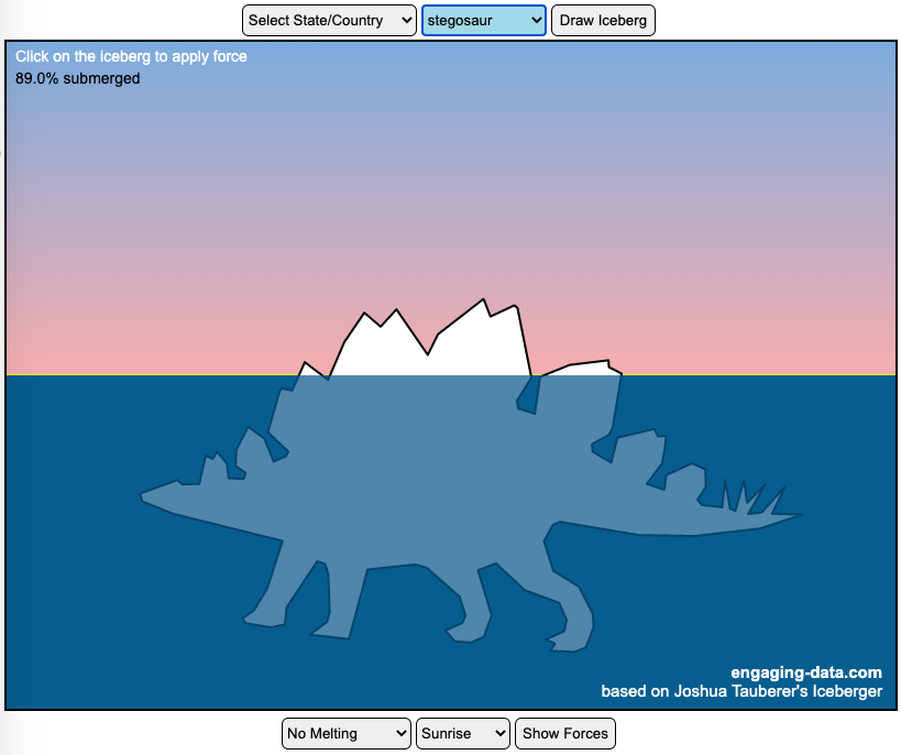
Iceberger Remixed and Improved – Iceberg Simulator
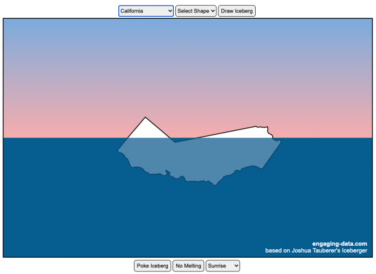
The melting algorithm has been updated so that melting below water is faster than melting above the waterline. It’s fun to try to get the iceberg pieces to radically change orientation when the iceberg breaks apart due to melting.
Draw (or choose) an iceberg and visualize how it will float and melt
I was so impressed with the interactive Iceberger tool that Josh Tauberer (@JoshData) made that I had to modify it and add some additional features. Click here to see the original. My additions allow you to conjure up pre-made “icebergs” to see how they float and also allow some interaction. Try “poking” the icebergs you make.
Josh and I were both inspired by a tweet by Megan Thompson-Munson (@GlacialMeg).
Today I channeled my energy into this very unofficial but passionate petition for scientists to start drawing icebergs in their stable orientations. I went to the trouble of painting a stable iceberg with my watercolors, so plz hear me out.
(1/4) pic.twitter.com/rtkCYub38b
— Megan Thompson-Munson (@GlacialMeg) February 19, 2021
Instructions
You can choose between 3 different iceberg creation options:
- Draw Iceberg – the original Iceberger option. Choose this option and draw any shape you want and see how it floats.
- Select State – Choose this option and select from one of the states of the United States to see how it will float.
- Select Shape = Choose this option and select from one of the premade shapes to see how it will float.
Once the iceberg has been created, you can also affect it in a couple of different ways:
- Click on the Iceberg – This lets you push on the left side of the iceberg to induce some rotation and see if there are multiple stable orientations. Click it several times in a row if you want to flip the iceberg over. If you push on the right size it will rotate the iceberg clockwise and if you push on the left size, it will rotate counter clockwise. if you push in the middle third of the iceberg, it will push it straight down.
- Melting – You can select between different options – No melting, slow medium and fast. This took awhile to code correctly. Previously, I’d just scale parts of the iceberg but this new code actually takes material away from the surface of the iceberg in a uniform way. It works more like you would expect melting ice to behave. Also melting occurs more quickly underwater than in the air.
- Changing the Sky – You can change the colors of the sky between sunrise, midday and sunset colors.
- Showing forces – You can toggle whether to show the center of buoyancy (B) and center of gravity (B) of the iceberg.
Some Physics – no equations
The force of gravity (G) affects the entire body regardless of where it is or how it is oriented. If you show the forces, the red dot labeled G shows where the center of mass of the iceberg is. The blue dot labeled B shows where the center of buoyancy is. This is the center of mass of the part of the iceberg that is submerged. The force acting on the submerged part is equal to the volume of water displaced. If the center of buoyancy is below the center of gravity, then the forces will be equal and object will be in stable equilibrium. If the center of buoyancy is somewhere other than under the center of gravity, then the buoyant force will be pushing up on a different place than the gravity force and this will induce a rotation until they are directly over one another.
The code has been updated so that multiple icebergs are now allowed. Melting can separate a single piece of iceberg into multiple pieces, just as in real life. The melting process was a bit difficult to program because of the complexity of shapes that could be produced.
If you have additional suggestions for shapes or countries to add to the list or other improvements to make, let me know in the comments. Also if you are using this as a teaching tool, I’d love to hear how you are incorporating it into your curriculum.
Sources and Tools:
This visualization uses HTML/CSS/Javascript code from the Iceberger app to simulate the buoyancy of icebergs. Melting was accomplished with the help of code from the turf.js, polygon-offset and simplify.js javascript libraries. Additional elements of the UI and other features are also made using HTML, CSS and javascript.
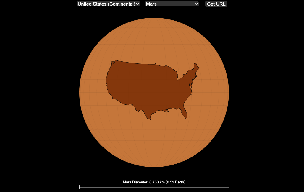
Countries Mapped onto Solar System Bodies
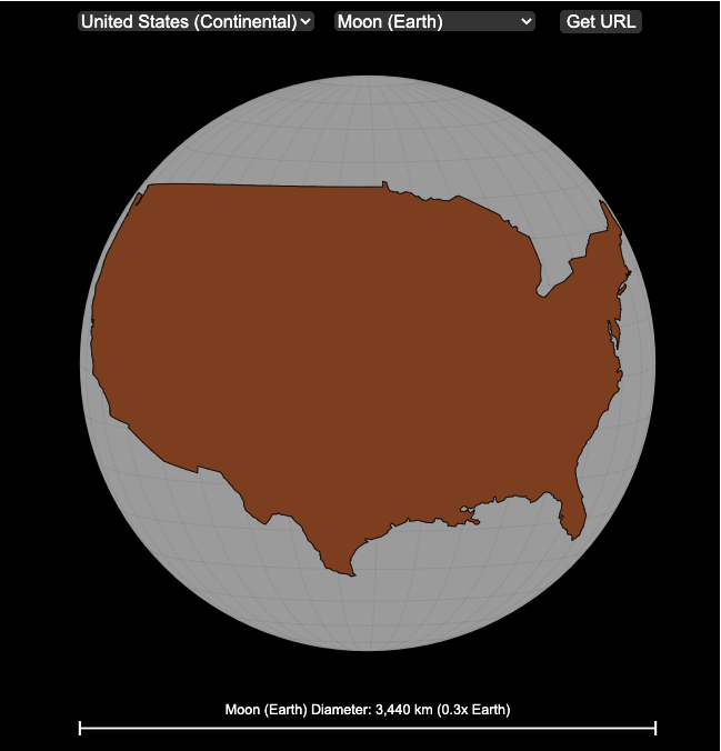
We can compare the sizes of countries and continents to planets and moons by projecting a map of a specific country onto another planet. Select a country and planet or moon to find out.
In one of my kid’s favorite books, there’s a picture demonstrating how Pluto is the same size as Australia. It has a satellite image of the country and an image of the former ninth planet superimposed on top as if it were hovering above the country. That image has stuck with me and I thought it would be interesting to see how other countries would compare with other planets and bodies in our solar system. As I’ve been working with javascript graphing/mapping library, D3.js and making maps/globes, I realized I should try to “project” individual countries onto these planets to see what they looked like.
Instructions
This visualization should be pretty self explanatory. You can select a country or continent and a planet or moon (or the sun) in the solar system. The visualization will then project the land onto the body and you have a simple visual comparison of the size of the country/continent and the planet or moon. You can drag on the visualization to rotate the planet.
There are some combinations that are not possible because the country/continent is too large to be projected onto the body without overlap. In these cases, the planet or country will be greyed out in the selection menu. You can click the “Get URL” button and share a specific map combination (country and planet) by copying the address in the url address bar.
The visualization also displays the area of the country/continent and the surface area of the planet or body. In some cases, the percentage may not look correct but remember that you can only see half of the planet surface and that it’s actually a hemisphere (half a sphere and not just a circle). It becomes clearer if you draw the surface of the planet around.
Calculations
The calculations to project a country onto another body involves starting with a set of coordinates (made up of longitude and latitude values) which define the border of the country, in the geojson format. To display them on Earth, the coordinates are modified so that the center of the country is centered at the intersection between the equator and prime meridian [0 deg latitude, 0 deg longitude].
To display them projected on a different planet or moon, it is necessary to change the latitude and longitude values of each point of the polygon country border so that it represents the same distance away from the polygon center. I used the Haversine formula to calculate the distance and bearing between two points on a sphere and then used the inverse to find the coordinates that were that distance and bearing from the center point on a sphere of a different size. These formulas can be found here. The main idea is that the distance representing one degree of latitude on Earth will be half as large on a planet that is half the size of Earth (like Mars). Thus, the distance between the center of a country and a point on the border will be a different number of degrees latitude and longitude from the center point on a different planet than on Earth. And this calculatin is done using these formulae.
Sources and Tools:
This visualization was made using the open-source, d3 javascript dataviz library and UI are made using HTML, CSS and javascript.
How much wealth do the world’s richest billionaires have?
This dataviz compares how rich the world’s top billionaires are, showing their wealth as a treemap. The treemap is used to show the relative size of their wealth as boxes and is organized in order from largest to smallest.
User controls let you change the number of billionaires shown on the graph as well as group each person by their country or industry. If you group by country or industry, you can also click on a specific grouping to isolate that group and zoom in to see the contents more clearly. Hovering over each of the boxes (especially the smaller ones) will give you a popup that lets you see their name, ranking and net worth more clearly.
The popup shows how much total wealth the top billionaires control and for context compare it to the wealth of a certain number of households in the US. The comparison isn’t ideal as many of the billionaires are not from the US, but I think it still provides a useful point of comparison.
This visualization uses the same data that I needed in order to create my “How Rich is Elon Musk?” visualization. Since I had all this data, I figured I could crank out another related graph.
Sources and Tools:
Data from Bloomberg’s Billionaire’s index is downloaded regularly using a python script. Data on US household net worth is from DQYDJ’s net worth percentile calculator.
The treemap is created using the open-source Plotly javascript visualization library, as well as HTML, CSS and Javascript code to create interactivity and UI.
How Rich is Elon Musk? – Visualization of Extreme Wealth
See related visualization: How much wealth do the world’s richest billionaires have?
Visualizing Elon Musk net worth in 2024
This visualization attempts to represent how much money Elon Musk, the richest person in the world, has. It gives context on this extreme amount of wealth by showing other very large sums of money that are somehow less than his net worth.
Each pixel on the screen represents a very modest amount of money (from
This visualization was inspired heavily by a similar visualization made by Matt Korostoff for Jeff Bezos (when he was the richest person in the world) called “Wealth shown to scale”.
If you have any ideas about other items that could be added to the money chart, please leave them in the comments, and I will see if I can add it.
Mega-billionaires such as Musk or Jeff Bezos are not just extremely rich, the wealth they possess is unimaginably large. There are some extremely rich folks shown in the visualization who can buy pretty much whatever they could ever possibly need and yet their wealth is closer to that of the average person than they are to that of Elon Musk.
Sources and Tools:
The full list of data sources for the various money amounts are listed below. Most data is from 2021 though networth data for billionaires is updated regularly. The visualization was made using HTML, CSS and Javascript code to create interactivity and UI. Data from Bloomberg’s Billionaire’s index , which is the source of Musk’s (and others) estimated wealth, is updated regularly.
Full List of Data Sources:
- Cost of a supertanker’s worth of oil (at $70/barrel): https://en.wikipedia.org/wiki/Oil_tanker
- Cost of a Boeing 777-200ER Airplane: https://en.wikipedia.org/wiki/Boeing_777
- Lebron James and Cristiano Ronaldo Net Worth: https://wealthygorilla.com/top-20-richest-athletes-world/
- Tiger Woods Net Worth: https://wealthygorilla.com/top-20-richest-athletes-world/
- It’s alot of money, but we’ve still got a long way to go:
- Cost of building the Burj Khalifa (world’s tallest building in Dubai): https://en.wikipedia.org/wiki/Burj_Khalifa
- Total Ad Revenue for CNN, Fox News and MSNBC: https://www.pewresearch.org/journalism/fact-sheet/cable-news/
- Ophrah Winfrey Net Worth: https://www.celebritynetworth.com/richest-celebrities/actors/oprah-net-worth/
- Tuition for all 280,000 University of California Students: https://www.ucop.edu/operating-budget/_files/rbudget/2021-22-budget-detail.pdf
- One 40-Foot Shipping Container Full of $100 Bills: self-calculation
- Net Worth of Bottom 33% of Americans: https://dqydj.com/average-median-top-net-worth-percentiles/
- George Lucas Net Worth: https://www.bloomberg.com/billionaires/
- Cost of 2020 Tokyo Olympics: https://www.usnews.com/news/business/articles/2021-08-06/tokyo-olympics-cost-154-billion-what-else-could-that-buy
- Annual Budget of the US Department of Energy: https://en.wikipedia.org/wiki/United_States_Department_of_Energy
- Worldwide Box Office Revenue for Marvel Cinematic Universe (2008-2021): https://www.the-numbers.com/movies/franchise/Marvel-Cinematic-Universe#tab=summary
- Total Amount Spent of Gasoline in the State of Texas in one year: https://www.eia.gov/state/seds/data.php?incfile=/state/seds/sep_fuel/html/fuel_mg.html&sid=US
- Size of Harvard University’s Endowment: https://www.thecrimson.com/article/2021/10/15/endowment-returns-soar-2021/
- Annual Budget of the US Department of Transportation: https://en.wikipedia.org/wiki/United_States_Department_of_Transportation
- Total Gross State Product of Hawaii in 2021: https://en.wikipedia.org/wiki/List_of_states_and_territories_of_the_United_States_by_GDP
- Warren Buffet Net Worth: https://www.bloomberg.com/billionaires/
- State of Texas Operating Budget: https://en.wikipedia.org/wiki/List_of_U.S._state_budgets
- Total Value of all National Football League (NFL) Teams: https://www.profootballnetwork.com/nfl-franchise-values/
- Total Annual Income of 2 Million Residents of Silicon Valley (San Jose-Sunnyvale-Santa Clara CA Metro Area): https://censusreporter.org/profiles/31000US41940-san-jose-sunnyvale-santa-clara-ca-metro-area/
- Total Dollar Value of All US Agricultural Production: https://www.ers.usda.gov/data-products/ag-and-food-statistics-charting-the-essentials/ag-and-food-sectors-and-the-economy/
- Bill Gates Net Worth: https://www.bloomberg.com/billionaires/
- Total Tesla Revenue Since Founding (2008-2021): https://www.statista.com/statistics/272120/revenue-of-tesla/
- Annual Advertising Revenue for Google: https://www.cnbc.com/2021/05/18/how-does-google-make-money-advertising-business-breakdown-.html
- Total Amount Spent on US Residential Electricity In A Year: https://www.eia.gov/state/seds/data.php?incfile=/state/seds/sep_fuel/html/fuel_pr_es.html&sid=US
- Jeff Bezos Net Worth: https://www.bloomberg.com/billionaires/
- Annual Federal Taxes paid in Florida: https://en.wikipedia.org/wiki/Federal_tax_revenue_by_state
- Global Electric Vehicle Market Size in 2020: https://www.globenewswire.com/en/news-release/2021/09/06/2291730/0/en/Electric-Vehicle-Market-Size-Is-Anticipated-to-Grow-USD-1-318-22-Billion-in-2028-at-a-CAGR-of-24-3.html
- Value (i.e. Market Capitalization) of Walt Disney Company: https://www.google.com/finance/quote/DIS:NYSE
- Annual Revenue of Toyota Motor Corporation: https://money.cnn.com/quote/financials/financials.html?symb=TM
- Annual Health Care Expenditures for the entire State of California: https://www.kff.org/other/state-indicator/health-care-expenditures-by-state-of-residence-in-millions/?currentTimeframe=0&sortModel=%7B%22colId%22:%22Location%22,%22sort%22:%22asc%22%7D
- Total Annual Income for 100,000 Average US Households: https://www.census.gov/library/publications/2021/demo/p60-273.html
- Cost of one Gerald Ford Class Aircraft Carrier: https://en.wikipedia.org/wiki/Gerald_R._Ford-class_aircraft_carrier
- Cost to Build California High Speed Rail System: https://en.wikipedia.org/wiki/California_High-Speed_Rail
- Inflation Adjusted Cost of NASA’s Apollo Program: https://www.forbes.com/sites/alexknapp/2019/07/20/apollo-11-facts-figures-business/
- Total Annual Housing and Utilities Expenditures For All 6.6 Million Households in Los Angeles Metro Area: https://www.bls.gov/cex/tables/geographic/mean/cu-msa-west-2-year-average-2020.pdf
- Annual Amount Spent on the Purchase of iPhones: https://www.businessofapps.com/data/apple-statistics/
- Annual Aggregate Salaries of US Workers in 2023 (various occupations): BLS Website: https://www.bls.gov/oes/current/oes_nat.htm
- Consumer Purchases: BEA Website: https://apps.bea.gov/
- Welfare Spending: Pew Research: https://www.pewresearch.org/short-reads/2023/07/19/what-the-data-says-about-food-stamps-in-the-u-s/
- Market Cap or Revenue for large companies : Stock Analysis: https://stockanalysis.com/list/sp-500-stocks/
- Elon Musk Net Worth: https://www.bloomberg.com/billionaires/
Using up our carbon budget
How much more CO2 can we emit if we want to keep the global temperature rise below 1.5°C or 2°C?
Every bit of CO2 we release is one step closer to using up our carbon budget.
Click on the animate button (or use the slider) to see how we have used up our carbon budget to limit global warming to 1.5°C or 2°C.
Climate change is the result of greenhouse gases such as CO2 and methane from human activities. The amount of CO2 and other greenhouse gases in the atmosphere determines how much of the incoming solar radiation is trapped as heat. Since CO2 is the most common greenhouse gas and very long lived in the atmosphere, there’s a good correlation between the total amount of human CO2 emissions and the amount of warming that the earth will experience. This leads to the concept of a carbon budget.
What is the carbon budget?
For every ton of CO2 that is emitted into the atmosphere about half a ton becomes part of the atmosphere for the long term, assuming there’s no massive new program to remove CO2 from the atmosphere. And there’s a direct correlation between the atmospheric concentration of CO2 and the earth’s temperature. Scientists tend to look at milestones of 2°C or 1.5°C when thinking about potential future warming. There is some uncertainty, but the total amount of human CO2 emissions that will lead to a 1.5°C warming from pre-industrial levels is around 2200 billion metric tonnes of CO2 plus or minus a few hundred billion tons (or 460 billion metric tonnes from 2020). This unit is also written as GtCO2 or gigatonnes of CO2. The values for the budget for 2°C warming are 1310 GtCO2 from 2020 or 2993 GtCO2 from pre-industrial levels.
Shown below is a graph from the Carbon Brief that shows the uncertainty in estimates for the remaining carbon budget (from 2018) before having a 50% chance of exceeding 1.5°C warming. As you can see there’s a fairly large range.
Update: The article’s author Zeke Hausfather pointed me to an updated article with newer IPCC estimates for the carbon budget of these two warming milestones. I have updated the code to account for these two new values.
What may happen at 1.5 degrees of warming?
1.5°C (2.7°F) doesn’t sound like alot, but there are some pretty serious potential consequences that we’ll be dealing with. These include increasing the amount or frequency of the following:
- extreme heatwaves
- droughts
- extreme storms and precipitation events
- loss of wildlife and biodiversity
- sea level rise
- and impacts of human health
This NASA article has much more info on the specific issues related to this temperature rise. Ideally we’d keep warming to under 1.5°C but it looks likely that we may exceed 2°C unless we take fairly dramatic action to reduce or CO2 emissions from fossil fuel combustion and use cleaner/lower-carbon sources of energy, like renewables and nuclear power.
From 1750 to 2020, humans have emitted approximately 1683 GtCO2. The IPCC estimates that 460 GtCO2 would put us at 1.5°C warming and 1310 GtCO2 would put us at 2°C warming. These values give us an estimated total carbon budget of 2143 GtCO2 for 1.5°C and 2993 GtCO2 for 2°C warming.
You can really see how we are getting close to using up all of our 1.5°C carbon budget and the speed at which we are using it up, especially in the last few decades.
Sources and Tools:
Annual emissions data is from the Global Carbon Project. The visualization was made using the plotly.js open source graphing library and HTML/CSS/Javascript code for the interactivity and UI.
National Park 3D Elevation Models
Play with an interactive 3D model of some popular National Parks in the US
I wanted to try my hand at creating 3D elevation models and thought trying to model some of the popular (and some of my favorite) national parks would be a good starting point.
Instructions
Once a 3D elevation model is selected and shown you can manipulated it in multiple ways:
- Zoom – You can zoom in and out, though the method depends on the device you are using. Try scrolling or pinch to zoom. You can also select the magnifying glass in the toolbar and drag to zoom.
- Rotate – You can rotate and change the angle of the model using by clicking and dragging on the model. This is the default selection in the toolbar (circular arrow around z axis)
- Pan – You can move the model around with if you select the panning tool from the toolbar (arrows going in all directions)
- Show contours – if you hover or click on part of the map, it can show all the areas of the model with the same elevation and the tooltip will show the geographic coordinates and elevation (you can toggle showing the tool tip if you select the tooltip bar)
- Save image – click on the camera icon in the toolbar to save as png
- Colors – you can change the color scale used to show elevation. You can also reverse the color scale.
- Change vertical exaggeration – you can select whether the vertical height is exaggerated using the ‘Height Scale’ slider. You can change between 1 (no exaggeration) to 11 (vertical scale is exaggerated by factor of 11).
- Change min elevation – you can select whether the minimum elevation is sea level or the lowest elevation in the park.
You can select a number of different parks from the drop down menu. If you have suggestions for additional parks, I may be able to add them to the list.
Note: the elevation files are data intensive since the visualization is downloading the elevation across in some cases, many hundreds or thousands of square miles. To keep the data needs down, I’ve reduced the resolution of the elevation data. Though the original data is 90 meter resolution (elevation is specified across every 90 x 90 m square in each park, I’ve averaged these squares together so that each park model only has about tens of thousands of these squares, regardless of the actual area of the park. This improves data loading and rendering times and makes the improves the responsiveness of the model.
Sources and Tools:
This visualization is written in HTML/CSS/Javascript. Digital elevation data is obtained from Open Topography and uses Shuttle Radar Topography Mission GL3 (90 meter resolution). The elevation data is downloaded using the opentopography API and parsed in a python script which downsamples the data to limit the number of elevation cells. The script also determines if a point is inside or outside of the park boundaries in order to create the elevation model. The 3D model is rendered using the Plotly open-source javascript graphing library.
Iceberger Remixed and Improved – Iceberg Simulator
The melting algorithm has been updated so that melting below water is faster than melting above the waterline. It’s fun to try to get the iceberg pieces to radically change orientation when the iceberg breaks apart due to melting.
Draw (or choose) an iceberg and visualize how it will float and melt
I was so impressed with the interactive Iceberger tool that Josh Tauberer (@JoshData) made that I had to modify it and add some additional features. Click here to see the original. My additions allow you to conjure up pre-made “icebergs” to see how they float and also allow some interaction. Try “poking” the icebergs you make.
Josh and I were both inspired by a tweet by Megan Thompson-Munson (@GlacialMeg).
Today I channeled my energy into this very unofficial but passionate petition for scientists to start drawing icebergs in their stable orientations. I went to the trouble of painting a stable iceberg with my watercolors, so plz hear me out.
(1/4) pic.twitter.com/rtkCYub38b
— Megan Thompson-Munson (@GlacialMeg) February 19, 2021
Instructions
You can choose between 3 different iceberg creation options:
- Draw Iceberg – the original Iceberger option. Choose this option and draw any shape you want and see how it floats.
- Select State – Choose this option and select from one of the states of the United States to see how it will float.
- Select Shape = Choose this option and select from one of the premade shapes to see how it will float.
Once the iceberg has been created, you can also affect it in a couple of different ways:
- Click on the Iceberg – This lets you push on the left side of the iceberg to induce some rotation and see if there are multiple stable orientations. Click it several times in a row if you want to flip the iceberg over. If you push on the right size it will rotate the iceberg clockwise and if you push on the left size, it will rotate counter clockwise. if you push in the middle third of the iceberg, it will push it straight down.
- Melting – You can select between different options – No melting, slow medium and fast. This took awhile to code correctly. Previously, I’d just scale parts of the iceberg but this new code actually takes material away from the surface of the iceberg in a uniform way. It works more like you would expect melting ice to behave. Also melting occurs more quickly underwater than in the air.
- Changing the Sky – You can change the colors of the sky between sunrise, midday and sunset colors.
- Showing forces – You can toggle whether to show the center of buoyancy (B) and center of gravity (B) of the iceberg.
Some Physics – no equations
The force of gravity (G) affects the entire body regardless of where it is or how it is oriented. If you show the forces, the red dot labeled G shows where the center of mass of the iceberg is. The blue dot labeled B shows where the center of buoyancy is. This is the center of mass of the part of the iceberg that is submerged. The force acting on the submerged part is equal to the volume of water displaced. If the center of buoyancy is below the center of gravity, then the forces will be equal and object will be in stable equilibrium. If the center of buoyancy is somewhere other than under the center of gravity, then the buoyant force will be pushing up on a different place than the gravity force and this will induce a rotation until they are directly over one another.
The code has been updated so that multiple icebergs are now allowed. Melting can separate a single piece of iceberg into multiple pieces, just as in real life. The melting process was a bit difficult to program because of the complexity of shapes that could be produced.
If you have additional suggestions for shapes or countries to add to the list or other improvements to make, let me know in the comments. Also if you are using this as a teaching tool, I’d love to hear how you are incorporating it into your curriculum.
Sources and Tools:
This visualization uses HTML/CSS/Javascript code from the Iceberger app to simulate the buoyancy of icebergs. Melting was accomplished with the help of code from the turf.js, polygon-offset and simplify.js javascript libraries. Additional elements of the UI and other features are also made using HTML, CSS and javascript.
Countries Mapped onto Solar System Bodies
We can compare the sizes of countries and continents to planets and moons by projecting a map of a specific country onto another planet. Select a country and planet or moon to find out.
In one of my kid’s favorite books, there’s a picture demonstrating how Pluto is the same size as Australia. It has a satellite image of the country and an image of the former ninth planet superimposed on top as if it were hovering above the country. That image has stuck with me and I thought it would be interesting to see how other countries would compare with other planets and bodies in our solar system. As I’ve been working with javascript graphing/mapping library, D3.js and making maps/globes, I realized I should try to “project” individual countries onto these planets to see what they looked like.
Instructions
This visualization should be pretty self explanatory. You can select a country or continent and a planet or moon (or the sun) in the solar system. The visualization will then project the land onto the body and you have a simple visual comparison of the size of the country/continent and the planet or moon. You can drag on the visualization to rotate the planet.
There are some combinations that are not possible because the country/continent is too large to be projected onto the body without overlap. In these cases, the planet or country will be greyed out in the selection menu. You can click the “Get URL” button and share a specific map combination (country and planet) by copying the address in the url address bar.
The visualization also displays the area of the country/continent and the surface area of the planet or body. In some cases, the percentage may not look correct but remember that you can only see half of the planet surface and that it’s actually a hemisphere (half a sphere and not just a circle). It becomes clearer if you draw the surface of the planet around.
Calculations
The calculations to project a country onto another body involves starting with a set of coordinates (made up of longitude and latitude values) which define the border of the country, in the geojson format. To display them on Earth, the coordinates are modified so that the center of the country is centered at the intersection between the equator and prime meridian [0 deg latitude, 0 deg longitude].
To display them projected on a different planet or moon, it is necessary to change the latitude and longitude values of each point of the polygon country border so that it represents the same distance away from the polygon center. I used the Haversine formula to calculate the distance and bearing between two points on a sphere and then used the inverse to find the coordinates that were that distance and bearing from the center point on a sphere of a different size. These formulas can be found here. The main idea is that the distance representing one degree of latitude on Earth will be half as large on a planet that is half the size of Earth (like Mars). Thus, the distance between the center of a country and a point on the border will be a different number of degrees latitude and longitude from the center point on a different planet than on Earth. And this calculatin is done using these formulae.
Sources and Tools:
This visualization was made using the open-source, d3 javascript dataviz library and UI are made using HTML, CSS and javascript.
Recent Comments