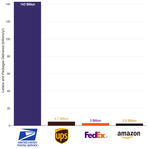
The US Postal Service mail volume is enormous and can’t easily be replaced by private delivery services
The US Postal Service (USPS) has been getting a good deal of press recently because of Trump’s attacks on the security of mail in voting and recent moves by political appointees to reduce the capability of the agency to delivery mail in a timely fashion. These changes reportedly include removing mail sorting equipment and changing overtime hours.
Some have suggested privatizing the postal service but currently the volume of mail and packages through private delivery services is far smaller than that carried by the federal agency.
Note that the USPS carries about 55 billion pieces of first class mail annually out of the reported 143 billion pieces of total mail.
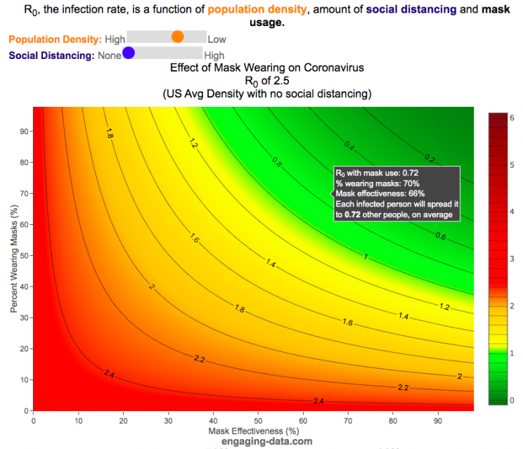
It depends on their effectiveness and how many people wear them
R0 is the transmission rate which is defined as the average number of cases that are expected to be produced from a single case in an uninfected population. R0 is dependent on a number of different factors that include transmissibility of a disease (how infectious it is), the amount of social contact and the duration of social contact. We have learned that variants of the coronavirus (such as delta or omicron) can greatly influence the transmissibility of the disease.
A baseline level of social contact is related to the population density (how often you come into contact with other people) and social distancing (limiting gatherings, not going in to work or school, etc) will reduce the amount of social contact with different people. Given what we know about coronavirus and its transmission, the amount of “contact” can also be influenced by mask wearing. This interactive graph shows the effect of mask wearing and effectiveness on reducing R0 even further. Because the effectiveness of existing vaccines is as of yet unknown against Omicron, this visualization does not take into account vaccines and their effectiveness of reducing R0, which is a very important limitation.
A very important caveat to this visualization: This visualization was initially created before COVID-19 vaccines were available and does not currently take their ability to prevent infection (and lower R0) into account because the effectiveness of each vaccines differs and the protection against infection wanes over time
This graph is a work-in-progress so please feel free to provide suggestions and feedback on issues of scientific concepts as well as for improvements in conveying the concepts/ideas.
Methodology
R0 values for different regions and population densities are estimated from Youyang Gu’s machine learning model for spread in Feb and early-March (i.e. before social distancing and mask wearing).
Baseline R0,variant based on variant transmissibility – R0 value ranges from an early estimate of 8 for Omicron to 5 for Delta and 2.5 for the original Alpha strain.
Population density factor (PDF) – this can increase or decrease the R0 value based on how much close contact you have. It ranges from about 2.4 in very high density places like New York City with lots of transit use where you are in close contact with other people for long periods of time to 0.8 in rural areas with much less contact. A value of 1 represents average US population density.
Social distancing factor (SDF) – this is simply a reduction on the baseline R0 based on the amount of social distancing (ranges from 100% (no social distancing) to 33% (high levels of social distancing). This is a reduction in the amount of time and number of people the average person is exposed to compared to baseline levels.
Mask effectiveness (Kmaskeff) – is defined as the percentage reduction in transmission of coronavirus that mask wearing can provide. An N95 mask is at least 95% effective at blocking most particles, but because it also reduces the speed at which your exhalation can travel outward (providing more time for droplets and aerosols to spread and diffuse to low concentration), an N95 can be much more than 95% effective in reducing coronavirus droplet and aerosol spread compared to the unmasked case. I’ve seen estimates for things like bandanas and homemade cloth mask having lower effectiveness maybe around 50% but I don’t know how scientifically they were estimated/calculated. Also depending on how mask are worn, this can also affect the effectiveness parameter. For example if an N95 mask does not fit tightly against the face and there are large gaps for air to flow, this will reduce the effectiveness of the mask. This parameter is shown on the x-axis.
Percent wearing masks (Kmaskfreq) – is simply the percentage of people wearing masks (varies from 0% to 100%). This parameter is shown on the y-axis.
The formula for effective Reffective is:
$R_\mathit{eff}=R_0,variant \times PDF \times SDF \times (1-K_{mask\mathit{eff}} \times K_{maskfreq})^2$
where $R_\mathit{eff}$ is the final average transmission value, $R_0,variant$ is the $R_0$ value based on the coronavirus variant type, PDF is the population density factor, SDF is the social distancing factor, $K_{mask\mathit{eff}}$ is the average mask effectiveness and $K_{maskfreq}$ is the percentage of people wearing masks. The squared parameter on the right side of the equation is essentially the average reduction in transmission that is likely due to mask usage and is from a preprint from Howard et al.
As you move up and to the right of the graph, mask use and effectiveness become very high and the transmission of coronavirus declines significantly. If you hover over the graph (on a desktop) or click on the graph (on mobile) you will see a popup that shows the Reff value that results. The lower the Reff value is the better as it dramatically affects the rate of transmission. High numbers will lead to explosive exponential growth while values below 1.0 will eventually reduce coronavirus transmissions to near 0.
For example at R0 of 6 and no social distancing or mask usage, one initial case can lead to approximately 56,000 cases in only 30 days. Whereas an Reff of 0.5 will only lead to a total of ~1 additional case in 30 days.
I am not an epidemiologist so some of the linear relationships and assumptions may be incorrect. Please let me know if I got anything terribly wrong or if you have any questions or suggestions on how the tool works, is structured or presented.
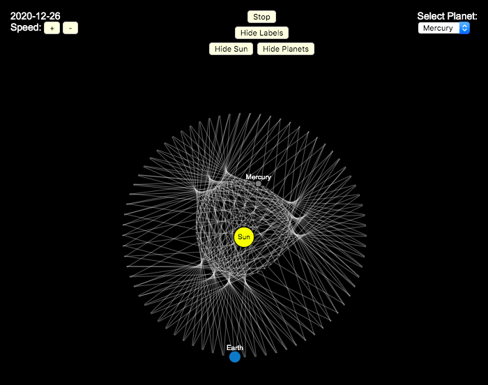
Earlier, I had made a visualization showing that Mercury is the closest planet to Earth (on average) and not Venus or Mars. To make that, I downloaded a bunch of NASA ephemeris (orbital) data. I realized I could use the same data to make some cool orbital art inspired by a spirograph – a planetary spirograph.
Basically, you get to choose a planet and the visualization will draw a line connecting that planet and Earth every few days. These lines will then build up into a cool pattern over 40 earth years of orbital cycles. Each planet (Mercury, Venus and Mars) has a different orbital period around the sun than Earth does and as a result, interesting patterns emerges.
Orbital periods of the four inner rocky planets:
Mercury: 88 days
Venus: 225 days
Earth:365 days
Mars: 687 days
Also evident is that the orbits of some of the planets are not quite circular so the pattern isn’t quite centered on the sun. Venus has the most regular pattern, creating a distinctive 5-lobed design. The other planets also have visually stunning patterns, though they do not repeat perfectly over time.
You can change the planets using the drop down menu as well as change the speed of the spirograph, and hide the planets and the sun.
Data and Tools:
I had thought about simulating the planets but there are plenty of tools out there that generate this orbital data so instead just downloaded 40 years of ephemeris data (data related to positions of astronomical bodies) from NASA website.. I processed the data using javascript and drew the picture using HTML canvas tools.
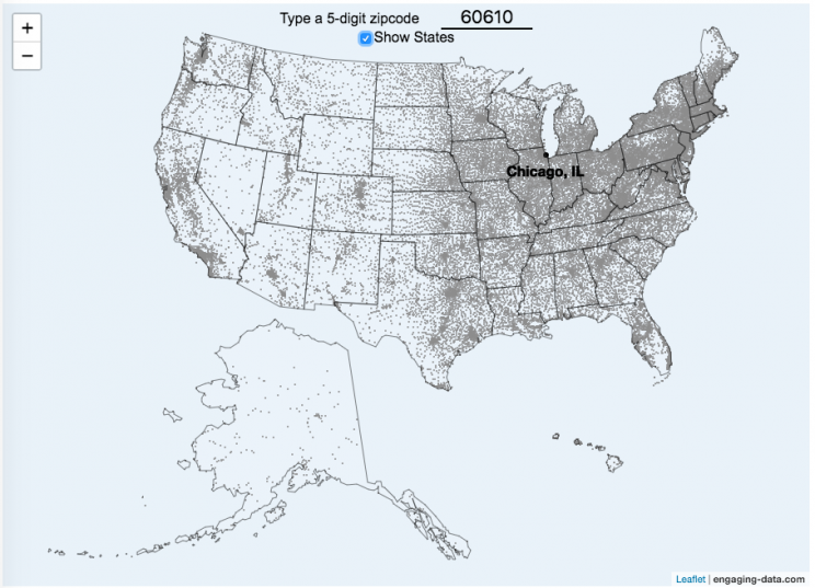
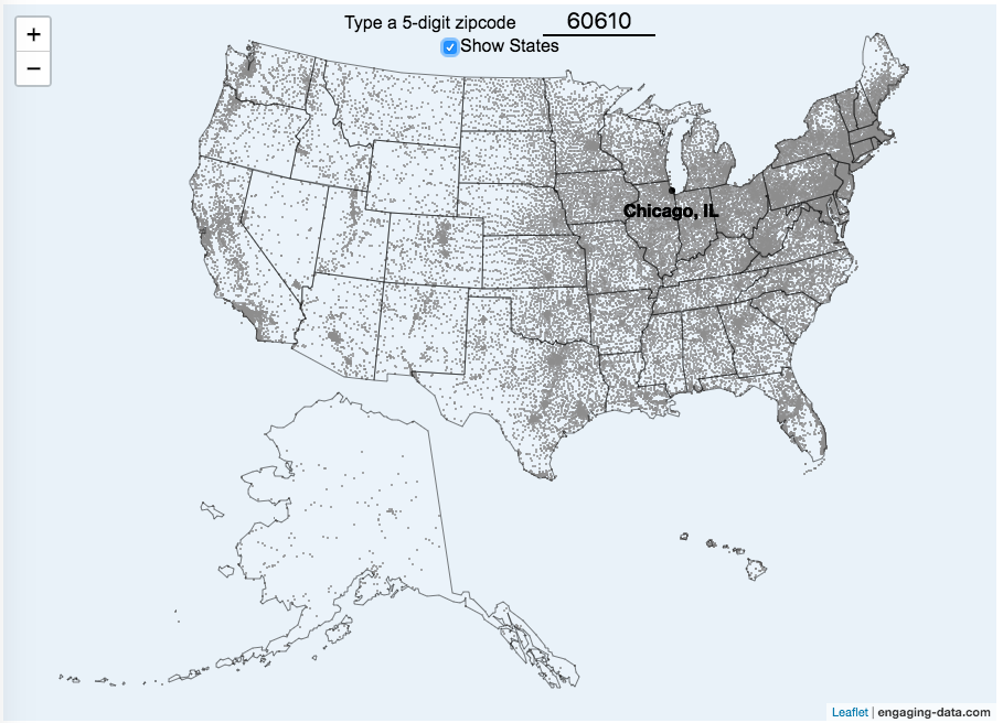
This zip code map of the United States visualizes over 42,000 zip codes in the 50 states. Zip codes are five digit postal codes used for mail delivery in the US. The points on the map show the geographic center of each zip code. The interactive visualization lets you type in a zip code and will show you where that zip code lies on the map. As you begin to type in the zip code, the map will highlight all the zip codes that begin with those numbers.
For example, if you type in “0”, you will highlight all zip codes that start with the zero in the Northeastern US. This will represent about 10% of the zip codes in the US. When you type in another number, it will narrow down the zip codes that begin with those two digits (approximately 1% of zip codes). It will progressively narrow down the number of zip codes as you type in more numbers, until you get to a full 5 digit zip code that represents 1 out of almost 43,000 zip codes (0.002% of zip codes). The map will then tell you the name of the city that that zip code is in.
You can explore how zip codes are distributed across the US by typing in different 1 and 2 digit numbers. You can also click on the check box to show or hide the outlines of the states.
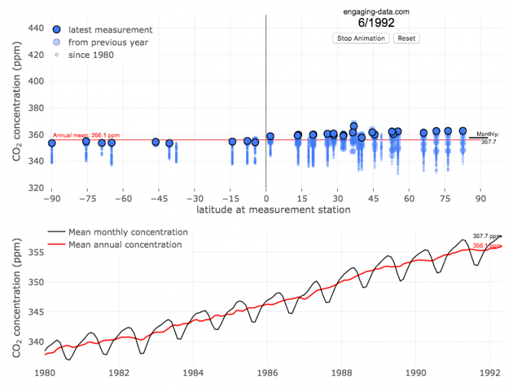
The current CO2 concentration in the atmosphere is over 400 parts per million (ppm). This has grown about 46% since pre-industrial levels (~280 ppm) in the early 1800s. The growing concentration of CO2 is a big concern because it is the most prevalent greenhouse gas, which is increasing the temperature of the planet and leading to substantial changes in the Earth’s climate patterns.
One of the interesting aspects of CO2 concentration is that it is not identical all around the globe, as it takes awhile for the atmosphere to mix. The graph shows geographic differences in CO2 concentration as well as seasonal ups and downs, that underly an overall growing trend in annual average (mean) concentration.
Seasonal trends in CO2 concentration occur due to differences in the amount of plant growth across different months. Spring and summer plant growth in the northern hemisphere causes a significant amount of photosynthesis, and CO2 absorption, relative to the fall and winter. This plant growth causes a very large amount of CO2 to be absorbed by plants and a noticeable reduction in the amount of CO2 in the atmosphere. The southern hemisphere spring and summer (northern hemisphere fall and winter) aren’t as obvious because there is much less land in the southern hemisphere and the land that is there is close to the tropics and green all year round.
CO2 concentration can change by about 4-5 ppm due to the “breathing” of plants, which is pretty significant. The total weight of CO2 in the atmosphere is about 3 trillion tonnes of CO2, so 4-5 ppm is about 1% of this or 30 billion tons of CO2 removed by plant life each spring/summer.
Data and Tools:
Data comes from the US National Oceanic and Atmospheric Administration (NOAA). Data was downloaded using an automated python script and the graphs were made using javascript and the open-sourced Plot.ly javascript engine.
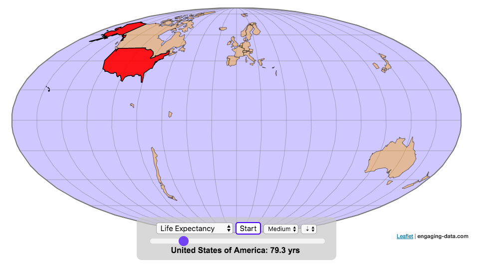
Watch the world assemble country-by-country based on a specific statistic
This map lets you watch as the world is built-up one country at a time. This can be done along the following statistical dimensions:
Country name
Population – from United Nations (2017)
GDP – from United Nations (2017)
GDP per capita
GDP per area
Land Area – from CIA factbook (2016)
Population density
Life expectancy – from World Health Organization (2015)
or a random order
These statistics can be sorted from small to large or vice versa to get a view of the globe and its constituent countries in a unique and interesting way. It’s a bit hypnotic to watch as the countries appear and add to the world one by one.
You can use this map to display all the countries that have higher life expectancy than the United States: select “Life expectancy”, sort from “high to low” and use the scroll bar to move to the United States and you’ll get a picture like this:
or this map to display all the countries that have higher population density than the United States: select “Population density, sort from “high to low” and use the scroll bar to move to the United States and you’ll get a picture like this:
I hope you enjoy exploring the countries of the world through this data viz tool. And if you have ideas for other statistics to add, I will try to do so.
function resizemap(){
//this function is called from the javascript from within the iframe after the contents of iframe are loaded (and after an additional 150ms delay)
setTimeout(function (){
mm = document.getElementById('molleweide');
mm.height = mm.contentWindow.document.body.scrollHeight+20+"px";
mobilewarn();
}, 150);
}
function reloadiframes(){
document.getElementById('molleweide').contentWindow.location.reload();
}
function mobilewarn(){
w=window.innerWidth;
if (w<600){
document.getElementById('mobilewarning').innerHTML="On mobile devices, visualizations are best viewed in landscape mode.";
} else {
document.getElementById('mobilewarning').innerHTML="";
}
}
mobilewarn();


Recent Comments