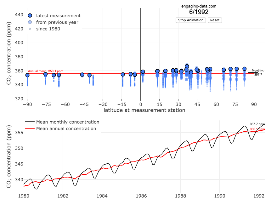
The current CO2 concentration in the atmosphere is over 400 parts per million (ppm). This has grown about 46% since pre-industrial levels (~280 ppm) in the early 1800s. The growing concentration of CO2 is a big concern because it is the most prevalent greenhouse gas, which is increasing the temperature of the planet and leading to substantial changes in the Earth’s climate patterns.
This graph visualizes the growth in CO2 concentration in the atmosphere (mainly from CO2 emissions due to human activities, such as burning fossil fuels for energy production, deforestation and other industrial processes). The graph starts at 1980 when CO2 concentration in the atmosphere was around 340ppm. It has grown significantly since then.
One of the interesting aspects of CO2 concentration is that it is not identical all around the globe, as it takes awhile for the atmosphere to mix. The graph shows geographic differences in CO2 concentration as well as seasonal ups and downs, that underly an overall growing trend in annual average (mean) concentration.
Seasonal trends in CO2 concentration occur due to differences in the amount of plant growth across different months. Spring and summer plant growth in the northern hemisphere causes a significant amount of photosynthesis, and CO2 absorption, relative to the fall and winter. This plant growth causes a very large amount of CO2 to be absorbed by plants and a noticeable reduction in the amount of CO2 in the atmosphere. The southern hemisphere spring and summer (northern hemisphere fall and winter) aren’t as obvious because there is much less land in the southern hemisphere and the land that is there is close to the tropics and green all year round.
CO2 concentration can change by about 4-5 ppm due to the “breathing” of plants, which is pretty significant. The total weight of CO2 in the atmosphere is about 3 trillion tonnes of CO2, so 4-5 ppm is about 1% of this or 30 billion tons of CO2 removed by plant life each spring/summer.
Data and Tools:
Data comes from the US National Oceanic and Atmospheric Administration (NOAA). Data was downloaded using an automated python script and the graphs were made using javascript and the open-sourced Plot.ly javascript engine.
No Comments »