Posts for Tag: climate change
Using up our carbon budget
How much more CO2 can we emit if we want to keep the global temperature rise below 1.5°C or 2°C?
Every bit of CO2 we release is one step closer to using up our carbon budget.
Click on the animate button (or use the slider) to see how we have used up our carbon budget to limit global warming to 1.5°C or 2°C.
Climate change is the result of greenhouse gases such as CO2 and methane from human activities. The amount of CO2 and other greenhouse gases in the atmosphere determines how much of the incoming solar radiation is trapped as heat. Since CO2 is the most common greenhouse gas and very long lived in the atmosphere, there’s a good correlation between the total amount of human CO2 emissions and the amount of warming that the earth will experience. This leads to the concept of a carbon budget.
What is the carbon budget?
For every ton of CO2 that is emitted into the atmosphere about half a ton becomes part of the atmosphere for the long term, assuming there’s no massive new program to remove CO2 from the atmosphere. And there’s a direct correlation between the atmospheric concentration of CO2 and the earth’s temperature. Scientists tend to look at milestones of 2°C or 1.5°C when thinking about potential future warming. There is some uncertainty, but the total amount of human CO2 emissions that will lead to a 1.5°C warming from pre-industrial levels is around 2200 billion metric tonnes of CO2 plus or minus a few hundred billion tons (or 460 billion metric tonnes from 2020). This unit is also written as GtCO2 or gigatonnes of CO2. The values for the budget for 2°C warming are 1310 GtCO2 from 2020 or 2993 GtCO2 from pre-industrial levels.
Shown below is a graph from the Carbon Brief that shows the uncertainty in estimates for the remaining carbon budget (from 2018) before having a 50% chance of exceeding 1.5°C warming. As you can see there’s a fairly large range.
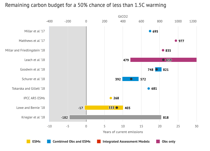
Update: The article’s author Zeke Hausfather pointed me to an updated article with newer IPCC estimates for the carbon budget of these two warming milestones. I have updated the code to account for these two new values.
What may happen at 1.5 degrees of warming?
1.5°C (2.7°F) doesn’t sound like alot, but there are some pretty serious potential consequences that we’ll be dealing with. These include increasing the amount or frequency of the following:
- extreme heatwaves
- droughts
- extreme storms and precipitation events
- loss of wildlife and biodiversity
- sea level rise
- and impacts of human health
This NASA article has much more info on the specific issues related to this temperature rise. Ideally we’d keep warming to under 1.5°C but it looks likely that we may exceed 2°C unless we take fairly dramatic action to reduce or CO2 emissions from fossil fuel combustion and use cleaner/lower-carbon sources of energy, like renewables and nuclear power.
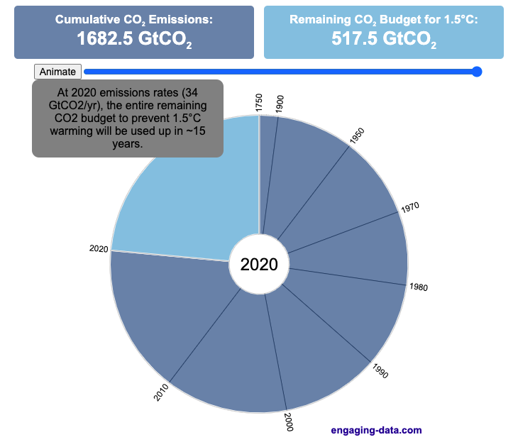
From 1750 to 2020, humans have emitted approximately 1683 GtCO2. The IPCC estimates that 460 GtCO2 would put us at 1.5°C warming and 1310 GtCO2 would put us at 2°C warming. These values give us an estimated total carbon budget of 2143 GtCO2 for 1.5°C and 2993 GtCO2 for 2°C warming.
You can really see how we are getting close to using up all of our 1.5°C carbon budget and the speed at which we are using it up, especially in the last few decades.
Sources and Tools:
Annual emissions data is from the Global Carbon Project. The visualization was made using the plotly.js open source graphing library and HTML/CSS/Javascript code for the interactivity and UI.

Visualizing The Growth of Atmospheric CO2 Concentration
The current CO2 concentration in the atmosphere is over 400 parts per million (ppm). This has grown about 46% since pre-industrial levels (~280 ppm) in the early 1800s. The growing concentration of CO2 is a big concern because it is the most prevalent greenhouse gas, which is increasing the temperature of the planet and leading to substantial changes in the Earth’s climate patterns.
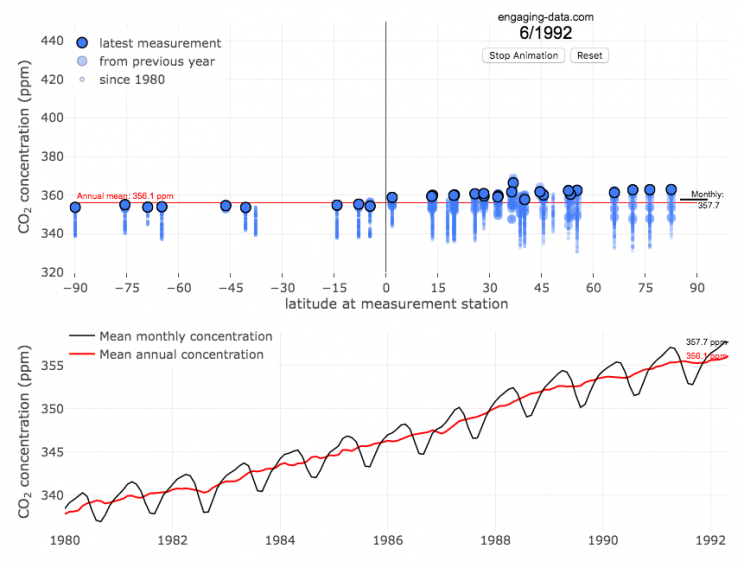
This graph visualizes the growth in CO2 concentration in the atmosphere (mainly from CO2 emissions due to human activities, such as burning fossil fuels for energy production, deforestation and other industrial processes). The graph starts at 1980 when CO2 concentration in the atmosphere was around 340ppm. It has grown significantly since then.
One of the interesting aspects of CO2 concentration is that it is not identical all around the globe, as it takes awhile for the atmosphere to mix. The graph shows geographic differences in CO2 concentration as well as seasonal ups and downs, that underly an overall growing trend in annual average (mean) concentration.
Seasonal trends in CO2 concentration occur due to differences in the amount of plant growth across different months. Spring and summer plant growth in the northern hemisphere causes a significant amount of photosynthesis, and CO2 absorption, relative to the fall and winter. This plant growth causes a very large amount of CO2 to be absorbed by plants and a noticeable reduction in the amount of CO2 in the atmosphere. The southern hemisphere spring and summer (northern hemisphere fall and winter) aren’t as obvious because there is much less land in the southern hemisphere and the land that is there is close to the tropics and green all year round.
CO2 concentration can change by about 4-5 ppm due to the “breathing” of plants, which is pretty significant. The total weight of CO2 in the atmosphere is about 3 trillion tonnes of CO2, so 4-5 ppm is about 1% of this or 30 billion tons of CO2 removed by plant life each spring/summer.
Data and Tools:
Data comes from the US National Oceanic and Atmospheric Administration (NOAA). Data was downloaded using an automated python script and the graphs were made using javascript and the open-sourced Plot.ly javascript engine.
Using up our carbon budget
How much more CO2 can we emit if we want to keep the global temperature rise below 1.5°C or 2°C?
Every bit of CO2 we release is one step closer to using up our carbon budget.
Click on the animate button (or use the slider) to see how we have used up our carbon budget to limit global warming to 1.5°C or 2°C.
Climate change is the result of greenhouse gases such as CO2 and methane from human activities. The amount of CO2 and other greenhouse gases in the atmosphere determines how much of the incoming solar radiation is trapped as heat. Since CO2 is the most common greenhouse gas and very long lived in the atmosphere, there’s a good correlation between the total amount of human CO2 emissions and the amount of warming that the earth will experience. This leads to the concept of a carbon budget.
What is the carbon budget?
For every ton of CO2 that is emitted into the atmosphere about half a ton becomes part of the atmosphere for the long term, assuming there’s no massive new program to remove CO2 from the atmosphere. And there’s a direct correlation between the atmospheric concentration of CO2 and the earth’s temperature. Scientists tend to look at milestones of 2°C or 1.5°C when thinking about potential future warming. There is some uncertainty, but the total amount of human CO2 emissions that will lead to a 1.5°C warming from pre-industrial levels is around 2200 billion metric tonnes of CO2 plus or minus a few hundred billion tons (or 460 billion metric tonnes from 2020). This unit is also written as GtCO2 or gigatonnes of CO2. The values for the budget for 2°C warming are 1310 GtCO2 from 2020 or 2993 GtCO2 from pre-industrial levels.
Shown below is a graph from the Carbon Brief that shows the uncertainty in estimates for the remaining carbon budget (from 2018) before having a 50% chance of exceeding 1.5°C warming. As you can see there’s a fairly large range.
Update: The article’s author Zeke Hausfather pointed me to an updated article with newer IPCC estimates for the carbon budget of these two warming milestones. I have updated the code to account for these two new values.
What may happen at 1.5 degrees of warming?
1.5°C (2.7°F) doesn’t sound like alot, but there are some pretty serious potential consequences that we’ll be dealing with. These include increasing the amount or frequency of the following:
- extreme heatwaves
- droughts
- extreme storms and precipitation events
- loss of wildlife and biodiversity
- sea level rise
- and impacts of human health
This NASA article has much more info on the specific issues related to this temperature rise. Ideally we’d keep warming to under 1.5°C but it looks likely that we may exceed 2°C unless we take fairly dramatic action to reduce or CO2 emissions from fossil fuel combustion and use cleaner/lower-carbon sources of energy, like renewables and nuclear power.
From 1750 to 2020, humans have emitted approximately 1683 GtCO2. The IPCC estimates that 460 GtCO2 would put us at 1.5°C warming and 1310 GtCO2 would put us at 2°C warming. These values give us an estimated total carbon budget of 2143 GtCO2 for 1.5°C and 2993 GtCO2 for 2°C warming.
You can really see how we are getting close to using up all of our 1.5°C carbon budget and the speed at which we are using it up, especially in the last few decades.
Sources and Tools:
Annual emissions data is from the Global Carbon Project. The visualization was made using the plotly.js open source graphing library and HTML/CSS/Javascript code for the interactivity and UI.
Visualizing The Growth of Atmospheric CO2 Concentration
The current CO2 concentration in the atmosphere is over 400 parts per million (ppm). This has grown about 46% since pre-industrial levels (~280 ppm) in the early 1800s. The growing concentration of CO2 is a big concern because it is the most prevalent greenhouse gas, which is increasing the temperature of the planet and leading to substantial changes in the Earth’s climate patterns.
This graph visualizes the growth in CO2 concentration in the atmosphere (mainly from CO2 emissions due to human activities, such as burning fossil fuels for energy production, deforestation and other industrial processes). The graph starts at 1980 when CO2 concentration in the atmosphere was around 340ppm. It has grown significantly since then.
One of the interesting aspects of CO2 concentration is that it is not identical all around the globe, as it takes awhile for the atmosphere to mix. The graph shows geographic differences in CO2 concentration as well as seasonal ups and downs, that underly an overall growing trend in annual average (mean) concentration.
Seasonal trends in CO2 concentration occur due to differences in the amount of plant growth across different months. Spring and summer plant growth in the northern hemisphere causes a significant amount of photosynthesis, and CO2 absorption, relative to the fall and winter. This plant growth causes a very large amount of CO2 to be absorbed by plants and a noticeable reduction in the amount of CO2 in the atmosphere. The southern hemisphere spring and summer (northern hemisphere fall and winter) aren’t as obvious because there is much less land in the southern hemisphere and the land that is there is close to the tropics and green all year round.
CO2 concentration can change by about 4-5 ppm due to the “breathing” of plants, which is pretty significant. The total weight of CO2 in the atmosphere is about 3 trillion tonnes of CO2, so 4-5 ppm is about 1% of this or 30 billion tons of CO2 removed by plant life each spring/summer.
Data and Tools:
Data comes from the US National Oceanic and Atmospheric Administration (NOAA). Data was downloaded using an automated python script and the graphs were made using javascript and the open-sourced Plot.ly javascript engine.
Recent Comments