I added a share button (arrow button) that lets you send a graph with specific name. It copies a custom URL to your clipboard which you can paste into a message/tweet/email.
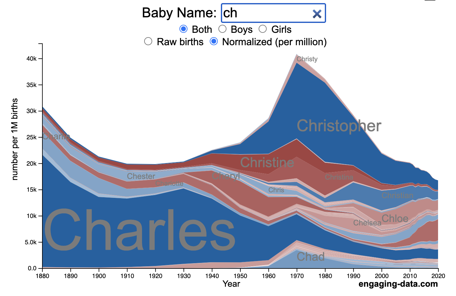
How popular is your name in US history?
Use this visualization to explore statistics about names, specifically the popularity of different names throughout US history (1880 until 2020). This is a useful tool for seeing the rise (and fall) of popularity of names. Look at names that we think of as old-fashioned, and names that are more modern.
Instructions
- Start typing a name into the input box above and the visualization will show all the names that begin with those letters. The graph will show the historical popularity of all these names as an area graph.
- You can hover (or click on mobile) to bring up a tooltip (popup) that shows you the exact number of births with that name for different years (or decades) and the names rank in that time period.
- It’s best used on computer (rather than a mobile or tablet device) so you can see the graph more clearly and also, if you click on a name wedge, it will zoom into names that begin with those letters.
- You can select different views, Boy names, Girl names or both, as well as looking at the raw number of births or a normalized popularity that accounts for the differential number of births throughout the period between 1880 and 2020.
- If you click the share (arrow) button, it will copy the parameters of the current graph you are looking at and create a custom URL to share with others. It copes the link into your clipboard and your browser’s address (URL) bar.
Isn’t there something out there like this already? Baby Name Wizard and Baby Name Voyager
This visualization is not my original idea, but rather a re-creation of the Baby Name Voyager (from the Baby Name Wizard website) created by Laura Wattenberg. The original visualization disappeared (for some unknown reason) from the web, and I thought it was a shame that we should be deprived of such a fun resource.
It started about a week ago, when I saw on twitter that the Baby Name Wizard website was gone. Here’s the blog post from Laura. I hadn’t used it in probably a decade, but it flashed me back to many years ago well before I got into web programming and dataviz and I remember seeing the Baby Name Voyager and thinking how amazing it was that someone could even make such a thing. Everyone I knew played with it quite a bit when it first came out. It got me thinking that it should still be around and that I could probably make it now with my programming skills and how cool that would be.
So I downloaded the frequency data for Baby Names from the US Social Security Administration and set to work trying to create a stacked area graph of baby names vs time. I started with my go to library for fast dataviz (Plotly.js) but eventually ended up creating the visualization in d3.js which is harder for me, but made it very responsive. I’m not an expert in d3, but know enough that using some similar examples and with lots of googling and stack overflow, I could create what I wanted.
I emailed Laura after creating a sample version, just to make sure it was okay to re-create it as a tribute to the Baby Name Wizard / Voyager and got the okay from her.
Where does the data come from?
Some info about Data (from SSA Baby Names Website):
All names are from Social Security card applications for births that occurred in the United States after 1879. Note that many people born before 1937 never applied for a Social Security card, so their names are not included in our data.
Name data are tabulated from the “First Name” field of the Social Security Card Application. Hyphens and spaces are removed, thus Julie-Anne, Julie Anne, and Julieanne will be counted as a single entry.
Name data are not edited. For example, the sex associated with a name may be incorrect.Different spellings of similar names are not combined. For example, the names Caitlin, Caitlyn, Kaitlin, Kaitlyn, Kaitlynn, Katelyn, and Katelynn are considered separate names and each has its own rank.
All data are from a 100% sample of our records on Social Security card applications as of March 2021.
I did notice that there was a significant under-representation of male names in the early data (before 1910) relative to female names. In the normalized data, I set the data for each sex to 500,000 male and 500,000 female births per million total births, instead of the actual data which shows approximately double the number of female names than male names. Not sure why females would have higher rates of social security applications in the early 20th century. Update: A helpful Redditor pointed me to this blog post which explains some of the wonkiness of the early data. The gist of it is that Social Security cards and numbers weren’t really a thing until 1935. Thus the names of births in 1880 are actually 55 year olds who applied for Social Security numbers and since they weren’t mandatory, they don’t include everyone. My correction basically makes the assumption that this data is actually a survey and we got uneven samples from males and female respondents. It’s not perfect (like the later data) but it’s a decent representation of name distribution.
Sources and Tools:
The biggest source of inspiration was of course, Laura Wattenberg’s original Baby Name Explorer.
I downloaded the baby names from the Social Security website. Thanks to Michael W. Shackleford at the SSA for starting their name data reporting. I used a python script to parse and organize the historical data into the proper format my javascript. The visualization is created using HTML, CSS and Javascript code (and the d3.js visualization library) to create interactivity and UI. Curran Kelleher’s area label d3 javascript library was a huge help for adding the names to the graph.

5 Comments »
5 Responses to US Baby Name Popularity Visualizer
Wonderful that you (and Wattenberg) have done this! It’s so well done!
Thanks for doing this. I loved the original incarnations of Baby Name Voyager and Baby Name Wizard.
I think part of the reason that male name data is less than female name data from the early years of SSA, is that Social Security “retirement” was less of a thing, since many workers weren’t expected to live into retirement. So SSA benefits were mainly a Widow’s benefit, with many men never filing.
My name isnt there 🙁
This is great. I can’t believe the original Voyager is gone, but it is. This is an excellent substitute.