Posts for Tag: demographics
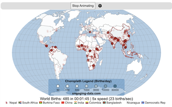
Global Birth Map

Where in the world are babies being born and how fast?
This interactive, animated map shows the where births are happening across the globe. It doesn’t actually show births in real-time, because data isn’t actually available to do that. However, the map does show the frequency of births that are occurring in different locations across the world. And you can see it in two ways, by country and also geo-referenced to specific locations (along a 1degree grid across the globe). There are many different ways to view this global birth map and these options are laid out in the controls at the top of the map. The scrolling list across the bottom also shows the country of each of the dots on the map.
Instructions
- Speed – change the slider to change the rate at which births show up on the map from real-speed to 25x faster
- Map projection – change the map projection
- Highlight country – an outline around the country when a birth occurs
- Choropleth – Build – as each birth occurs, the background color of the country will slowly change to reflect the number of births in the country
- Choropleth – Show – this option colors all the countries to show the number of births per day that occur in the country
- Dots – Show – this is the main feature that shows where each birth is occurring at the frequency that it does occur.
- Dots – Persist – this feature shows where previous births have occurred and the dots get darker as more births happen in that location.
If you hover (or click on mobile) on a country during the animation, it will display how many births have occurred since the animation stared.
Population distribution data combined with country birthrates
I used data that divided and aggregated the world’s population into 1 degree grid spacing across the globe and I assigned the center of each of these grid locations to a country. Then the country’s annual births (i.e. the country’s population times its birthrate) were distributed across all of the populated locations in each country, weighted by the population distribution (i.e. more populated areas got a greater fraction of the births).
Data Sources and Tools
Population and birthrate data for 2023 was obtained from Wikipedia (Population and birth rates). Population distribution across the globe was obtained from Socioeconomic Data and Applications Center (sedac) at Columbia University.
I used python to process country, population distribution data and parse the data into the probability of a birth at each 1 degree x 1 degree location. Then I used javascript to make random draws and predict the number of births for each map location. D3.js was used to create the map elements and html, css and javascript were used to create the user interface.
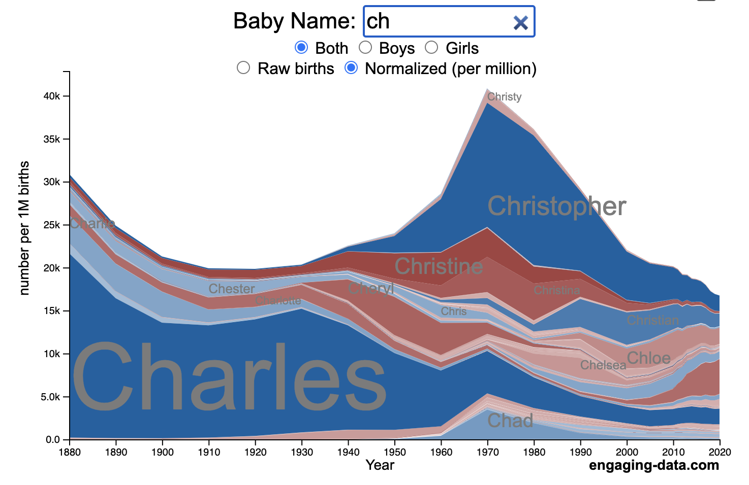
US Baby Name Popularity Visualizer

I added a share button (arrow button) that lets you send a graph with specific name. It copies a custom URL to your clipboard which you can paste into a message/tweet/email.
How popular is your name in US history?
Use this visualization to explore statistics about names, specifically the popularity of different names throughout US history (1880 until 2020). This is a useful tool for seeing the rise (and fall) of popularity of names. Look at names that we think of as old-fashioned, and names that are more modern.
Instructions
- Start typing a name into the input box above and the visualization will show all the names that begin with those letters. The graph will show the historical popularity of all these names as an area graph.
- You can hover (or click on mobile) to bring up a tooltip (popup) that shows you the exact number of births with that name for different years (or decades) and the names rank in that time period.
- It’s best used on computer (rather than a mobile or tablet device) so you can see the graph more clearly and also, if you click on a name wedge, it will zoom into names that begin with those letters.
- You can select different views, Boy names, Girl names or both, as well as looking at the raw number of births or a normalized popularity that accounts for the differential number of births throughout the period between 1880 and 2020.
- If you click the share (arrow) button, it will copy the parameters of the current graph you are looking at and create a custom URL to share with others. It copes the link into your clipboard and your browser’s address (URL) bar.
Isn’t there something out there like this already? Baby Name Wizard and Baby Name Voyager
This visualization is not my original idea, but rather a re-creation of the Baby Name Voyager (from the Baby Name Wizard website) created by Laura Wattenberg. The original visualization disappeared (for some unknown reason) from the web, and I thought it was a shame that we should be deprived of such a fun resource.
It started about a week ago, when I saw on twitter that the Baby Name Wizard website was gone. Here’s the blog post from Laura. I hadn’t used it in probably a decade, but it flashed me back to many years ago well before I got into web programming and dataviz and I remember seeing the Baby Name Voyager and thinking how amazing it was that someone could even make such a thing. Everyone I knew played with it quite a bit when it first came out. It got me thinking that it should still be around and that I could probably make it now with my programming skills and how cool that would be.
So I downloaded the frequency data for Baby Names from the US Social Security Administration and set to work trying to create a stacked area graph of baby names vs time. I started with my go to library for fast dataviz (Plotly.js) but eventually ended up creating the visualization in d3.js which is harder for me, but made it very responsive. I’m not an expert in d3, but know enough that using some similar examples and with lots of googling and stack overflow, I could create what I wanted.
I emailed Laura after creating a sample version, just to make sure it was okay to re-create it as a tribute to the Baby Name Wizard / Voyager and got the okay from her.
Where does the data come from?
Some info about Data (from SSA Baby Names Website):
All names are from Social Security card applications for births that occurred in the United States after 1879. Note that many people born before 1937 never applied for a Social Security card, so their names are not included in our data.
Name data are tabulated from the “First Name” field of the Social Security Card Application. Hyphens and spaces are removed, thus Julie-Anne, Julie Anne, and Julieanne will be counted as a single entry.
Name data are not edited. For example, the sex associated with a name may be incorrect.
Different spellings of similar names are not combined. For example, the names Caitlin, Caitlyn, Kaitlin, Kaitlyn, Kaitlynn, Katelyn, and Katelynn are considered separate names and each has its own rank.
All data are from a 100% sample of our records on Social Security card applications as of March 2021.
I did notice that there was a significant under-representation of male names in the early data (before 1910) relative to female names. In the normalized data, I set the data for each sex to 500,000 male and 500,000 female births per million total births, instead of the actual data which shows approximately double the number of female names than male names. Not sure why females would have higher rates of social security applications in the early 20th century. Update: A helpful Redditor pointed me to this blog post which explains some of the wonkiness of the early data. The gist of it is that Social Security cards and numbers weren’t really a thing until 1935. Thus the names of births in 1880 are actually 55 year olds who applied for Social Security numbers and since they weren’t mandatory, they don’t include everyone. My correction basically makes the assumption that this data is actually a survey and we got uneven samples from males and female respondents. It’s not perfect (like the later data) but it’s a decent representation of name distribution.
Sources and Tools:
The biggest source of inspiration was of course, Laura Wattenberg’s original Baby Name Explorer.
I downloaded the baby names from the Social Security website. Thanks to Michael W. Shackleford at the SSA for starting their name data reporting. I used a python script to parse and organize the historical data into the proper format my javascript. The visualization is created using HTML, CSS and Javascript code (and the d3.js visualization library) to create interactivity and UI. Curran Kelleher’s area label d3 javascript library was a huge help for adding the names to the graph.
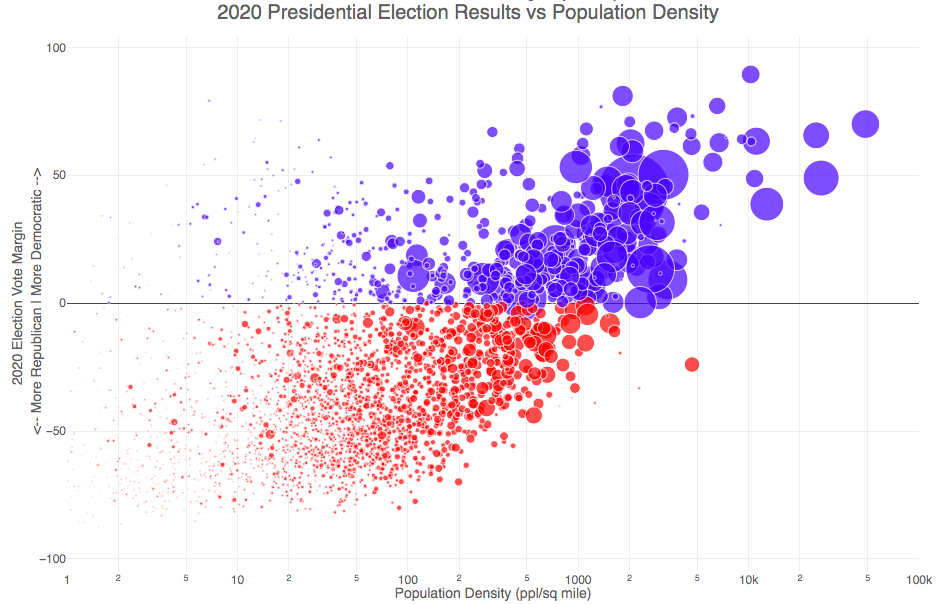
Election Results and Population Density

How do 2020 presidential election results correlate with population density?
The visualization I made about county election results and comparing land area to population size was very popular around the time of the 2020 presidential election. As the counties were represented by population, it was clear that democratic-leaning areas on that map tended to grow in size, while republican-leaning areas tended to shrink. This raised the question of exactly how population density correlates with election results.
Hover over (or click on) the bubbles to see information about the county.
It’s clear there is a very strong correlation between the vote margin and population density. Vote margin is the percentage amount that one candidate beat the other candidate by in the county (0% means a tie while 50% means that one candidate got 75% and the other got 25% of the voteshare). Population density is calculated as people per square mile in the county and is shown in the graph on a log scale, where each major grid line is 10 time greater than the previous one. This is done because there is one to two orders of magnitude difference in the densest counties (in New York City) and even moderately dense counties. There are also several counties with population density below 1 person per square mile (several in Alaska because of the size of their counties) but these are excluded from the graph.
Richmond County, NY (i.e. the Borough of Staten Island) is the densest county (17th densest) in the country that Trump won. The densest counties favored Biden quite heavily as he won 45 of the 50 densest counties in the country, which also tend to have a fairly high population.
This second graph is a histogram that specifically categorizes counties into discreet bins by population density. Note that they are on a log scale as well. You can toggle the graph to show the number of counties won by each candidate or the number of votes won in each of the population density bins. The black line shows the percentage of counties (or votes) won by the democratic candidate (Joe Biden) in each of those bins.
Hover over (or click on) the bars to see information about each county bin.
It’s pretty clear in these graphs that low population density areas clearly favor the republican while the denser areas favor the democrat.
Data and Tools
The 2020 county-level election data is downloaded from the New York Times county election data API and processed using a python script. Population data used is for 2018. The visualization was created using the open-source plotly javascript graphing library.
Assembling the USA state-by-state with state-level statistics

Watch the United States assemble state by state based on statistics of interest
Based on earlier popularity of the country-by-country animation, this map lets you watch as the world is built-up one state at a time. This can be done along a large range of statistical dimensions:
Name (alphabetical)
abbreviation
Date of entry to the United States
State Population (2018)
Population per Electoral Vote (2018)
Population per House Seat (2018)
Land Area (square miles)
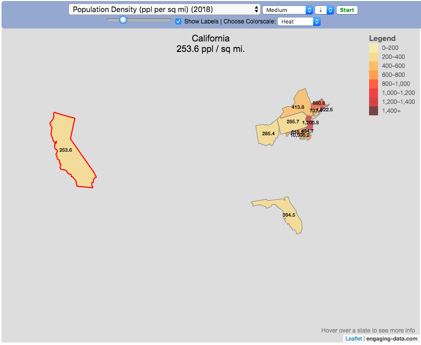
Population Density (ppl per sq mi) (2018)
State’s Highest Point
Highest Elevation (ft)
Mean Elevation (ft)
State’s Lowest Point
Lowest Point (ft)
Life Expectancy at Birth (yrs)
Median Age (yrs)
Percent with High School Education
Percent with Bachelor’s Degree
Residential Electricity Price (cents per kWh) (2018)
Gasoline Price ($/gal) Regular unleaded (2019)
State Gross Domestic Product GDP ($Million) (2018)
GDP per capita ($/capita)
Number of Counties (or subdivisions)
Average Daily Solar Radiation (kWh/m2)
Birth rate (per thousand population)
Avg Age of Mother at Birth
Annual Precipitation (in/yr)
Average Temperature (deg F)
These statistics can be sorted from small to large or vice versa to get a view of the US and its constituent states plus DC in a unique and interesting way. It’s a bit hypnotic to watch as the states appear and add to the country one by one.
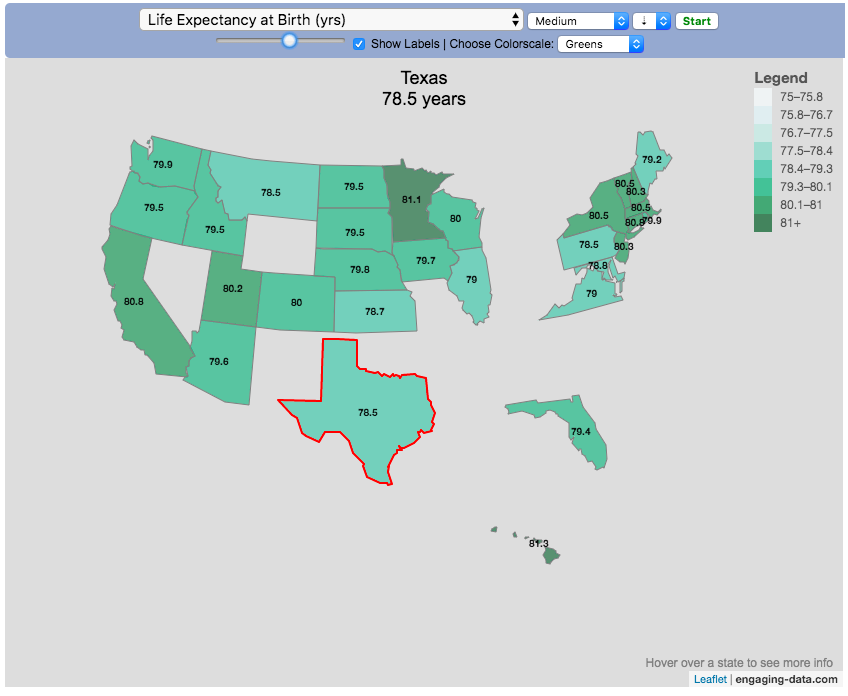
You can use this map to display all the states that have higher life expectancy than the Texas:
select “Life expectancy”, sort from “high to low” and use the scroll bar to move to the Texax and you’ll get a picture like this:
or this map to display all the states that have higher population density than California:
select “Population density, sort from “high to low” and use the scroll bar to move to the United States and you’ll get a picture like this:
I hope you enjoy exploring the United States through a number of different demographic, economic and physical characteristics through this data viz tool. And if you have ideas for other statistics to add, I will try to do so.
Data and tools: Data was downloaded from a variety of sources:
- Population https://en.wikipedia.org/wiki/List_of_states_and_territories_of_the_United_States_by_population
- Admission to union https://simple.wikipedia.org/wiki/List_of_U.S._states_by_date_of_admission_to_the_Union
- Educational attainment https://nces.ed.gov/programs/digest/d18/tables/dt18_104.88.asp
- Highest points https://geology.com/state-high-points.shtml
- Life expectancy https://en.wikipedia.org/wiki/List_of_U.S._states_and_territories_by_life_expectancy
- Median Age http://www.statemaster.com/graph/peo_med_age-people-median-age
- Land area https://statesymbolsusa.org/symbol-official-item/national-us/uncategorized/states-size
- Mean elevation https://www.census.gov/library/publications/2011/compendia/statab/131ed/geography-environment.html
- Electricity price https://www.chooseenergy.com/electricity-rates-by-state/
- Gasoline price https://gasprices.aaa.com/state-gas-price-averages/
- GDP https://www.bea.gov/data/gdp/gdp-state
- Sunlight North America Land Data Assimilation System (NLDAS) Daily Sunlight (insolation) for years 1979-2011 on CDC WONDER Online Database, released 2013. Accessed at http://wonder.cdc.gov/NASA-INSOLAR.html on Jun 14, 2019 1:37:15 PM
- Births United States Department of Health and Human Services (US DHHS), Centers for Disease Control and Prevention (CDC), National Center for Health Statistics (NCHS), Division of Vital Statistics, Natality public-use data 2007-2017, on CDC WONDER Online Database, October 2018. Accessed at http://wonder.cdc.gov/natality-current.html on Jun 14, 2019 1:53:58 PM
- Precipitation North America Land Data Assimilation System (NLDAS) Daily Precipitation for years 1979-2011 on CDC WONDER Online Database, released 2013. Accessed at http://wonder.cdc.gov/NASA-Precipitation.html on Jun 26, 2019 3:30:40 PM
- Temperature http://www.usa.com/rank/us–average-temperature–state-rank.htm
The map was created with the help of the open source leaflet javascript mapping library
How do Americans Spend Money? US Household Spending Breakdown by Education Level
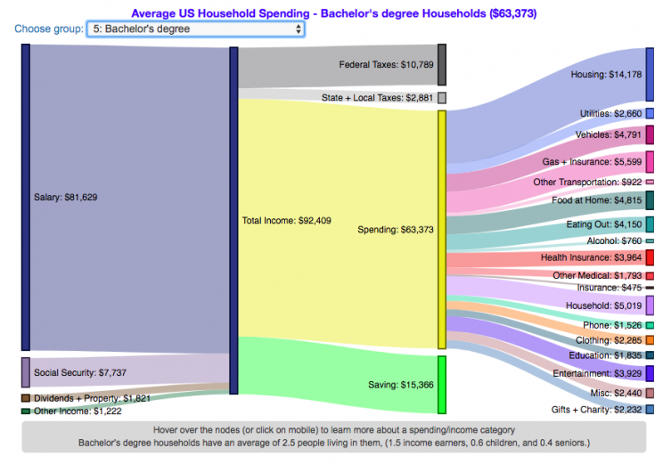
How much do US households spend and how does it change with education level?
This visualization is one of a series of visualizations that present US household spending data from the US Bureau of Labor Statistics. This one looks at the education level of the primary resident.
- US Household spending by income group
- US Household spending by age of primary resident
- US Household spending by education level of primary resident
- US Household spending by household composition
This visualization focuses on the education level of the primary resident. This is defined in the BLS documentation as the person who is first mentioned when the survey respondent is asked who in the household rents or owns the home.
I obtained data from the US Bureau of Labor Statistics (BLS), based upon a survey of consumer households and their spending habits. This data breaks down spending and income into many categories that are aggregated and plotted in a Sankey graph.
One of the key factors in financial health of an individual or household is making sure that household spending is equal to or below household income. If your spending is higher than income, you will be drawing down your savings (if you have any) or borrowing money. If your spending is lower than your income, you will presumably be saving money which can provide flexibility in the future, fund your retirement (maybe even early) and generally give you peace of mind.
Instructions:
- Hover (or on mobile click) on a link to get more information on the definition of a particular spending or income category.
- Use the dropdown menu to look at averages for different groups of households based on the education level of the primary resident. This data breaks households into the following groups:
- All
- Less than HS graduate
- High school graduate
- HS grad + some college
- Associate’s degree
- Bachelor’s degree
- Master’s, professional, doctoral degree
The composition of households and income change as the education level of the primary resident changes, which in turn affects spending totals and individual categories.
As stated before, one of the keys to financial security is spending less than your income. We can see that on average, income tends to increase with education level. Those with the highest incomes and greatest spending have advanced degrees, but they also save the most money.
The group with the lowest education level (not finishing high school) have the lowest income and on average needs to borrow or draw down on savings to live their lifestyle.
How does your overall spending compare with those that have the same education level as you? How about spending in individual categories like housing, vehicles, food, clothing, etc…?
Probably one of the best things you can do from a financial perspective is to go through your spending and understand where your money is going. These sankey diagrams are one way to do it and see it visually, but of course, you can also make a table or pie chart (Honestly, whatever gets you to look at your income and expenses is a good thing).
The main thing is to understand where your money is going. Once you’ve done this you can be more conscious of what you are spending your money on, and then decide if you are spending too much (or too little) in certain categories. Having context of what other people spend money on is helpful as well, and why it is useful to compare to these averages, even though the income level, regional cost of living, and household composition won’t look exactly the same as your household.
**Click Here to view other financial-related tools and data visualizations from engaging-data**
Here is more information about the Consumer Expenditure Surveys from the BLS website:
The Consumer Expenditure Surveys (CE) collect information from the US households and families on their spending habits (expenditures), income, and household characteristics. The strength of the surveys is that it allows data users to relate the expenditures and income of consumers to the characteristics of those consumers. The surveys consist of two components, a quarterly Interview Survey and a weekly Diary Survey, each with its own questionnaire and sample.
Data and Tools:
Data on consumer spending was obtained from the BLS Consumer Expenditure Surveys, and aggregation and calculations were done using javascript and code modified from the Sankeymatic plotting website. I aggregated many of the survey output categories so as to make the graph legible, otherwise there’d be 4x as many spending categories and all very small and difficult to read.

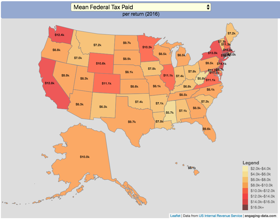
How Much Does Each State Pay In Taxes?

Given that tax day has just passed, I thought it would be good to check out some data on taxes. The IRS provides a great resource on tax data that I’ve only just gotten into. I think I’ll be able to do more with this in the future. This one looks at how taxes paid varies by state and presents it as a choropleth map (coloring states based on certain categories of tax data).
You can choose from a number of different categories:
- Mean Federal Tax Paid
- Mean Adjusted Gross Income
- Mean State/Local Tax
- Mean Combined (Fed/State/Local) Tax
- Percent Income from Dividends and Capital Gains
- Percent of Returns with Itemized Deductions
- Number of Tax Returns
- Mean Federal Tax Rate
- Mean State/Local Tax Rate
- Mean Combined (Fed/State/Local) Rate
- Total Federal Tax Liability
I may add more categories in the future, so if you have ideas of tax data you want to see visualized let me know and I’ll see what I can do.
For other tax-related tools and visualizations see my tax bracket calculator and visualization of marginal tax rates.
**Click Here to view other financial-related tools and data visualizations from engaging-data**
Data and Tools:
Data on tax returns by state is from the IRS website in an excel format. The map was made using the leaflet open source mapping library. Data was compiled in excel and calculations made using javascript.
Global Birth Map
Where in the world are babies being born and how fast?
This interactive, animated map shows the where births are happening across the globe. It doesn’t actually show births in real-time, because data isn’t actually available to do that. However, the map does show the frequency of births that are occurring in different locations across the world. And you can see it in two ways, by country and also geo-referenced to specific locations (along a 1degree grid across the globe). There are many different ways to view this global birth map and these options are laid out in the controls at the top of the map. The scrolling list across the bottom also shows the country of each of the dots on the map.
Instructions
- Speed – change the slider to change the rate at which births show up on the map from real-speed to 25x faster
- Map projection – change the map projection
- Highlight country – an outline around the country when a birth occurs
- Choropleth – Build – as each birth occurs, the background color of the country will slowly change to reflect the number of births in the country
- Choropleth – Show – this option colors all the countries to show the number of births per day that occur in the country
- Dots – Show – this is the main feature that shows where each birth is occurring at the frequency that it does occur.
- Dots – Persist – this feature shows where previous births have occurred and the dots get darker as more births happen in that location.
If you hover (or click on mobile) on a country during the animation, it will display how many births have occurred since the animation stared.
Population distribution data combined with country birthrates
I used data that divided and aggregated the world’s population into 1 degree grid spacing across the globe and I assigned the center of each of these grid locations to a country. Then the country’s annual births (i.e. the country’s population times its birthrate) were distributed across all of the populated locations in each country, weighted by the population distribution (i.e. more populated areas got a greater fraction of the births).
Data Sources and Tools
Population and birthrate data for 2023 was obtained from Wikipedia (Population and birth rates). Population distribution across the globe was obtained from Socioeconomic Data and Applications Center (sedac) at Columbia University.
I used python to process country, population distribution data and parse the data into the probability of a birth at each 1 degree x 1 degree location. Then I used javascript to make random draws and predict the number of births for each map location. D3.js was used to create the map elements and html, css and javascript were used to create the user interface.
US Baby Name Popularity Visualizer
I added a share button (arrow button) that lets you send a graph with specific name. It copies a custom URL to your clipboard which you can paste into a message/tweet/email.
How popular is your name in US history?
Use this visualization to explore statistics about names, specifically the popularity of different names throughout US history (1880 until 2020). This is a useful tool for seeing the rise (and fall) of popularity of names. Look at names that we think of as old-fashioned, and names that are more modern.
Instructions
- Start typing a name into the input box above and the visualization will show all the names that begin with those letters. The graph will show the historical popularity of all these names as an area graph.
- You can hover (or click on mobile) to bring up a tooltip (popup) that shows you the exact number of births with that name for different years (or decades) and the names rank in that time period.
- It’s best used on computer (rather than a mobile or tablet device) so you can see the graph more clearly and also, if you click on a name wedge, it will zoom into names that begin with those letters.
- You can select different views, Boy names, Girl names or both, as well as looking at the raw number of births or a normalized popularity that accounts for the differential number of births throughout the period between 1880 and 2020.
- If you click the share (arrow) button, it will copy the parameters of the current graph you are looking at and create a custom URL to share with others. It copes the link into your clipboard and your browser’s address (URL) bar.
Isn’t there something out there like this already? Baby Name Wizard and Baby Name Voyager
This visualization is not my original idea, but rather a re-creation of the Baby Name Voyager (from the Baby Name Wizard website) created by Laura Wattenberg. The original visualization disappeared (for some unknown reason) from the web, and I thought it was a shame that we should be deprived of such a fun resource.
It started about a week ago, when I saw on twitter that the Baby Name Wizard website was gone. Here’s the blog post from Laura. I hadn’t used it in probably a decade, but it flashed me back to many years ago well before I got into web programming and dataviz and I remember seeing the Baby Name Voyager and thinking how amazing it was that someone could even make such a thing. Everyone I knew played with it quite a bit when it first came out. It got me thinking that it should still be around and that I could probably make it now with my programming skills and how cool that would be.
So I downloaded the frequency data for Baby Names from the US Social Security Administration and set to work trying to create a stacked area graph of baby names vs time. I started with my go to library for fast dataviz (Plotly.js) but eventually ended up creating the visualization in d3.js which is harder for me, but made it very responsive. I’m not an expert in d3, but know enough that using some similar examples and with lots of googling and stack overflow, I could create what I wanted.
I emailed Laura after creating a sample version, just to make sure it was okay to re-create it as a tribute to the Baby Name Wizard / Voyager and got the okay from her.
Where does the data come from?
Some info about Data (from SSA Baby Names Website):
All names are from Social Security card applications for births that occurred in the United States after 1879. Note that many people born before 1937 never applied for a Social Security card, so their names are not included in our data.
Name data are tabulated from the “First Name” field of the Social Security Card Application. Hyphens and spaces are removed, thus Julie-Anne, Julie Anne, and Julieanne will be counted as a single entry.
Name data are not edited. For example, the sex associated with a name may be incorrect.Different spellings of similar names are not combined. For example, the names Caitlin, Caitlyn, Kaitlin, Kaitlyn, Kaitlynn, Katelyn, and Katelynn are considered separate names and each has its own rank.
All data are from a 100% sample of our records on Social Security card applications as of March 2021.
I did notice that there was a significant under-representation of male names in the early data (before 1910) relative to female names. In the normalized data, I set the data for each sex to 500,000 male and 500,000 female births per million total births, instead of the actual data which shows approximately double the number of female names than male names. Not sure why females would have higher rates of social security applications in the early 20th century. Update: A helpful Redditor pointed me to this blog post which explains some of the wonkiness of the early data. The gist of it is that Social Security cards and numbers weren’t really a thing until 1935. Thus the names of births in 1880 are actually 55 year olds who applied for Social Security numbers and since they weren’t mandatory, they don’t include everyone. My correction basically makes the assumption that this data is actually a survey and we got uneven samples from males and female respondents. It’s not perfect (like the later data) but it’s a decent representation of name distribution.
Sources and Tools:
The biggest source of inspiration was of course, Laura Wattenberg’s original Baby Name Explorer.
I downloaded the baby names from the Social Security website. Thanks to Michael W. Shackleford at the SSA for starting their name data reporting. I used a python script to parse and organize the historical data into the proper format my javascript. The visualization is created using HTML, CSS and Javascript code (and the d3.js visualization library) to create interactivity and UI. Curran Kelleher’s area label d3 javascript library was a huge help for adding the names to the graph.
Election Results and Population Density
How do 2020 presidential election results correlate with population density?
The visualization I made about county election results and comparing land area to population size was very popular around the time of the 2020 presidential election. As the counties were represented by population, it was clear that democratic-leaning areas on that map tended to grow in size, while republican-leaning areas tended to shrink. This raised the question of exactly how population density correlates with election results.
Hover over (or click on) the bubbles to see information about the county.
It’s clear there is a very strong correlation between the vote margin and population density. Vote margin is the percentage amount that one candidate beat the other candidate by in the county (0% means a tie while 50% means that one candidate got 75% and the other got 25% of the voteshare). Population density is calculated as people per square mile in the county and is shown in the graph on a log scale, where each major grid line is 10 time greater than the previous one. This is done because there is one to two orders of magnitude difference in the densest counties (in New York City) and even moderately dense counties. There are also several counties with population density below 1 person per square mile (several in Alaska because of the size of their counties) but these are excluded from the graph.
Richmond County, NY (i.e. the Borough of Staten Island) is the densest county (17th densest) in the country that Trump won. The densest counties favored Biden quite heavily as he won 45 of the 50 densest counties in the country, which also tend to have a fairly high population.
This second graph is a histogram that specifically categorizes counties into discreet bins by population density. Note that they are on a log scale as well. You can toggle the graph to show the number of counties won by each candidate or the number of votes won in each of the population density bins. The black line shows the percentage of counties (or votes) won by the democratic candidate (Joe Biden) in each of those bins.
Hover over (or click on) the bars to see information about each county bin.
It’s pretty clear in these graphs that low population density areas clearly favor the republican while the denser areas favor the democrat.
Data and Tools
The 2020 county-level election data is downloaded from the New York Times county election data API and processed using a python script. Population data used is for 2018. The visualization was created using the open-source plotly javascript graphing library.
Assembling the USA state-by-state with state-level statistics
Watch the United States assemble state by state based on statistics of interest
Based on earlier popularity of the country-by-country animation, this map lets you watch as the world is built-up one state at a time. This can be done along a large range of statistical dimensions:
These statistics can be sorted from small to large or vice versa to get a view of the US and its constituent states plus DC in a unique and interesting way. It’s a bit hypnotic to watch as the states appear and add to the country one by one.
You can use this map to display all the states that have higher life expectancy than the Texas:
select “Life expectancy”, sort from “high to low” and use the scroll bar to move to the Texax and you’ll get a picture like this:
or this map to display all the states that have higher population density than California:
select “Population density, sort from “high to low” and use the scroll bar to move to the United States and you’ll get a picture like this:
I hope you enjoy exploring the United States through a number of different demographic, economic and physical characteristics through this data viz tool. And if you have ideas for other statistics to add, I will try to do so.
Data and tools: Data was downloaded from a variety of sources:
- Population https://en.wikipedia.org/wiki/List_of_states_and_territories_of_the_United_States_by_population
- Admission to union https://simple.wikipedia.org/wiki/List_of_U.S._states_by_date_of_admission_to_the_Union
- Educational attainment https://nces.ed.gov/programs/digest/d18/tables/dt18_104.88.asp
- Highest points https://geology.com/state-high-points.shtml
- Life expectancy https://en.wikipedia.org/wiki/List_of_U.S._states_and_territories_by_life_expectancy
- Median Age http://www.statemaster.com/graph/peo_med_age-people-median-age
- Land area https://statesymbolsusa.org/symbol-official-item/national-us/uncategorized/states-size
- Mean elevation https://www.census.gov/library/publications/2011/compendia/statab/131ed/geography-environment.html
- Electricity price https://www.chooseenergy.com/electricity-rates-by-state/
- Gasoline price https://gasprices.aaa.com/state-gas-price-averages/
- GDP https://www.bea.gov/data/gdp/gdp-state
- Sunlight North America Land Data Assimilation System (NLDAS) Daily Sunlight (insolation) for years 1979-2011 on CDC WONDER Online Database, released 2013. Accessed at http://wonder.cdc.gov/NASA-INSOLAR.html on Jun 14, 2019 1:37:15 PM
- Births United States Department of Health and Human Services (US DHHS), Centers for Disease Control and Prevention (CDC), National Center for Health Statistics (NCHS), Division of Vital Statistics, Natality public-use data 2007-2017, on CDC WONDER Online Database, October 2018. Accessed at http://wonder.cdc.gov/natality-current.html on Jun 14, 2019 1:53:58 PM
- Precipitation North America Land Data Assimilation System (NLDAS) Daily Precipitation for years 1979-2011 on CDC WONDER Online Database, released 2013. Accessed at http://wonder.cdc.gov/NASA-Precipitation.html on Jun 26, 2019 3:30:40 PM
- Temperature http://www.usa.com/rank/us–average-temperature–state-rank.htm
The map was created with the help of the open source leaflet javascript mapping library
How do Americans Spend Money? US Household Spending Breakdown by Education Level
How much do US households spend and how does it change with education level?
This visualization is one of a series of visualizations that present US household spending data from the US Bureau of Labor Statistics. This one looks at the education level of the primary resident.
- US Household spending by income group
- US Household spending by age of primary resident
- US Household spending by education level of primary resident
- US Household spending by household composition
This visualization focuses on the education level of the primary resident. This is defined in the BLS documentation as the person who is first mentioned when the survey respondent is asked who in the household rents or owns the home.
I obtained data from the US Bureau of Labor Statistics (BLS), based upon a survey of consumer households and their spending habits. This data breaks down spending and income into many categories that are aggregated and plotted in a Sankey graph.
One of the key factors in financial health of an individual or household is making sure that household spending is equal to or below household income. If your spending is higher than income, you will be drawing down your savings (if you have any) or borrowing money. If your spending is lower than your income, you will presumably be saving money which can provide flexibility in the future, fund your retirement (maybe even early) and generally give you peace of mind.
Instructions:
- Hover (or on mobile click) on a link to get more information on the definition of a particular spending or income category.
- Use the dropdown menu to look at averages for different groups of households based on the education level of the primary resident. This data breaks households into the following groups:
- All
- Less than HS graduate
- High school graduate
- HS grad + some college
- Associate’s degree
- Bachelor’s degree
- Master’s, professional, doctoral degree
The composition of households and income change as the education level of the primary resident changes, which in turn affects spending totals and individual categories.
As stated before, one of the keys to financial security is spending less than your income. We can see that on average, income tends to increase with education level. Those with the highest incomes and greatest spending have advanced degrees, but they also save the most money.
The group with the lowest education level (not finishing high school) have the lowest income and on average needs to borrow or draw down on savings to live their lifestyle.
How does your overall spending compare with those that have the same education level as you? How about spending in individual categories like housing, vehicles, food, clothing, etc…?
Probably one of the best things you can do from a financial perspective is to go through your spending and understand where your money is going. These sankey diagrams are one way to do it and see it visually, but of course, you can also make a table or pie chart (Honestly, whatever gets you to look at your income and expenses is a good thing).
The main thing is to understand where your money is going. Once you’ve done this you can be more conscious of what you are spending your money on, and then decide if you are spending too much (or too little) in certain categories. Having context of what other people spend money on is helpful as well, and why it is useful to compare to these averages, even though the income level, regional cost of living, and household composition won’t look exactly the same as your household.
**Click Here to view other financial-related tools and data visualizations from engaging-data**
Here is more information about the Consumer Expenditure Surveys from the BLS website:
The Consumer Expenditure Surveys (CE) collect information from the US households and families on their spending habits (expenditures), income, and household characteristics. The strength of the surveys is that it allows data users to relate the expenditures and income of consumers to the characteristics of those consumers. The surveys consist of two components, a quarterly Interview Survey and a weekly Diary Survey, each with its own questionnaire and sample.
Data and Tools:
Data on consumer spending was obtained from the BLS Consumer Expenditure Surveys, and aggregation and calculations were done using javascript and code modified from the Sankeymatic plotting website. I aggregated many of the survey output categories so as to make the graph legible, otherwise there’d be 4x as many spending categories and all very small and difficult to read.
How Much Does Each State Pay In Taxes?
Given that tax day has just passed, I thought it would be good to check out some data on taxes. The IRS provides a great resource on tax data that I’ve only just gotten into. I think I’ll be able to do more with this in the future. This one looks at how taxes paid varies by state and presents it as a choropleth map (coloring states based on certain categories of tax data).
- Mean Federal Tax Paid
- Mean Adjusted Gross Income
- Mean State/Local Tax
- Mean Combined (Fed/State/Local) Tax
- Percent Income from Dividends and Capital Gains
- Percent of Returns with Itemized Deductions
- Number of Tax Returns
- Mean Federal Tax Rate
- Mean State/Local Tax Rate
- Mean Combined (Fed/State/Local) Rate
- Total Federal Tax Liability
I may add more categories in the future, so if you have ideas of tax data you want to see visualized let me know and I’ll see what I can do.
For other tax-related tools and visualizations see my tax bracket calculator and visualization of marginal tax rates.
**Click Here to view other financial-related tools and data visualizations from engaging-data**
Data and Tools:
Data on tax returns by state is from the IRS website in an excel format. The map was made using the leaflet open source mapping library. Data was compiled in excel and calculations made using javascript.
Recent Comments