Posts for Tag: demographics
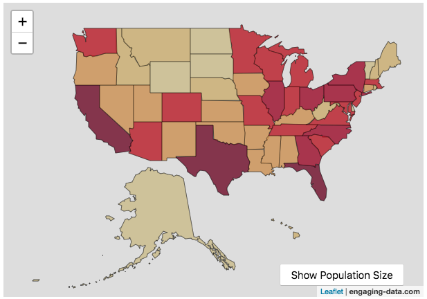
Scaling the physical size of States in the US to reflect population size (animation)
States sized to New Jersey’s population density
Choropleth maps are a pretty useful kind of map that colors distinct areas of the map (e.g. states, counties or countries) to reflect different numerical or categorical values. It is useful to show differences across geographic regions. I’ve been making a bunch of these recently (stressed states, bitcoin electricity consumption, college admissions). One of the issues that can be problematic with these maps is that some regions can be very large but only have very few people. If the choropleth map is tracking a intensity value (like CO2 emissions per capita), a large area with a high color value might visually indicate that total emissions (emissions per capita x # of people) is also high. In the US this is reflected in states like Alaska, Montana and Wyoming, which are large but have very few people.
I decided to make a modified choropleth map (updated after learning that it’s called a cartogram) that scales the size of the states to be the proportional to the state’s population. States with larger populations show up as larger. This is equivalent to making each state have the same population density. Since New Jersey has the highest population density of any state in the US (1200 people/square mile), it stays the same size in this map and all the other states shrink, to reflect their lower population density. For example, California has a larger population than NJ (4.4x), but its physical size is about 20x larger. So California is shrunk to about 20% its original size to make its physical size 4.4x the size of NJ.
The states are also colored to show population as well (darker redder colors reflect larger population while yellow/beige reflects small populations).
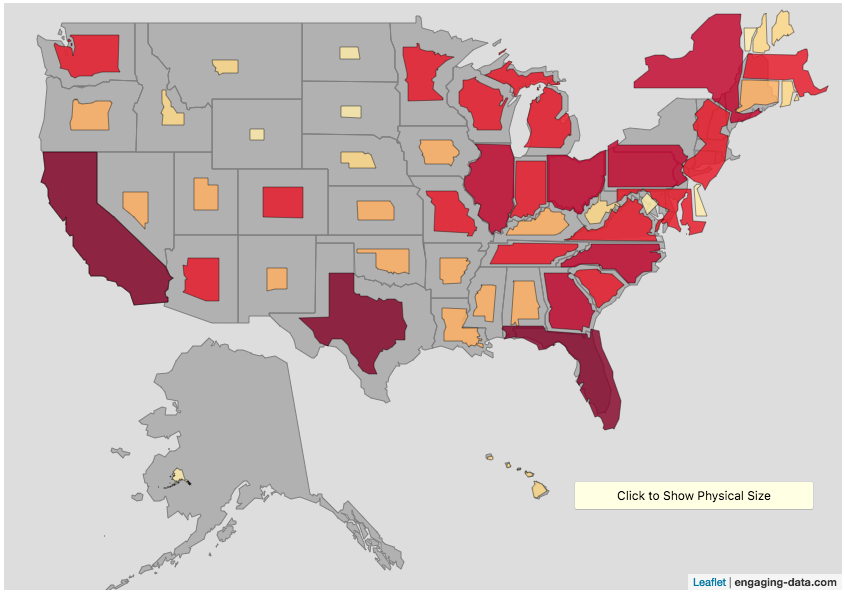
States sized to California’s population density
Living in California, I decided to make another animation, this time with scaled to the density of California, so some states that are less dense will shrink, while others that are denser will grow. New Jersey grows quite a bit. Because many of the dense Northeast states grow a bit, I had to space them out (manually) so you could still see them otherwise they’d overlap too much.
Data Sources and Tools:
2015 population and population density data comes from Wikipedia and leaflet.js open source mapping library was used to create the maps. State outlines in geoJSON format come from leaflet. Javascript code was used to scale the coordinates of the geoJSON polygons to the appropriate size and animate the map.
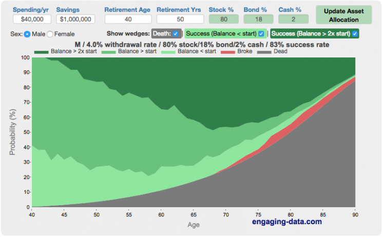
Rich, Broke or Dead? Post-Retirement FIRE Calculator: Visualizing Early Retirement Success and Longevity Risk
Update: June 2025 – bug fix in how tax rate on additional income is applied. If you have a lot of additional income, your success rate will likely go down.
Updated Shiller returns and inflation dataset through beginning of 2024
Rich, Broke or Dead?
One of the key issues with retiring is ensuring that the money you have saved will not be exhausted during your retirement. This is also known as Longevity Risk and is especially important if you want to retire early, since your retirement could be 50 years long (or more). This interactive post-retirement fire calculator and visualization looks at the question of whether your retirement savings can last long enough to support your retirement spending and combines it with average US life expectancy values to get a fuller picture of the likelihood of running out of money before you die.
It helps to answer the question: If I start out with $X dollars at the beginning of my retirement, will I run out of money before I die?
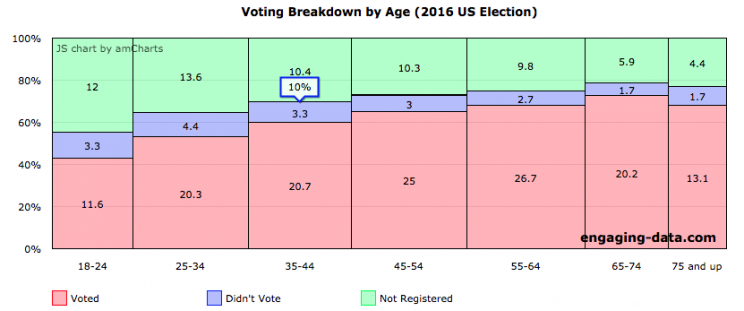
Demographic Characteristics of US Voters (2016)
If you need to register to vote, please visit Rock the Vote to get registered in your state.
US politics has more than a few issues, which have been highlighted by the current situation in Washington DC. The protests and greater political awareness from high school students and young adults is a positive sign for democracy, but it needs to be accompanied by increased rates of voting from this demographic. I thought it would be interesting to explore rates of voting in the US across different demographic groups (age, education, income, race). This data is from the 2016 US presidential election.
Total eligible US voting population was about 224 million in 2016 and the overall rate of voting among this population was 61.4%.
The first graph shows the distribution by age. As we can see, the rate of registration and voting increases with age. It is hard to engage young people to be interested in voting but hopefully they will do so in greater numbers this upcoming election.
Scaling the physical size of States in the US to reflect population size (animation)
States sized to New Jersey’s population density
Choropleth maps are a pretty useful kind of map that colors distinct areas of the map (e.g. states, counties or countries) to reflect different numerical or categorical values. It is useful to show differences across geographic regions. I’ve been making a bunch of these recently (stressed states, bitcoin electricity consumption, college admissions). One of the issues that can be problematic with these maps is that some regions can be very large but only have very few people. If the choropleth map is tracking a intensity value (like CO2 emissions per capita), a large area with a high color value might visually indicate that total emissions (emissions per capita x # of people) is also high. In the US this is reflected in states like Alaska, Montana and Wyoming, which are large but have very few people.
I decided to make a modified choropleth map (updated after learning that it’s called a cartogram) that scales the size of the states to be the proportional to the state’s population. States with larger populations show up as larger. This is equivalent to making each state have the same population density. Since New Jersey has the highest population density of any state in the US (1200 people/square mile), it stays the same size in this map and all the other states shrink, to reflect their lower population density. For example, California has a larger population than NJ (4.4x), but its physical size is about 20x larger. So California is shrunk to about 20% its original size to make its physical size 4.4x the size of NJ.
The states are also colored to show population as well (darker redder colors reflect larger population while yellow/beige reflects small populations).
States sized to California’s population density
Living in California, I decided to make another animation, this time with scaled to the density of California, so some states that are less dense will shrink, while others that are denser will grow. New Jersey grows quite a bit. Because many of the dense Northeast states grow a bit, I had to space them out (manually) so you could still see them otherwise they’d overlap too much.
Data Sources and Tools:
2015 population and population density data comes from Wikipedia and leaflet.js open source mapping library was used to create the maps. State outlines in geoJSON format come from leaflet. Javascript code was used to scale the coordinates of the geoJSON polygons to the appropriate size and animate the map.
Rich, Broke or Dead? Post-Retirement FIRE Calculator: Visualizing Early Retirement Success and Longevity Risk
Update: June 2025 – bug fix in how tax rate on additional income is applied. If you have a lot of additional income, your success rate will likely go down.
Updated Shiller returns and inflation dataset through beginning of 2024
Rich, Broke or Dead?
One of the key issues with retiring is ensuring that the money you have saved will not be exhausted during your retirement. This is also known as Longevity Risk and is especially important if you want to retire early, since your retirement could be 50 years long (or more). This interactive post-retirement fire calculator and visualization looks at the question of whether your retirement savings can last long enough to support your retirement spending and combines it with average US life expectancy values to get a fuller picture of the likelihood of running out of money before you die.
It helps to answer the question: If I start out with $X dollars at the beginning of my retirement, will I run out of money before I die?
Demographic Characteristics of US Voters (2016)
If you need to register to vote, please visit Rock the Vote to get registered in your state.
US politics has more than a few issues, which have been highlighted by the current situation in Washington DC. The protests and greater political awareness from high school students and young adults is a positive sign for democracy, but it needs to be accompanied by increased rates of voting from this demographic. I thought it would be interesting to explore rates of voting in the US across different demographic groups (age, education, income, race). This data is from the 2016 US presidential election.
Total eligible US voting population was about 224 million in 2016 and the overall rate of voting among this population was 61.4%.
The first graph shows the distribution by age. As we can see, the rate of registration and voting increases with age. It is hard to engage young people to be interested in voting but hopefully they will do so in greater numbers this upcoming election.
Recent Comments