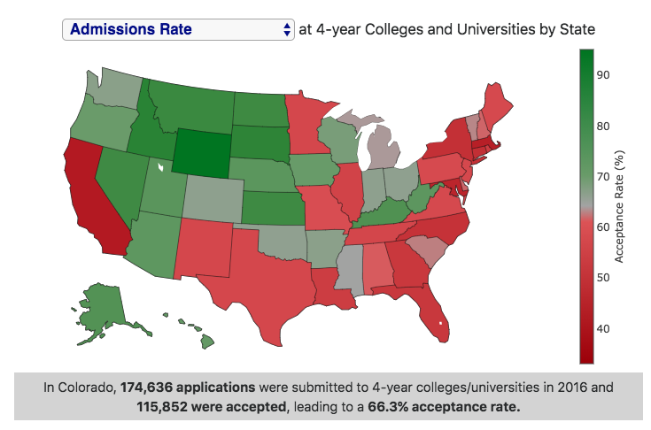
Here is an interactive choropleth map that shows college admissions statistics for 4-year colleges and universities averaged across entire states. Admittedly, this is not the most useful way to look at admissions data, but provides an interesting look at the relative number and selectivity of colleges in different states.
There are 5 different maps you can look at (using the drop down menu in the graph title):
- Admissions rate – this is the number of acceptances divided by the number of applications, expressed as a percentage. It is important to note that students can apply to many schools and can be accepted by many schools.
- Yield rate – this is the number of enrolled students divided by the number of acceptances, expressed as a percentage. It is important to note that students can be accepted to many schools but can only enroll in one.
- Enrollment rate – this is the number of enrolled students divided by the number of applications, expressed as a percentage. It is important to note that students can apply to many schools but can only enroll in one.
- Number of Colleges – this is the number of 4-year colleges and universities in a given state.
- Number of Entering Students – this is the number of students that enter as a first year student at 4-year colleges and universities in a given state.
Data and Tools:
-
Data is obtained from the National Center for Education Statistics. Data was downloaded and parsed using javascript and the map was created in javascript using the plot.ly open-source graphing library.

No Comments »