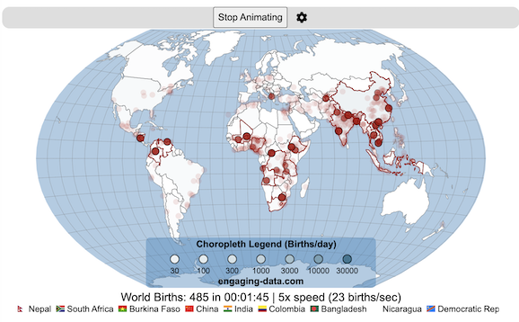
Where in the world are babies being born and how fast?
This interactive, animated map shows the where births are happening across the globe. It doesn’t actually show births in real-time, because data isn’t actually available to do that. However, the map does show the frequency of births that are occurring in different locations across the world. And you can see it in two ways, by country and also geo-referenced to specific locations (along a 1degree grid across the globe). There are many different ways to view this global birth map and these options are laid out in the controls at the top of the map. The scrolling list across the bottom also shows the country of each of the dots on the map.
Instructions
Speed – change the slider to change the rate at which births show up on the map from real-speed to 25x faster
Map projection – change the map projection
Highlight country – an outline around the country when a birth occurs
Choropleth – Build – as each birth occurs, the background color of the country will slowly change to reflect the number of births in the country
Choropleth – Show – this option colors all the countries to show the number of births per day that occur in the country
Dots – Show – this is the main feature that shows where each birth is occurring at the frequency that it does occur.
Dots – Persist – this feature shows where previous births have occurred and the dots get darker as more births happen in that location.
If you hover (or click on mobile) on a country during the animation, it will display how many births have occurred since the animation stared.
Population distribution data combined with country birthrates
I used data that divided and aggregated the world’s population into 1 degree grid spacing across the globe and I assigned the center of each of these grid locations to a country. Then the country’s annual births (i.e. the country’s population times its birthrate) were distributed across all of the populated locations in each country, weighted by the population distribution (i.e. more populated areas got a greater fraction of the births).
I used python to process country, population distribution data and parse the data into the probability of a birth at each 1 degree x 1 degree location. Then I used javascript to make random draws and predict the number of births for each map location. D3.js was used to create the map elements and html, css and javascript were used to create the user interface.
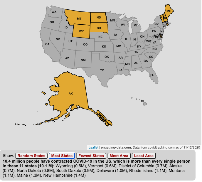
The number of US coronavirus cases is equal to the population of several states put together.
click on the buttons below to see a new set of states.
The number of Americans who have contracted the Coronavirus keeps going up with little indication of slowing down. This is an amazingly large number of cases is the highest in the world and I wanted to visualize how many people this actually is.
While the number of US COVID-19 cases is very large, comparing these number to the size of the populations in several states helps to provide more context. The visualization shows a random collection of states whose total population is equal to the latest coronavirus numbers. If you click the button you can see a different set of states that have a population equal to the current number of coronavirus cases.
The graph is updated daily using data from covidtracking.com. It’s important to note that the number of people with COVID-19 is an underestimate as many coronavirus cases are asymptomatic (i.e. people don’t get sick or show any symptoms) and the positivity rate of tests is quite high.
Stay safe out there: stay away from people and wear your mask!
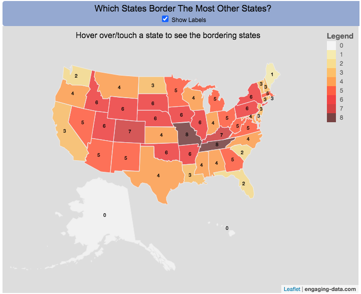
Interactive Choropleth of the Number of States That Border Each State
This is a fun little map that shows the number of states that border each state. I’m working on improving the interactivity of maps and this was a good project to try this with. The base map is a choropleth map which color codes each state by the number of states it shares a border with. If you hover over (or touch on mobile) a state, it will highlight the state and show you (and list) the bordering states.
It’s important to note that officially New York and Rhode Island share a water border (between Rhode Island and Long Island, NY) and that Michigan and Minnesota also share a border (in Lake Superior).
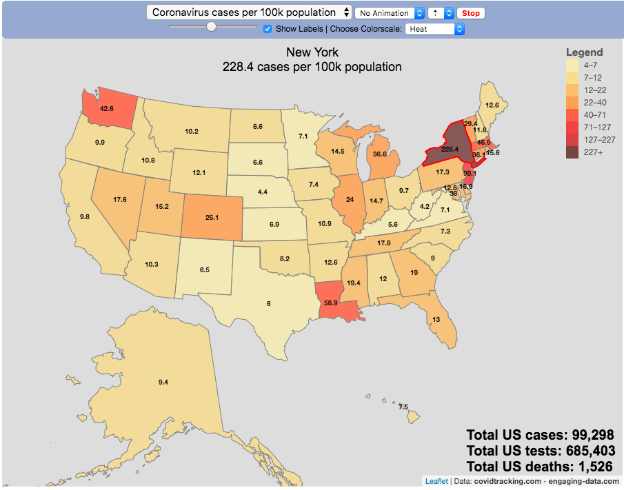
The coronavirus (SARS-CoV-2) is literally affecting the entire globe right now and changing the way we live our lives here in the US and all over the world.
There are quite a number of different coronavirus-related dataviz out there, but as we shelter-in-place I wanted to add a map that looked at a number of different metrics that tell us about the coronavirus pandemic by US states and look at those metrics on a population basis.
There are a number of data sources that I’ve found that publish data about the coronavirus and the resulting disease (Covid-19) in the United States:
This map is based on the data compiled from covidtracking.com, partly because it has a good API and also lists testing, cases and deaths. The data I’ve included on the map is:
Numbers of coronavirus cases – i.e. tested positive for virus
Numbers of coronavirus tests administered
Numbers of deaths due to coronavirus
Each of these is also calculated per 100,000 population in the state:
Numbers of coronavirus cases per 100k people- i.e. tested positive for virus
Numbers of coronavirus tests administered per 100k people
Numbers of deaths due to coronavirus per 100k people
These latter metrics are important because numbers of cases or deaths can be obscured by small or large populations but per capita data (or per 100k capita data) can point out interesting outliers.
It is important to note that the data is far from perfect. There is probably significant underreporting of tests, cases and deaths. The data is a collection for the various local and state agencies that are working hard to deal with the medical, social and political ramifications of the pandemic, while also collecting data. We don’t know how many Americans have coronavirus because of lack of testing.
Also important is that the number of positive cases is a function of how much testing is taking place so cases does not necessarily represent the exact prevalence of the virus, though there will probably be good correlation between cases and actual coronavirus infections. Luckily it sounds like tests are becoming more widely available so hopefully those numbers will go up sharply.
For more information about the virus and the disease and data collection, you can find good information on the CDC website.
Watch the United States assemble state by state based on statistics of interest
Based on earlier popularity of the country-by-country animation, this map lets you watch as the world is built-up one state at a time. This can be done along a large range of statistical dimensions:
Name (alphabetical)
abbreviation
Date of entry to the United States
State Population (2018)
Population per Electoral Vote (2018)
Population per House Seat (2018)
Land Area (square miles)
Population Density (ppl per sq mi) (2018)
State’s Highest Point
Highest Elevation (ft)
Mean Elevation (ft)
State’s Lowest Point
Lowest Point (ft)
Life Expectancy at Birth (yrs)
Median Age (yrs)
Percent with High School Education
Percent with Bachelor’s Degree
Residential Electricity Price (cents per kWh) (2018)
Gasoline Price ($/gal) Regular unleaded (2019)
State Gross Domestic Product GDP ($Million) (2018)
GDP per capita ($/capita)
Number of Counties (or subdivisions)
Average Daily Solar Radiation (kWh/m2)
Birth rate (per thousand population)
Avg Age of Mother at Birth
Annual Precipitation (in/yr)
Average Temperature (deg F)
These statistics can be sorted from small to large or vice versa to get a view of the US and its constituent states plus DC in a unique and interesting way. It’s a bit hypnotic to watch as the states appear and add to the country one by one.
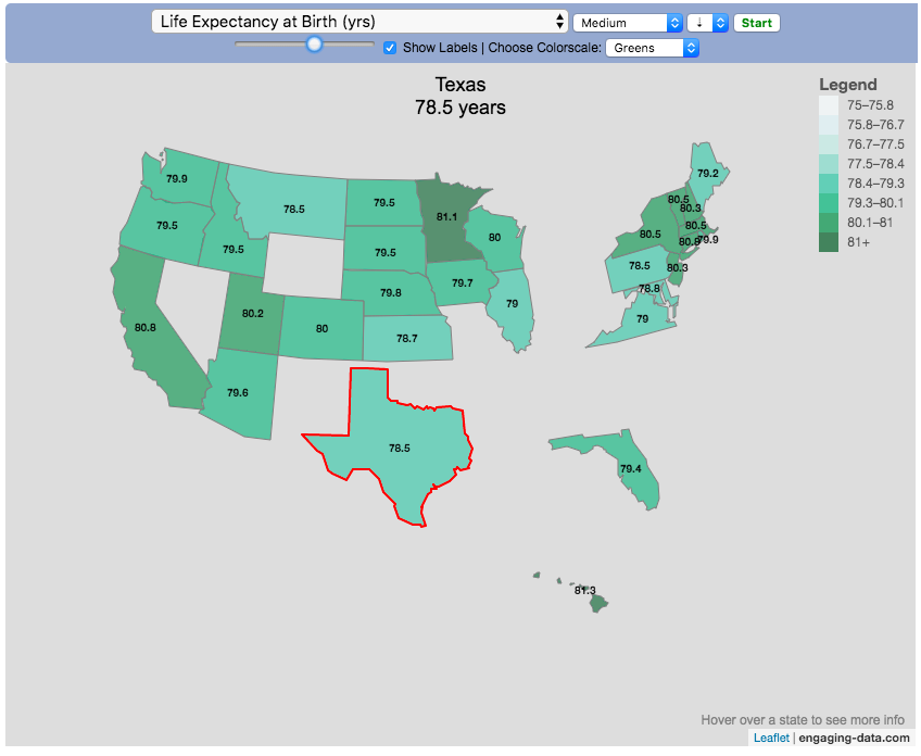
You can use this map to display all the states that have higher life expectancy than the Texas: select “Life expectancy”, sort from “high to low” and use the scroll bar to move to the Texax and you’ll get a picture like this:
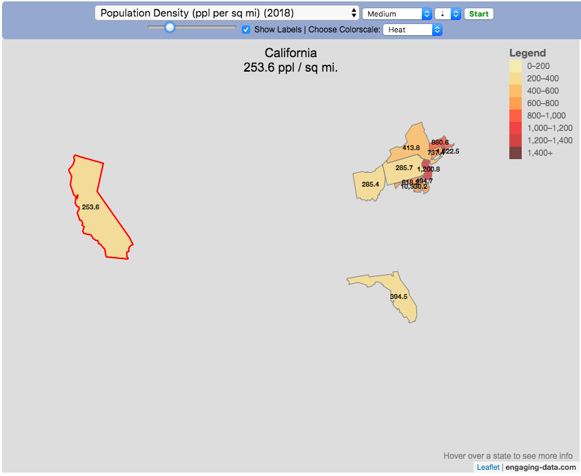
or this map to display all the states that have higher population density than California: select “Population density, sort from “high to low” and use the scroll bar to move to the United States and you’ll get a picture like this:
I hope you enjoy exploring the United States through a number of different demographic, economic and physical characteristics through this data viz tool. And if you have ideas for other statistics to add, I will try to do so.
Data and tools: Data was downloaded from a variety of sources:
Population https://en.wikipedia.org/wiki/List_of_states_and_territories_of_the_United_States_by_population
Admission to union https://simple.wikipedia.org/wiki/List_of_U.S._states_by_date_of_admission_to_the_Union
Sunlight North America Land Data Assimilation System (NLDAS) Daily Sunlight (insolation) for years 1979-2011 on CDC WONDER Online Database, released 2013. Accessed at http://wonder.cdc.gov/NASA-INSOLAR.html on Jun 14, 2019 1:37:15 PM
Births United States Department of Health and Human Services (US DHHS), Centers for Disease Control and Prevention (CDC), National Center for Health Statistics (NCHS), Division of Vital Statistics, Natality public-use data 2007-2017, on CDC WONDER Online Database, October 2018. Accessed at http://wonder.cdc.gov/natality-current.html on Jun 14, 2019 1:53:58 PM
Precipitation North America Land Data Assimilation System (NLDAS) Daily Precipitation for years 1979-2011 on CDC WONDER Online Database, released 2013. Accessed at http://wonder.cdc.gov/NASA-Precipitation.html on Jun 26, 2019 3:30:40 PM
Temperature http://www.usa.com/rank/us–average-temperature–state-rank.htm
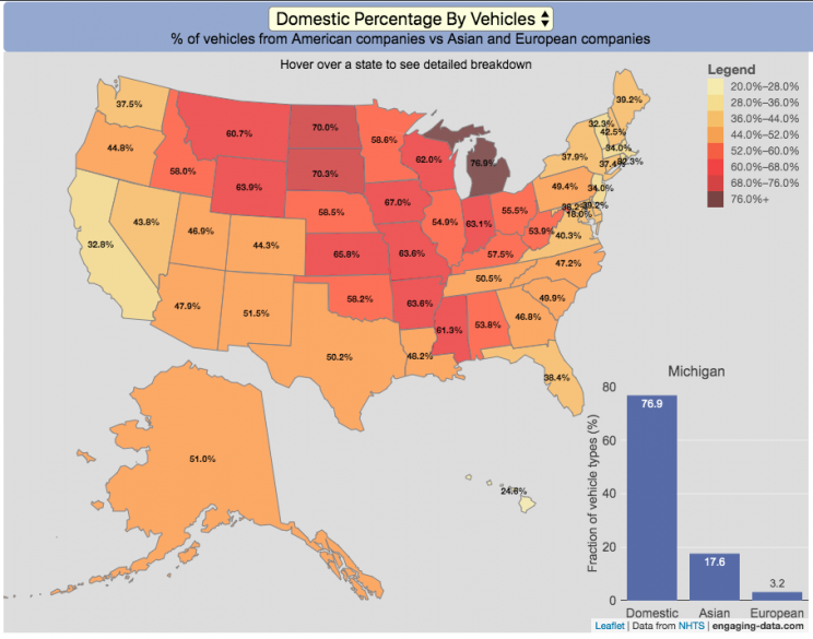
Americans are known for loving cars and driving quite a bit. Drivers in the United States own more cars and drive more than those in any other country. So what kinds of vehicles do Americans drive? This visualization looks at the types of vehicles (by body type and country of origin) across the 50 States and Washington DC.
You can view two different attributes about the types of vehicles in use in the United States:
Body type of passenger vehicles
Manufacturer/Brand region of origin
The different categories of passenger vehicles include:
Cars – includes sedans, hatchbacks, wagons and sports cars
Pickup trucks
SUVs
Vans – includes Minivans and full-size vans
Classification of the vehicles manufacturer (US, Asia or Europe) is based on the company’s headquarters and not the place of vehicle manufacturing. So a Toyota here is an Asian vehicle even if it was assembled in Mississippi.
It is pretty interesting to see the regional differences in vehicle types (cars vs trucks and SUVs) and vehicle brand (domestic vs foreign). Michigan, especially, stands out with their very high domestic ownership. It makes sense as Detroit is the home of the big three US auto manufacturers (Ford, GM and Chrysler). And I hear there’s a very strong culture of owning American cars there (and employee, friends and family discounts as well).
The data is derived from a survey by the US Department of Transportation called the National Household Travel Survey (NHTS) released in 2017. The following is a quote from the NHTS webpage:
The National Household Travel Survey (NHTS) is the source of the Nation’s information about travel by U.S. residents in all 50 States and Washington, DC. This inventory of travel behavior includes trips made by all modes of travel (i.e., private vehicle, public transportation, pedestrian, and cycling) and for all purposes (e.g., travel to work, school, recreation, and personal/family trips). It provides information to assist transportation planners and policymakers who need comprehensive data on travel and transportation patterns in the United States.


Recent Comments