County-level Election Results from 2024, 2020 and 2016
The interface has been updated and you can now also zoom in and look at a specific state’s election results.
Click here to view a visualization that looks more explicitly at the correlation between population density and votes by county.
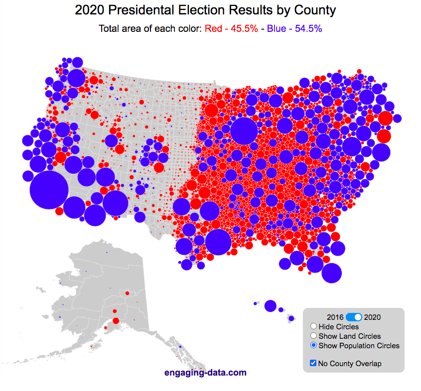
This interactive map shows the election results by county and you can display the size of counties based on their land area or population size.
Previously, I created a map (cartogram) that showed the state by state electoral results from the Presidential Election by scaling the size of the states based on their electoral votes. The idea for that map was that by portraying a state as Red or Blue, your eye naturally attempts to determine which color has a greater share of the total. On a normal election map, Red states dominate, especially because a number of larger, less populated states happen to vote Republican. That cartogram changed the size of the states so that large states with low population, and thus low electoral votes tended to shrink in size, while smaller states with moderate to larger populations tended to grow in size. Thus, when your eyes attempt to discern which color prevails, the comparison is more accurate and attempts to replicate the relative ratio of electoral votes for each side.
This map looks at the 2024, 2020 and 2016 presidential election results, county by county. An interesting thing to note is that this view is even more heavily dominated by the color red, for the same reasons. Less densely populated counties tend to vote republican, while higher density, typically smaller counties tend to vote for democrats. As a result, the blue counties tend to be the smaller ones so blue is visually less represented than it should be based on vote totals. More than 75% of the land area is red, when looking at the map based on land areas, while shifting to the population view only about 46% of the map is red. Neither of these percentages is exactly correct because each county is colored fully red or blue and don’t take into account that some counties are won by a large percentage and some are essentially tied. However, the population number is certainly closer to reality as Trump won about 48.8% of the votes that went to either Trump or Clinton.
Instructions
This tool should be relatively straightforward to use. Just click around and play with it.
The map has a few different options for display:
- Hide Circles – just shows the county map
- Show land circles – where the area of the circle matches the area of the county itself, though obviously shaped like a circle. The counties are colored red or blue depending on whether Trump or Harris (in 2024), Biden (in 2020) or Clinton (in 2016) won more votes in that county vs Donald Trump (2024, 2020 and 2016).
- Show population circles – where the area of the circle matches the relative population of the county itself. More populated counties will grow larger while less populated counties will shrink. The counties are colored red or blue depending on whether Trump or Biden or Clinton won more votes in that county.
- Selecting the No County Overlap button will spread out all of the circles so you can see them all. The total displayed area of the county circles is the same in either land and population view, though if the circles are overlapping, you may see less total colors.
- Selecting the Color by Margin button will color the each county circle by the amount that a candidate won the county. If the vote margin is small, the county will be colored light blue or red, whereas if a county strongly favors one candidate, it will be colored darker red or blue.
- Selecting the Allow State Zoom button let you zoom into and only show the counties of a specific state. Just click on the state to zoom in (and back out).
Visualization notes
This was my second attempt at using d3 to generate visualizations. I typically use leaflet to do web-based mapping but I wanted the power of d3 which has functions for the circles to prevent overlapping. This map was inspired by Karim Douieb’s cool visualization of 2016 election results. I modified it in a number of different ways to try to make it more interactive and useful.
This visualization does not actually simulate the collisions between the circles on your browser. It is a bit computationally taxing and causes my computer fan to turn on after awhile. So instead I ran the simulation on my computer and recorded the coordinates for where each circle ended up for each category. Then your browser is simply using d3 transitions to shift positions and sizes of the circles between each of the maps, which is simpler, though with 3142 counties, it can still tax the computer occasionally.
Data and Tools
County level election data for 2016 is from MIT Election Lab. The 2020 county level data is downloaded from the New York Times county election data API and processed using a python script. 2024 county data is from the NYTimes as well by individual state (e.g. Maine) Population data used is for 2018. The visualization was created using d3 javascript visualization library.
Related Posts
25 Comments »
25 Responses to US County Electoral Map – Land Area vs Population
This post brings such an interesting perspective to the electoral map! It’s fascinating to see how land area doesn’t always align with population density. Makes you rethink how representation is structured in different regions. Great visuals too!
Thank you for taking the time to create this and share it. I am hopeful you will be able to create 2024 results as well.
I think these population representation are awesome and a much better representation. Will you please update this map with the 2024 election results? Thanks.
if you color by margin & select population map, one thing stands out clearly, Village folks are dead sure about voting republican.
Do you have a way to download the raw data? I can’t seem to find a list of U.S. counties organized by state that have 2020 presidential election data. I thought it would be easy to find. I’d like to list them along with other county data such as population from 2020 census, geographic size, etc. A map is nice but raw data can be verified from several sources. I’d rather not go to 50 state websites to download their county data if I don’t have to! Thanks,
It would be interesting to overlay the 2020 data with Covid19 data. Specifically, infection/vaccination rates from Jan 2020 to today.
Possibly point your scraper to:
https://covid19-projections.com/
This is a very nice data display!
I do have one comment/question regarding Alaska. Your map shows county equivalents (aka boroughs and census districts) for Alaska. However, the NY Times (also the MIT Election Lab data you linked) for Alaska are reported for State House Districts, which are different. Some districts overlap several boroughs. (Though MIT list “FIPS codes” for Alaska these are not the real census FIPS codes.) Given this, how are you imputing the election results for the boroughs?
Interesting that Trump increased the land percentage from 2016.
Am I toggling wrong? When I click the land circle 2016, the Trump percentage = 76.7%, and when I toggle to 2020, it reads Trump, 74.4%, a 2.3% decrease. No?
Yeah, that’s awesome. Interesting that only few circles (about 60 out of more than 3000) change their colour from 2016 to 2020. Until now I found only one circle which has changed from blue to red (Nassau County NY).
Greatings from Switzerland
Great map! For the 2020 results from NYT, did you manually enter every single county or use some kind of scrapper? I do not see an option to download all the county data or even a single sheet with it on their site. Would love to know how you got that to use data for my research!
thanks!
I used their api. Change the name of the state in this url to get each state’s data:
https://static01.nyt.com/elections-assets/2020/data/api/2020-11-03/race-page/alaska/president.json
if the state has a space in it like “South Dakota” just put a hyphen in it:
https://static01.nyt.com/elections-assets/2020/data/api/2020-11-03/race-page/south-dakota/president.json
Thank you again.. full year later for this! I am trying to scrape similar data for their vaccination reports, but not sure how to get this with the API. Do you have any insight or resources that may helpful for learning how to do this?
Hope you are still checking this page! Thanks
Love the graphic but as a physicist with a little mathematical background, I have been trying to understand what is happening with a “simple as possible” numerical graph. The county voting data provide unambiguous vote vs. population as you have utilized in the graphic. I would sure be interested nation wide in the relative size of Democratic votes to Republican votes (or the reciprocal doesn’t matter) plotted as a function of population. I took Pennsylvania (manually copying data from state web site) and plotted the ratio rD as a function of p. After playing around with Excel, I found the result that a log-log plot fits reasonably well the curve rD=r0 exp(p/p0), where r0 is the ratio of votes in small populations and p0=ln(1/rD) is the population where the Democrats overtake republicans as population grows. For Pennsylvania r0 is about 0.38 and p0 is about 300,000. The same two characteristics are obvious from the raw data, but maybe the curve fitting would be a way to quickly condense the raw data for the whole nation, and region by region? That is what I meant by “as simple as possible.”
Any chance I could request a 2020 map (population circles) but using a color gradient from red-white-blue to reflect the margin of voter choice? I’d love to see how “red” or “blue” the map becomes when close elections wash out to white.
Just added this option, click the “Color by Margin” checkbox.
The color ranges from Red (strongly R) to white (even) to Blue (strongly D).
It would be awesome to see this map with purple for 47.5-52.5% results integrated into the visualization.
Hennepin County and Ramsey County in Minnesota are wrong! The margins for Trump vs Biden are reversed on this graphic
thanks for point this out. There was a bug in the scrapper that has been fixed!
Something is wrong here. Hennepin County voted for Biden, as did the state of Minnesota, and by a pretty wide margin. Your map shows Hennepin County red.
awesome viz. the percentages don’t seem to be updating when switching between 2016 and 2020
Awesome work. Thanks.
Is it possible to let the colored area sum up to area = U.S. geography, and then flow into the map, losing the circles and eliminating the grey space?
The tiny circles and grey space around them still exaggerate the significance of small population/large acreage states.
Thank you for the visualization and providing your data sources 🙂
This is exactly the type of viz I was wanting to make to examine as a factor in where I might want to live in the future.
This is an amazing graphic to provide/share, thank you. You make data beautiful.
One of my friends from Minneapolis says that she keeps seeing her area portrayed as red and can’t imagine a time it was ever anything but blue. She saw other maps showing her area as red, as well. Just for note in case it helps. 🙂
It’s nice to see the population map by state, but it doesn’t reflect the national proportionately. In a tru national po;ulation map Montana and Wyoming would be little dots, smaller than rhode island. All the geographic maps over emphasized the red vote.