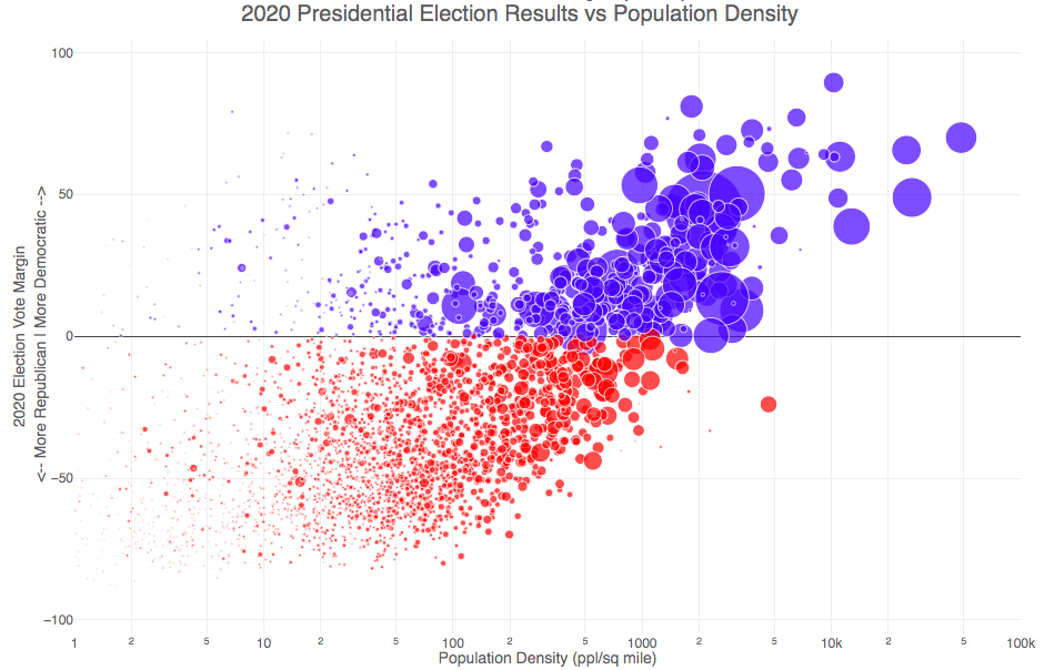
How do 2020 presidential election results correlate with population density?
The visualization I made about county election results and comparing land area to population size was very popular around the time of the 2020 presidential election. As the counties were represented by population, it was clear that democratic-leaning areas on that map tended to grow in size, while republican-leaning areas tended to shrink. This raised the question of exactly how population density correlates with election results.
Hover over (or click on) the bubbles to see information about the county.
It’s clear there is a very strong correlation between the vote margin and population density. Vote margin is the percentage amount that one candidate beat the other candidate by in the county (0% means a tie while 50% means that one candidate got 75% and the other got 25% of the voteshare). Population density is calculated as people per square mile in the county and is shown in the graph on a log scale, where each major grid line is 10 time greater than the previous one. This is done because there is one to two orders of magnitude difference in the densest counties (in New York City) and even moderately dense counties. There are also several counties with population density below 1 person per square mile (several in Alaska because of the size of their counties) but these are excluded from the graph.
Richmond County, NY (i.e. the Borough of Staten Island) is the densest county (17th densest) in the country that Trump won. The densest counties favored Biden quite heavily as he won 45 of the 50 densest counties in the country, which also tend to have a fairly high population.
This second graph is a histogram that specifically categorizes counties into discreet bins by population density. Note that they are on a log scale as well. You can toggle the graph to show the number of counties won by each candidate or the number of votes won in each of the population density bins. The black line shows the percentage of counties (or votes) won by the democratic candidate (Joe Biden) in each of those bins.
Hover over (or click on) the bars to see information about each county bin.
It’s pretty clear in these graphs that low population density areas clearly favor the republican while the denser areas favor the democrat.
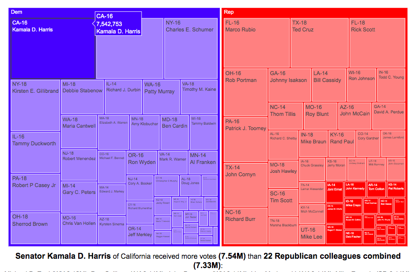
Each state has two senators in the Senate, even though there is a great disparity in the populations of the states. This was a compromise that the framers of the Constitution dealt with in creating the framework of the US government. While the US House of Representatives is based on proportional representation, the Senate was designed to have two senators per state regardless of population. This leads to some interesting variations in the number of votes that some senators get relative to other senators (and how many people they represent).
Graph of Total Votes for Each Current Senator (2014, 2016 and 2018)
This graph is called a treemap and shows the total number of votes cast for the winner of each senate race of the current sitting senators. They are shown in order from largest to smallest vote totals, where the area of the rectangle is proportional to the number of votes. The treemap can be organized by party if desired. This graph does not show the number of votes that their opponents got.
If you hover over (click, on mobile) one of the boxes in the treemap, you can compare the number of votes received by that senator to the number of senators that received the same number of votes combined. This helps highlight the disparities in the representation of voters in large states in the Senate relative to that of voters in states with low populations.
For example, Kamala Harris, Democratic senator of my home state of California, received 7.5 million votes when she won her senate race in 2016. This large number of votes is larger than the combined votes for 22 of her Republican colleagues in small states. This is even more impressive since, as noted before, she ran against another Democrat Loretta Sanchez, in the election.
Note that some of the recently elected senators shown in the table are no longer serving in the Senate:
John McCain’s seat is currently held by Martha McSally
Johnny Isakson’s seat is currently held by Kelly Loeffler
Because of the large variation in population sizes and a tendency for more populous states to vote for democrats, Democratic Senators received many more votes in their elections than their Republican colleagues did, despite having fewer numbers. The 47 Democratic (and Independent) senators received a total of 67.5 million votes while the 53 Republican senators received 59.5 million votes.
Graph of Margin of Victory over Opposing Party for Each Current Senator (2014, 2016 and 2018)
This graph shows a slightly different set of data. Instead of total votes for the winning candidate, it shows the vote margin (i.e. the number of votes the winner received vs the opponent of a different party). The reason I specify it this way is that the two Democratic California senators defeated other democrats to win their elections (i.e. no republican was on the ballot in the general election because no republican got enough votes in the primary). This comparison is interesting because not only do some senators receive very few votes (because they live in small states), but they may only win by a small margin over their opponents. Comparing margins of victory, shows how few votes it would take to “flip” a Senate seat between the two parties.
If you take Kamala Harris’s margin of victory over Republicans to be her vote total (7.5 million votes) since there was no Republican running against her, her margin of victory is greater than the margin of victory of 43 of her Republican Senate colleagues combined.
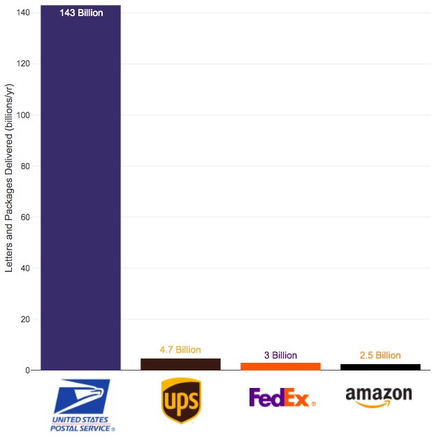
The US Postal Service mail volume is enormous and can’t easily be replaced by private delivery services
The US Postal Service (USPS) has been getting a good deal of press recently because of Trump’s attacks on the security of mail in voting and recent moves by political appointees to reduce the capability of the agency to delivery mail in a timely fashion. These changes reportedly include removing mail sorting equipment and changing overtime hours.
Some have suggested privatizing the postal service but currently the volume of mail and packages through private delivery services is far smaller than that carried by the federal agency.
Note that the USPS carries about 55 billion pieces of first class mail annually out of the reported 143 billion pieces of total mail.
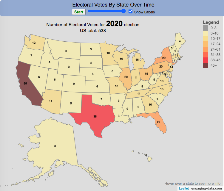
How many electoral votes did each state have across two centuries of elections?
This animation shows the number of electoral votes each state had during each of the 59 presidential elections in US history between 1788 and 2020. It’s interesting to see the number of US states and their relative population sizes (in terms of electoral votes) over many different presidential elections. The population is counted every 10 years in the census so if a presidential election occurs between a census, it likely will not see any difference in numbers of electoral votes, unless something else happens (such as addition of a new state to the country).
Instructions
You can use the slider to control the election year to focus on a specific election and toggle the animation by hitting the Start/Stop button. Hovering over each state will tell you the number of electoral votes and the percentage of the total number of electoral votes in that election.
In the elections during and immediately after the US Civil War, we also see some states whose electoral votes for president are not counted (shown in purple). Wyoming, the state with the lowest population in the US, has the highest number of electoral votes per person in the state, while the three most populous states, California, Florida and Texas have the least number of electoral votes per person. Wyoming has four times the number of electors per capita than these 3 states have (i.e. accounting for their population sizes). That will be the subject of another map dataviz.
Previously, I created a map (cartogram) that showed the state by state electoral results from the Presidential Election by scaling the size of the states based on their electoral votes. The idea for that map was that by portraying a state as Red or Blue, your eye naturally attempts to determine which color has a greater share of the total. On a normal election map, Red states dominate, especially because a number of larger, less populated states happen to vote Republican. That cartogram changed the size of the states so that large states with low population, and thus low electoral votes tended to shrink in size, while smaller states with moderate to larger populations tended to grow in size. Thus, when your eyes attempt to discern which color prevails, the comparison is more accurate and attempts to replicate the relative ratio of electoral votes for each side.
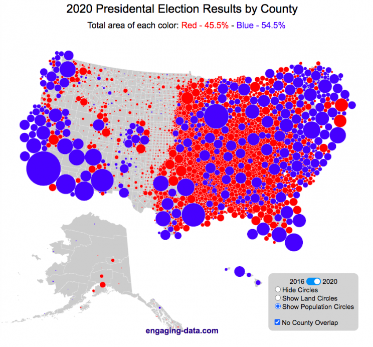
This map looks at the 2024, 2020 and 2016 presidential election results, county by county. An interesting thing to note is that this view is even more heavily dominated by the color red, for the same reasons. Less densely populated counties tend to vote republican, while higher density, typically smaller counties tend to vote for democrats. As a result, the blue counties tend to be the smaller ones so blue is visually less represented than it should be based on vote totals. More than 75% of the land area is red, when looking at the map based on land areas, while shifting to the population view only about 46% of the map is red. Neither of these percentages is exactly correct because each county is colored fully red or blue and don’t take into account that some counties are won by a large percentage and some are essentially tied. However, the population number is certainly closer to reality as Trump won about 48.8% of the votes that went to either Trump or Clinton.
Instructions
This tool should be relatively straightforward to use. Just click around and play with it.
The map has a few different options for display:
Hide Circles – just shows the county map
Show land circles – where the area of the circle matches the area of the county itself, though obviously shaped like a circle. The counties are colored red or blue depending on whether Trump or Harris (in 2024), Biden (in 2020) or Clinton (in 2016) won more votes in that county vs Donald Trump (2024, 2020 and 2016).
Show population circles – where the area of the circle matches the relative population of the county itself. More populated counties will grow larger while less populated counties will shrink. The counties are colored red or blue depending on whether Trump or Biden or Clinton won more votes in that county.
Selecting the No County Overlap button will spread out all of the circles so you can see them all. The total displayed area of the county circles is the same in either land and population view, though if the circles are overlapping, you may see less total colors.
Selecting the Color by Margin button will color the each county circle by the amount that a candidate won the county. If the vote margin is small, the county will be colored light blue or red, whereas if a county strongly favors one candidate, it will be colored darker red or blue.
Selecting the Allow State Zoom button let you zoom into and only show the counties of a specific state. Just click on the state to zoom in (and back out).
Visualization notes
This was my second attempt at using d3 to generate visualizations. I typically use leaflet to do web-based mapping but I wanted the power of d3 which has functions for the circles to prevent overlapping. This map was inspired by Karim Douieb’s cool visualization of 2016 election results. I modified it in a number of different ways to try to make it more interactive and useful.
This visualization does not actually simulate the collisions between the circles on your browser. It is a bit computationally taxing and causes my computer fan to turn on after awhile. So instead I ran the simulation on my computer and recorded the coordinates for where each circle ended up for each category. Then your browser is simply using d3 transitions to shift positions and sizes of the circles between each of the maps, which is simpler, though with 3142 counties, it can still tax the computer occasionally.
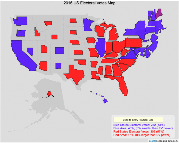
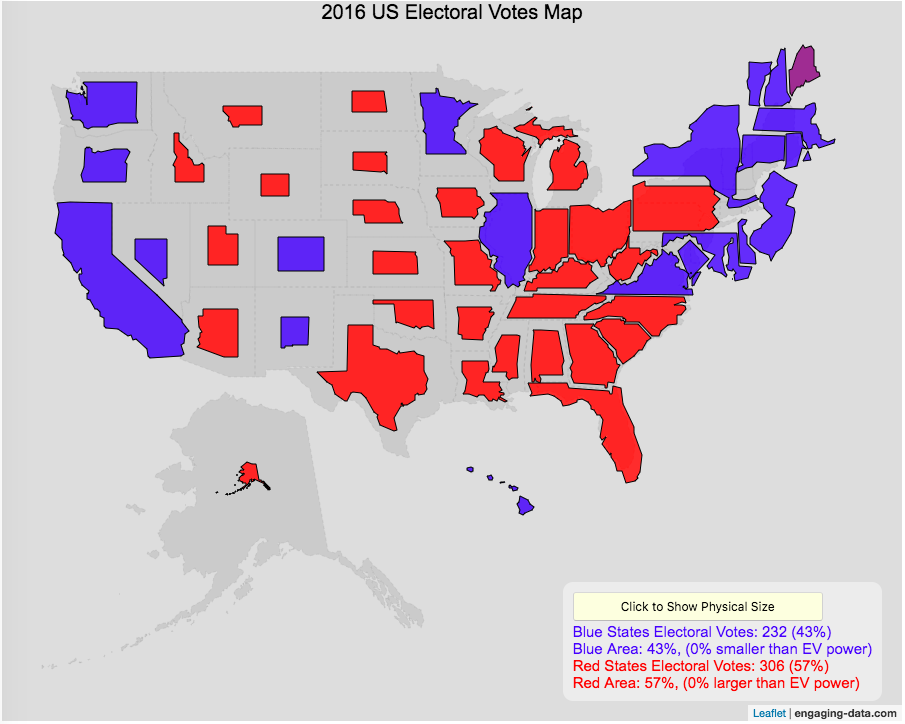
Electoral Vote maps give more visual power to states with large areas but few electoral votes
This map shows the electoral outcome of the 2016 and 2020 US Presidential Election and is color coded red if the state was won by Donald Trump (R) and blue if the state was won by Hilary Clinton or Joe Biden. When looking at the map, red states tend to be larger in area than blue states, but also generally have lower populations. This gives a misleading impression that the electoral share is “redder” than it actually is. For 2016, we can see that Trump won 306 electoral votes or (57% of the total electoral votes), but the map is shaded such that 73% of the area of the US is colored red. Similarly, Clinton won 232 electoral votes, but the map is shaded such that only 27% of the map is colored blue. For 2020, we can see that Biden won 306 electoral votes or (57% of the total electoral votes), but the map is shaded such that 38% of the area of the US is colored blue. Trump won 232 electoral votes, but the map is shaded such that 62% of the map is colored red.
The map shrinks the states with low electoral votes relative to its area and increases the size of states with large numbers of electoral votes relative to its area. On average blue states grow as they are under-represented visually, while red states tend to shrink quite a bit because they are over-represented visually. Alaska is the state that shrinks the most and DC and New Jersey are the areas that grow the most in the new map.
I think this gives a more accurate picture of how the states voted because it also gives a sense of the relative weight of those states votes.
Data and Tools:
Data on electoral votes is from Wikipedia. The map was made using the leaflet open source mapping library. Data was compiled and calculations on resizing states were made using javascript.


Recent Comments