Posts for Tag: programming
US County Electoral Map – Land Area vs Population
County-level Election Results from 2024, 2020 and 2016
The interface has been updated and you can now also zoom in and look at a specific state’s election results.
Click here to view a visualization that looks more explicitly at the correlation between population density and votes by county.
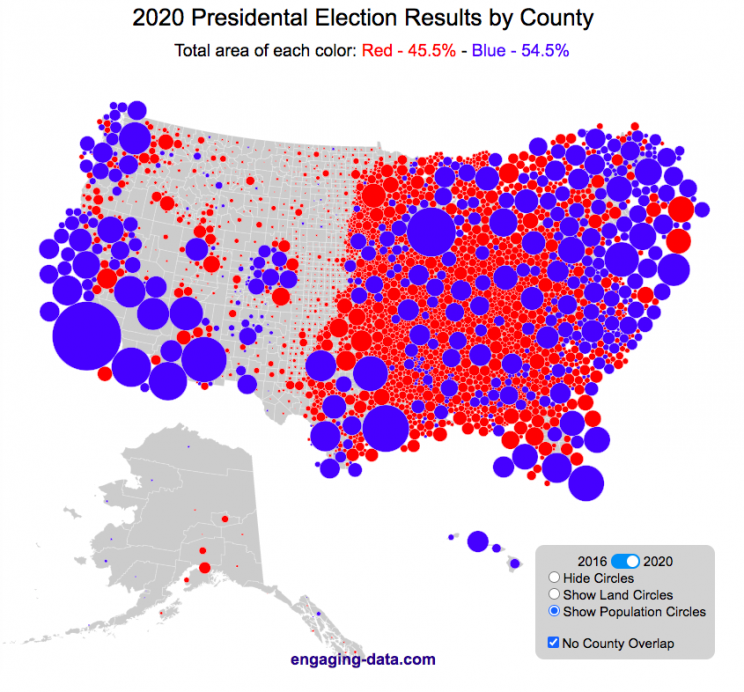
This interactive map shows the election results by county and you can display the size of counties based on their land area or population size.
Previously, I created a map (cartogram) that showed the state by state electoral results from the Presidential Election by scaling the size of the states based on their electoral votes. The idea for that map was that by portraying a state as Red or Blue, your eye naturally attempts to determine which color has a greater share of the total. On a normal election map, Red states dominate, especially because a number of larger, less populated states happen to vote Republican. That cartogram changed the size of the states so that large states with low population, and thus low electoral votes tended to shrink in size, while smaller states with moderate to larger populations tended to grow in size. Thus, when your eyes attempt to discern which color prevails, the comparison is more accurate and attempts to replicate the relative ratio of electoral votes for each side.
This map looks at the 2024, 2020 and 2016 presidential election results, county by county. An interesting thing to note is that this view is even more heavily dominated by the color red, for the same reasons. Less densely populated counties tend to vote republican, while higher density, typically smaller counties tend to vote for democrats. As a result, the blue counties tend to be the smaller ones so blue is visually less represented than it should be based on vote totals. More than 75% of the land area is red, when looking at the map based on land areas, while shifting to the population view only about 46% of the map is red. Neither of these percentages is exactly correct because each county is colored fully red or blue and don’t take into account that some counties are won by a large percentage and some are essentially tied. However, the population number is certainly closer to reality as Trump won about 48.8% of the votes that went to either Trump or Clinton.
Instructions
This tool should be relatively straightforward to use. Just click around and play with it.
The map has a few different options for display:
- Hide Circles – just shows the county map
- Show land circles – where the area of the circle matches the area of the county itself, though obviously shaped like a circle. The counties are colored red or blue depending on whether Trump or Harris (in 2024), Biden (in 2020) or Clinton (in 2016) won more votes in that county vs Donald Trump (2024, 2020 and 2016).
- Show population circles – where the area of the circle matches the relative population of the county itself. More populated counties will grow larger while less populated counties will shrink. The counties are colored red or blue depending on whether Trump or Biden or Clinton won more votes in that county.
- Selecting the No County Overlap button will spread out all of the circles so you can see them all. The total displayed area of the county circles is the same in either land and population view, though if the circles are overlapping, you may see less total colors.
- Selecting the Color by Margin button will color the each county circle by the amount that a candidate won the county. If the vote margin is small, the county will be colored light blue or red, whereas if a county strongly favors one candidate, it will be colored darker red or blue.
- Selecting the Allow State Zoom button let you zoom into and only show the counties of a specific state. Just click on the state to zoom in (and back out).
Visualization notes
This was my second attempt at using d3 to generate visualizations. I typically use leaflet to do web-based mapping but I wanted the power of d3 which has functions for the circles to prevent overlapping. This map was inspired by Karim Douieb’s cool visualization of 2016 election results. I modified it in a number of different ways to try to make it more interactive and useful.
This visualization does not actually simulate the collisions between the circles on your browser. It is a bit computationally taxing and causes my computer fan to turn on after awhile. So instead I ran the simulation on my computer and recorded the coordinates for where each circle ended up for each category. Then your browser is simply using d3 transitions to shift positions and sizes of the circles between each of the maps, which is simpler, though with 3142 counties, it can still tax the computer occasionally.
Data and Tools
County level election data for 2016 is from MIT Election Lab. The 2020 county level data is downloaded from the New York Times county election data API and processed using a python script. 2024 county data is from the NYTimes as well by individual state (e.g. Maine) Population data used is for 2018. The visualization was created using d3 javascript visualization library.

Shall We Play A (Market Timing) Game?
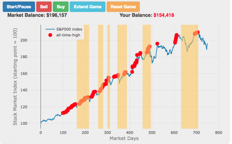

The Market Timing Game simulation is premised on the idea that buying-and-holding index investing and index funds are a no-brainer investment strategy and market timing (i.e. trying to predict market direction and trading accordingly) is a less than optimal strategy. The saying goes “Time in the market not timing the market”. In this simulation, you are given a 3-year market period from sometime in history (data starts January 1, 1950 and goes through the most recent market price, as prices are updated daily) or you can run in Monte Carlo mode (which picks randomly from daily returns in this period) and you start fully invested in the market and can trade out of (and into) the market if you feel like the market will fall (or rise). The goal is to see if you can beat the market index returns.
(more…)
Counting to One Million in Different Languages (Chinese, English and Spanish)
Updated: Lots of folks on Reddit pointed out some mistakes in the Spanish calculations, and helped me figure out the solutions, so the Spanish graphs are now updated. The Spanish calculator is now live!
Building off of the last post about Counting to One Million in English, I received some comments about looking at other languages. That seemed like a very good idea, so I looked at a list of the world’s most popular languages and saw Chinese and Spanish listed with English in the Top 3. Having a little experience with both of those, I set out to compare how long it’d take to count in each of these languages, if you had to pronounce every single number from one to one million.
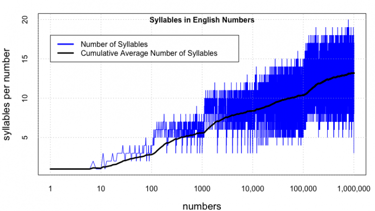
Again, here’s the plot of the number of syllables per number for English. The longest word is seven hundred seventy seven thousand seven hundred seventy seven (20 syllables).
March Madness Matchup Visualizer
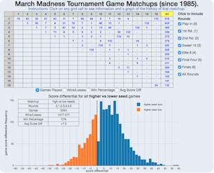
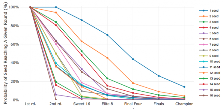
It’s March and for those who follow sports, that means college basketball and March Madness. The tournament is mainly interesting because of two reasons: (1) filling out brackets and (2) watching and hoping for upsets . This interactive March Madness matchup visualizer helps do both of these things by showing you the history of the tournament (since 1985 when the tournament expanded to 64 teams) in terms of matchups between teams with different seeds (1 through 16 in four regions).
(more…)
US County Electoral Map – Land Area vs Population

County-level Election Results from 2024, 2020 and 2016
The interface has been updated and you can now also zoom in and look at a specific state’s election results.
Click here to view a visualization that looks more explicitly at the correlation between population density and votes by county.
This interactive map shows the election results by county and you can display the size of counties based on their land area or population size.
Previously, I created a map (cartogram) that showed the state by state electoral results from the Presidential Election by scaling the size of the states based on their electoral votes. The idea for that map was that by portraying a state as Red or Blue, your eye naturally attempts to determine which color has a greater share of the total. On a normal election map, Red states dominate, especially because a number of larger, less populated states happen to vote Republican. That cartogram changed the size of the states so that large states with low population, and thus low electoral votes tended to shrink in size, while smaller states with moderate to larger populations tended to grow in size. Thus, when your eyes attempt to discern which color prevails, the comparison is more accurate and attempts to replicate the relative ratio of electoral votes for each side.
This map looks at the 2024, 2020 and 2016 presidential election results, county by county. An interesting thing to note is that this view is even more heavily dominated by the color red, for the same reasons. Less densely populated counties tend to vote republican, while higher density, typically smaller counties tend to vote for democrats. As a result, the blue counties tend to be the smaller ones so blue is visually less represented than it should be based on vote totals. More than 75% of the land area is red, when looking at the map based on land areas, while shifting to the population view only about 46% of the map is red. Neither of these percentages is exactly correct because each county is colored fully red or blue and don’t take into account that some counties are won by a large percentage and some are essentially tied. However, the population number is certainly closer to reality as Trump won about 48.8% of the votes that went to either Trump or Clinton.
Instructions
This tool should be relatively straightforward to use. Just click around and play with it.
The map has a few different options for display:
- Hide Circles – just shows the county map
- Show land circles – where the area of the circle matches the area of the county itself, though obviously shaped like a circle. The counties are colored red or blue depending on whether Trump or Harris (in 2024), Biden (in 2020) or Clinton (in 2016) won more votes in that county vs Donald Trump (2024, 2020 and 2016).
- Show population circles – where the area of the circle matches the relative population of the county itself. More populated counties will grow larger while less populated counties will shrink. The counties are colored red or blue depending on whether Trump or Biden or Clinton won more votes in that county.
- Selecting the No County Overlap button will spread out all of the circles so you can see them all. The total displayed area of the county circles is the same in either land and population view, though if the circles are overlapping, you may see less total colors.
- Selecting the Color by Margin button will color the each county circle by the amount that a candidate won the county. If the vote margin is small, the county will be colored light blue or red, whereas if a county strongly favors one candidate, it will be colored darker red or blue.
- Selecting the Allow State Zoom button let you zoom into and only show the counties of a specific state. Just click on the state to zoom in (and back out).
Visualization notes
This was my second attempt at using d3 to generate visualizations. I typically use leaflet to do web-based mapping but I wanted the power of d3 which has functions for the circles to prevent overlapping. This map was inspired by Karim Douieb’s cool visualization of 2016 election results. I modified it in a number of different ways to try to make it more interactive and useful.
This visualization does not actually simulate the collisions between the circles on your browser. It is a bit computationally taxing and causes my computer fan to turn on after awhile. So instead I ran the simulation on my computer and recorded the coordinates for where each circle ended up for each category. Then your browser is simply using d3 transitions to shift positions and sizes of the circles between each of the maps, which is simpler, though with 3142 counties, it can still tax the computer occasionally.
Data and Tools
County level election data for 2016 is from MIT Election Lab. The 2020 county level data is downloaded from the New York Times county election data API and processed using a python script. 2024 county data is from the NYTimes as well by individual state (e.g. Maine) Population data used is for 2018. The visualization was created using d3 javascript visualization library.

Shall We Play A (Market Timing) Game?


The Market Timing Game simulation is premised on the idea that buying-and-holding index investing and index funds are a no-brainer investment strategy and market timing (i.e. trying to predict market direction and trading accordingly) is a less than optimal strategy. The saying goes “Time in the market not timing the market”. In this simulation, you are given a 3-year market period from sometime in history (data starts January 1, 1950 and goes through the most recent market price, as prices are updated daily) or you can run in Monte Carlo mode (which picks randomly from daily returns in this period) and you start fully invested in the market and can trade out of (and into) the market if you feel like the market will fall (or rise). The goal is to see if you can beat the market index returns.
(more…)
Counting to One Million in Different Languages (Chinese, English and Spanish)

Updated: Lots of folks on Reddit pointed out some mistakes in the Spanish calculations, and helped me figure out the solutions, so the Spanish graphs are now updated. The Spanish calculator is now live!
Building off of the last post about Counting to One Million in English, I received some comments about looking at other languages. That seemed like a very good idea, so I looked at a list of the world’s most popular languages and saw Chinese and Spanish listed with English in the Top 3. Having a little experience with both of those, I set out to compare how long it’d take to count in each of these languages, if you had to pronounce every single number from one to one million.
Again, here’s the plot of the number of syllables per number for English. The longest word is seven hundred seventy seven thousand seven hundred seventy seven (20 syllables).
March Madness Matchup Visualizer

It’s March and for those who follow sports, that means college basketball and March Madness. The tournament is mainly interesting because of two reasons: (1) filling out brackets and (2) watching and hoping for upsets . This interactive March Madness matchup visualizer helps do both of these things by showing you the history of the tournament (since 1985 when the tournament expanded to 64 teams) in terms of matchups between teams with different seeds (1 through 16 in four regions).
(more…)

Recent Comments