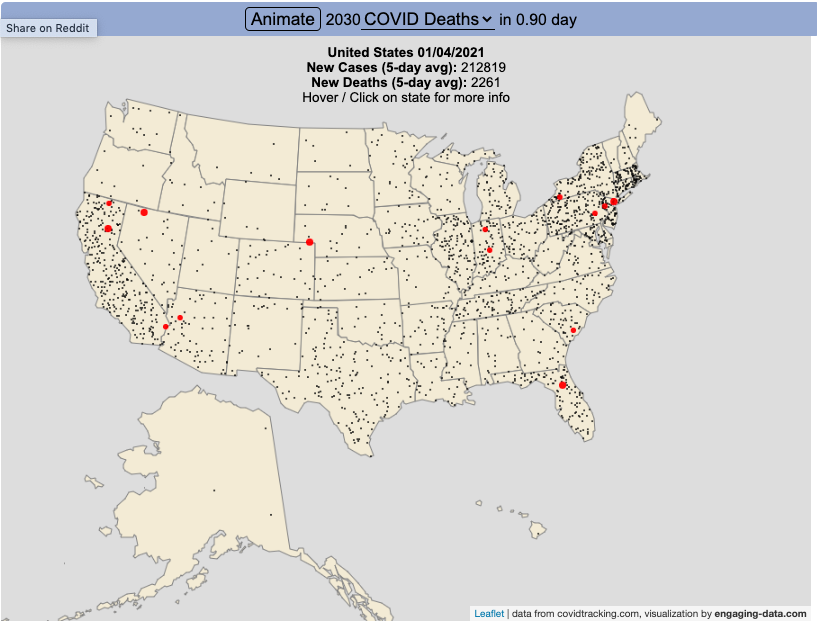
Visualize the large number of coronavirus cases and deaths in the US each day/hour in about 10 seconds
The rate of COVID-19 deaths and cases in the US is crazy high after the 2020 winter holidays and maybe still be going up. This visualization shows the number of COVID cases that occur in one hour or the COVID deaths that occur in one day based on the average of the last five days. This is another attempt to show the true scale of how many cases and deaths the US is dealing with, since it is often hard to understand large numbers. I have also attempted to show the scale of US deaths/cases here and here. Unfortunately, there are so many people getting sick and dying, it’s hard to fathom just how many people this actually is.
The 5-day averaging was done to smooth out any peaks and troughs in data reporting due to weekends/holidays, since I noticed that some states were literally reporting zero COVID cases some days while reporting many hundreds or thousands of cases other days.
The dots shown on the animation are located in the state that the cases or deaths occur but are randomly spread out within the state. This is done for visual clarity since if they were shown in their actual location, most of the dots would be overlapping in urban, high density areas. This approach lets you see which states have high COVID instances but still locate them by state.
You can share this animation by putting ?cat=deaths or ?cat=cases behind the url or copying and sharing one of these links:
How much money can you expect in your stimulus check?
Updated to include the $1400 stimulus payment per adult and dependent in March 2021.
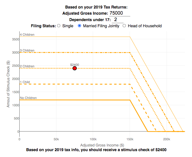
Use this stimulus check calculator to figure out how much you will receive in your thrid stimulus check.
On December 21, 2020, Congress passed a $900 billion dollar stimulus package in response to the COVID pandemic. The bill authorizes economic assistance to Americans in the amount of $600 per person subject to income limits. It also includes expanded unemployment benefits, rental assistance and an extension to the eviction ban. This calculator helps you calculate the amount of stimulus check that you can expect to receive based on your 2019 tax return filing status, adjusted gross income and number of dependents under 17.
Changing the inputs to the calculator, will show you how your expected stimulus check amount will change. The graph shows for a giving filing status (single, married filing jointly or head of household) how the stimulus check amount will change as a function of income and number of children. You can share a URL with specific parameters included
Sounds like some checks may even get to folks at the end of December and many more will get them in January 2021.
On March 5, congress passed the American Rescue Plan which includes $1400 payments for all Americans. The phase out of this stimulus check is different in that over a $10000 range the stimulus goes from 100% to 0% at the phase out threshold, no matter how many dependents you have. This changes things significantly as you’ll see in the calculator.
Sources and Tools:
The stimulus check calculator is made using javascript and the plotly open source graphing library. It is based on news reports of the expected stimulus amounts and income thresholds.
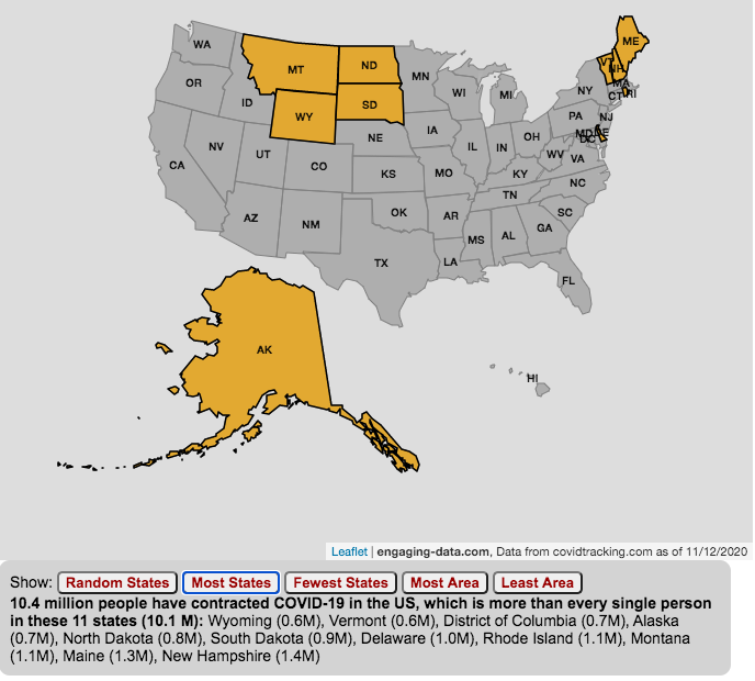
The number of US coronavirus cases is equal to the population of several states put together.
click on the buttons below to see a new set of states.
The number of Americans who have contracted the Coronavirus keeps going up with little indication of slowing down. This is an amazingly large number of cases is the highest in the world and I wanted to visualize how many people this actually is.
While the number of US COVID-19 cases is very large, comparing these number to the size of the populations in several states helps to provide more context. The visualization shows a random collection of states whose total population is equal to the latest coronavirus numbers. If you click the button you can see a different set of states that have a population equal to the current number of coronavirus cases.
The graph is updated daily using data from covidtracking.com. It’s important to note that the number of people with COVID-19 is an underestimate as many coronavirus cases are asymptomatic (i.e. people don’t get sick or show any symptoms) and the positivity rate of tests is quite high.
Stay safe out there: stay away from people and wear your mask!
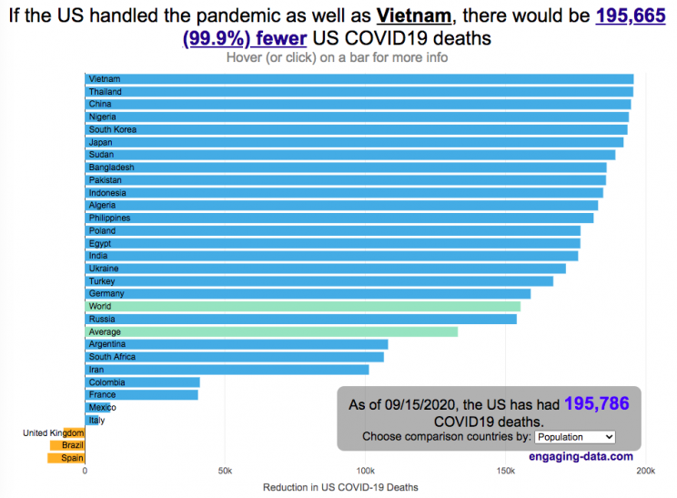
The US coronavirus death rate is quite high compared to other countries (on a population-corrected basis)
US coronavirus deaths have surpassed 300,000. Many of these deaths could have been avoided if swift action had been taken in February and March, as many other countries did. This graph shows an rough estimate of the number of US deaths that could have been avoided if the US had acted similar to other countries.
This graph takes the rate of coronavirus deaths by country (normalized to their population size) and imagines what would happen if the US had had that death rate, instead of its own. It then applies that reduction (or increase) in death rate to the total number of deaths that the US has experienced. The US death rate is about 600/million people in September 2020 and if a country has a death rate of 60/million people, then 90% of US deaths (about 180,000 people) could have been avoided if the US had matched their death rate. The government response to the pandemic is one of several important factors that determine the number of cases and deaths in a country. This means proper messaging about the need to wear masks and socially distance as well as providing payments to citizens and business to help them during the economic shutdown. Other important factors can include the overall health of the population, the population structure (i.e. age distribution of population), ease of controlling borders to prevent cases from entering the country, presence of universal or low-cost health care system, and relative wealth and education of the population.
The graph lets you compare the potential reduction in US deaths when looking at 30 different countries. You can choose those 30 countries based on total population, GDP or GDP per capita. These give somewhat different sets of countries to compare death rates, which is an indication of the effectiveness of the coronavirus response.
A valid criticism of this graph is that testing and data collection is very different in each of the countries shown and the comparisons are not always valid. This is definitely a problem with all coronavirus data but for the most part, the very large differences between death rates would still exist even if data collection were totally standardized. Some of the data from the poorest countries is less reliable, because they have less testing capabilities.
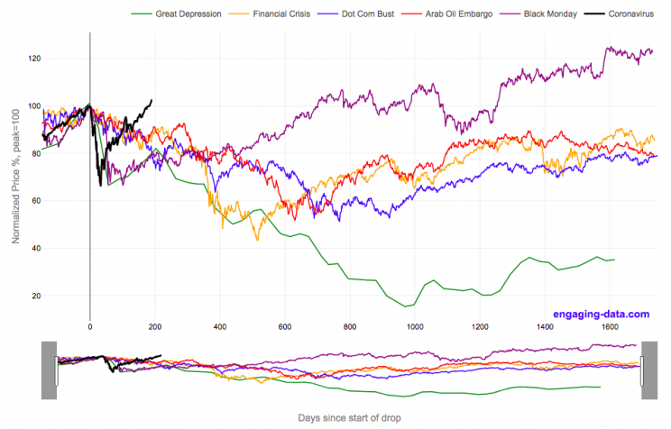
2020’s stock market drop was unprecedented for the speed of the drop and also the speed of the recovery
This graph shows the stock market drops from the 2020 and other bear markets normalized so that the peak is at 100% at day 0. This lets you see the severity and duration of different bear markets from the Great Depression (1929), the Dot Com Bust (2000), and the Financial Crisis (2008) and other drops over 30%.
The coronavirus pandemic has significantly disrupted the global economy. Q2 GDP in the United States declined at an annualized rate of 32% and US unemployment reaching 15% due to coronavirus induced business shutdowns.
However, the stock market drop (represented by the S&P500 index) in late February and early March 2020 has somewhat surprisingly rebounded and reached a new all-time-high in August 2020, even as unemployment and GDP output has continued to falter. There certainly seems to be a disconnect between the fundamentals of the economy and the stock market.
Will the recovery in the stock markets continue or will it begin to align more closely with the fundamentals of the economy?
There are many proposed reasons why this disconnect is happening. The Federal Reserve actions to increase liquidity and prop up the stock market. The heavy weighting of tech in the S&P500 and the pandemic’s boost to many tech company’s business (i.e. Amazon, Zoom, Apple). Whatever the reason, the question of whether the market can continue at this pace or will have a correction is important and one to watch.
Data for the S&P500 price is daily from 1950 onward but before 1950, the data I had available was on a monthly basis. I interpolated this monthly data to create daily data, so not all the data is 100% accurate for any given day before 1950. Data for 2020 will continue to be updated daily.
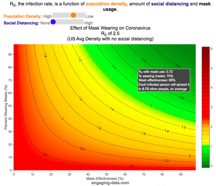
It depends on their effectiveness and how many people wear them
R0 is the transmission rate which is defined as the average number of cases that are expected to be produced from a single case in an uninfected population. R0 is dependent on a number of different factors that include transmissibility of a disease (how infectious it is), the amount of social contact and the duration of social contact. We have learned that variants of the coronavirus (such as delta or omicron) can greatly influence the transmissibility of the disease.
A baseline level of social contact is related to the population density (how often you come into contact with other people) and social distancing (limiting gatherings, not going in to work or school, etc) will reduce the amount of social contact with different people. Given what we know about coronavirus and its transmission, the amount of “contact” can also be influenced by mask wearing. This interactive graph shows the effect of mask wearing and effectiveness on reducing R0 even further. Because the effectiveness of existing vaccines is as of yet unknown against Omicron, this visualization does not take into account vaccines and their effectiveness of reducing R0, which is a very important limitation.
A very important caveat to this visualization: This visualization was initially created before COVID-19 vaccines were available and does not currently take their ability to prevent infection (and lower R0) into account because the effectiveness of each vaccines differs and the protection against infection wanes over time
This graph is a work-in-progress so please feel free to provide suggestions and feedback on issues of scientific concepts as well as for improvements in conveying the concepts/ideas.
Methodology
R0 values for different regions and population densities are estimated from Youyang Gu’s machine learning model for spread in Feb and early-March (i.e. before social distancing and mask wearing).
Baseline R0,variant based on variant transmissibility – R0 value ranges from an early estimate of 8 for Omicron to 5 for Delta and 2.5 for the original Alpha strain.
Population density factor (PDF) – this can increase or decrease the R0 value based on how much close contact you have. It ranges from about 2.4 in very high density places like New York City with lots of transit use where you are in close contact with other people for long periods of time to 0.8 in rural areas with much less contact. A value of 1 represents average US population density.
Social distancing factor (SDF) – this is simply a reduction on the baseline R0 based on the amount of social distancing (ranges from 100% (no social distancing) to 33% (high levels of social distancing). This is a reduction in the amount of time and number of people the average person is exposed to compared to baseline levels.
Mask effectiveness (Kmaskeff) – is defined as the percentage reduction in transmission of coronavirus that mask wearing can provide. An N95 mask is at least 95% effective at blocking most particles, but because it also reduces the speed at which your exhalation can travel outward (providing more time for droplets and aerosols to spread and diffuse to low concentration), an N95 can be much more than 95% effective in reducing coronavirus droplet and aerosol spread compared to the unmasked case. I’ve seen estimates for things like bandanas and homemade cloth mask having lower effectiveness maybe around 50% but I don’t know how scientifically they were estimated/calculated. Also depending on how mask are worn, this can also affect the effectiveness parameter. For example if an N95 mask does not fit tightly against the face and there are large gaps for air to flow, this will reduce the effectiveness of the mask. This parameter is shown on the x-axis.
Percent wearing masks (Kmaskfreq) – is simply the percentage of people wearing masks (varies from 0% to 100%). This parameter is shown on the y-axis.
The formula for effective Reffective is:
$R_\mathit{eff}=R_0,variant \times PDF \times SDF \times (1-K_{mask\mathit{eff}} \times K_{maskfreq})^2$
where $R_\mathit{eff}$ is the final average transmission value, $R_0,variant$ is the $R_0$ value based on the coronavirus variant type, PDF is the population density factor, SDF is the social distancing factor, $K_{mask\mathit{eff}}$ is the average mask effectiveness and $K_{maskfreq}$ is the percentage of people wearing masks. The squared parameter on the right side of the equation is essentially the average reduction in transmission that is likely due to mask usage and is from a preprint from Howard et al.
As you move up and to the right of the graph, mask use and effectiveness become very high and the transmission of coronavirus declines significantly. If you hover over the graph (on a desktop) or click on the graph (on mobile) you will see a popup that shows the Reff value that results. The lower the Reff value is the better as it dramatically affects the rate of transmission. High numbers will lead to explosive exponential growth while values below 1.0 will eventually reduce coronavirus transmissions to near 0.
For example at R0 of 6 and no social distancing or mask usage, one initial case can lead to approximately 56,000 cases in only 30 days. Whereas an Reff of 0.5 will only lead to a total of ~1 additional case in 30 days.
I am not an epidemiologist so some of the linear relationships and assumptions may be incorrect. Please let me know if I got anything terribly wrong or if you have any questions or suggestions on how the tool works, is structured or presented.


Recent Comments