Posts for Tag: coronavirus
Bay Area Coronavirus Cases
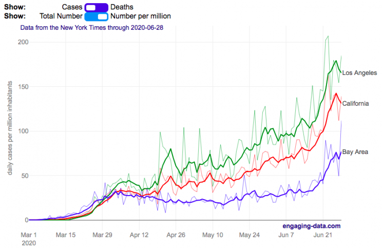
Compare the Bay Area coronavirus cases with Los Angeles and the rest of California
I wanted to better understand the coronavirus situation in my home region, the Bay Area, and I hadn’t seen any good resources that compared what was happening here to other regions in California. So I decided to make this graph. This page will be updated daily so you can come back regularly to see how the situation is changing (and hopefully improving sometime soon).
The coronavirus lockdowns began in mid-March 2020 and things have been opening up in late May, which corresponded to an uptick in coronavirus cases in the Bay Area and throughout California. While the cases in the Bay Area are increasing, it’s clear that there’s a big difference between the Bay Area and much of the rest of California. Los Angeles is currently leading the state with a large increase in the number of new cases in June as the economy tries to reopen restaurants, bars, gyms and other businesses.
You can toggle between coronavirus cases and deaths and look at the absolute numbers or on a per capita basis (per one million inhabitants). California has 39.5 million residents, while greater LA has 18.7 million residents and the Bay Area has 7.7 million residents. The daily data is shown as well as a five day moving average so you can get a better sense of the trends.
The San Francisco Bay Area was among the first regions to impose restrictions on gatherings and encourage people to stay home to fight the virus. In late February, the city of San Francisco declared an emergency in preparation for the upcoming pandemic and by early March, things became clear that life would not continue on as before.
The Bay Area is defined as the nine-county region consisting of Alameda, Contra Costa, Marin, Napa, San Francisco, San Mateo, Santa Clara, Solano and Sonoma counties.
Greater Los Angeles is defined as the 5 county region consisting of Los Angeles, Orange, Ventura, San Bernardino and Riverside counties.
Data and Tools:
County level data on coronavirus cases and deaths is from the New York Times github. Data is processed in python and javascript and graphed using the plotly open source graphing library.

US Coronavirus Deaths
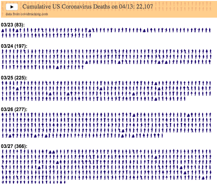
This visualization is meant to demonstrate the exponential growth of coronavirus deaths in the United States starting in early March when the first confirmed deaths took place. Some reports indicate that the first deaths may have been as early as early February, though that is not shown in this data.
In the animation, each day is about 1 second long so on days with fewer deaths, the figures show up more slowly, while on days with greater deaths, the figures come very, very quickly.
Deaths stop growing exponentially in early April and start to level off and plateau. However, they haven’t yet started to decline significantly so we are still seeing thousands of deaths each day (as of late April).
The data and visualization will be updated daily with data from Covidtracking.com.
For more information about the virus and the disease and data collection, you can find good information on the CDC website.
Sources and Tools:
Coronavirus cases are obtained from covidtracking.com. And the visualization was created using javascript and the font with people figures is called Wee People and was created by Albert Cairo and Propublica.

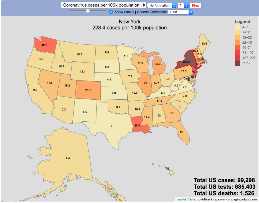
Tracking US Coronavirus Cases by State

The coronavirus (SARS-CoV-2) is literally affecting the entire globe right now and changing the way we live our lives here in the US and all over the world.
There are quite a number of different coronavirus-related dataviz out there, but as we shelter-in-place I wanted to add a map that looked at a number of different metrics that tell us about the coronavirus pandemic by US states and look at those metrics on a population basis.
There are a number of data sources that I’ve found that publish data about the coronavirus and the resulting disease (Covid-19) in the United States:
This map is based on the data compiled from covidtracking.com, partly because it has a good API and also lists testing, cases and deaths. The data I’ve included on the map is:
- Numbers of coronavirus cases – i.e. tested positive for virus
- Numbers of coronavirus tests administered
- Numbers of deaths due to coronavirus
Each of these is also calculated per 100,000 population in the state:
- Numbers of coronavirus cases per 100k people- i.e. tested positive for virus
- Numbers of coronavirus tests administered per 100k people
- Numbers of deaths due to coronavirus per 100k people
These latter metrics are important because numbers of cases or deaths can be obscured by small or large populations but per capita data (or per 100k capita data) can point out interesting outliers.
It is important to note that the data is far from perfect. There is probably significant underreporting of tests, cases and deaths. The data is a collection for the various local and state agencies that are working hard to deal with the medical, social and political ramifications of the pandemic, while also collecting data. We don’t know how many Americans have coronavirus because of lack of testing.
Also important is that the number of positive cases is a function of how much testing is taking place so cases does not necessarily represent the exact prevalence of the virus, though there will probably be good correlation between cases and actual coronavirus infections. Luckily it sounds like tests are becoming more widely available so hopefully those numbers will go up sharply.
For more information about the virus and the disease and data collection, you can find good information on the CDC website.
Sources and Tools:
Coronavirus cases are obtained from covidtracking.com. And the visualization was created using javascript and the open source leaflet javascript mapping library.
Bay Area Coronavirus Cases
Compare the Bay Area coronavirus cases with Los Angeles and the rest of California
I wanted to better understand the coronavirus situation in my home region, the Bay Area, and I hadn’t seen any good resources that compared what was happening here to other regions in California. So I decided to make this graph. This page will be updated daily so you can come back regularly to see how the situation is changing (and hopefully improving sometime soon).
The coronavirus lockdowns began in mid-March 2020 and things have been opening up in late May, which corresponded to an uptick in coronavirus cases in the Bay Area and throughout California. While the cases in the Bay Area are increasing, it’s clear that there’s a big difference between the Bay Area and much of the rest of California. Los Angeles is currently leading the state with a large increase in the number of new cases in June as the economy tries to reopen restaurants, bars, gyms and other businesses.
You can toggle between coronavirus cases and deaths and look at the absolute numbers or on a per capita basis (per one million inhabitants). California has 39.5 million residents, while greater LA has 18.7 million residents and the Bay Area has 7.7 million residents. The daily data is shown as well as a five day moving average so you can get a better sense of the trends.
The San Francisco Bay Area was among the first regions to impose restrictions on gatherings and encourage people to stay home to fight the virus. In late February, the city of San Francisco declared an emergency in preparation for the upcoming pandemic and by early March, things became clear that life would not continue on as before.
The Bay Area is defined as the nine-county region consisting of Alameda, Contra Costa, Marin, Napa, San Francisco, San Mateo, Santa Clara, Solano and Sonoma counties.
Greater Los Angeles is defined as the 5 county region consisting of Los Angeles, Orange, Ventura, San Bernardino and Riverside counties.
Data and Tools:
County level data on coronavirus cases and deaths is from the New York Times github. Data is processed in python and javascript and graphed using the plotly open source graphing library.
US Coronavirus Deaths
This visualization is meant to demonstrate the exponential growth of coronavirus deaths in the United States starting in early March when the first confirmed deaths took place. Some reports indicate that the first deaths may have been as early as early February, though that is not shown in this data.
In the animation, each day is about 1 second long so on days with fewer deaths, the figures show up more slowly, while on days with greater deaths, the figures come very, very quickly.
Deaths stop growing exponentially in early April and start to level off and plateau. However, they haven’t yet started to decline significantly so we are still seeing thousands of deaths each day (as of late April).
The data and visualization will be updated daily with data from Covidtracking.com.
For more information about the virus and the disease and data collection, you can find good information on the CDC website.
Sources and Tools:
Coronavirus cases are obtained from covidtracking.com. And the visualization was created using javascript and the font with people figures is called Wee People and was created by Albert Cairo and Propublica.
Tracking US Coronavirus Cases by State
The coronavirus (SARS-CoV-2) is literally affecting the entire globe right now and changing the way we live our lives here in the US and all over the world.
There are quite a number of different coronavirus-related dataviz out there, but as we shelter-in-place I wanted to add a map that looked at a number of different metrics that tell us about the coronavirus pandemic by US states and look at those metrics on a population basis.
There are a number of data sources that I’ve found that publish data about the coronavirus and the resulting disease (Covid-19) in the United States:
This map is based on the data compiled from covidtracking.com, partly because it has a good API and also lists testing, cases and deaths. The data I’ve included on the map is:
- Numbers of coronavirus cases – i.e. tested positive for virus
- Numbers of coronavirus tests administered
- Numbers of deaths due to coronavirus
Each of these is also calculated per 100,000 population in the state:
- Numbers of coronavirus cases per 100k people- i.e. tested positive for virus
- Numbers of coronavirus tests administered per 100k people
- Numbers of deaths due to coronavirus per 100k people
These latter metrics are important because numbers of cases or deaths can be obscured by small or large populations but per capita data (or per 100k capita data) can point out interesting outliers.
It is important to note that the data is far from perfect. There is probably significant underreporting of tests, cases and deaths. The data is a collection for the various local and state agencies that are working hard to deal with the medical, social and political ramifications of the pandemic, while also collecting data. We don’t know how many Americans have coronavirus because of lack of testing.
Also important is that the number of positive cases is a function of how much testing is taking place so cases does not necessarily represent the exact prevalence of the virus, though there will probably be good correlation between cases and actual coronavirus infections. Luckily it sounds like tests are becoming more widely available so hopefully those numbers will go up sharply.
For more information about the virus and the disease and data collection, you can find good information on the CDC website.
Sources and Tools:
Coronavirus cases are obtained from covidtracking.com. And the visualization was created using javascript and the open source leaflet javascript mapping library.
Recent Comments