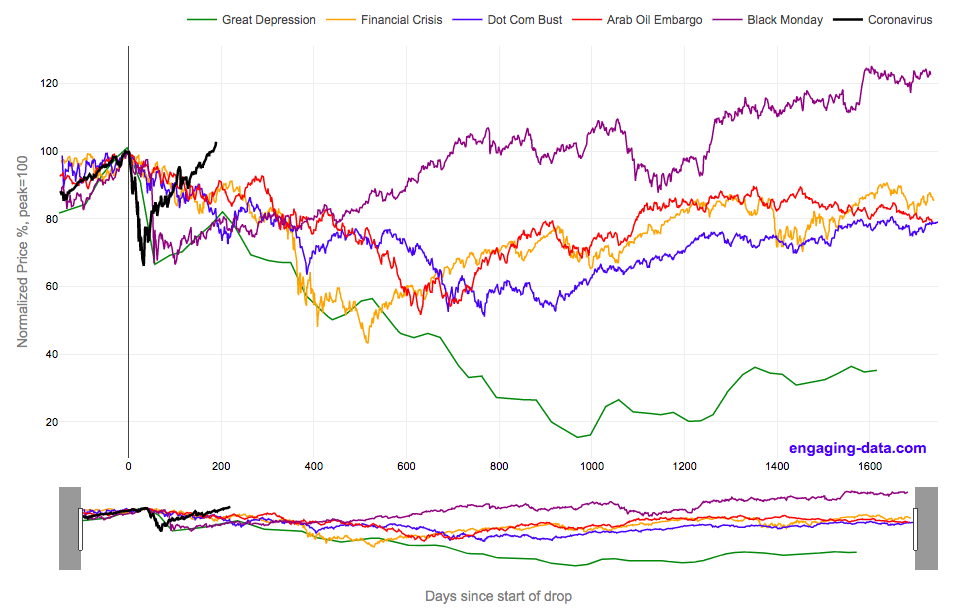
2020’s stock market drop was unprecedented for the speed of the drop and also the speed of the recovery
This graph shows the stock market drops from the 2020 and other bear markets normalized so that the peak is at 100% at day 0. This lets you see the severity and duration of different bear markets from the Great Depression (1929), the Dot Com Bust (2000), and the Financial Crisis (2008) and other drops over 30%.
The coronavirus pandemic has significantly disrupted the global economy. Q2 GDP in the United States declined at an annualized rate of 32% and US unemployment reaching 15% due to coronavirus induced business shutdowns.
However, the stock market drop (represented by the S&P500 index) in late February and early March 2020 has somewhat surprisingly rebounded and reached a new all-time-high in August 2020, even as unemployment and GDP output has continued to falter. There certainly seems to be a disconnect between the fundamentals of the economy and the stock market.
Will the recovery in the stock markets continue or will it begin to align more closely with the fundamentals of the economy?
There are many proposed reasons why this disconnect is happening. The Federal Reserve actions to increase liquidity and prop up the stock market. The heavy weighting of tech in the S&P500 and the pandemic’s boost to many tech company’s business (i.e. Amazon, Zoom, Apple). Whatever the reason, the question of whether the market can continue at this pace or will have a correction is important and one to watch.
Data for the S&P500 price is daily from 1950 onward but before 1950, the data I had available was on a monthly basis. I interpolated this monthly data to create daily data, so not all the data is 100% accurate for any given day before 1950. Data for 2020 will continue to be updated daily.
Source and Tools:
Data on historical S&P500 prices is from Yahoo! Finance and downloaded and cleaned with a python script. Graph is made using the plotly open source javascript library.
Related Posts
No Comments »
