Posts for Tag: environment
Visualizing The Growth of Atmospheric CO2 Concentration
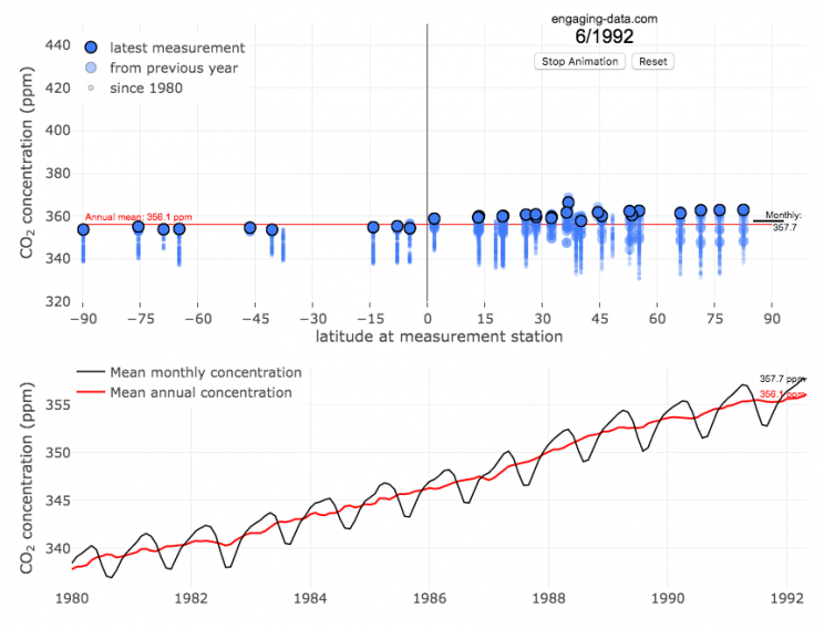
The current CO2 concentration in the atmosphere is over 400 parts per million (ppm). This has grown about 46% since pre-industrial levels (~280 ppm) in the early 1800s. The growing concentration of CO2 is a big concern because it is the most prevalent greenhouse gas, which is increasing the temperature of the planet and leading to substantial changes in the Earth’s climate patterns.
This graph visualizes the growth in CO2 concentration in the atmosphere (mainly from CO2 emissions due to human activities, such as burning fossil fuels for energy production, deforestation and other industrial processes). The graph starts at 1980 when CO2 concentration in the atmosphere was around 340ppm. It has grown significantly since then.
One of the interesting aspects of CO2 concentration is that it is not identical all around the globe, as it takes awhile for the atmosphere to mix. The graph shows geographic differences in CO2 concentration as well as seasonal ups and downs, that underly an overall growing trend in annual average (mean) concentration.
Seasonal trends in CO2 concentration occur due to differences in the amount of plant growth across different months. Spring and summer plant growth in the northern hemisphere causes a significant amount of photosynthesis, and CO2 absorption, relative to the fall and winter. This plant growth causes a very large amount of CO2 to be absorbed by plants and a noticeable reduction in the amount of CO2 in the atmosphere. The southern hemisphere spring and summer (northern hemisphere fall and winter) aren’t as obvious because there is much less land in the southern hemisphere and the land that is there is close to the tropics and green all year round.
CO2 concentration can change by about 4-5 ppm due to the “breathing” of plants, which is pretty significant. The total weight of CO2 in the atmosphere is about 3 trillion tonnes of CO2, so 4-5 ppm is about 1% of this or 30 billion tons of CO2 removed by plant life each spring/summer.
Data and Tools:
Data comes from the US National Oceanic and Atmospheric Administration (NOAA). Data was downloaded using an automated python script and the graphs were made using javascript and the open-sourced Plot.ly javascript engine.
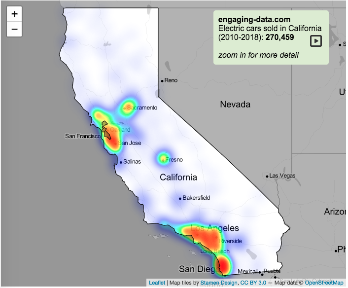
Electric Vehicle Sales By State
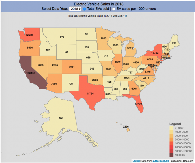
Where are electric vehicles being sold in the United States?
Electric vehicles are any vehicle that can be plugged in to recharge a battery that provides power to move the vehicle. Two broad classes are battery electric vehicles (BEVs) which only have batteries as their power source and plug-in hybrid electric vehicles (PHEVs) which have an alternative or parallel power source, typically a gasoline engine. PHEVs are built so that when the battery is depleted, the car can still run on gasoline and operate like a hybrid vehicle similar to a regular Toyota Prius (which is not plugged in at all).
Electric vehicles (EVs) have been sold in the US since 2011 (a few commercial models were sold previous to that but not in any significant numbers) and some conversions were also available. Since then, the number of EVs sold has increased pretty significantly. I wanted to look at the distribution of where those vehicles were located. What is interesting is that California accounts for around 50% of the electric vehicles sold in the United States. Other states have lower rates of EV adoption (in some cases much, much lower). There are many reasons for this, including beneficial policies, public awareness, a large number of potential early adopters and a mild climate. Even so, the EV heatmap of California done early shows that sales are mostly limited to the Bay Area, and LA areas.
The map shows data for total electric vehicle sales by state for years 2016, 2017 or 2018 and also the number of EV sales per 1000 licensed drivers (this is all people in the state with a drivers license, not drivers of EVs). If you hover over a state, you can see both data points for that state.
It will be interesting to see how the next generation of electric vehicles continues to improve, lower in price and become more popular with drivers outside of early adopters.
Click here to see other Energy-Related visualizations
Data and Tools:
Data on electric vehicle sales is from the Auto Alliance website. Licensed driver data was downloaded from the US Department of Transportation’s Bureau of Transportation Statistics website. The map was made using the leaflet open source mapping library. Data was compiled and calculated using javascript.

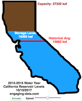
Interactive California Reservoir Levels Dashboard
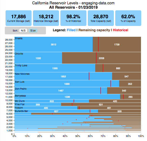
How much water is in California’s reservoirs?
Check out my new Colorado river reservoirs visualization.
I also added the ability to select specific reservoirs to display on the graph and share a custom URL which will point those selected reservoirs (click on “list” button on top right of dashboard).
If you are reading this, it’s probably the winter rainy season in California again, and time to check on the status of the water in the California reservoirs. I previously made a “bar graph” showing the overall level of water in the major California reservoirs. This dashboard provides a bit more detail on the state of each of the reservoirs while also showing an aggregate total. It updates hourly using data from the California Department of Water Resources (DWR) website, giving an up-to-date picture of California reservoir levels.
This is a marimekko (or mekko) graph which may take some time to understand if you aren’t used to seeing them. Each “row” represents one reservoir, with bars showing how much of the reservoir is filled (blue) and unfilled (brown). The height of the “row” indicates how much water the reservoir could hold. Shasta is the reservoir with the largest capacity and so it is the tallest row. The proportion of blue to brown will show how full it is, while the red line shows the historical level that reservoir is typically at for this date of the water year. The blue line indicates the reservoir’s water level one year ago today. There are many very small reservoirs (relative to Shasta) so the bars will be very thin to the point where they are barely a sliver or may not even show up.
Instructions:
If you are on a computer, you can hover your cursor over a reservoir and the dashboard at the top will provide information about that individual reservoir. If you are on a mobile device you can tap the reservoir to get that same info. It’s not possible to see or really interact with the tiniest slivers. The main goal of this visualization is to provide a quick overview of the status of the main reservoirs in the state and how they compare to historical levels.
You can sort the mekko graph by size – largest at the top to smallest at the bottom – or by reservoir location, from north to south.
If you click on the “list” button in the top right of the dashboard, it will show a list of the reservoirs (in order of size from largest to smallest) and you can check which ones you would like to display. You can also share a custom URL by clicking the “Save URL” button which will put the custom URL into the URL bar of your browser which you can then copy and share. You can also use it to monitor only the reservoirs you are most interested in.
Units are in kaf, thousands of acre feet. 1 kaf is the amount of water that would cover 1 acre in one thousand feet of water (or 1000 acres in water in 1 foot of water). It is also the amount of water in a cube that is 352 feet per side (about the length of a football field). Shasta is very large and could hold about 3.5 cubic kilometers of water at full (but not flood) capacity.
Data and Tools
The data on water storage comes from the California Department of Water Resources’ (DWR) Data Exchange Center. Python is used to extract the data from this page hourly and wrangle the data in to a clean format. Visualization was done in javascript and specifically the D3.js visualization library. It was my first time using D3 and it took me a long time to get up to speed. It takes a fair amount of work to make graphs compared to other more plug-and-play libraries but its very customizable, which is a plus. It was the only tool that I could find that would allow me to make a vertical marimekko graph.

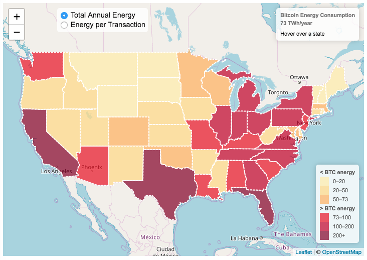
Bitcoin Energy Consumption – Does It Consume More Electricity Than Your State?

This visualization looks at the staggeringly high energy use of Bitcoin and puts it into context: comparing it to electricity usage of US states. Unfortunately for Bitcoin, high energy usage is an intended feature of the system, rather than an unintended consequence. This is because mining is an increasingly energy intensive process, based upon increasingly computationally intensive calculations that are performed on high powered computers and graphical processing units.
Currently, 28 out of 50 states plus the District of Columbia all have lower electricity consumption than estimated annual bitcoin electricity consumption (~73 TWh per year). These states are highlighted in variations of yellow. This is approximately equal to the average annual electricity usage across all US States. States with higher electricity consumption than bitcoin are highlighted in shades of red.
When dividing the total energy use (73 TWh) by the current number of transactions (93 million), we get an average energy consumption of 783 kWh per transaction. Click on the “Energy per Transaction” button to see this visualization. What’s crazy is that a transaction is simply a transfer of bitcoin between “wallets”, recording the transaction, and a validation of the process. There’s no good reason why verifying digital transactions should take this much energy, except that it was built into the fundamental process of validating and mining bitcoin. 783 kWh is larger than the monthly per capita electricity consumption in 10 US states. It could also drive you and your family over 2000 miles in an electric car (e.g. Tesla Model S).
I’m not expert enough in this area to know how much more energy consumption will rise into the future, but if crypto advocates’ predictions come true and bitcoin is used extensively, millions of transactions will occur per hour instead of per year and the price of bitcoin may rise much higher than it currently is. If the price rises, then miners will be willing to expend more energy to “mine” the more valuable bitcoin. Needless to say, this sounds like a very bad idea from an energy consumption and sustainability standpoint.
Data and Tools:
State energy data comes from the US Department of Energy. Estimates of Bitcoin energy use come from Digiconomist’s Bitcoin Energy Consumption Index. The choropleth map is visualized using javascript and the Leaflet.js library with Open Street Map tiles.
How Fast Are California Reservoirs Filling Up?
Update: I added a date slider to let you scrub through dates as well as the ability to pause the animation.
In my California water levels visualization, I presented a “bar graph” showing the amount of water currently in California’s reservoirs. However, I thought it’d be interesting to see how this has changed over the course of the last few months, since the state has gotten alot of rain and snow recently.
This visualizations “animates” the graph for recent history (going back to October 1, 2015) showing how the recent rains (or lack thereof) has been caused the levels of the reservoirs in California to rise (and fall).
The historical average represents a daily average reservoir level. It changes for each day of the water year to represent seasonality of precipitation and runoff.
Click the “animate” button below the figure and you can use the slider to change the speed of animation as it cycles through the days. I added a Date slider which lets you scrub through all the dates and animate from different points. (more…)
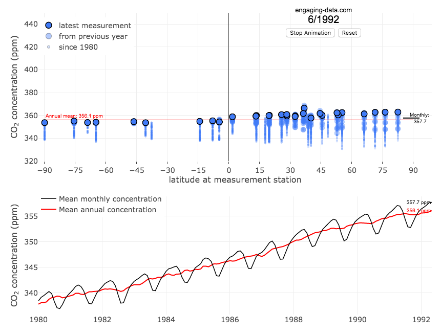
Visualizing The Growth of Atmospheric CO2 Concentration
The current CO2 concentration in the atmosphere is over 400 parts per million (ppm). This has grown about 46% since pre-industrial levels (~280 ppm) in the early 1800s. The growing concentration of CO2 is a big concern because it is the most prevalent greenhouse gas, which is increasing the temperature of the planet and leading to substantial changes in the Earth’s climate patterns.
This graph visualizes the growth in CO2 concentration in the atmosphere (mainly from CO2 emissions due to human activities, such as burning fossil fuels for energy production, deforestation and other industrial processes). The graph starts at 1980 when CO2 concentration in the atmosphere was around 340ppm. It has grown significantly since then.
One of the interesting aspects of CO2 concentration is that it is not identical all around the globe, as it takes awhile for the atmosphere to mix. The graph shows geographic differences in CO2 concentration as well as seasonal ups and downs, that underly an overall growing trend in annual average (mean) concentration.
Seasonal trends in CO2 concentration occur due to differences in the amount of plant growth across different months. Spring and summer plant growth in the northern hemisphere causes a significant amount of photosynthesis, and CO2 absorption, relative to the fall and winter. This plant growth causes a very large amount of CO2 to be absorbed by plants and a noticeable reduction in the amount of CO2 in the atmosphere. The southern hemisphere spring and summer (northern hemisphere fall and winter) aren’t as obvious because there is much less land in the southern hemisphere and the land that is there is close to the tropics and green all year round.
CO2 concentration can change by about 4-5 ppm due to the “breathing” of plants, which is pretty significant. The total weight of CO2 in the atmosphere is about 3 trillion tonnes of CO2, so 4-5 ppm is about 1% of this or 30 billion tons of CO2 removed by plant life each spring/summer.
Data and Tools:
Data comes from the US National Oceanic and Atmospheric Administration (NOAA). Data was downloaded using an automated python script and the graphs were made using javascript and the open-sourced Plot.ly javascript engine.
Electric Vehicle Sales By State
Where are electric vehicles being sold in the United States?
Electric vehicles are any vehicle that can be plugged in to recharge a battery that provides power to move the vehicle. Two broad classes are battery electric vehicles (BEVs) which only have batteries as their power source and plug-in hybrid electric vehicles (PHEVs) which have an alternative or parallel power source, typically a gasoline engine. PHEVs are built so that when the battery is depleted, the car can still run on gasoline and operate like a hybrid vehicle similar to a regular Toyota Prius (which is not plugged in at all).
Electric vehicles (EVs) have been sold in the US since 2011 (a few commercial models were sold previous to that but not in any significant numbers) and some conversions were also available. Since then, the number of EVs sold has increased pretty significantly. I wanted to look at the distribution of where those vehicles were located. What is interesting is that California accounts for around 50% of the electric vehicles sold in the United States. Other states have lower rates of EV adoption (in some cases much, much lower). There are many reasons for this, including beneficial policies, public awareness, a large number of potential early adopters and a mild climate. Even so, the EV heatmap of California done early shows that sales are mostly limited to the Bay Area, and LA areas.
The map shows data for total electric vehicle sales by state for years 2016, 2017 or 2018 and also the number of EV sales per 1000 licensed drivers (this is all people in the state with a drivers license, not drivers of EVs). If you hover over a state, you can see both data points for that state.
It will be interesting to see how the next generation of electric vehicles continues to improve, lower in price and become more popular with drivers outside of early adopters.
Click here to see other Energy-Related visualizations
Data and Tools:
Data on electric vehicle sales is from the Auto Alliance website. Licensed driver data was downloaded from the US Department of Transportation’s Bureau of Transportation Statistics website. The map was made using the leaflet open source mapping library. Data was compiled and calculated using javascript.
Interactive California Reservoir Levels Dashboard
How much water is in California’s reservoirs?
Check out my new Colorado river reservoirs visualization.
I also added the ability to select specific reservoirs to display on the graph and share a custom URL which will point those selected reservoirs (click on “list” button on top right of dashboard).
If you are reading this, it’s probably the winter rainy season in California again, and time to check on the status of the water in the California reservoirs. I previously made a “bar graph” showing the overall level of water in the major California reservoirs. This dashboard provides a bit more detail on the state of each of the reservoirs while also showing an aggregate total. It updates hourly using data from the California Department of Water Resources (DWR) website, giving an up-to-date picture of California reservoir levels.
This is a marimekko (or mekko) graph which may take some time to understand if you aren’t used to seeing them. Each “row” represents one reservoir, with bars showing how much of the reservoir is filled (blue) and unfilled (brown). The height of the “row” indicates how much water the reservoir could hold. Shasta is the reservoir with the largest capacity and so it is the tallest row. The proportion of blue to brown will show how full it is, while the red line shows the historical level that reservoir is typically at for this date of the water year. The blue line indicates the reservoir’s water level one year ago today. There are many very small reservoirs (relative to Shasta) so the bars will be very thin to the point where they are barely a sliver or may not even show up.
Instructions:
If you are on a computer, you can hover your cursor over a reservoir and the dashboard at the top will provide information about that individual reservoir. If you are on a mobile device you can tap the reservoir to get that same info. It’s not possible to see or really interact with the tiniest slivers. The main goal of this visualization is to provide a quick overview of the status of the main reservoirs in the state and how they compare to historical levels.
You can sort the mekko graph by size – largest at the top to smallest at the bottom – or by reservoir location, from north to south.
If you click on the “list” button in the top right of the dashboard, it will show a list of the reservoirs (in order of size from largest to smallest) and you can check which ones you would like to display. You can also share a custom URL by clicking the “Save URL” button which will put the custom URL into the URL bar of your browser which you can then copy and share. You can also use it to monitor only the reservoirs you are most interested in.
Units are in kaf, thousands of acre feet. 1 kaf is the amount of water that would cover 1 acre in one thousand feet of water (or 1000 acres in water in 1 foot of water). It is also the amount of water in a cube that is 352 feet per side (about the length of a football field). Shasta is very large and could hold about 3.5 cubic kilometers of water at full (but not flood) capacity.
Data and Tools
The data on water storage comes from the California Department of Water Resources’ (DWR) Data Exchange Center. Python is used to extract the data from this page hourly and wrangle the data in to a clean format. Visualization was done in javascript and specifically the D3.js visualization library. It was my first time using D3 and it took me a long time to get up to speed. It takes a fair amount of work to make graphs compared to other more plug-and-play libraries but its very customizable, which is a plus. It was the only tool that I could find that would allow me to make a vertical marimekko graph.
Bitcoin Energy Consumption – Does It Consume More Electricity Than Your State?
This visualization looks at the staggeringly high energy use of Bitcoin and puts it into context: comparing it to electricity usage of US states. Unfortunately for Bitcoin, high energy usage is an intended feature of the system, rather than an unintended consequence. This is because mining is an increasingly energy intensive process, based upon increasingly computationally intensive calculations that are performed on high powered computers and graphical processing units.
Currently, 28 out of 50 states plus the District of Columbia all have lower electricity consumption than estimated annual bitcoin electricity consumption (~73 TWh per year). These states are highlighted in variations of yellow. This is approximately equal to the average annual electricity usage across all US States. States with higher electricity consumption than bitcoin are highlighted in shades of red.
When dividing the total energy use (73 TWh) by the current number of transactions (93 million), we get an average energy consumption of 783 kWh per transaction. Click on the “Energy per Transaction” button to see this visualization. What’s crazy is that a transaction is simply a transfer of bitcoin between “wallets”, recording the transaction, and a validation of the process. There’s no good reason why verifying digital transactions should take this much energy, except that it was built into the fundamental process of validating and mining bitcoin. 783 kWh is larger than the monthly per capita electricity consumption in 10 US states. It could also drive you and your family over 2000 miles in an electric car (e.g. Tesla Model S).
I’m not expert enough in this area to know how much more energy consumption will rise into the future, but if crypto advocates’ predictions come true and bitcoin is used extensively, millions of transactions will occur per hour instead of per year and the price of bitcoin may rise much higher than it currently is. If the price rises, then miners will be willing to expend more energy to “mine” the more valuable bitcoin. Needless to say, this sounds like a very bad idea from an energy consumption and sustainability standpoint.
Data and Tools:
State energy data comes from the US Department of Energy. Estimates of Bitcoin energy use come from Digiconomist’s Bitcoin Energy Consumption Index. The choropleth map is visualized using javascript and the Leaflet.js library with Open Street Map tiles.
How Fast Are California Reservoirs Filling Up?
Update: I added a date slider to let you scrub through dates as well as the ability to pause the animation.
In my California water levels visualization, I presented a “bar graph” showing the amount of water currently in California’s reservoirs. However, I thought it’d be interesting to see how this has changed over the course of the last few months, since the state has gotten alot of rain and snow recently.
This visualizations “animates” the graph for recent history (going back to October 1, 2015) showing how the recent rains (or lack thereof) has been caused the levels of the reservoirs in California to rise (and fall).
The historical average represents a daily average reservoir level. It changes for each day of the water year to represent seasonality of precipitation and runoff.
Click the “animate” button below the figure and you can use the slider to change the speed of animation as it cycles through the days. I added a Date slider which lets you scrub through all the dates and animate from different points. (more…)
Recent Comments