Posts for Tag: environment
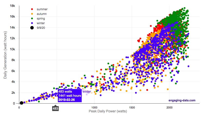
Wildfire smoke impacts solar panel generation

On September 9th, 2020, the entire San Francisco Bay Area, we had a crazy combination of wildfire smoke and low clouds that darkened the sky and turned everything orange. At 9am, it looked like it was nighttime and at noon, it was so dark, that it looked like dusk.
Here is a plot of 8+ years of solar panel generation from our panels. If you click on the legend, you can toggle whether that data is shown. Total generation for the day was only 93 watt hours (as opposed to a summer median of 13300 watt hours, 13.3 kWh) and peak power was only 32 watts (vs a median summer peak of 2000 watts (2.0 kW)).
The solar generation was even worse than the next worst day in winter (typically when it rains all day). Clicking on the legend will toggle whether certain seasons are shown and you can view how solar generation varies by season.
Here is a google image search of photos showing the crazy, apocalyptic scenes with the orange color.
Source and Tools:
Data on solar generation is downloaded from our solar panel inverter provider (enphase) and cleaned with a python script. Graph is made using the plotly open source javascript library.
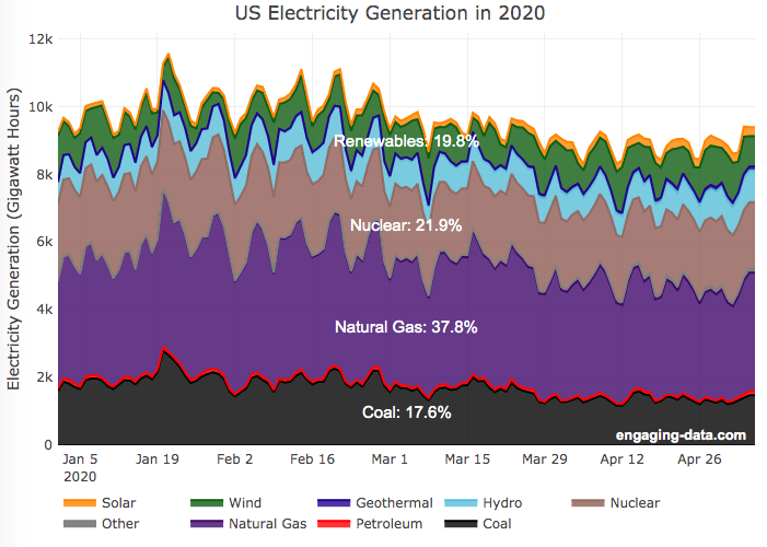
Renewable Electricity Generation in US is Now Greater Than Coal

A remarkable thing is happening in the United States and in other places around the world. Partly due to the coronavirus pandemic and partly due to changes in natural gas and renewable energy prices, renewable electricity is now a larger fraction of the US electricity grid than coal. As of early May 2020, the fraction of coal generation of US electricity is about 18% while renewables (hydroelectric, wind, solar and geothermal) account for nearly 20%.
For the entire year of 2019, coal accounted for about 24.2% of US electricity generation, while renewables accounted for 17%.4. And in 2018, coal was 28.4% and renewables were 16.8%. When you include nuclear (not technically a renewable resource, but zero emissions of greenhouse gases), about 42% of US electricity generation in 2020 comes from zero carbon sources, while fossil fuels make up the remaining 68%.
This is good news because renewables produce little to no pollution that contributes to urban air quality, health issues and climate change. Coal is by far the worst electricity generation source when it comes to air pollution that impacts human health and climate change. So this shift away from coal and towards renewables is very good news.
Here’s the same graph but showing instead the fraction of electricity from each source (you can hover over the graph to get daily values).
Source and Tools
Data is downloaded from the US Department of Energy’s Energy Information Agency (EIA).. The graph is made using the open source, javascript Plot.ly graphing library.
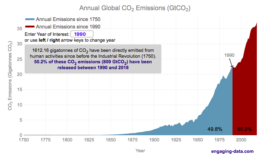
Cumulative CO2 emissions calculator
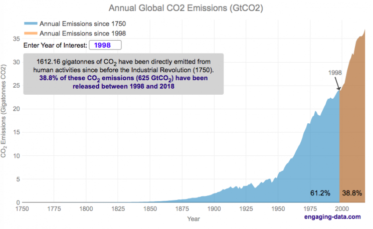
CO2 emissions are the primary contributor to our current ‘climate crisis’. Because of buildup of heat-trapping nature of CO2 and other greenhouse gases in the atmosphere, temperatures are rising and weather and precipitation patterns are changing. Changes in climate will have profound impacts on both natural systems and our human landscapes.
Significant emissions of CO2 really started in the industrial revolution. This is when humans really started using significant quantities of non-renewable energy sources, mainly fossil fuels such as coal and later natural gas and oil. The increase in the burning of hydrocarbon energy sources for powering factories and transportation lead to growing CO2 emissions. The following graph shows the annual emissions of CO2 since 1750, before the start of the industrial revolution. In this period of 269 years, humans have emitted 1600 billion tonnes of CO2 (1600 gigatonnes). One incredible fact is that due to rapid growth in population and energy use per capita over time, we are emitting more and more CO2 each year and that humans have emitted as much in the last 28 years than in the 240 years prior to that.
Calculate CO2 emissions since <insert date>
Instructions
The interactive visualization lets you enter any year between 1750 and 2021 and it will show the relative proportion of human CO2 before and after that year.
You can also use the left and right arrow keys to change the year up and down
If you hover over the graph you can see the annual and cumulative emission for each individual year in the graph
If you want to share the visualization with a specific year highlighted, you can add the following to the URL “?yr=yyyy” where yyyy is the four digit year (e.g. https://engaging-data.com/most-emissions-last-30-years/?yr=1980).
The global median age is around 30 years old (i.e. half the people on earth were born after 1989). This means that more than half of the earth’s population has seen the global cumulative CO2 emissions double in their lifetime. Also very striking is that in my children’s lifetimes (around a decade), humanity has added nearly 1/5 of all human produced CO2 ever to the atmosphere.
Notes: Emissions are in units of gigatonnes of CO2. To convert to gigatons of carbon, another common unit of measuring carbon emissions, divide by 3.666.
Data source and Tools
Annual emissions data is from the Global Carbon Project. The data is processed in javascript and plotted using the open-source, javascript plotting library, Plotly.
Where on Earth is all the water? From the solar system to living things
Earth is known as the blue planet, because it’s covered with quite a bit of water. But do you know where all that water on Earth is located? This interactive visualization will show the various amounts of water in its many forms on Earth: Oceans, Lakes, Rivers, Ice, Groundwater, etc….
If you hover over a part of the circular, sunburst graph, it will show you the amount of water that is in each of the various forms shown. If the label for that form is bolded, you can click on it and see further subdivisions beyond that broad category. For example, if you click on Oceans, it will show you how the water in the oceans is distributed among the five main oceans on Earth. As you move towards more focused views on the graph, you can click on the center of the circle to move back out to larger categories and see the big picture again.
As you can see, most of the water on Earth is found in a salty form, and most of that is in the oceans. It can be hard to click through to see freshwater lakes and rivers, as you have to be very precise to expand the “Surface Water” wedge, when you are looking at all “Freshwater”.
Even smaller, on that same visualization, is the “Living things” wedge is basically invisible. You can further explore the details of the living things category by clicking on the button that appears on the freshwater graph.
Checking the Group Rivers and Lakes checkbox will group rivers by continent and lakes by major groups.
It is interesting to see how much water there is on Earth (about 1.4 billion cubic kilometers of water), but how little of it is non-salty, liquid freshwater at the surface (about 100,000 cubic kilometers, though that is still quite a lot) but it only makes up about 0.008% of all water on Earth. That means for every 10,000 gallons of water on Earth, only one of those gallons is freshwater in a lake or river that we can easily access.
It is also believed that there is more water deep in the Earth’s interior (i.e. the mantle) than on the surface or near-subsurface, but estimates of that are highly uncertain and are not included in this graph.
If you click out past Earth’s water to look at water in the solar system, the estimates shown in this visualization are only including liquid water and do not include estimates of ice (which I haven’t been able to find estimates of). The amount of water in living things is estimated assuming that the ratio of organic carbon to liquid water is more or less the same across all different types of living things (i.e. viruses, bacteria, fungi, plants, animals, etc.). This isn’t a great assumption but the estimates, which come from estimates of the dry carbon weight of these organisms, vary across many orders of magnitude so being off in liquid water weight/volume by a factor of two or so isn’t a huge problem.
Tools and Data Sources
The sunburst chart is made using the open source, javascript Plot.ly graphing library. Data on water distributions is primarily from Wikipedia – Distribution of Water – List of Rivers by Discharge – List of Lakes – Weight of Living Biomass – Extra-terrestrial water estimates

Greenhouse gas emissions from airplane flights
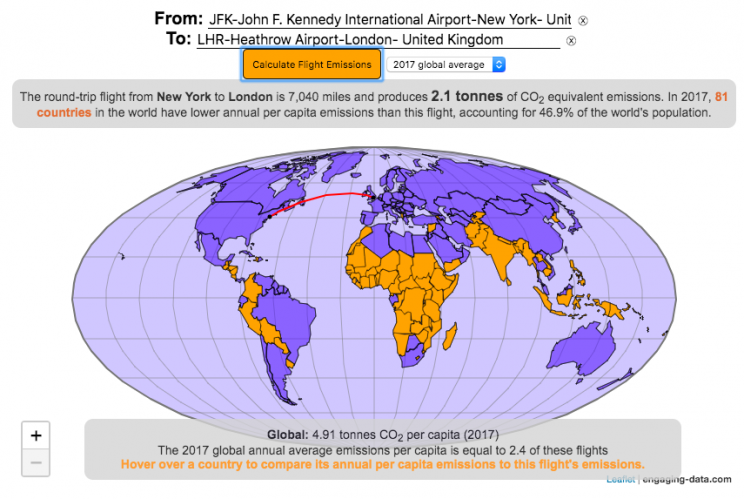
Traveling by airplane produces significant greenhouse gas emissions
Flying in an airplane is likely the most greenhouse gas intensive activity you can do. In a few short hours, you can can travel thousands of miles across the continent or ocean. It takes a large amount of fossil-fuel energy (oil) to lift an 80+ ton airplane off the ground and propel it at 600 miles per hour through the air. Every hour of travel (in a Boeing 737) consumes around 750 gallons of jet fuel.
Even when dividing the fuel usage across all of the passengers (and cargo) of an aircraft, airplane travel consumes a significant amount of fuel per passenger. The fuel economy is estimated to be about the same as a fairly efficient hybrid car driven by one person (60-70 passenger miles per gallon). However, because you can go 10 times faster and much further more easily than you would in a car, airline travel can, on an absolute basis, emit larger amounts of greenhouse gases. In fact, an individual passenger’s share of emissions from a single airplane flight can exceed the annual average greenhouse gas emissions per capita from a number of countries (and the global average).
The following flight calculator and data visualization shows the miles and emissions produced per passenger by a airplane trip that you can specify. Choose two airports that you are interested in and click the “Calculate Flight Emissions” button to see the emissions associated with a round-trip flight between these two cities. The map will show you the flight route and also shows you the countries in the world where this one single round-trip flight produces more emissions per passenger than the average resident does in one year from all sources (annual per capita emissions).
In addition to individual countries, the tool also compares the flight’s per passenger emissions to the global average emissions per capita in 2017 (4.91 tonnes) and the emissions required to achieve a 22℃ climate stabilization in 2030 (3.08 tonnes) and in 2050 (1.37 tonnes). These 2030 and 2050 numbers are based on an International Energy Agency scenario.
Calculations of Airplane Emissions
The emissions calculated by this calculator are based on calculations from myclimate.org, a non-profit environmental organization.
The fuel consumption of a jet depends on the size of the aircraft and distance traveled, but takeoff and climbing to cruising altitude are particularly fuel-intensive. On shorter flights, the takeoff and initial climb will constitute a greater proportion of the total flight time so fuel consumption per mile will be higher than on longer (e.g. international) flights.
The detailed methodology is described in more detail in this document.
In addition to emissions of CO2 from the burning of jet fuel, jets also emit other gases (including methane, NOx, and water vapor) which can also contribute to warming (also known as “radiative forcing”). Because the emissions are occurring at high altitude, these gases can have different impacts than those at lower altitude. A number of studies have estimated the impact of these other gases can significantly contribute to the overall radiative forcing and have somewhere between 1.5 and 3 times the impact that the CO2 alone would. A number of studies, including the myclimate calculator use a factor of 2 to account for these non-CO2 gases and their warming impact, and that is what is used in this calculator as well.
Unlike cars, trucks and trains, it is much harder to power airplanes with batteries and electricity and producing low-carbon jet fuels from biomass is proving very challenging.
In order to achieve climate stabilization at 2 degrees C, global emissions need to basically go to zero over the next 40 years. With a growing global population, this means that the allowable emissions per person will shrink rapidly over these coming decades.
Ultimately, while aviation is a small part of global greenhouse gas emissions, it is a larger part of emissions in richer countries (i.e. if you are reading/viewing this post). And there are many in these richer countries who fly a disproportionate amount and therefore contribute a disproportionate amount of emissions. Hopefully, putting airplane travel in this context can help us better understand the impact of our actions and choices and maybe even change behavior for some.
Tools and Data Sources
The calculator estimates flight emissions based on the myclimate carbon footprint calculator. Data for CO2 emissions by country was downloaded from the European Commissions’s Emissions Database for Global Atmospheric Research. The map was built using the leaflet open-source mapping library in javascript.

What kinds of vehicles do Americans drive?
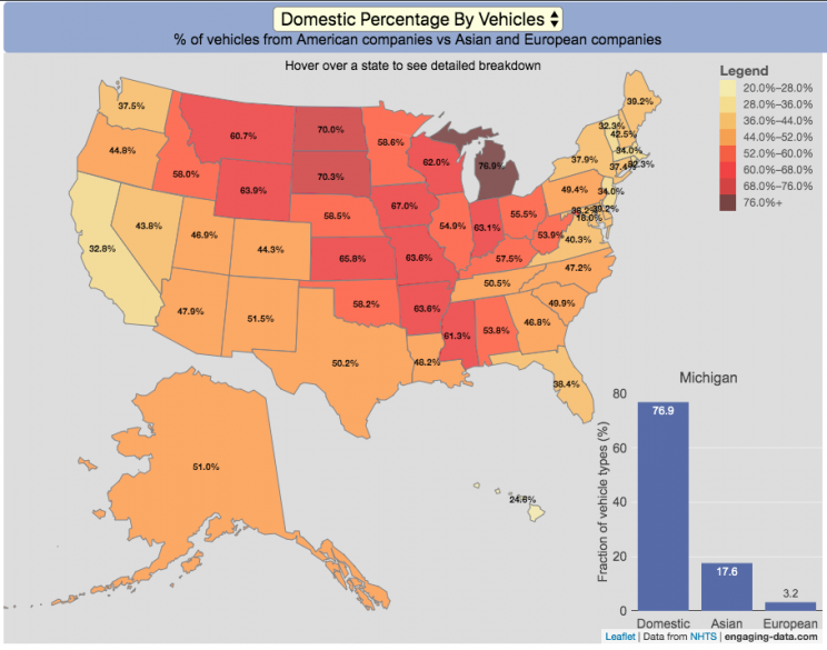
Americans are known for loving cars and driving quite a bit. Drivers in the United States own more cars and drive more than those in any other country. So what kinds of vehicles do Americans drive? This visualization looks at the types of vehicles (by body type and country of origin) across the 50 States and Washington DC.
You can view two different attributes about the types of vehicles in use in the United States:
- Body type of passenger vehicles
- Manufacturer/Brand region of origin
The different categories of passenger vehicles include:
- Cars – includes sedans, hatchbacks, wagons and sports cars
- Pickup trucks
- SUVs
- Vans – includes Minivans and full-size vans
Classification of the vehicles manufacturer (US, Asia or Europe) is based on the company’s headquarters and not the place of vehicle manufacturing. So a Toyota here is an Asian vehicle even if it was assembled in Mississippi.
It is pretty interesting to see the regional differences in vehicle types (cars vs trucks and SUVs) and vehicle brand (domestic vs foreign). Michigan, especially, stands out with their very high domestic ownership. It makes sense as Detroit is the home of the big three US auto manufacturers (Ford, GM and Chrysler). And I hear there’s a very strong culture of owning American cars there (and employee, friends and family discounts as well).
The data is derived from a survey by the US Department of Transportation called the National Household Travel Survey (NHTS) released in 2017. The following is a quote from the NHTS webpage:
The National Household Travel Survey (NHTS) is the source of the Nation’s information about travel by U.S. residents in all 50 States and Washington, DC. This inventory of travel behavior includes trips made by all modes of travel (i.e., private vehicle, public transportation, pedestrian, and cycling) and for all purposes (e.g., travel to work, school, recreation, and personal/family trips). It provides information to assist transportation planners and policymakers who need comprehensive data on travel and transportation patterns in the United States.
Data and Tools:
Data, as stated before, comes from the US Department of Transportation’s National Household Travel Survey (NHTS). That data was processed to identify vehicle characteristics by state and plotted using javascript and the open-source leaflet map library.

Wildfire smoke impacts solar panel generation
On September 9th, 2020, the entire San Francisco Bay Area, we had a crazy combination of wildfire smoke and low clouds that darkened the sky and turned everything orange. At 9am, it looked like it was nighttime and at noon, it was so dark, that it looked like dusk.
Here is a plot of 8+ years of solar panel generation from our panels. If you click on the legend, you can toggle whether that data is shown. Total generation for the day was only 93 watt hours (as opposed to a summer median of 13300 watt hours, 13.3 kWh) and peak power was only 32 watts (vs a median summer peak of 2000 watts (2.0 kW)).
The solar generation was even worse than the next worst day in winter (typically when it rains all day). Clicking on the legend will toggle whether certain seasons are shown and you can view how solar generation varies by season.
Here is a google image search of photos showing the crazy, apocalyptic scenes with the orange color.
Source and Tools:
Data on solar generation is downloaded from our solar panel inverter provider (enphase) and cleaned with a python script. Graph is made using the plotly open source javascript library.
Renewable Electricity Generation in US is Now Greater Than Coal
A remarkable thing is happening in the United States and in other places around the world. Partly due to the coronavirus pandemic and partly due to changes in natural gas and renewable energy prices, renewable electricity is now a larger fraction of the US electricity grid than coal. As of early May 2020, the fraction of coal generation of US electricity is about 18% while renewables (hydroelectric, wind, solar and geothermal) account for nearly 20%.
For the entire year of 2019, coal accounted for about 24.2% of US electricity generation, while renewables accounted for 17%.4. And in 2018, coal was 28.4% and renewables were 16.8%. When you include nuclear (not technically a renewable resource, but zero emissions of greenhouse gases), about 42% of US electricity generation in 2020 comes from zero carbon sources, while fossil fuels make up the remaining 68%.
This is good news because renewables produce little to no pollution that contributes to urban air quality, health issues and climate change. Coal is by far the worst electricity generation source when it comes to air pollution that impacts human health and climate change. So this shift away from coal and towards renewables is very good news.
Here’s the same graph but showing instead the fraction of electricity from each source (you can hover over the graph to get daily values).
Source and Tools
Data is downloaded from the US Department of Energy’s Energy Information Agency (EIA).. The graph is made using the open source, javascript Plot.ly graphing library.
Cumulative CO2 emissions calculator
CO2 emissions are the primary contributor to our current ‘climate crisis’. Because of buildup of heat-trapping nature of CO2 and other greenhouse gases in the atmosphere, temperatures are rising and weather and precipitation patterns are changing. Changes in climate will have profound impacts on both natural systems and our human landscapes.
Significant emissions of CO2 really started in the industrial revolution. This is when humans really started using significant quantities of non-renewable energy sources, mainly fossil fuels such as coal and later natural gas and oil. The increase in the burning of hydrocarbon energy sources for powering factories and transportation lead to growing CO2 emissions. The following graph shows the annual emissions of CO2 since 1750, before the start of the industrial revolution. In this period of 269 years, humans have emitted 1600 billion tonnes of CO2 (1600 gigatonnes). One incredible fact is that due to rapid growth in population and energy use per capita over time, we are emitting more and more CO2 each year and that humans have emitted as much in the last 28 years than in the 240 years prior to that.
Calculate CO2 emissions since <insert date>
Instructions
The global median age is around 30 years old (i.e. half the people on earth were born after 1989). This means that more than half of the earth’s population has seen the global cumulative CO2 emissions double in their lifetime. Also very striking is that in my children’s lifetimes (around a decade), humanity has added nearly 1/5 of all human produced CO2 ever to the atmosphere.
Notes: Emissions are in units of gigatonnes of CO2. To convert to gigatons of carbon, another common unit of measuring carbon emissions, divide by 3.666.
Data source and Tools
Annual emissions data is from the Global Carbon Project. The data is processed in javascript and plotted using the open-source, javascript plotting library, Plotly.
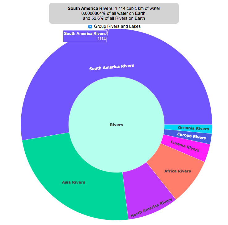
Where on Earth is all the water? From the solar system to living things
Earth is known as the blue planet, because it’s covered with quite a bit of water. But do you know where all that water on Earth is located? This interactive visualization will show the various amounts of water in its many forms on Earth: Oceans, Lakes, Rivers, Ice, Groundwater, etc….
If you hover over a part of the circular, sunburst graph, it will show you the amount of water that is in each of the various forms shown. If the label for that form is bolded, you can click on it and see further subdivisions beyond that broad category. For example, if you click on Oceans, it will show you how the water in the oceans is distributed among the five main oceans on Earth. As you move towards more focused views on the graph, you can click on the center of the circle to move back out to larger categories and see the big picture again.
As you can see, most of the water on Earth is found in a salty form, and most of that is in the oceans. It can be hard to click through to see freshwater lakes and rivers, as you have to be very precise to expand the “Surface Water” wedge, when you are looking at all “Freshwater”.
Even smaller, on that same visualization, is the “Living things” wedge is basically invisible. You can further explore the details of the living things category by clicking on the button that appears on the freshwater graph.
Checking the Group Rivers and Lakes checkbox will group rivers by continent and lakes by major groups.
It is interesting to see how much water there is on Earth (about 1.4 billion cubic kilometers of water), but how little of it is non-salty, liquid freshwater at the surface (about 100,000 cubic kilometers, though that is still quite a lot) but it only makes up about 0.008% of all water on Earth. That means for every 10,000 gallons of water on Earth, only one of those gallons is freshwater in a lake or river that we can easily access.
It is also believed that there is more water deep in the Earth’s interior (i.e. the mantle) than on the surface or near-subsurface, but estimates of that are highly uncertain and are not included in this graph.
If you click out past Earth’s water to look at water in the solar system, the estimates shown in this visualization are only including liquid water and do not include estimates of ice (which I haven’t been able to find estimates of). The amount of water in living things is estimated assuming that the ratio of organic carbon to liquid water is more or less the same across all different types of living things (i.e. viruses, bacteria, fungi, plants, animals, etc.). This isn’t a great assumption but the estimates, which come from estimates of the dry carbon weight of these organisms, vary across many orders of magnitude so being off in liquid water weight/volume by a factor of two or so isn’t a huge problem.
Tools and Data Sources
The sunburst chart is made using the open source, javascript Plot.ly graphing library. Data on water distributions is primarily from Wikipedia – Distribution of Water – List of Rivers by Discharge – List of Lakes – Weight of Living Biomass – Extra-terrestrial water estimates
Greenhouse gas emissions from airplane flights
Traveling by airplane produces significant greenhouse gas emissions
Flying in an airplane is likely the most greenhouse gas intensive activity you can do. In a few short hours, you can can travel thousands of miles across the continent or ocean. It takes a large amount of fossil-fuel energy (oil) to lift an 80+ ton airplane off the ground and propel it at 600 miles per hour through the air. Every hour of travel (in a Boeing 737) consumes around 750 gallons of jet fuel.
Even when dividing the fuel usage across all of the passengers (and cargo) of an aircraft, airplane travel consumes a significant amount of fuel per passenger. The fuel economy is estimated to be about the same as a fairly efficient hybrid car driven by one person (60-70 passenger miles per gallon). However, because you can go 10 times faster and much further more easily than you would in a car, airline travel can, on an absolute basis, emit larger amounts of greenhouse gases. In fact, an individual passenger’s share of emissions from a single airplane flight can exceed the annual average greenhouse gas emissions per capita from a number of countries (and the global average).
The following flight calculator and data visualization shows the miles and emissions produced per passenger by a airplane trip that you can specify. Choose two airports that you are interested in and click the “Calculate Flight Emissions” button to see the emissions associated with a round-trip flight between these two cities. The map will show you the flight route and also shows you the countries in the world where this one single round-trip flight produces more emissions per passenger than the average resident does in one year from all sources (annual per capita emissions).
In addition to individual countries, the tool also compares the flight’s per passenger emissions to the global average emissions per capita in 2017 (4.91 tonnes) and the emissions required to achieve a 22℃ climate stabilization in 2030 (3.08 tonnes) and in 2050 (1.37 tonnes). These 2030 and 2050 numbers are based on an International Energy Agency scenario.
Calculations of Airplane Emissions
The emissions calculated by this calculator are based on calculations from myclimate.org, a non-profit environmental organization.
The fuel consumption of a jet depends on the size of the aircraft and distance traveled, but takeoff and climbing to cruising altitude are particularly fuel-intensive. On shorter flights, the takeoff and initial climb will constitute a greater proportion of the total flight time so fuel consumption per mile will be higher than on longer (e.g. international) flights.
The detailed methodology is described in more detail in this document.
In addition to emissions of CO2 from the burning of jet fuel, jets also emit other gases (including methane, NOx, and water vapor) which can also contribute to warming (also known as “radiative forcing”). Because the emissions are occurring at high altitude, these gases can have different impacts than those at lower altitude. A number of studies have estimated the impact of these other gases can significantly contribute to the overall radiative forcing and have somewhere between 1.5 and 3 times the impact that the CO2 alone would. A number of studies, including the myclimate calculator use a factor of 2 to account for these non-CO2 gases and their warming impact, and that is what is used in this calculator as well.
Unlike cars, trucks and trains, it is much harder to power airplanes with batteries and electricity and producing low-carbon jet fuels from biomass is proving very challenging.
In order to achieve climate stabilization at 2 degrees C, global emissions need to basically go to zero over the next 40 years. With a growing global population, this means that the allowable emissions per person will shrink rapidly over these coming decades.
Ultimately, while aviation is a small part of global greenhouse gas emissions, it is a larger part of emissions in richer countries (i.e. if you are reading/viewing this post). And there are many in these richer countries who fly a disproportionate amount and therefore contribute a disproportionate amount of emissions. Hopefully, putting airplane travel in this context can help us better understand the impact of our actions and choices and maybe even change behavior for some.
Tools and Data Sources
The calculator estimates flight emissions based on the myclimate carbon footprint calculator. Data for CO2 emissions by country was downloaded from the European Commissions’s Emissions Database for Global Atmospheric Research. The map was built using the leaflet open-source mapping library in javascript.
What kinds of vehicles do Americans drive?
Americans are known for loving cars and driving quite a bit. Drivers in the United States own more cars and drive more than those in any other country. So what kinds of vehicles do Americans drive? This visualization looks at the types of vehicles (by body type and country of origin) across the 50 States and Washington DC.
You can view two different attributes about the types of vehicles in use in the United States:
- Body type of passenger vehicles
- Manufacturer/Brand region of origin
The different categories of passenger vehicles include:
- Cars – includes sedans, hatchbacks, wagons and sports cars
- Pickup trucks
- SUVs
- Vans – includes Minivans and full-size vans
Classification of the vehicles manufacturer (US, Asia or Europe) is based on the company’s headquarters and not the place of vehicle manufacturing. So a Toyota here is an Asian vehicle even if it was assembled in Mississippi.
It is pretty interesting to see the regional differences in vehicle types (cars vs trucks and SUVs) and vehicle brand (domestic vs foreign). Michigan, especially, stands out with their very high domestic ownership. It makes sense as Detroit is the home of the big three US auto manufacturers (Ford, GM and Chrysler). And I hear there’s a very strong culture of owning American cars there (and employee, friends and family discounts as well).
The data is derived from a survey by the US Department of Transportation called the National Household Travel Survey (NHTS) released in 2017. The following is a quote from the NHTS webpage:
The National Household Travel Survey (NHTS) is the source of the Nation’s information about travel by U.S. residents in all 50 States and Washington, DC. This inventory of travel behavior includes trips made by all modes of travel (i.e., private vehicle, public transportation, pedestrian, and cycling) and for all purposes (e.g., travel to work, school, recreation, and personal/family trips). It provides information to assist transportation planners and policymakers who need comprehensive data on travel and transportation patterns in the United States.
Data and Tools:
Data, as stated before, comes from the US Department of Transportation’s National Household Travel Survey (NHTS). That data was processed to identify vehicle characteristics by state and plotted using javascript and the open-source leaflet map library.
Recent Comments