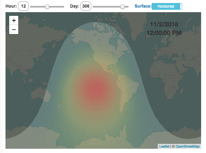
This visualization shows the amount of solar intensity (also called solar insolation and measured in watts per square meter) all across the globe as a function of time of day and day of year. This is an idealized calculation as it does not take into account reductions in solar intensity due to cloud cover or other things that might block the sun from reaching the earth (e.g dust and pollution).
As would be expected, the highest amount of solar intensity occurs on the globe right where the sun is overhead and as the angle of the sun lowers, the solar intensity declines. This is why the area around the equator and up through the tropics is so sunny, the sun is overhead here the most. If you click on the map you should see a popup of the intensity of sunlight at that location.
As the earth rotates over the course of a day, the angle of the sun changes and eventually the angle is so low, the sun is blocked by the horizon (this is sunset).
Instructions
- The default is to show the sunlight intensity for the current date and time but you can change it by moving the sliders for hour or day.
- You can also toggle between the orientation of the surface that you measure the sunlight on. The default shows the intensity of sunlight on a horizontal surface. The other option shows the intensity on a surface that is oriented to face the sun (i.e. perpendicular)
Again, the intensity will depend on the angle it makes with the sun and so it depends on your location on earth (i.e. latitude). Latitudes around the equator will receive more sunlight because their angle is closer to perpendicular.
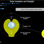
Shifting through the days of the year, you can start to see the cause of the seasons as the amount of sunlight changes and more or less sunlight goes to each of the northern and southern hemispheres.
Calculations and Tools:
The calculations for solar intensity are based on equations from “Renewable and Efficient Electric Power Systems” by Gilbert Masters Chapter 7. Calculations were made using javascript and visualized using the Leaflet.js library with Open Street Map tiles.
This was a fun project for me to learn online mapping tools and programming.
9 Comments »
9 Responses to Solar (Sun) Intensity By Location and Time
Just curious: why is there a north/south asymmetry? For example, the peak horizontal intensity on June 21 at 23 deg N is ~935 W/m2, but the peak intensity on Dec 21 at 23 deg S is ~1050 W/m2.
Earth’s closest approach to the sun, called perihelion, comes in early January and is 146 million km.
The farthest from the sun Earth gets is called aphelion. It comes in early July and is about 152 million km.
Solar intensity is proportional to the square of the distance.
Therefore, I would expect 8% gap from min to max.
This is close to the 10% difference you found, and has the right seasonal timing, but still not equal, I wonder why.
Earth’s distance from the sun varies in its orbit.
Likely due to axis tilt. The same reason it is almost totally dusk/dawn in Alaska in the winter (no daylight) and then almost total daytime in June (land of the midnight sun).
This is a good question, and its a result of the Earth’s orbit around the sun being elliptical, and not perfectly circular. The Earth is actually closest to the sun in January (~ January 4th), so on the summer solstice in the southern hemisphere the earth receives more solar energy than the summer solstice in the northern hemisphere, when the earth is nearly 5 million KM father away.
It depends on aphelion and perihelion.
That would be because st the southern hemisphere solar solstice (Dec 21) the earth is closer to the sun than at the northern heipshere summer solstice (Jun 21) – by around 5 Million kilometres.
i need average monthly and annual solar intensity figures for BOTSWANA
Your time slider seems to be about 12 hours out of phase, at least for the UK.
I am seeing hours of daylight from around 7pm to 7am 🙂