Posts for Tag: heatmap
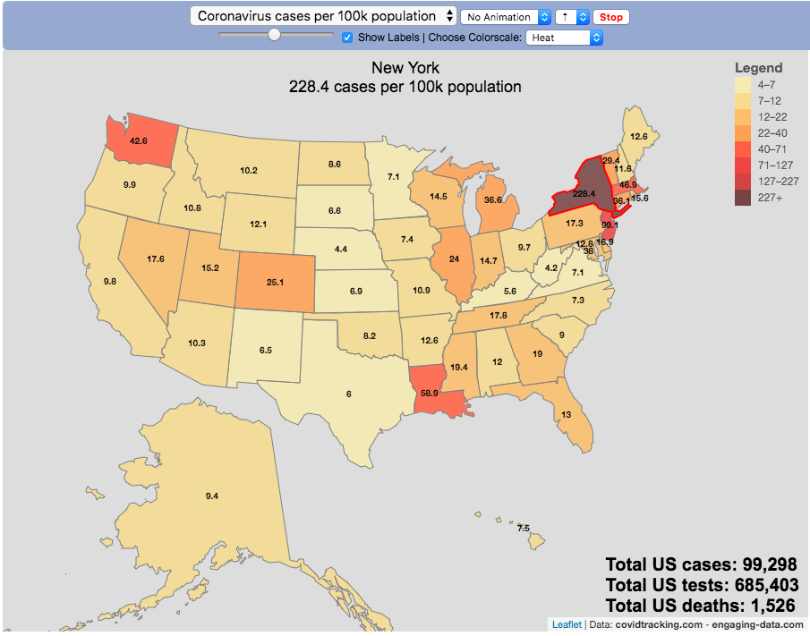
Tracking US Coronavirus Cases by State

The coronavirus (SARS-CoV-2) is literally affecting the entire globe right now and changing the way we live our lives here in the US and all over the world.
There are quite a number of different coronavirus-related dataviz out there, but as we shelter-in-place I wanted to add a map that looked at a number of different metrics that tell us about the coronavirus pandemic by US states and look at those metrics on a population basis.
There are a number of data sources that I’ve found that publish data about the coronavirus and the resulting disease (Covid-19) in the United States:
This map is based on the data compiled from covidtracking.com, partly because it has a good API and also lists testing, cases and deaths. The data I’ve included on the map is:
- Numbers of coronavirus cases – i.e. tested positive for virus
- Numbers of coronavirus tests administered
- Numbers of deaths due to coronavirus
Each of these is also calculated per 100,000 population in the state:
- Numbers of coronavirus cases per 100k people- i.e. tested positive for virus
- Numbers of coronavirus tests administered per 100k people
- Numbers of deaths due to coronavirus per 100k people
These latter metrics are important because numbers of cases or deaths can be obscured by small or large populations but per capita data (or per 100k capita data) can point out interesting outliers.
It is important to note that the data is far from perfect. There is probably significant underreporting of tests, cases and deaths. The data is a collection for the various local and state agencies that are working hard to deal with the medical, social and political ramifications of the pandemic, while also collecting data. We don’t know how many Americans have coronavirus because of lack of testing.
Also important is that the number of positive cases is a function of how much testing is taking place so cases does not necessarily represent the exact prevalence of the virus, though there will probably be good correlation between cases and actual coronavirus infections. Luckily it sounds like tests are becoming more widely available so hopefully those numbers will go up sharply.
For more information about the virus and the disease and data collection, you can find good information on the CDC website.
Sources and Tools:
Coronavirus cases are obtained from covidtracking.com. And the visualization was created using javascript and the open source leaflet javascript mapping library.
Electric Vehicle Sales By State
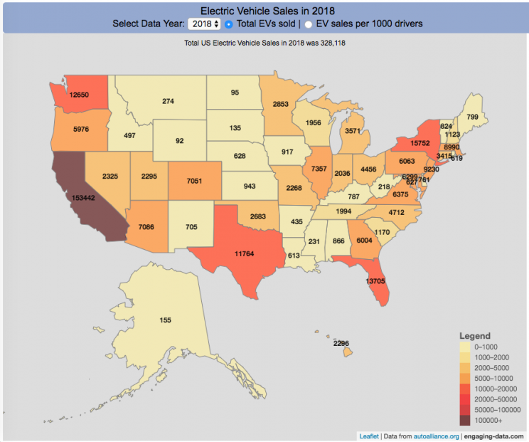
Where are electric vehicles being sold in the United States?
Electric vehicles are any vehicle that can be plugged in to recharge a battery that provides power to move the vehicle. Two broad classes are battery electric vehicles (BEVs) which only have batteries as their power source and plug-in hybrid electric vehicles (PHEVs) which have an alternative or parallel power source, typically a gasoline engine. PHEVs are built so that when the battery is depleted, the car can still run on gasoline and operate like a hybrid vehicle similar to a regular Toyota Prius (which is not plugged in at all).
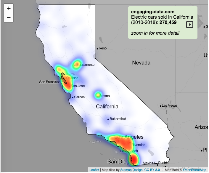
Electric vehicles (EVs) have been sold in the US since 2011 (a few commercial models were sold previous to that but not in any significant numbers) and some conversions were also available. Since then, the number of EVs sold has increased pretty significantly. I wanted to look at the distribution of where those vehicles were located. What is interesting is that California accounts for around 50% of the electric vehicles sold in the United States. Other states have lower rates of EV adoption (in some cases much, much lower). There are many reasons for this, including beneficial policies, public awareness, a large number of potential early adopters and a mild climate. Even so, the EV heatmap of California done early shows that sales are mostly limited to the Bay Area, and LA areas.
The map shows data for total electric vehicle sales by state for years 2016, 2017 or 2018 and also the number of EV sales per 1000 licensed drivers (this is all people in the state with a drivers license, not drivers of EVs). If you hover over a state, you can see both data points for that state.
It will be interesting to see how the next generation of electric vehicles continues to improve, lower in price and become more popular with drivers outside of early adopters.
Click here to see other Energy-Related visualizations
Data and Tools:
Data on electric vehicle sales is from the Auto Alliance website. Licensed driver data was downloaded from the US Department of Transportation’s Bureau of Transportation Statistics website. The map was made using the leaflet open source mapping library. Data was compiled and calculated using javascript.

Solar (Sun) Intensity By Location and Time
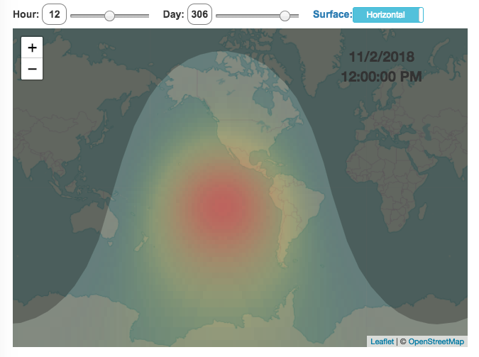
This visualization shows the amount of solar intensity (also called solar insolation and measured in watts per square meter) all across the globe as a function of time of day and day of year. This is an idealized calculation as it does not take into account reductions in solar intensity due to cloud cover or other things that might block the sun from reaching the earth (e.g dust and pollution).
As would be expected, the highest amount of solar intensity occurs on the globe right where the sun is overhead and as the angle of the sun lowers, the solar intensity declines. This is why the area around the equator and up through the tropics is so sunny, the sun is overhead here the most. If you click on the map you should see a popup of the intensity of sunlight at that location.
As the earth rotates over the course of a day, the angle of the sun changes and eventually the angle is so low, the sun is blocked by the horizon (this is sunset).
Instructions
- The default is to show the sunlight intensity for the current date and time but you can change it by moving the sliders for hour or day.
- You can also toggle between the orientation of the surface that you measure the sunlight on. The default shows the intensity of sunlight on a horizontal surface. The other option shows the intensity on a surface that is oriented to face the sun (i.e. perpendicular)
Again, the intensity will depend on the angle it makes with the sun and so it depends on your location on earth (i.e. latitude). Latitudes around the equator will receive more sunlight because their angle is closer to perpendicular.
Shifting through the days of the year, you can start to see the cause of the seasons as the amount of sunlight changes and more or less sunlight goes to each of the northern and southern hemispheres.
Calculations and Tools:
The calculations for solar intensity are based on equations from “Renewable and Efficient Electric Power Systems” by Gilbert Masters Chapter 7. Calculations were made using javascript and visualized using the Leaflet.js library with Open Street Map tiles.
This was a fun project for me to learn online mapping tools and programming.

Tracking US Coronavirus Cases by State
The coronavirus (SARS-CoV-2) is literally affecting the entire globe right now and changing the way we live our lives here in the US and all over the world.
There are quite a number of different coronavirus-related dataviz out there, but as we shelter-in-place I wanted to add a map that looked at a number of different metrics that tell us about the coronavirus pandemic by US states and look at those metrics on a population basis.
There are a number of data sources that I’ve found that publish data about the coronavirus and the resulting disease (Covid-19) in the United States:
This map is based on the data compiled from covidtracking.com, partly because it has a good API and also lists testing, cases and deaths. The data I’ve included on the map is:
- Numbers of coronavirus cases – i.e. tested positive for virus
- Numbers of coronavirus tests administered
- Numbers of deaths due to coronavirus
Each of these is also calculated per 100,000 population in the state:
- Numbers of coronavirus cases per 100k people- i.e. tested positive for virus
- Numbers of coronavirus tests administered per 100k people
- Numbers of deaths due to coronavirus per 100k people
These latter metrics are important because numbers of cases or deaths can be obscured by small or large populations but per capita data (or per 100k capita data) can point out interesting outliers.
It is important to note that the data is far from perfect. There is probably significant underreporting of tests, cases and deaths. The data is a collection for the various local and state agencies that are working hard to deal with the medical, social and political ramifications of the pandemic, while also collecting data. We don’t know how many Americans have coronavirus because of lack of testing.
Also important is that the number of positive cases is a function of how much testing is taking place so cases does not necessarily represent the exact prevalence of the virus, though there will probably be good correlation between cases and actual coronavirus infections. Luckily it sounds like tests are becoming more widely available so hopefully those numbers will go up sharply.
For more information about the virus and the disease and data collection, you can find good information on the CDC website.
Sources and Tools:
Coronavirus cases are obtained from covidtracking.com. And the visualization was created using javascript and the open source leaflet javascript mapping library.
Electric Vehicle Sales By State
Where are electric vehicles being sold in the United States?
Electric vehicles are any vehicle that can be plugged in to recharge a battery that provides power to move the vehicle. Two broad classes are battery electric vehicles (BEVs) which only have batteries as their power source and plug-in hybrid electric vehicles (PHEVs) which have an alternative or parallel power source, typically a gasoline engine. PHEVs are built so that when the battery is depleted, the car can still run on gasoline and operate like a hybrid vehicle similar to a regular Toyota Prius (which is not plugged in at all).
Electric vehicles (EVs) have been sold in the US since 2011 (a few commercial models were sold previous to that but not in any significant numbers) and some conversions were also available. Since then, the number of EVs sold has increased pretty significantly. I wanted to look at the distribution of where those vehicles were located. What is interesting is that California accounts for around 50% of the electric vehicles sold in the United States. Other states have lower rates of EV adoption (in some cases much, much lower). There are many reasons for this, including beneficial policies, public awareness, a large number of potential early adopters and a mild climate. Even so, the EV heatmap of California done early shows that sales are mostly limited to the Bay Area, and LA areas.
The map shows data for total electric vehicle sales by state for years 2016, 2017 or 2018 and also the number of EV sales per 1000 licensed drivers (this is all people in the state with a drivers license, not drivers of EVs). If you hover over a state, you can see both data points for that state.
It will be interesting to see how the next generation of electric vehicles continues to improve, lower in price and become more popular with drivers outside of early adopters.
Click here to see other Energy-Related visualizations
Data and Tools:
Data on electric vehicle sales is from the Auto Alliance website. Licensed driver data was downloaded from the US Department of Transportation’s Bureau of Transportation Statistics website. The map was made using the leaflet open source mapping library. Data was compiled and calculated using javascript.
Solar (Sun) Intensity By Location and Time
This visualization shows the amount of solar intensity (also called solar insolation and measured in watts per square meter) all across the globe as a function of time of day and day of year. This is an idealized calculation as it does not take into account reductions in solar intensity due to cloud cover or other things that might block the sun from reaching the earth (e.g dust and pollution).
As would be expected, the highest amount of solar intensity occurs on the globe right where the sun is overhead and as the angle of the sun lowers, the solar intensity declines. This is why the area around the equator and up through the tropics is so sunny, the sun is overhead here the most. If you click on the map you should see a popup of the intensity of sunlight at that location.
As the earth rotates over the course of a day, the angle of the sun changes and eventually the angle is so low, the sun is blocked by the horizon (this is sunset).
Instructions
- The default is to show the sunlight intensity for the current date and time but you can change it by moving the sliders for hour or day.
- You can also toggle between the orientation of the surface that you measure the sunlight on. The default shows the intensity of sunlight on a horizontal surface. The other option shows the intensity on a surface that is oriented to face the sun (i.e. perpendicular)
Again, the intensity will depend on the angle it makes with the sun and so it depends on your location on earth (i.e. latitude). Latitudes around the equator will receive more sunlight because their angle is closer to perpendicular.
Shifting through the days of the year, you can start to see the cause of the seasons as the amount of sunlight changes and more or less sunlight goes to each of the northern and southern hemispheres.
Calculations and Tools:
The calculations for solar intensity are based on equations from “Renewable and Efficient Electric Power Systems” by Gilbert Masters Chapter 7. Calculations were made using javascript and visualized using the Leaflet.js library with Open Street Map tiles.
This was a fun project for me to learn online mapping tools and programming.
Recent Comments