Posts for Tag: visualization
Visual Guide to Understanding Marginal Tax Rates
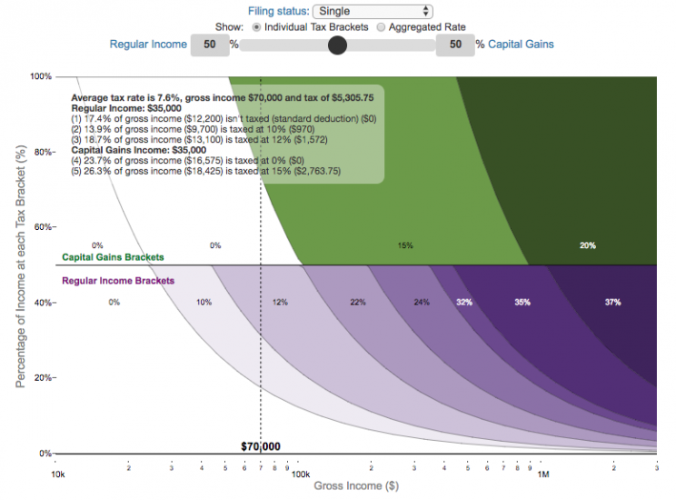
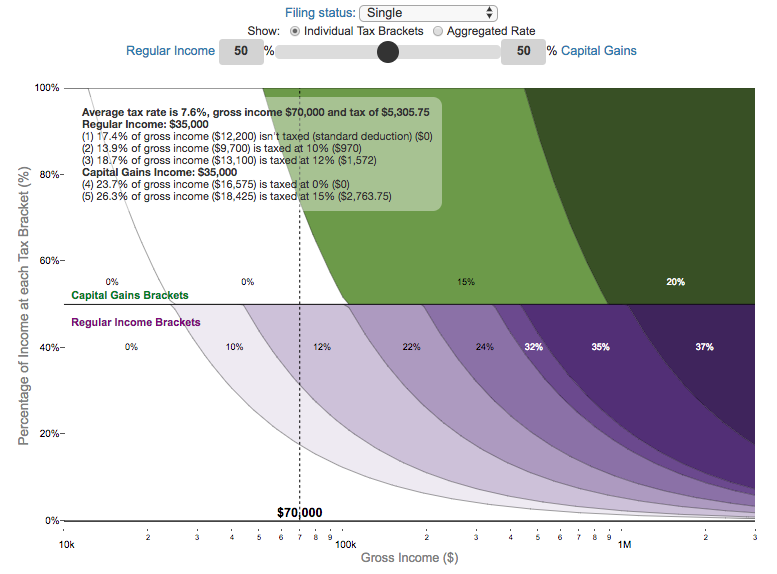
What is a marginal tax rate?
There is a fair amount of confusion about what a marginal tax rate is and how it affects how much tax you would owe the government on a certain amount of income. These graphs are here to help you better understand the difference between a marginal and average tax rate and to easily calculate these rates for specific examples in the US context. This tool only looks at US Federal Income taxes and ignores state, local and Social Security/Medicare taxes.
Marginal tax rates are the rate at which an additional dollar of income will be taxed at. There are different tax brackets (each with its own marginal rate) depending on which dollar of income you are looking at. This is very different from the Average (or effective) tax rate that is the result of applying these marginal tax rates across all of your income.
**Click Here to view other financial-related tools and data visualizations from engaging-data**
Instructions for using the visual tax calculator:
- Select filing status: Single, Married Filing Jointly or Head of Household. For more info on these filing categories see the IRS website
- Select percentage of regular income vs capital gains income. Regular income is wage or employment income and is taxed at a higher rate than capital gains income. Capital gains income is typically investment income from the sale of stocks or dividends and taxed at a lower rate than regular income.
- Move your cursor or click on the graph to select a specific income Make sure you note that the x-axis is a logarithmic-scale, meaning that income grows exponentially as you move to the right.
- Choose your graph preference One graph (Individual Tax Brackets) shows the individual tax brackets and how much of your income is taxed at the different marginal rates. The other graph (Aggregate Rates) shows the net result of applying the different rates to get your effective rate.
One of the most interesting things is to vary the proportion of regular income vs capital gains taxes. Generally, wealthier households earn a greater fraction of their income from capital gains and as a result of the lower tax rates on capital gains, these household pay a lower effective tax rate than those making an order of magnitude less in overall income.
Here are two tables that lists the marginal tax brackets in the United States in 2019 that form the basis of the calculations in the calculator. 2018’s numbers are pretty similar.
US Tax Brackets and Rates for 2019
Rate
Single
Taxable Income Over
Married Filing Joint
Taxable Income Over
Heads of Households
Taxable Income Over
10%
$0
$0
$0
12%
$9,700
$19,400
$13,850
22%
$39,475
$78,950
$52,850
24%
$84,200
$168,400
$84,200
32%
$160,725
$321,450
$160,700
35%
$204,100
$408,200
$204,100
37%
$510,300
$612,350
$510,300
You can see that tax rates are much lower for capital gains in the table below than for regular income (table above).
Capital Gains Brackets for 2019
Single
Capital Gains Over
Married Filing Jointly
Capital Gains Over
Heads of Households
Capital Gains Over
0%
$0
$0
$0
15%
$39,375
$78,750
$52,750
20%
$434,550
$488,850
$461,700
For those not visually inclined, here is a written description of how to apply marginal tax rates. The first thing to note is that the income shown here in the graphs is taxable income, which simply speaking is your gross income with deductions removed. The standard deduction for 2019 range from $12,200 for Single filers to $24,400 for Married filers.
- If you are single, all of your regular taxable income between 0 and $9,700 is taxed at a 10% rate. This means that your all of your gross income below $12,200 is not taxed and your gross income between $12,200 and $21,900 is taxed at 10%.
- If you have more income, you move up a marginal tax bracket. Any taxable income in excess of $9,700 but below $39,475 will be taxed at the 12% rate. It is important to note that not all of your income is taxed at the marginal rate, just the income between these amounts.
- Income between $39,475 and $84,200 is taxed at 24% and so on until you have income over $510,300 and are in the 37% marginal tax rate . . .
- Thus, different parts of your income are taxed at different rates and you can calculate an average or effective rate (which is shown in the aggregate rates graph).
- Capital gains income complicates things slightly as it is taxed after regular income. Thus any amount of capital gains taxes you make are taxed at a rate that corresponds to starting after you regular income. If you made $100,000 in regular income, and only $100 in capital gains income, that $100 dollars would be taxed at the 15% rate and not at the 0% rate, because the $100,000 in regular income pushes you into the 2nd marginal tax bracket for capital gains (between $39,375 and $434,550).
Data and Tools:
Tax brackets and rates were obtained from the IRS website and calculations were made using javascript and plotted using the plot.ly open source javascript plotting library.
Interactive California Reservoir Levels Dashboard
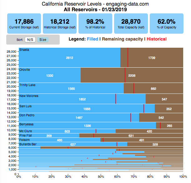
How much water is in California’s reservoirs?
Check out my new Colorado river reservoirs visualization.
I also added the ability to select specific reservoirs to display on the graph and share a custom URL which will point those selected reservoirs (click on “list” button on top right of dashboard).
If you are reading this, it’s probably the winter rainy season in California again, and time to check on the status of the water in the California reservoirs. I previously made a “bar graph” showing the overall level of water in the major California reservoirs. This dashboard provides a bit more detail on the state of each of the reservoirs while also showing an aggregate total. It updates hourly using data from the California Department of Water Resources (DWR) website, giving an up-to-date picture of California reservoir levels.
This is a marimekko (or mekko) graph which may take some time to understand if you aren’t used to seeing them. Each “row” represents one reservoir, with bars showing how much of the reservoir is filled (blue) and unfilled (brown). The height of the “row” indicates how much water the reservoir could hold. Shasta is the reservoir with the largest capacity and so it is the tallest row. The proportion of blue to brown will show how full it is, while the red line shows the historical level that reservoir is typically at for this date of the water year. The blue line indicates the reservoir’s water level one year ago today. There are many very small reservoirs (relative to Shasta) so the bars will be very thin to the point where they are barely a sliver or may not even show up.
Instructions:
If you are on a computer, you can hover your cursor over a reservoir and the dashboard at the top will provide information about that individual reservoir. If you are on a mobile device you can tap the reservoir to get that same info. It’s not possible to see or really interact with the tiniest slivers. The main goal of this visualization is to provide a quick overview of the status of the main reservoirs in the state and how they compare to historical levels.
You can sort the mekko graph by size – largest at the top to smallest at the bottom – or by reservoir location, from north to south.
If you click on the “list” button in the top right of the dashboard, it will show a list of the reservoirs (in order of size from largest to smallest) and you can check which ones you would like to display. You can also share a custom URL by clicking the “Save URL” button which will put the custom URL into the URL bar of your browser which you can then copy and share. You can also use it to monitor only the reservoirs you are most interested in.
Units are in kaf, thousands of acre feet. 1 kaf is the amount of water that would cover 1 acre in one thousand feet of water (or 1000 acres in water in 1 foot of water). It is also the amount of water in a cube that is 352 feet per side (about the length of a football field). Shasta is very large and could hold about 3.5 cubic kilometers of water at full (but not flood) capacity.
Data and Tools
The data on water storage comes from the California Department of Water Resources’ (DWR) Data Exchange Center. Python is used to extract the data from this page hourly and wrangle the data in to a clean format. Visualization was done in javascript and specifically the D3.js visualization library. It was my first time using D3 and it took me a long time to get up to speed. It takes a fair amount of work to make graphs compared to other more plug-and-play libraries but its very customizable, which is a plus. It was the only tool that I could find that would allow me to make a vertical marimekko graph.

Antipodes map: What’s on the other side of the Earth?
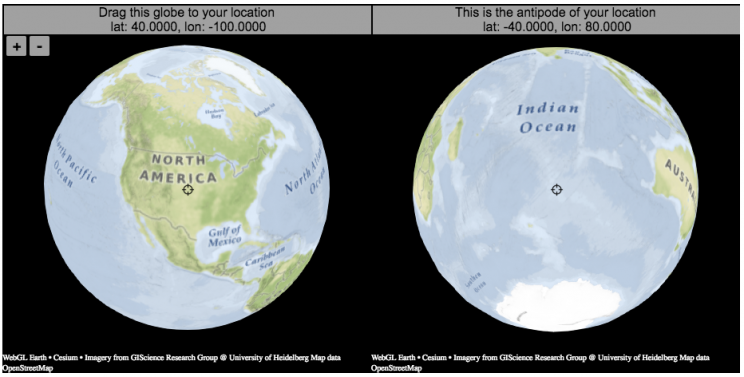
What is an antipode?
An antipode is a point that is on the exact opposite side of the earth (or other sphere) from a given location. If you drew a line (vector) from your location to the center of the earth and continued that line until it emerged from the other side of the earth’s surface, that point of intersection on the other side is the antipode. When I was a kid, people occasionally mentioned “digging a hole to China”. While this is currently impossible for many reasons1Earth’s core is about 6000 degrees C, China is not the antipode for North America (where I grew up). If you grew up in Argentina or Chile, then maybe that would make a little more sense.
The antipodes for most of North America and Europe are in the Indian and South Pacific oceans respectively.
Other examples of antipodes that are both on land:
Instructions:
It should be relatively explanatory, but you find your location by dragging the globe on the left side so that your location is in the center crosshair. The other globe (on the right) will show you the antipode to your location.
You can zoom in and out with the +/- buttons or pinch to zoom on mobile. If you zoom in enough, it will look like a normal two-dimensional web map (like google maps).
Tools:
This interactive visualization is made using the awesome webglearth javascript library. I just discovered this recently after making a number of 2D maps.

Footnotes
Footnotes
↑1 Earth’s core is about 6000 degrees C
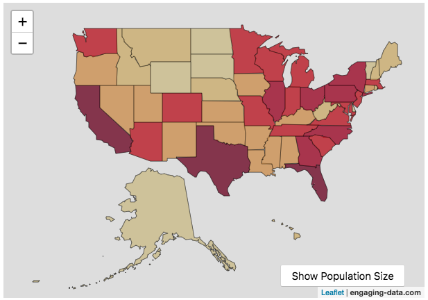
Scaling the physical size of States in the US to reflect population size (animation)
States sized to New Jersey’s population density
Choropleth maps are a pretty useful kind of map that colors distinct areas of the map (e.g. states, counties or countries) to reflect different numerical or categorical values. It is useful to show differences across geographic regions. I’ve been making a bunch of these recently (stressed states, bitcoin electricity consumption, college admissions). One of the issues that can be problematic with these maps is that some regions can be very large but only have very few people. If the choropleth map is tracking a intensity value (like CO2 emissions per capita), a large area with a high color value might visually indicate that total emissions (emissions per capita x # of people) is also high. In the US this is reflected in states like Alaska, Montana and Wyoming, which are large but have very few people.
I decided to make a modified choropleth map (updated after learning that it’s called a cartogram) that scales the size of the states to be the proportional to the state’s population. States with larger populations show up as larger. This is equivalent to making each state have the same population density. Since New Jersey has the highest population density of any state in the US (1200 people/square mile), it stays the same size in this map and all the other states shrink, to reflect their lower population density. For example, California has a larger population than NJ (4.4x), but its physical size is about 20x larger. So California is shrunk to about 20% its original size to make its physical size 4.4x the size of NJ.
The states are also colored to show population as well (darker redder colors reflect larger population while yellow/beige reflects small populations).
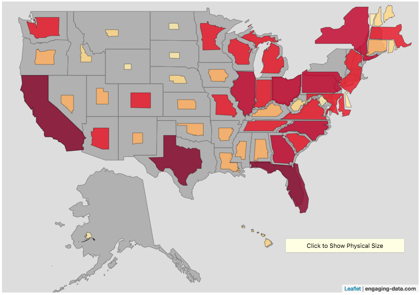
States sized to California’s population density
Living in California, I decided to make another animation, this time with scaled to the density of California, so some states that are less dense will shrink, while others that are denser will grow. New Jersey grows quite a bit. Because many of the dense Northeast states grow a bit, I had to space them out (manually) so you could still see them otherwise they’d overlap too much.
Data Sources and Tools:
2015 population and population density data comes from Wikipedia and leaflet.js open source mapping library was used to create the maps. State outlines in geoJSON format come from leaflet. Javascript code was used to scale the coordinates of the geoJSON polygons to the appropriate size and animate the map.
Speed and Kinetic Energy of Sports Pitches, Shots and Kicks
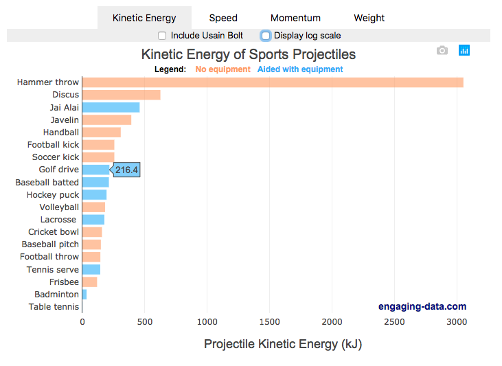
I’ve been playing (and watching) alot of soccer recently with the kids and it got me thinking about how hard the pros can kick the ball compared to us. This got me thinking about how much energy athletes can impart to a soccer ball and how that compares to balls and projectiles in other sports. This is not a scientific study, as I just googled the fastest pitch, shot, serve, kick, throw etc. from a variety of sports and the weight of the respective balls/projectiles to calculate their kinetic energy and momentum. I added in the stats for a (sort of) human projectile for comparison as well (Usain Bolt).
The graph is color coded so orange refers to projectiles that require no additional equipment, while the blue requires a bat or racket or club to aid in hitting the ball. You can toggle between log and linear scale on the x-axis to better see the differences between different projectiles.
The hammer throw is interesting because it far exceeds the kinetic energy and momentum of the other balls. If you watch a video of olympic hammer throws, you’ll see how much energy these very large, strong athletes are able to put into the throw. I think another aspect is that the top kinetic energy projectiles are all throws where there is significant acceleration of the projectile over a longer period of time rather than an instantaneous kick or hit.
Switching to the speed tab, all of the fastest projectiles are aided by equipment to achieve their very high speeds, but generally these projectiles have lower weights. This is also seen in the momentum tab, where the heavier projectiles are mostly unaided by equipment, probably because of the challenge of imparting enough momentum onto a heavy ball/projectile would require accelerating an even heavier racket/bat.
Equations and stuff
The equation for kinetic energy is \(E = {1\over2} mv^2\),
where E is kinetic energy (expressed in joules or kilojoules), m is mass and v is velocity (or speed).
The equation for momentum is \(P = mv\), where P is momentum.
The difference between momentum and kinetic energy is slightly tricky. The momentum rankings seem to prioritize the mass of the projectile while kinetic energy is a balance between speed (velocity) and mass. In kicking, throwing or hitting a ball/projectile, the player needs to put impart the energy into the ball. In a collision, total momentum of the system (player and ball) is conserved but kinetic energy is not, although total energy is (some energy may be “lost” as heat, sound, etc). In terms of being “hit” by the projectile, I believe that kinetic energy is probably more important than momentum for gauging the overall effect of the impact, but the total energy is not the only concern.The area over which the impact would occur is also important. Honestly, the table tennis (ping-pong) ball is the only one I think I’d be okay getting hit by (at least at these world record speeds).
Data sources and tools:
Mostly google for ball weights and trying to find some mention of the “fastest” throw or kick or whatever. Calculations are made using the equations above and plotted using Plot.ly javascript library.

Visual Guide to Understanding Marginal Tax Rates
What is a marginal tax rate?
There is a fair amount of confusion about what a marginal tax rate is and how it affects how much tax you would owe the government on a certain amount of income. These graphs are here to help you better understand the difference between a marginal and average tax rate and to easily calculate these rates for specific examples in the US context. This tool only looks at US Federal Income taxes and ignores state, local and Social Security/Medicare taxes.
Marginal tax rates are the rate at which an additional dollar of income will be taxed at. There are different tax brackets (each with its own marginal rate) depending on which dollar of income you are looking at. This is very different from the Average (or effective) tax rate that is the result of applying these marginal tax rates across all of your income.
**Click Here to view other financial-related tools and data visualizations from engaging-data**
Instructions for using the visual tax calculator:
- Select filing status: Single, Married Filing Jointly or Head of Household. For more info on these filing categories see the IRS website
- Select percentage of regular income vs capital gains income. Regular income is wage or employment income and is taxed at a higher rate than capital gains income. Capital gains income is typically investment income from the sale of stocks or dividends and taxed at a lower rate than regular income.
- Move your cursor or click on the graph to select a specific income Make sure you note that the x-axis is a logarithmic-scale, meaning that income grows exponentially as you move to the right.
- Choose your graph preference One graph (Individual Tax Brackets) shows the individual tax brackets and how much of your income is taxed at the different marginal rates. The other graph (Aggregate Rates) shows the net result of applying the different rates to get your effective rate.
Here are two tables that lists the marginal tax brackets in the United States in 2019 that form the basis of the calculations in the calculator. 2018’s numbers are pretty similar.
| Rate | Single Taxable Income Over |
Married Filing Joint Taxable Income Over |
Heads of Households Taxable Income Over |
|---|---|---|---|
| 10% | $0 | $0 | $0 |
| 12% | $9,700 | $19,400 | $13,850 |
| 22% | $39,475 | $78,950 | $52,850 |
| 24% | $84,200 | $168,400 | $84,200 |
| 32% | $160,725 | $321,450 | $160,700 |
| 35% | $204,100 | $408,200 | $204,100 |
| 37% | $510,300 | $612,350 | $510,300 |
You can see that tax rates are much lower for capital gains in the table below than for regular income (table above).
| Single Capital Gains Over |
Married Filing Jointly Capital Gains Over |
Heads of Households Capital Gains Over |
|
|---|---|---|---|
| 0% | $0 | $0 | $0 |
| 15% | $39,375 | $78,750 | $52,750 |
| 20% | $434,550 | $488,850 | $461,700 |
For those not visually inclined, here is a written description of how to apply marginal tax rates. The first thing to note is that the income shown here in the graphs is taxable income, which simply speaking is your gross income with deductions removed. The standard deduction for 2019 range from $12,200 for Single filers to $24,400 for Married filers.
- If you are single, all of your regular taxable income between 0 and $9,700 is taxed at a 10% rate. This means that your all of your gross income below $12,200 is not taxed and your gross income between $12,200 and $21,900 is taxed at 10%.
- If you have more income, you move up a marginal tax bracket. Any taxable income in excess of $9,700 but below $39,475 will be taxed at the 12% rate. It is important to note that not all of your income is taxed at the marginal rate, just the income between these amounts.
- Income between $39,475 and $84,200 is taxed at 24% and so on until you have income over $510,300 and are in the 37% marginal tax rate . . .
- Thus, different parts of your income are taxed at different rates and you can calculate an average or effective rate (which is shown in the aggregate rates graph).
- Capital gains income complicates things slightly as it is taxed after regular income. Thus any amount of capital gains taxes you make are taxed at a rate that corresponds to starting after you regular income. If you made $100,000 in regular income, and only $100 in capital gains income, that $100 dollars would be taxed at the 15% rate and not at the 0% rate, because the $100,000 in regular income pushes you into the 2nd marginal tax bracket for capital gains (between $39,375 and $434,550).
Data and Tools:
Tax brackets and rates were obtained from the IRS website and calculations were made using javascript and plotted using the plot.ly open source javascript plotting library.
Interactive California Reservoir Levels Dashboard
How much water is in California’s reservoirs?
Check out my new Colorado river reservoirs visualization.
I also added the ability to select specific reservoirs to display on the graph and share a custom URL which will point those selected reservoirs (click on “list” button on top right of dashboard).
If you are reading this, it’s probably the winter rainy season in California again, and time to check on the status of the water in the California reservoirs. I previously made a “bar graph” showing the overall level of water in the major California reservoirs. This dashboard provides a bit more detail on the state of each of the reservoirs while also showing an aggregate total. It updates hourly using data from the California Department of Water Resources (DWR) website, giving an up-to-date picture of California reservoir levels.
This is a marimekko (or mekko) graph which may take some time to understand if you aren’t used to seeing them. Each “row” represents one reservoir, with bars showing how much of the reservoir is filled (blue) and unfilled (brown). The height of the “row” indicates how much water the reservoir could hold. Shasta is the reservoir with the largest capacity and so it is the tallest row. The proportion of blue to brown will show how full it is, while the red line shows the historical level that reservoir is typically at for this date of the water year. The blue line indicates the reservoir’s water level one year ago today. There are many very small reservoirs (relative to Shasta) so the bars will be very thin to the point where they are barely a sliver or may not even show up.
Instructions:
If you are on a computer, you can hover your cursor over a reservoir and the dashboard at the top will provide information about that individual reservoir. If you are on a mobile device you can tap the reservoir to get that same info. It’s not possible to see or really interact with the tiniest slivers. The main goal of this visualization is to provide a quick overview of the status of the main reservoirs in the state and how they compare to historical levels.
You can sort the mekko graph by size – largest at the top to smallest at the bottom – or by reservoir location, from north to south.
If you click on the “list” button in the top right of the dashboard, it will show a list of the reservoirs (in order of size from largest to smallest) and you can check which ones you would like to display. You can also share a custom URL by clicking the “Save URL” button which will put the custom URL into the URL bar of your browser which you can then copy and share. You can also use it to monitor only the reservoirs you are most interested in.
Units are in kaf, thousands of acre feet. 1 kaf is the amount of water that would cover 1 acre in one thousand feet of water (or 1000 acres in water in 1 foot of water). It is also the amount of water in a cube that is 352 feet per side (about the length of a football field). Shasta is very large and could hold about 3.5 cubic kilometers of water at full (but not flood) capacity.
Data and Tools
The data on water storage comes from the California Department of Water Resources’ (DWR) Data Exchange Center. Python is used to extract the data from this page hourly and wrangle the data in to a clean format. Visualization was done in javascript and specifically the D3.js visualization library. It was my first time using D3 and it took me a long time to get up to speed. It takes a fair amount of work to make graphs compared to other more plug-and-play libraries but its very customizable, which is a plus. It was the only tool that I could find that would allow me to make a vertical marimekko graph.
Antipodes map: What’s on the other side of the Earth?
What is an antipode?
An antipode is a point that is on the exact opposite side of the earth (or other sphere) from a given location. If you drew a line (vector) from your location to the center of the earth and continued that line until it emerged from the other side of the earth’s surface, that point of intersection on the other side is the antipode. When I was a kid, people occasionally mentioned “digging a hole to China”. While this is currently impossible for many reasons1Earth’s core is about 6000 degrees C, China is not the antipode for North America (where I grew up). If you grew up in Argentina or Chile, then maybe that would make a little more sense.
The antipodes for most of North America and Europe are in the Indian and South Pacific oceans respectively.
Other examples of antipodes that are both on land:
Instructions:
It should be relatively explanatory, but you find your location by dragging the globe on the left side so that your location is in the center crosshair. The other globe (on the right) will show you the antipode to your location.
You can zoom in and out with the +/- buttons or pinch to zoom on mobile. If you zoom in enough, it will look like a normal two-dimensional web map (like google maps).
Tools:
This interactive visualization is made using the awesome webglearth javascript library. I just discovered this recently after making a number of 2D maps.
Footnotes
| ↑1 | Earth’s core is about 6000 degrees C |
|---|
Scaling the physical size of States in the US to reflect population size (animation)
States sized to New Jersey’s population density
Choropleth maps are a pretty useful kind of map that colors distinct areas of the map (e.g. states, counties or countries) to reflect different numerical or categorical values. It is useful to show differences across geographic regions. I’ve been making a bunch of these recently (stressed states, bitcoin electricity consumption, college admissions). One of the issues that can be problematic with these maps is that some regions can be very large but only have very few people. If the choropleth map is tracking a intensity value (like CO2 emissions per capita), a large area with a high color value might visually indicate that total emissions (emissions per capita x # of people) is also high. In the US this is reflected in states like Alaska, Montana and Wyoming, which are large but have very few people.
I decided to make a modified choropleth map (updated after learning that it’s called a cartogram) that scales the size of the states to be the proportional to the state’s population. States with larger populations show up as larger. This is equivalent to making each state have the same population density. Since New Jersey has the highest population density of any state in the US (1200 people/square mile), it stays the same size in this map and all the other states shrink, to reflect their lower population density. For example, California has a larger population than NJ (4.4x), but its physical size is about 20x larger. So California is shrunk to about 20% its original size to make its physical size 4.4x the size of NJ.
The states are also colored to show population as well (darker redder colors reflect larger population while yellow/beige reflects small populations).
States sized to California’s population density
Living in California, I decided to make another animation, this time with scaled to the density of California, so some states that are less dense will shrink, while others that are denser will grow. New Jersey grows quite a bit. Because many of the dense Northeast states grow a bit, I had to space them out (manually) so you could still see them otherwise they’d overlap too much.
Data Sources and Tools:
2015 population and population density data comes from Wikipedia and leaflet.js open source mapping library was used to create the maps. State outlines in geoJSON format come from leaflet. Javascript code was used to scale the coordinates of the geoJSON polygons to the appropriate size and animate the map.
Speed and Kinetic Energy of Sports Pitches, Shots and Kicks
I’ve been playing (and watching) alot of soccer recently with the kids and it got me thinking about how hard the pros can kick the ball compared to us. This got me thinking about how much energy athletes can impart to a soccer ball and how that compares to balls and projectiles in other sports. This is not a scientific study, as I just googled the fastest pitch, shot, serve, kick, throw etc. from a variety of sports and the weight of the respective balls/projectiles to calculate their kinetic energy and momentum. I added in the stats for a (sort of) human projectile for comparison as well (Usain Bolt).
The graph is color coded so orange refers to projectiles that require no additional equipment, while the blue requires a bat or racket or club to aid in hitting the ball. You can toggle between log and linear scale on the x-axis to better see the differences between different projectiles.
The hammer throw is interesting because it far exceeds the kinetic energy and momentum of the other balls. If you watch a video of olympic hammer throws, you’ll see how much energy these very large, strong athletes are able to put into the throw. I think another aspect is that the top kinetic energy projectiles are all throws where there is significant acceleration of the projectile over a longer period of time rather than an instantaneous kick or hit.
Switching to the speed tab, all of the fastest projectiles are aided by equipment to achieve their very high speeds, but generally these projectiles have lower weights. This is also seen in the momentum tab, where the heavier projectiles are mostly unaided by equipment, probably because of the challenge of imparting enough momentum onto a heavy ball/projectile would require accelerating an even heavier racket/bat.
Equations and stuff
The equation for kinetic energy is \(E = {1\over2} mv^2\),
where E is kinetic energy (expressed in joules or kilojoules), m is mass and v is velocity (or speed).
The equation for momentum is \(P = mv\), where P is momentum.
The difference between momentum and kinetic energy is slightly tricky. The momentum rankings seem to prioritize the mass of the projectile while kinetic energy is a balance between speed (velocity) and mass. In kicking, throwing or hitting a ball/projectile, the player needs to put impart the energy into the ball. In a collision, total momentum of the system (player and ball) is conserved but kinetic energy is not, although total energy is (some energy may be “lost” as heat, sound, etc). In terms of being “hit” by the projectile, I believe that kinetic energy is probably more important than momentum for gauging the overall effect of the impact, but the total energy is not the only concern.The area over which the impact would occur is also important. Honestly, the table tennis (ping-pong) ball is the only one I think I’d be okay getting hit by (at least at these world record speeds).
Data sources and tools:
Mostly google for ball weights and trying to find some mention of the “fastest” throw or kick or whatever. Calculations are made using the equations above and plotted using Plot.ly javascript library.
Recent Comments