Posts for Tag: animation
Sizing the States Based On Electoral Votes
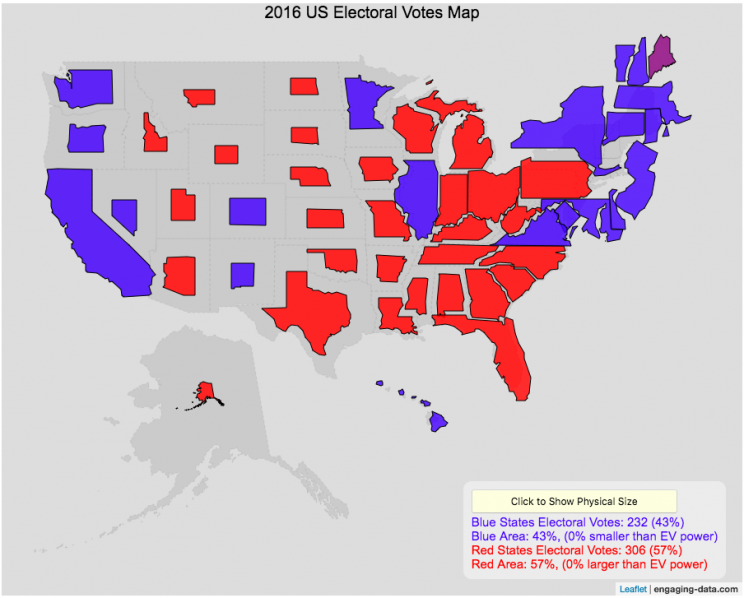
Electoral Vote maps give more visual power to states with large areas but few electoral votes
This map shows the electoral outcome of the 2016 and 2020 US Presidential Election and is color coded red if the state was won by Donald Trump (R) and blue if the state was won by Hilary Clinton or Joe Biden. When looking at the map, red states tend to be larger in area than blue states, but also generally have lower populations. This gives a misleading impression that the electoral share is “redder” than it actually is. For 2016, we can see that Trump won 306 electoral votes or (57% of the total electoral votes), but the map is shaded such that 73% of the area of the US is colored red. Similarly, Clinton won 232 electoral votes, but the map is shaded such that only 27% of the map is colored blue. For 2020, we can see that Biden won 306 electoral votes or (57% of the total electoral votes), but the map is shaded such that 38% of the area of the US is colored blue. Trump won 232 electoral votes, but the map is shaded such that 62% of the map is colored red.
The map shrinks the states with low electoral votes relative to its area and increases the size of states with large numbers of electoral votes relative to its area. On average blue states grow as they are under-represented visually, while red states tend to shrink quite a bit because they are over-represented visually. Alaska is the state that shrinks the most and DC and New Jersey are the areas that grow the most in the new map.
I think this gives a more accurate picture of how the states voted because it also gives a sense of the relative weight of those states votes.
Data and Tools:
Data on electoral votes is from Wikipedia. The map was made using the leaflet open source mapping library. Data was compiled and calculations on resizing states were made using javascript.
Assembling the World Country-By-Country

Watch the world assemble country-by-country based on a specific statistic
This map lets you watch as the world is built-up one country at a time. This can be done along the following statistical dimensions:
- Country name
- Population – from United Nations (2017)
- GDP – from United Nations (2017)
- GDP per capita
- GDP per area
- Land Area – from CIA factbook (2016)
- Population density
- Life expectancy – from World Health Organization (2015)
- or a random order
These statistics can be sorted from small to large or vice versa to get a view of the globe and its constituent countries in a unique and interesting way. It’s a bit hypnotic to watch as the countries appear and add to the world one by one.
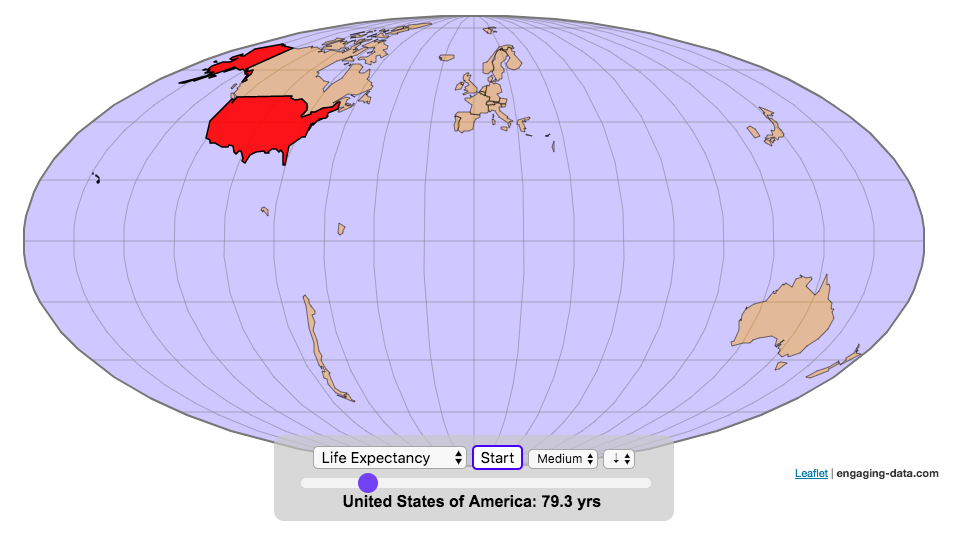
You can use this map to display all the countries that have higher life expectancy than the United States:
select “Life expectancy”, sort from “high to low” and use the scroll bar to move to the United States and you’ll get a picture like this:
or this map to display all the countries that have higher population density than the United States:
select “Population density, sort from “high to low” and use the scroll bar to move to the United States and you’ll get a picture like this:

I hope you enjoy exploring the countries of the world through this data viz tool. And if you have ideas for other statistics to add, I will try to do so.
Data and tools: Data was downloaded primarily from Wikipedia: Life expectancy from World Health Organization (2015) | GDP from United Nations (2017) | Population from United Nations (2017) | Land Area from CIA factbook (2016)
The map was created with the help of the open source leaflet javascript mapping library
World Population Distribution by Latitude and Longitude
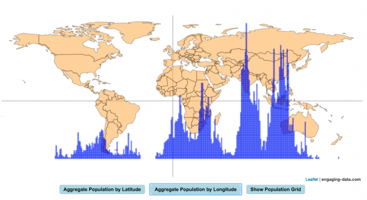
How is population distributed by latitude and longitude
This interactive map shows how population is distributed by latitude or longitude. It animates the creation of a bar graph by shifting population from its location on the map to aggregate population levels by latitude or longitude increments. Each “block” of the bar graph represents 1 million people. Population is highest in the northern hemisphere at 25-26 degrees North latitude and 77-78 degrees East Longitude.
Instructions:
It should be relatively explanatory. Press the “Aggregate Population by Latitude” button to make a plot of population by line of latitude (i.e. rows of the map).
Press the “Aggregate Population by Longitude” button to make a plot of population by line of longitude (i.e. columns of the map). To see the population distributed across the map, press the “Show Population Grid” button.
This map was inspired by some mapping work done by neilrkaye on twitter and reddit.
Data Sources and Tools:
This map projection is an equirectangular projection. Data on population density comes from NASA’s Socioeconomic Data and Applications Center (SEDAC) site and is displayed at the 1 degree resolution. This interactive visualization is made using the awesome leaflet.js javascript library.

Scaling the physical size of States in the US to reflect population size (animation)
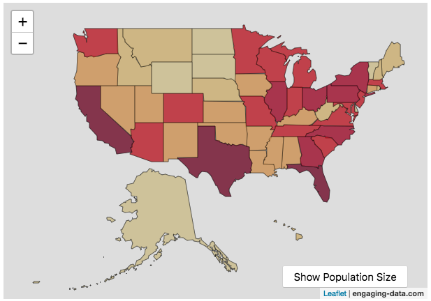
States sized to New Jersey’s population density
Choropleth maps are a pretty useful kind of map that colors distinct areas of the map (e.g. states, counties or countries) to reflect different numerical or categorical values. It is useful to show differences across geographic regions. I’ve been making a bunch of these recently (stressed states, bitcoin electricity consumption, college admissions). One of the issues that can be problematic with these maps is that some regions can be very large but only have very few people. If the choropleth map is tracking a intensity value (like CO2 emissions per capita), a large area with a high color value might visually indicate that total emissions (emissions per capita x # of people) is also high. In the US this is reflected in states like Alaska, Montana and Wyoming, which are large but have very few people.
I decided to make a modified choropleth map (updated after learning that it’s called a cartogram) that scales the size of the states to be the proportional to the state’s population. States with larger populations show up as larger. This is equivalent to making each state have the same population density. Since New Jersey has the highest population density of any state in the US (1200 people/square mile), it stays the same size in this map and all the other states shrink, to reflect their lower population density. For example, California has a larger population than NJ (4.4x), but its physical size is about 20x larger. So California is shrunk to about 20% its original size to make its physical size 4.4x the size of NJ.
The states are also colored to show population as well (darker redder colors reflect larger population while yellow/beige reflects small populations).
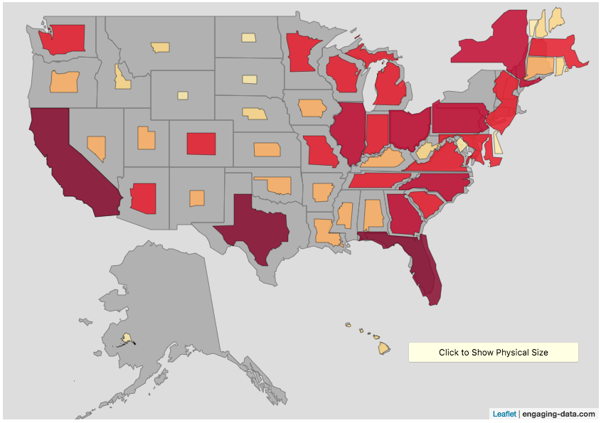
States sized to California’s population density
Living in California, I decided to make another animation, this time with scaled to the density of California, so some states that are less dense will shrink, while others that are denser will grow. New Jersey grows quite a bit. Because many of the dense Northeast states grow a bit, I had to space them out (manually) so you could still see them otherwise they’d overlap too much.
Data Sources and Tools:
2015 population and population density data comes from Wikipedia and leaflet.js open source mapping library was used to create the maps. State outlines in geoJSON format come from leaflet. Javascript code was used to scale the coordinates of the geoJSON polygons to the appropriate size and animate the map.
Real Country Sizes Shown on Mercator Projection (Updated)
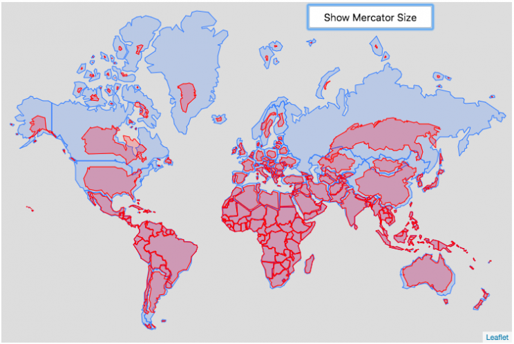
Hover or click on a country to see how much it shrinks from the Mercator projection size.
Check out some other engaging and interactive map dataviz:
I remember as a child thinking that Alaska was as large as 1/2 of the continental US. Later, however, I learned that while it is the largest state, it is actually only about 1/5 the size of the lower 48 states. My son has also remarked that Greenland is very big. And while it is very big, it’s nowhere near the size of the continent of Africa.
The map above shows the distortion in sizes of countries due to the mercator projection. Pressing on the button animates the country ‘shrinking’ to its actual size or ‘growing’ to the size shown on the mercator projection. It was inspired by a similar animation that I saw on reddit and decided I wanted to try to build the same thing.
The mercator projection is a commonly used projection on computer maps because it has perpendicular latitude and longitude lines (forming rectangles). It is formed by projecting the globe onto a cylinder A variant of the was adopted by Google maps, which helped establish it as the informal standard for web-based maps (although Google maps now also uses a globe view, instead of a map projection when zooming out to a very wide view).
Areas far from the equator are distorted in terms of their distances and are shown much larger than they actually are. This is one of the major issues with a projection of a globe onto a cylinder area. This is why Greenland, Russia and Canada shrink so much in height and width in the animation, they are fairly high in latitude in the Northern Hemisphere. Also important is that the closer you are to the poles, the more the distortion when a country is shown on the Mercator projection. Since longitude lines converge at the poles, but are parallel on a Mercator, the closer a part of a country is to the poles, the more that part will get stretched wider relative to a part of a country that is not as close to the poles. As a clear example, see what happens to the southern part of Australia, relative to the northern end. Similarly, the latitude lines also get further apart on a Mercator projection, while on a globe they stay equidistant. This means that the parts of countries that are nearer the poles will get taller, i.e. stretched out from a north-south perspective relative to parts of countries that are further from the poles. You can see this clearly in the northern ends of Russsia and Greenland, where the tops get smushed down.
This next graph shows each country plotted with their actual land area and apparent land area as shown on a Mercator projection. The further the countries are from the 1:1 line the greater the overestimate of their size from the Mercator (also color coded to be red). It is a logarithmic plot showing many different orders of magnitude in country size. The table also shows the top 10 countries whose size is overestimated (and the difference in land area in square kilometers or as a percentage reduction from the size in the Mercator projection).
As it shows, Greenland is the country that has the largest percent difference between its apparent size in a Mercator projection and it’s real size (it’s only about 1/4 of the apparent size). And Russia is the country with the largest absolute difference between these two sizes.
This is the original graph that keeps the shape of the countries exactly the same and just scales the size. This is incorrect because as you move towards the poles the distances between longitude lines decreases. As a result the tops (northern ends) of countries will shrink more than the bottoms (southern ends) of countries in the Northern Hemisphere and vice versa in the Southern Hemisphere.
Old map that changes sizes but incorrectly preserves the Mercator shape

Calculations:
I calculated the area in two ways, one assuming latitude and longitude are rectangular coordinates (i.e. Mercator projection) and the other was the actual area.
The new coordinates needed to draw the “real size” of the countries are derived by calculating the distance between the center of the country and each of the coordinates in the country’s shapefile. As you move towards the poles on a globe, the distance between longitude lines decreases as a function (cosine) of latitude. In a mercator projection, the longitude lines are shown as equi-distant regardless of latitude. In this calculation, we create a new set of coordinates by calculating the distance between the center of the polygon and each set of coordinates and change the coordinates to reflect the shrinking of distance between longitude lines as you head towards the poles.
In the previous version of this animation, I calculated the latitude and longitude coordinates for the outline of the “real” size by modifying the original latitude and longitude by the ratio of these two areas to draw the new smaller, “real” country size.
Data and tools: This visualization was made using the Leafletjs javascript mapping library and country shapefiles (converted to geojson).
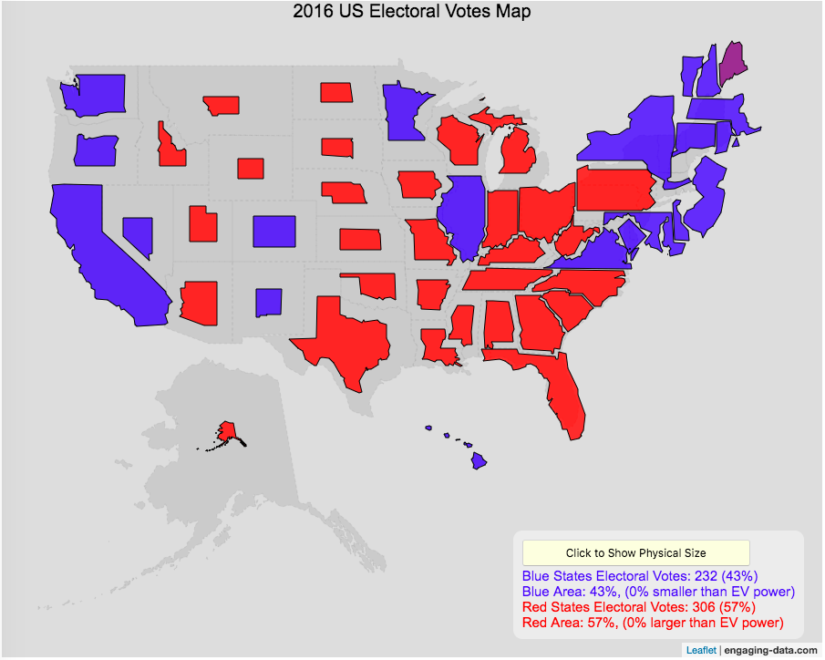
Sizing the States Based On Electoral Votes
Electoral Vote maps give more visual power to states with large areas but few electoral votes
This map shows the electoral outcome of the 2016 and 2020 US Presidential Election and is color coded red if the state was won by Donald Trump (R) and blue if the state was won by Hilary Clinton or Joe Biden. When looking at the map, red states tend to be larger in area than blue states, but also generally have lower populations. This gives a misleading impression that the electoral share is “redder” than it actually is. For 2016, we can see that Trump won 306 electoral votes or (57% of the total electoral votes), but the map is shaded such that 73% of the area of the US is colored red. Similarly, Clinton won 232 electoral votes, but the map is shaded such that only 27% of the map is colored blue. For 2020, we can see that Biden won 306 electoral votes or (57% of the total electoral votes), but the map is shaded such that 38% of the area of the US is colored blue. Trump won 232 electoral votes, but the map is shaded such that 62% of the map is colored red.
The map shrinks the states with low electoral votes relative to its area and increases the size of states with large numbers of electoral votes relative to its area. On average blue states grow as they are under-represented visually, while red states tend to shrink quite a bit because they are over-represented visually. Alaska is the state that shrinks the most and DC and New Jersey are the areas that grow the most in the new map.
I think this gives a more accurate picture of how the states voted because it also gives a sense of the relative weight of those states votes.
Data and Tools:
Data on electoral votes is from Wikipedia. The map was made using the leaflet open source mapping library. Data was compiled and calculations on resizing states were made using javascript.
Assembling the World Country-By-Country
Watch the world assemble country-by-country based on a specific statistic
- Country name
- Population – from United Nations (2017)
- GDP – from United Nations (2017)
- GDP per capita
- GDP per area
- Land Area – from CIA factbook (2016)
- Population density
- Life expectancy – from World Health Organization (2015)
- or a random order
These statistics can be sorted from small to large or vice versa to get a view of the globe and its constituent countries in a unique and interesting way. It’s a bit hypnotic to watch as the countries appear and add to the world one by one.
You can use this map to display all the countries that have higher life expectancy than the United States:
select “Life expectancy”, sort from “high to low” and use the scroll bar to move to the United States and you’ll get a picture like this:
or this map to display all the countries that have higher population density than the United States:
select “Population density, sort from “high to low” and use the scroll bar to move to the United States and you’ll get a picture like this:
I hope you enjoy exploring the countries of the world through this data viz tool. And if you have ideas for other statistics to add, I will try to do so.
Data and tools: Data was downloaded primarily from Wikipedia: Life expectancy from World Health Organization (2015) | GDP from United Nations (2017) | Population from United Nations (2017) | Land Area from CIA factbook (2016)
The map was created with the help of the open source leaflet javascript mapping library
World Population Distribution by Latitude and Longitude
How is population distributed by latitude and longitude
This interactive map shows how population is distributed by latitude or longitude. It animates the creation of a bar graph by shifting population from its location on the map to aggregate population levels by latitude or longitude increments. Each “block” of the bar graph represents 1 million people. Population is highest in the northern hemisphere at 25-26 degrees North latitude and 77-78 degrees East Longitude.
Instructions:
It should be relatively explanatory. Press the “Aggregate Population by Latitude” button to make a plot of population by line of latitude (i.e. rows of the map).
Press the “Aggregate Population by Longitude” button to make a plot of population by line of longitude (i.e. columns of the map). To see the population distributed across the map, press the “Show Population Grid” button.
This map was inspired by some mapping work done by neilrkaye on twitter and reddit.
Data Sources and Tools:
This map projection is an equirectangular projection. Data on population density comes from NASA’s Socioeconomic Data and Applications Center (SEDAC) site and is displayed at the 1 degree resolution. This interactive visualization is made using the awesome leaflet.js javascript library.
Scaling the physical size of States in the US to reflect population size (animation)
States sized to New Jersey’s population density
Choropleth maps are a pretty useful kind of map that colors distinct areas of the map (e.g. states, counties or countries) to reflect different numerical or categorical values. It is useful to show differences across geographic regions. I’ve been making a bunch of these recently (stressed states, bitcoin electricity consumption, college admissions). One of the issues that can be problematic with these maps is that some regions can be very large but only have very few people. If the choropleth map is tracking a intensity value (like CO2 emissions per capita), a large area with a high color value might visually indicate that total emissions (emissions per capita x # of people) is also high. In the US this is reflected in states like Alaska, Montana and Wyoming, which are large but have very few people.
I decided to make a modified choropleth map (updated after learning that it’s called a cartogram) that scales the size of the states to be the proportional to the state’s population. States with larger populations show up as larger. This is equivalent to making each state have the same population density. Since New Jersey has the highest population density of any state in the US (1200 people/square mile), it stays the same size in this map and all the other states shrink, to reflect their lower population density. For example, California has a larger population than NJ (4.4x), but its physical size is about 20x larger. So California is shrunk to about 20% its original size to make its physical size 4.4x the size of NJ.
The states are also colored to show population as well (darker redder colors reflect larger population while yellow/beige reflects small populations).
States sized to California’s population density
Living in California, I decided to make another animation, this time with scaled to the density of California, so some states that are less dense will shrink, while others that are denser will grow. New Jersey grows quite a bit. Because many of the dense Northeast states grow a bit, I had to space them out (manually) so you could still see them otherwise they’d overlap too much.
Data Sources and Tools:
2015 population and population density data comes from Wikipedia and leaflet.js open source mapping library was used to create the maps. State outlines in geoJSON format come from leaflet. Javascript code was used to scale the coordinates of the geoJSON polygons to the appropriate size and animate the map.
Real Country Sizes Shown on Mercator Projection (Updated)
Hover or click on a country to see how much it shrinks from the Mercator projection size.
Check out some other engaging and interactive map dataviz:
I remember as a child thinking that Alaska was as large as 1/2 of the continental US. Later, however, I learned that while it is the largest state, it is actually only about 1/5 the size of the lower 48 states. My son has also remarked that Greenland is very big. And while it is very big, it’s nowhere near the size of the continent of Africa.
The map above shows the distortion in sizes of countries due to the mercator projection. Pressing on the button animates the country ‘shrinking’ to its actual size or ‘growing’ to the size shown on the mercator projection. It was inspired by a similar animation that I saw on reddit and decided I wanted to try to build the same thing.
The mercator projection is a commonly used projection on computer maps because it has perpendicular latitude and longitude lines (forming rectangles). It is formed by projecting the globe onto a cylinder A variant of the was adopted by Google maps, which helped establish it as the informal standard for web-based maps (although Google maps now also uses a globe view, instead of a map projection when zooming out to a very wide view).
Areas far from the equator are distorted in terms of their distances and are shown much larger than they actually are. This is one of the major issues with a projection of a globe onto a cylinder area. This is why Greenland, Russia and Canada shrink so much in height and width in the animation, they are fairly high in latitude in the Northern Hemisphere. Also important is that the closer you are to the poles, the more the distortion when a country is shown on the Mercator projection. Since longitude lines converge at the poles, but are parallel on a Mercator, the closer a part of a country is to the poles, the more that part will get stretched wider relative to a part of a country that is not as close to the poles. As a clear example, see what happens to the southern part of Australia, relative to the northern end. Similarly, the latitude lines also get further apart on a Mercator projection, while on a globe they stay equidistant. This means that the parts of countries that are nearer the poles will get taller, i.e. stretched out from a north-south perspective relative to parts of countries that are further from the poles. You can see this clearly in the northern ends of Russsia and Greenland, where the tops get smushed down.
This next graph shows each country plotted with their actual land area and apparent land area as shown on a Mercator projection. The further the countries are from the 1:1 line the greater the overestimate of their size from the Mercator (also color coded to be red). It is a logarithmic plot showing many different orders of magnitude in country size. The table also shows the top 10 countries whose size is overestimated (and the difference in land area in square kilometers or as a percentage reduction from the size in the Mercator projection).
As it shows, Greenland is the country that has the largest percent difference between its apparent size in a Mercator projection and it’s real size (it’s only about 1/4 of the apparent size). And Russia is the country with the largest absolute difference between these two sizes.
This is the original graph that keeps the shape of the countries exactly the same and just scales the size. This is incorrect because as you move towards the poles the distances between longitude lines decreases. As a result the tops (northern ends) of countries will shrink more than the bottoms (southern ends) of countries in the Northern Hemisphere and vice versa in the Southern Hemisphere.
Old map that changes sizes but incorrectly preserves the Mercator shape
Calculations:
I calculated the area in two ways, one assuming latitude and longitude are rectangular coordinates (i.e. Mercator projection) and the other was the actual area.
The new coordinates needed to draw the “real size” of the countries are derived by calculating the distance between the center of the country and each of the coordinates in the country’s shapefile. As you move towards the poles on a globe, the distance between longitude lines decreases as a function (cosine) of latitude. In a mercator projection, the longitude lines are shown as equi-distant regardless of latitude. In this calculation, we create a new set of coordinates by calculating the distance between the center of the polygon and each set of coordinates and change the coordinates to reflect the shrinking of distance between longitude lines as you head towards the poles.
In the previous version of this animation, I calculated the latitude and longitude coordinates for the outline of the “real” size by modifying the original latitude and longitude by the ratio of these two areas to draw the new smaller, “real” country size.
Data and tools: This visualization was made using the Leafletjs javascript mapping library and country shapefiles (converted to geojson).
Recent Comments