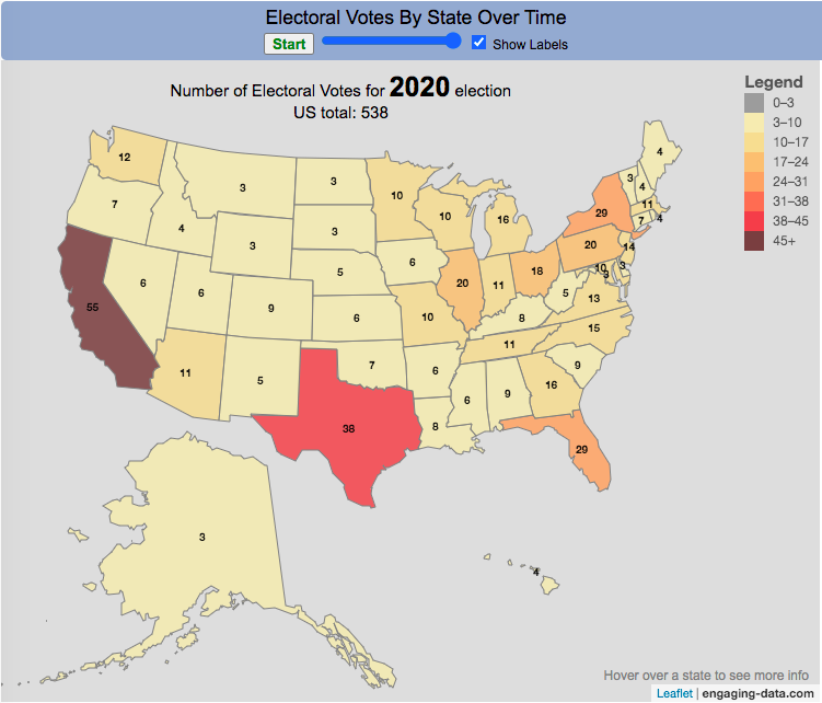
How many electoral votes did each state have across two centuries of elections?
This animation shows the number of electoral votes each state had during each of the 59 presidential elections in US history between 1788 and 2020. It’s interesting to see the number of US states and their relative population sizes (in terms of electoral votes) over many different presidential elections. The population is counted every 10 years in the census so if a presidential election occurs between a census, it likely will not see any difference in numbers of electoral votes, unless something else happens (such as addition of a new state to the country).
Instructions
You can use the slider to control the election year to focus on a specific election and toggle the animation by hitting the Start/Stop button. Hovering over each state will tell you the number of electoral votes and the percentage of the total number of electoral votes in that election.
In the elections during and immediately after the US Civil War, we also see some states whose electoral votes for president are not counted (shown in purple). Wyoming, the state with the lowest population in the US, has the highest number of electoral votes per person in the state, while the three most populous states, California, Florida and Texas have the least number of electoral votes per person. Wyoming has four times the number of electors per capita than these 3 states have (i.e. accounting for their population sizes). That will be the subject of another map dataviz.
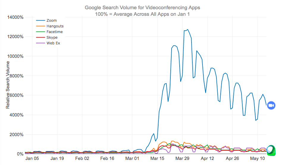
Zoom has become the primary video conferencing app over the last few months as schools and workplaces increasingly turned to remote learning and meetings.
Since the shelter-in-place orders across the United States due to the coronavirus in early to mid-March, many things have changed about our daily lives. One of the main ones is that schooling and work is being done remotely through video conferencing apps on our computers, tablets and smartphones. Our kids have zoom meetings with their teachers, parents have zoom meetings with our work colleagues and we all have facetime and google hangouts chats with our friends and family.
I remembered just a few year ago Skype was a very popular app to use for video chats, so I wanted to see how Zoom came to be the most popular app. The animated graph above shows the relative search volumes for 5 popular video conferencing apps from January 1 to May 15th (before and during the coronavirus restrictions on travel and gatherings).
This article implies that the reason Zoom had taken over so much is because it is free and easy to use for consumers. Even my tech-challenged mother is doing zoom calls for friends and classes.
Data and Tools:
Data is from google trends analysis of videoconferencing apps. Data is processed in javascript and graphed using the plotly open source graphing library.
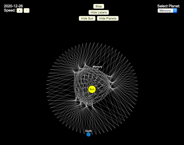
Earlier, I had made a visualization showing that Mercury is the closest planet to Earth (on average) and not Venus or Mars. To make that, I downloaded a bunch of NASA ephemeris (orbital) data. I realized I could use the same data to make some cool orbital art inspired by a spirograph – a planetary spirograph.
Basically, you get to choose a planet and the visualization will draw a line connecting that planet and Earth every few days. These lines will then build up into a cool pattern over 40 earth years of orbital cycles. Each planet (Mercury, Venus and Mars) has a different orbital period around the sun than Earth does and as a result, interesting patterns emerges.
Orbital periods of the four inner rocky planets:
Mercury: 88 days
Venus: 225 days
Earth:365 days
Mars: 687 days
Also evident is that the orbits of some of the planets are not quite circular so the pattern isn’t quite centered on the sun. Venus has the most regular pattern, creating a distinctive 5-lobed design. The other planets also have visually stunning patterns, though they do not repeat perfectly over time.
You can change the planets using the drop down menu as well as change the speed of the spirograph, and hide the planets and the sun.
Data and Tools:
I had thought about simulating the planets but there are plenty of tools out there that generate this orbital data so instead just downloaded 40 years of ephemeris data (data related to positions of astronomical bodies) from NASA website.. I processed the data using javascript and drew the picture using HTML canvas tools.
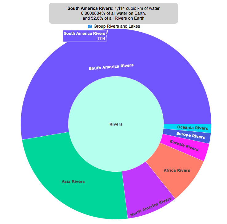
Earth is known as the blue planet, because it’s covered with quite a bit of water. But do you know where all that water on Earth is located? This interactive visualization will show the various amounts of water in its many forms on Earth: Oceans, Lakes, Rivers, Ice, Groundwater, etc….
If you hover over a part of the circular, sunburst graph, it will show you the amount of water that is in each of the various forms shown. If the label for that form is bolded, you can click on it and see further subdivisions beyond that broad category. For example, if you click on Oceans, it will show you how the water in the oceans is distributed among the five main oceans on Earth. As you move towards more focused views on the graph, you can click on the center of the circle to move back out to larger categories and see the big picture again.
As you can see, most of the water on Earth is found in a salty form, and most of that is in the oceans. It can be hard to click through to see freshwater lakes and rivers, as you have to be very precise to expand the “Surface Water” wedge, when you are looking at all “Freshwater”.
Even smaller, on that same visualization, is the “Living things” wedge is basically invisible. You can further explore the details of the living things category by clicking on the button that appears on the freshwater graph.
Checking the Group Rivers and Lakes checkbox will group rivers by continent and lakes by major groups.
It is interesting to see how much water there is on Earth (about 1.4 billion cubic kilometers of water), but how little of it is non-salty, liquid freshwater at the surface (about 100,000 cubic kilometers, though that is still quite a lot) but it only makes up about 0.008% of all water on Earth. That means for every 10,000 gallons of water on Earth, only one of those gallons is freshwater in a lake or river that we can easily access.
It is also believed that there is more water deep in the Earth’s interior (i.e. the mantle) than on the surface or near-subsurface, but estimates of that are highly uncertain and are not included in this graph.
If you click out past Earth’s water to look at water in the solar system, the estimates shown in this visualization are only including liquid water and do not include estimates of ice (which I haven’t been able to find estimates of). The amount of water in living things is estimated assuming that the ratio of organic carbon to liquid water is more or less the same across all different types of living things (i.e. viruses, bacteria, fungi, plants, animals, etc.). This isn’t a great assumption but the estimates, which come from estimates of the dry carbon weight of these organisms, vary across many orders of magnitude so being off in liquid water weight/volume by a factor of two or so isn’t a huge problem.
Watch the United States assemble state by state based on statistics of interest
Based on earlier popularity of the country-by-country animation, this map lets you watch as the world is built-up one state at a time. This can be done along a large range of statistical dimensions:
Name (alphabetical)
abbreviation
Date of entry to the United States
State Population (2018)
Population per Electoral Vote (2018)
Population per House Seat (2018)
Land Area (square miles)
Population Density (ppl per sq mi) (2018)
State’s Highest Point
Highest Elevation (ft)
Mean Elevation (ft)
State’s Lowest Point
Lowest Point (ft)
Life Expectancy at Birth (yrs)
Median Age (yrs)
Percent with High School Education
Percent with Bachelor’s Degree
Residential Electricity Price (cents per kWh) (2018)
Gasoline Price ($/gal) Regular unleaded (2019)
State Gross Domestic Product GDP ($Million) (2018)
GDP per capita ($/capita)
Number of Counties (or subdivisions)
Average Daily Solar Radiation (kWh/m2)
Birth rate (per thousand population)
Avg Age of Mother at Birth
Annual Precipitation (in/yr)
Average Temperature (deg F)
These statistics can be sorted from small to large or vice versa to get a view of the US and its constituent states plus DC in a unique and interesting way. It’s a bit hypnotic to watch as the states appear and add to the country one by one.
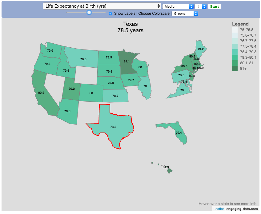
You can use this map to display all the states that have higher life expectancy than the Texas: select “Life expectancy”, sort from “high to low” and use the scroll bar to move to the Texax and you’ll get a picture like this:
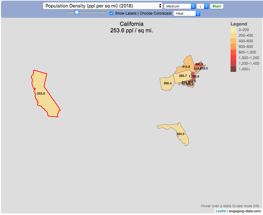
or this map to display all the states that have higher population density than California: select “Population density, sort from “high to low” and use the scroll bar to move to the United States and you’ll get a picture like this:
I hope you enjoy exploring the United States through a number of different demographic, economic and physical characteristics through this data viz tool. And if you have ideas for other statistics to add, I will try to do so.
Data and tools: Data was downloaded from a variety of sources:
Population https://en.wikipedia.org/wiki/List_of_states_and_territories_of_the_United_States_by_population
Admission to union https://simple.wikipedia.org/wiki/List_of_U.S._states_by_date_of_admission_to_the_Union
Sunlight North America Land Data Assimilation System (NLDAS) Daily Sunlight (insolation) for years 1979-2011 on CDC WONDER Online Database, released 2013. Accessed at http://wonder.cdc.gov/NASA-INSOLAR.html on Jun 14, 2019 1:37:15 PM
Births United States Department of Health and Human Services (US DHHS), Centers for Disease Control and Prevention (CDC), National Center for Health Statistics (NCHS), Division of Vital Statistics, Natality public-use data 2007-2017, on CDC WONDER Online Database, October 2018. Accessed at http://wonder.cdc.gov/natality-current.html on Jun 14, 2019 1:53:58 PM
Precipitation North America Land Data Assimilation System (NLDAS) Daily Precipitation for years 1979-2011 on CDC WONDER Online Database, released 2013. Accessed at http://wonder.cdc.gov/NASA-Precipitation.html on Jun 26, 2019 3:30:40 PM
Temperature http://www.usa.com/rank/us–average-temperature–state-rank.htm
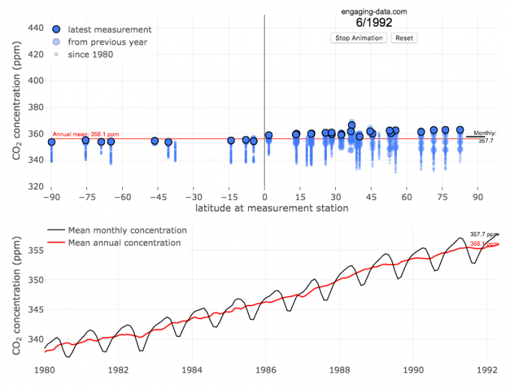
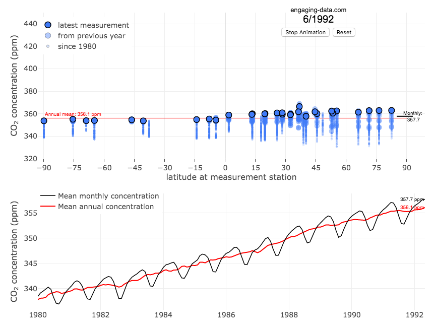
The current CO2 concentration in the atmosphere is over 400 parts per million (ppm). This has grown about 46% since pre-industrial levels (~280 ppm) in the early 1800s. The growing concentration of CO2 is a big concern because it is the most prevalent greenhouse gas, which is increasing the temperature of the planet and leading to substantial changes in the Earth’s climate patterns.
One of the interesting aspects of CO2 concentration is that it is not identical all around the globe, as it takes awhile for the atmosphere to mix. The graph shows geographic differences in CO2 concentration as well as seasonal ups and downs, that underly an overall growing trend in annual average (mean) concentration.
Seasonal trends in CO2 concentration occur due to differences in the amount of plant growth across different months. Spring and summer plant growth in the northern hemisphere causes a significant amount of photosynthesis, and CO2 absorption, relative to the fall and winter. This plant growth causes a very large amount of CO2 to be absorbed by plants and a noticeable reduction in the amount of CO2 in the atmosphere. The southern hemisphere spring and summer (northern hemisphere fall and winter) aren’t as obvious because there is much less land in the southern hemisphere and the land that is there is close to the tropics and green all year round.
CO2 concentration can change by about 4-5 ppm due to the “breathing” of plants, which is pretty significant. The total weight of CO2 in the atmosphere is about 3 trillion tonnes of CO2, so 4-5 ppm is about 1% of this or 30 billion tons of CO2 removed by plant life each spring/summer.
Data and Tools:
Data comes from the US National Oceanic and Atmospheric Administration (NOAA). Data was downloaded using an automated python script and the graphs were made using javascript and the open-sourced Plot.ly javascript engine.


Recent Comments