Posts for Tag: animation
Iceberger Remixed and Improved – Iceberg Simulator
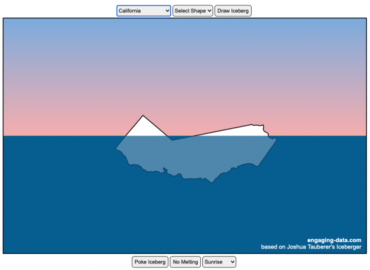
The melting algorithm has been updated so that melting below water is faster than melting above the waterline. It’s fun to try to get the iceberg pieces to radically change orientation when the iceberg breaks apart due to melting.
Draw (or choose) an iceberg and visualize how it will float and melt
I was so impressed with the interactive Iceberger tool that Josh Tauberer (@JoshData) made that I had to modify it and add some additional features. Click here to see the original. My additions allow you to conjure up pre-made “icebergs” to see how they float and also allow some interaction. Try “poking” the icebergs you make.
Josh and I were both inspired by a tweet by Megan Thompson-Munson (@GlacialMeg).
Today I channeled my energy into this very unofficial but passionate petition for scientists to start drawing icebergs in their stable orientations. I went to the trouble of painting a stable iceberg with my watercolors, so plz hear me out.
(1/4) pic.twitter.com/rtkCYub38b
— Megan Thompson-Munson (@GlacialMeg) February 19, 2021
Instructions
You can choose between 3 different iceberg creation options:
- Draw Iceberg – the original Iceberger option. Choose this option and draw any shape you want and see how it floats.
- Select State – Choose this option and select from one of the states of the United States to see how it will float.
- Select Shape = Choose this option and select from one of the premade shapes to see how it will float.
Once the iceberg has been created, you can also affect it in a couple of different ways:
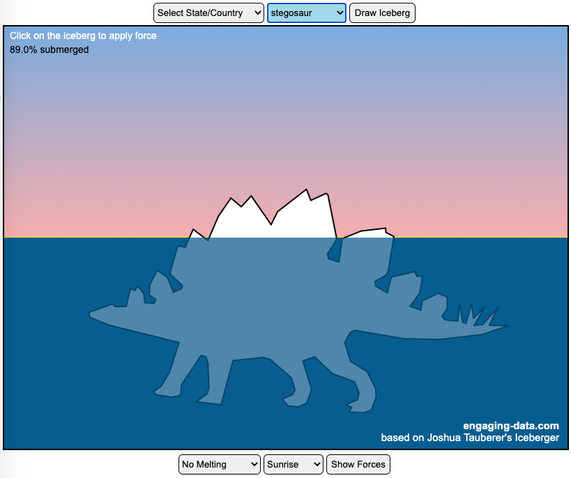
- Click on the Iceberg – This lets you push on the left side of the iceberg to induce some rotation and see if there are multiple stable orientations. Click it several times in a row if you want to flip the iceberg over. If you push on the right size it will rotate the iceberg clockwise and if you push on the left size, it will rotate counter clockwise. if you push in the middle third of the iceberg, it will push it straight down.
- Melting – You can select between different options – No melting, slow medium and fast. This took awhile to code correctly. Previously, I’d just scale parts of the iceberg but this new code actually takes material away from the surface of the iceberg in a uniform way. It works more like you would expect melting ice to behave. Also melting occurs more quickly underwater than in the air.
- Changing the Sky – You can change the colors of the sky between sunrise, midday and sunset colors.
- Showing forces – You can toggle whether to show the center of buoyancy (B) and center of gravity (B) of the iceberg.
Some Physics – no equations
The force of gravity (G) affects the entire body regardless of where it is or how it is oriented. If you show the forces, the red dot labeled G shows where the center of mass of the iceberg is. The blue dot labeled B shows where the center of buoyancy is. This is the center of mass of the part of the iceberg that is submerged. The force acting on the submerged part is equal to the volume of water displaced. If the center of buoyancy is below the center of gravity, then the forces will be equal and object will be in stable equilibrium. If the center of buoyancy is somewhere other than under the center of gravity, then the buoyant force will be pushing up on a different place than the gravity force and this will induce a rotation until they are directly over one another.
The code has been updated so that multiple icebergs are now allowed. Melting can separate a single piece of iceberg into multiple pieces, just as in real life. The melting process was a bit difficult to program because of the complexity of shapes that could be produced.
If you have additional suggestions for shapes or countries to add to the list or other improvements to make, let me know in the comments. Also if you are using this as a teaching tool, I’d love to hear how you are incorporating it into your curriculum.
Sources and Tools:
This visualization uses HTML/CSS/Javascript code from the Iceberger app to simulate the buoyancy of icebergs. Melting was accomplished with the help of code from the turf.js, polygon-offset and simplify.js javascript libraries. Additional elements of the UI and other features are also made using HTML, CSS and javascript.
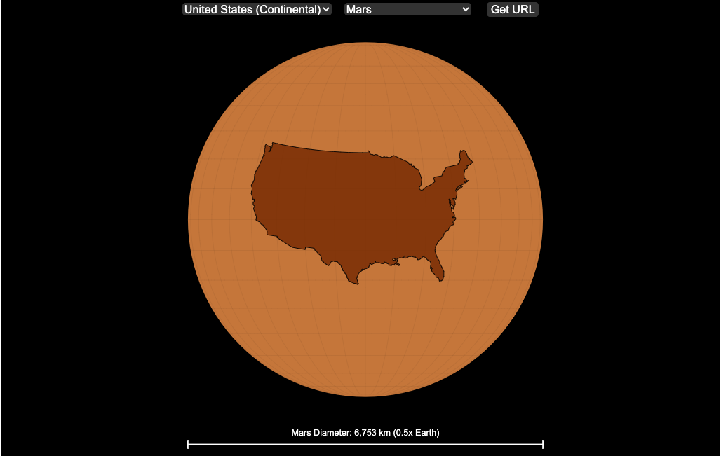
Countries Mapped onto Solar System Bodies
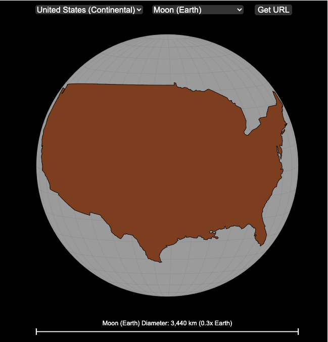
We can compare the sizes of countries and continents to planets and moons by projecting a map of a specific country onto another planet. Select a country and planet or moon to find out.
In one of my kid’s favorite books, there’s a picture demonstrating how Pluto is the same size as Australia. It has a satellite image of the country and an image of the former ninth planet superimposed on top as if it were hovering above the country. That image has stuck with me and I thought it would be interesting to see how other countries would compare with other planets and bodies in our solar system. As I’ve been working with javascript graphing/mapping library, D3.js and making maps/globes, I realized I should try to “project” individual countries onto these planets to see what they looked like.
Instructions
This visualization should be pretty self explanatory. You can select a country or continent and a planet or moon (or the sun) in the solar system. The visualization will then project the land onto the body and you have a simple visual comparison of the size of the country/continent and the planet or moon. You can drag on the visualization to rotate the planet.
There are some combinations that are not possible because the country/continent is too large to be projected onto the body without overlap. In these cases, the planet or country will be greyed out in the selection menu. You can click the “Get URL” button and share a specific map combination (country and planet) by copying the address in the url address bar.
The visualization also displays the area of the country/continent and the surface area of the planet or body. In some cases, the percentage may not look correct but remember that you can only see half of the planet surface and that it’s actually a hemisphere (half a sphere and not just a circle). It becomes clearer if you draw the surface of the planet around.
Calculations
The calculations to project a country onto another body involves starting with a set of coordinates (made up of longitude and latitude values) which define the border of the country, in the geojson format. To display them on Earth, the coordinates are modified so that the center of the country is centered at the intersection between the equator and prime meridian [0 deg latitude, 0 deg longitude].
To display them projected on a different planet or moon, it is necessary to change the latitude and longitude values of each point of the polygon country border so that it represents the same distance away from the polygon center. I used the Haversine formula to calculate the distance and bearing between two points on a sphere and then used the inverse to find the coordinates that were that distance and bearing from the center point on a sphere of a different size. These formulas can be found here. The main idea is that the distance representing one degree of latitude on Earth will be half as large on a planet that is half the size of Earth (like Mars). Thus, the distance between the center of a country and a point on the border will be a different number of degrees latitude and longitude from the center point on a different planet than on Earth. And this calculatin is done using these formulae.
Sources and Tools:
This visualization was made using the open-source, d3 javascript dataviz library and UI are made using HTML, CSS and javascript.
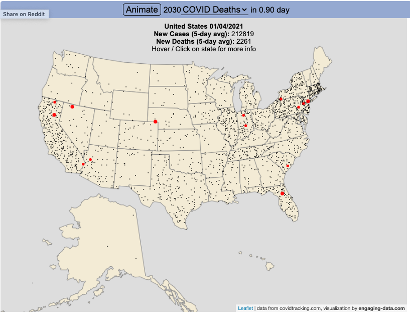
Animation of Coronavirus Cases and Deaths in US

Visualize the large number of coronavirus cases and deaths in the US each day/hour in about 10 seconds
The rate of COVID-19 deaths and cases in the US is crazy high after the 2020 winter holidays and maybe still be going up. This visualization shows the number of COVID cases that occur in one hour or the COVID deaths that occur in one day based on the average of the last five days. This is another attempt to show the true scale of how many cases and deaths the US is dealing with, since it is often hard to understand large numbers. I have also attempted to show the scale of US deaths/cases here and here. Unfortunately, there are so many people getting sick and dying, it’s hard to fathom just how many people this actually is.
The 5-day averaging was done to smooth out any peaks and troughs in data reporting due to weekends/holidays, since I noticed that some states were literally reporting zero COVID cases some days while reporting many hundreds or thousands of cases other days.
The dots shown on the animation are located in the state that the cases or deaths occur but are randomly spread out within the state. This is done for visual clarity since if they were shown in their actual location, most of the dots would be overlapping in urban, high density areas. This approach lets you see which states have high COVID instances but still locate them by state.
You can share this animation by putting ?cat=deaths or ?cat=cases behind the url or copying and sharing one of these links:
https://engaging-data.com/animation-of-us-covid/?cat=cases
https://engaging-data.com/animation-of-us-covid/?cat=deaths
Sources and Tools:
The coronavirus data comes from the covidtracking.com API. The data is parsed daily using a custom python script and visualizations are made using the open-source Leaflet javascript mapping library and the interface and animation are made using HTML/CSS/javascript.
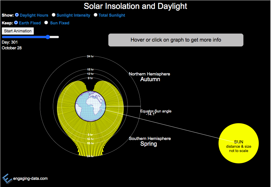
Visualizing the Variation in Sunlight by Latitude and Time of Year

How does the Earth’s tilt affect sunlight and seasons by latitude?
This visualization looks at the variation in the amount of sunlight different latitudes receive over the different days of the year. The amount of sunlight can be classified in 3 different categories:
- The number of hours of sunlight received each day
- The average sunlight intensity (in watts per square meter)
- The total amount of sunlight received across an entire latitude band (in gigawatt hours)
The default view is to see the number of hours of sunlight received by latitude on the current date, shown by the yellow bars. The sunlight hours range from 0 to 24 hours per day while most latitudes range from 9 to 15 hours.
If you hover over the yellow bars (or click on mobile), you will see the exact number of hours for that latitude band for that date.
Pressing the ‘Start Animation’ button, will change the angle of the sun relative to the Earth (as the earth rotates around the sun) and change the distribution of sunlight across the globe. You can view this animation with the earth fixed and the sun angle changing (the default view) or with the sun location fixed and the earth’s tilt changing.
This visualization helps to show how the seasons come about. When the Northern Hemisphere is tilted towards the sun, the amount of sunlight it receives increases (hours of daylight, average sun intensity and total amount of sunlight received). As the hemisphere tilts away from the sun, the amount of sunlight it receives decreases. The amount of sunlight a region receives causes the seasons that we experience.
Interestingly, when you are at the equator, the amount of sunlight per day does not really vary too significantly over the course of the year, whereas if you are near the poles, the difference between summer and winter is very dramatic. When looking at total sunlight received, the poles generally have lower sunlight because even in their summer, there is much lower land area relative to the middle latitudes (close to the equator)
The second visualization shown here shows how the tilt of the Earth’s axis is changed over the course of the Earth’s revolution around the sun. The Earth’s axis is tilted at 23.5 degrees relative to the plane of the Earth’s orbit around the sun. Like the last visualization, you can look at Earth the way we normally do (without the tilted axis) or from the perspective of the sun (with a tilted axis). This makes it a bit clearer why the tilt of the Earth’s axis can change from the north pole angled away to angled towards the sun.
Sources and Tools:
The equations for average daily solar insolation come from online lecture notes from University of Albany. The equations for number of hours of daylight comes from Wikipedia. The visualizations are made using the javascript d3 data visualization library and the interface and animation are made using javascript.
Moon Phases Visualization
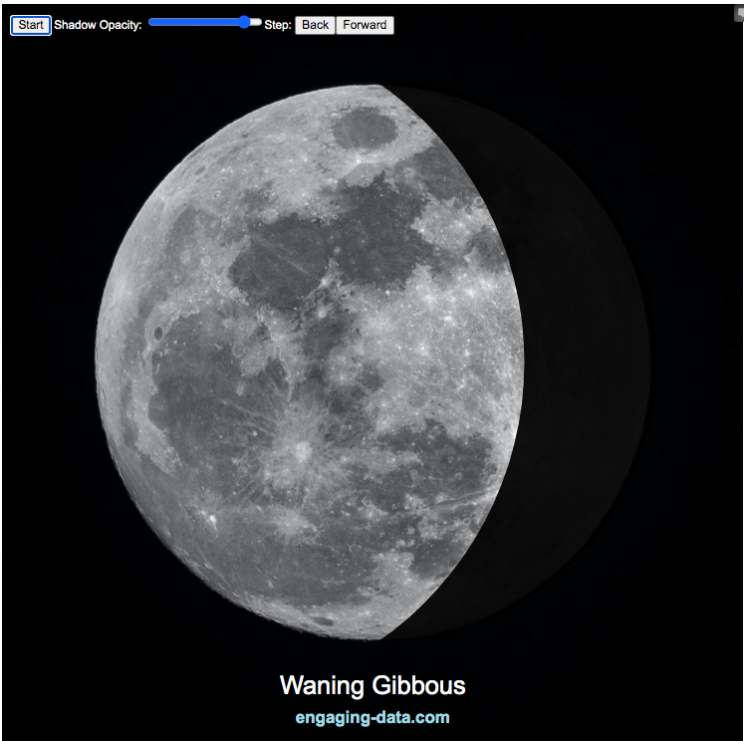
Animation and Description of the Moon Phases
This visualization shows the phases of the moon. It’s a fairly simple visualization that shows a photo of the moon and covers it with a shadow to show only the lit up portion of the moon. Half of the moon is always lit up (half of the sphere) but we can usually only see part of the lit up portion.
Controls
You can use the slider to control the opacity of the shadow. There is a button that lets you start and stop the animation and you can also step through the animation with the ‘Back’ and ‘Forward’ buttons or the left and right arrow keys.
Moon Phases
- Full Moon – we can see the entire lit up portion of the moon
- New Moon we can’t see any of the lit up part (moon is dark when viewing from Earth).
- Waxing – refers to the moon when the lit up portion is getting bigger (i.e. we can see more of it each subsequent day)
- Waning – refers to the moon when the lit up portion is getting smaller (i.e. we see less of it each subsequent day)
- Crescent – is when the visible moon is less than half lit up
- Gibbous – is when the visible portion of the moon is more than half lit
- Quarter Moon – when the visible portion of the moon is exactly half of the circle
These are combined to get eight different distinct phases:
- Waxing Crescent
- Quarter Moon
- Waxing Gibbous
- Full Moon
- Waning Gibbous
- Quarter Moon
- Waning Crescent
- New Moon
The moon goes through these phases once every 29.5 days. Because it’s not exactly a whole number of days, the size of each crescent isn’t exactly the same each lunar cycle. The rate of change in the size of the lit up portion of the moon is fastest when the moon is close to a quarter moon and slowest when the moon is closest to a new moon or full moon. This has to do with the way the light is projected onto a 3D sphere but viewed as a 2D disc.
Data Sources and Tools:
The moon image was downloaded from unsplash.com and taken by Mike Petrucci representing Delaware. The code to determine the size and draw the shadow was written in javascript and d3 open source data visualization library.

Visualizing the outcome of Eeny Meeny Miney Moe
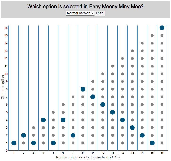
Who is selected when kids do Eeny Meeny Miney Moe?
I was watching my kids try to pick who got go first by doing the kids rhyme,
“Eeny, meeny, miny, moe, catch a tiger by the toe, if he hollers let him go, eeny, meeny, miny moe.”
Since there were only two of them, it got me thinking, if you knew which one it would fall on at the end, you could decide who to start counting with to ensure that you select who you want. For each set with different numbers of options, you will get a different individual from that set chosen so I thought I’d visualize who gets selected.
Click “Start” to see which option gets selected when there are different numbers of options. Hover over the graph to see which option is chosen.
There are multiple variants of the rhyme, but the primary one mentioned above has 16 counting elements. The math is such that you take the modulo (which is equivalent to a remainder in long division). For example, if you have 15 choices for the 16 element phrase, you’ll count through all 15 and then go back to the first option and end on it (i.e. item number 1 is chosen). 16 divided by 15 has a remainder of 1. In the case that the remainder is zero, you choose the last item. I.e. if there are 16 items/people to choose among, the last option is chosen and the remainder will be 0.
Longer variants will have more words, which are also shown on the dropdown menu. If you know of other variations, let me know in the comments and I can add them.
Primary: “Eeny, meeny, miny, moe, catch a tiger by the toe, if he hollers let him go, eeny, meeny, miny moe.” – 16 counting elements (“catch a” is one element, “by the” is another, etc)
Variation#1: “Eeny, meeny, miny, moe, catch a tiger by the toe, if he hollers let him go, eeny, meeny, miny moe My mother told me to pick the very best one and that is Y O U” – 31 counting elements
Variation#2: “Eeny, meeny, miny, moe, catch a tiger by the toe, if he hollers let him go, eeny, meeny, miny moe My mother told me to pick the very best one and you are it” – 29 counting elements
Source and Tools:
The rhymes come from my childhood and my kids helped me remember some of the variants. Calculations are done in javascript and visualization is done with the open source Plotly javascript graphing library.

Iceberger Remixed and Improved – Iceberg Simulator
The melting algorithm has been updated so that melting below water is faster than melting above the waterline. It’s fun to try to get the iceberg pieces to radically change orientation when the iceberg breaks apart due to melting.
Draw (or choose) an iceberg and visualize how it will float and melt
I was so impressed with the interactive Iceberger tool that Josh Tauberer (@JoshData) made that I had to modify it and add some additional features. Click here to see the original. My additions allow you to conjure up pre-made “icebergs” to see how they float and also allow some interaction. Try “poking” the icebergs you make.
Josh and I were both inspired by a tweet by Megan Thompson-Munson (@GlacialMeg).
Today I channeled my energy into this very unofficial but passionate petition for scientists to start drawing icebergs in their stable orientations. I went to the trouble of painting a stable iceberg with my watercolors, so plz hear me out.
(1/4) pic.twitter.com/rtkCYub38b
— Megan Thompson-Munson (@GlacialMeg) February 19, 2021
Instructions
You can choose between 3 different iceberg creation options:
- Draw Iceberg – the original Iceberger option. Choose this option and draw any shape you want and see how it floats.
- Select State – Choose this option and select from one of the states of the United States to see how it will float.
- Select Shape = Choose this option and select from one of the premade shapes to see how it will float.
Once the iceberg has been created, you can also affect it in a couple of different ways:
- Click on the Iceberg – This lets you push on the left side of the iceberg to induce some rotation and see if there are multiple stable orientations. Click it several times in a row if you want to flip the iceberg over. If you push on the right size it will rotate the iceberg clockwise and if you push on the left size, it will rotate counter clockwise. if you push in the middle third of the iceberg, it will push it straight down.
- Melting – You can select between different options – No melting, slow medium and fast. This took awhile to code correctly. Previously, I’d just scale parts of the iceberg but this new code actually takes material away from the surface of the iceberg in a uniform way. It works more like you would expect melting ice to behave. Also melting occurs more quickly underwater than in the air.
- Changing the Sky – You can change the colors of the sky between sunrise, midday and sunset colors.
- Showing forces – You can toggle whether to show the center of buoyancy (B) and center of gravity (B) of the iceberg.
Some Physics – no equations
The force of gravity (G) affects the entire body regardless of where it is or how it is oriented. If you show the forces, the red dot labeled G shows where the center of mass of the iceberg is. The blue dot labeled B shows where the center of buoyancy is. This is the center of mass of the part of the iceberg that is submerged. The force acting on the submerged part is equal to the volume of water displaced. If the center of buoyancy is below the center of gravity, then the forces will be equal and object will be in stable equilibrium. If the center of buoyancy is somewhere other than under the center of gravity, then the buoyant force will be pushing up on a different place than the gravity force and this will induce a rotation until they are directly over one another.
The code has been updated so that multiple icebergs are now allowed. Melting can separate a single piece of iceberg into multiple pieces, just as in real life. The melting process was a bit difficult to program because of the complexity of shapes that could be produced.
If you have additional suggestions for shapes or countries to add to the list or other improvements to make, let me know in the comments. Also if you are using this as a teaching tool, I’d love to hear how you are incorporating it into your curriculum.
Sources and Tools:
This visualization uses HTML/CSS/Javascript code from the Iceberger app to simulate the buoyancy of icebergs. Melting was accomplished with the help of code from the turf.js, polygon-offset and simplify.js javascript libraries. Additional elements of the UI and other features are also made using HTML, CSS and javascript.
Countries Mapped onto Solar System Bodies
We can compare the sizes of countries and continents to planets and moons by projecting a map of a specific country onto another planet. Select a country and planet or moon to find out.
In one of my kid’s favorite books, there’s a picture demonstrating how Pluto is the same size as Australia. It has a satellite image of the country and an image of the former ninth planet superimposed on top as if it were hovering above the country. That image has stuck with me and I thought it would be interesting to see how other countries would compare with other planets and bodies in our solar system. As I’ve been working with javascript graphing/mapping library, D3.js and making maps/globes, I realized I should try to “project” individual countries onto these planets to see what they looked like.
Instructions
This visualization should be pretty self explanatory. You can select a country or continent and a planet or moon (or the sun) in the solar system. The visualization will then project the land onto the body and you have a simple visual comparison of the size of the country/continent and the planet or moon. You can drag on the visualization to rotate the planet.
There are some combinations that are not possible because the country/continent is too large to be projected onto the body without overlap. In these cases, the planet or country will be greyed out in the selection menu. You can click the “Get URL” button and share a specific map combination (country and planet) by copying the address in the url address bar.
The visualization also displays the area of the country/continent and the surface area of the planet or body. In some cases, the percentage may not look correct but remember that you can only see half of the planet surface and that it’s actually a hemisphere (half a sphere and not just a circle). It becomes clearer if you draw the surface of the planet around.
Calculations
The calculations to project a country onto another body involves starting with a set of coordinates (made up of longitude and latitude values) which define the border of the country, in the geojson format. To display them on Earth, the coordinates are modified so that the center of the country is centered at the intersection between the equator and prime meridian [0 deg latitude, 0 deg longitude].
To display them projected on a different planet or moon, it is necessary to change the latitude and longitude values of each point of the polygon country border so that it represents the same distance away from the polygon center. I used the Haversine formula to calculate the distance and bearing between two points on a sphere and then used the inverse to find the coordinates that were that distance and bearing from the center point on a sphere of a different size. These formulas can be found here. The main idea is that the distance representing one degree of latitude on Earth will be half as large on a planet that is half the size of Earth (like Mars). Thus, the distance between the center of a country and a point on the border will be a different number of degrees latitude and longitude from the center point on a different planet than on Earth. And this calculatin is done using these formulae.
Sources and Tools:
This visualization was made using the open-source, d3 javascript dataviz library and UI are made using HTML, CSS and javascript.
Animation of Coronavirus Cases and Deaths in US
Visualize the large number of coronavirus cases and deaths in the US each day/hour in about 10 seconds
The rate of COVID-19 deaths and cases in the US is crazy high after the 2020 winter holidays and maybe still be going up. This visualization shows the number of COVID cases that occur in one hour or the COVID deaths that occur in one day based on the average of the last five days. This is another attempt to show the true scale of how many cases and deaths the US is dealing with, since it is often hard to understand large numbers. I have also attempted to show the scale of US deaths/cases here and here. Unfortunately, there are so many people getting sick and dying, it’s hard to fathom just how many people this actually is.
The 5-day averaging was done to smooth out any peaks and troughs in data reporting due to weekends/holidays, since I noticed that some states were literally reporting zero COVID cases some days while reporting many hundreds or thousands of cases other days.
The dots shown on the animation are located in the state that the cases or deaths occur but are randomly spread out within the state. This is done for visual clarity since if they were shown in their actual location, most of the dots would be overlapping in urban, high density areas. This approach lets you see which states have high COVID instances but still locate them by state.
You can share this animation by putting ?cat=deaths or ?cat=cases behind the url or copying and sharing one of these links:
Sources and Tools:
The coronavirus data comes from the covidtracking.com API. The data is parsed daily using a custom python script and visualizations are made using the open-source Leaflet javascript mapping library and the interface and animation are made using HTML/CSS/javascript.
Visualizing the Variation in Sunlight by Latitude and Time of Year
How does the Earth’s tilt affect sunlight and seasons by latitude?
This visualization looks at the variation in the amount of sunlight different latitudes receive over the different days of the year. The amount of sunlight can be classified in 3 different categories:
- The number of hours of sunlight received each day
- The average sunlight intensity (in watts per square meter)
- The total amount of sunlight received across an entire latitude band (in gigawatt hours)
The default view is to see the number of hours of sunlight received by latitude on the current date, shown by the yellow bars. The sunlight hours range from 0 to 24 hours per day while most latitudes range from 9 to 15 hours.
If you hover over the yellow bars (or click on mobile), you will see the exact number of hours for that latitude band for that date.
Pressing the ‘Start Animation’ button, will change the angle of the sun relative to the Earth (as the earth rotates around the sun) and change the distribution of sunlight across the globe. You can view this animation with the earth fixed and the sun angle changing (the default view) or with the sun location fixed and the earth’s tilt changing.
This visualization helps to show how the seasons come about. When the Northern Hemisphere is tilted towards the sun, the amount of sunlight it receives increases (hours of daylight, average sun intensity and total amount of sunlight received). As the hemisphere tilts away from the sun, the amount of sunlight it receives decreases. The amount of sunlight a region receives causes the seasons that we experience.
Interestingly, when you are at the equator, the amount of sunlight per day does not really vary too significantly over the course of the year, whereas if you are near the poles, the difference between summer and winter is very dramatic. When looking at total sunlight received, the poles generally have lower sunlight because even in their summer, there is much lower land area relative to the middle latitudes (close to the equator)
The second visualization shown here shows how the tilt of the Earth’s axis is changed over the course of the Earth’s revolution around the sun. The Earth’s axis is tilted at 23.5 degrees relative to the plane of the Earth’s orbit around the sun. Like the last visualization, you can look at Earth the way we normally do (without the tilted axis) or from the perspective of the sun (with a tilted axis). This makes it a bit clearer why the tilt of the Earth’s axis can change from the north pole angled away to angled towards the sun.
Sources and Tools:
The equations for average daily solar insolation come from online lecture notes from University of Albany. The equations for number of hours of daylight comes from Wikipedia. The visualizations are made using the javascript d3 data visualization library and the interface and animation are made using javascript.
Moon Phases Visualization
Animation and Description of the Moon Phases
This visualization shows the phases of the moon. It’s a fairly simple visualization that shows a photo of the moon and covers it with a shadow to show only the lit up portion of the moon. Half of the moon is always lit up (half of the sphere) but we can usually only see part of the lit up portion.
Controls
You can use the slider to control the opacity of the shadow. There is a button that lets you start and stop the animation and you can also step through the animation with the ‘Back’ and ‘Forward’ buttons or the left and right arrow keys.
Moon Phases
- Full Moon – we can see the entire lit up portion of the moon
- New Moon we can’t see any of the lit up part (moon is dark when viewing from Earth).
- Waxing – refers to the moon when the lit up portion is getting bigger (i.e. we can see more of it each subsequent day)
- Waning – refers to the moon when the lit up portion is getting smaller (i.e. we see less of it each subsequent day)
- Crescent – is when the visible moon is less than half lit up
- Gibbous – is when the visible portion of the moon is more than half lit
- Quarter Moon – when the visible portion of the moon is exactly half of the circle
These are combined to get eight different distinct phases:
- Waxing Crescent
- Quarter Moon
- Waxing Gibbous
- Full Moon
- Waning Gibbous
- Quarter Moon
- Waning Crescent
- New Moon
The moon goes through these phases once every 29.5 days. Because it’s not exactly a whole number of days, the size of each crescent isn’t exactly the same each lunar cycle. The rate of change in the size of the lit up portion of the moon is fastest when the moon is close to a quarter moon and slowest when the moon is closest to a new moon or full moon. This has to do with the way the light is projected onto a 3D sphere but viewed as a 2D disc.
Data Sources and Tools:
The moon image was downloaded from unsplash.com and taken by Mike Petrucci representing Delaware. The code to determine the size and draw the shadow was written in javascript and d3 open source data visualization library.
Visualizing the outcome of Eeny Meeny Miney Moe
Who is selected when kids do Eeny Meeny Miney Moe?
I was watching my kids try to pick who got go first by doing the kids rhyme,
“Eeny, meeny, miny, moe, catch a tiger by the toe, if he hollers let him go, eeny, meeny, miny moe.”
Since there were only two of them, it got me thinking, if you knew which one it would fall on at the end, you could decide who to start counting with to ensure that you select who you want. For each set with different numbers of options, you will get a different individual from that set chosen so I thought I’d visualize who gets selected.
Click “Start” to see which option gets selected when there are different numbers of options. Hover over the graph to see which option is chosen.
There are multiple variants of the rhyme, but the primary one mentioned above has 16 counting elements. The math is such that you take the modulo (which is equivalent to a remainder in long division). For example, if you have 15 choices for the 16 element phrase, you’ll count through all 15 and then go back to the first option and end on it (i.e. item number 1 is chosen). 16 divided by 15 has a remainder of 1. In the case that the remainder is zero, you choose the last item. I.e. if there are 16 items/people to choose among, the last option is chosen and the remainder will be 0.
Longer variants will have more words, which are also shown on the dropdown menu. If you know of other variations, let me know in the comments and I can add them.
Primary: “Eeny, meeny, miny, moe, catch a tiger by the toe, if he hollers let him go, eeny, meeny, miny moe.” – 16 counting elements (“catch a” is one element, “by the” is another, etc)
Variation#1: “Eeny, meeny, miny, moe, catch a tiger by the toe, if he hollers let him go, eeny, meeny, miny moe My mother told me to pick the very best one and that is Y O U” – 31 counting elements
Variation#2: “Eeny, meeny, miny, moe, catch a tiger by the toe, if he hollers let him go, eeny, meeny, miny moe My mother told me to pick the very best one and you are it” – 29 counting elements
Source and Tools:
The rhymes come from my childhood and my kids helped me remember some of the variants. Calculations are done in javascript and visualization is done with the open source Plotly javascript graphing library.
Recent Comments