Posts for Tag: interactive
National Park 3D Elevation Models
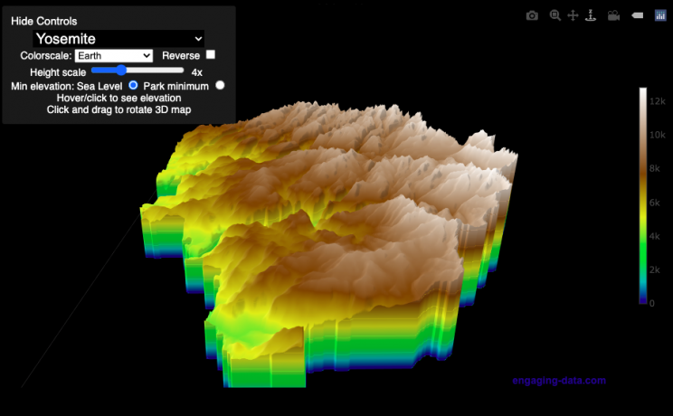
Play with an interactive 3D model of some popular National Parks in the US
I wanted to try my hand at creating 3D elevation models and thought trying to model some of the popular (and some of my favorite) national parks would be a good starting point.
Instructions
Once a 3D elevation model is selected and shown you can manipulated it in multiple ways:
- Zoom – You can zoom in and out, though the method depends on the device you are using. Try scrolling or pinch to zoom. You can also select the magnifying glass in the toolbar and drag to zoom.
- Rotate – You can rotate and change the angle of the model using by clicking and dragging on the model. This is the default selection in the toolbar (circular arrow around z axis)
- Pan – You can move the model around with if you select the panning tool from the toolbar (arrows going in all directions)
- Show contours – if you hover or click on part of the map, it can show all the areas of the model with the same elevation and the tooltip will show the geographic coordinates and elevation (you can toggle showing the tool tip if you select the tooltip bar)
- Save image – click on the camera icon in the toolbar to save as png
- Colors – you can change the color scale used to show elevation. You can also reverse the color scale.
- Change vertical exaggeration – you can select whether the vertical height is exaggerated using the ‘Height Scale’ slider. You can change between 1 (no exaggeration) to 11 (vertical scale is exaggerated by factor of 11).
- Change min elevation – you can select whether the minimum elevation is sea level or the lowest elevation in the park.
You can select a number of different parks from the drop down menu. If you have suggestions for additional parks, I may be able to add them to the list.
Note: the elevation files are data intensive since the visualization is downloading the elevation across in some cases, many hundreds or thousands of square miles. To keep the data needs down, I’ve reduced the resolution of the elevation data. Though the original data is 90 meter resolution (elevation is specified across every 90 x 90 m square in each park, I’ve averaged these squares together so that each park model only has about tens of thousands of these squares, regardless of the actual area of the park. This improves data loading and rendering times and makes the improves the responsiveness of the model.
Sources and Tools:
This visualization is written in HTML/CSS/Javascript. Digital elevation data is obtained from Open Topography and uses Shuttle Radar Topography Mission GL3 (90 meter resolution). The elevation data is downloaded using the opentopography API and parsed in a python script which downsamples the data to limit the number of elevation cells. The script also determines if a point is inside or outside of the park boundaries in order to create the elevation model. The 3D model is rendered using the Plotly open-source javascript graphing library.

Early Retirement Calculators and Tools
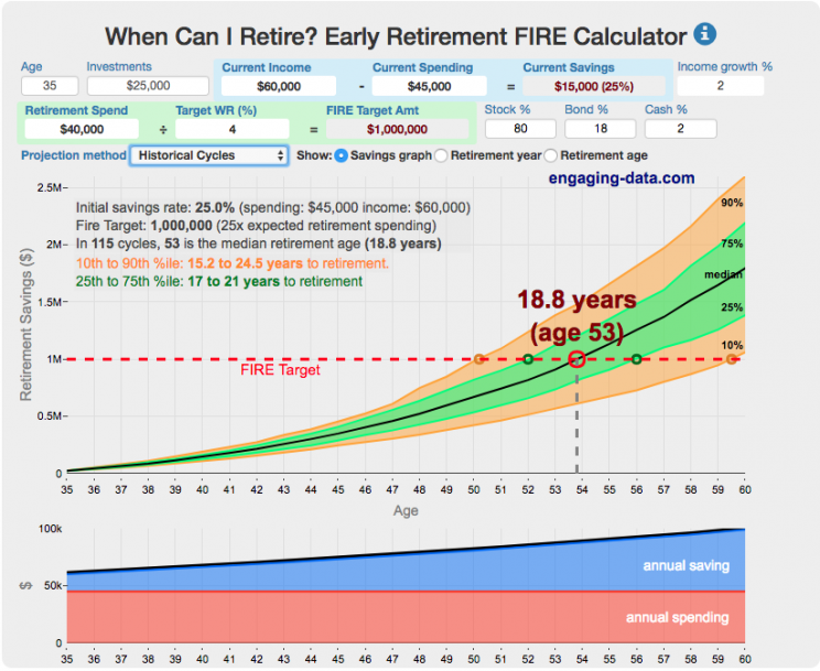
Interested in Early Retirement or FIRE (Financial Independence to Retire Early)?
Here are some interactive and educational planning tools that I developed to help you understand the concepts of FIRE and calculate how long it will take to achieve retirement and how likely you are to survive retirement. Click on the tools below to try them out.
Financial Independence Calculators
Regardless of where you are on your path to FIRE, there are several types of tools that are useful:
Planning to get to retirement
How long and how safe will your retirement be?
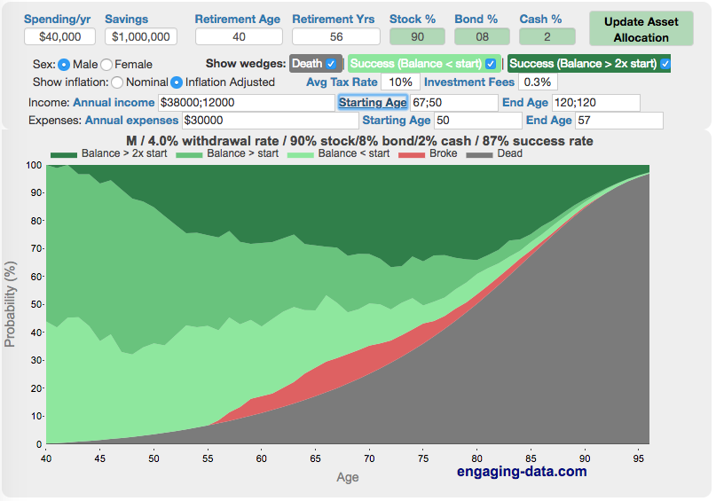
Rich, Broke or Dead? Will your Money Last Through Early Retirement?
Simulating retirement portfolio survival probability and human longevity
Determining the appropriate withdrawal rate (i.e. is 4% best?)
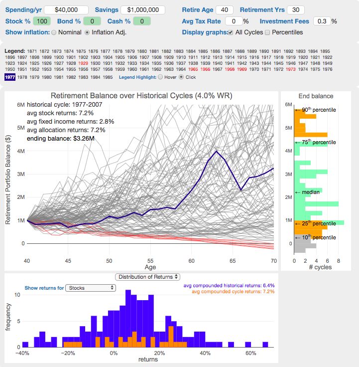
Understanding portfolio simulations and historical cycles
Interactive tool lets you explore the concept of historical simulations and understand how to determine a safe withdrawal rate
Tracking Progress to Retirement Target
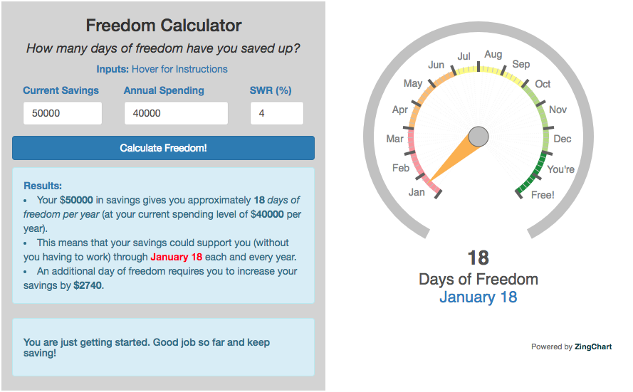
Financial freedom calculator / calendar
Track your progress to retirement by calculating days of “freedom”, the number of days your savings could support you per year
These tools all focus on the concept of FIRE. FIRE is the concept that revolves around saving and investing to achieve Financial Independence (FI) and to potentially Retire Early (RE). One of the core concepts is that once you can save up enough money, you can retire by withdrawing a fraction of this money annually to cover your living expenses. Other important topics related to this core concept have to do with reducing spending so you can save money and investing so your money can grow and sustain your retirement over many decades.
Other visualizations and tools related to Financial Independence
These tools relate to taxes and stock market returns.
Calculating Returns from Periodic Investments
Visualizing Market Returns
Understanding Market Timing
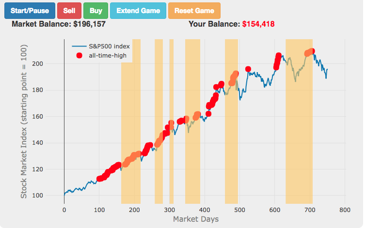
Market Timing Game
How difficult is it to time the stock market?
Income Taxes
Income Tax Bracket Calculator
Tax bracket calculator to visualize how income and capital gains taxed
Data Sources and Tools:
See the individual tool to learn more about how it was made.
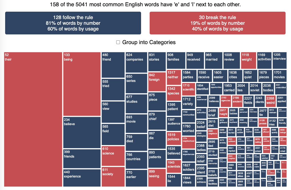
Visualizing the accuracy of the “i before e, except after c” spelling rule
See which words follow and break the “i before e” rule
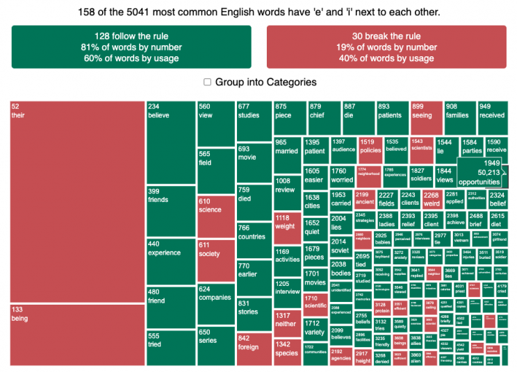
I wanted to see how often there were exceptions to the spelling rule “i before e, except after c”. I found a website (wordfrequency.info) that had a list of the 5050 most common english words and decided to do some analysis on it to see which words followed this rule and which did not. Below is a treemap graph that shows the words that follow the rule in green and those that do not in red. The size of the box represents how common the word is in regular American English usage (based on the frequency that it shows up in the Corpus of Contemporary American English).
What we see is that while 81% of the 158 most common words with ‘e’ and ‘i’ adjacent to one another do follow the rule, when you take into account how frequently these words are used, the weighted percentage of words following the rule drops to around 60%. This is because some very commonly used words do not follow this rule and if you were to count how many times you use words from this list, it’s likely that about 40% of the time you’ll be using words that don’t follow the rule. For example, the two most commonly used words with ‘e’ and ‘i’ adjacent (their and being) do not follow the rule, since then have the ‘e’ before the ‘i’ but aren’t after a ‘c’.
I was inspired to look into this after seeing a tweet about the rule in the comic Pearls before Swine by @stephanpastis.
Perhaps the most unhelpful spelling rule ever. pic.twitter.com/sW0aud6rA3
— Stephan Pastis (@stephanpastis) March 9, 2021
I asked my kids but they had never heard of the rule so perhaps this isn’t taught in schools anymore.
Sources and Tools:
I downloaded the word list from wordfrequency.info. The wordlist comes from the Corpus of Contemporary American English (COCA), a collection of English works across a wide variety of genres (spoken, fiction, popular magazines, newspapers, academic texts, and TV and Movies subtitles, blogs, and other web pages between 1990 and 2020). This word list was then analyzed using javascript to categorize the word as fitting or breaking the rule. The visualization uses the plotly.js open source graphing library and HTML/CSS/Javascript code for the interactivity and UI.
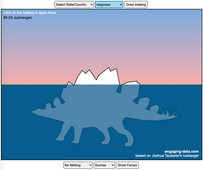
Iceberger Remixed and Improved – Iceberg Simulator
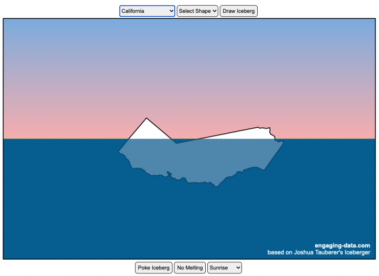
The melting algorithm has been updated so that melting below water is faster than melting above the waterline. It’s fun to try to get the iceberg pieces to radically change orientation when the iceberg breaks apart due to melting.
Draw (or choose) an iceberg and visualize how it will float and melt
I was so impressed with the interactive Iceberger tool that Josh Tauberer (@JoshData) made that I had to modify it and add some additional features. Click here to see the original. My additions allow you to conjure up pre-made “icebergs” to see how they float and also allow some interaction. Try “poking” the icebergs you make.
Josh and I were both inspired by a tweet by Megan Thompson-Munson (@GlacialMeg).
Today I channeled my energy into this very unofficial but passionate petition for scientists to start drawing icebergs in their stable orientations. I went to the trouble of painting a stable iceberg with my watercolors, so plz hear me out.
(1/4) pic.twitter.com/rtkCYub38b
— Megan Thompson-Munson (@GlacialMeg) February 19, 2021
Instructions
You can choose between 3 different iceberg creation options:
- Draw Iceberg – the original Iceberger option. Choose this option and draw any shape you want and see how it floats.
- Select State – Choose this option and select from one of the states of the United States to see how it will float.
- Select Shape = Choose this option and select from one of the premade shapes to see how it will float.
Once the iceberg has been created, you can also affect it in a couple of different ways:
- Click on the Iceberg – This lets you push on the left side of the iceberg to induce some rotation and see if there are multiple stable orientations. Click it several times in a row if you want to flip the iceberg over. If you push on the right size it will rotate the iceberg clockwise and if you push on the left size, it will rotate counter clockwise. if you push in the middle third of the iceberg, it will push it straight down.
- Melting – You can select between different options – No melting, slow medium and fast. This took awhile to code correctly. Previously, I’d just scale parts of the iceberg but this new code actually takes material away from the surface of the iceberg in a uniform way. It works more like you would expect melting ice to behave. Also melting occurs more quickly underwater than in the air.
- Changing the Sky – You can change the colors of the sky between sunrise, midday and sunset colors.
- Showing forces – You can toggle whether to show the center of buoyancy (B) and center of gravity (B) of the iceberg.
Some Physics – no equations
The force of gravity (G) affects the entire body regardless of where it is or how it is oriented. If you show the forces, the red dot labeled G shows where the center of mass of the iceberg is. The blue dot labeled B shows where the center of buoyancy is. This is the center of mass of the part of the iceberg that is submerged. The force acting on the submerged part is equal to the volume of water displaced. If the center of buoyancy is below the center of gravity, then the forces will be equal and object will be in stable equilibrium. If the center of buoyancy is somewhere other than under the center of gravity, then the buoyant force will be pushing up on a different place than the gravity force and this will induce a rotation until they are directly over one another.
The code has been updated so that multiple icebergs are now allowed. Melting can separate a single piece of iceberg into multiple pieces, just as in real life. The melting process was a bit difficult to program because of the complexity of shapes that could be produced.
If you have additional suggestions for shapes or countries to add to the list or other improvements to make, let me know in the comments. Also if you are using this as a teaching tool, I’d love to hear how you are incorporating it into your curriculum.
Sources and Tools:
This visualization uses HTML/CSS/Javascript code from the Iceberger app to simulate the buoyancy of icebergs. Melting was accomplished with the help of code from the turf.js, polygon-offset and simplify.js javascript libraries. Additional elements of the UI and other features are also made using HTML, CSS and javascript.
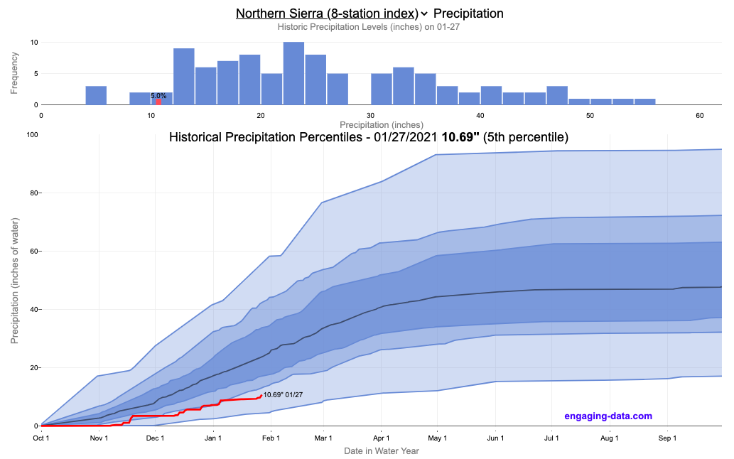
California Rainfall Totals

How do current California rainfall and precipitation totals compare with Historical Averages?
If you are lookin at this visualization, it’s likely winter in California and that means the rainy season (snowy in the mountains). I wanted to visualize how the current year compares with historical levels for this time of year. I used data for California rainfall totals from the California Department of Water Resources. Other California water-related visualizations include reservoir levels in the state as well.
There are three sets of stations that are tracked in the data and these plots:
- Northern Sierra 8-station index
- Tulare Basin 6-station index
- San Joaquin 5-station index
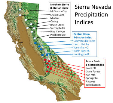
These stations are tracked because they provide important information about the state’s water supply (most of which originates from the Sierra Nevada Mountains). Data from the CDEC website appears to be updated at around 8:30am PST each day.
The visualization consists of two primary graphs both of which show the range of historical values for precipitation. The top graph is a histogram of water year precipitation totals on the specified date (in blue) as well as the precipitation total for the current water year in red.
The second graph shows the percentiles of precipitation over the course of the historical water year, spreading out like a cone from the start of the water year (October 1). You can see the current water year plotted on this to show how it compares to historical values. It also shows the present precipitation level and its percentile within the historical data for the day of the water year.
You can hover (or click) on the graph to audit the data a little more clearly.
Sources and Tools
Data is downloaded from the California Data Exchange Center website of the California Department of Water Resources using a python script. The data is processed in javascript and visualized here using HTML, CSS and javascript and the open source Plotly javascript graphing library.
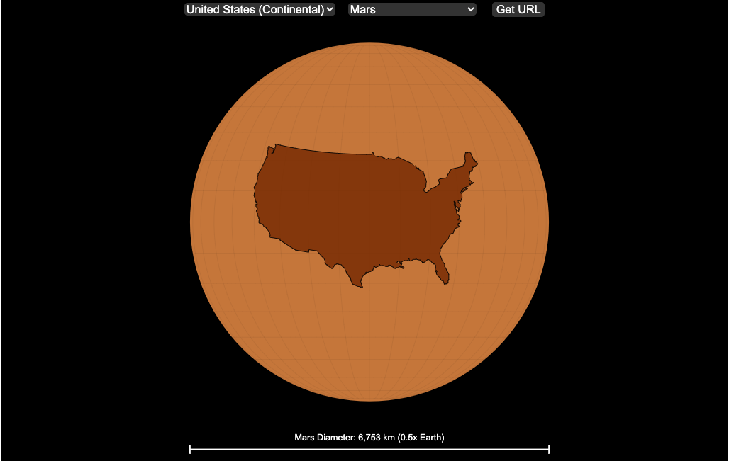
Countries Mapped onto Solar System Bodies
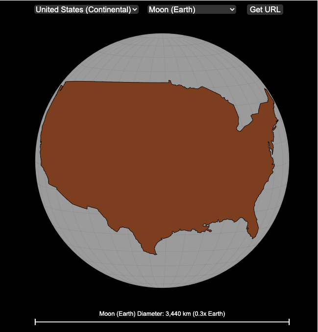
We can compare the sizes of countries and continents to planets and moons by projecting a map of a specific country onto another planet. Select a country and planet or moon to find out.
In one of my kid’s favorite books, there’s a picture demonstrating how Pluto is the same size as Australia. It has a satellite image of the country and an image of the former ninth planet superimposed on top as if it were hovering above the country. That image has stuck with me and I thought it would be interesting to see how other countries would compare with other planets and bodies in our solar system. As I’ve been working with javascript graphing/mapping library, D3.js and making maps/globes, I realized I should try to “project” individual countries onto these planets to see what they looked like.
Instructions
This visualization should be pretty self explanatory. You can select a country or continent and a planet or moon (or the sun) in the solar system. The visualization will then project the land onto the body and you have a simple visual comparison of the size of the country/continent and the planet or moon. You can drag on the visualization to rotate the planet.
There are some combinations that are not possible because the country/continent is too large to be projected onto the body without overlap. In these cases, the planet or country will be greyed out in the selection menu. You can click the “Get URL” button and share a specific map combination (country and planet) by copying the address in the url address bar.
The visualization also displays the area of the country/continent and the surface area of the planet or body. In some cases, the percentage may not look correct but remember that you can only see half of the planet surface and that it’s actually a hemisphere (half a sphere and not just a circle). It becomes clearer if you draw the surface of the planet around.
Calculations
The calculations to project a country onto another body involves starting with a set of coordinates (made up of longitude and latitude values) which define the border of the country, in the geojson format. To display them on Earth, the coordinates are modified so that the center of the country is centered at the intersection between the equator and prime meridian [0 deg latitude, 0 deg longitude].
To display them projected on a different planet or moon, it is necessary to change the latitude and longitude values of each point of the polygon country border so that it represents the same distance away from the polygon center. I used the Haversine formula to calculate the distance and bearing between two points on a sphere and then used the inverse to find the coordinates that were that distance and bearing from the center point on a sphere of a different size. These formulas can be found here. The main idea is that the distance representing one degree of latitude on Earth will be half as large on a planet that is half the size of Earth (like Mars). Thus, the distance between the center of a country and a point on the border will be a different number of degrees latitude and longitude from the center point on a different planet than on Earth. And this calculatin is done using these formulae.
Sources and Tools:
This visualization was made using the open-source, d3 javascript dataviz library and UI are made using HTML, CSS and javascript.
National Park 3D Elevation Models
Play with an interactive 3D model of some popular National Parks in the US
I wanted to try my hand at creating 3D elevation models and thought trying to model some of the popular (and some of my favorite) national parks would be a good starting point.
Instructions
Once a 3D elevation model is selected and shown you can manipulated it in multiple ways:
- Zoom – You can zoom in and out, though the method depends on the device you are using. Try scrolling or pinch to zoom. You can also select the magnifying glass in the toolbar and drag to zoom.
- Rotate – You can rotate and change the angle of the model using by clicking and dragging on the model. This is the default selection in the toolbar (circular arrow around z axis)
- Pan – You can move the model around with if you select the panning tool from the toolbar (arrows going in all directions)
- Show contours – if you hover or click on part of the map, it can show all the areas of the model with the same elevation and the tooltip will show the geographic coordinates and elevation (you can toggle showing the tool tip if you select the tooltip bar)
- Save image – click on the camera icon in the toolbar to save as png
- Colors – you can change the color scale used to show elevation. You can also reverse the color scale.
- Change vertical exaggeration – you can select whether the vertical height is exaggerated using the ‘Height Scale’ slider. You can change between 1 (no exaggeration) to 11 (vertical scale is exaggerated by factor of 11).
- Change min elevation – you can select whether the minimum elevation is sea level or the lowest elevation in the park.
You can select a number of different parks from the drop down menu. If you have suggestions for additional parks, I may be able to add them to the list.
Note: the elevation files are data intensive since the visualization is downloading the elevation across in some cases, many hundreds or thousands of square miles. To keep the data needs down, I’ve reduced the resolution of the elevation data. Though the original data is 90 meter resolution (elevation is specified across every 90 x 90 m square in each park, I’ve averaged these squares together so that each park model only has about tens of thousands of these squares, regardless of the actual area of the park. This improves data loading and rendering times and makes the improves the responsiveness of the model.
Sources and Tools:
This visualization is written in HTML/CSS/Javascript. Digital elevation data is obtained from Open Topography and uses Shuttle Radar Topography Mission GL3 (90 meter resolution). The elevation data is downloaded using the opentopography API and parsed in a python script which downsamples the data to limit the number of elevation cells. The script also determines if a point is inside or outside of the park boundaries in order to create the elevation model. The 3D model is rendered using the Plotly open-source javascript graphing library.
Early Retirement Calculators and Tools
Interested in Early Retirement or FIRE (Financial Independence to Retire Early)?
Here are some interactive and educational planning tools that I developed to help you understand the concepts of FIRE and calculate how long it will take to achieve retirement and how likely you are to survive retirement. Click on the tools below to try them out.
Financial Independence Calculators
Regardless of where you are on your path to FIRE, there are several types of tools that are useful:
Planning to get to retirement

How long and how safe will your retirement be?
Rich, Broke or Dead? Will your Money Last Through Early Retirement?
Simulating retirement portfolio survival probability and human longevity
Determining the appropriate withdrawal rate (i.e. is 4% best?)
Understanding portfolio simulations and historical cycles
Interactive tool lets you explore the concept of historical simulations and understand how to determine a safe withdrawal rate
Tracking Progress to Retirement Target
Financial freedom calculator / calendar
Track your progress to retirement by calculating days of “freedom”, the number of days your savings could support you per year
These tools all focus on the concept of FIRE. FIRE is the concept that revolves around saving and investing to achieve Financial Independence (FI) and to potentially Retire Early (RE). One of the core concepts is that once you can save up enough money, you can retire by withdrawing a fraction of this money annually to cover your living expenses. Other important topics related to this core concept have to do with reducing spending so you can save money and investing so your money can grow and sustain your retirement over many decades.
Other visualizations and tools related to Financial Independence
These tools relate to taxes and stock market returns.
Calculating Returns from Periodic Investments
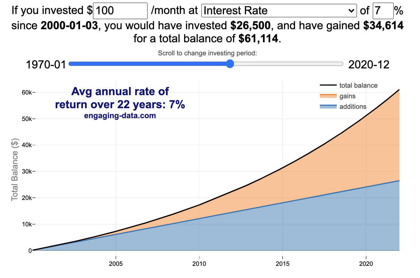
Visualizing Market Returns
Understanding Market Timing
How difficult is it to time the stock market?
Market Timing Game
Income Taxes
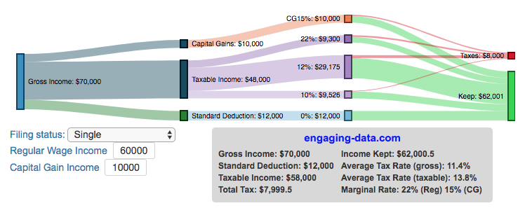
Tax bracket calculator to visualize how income and capital gains taxed
Income Tax Bracket Calculator
Data Sources and Tools:
See the individual tool to learn more about how it was made.
Visualizing the accuracy of the “i before e, except after c” spelling rule
See which words follow and break the “i before e” rule
I wanted to see how often there were exceptions to the spelling rule “i before e, except after c”. I found a website (wordfrequency.info) that had a list of the 5050 most common english words and decided to do some analysis on it to see which words followed this rule and which did not. Below is a treemap graph that shows the words that follow the rule in green and those that do not in red. The size of the box represents how common the word is in regular American English usage (based on the frequency that it shows up in the Corpus of Contemporary American English).
What we see is that while 81% of the 158 most common words with ‘e’ and ‘i’ adjacent to one another do follow the rule, when you take into account how frequently these words are used, the weighted percentage of words following the rule drops to around 60%. This is because some very commonly used words do not follow this rule and if you were to count how many times you use words from this list, it’s likely that about 40% of the time you’ll be using words that don’t follow the rule. For example, the two most commonly used words with ‘e’ and ‘i’ adjacent (their and being) do not follow the rule, since then have the ‘e’ before the ‘i’ but aren’t after a ‘c’.
I was inspired to look into this after seeing a tweet about the rule in the comic Pearls before Swine by @stephanpastis.
Perhaps the most unhelpful spelling rule ever. pic.twitter.com/sW0aud6rA3
— Stephan Pastis (@stephanpastis) March 9, 2021
I asked my kids but they had never heard of the rule so perhaps this isn’t taught in schools anymore.
Sources and Tools:
I downloaded the word list from wordfrequency.info. The wordlist comes from the Corpus of Contemporary American English (COCA), a collection of English works across a wide variety of genres (spoken, fiction, popular magazines, newspapers, academic texts, and TV and Movies subtitles, blogs, and other web pages between 1990 and 2020). This word list was then analyzed using javascript to categorize the word as fitting or breaking the rule. The visualization uses the plotly.js open source graphing library and HTML/CSS/Javascript code for the interactivity and UI.
Iceberger Remixed and Improved – Iceberg Simulator
The melting algorithm has been updated so that melting below water is faster than melting above the waterline. It’s fun to try to get the iceberg pieces to radically change orientation when the iceberg breaks apart due to melting.
Draw (or choose) an iceberg and visualize how it will float and melt
I was so impressed with the interactive Iceberger tool that Josh Tauberer (@JoshData) made that I had to modify it and add some additional features. Click here to see the original. My additions allow you to conjure up pre-made “icebergs” to see how they float and also allow some interaction. Try “poking” the icebergs you make.
Josh and I were both inspired by a tweet by Megan Thompson-Munson (@GlacialMeg).
Today I channeled my energy into this very unofficial but passionate petition for scientists to start drawing icebergs in their stable orientations. I went to the trouble of painting a stable iceberg with my watercolors, so plz hear me out.
(1/4) pic.twitter.com/rtkCYub38b
— Megan Thompson-Munson (@GlacialMeg) February 19, 2021
Instructions
You can choose between 3 different iceberg creation options:
- Draw Iceberg – the original Iceberger option. Choose this option and draw any shape you want and see how it floats.
- Select State – Choose this option and select from one of the states of the United States to see how it will float.
- Select Shape = Choose this option and select from one of the premade shapes to see how it will float.
Once the iceberg has been created, you can also affect it in a couple of different ways:
- Click on the Iceberg – This lets you push on the left side of the iceberg to induce some rotation and see if there are multiple stable orientations. Click it several times in a row if you want to flip the iceberg over. If you push on the right size it will rotate the iceberg clockwise and if you push on the left size, it will rotate counter clockwise. if you push in the middle third of the iceberg, it will push it straight down.
- Melting – You can select between different options – No melting, slow medium and fast. This took awhile to code correctly. Previously, I’d just scale parts of the iceberg but this new code actually takes material away from the surface of the iceberg in a uniform way. It works more like you would expect melting ice to behave. Also melting occurs more quickly underwater than in the air.
- Changing the Sky – You can change the colors of the sky between sunrise, midday and sunset colors.
- Showing forces – You can toggle whether to show the center of buoyancy (B) and center of gravity (B) of the iceberg.
Some Physics – no equations
The force of gravity (G) affects the entire body regardless of where it is or how it is oriented. If you show the forces, the red dot labeled G shows where the center of mass of the iceberg is. The blue dot labeled B shows where the center of buoyancy is. This is the center of mass of the part of the iceberg that is submerged. The force acting on the submerged part is equal to the volume of water displaced. If the center of buoyancy is below the center of gravity, then the forces will be equal and object will be in stable equilibrium. If the center of buoyancy is somewhere other than under the center of gravity, then the buoyant force will be pushing up on a different place than the gravity force and this will induce a rotation until they are directly over one another.
The code has been updated so that multiple icebergs are now allowed. Melting can separate a single piece of iceberg into multiple pieces, just as in real life. The melting process was a bit difficult to program because of the complexity of shapes that could be produced.
If you have additional suggestions for shapes or countries to add to the list or other improvements to make, let me know in the comments. Also if you are using this as a teaching tool, I’d love to hear how you are incorporating it into your curriculum.
Sources and Tools:
This visualization uses HTML/CSS/Javascript code from the Iceberger app to simulate the buoyancy of icebergs. Melting was accomplished with the help of code from the turf.js, polygon-offset and simplify.js javascript libraries. Additional elements of the UI and other features are also made using HTML, CSS and javascript.
California Rainfall Totals
How do current California rainfall and precipitation totals compare with Historical Averages?
If you are lookin at this visualization, it’s likely winter in California and that means the rainy season (snowy in the mountains). I wanted to visualize how the current year compares with historical levels for this time of year. I used data for California rainfall totals from the California Department of Water Resources. Other California water-related visualizations include reservoir levels in the state as well.
There are three sets of stations that are tracked in the data and these plots:
- Northern Sierra 8-station index
- Tulare Basin 6-station index
- San Joaquin 5-station index
These stations are tracked because they provide important information about the state’s water supply (most of which originates from the Sierra Nevada Mountains). Data from the CDEC website appears to be updated at around 8:30am PST each day.
The visualization consists of two primary graphs both of which show the range of historical values for precipitation. The top graph is a histogram of water year precipitation totals on the specified date (in blue) as well as the precipitation total for the current water year in red.
The second graph shows the percentiles of precipitation over the course of the historical water year, spreading out like a cone from the start of the water year (October 1). You can see the current water year plotted on this to show how it compares to historical values. It also shows the present precipitation level and its percentile within the historical data for the day of the water year.
You can hover (or click) on the graph to audit the data a little more clearly.
Sources and Tools
Data is downloaded from the California Data Exchange Center website of the California Department of Water Resources using a python script. The data is processed in javascript and visualized here using HTML, CSS and javascript and the open source Plotly javascript graphing library.
Countries Mapped onto Solar System Bodies
We can compare the sizes of countries and continents to planets and moons by projecting a map of a specific country onto another planet. Select a country and planet or moon to find out.
In one of my kid’s favorite books, there’s a picture demonstrating how Pluto is the same size as Australia. It has a satellite image of the country and an image of the former ninth planet superimposed on top as if it were hovering above the country. That image has stuck with me and I thought it would be interesting to see how other countries would compare with other planets and bodies in our solar system. As I’ve been working with javascript graphing/mapping library, D3.js and making maps/globes, I realized I should try to “project” individual countries onto these planets to see what they looked like.
Instructions
This visualization should be pretty self explanatory. You can select a country or continent and a planet or moon (or the sun) in the solar system. The visualization will then project the land onto the body and you have a simple visual comparison of the size of the country/continent and the planet or moon. You can drag on the visualization to rotate the planet.
There are some combinations that are not possible because the country/continent is too large to be projected onto the body without overlap. In these cases, the planet or country will be greyed out in the selection menu. You can click the “Get URL” button and share a specific map combination (country and planet) by copying the address in the url address bar.
The visualization also displays the area of the country/continent and the surface area of the planet or body. In some cases, the percentage may not look correct but remember that you can only see half of the planet surface and that it’s actually a hemisphere (half a sphere and not just a circle). It becomes clearer if you draw the surface of the planet around.
Calculations
The calculations to project a country onto another body involves starting with a set of coordinates (made up of longitude and latitude values) which define the border of the country, in the geojson format. To display them on Earth, the coordinates are modified so that the center of the country is centered at the intersection between the equator and prime meridian [0 deg latitude, 0 deg longitude].
To display them projected on a different planet or moon, it is necessary to change the latitude and longitude values of each point of the polygon country border so that it represents the same distance away from the polygon center. I used the Haversine formula to calculate the distance and bearing between two points on a sphere and then used the inverse to find the coordinates that were that distance and bearing from the center point on a sphere of a different size. These formulas can be found here. The main idea is that the distance representing one degree of latitude on Earth will be half as large on a planet that is half the size of Earth (like Mars). Thus, the distance between the center of a country and a point on the border will be a different number of degrees latitude and longitude from the center point on a different planet than on Earth. And this calculatin is done using these formulae.
Sources and Tools:
This visualization was made using the open-source, d3 javascript dataviz library and UI are made using HTML, CSS and javascript.
Recent Comments