Posts for Tag: graph
How much wealth do the world’s richest billionaires have?
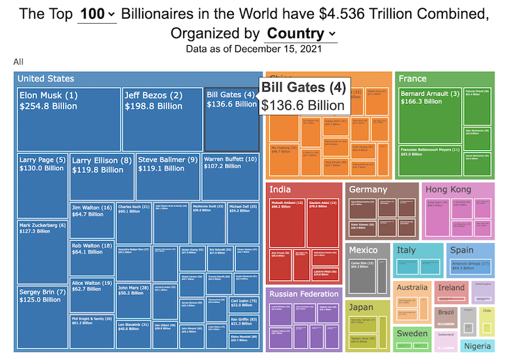
This dataviz compares how rich the world’s top billionaires are, showing their wealth as a treemap. The treemap is used to show the relative size of their wealth as boxes and is organized in order from largest to smallest.
User controls let you change the number of billionaires shown on the graph as well as group each person by their country or industry. If you group by country or industry, you can also click on a specific grouping to isolate that group and zoom in to see the contents more clearly. Hovering over each of the boxes (especially the smaller ones) will give you a popup that lets you see their name, ranking and net worth more clearly.
The popup shows how much total wealth the top billionaires control and for context compare it to the wealth of a certain number of households in the US. The comparison isn’t ideal as many of the billionaires are not from the US, but I think it still provides a useful point of comparison.
This visualization uses the same data that I needed in order to create my “How Rich is Elon Musk?” visualization. Since I had all this data, I figured I could crank out another related graph.
Sources and Tools:
Data from Bloomberg’s Billionaire’s index is downloaded regularly using a python script. Data on US household net worth is from DQYDJ’s net worth percentile calculator.
The treemap is created using the open-source Plotly javascript visualization library, as well as HTML, CSS and Javascript code to create interactivity and UI.

Using up our carbon budget
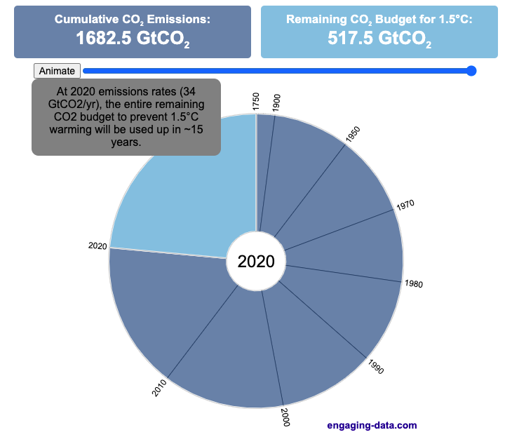
How much more CO2 can we emit if we want to keep the global temperature rise below 1.5°C or 2°C?
Every bit of CO2 we release is one step closer to using up our carbon budget.
Click on the animate button (or use the slider) to see how we have used up our carbon budget to limit global warming to 1.5°C or 2°C.
Climate change is the result of greenhouse gases such as CO2 and methane from human activities. The amount of CO2 and other greenhouse gases in the atmosphere determines how much of the incoming solar radiation is trapped as heat. Since CO2 is the most common greenhouse gas and very long lived in the atmosphere, there’s a good correlation between the total amount of human CO2 emissions and the amount of warming that the earth will experience. This leads to the concept of a carbon budget.
What is the carbon budget?
For every ton of CO2 that is emitted into the atmosphere about half a ton becomes part of the atmosphere for the long term, assuming there’s no massive new program to remove CO2 from the atmosphere. And there’s a direct correlation between the atmospheric concentration of CO2 and the earth’s temperature. Scientists tend to look at milestones of 2°C or 1.5°C when thinking about potential future warming. There is some uncertainty, but the total amount of human CO2 emissions that will lead to a 1.5°C warming from pre-industrial levels is around 2200 billion metric tonnes of CO2 plus or minus a few hundred billion tons (or 460 billion metric tonnes from 2020). This unit is also written as GtCO2 or gigatonnes of CO2. The values for the budget for 2°C warming are 1310 GtCO2 from 2020 or 2993 GtCO2 from pre-industrial levels.
Shown below is a graph from the Carbon Brief that shows the uncertainty in estimates for the remaining carbon budget (from 2018) before having a 50% chance of exceeding 1.5°C warming. As you can see there’s a fairly large range.
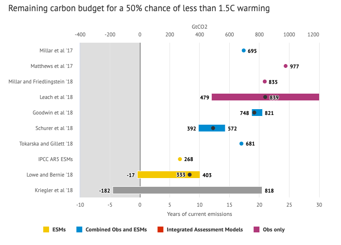
Update: The article’s author Zeke Hausfather pointed me to an updated article with newer IPCC estimates for the carbon budget of these two warming milestones. I have updated the code to account for these two new values.
What may happen at 1.5 degrees of warming?
1.5°C (2.7°F) doesn’t sound like alot, but there are some pretty serious potential consequences that we’ll be dealing with. These include increasing the amount or frequency of the following:
- extreme heatwaves
- droughts
- extreme storms and precipitation events
- loss of wildlife and biodiversity
- sea level rise
- and impacts of human health
This NASA article has much more info on the specific issues related to this temperature rise. Ideally we’d keep warming to under 1.5°C but it looks likely that we may exceed 2°C unless we take fairly dramatic action to reduce or CO2 emissions from fossil fuel combustion and use cleaner/lower-carbon sources of energy, like renewables and nuclear power.
From 1750 to 2020, humans have emitted approximately 1683 GtCO2. The IPCC estimates that 460 GtCO2 would put us at 1.5°C warming and 1310 GtCO2 would put us at 2°C warming. These values give us an estimated total carbon budget of 2143 GtCO2 for 1.5°C and 2993 GtCO2 for 2°C warming.
You can really see how we are getting close to using up all of our 1.5°C carbon budget and the speed at which we are using it up, especially in the last few decades.
Sources and Tools:
Annual emissions data is from the Global Carbon Project. The visualization was made using the plotly.js open source graphing library and HTML/CSS/Javascript code for the interactivity and UI.

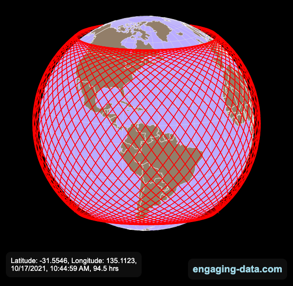
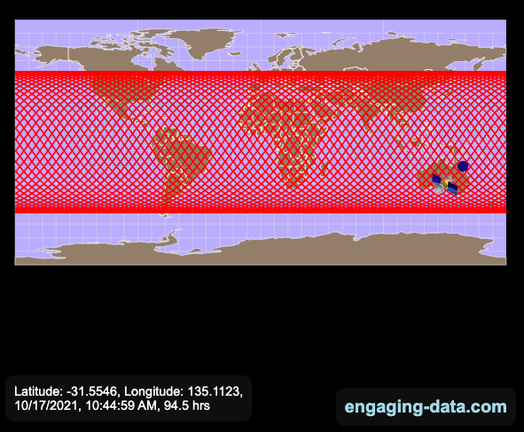
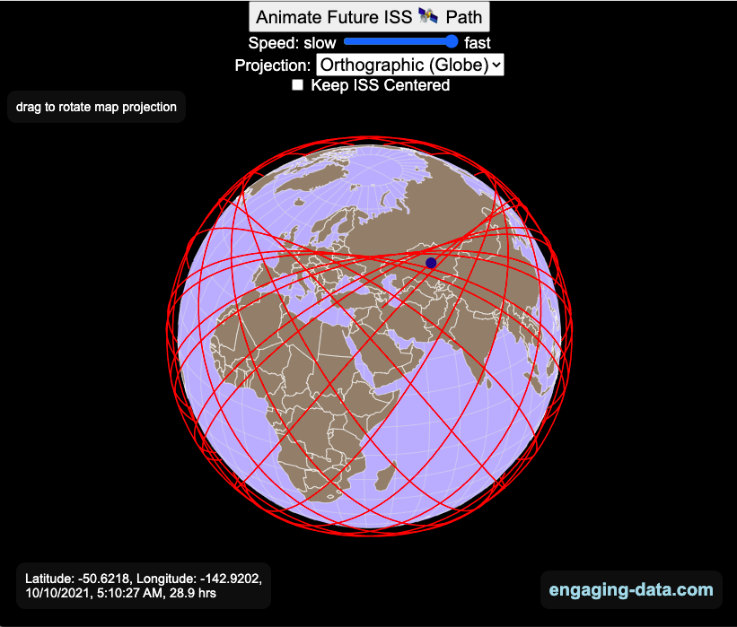
Visualizing the Orbit of the International Space Station (ISS)
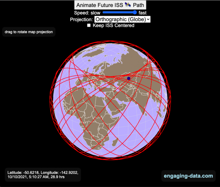
Where is the International Space Station currently? And what pattern does it make as it orbits around the Earth?
This visualization shows the current location of the International Space Station (ISS), actually the point above the Earth that the station is closest to. It is approximately 260 miles (420 km) above the Earth’s surface The station began construction in 1998 and had its first long term residents in 2000.
The visualization can also show the animated future orbital path of the ISS using ephemeris calculations, which makes a nice, cool pattern over an approximately 3.9 day cycle, where it starts to repeat. The animation allows you to view the orbital patterns on the globe (orthographic projection) or a mercator or equirectangular projection.
One of the cooler features is to drag and rotate the globe view while the orbital paths are being drawn. You can also adjust the speed of the orbit as well as keep the ISS centered in your view while the globe spins around underneath it. If you select the “rotate earth” checkbox, it becomes apparent that the ISS is in a circular orbit around the earth and that the pattern being made is simply a function of the earth’s rotation underneath the orbit.
This visualization only shows the approximate location of the ISS as there are several confounding factors that are not represented here. The speed of the ISS changes somewhat over time as the station experiences a small amount of atmospheric drag, which slows the station over time. But it still goes over 7000 meters per second or about 17000 miles per hour. As it slows, its orbit decays so it falls closer to earth and it experiences even more atmospheric drag. Occasionally, the station is boosted up to a higher orbit to counteract this decay. Secondly the earth is not a perfect sphere and this also causes the calculations to be only approximately correct.
Some other cool facts about the International Space Station:
- the angle the orbit makes relative to the equator is 51.6 degrees (i.e. this means the highest and lowest latitudes it will reach are 51.6 degrees North and South and doesn’t orbit over the poles
- the circular orbit around the earth makes a sin wave pattern on 2D map projections (shown on the mercator and equirectangular projections
- one orbit takes about 90 minutes. This means there are approximately 16 orbits per day and astronauts aboard the ISS will see 16 sunrises and sunsets
Other cool space-related orbital art can be seen at the inner planet spirographs.
Here are a couple of images showing the final pattern made by the ISS on different map projections.
Sources and Tools:
I used the satellite.js javascript package and the ISS TLE file to calculate the position of the ISS.
The visualization was made using the d3.js open source graphing library and HTML/CSS/Javascript code for the interactivity and UI.
Visualizing Olympic Sports
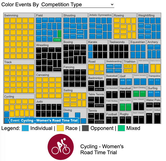
See all 339 Olympic Events in the Tokyo 2020/2021 Olympics
It had always seemed like the most decorated US Olympians tended to be swimmers, so I wanted to see how all the various events are distributed across the different types of sports. Each sport (like swimming) has a number of individual events and are show in a treemap as a collection of boxes. And indeed swimming does have the most individual events of any of the sports in the 2020/2021 Olympics.
I also wanted to see how you can categorize the different Olympic events, so I looked at several different dimensions, which are color coded:
- Athlete Gender – Events are categorized into Men’s, Women’s, Mixed and Open Events. Mixed is when a specified number of Men and Women are in an event (i.e. one man and one woman) while Open events can be either Men or Women.
- Team vs Individual – Events are categorized into whether the competitors are individuals or a team (more than one individual)
- Competition Type – Events are categorized into the type of competition, such as a Race (competitors are performing simultaneously to see who finishes first), Individual (where the competitor performs the event by themselves), Opponent (where the competition is one opponent vs another) or Mixed (where there’s some combination of these types)
- How winner are Determined – Events are categorized by the type of scoring: Timed (including all races), Judged, Scored (either in ball sports such as soccer or tennis, or in fighting sports like boxing and wrestling), Completion (where each competitor attempts to complete a jump or lift and the winner is the one who can complete the highest level), Distance (jumping and throwing events) and Hybrid (a combination of these types).
The sports with the largest number of individual events is swimming, then track, cycling, and field. Some the fighting sports have many individual events but they are all exclusive categories (i.e. you can’t compete in two different boxing or wrestling events).
Sources and Tools:
I grabbed a list of Olympic sports from Wikipedia and manually coded the information about gender, competition type and other factors. The visualization uses the plotly.js open source graphing library and HTML/CSS/Javascript code for the interactivity and UI.

Early Retirement Calculators and Tools
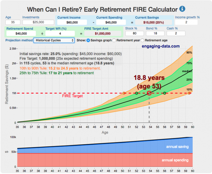
Interested in Early Retirement or FIRE (Financial Independence to Retire Early)?
Here are some interactive and educational planning tools that I developed to help you understand the concepts of FIRE and calculate how long it will take to achieve retirement and how likely you are to survive retirement. Click on the tools below to try them out.
Financial Independence Calculators
Regardless of where you are on your path to FIRE, there are several types of tools that are useful:
Planning to get to retirement
How long and how safe will your retirement be?
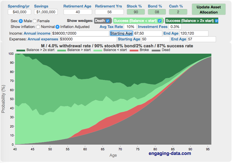
Rich, Broke or Dead? Will your Money Last Through Early Retirement?
Simulating retirement portfolio survival probability and human longevity
Determining the appropriate withdrawal rate (i.e. is 4% best?)
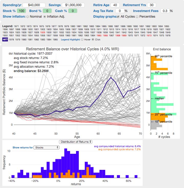
Understanding portfolio simulations and historical cycles
Interactive tool lets you explore the concept of historical simulations and understand how to determine a safe withdrawal rate
Tracking Progress to Retirement Target
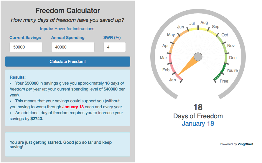
Financial freedom calculator / calendar
Track your progress to retirement by calculating days of “freedom”, the number of days your savings could support you per year
These tools all focus on the concept of FIRE. FIRE is the concept that revolves around saving and investing to achieve Financial Independence (FI) and to potentially Retire Early (RE). One of the core concepts is that once you can save up enough money, you can retire by withdrawing a fraction of this money annually to cover your living expenses. Other important topics related to this core concept have to do with reducing spending so you can save money and investing so your money can grow and sustain your retirement over many decades.
Other visualizations and tools related to Financial Independence
These tools relate to taxes and stock market returns.
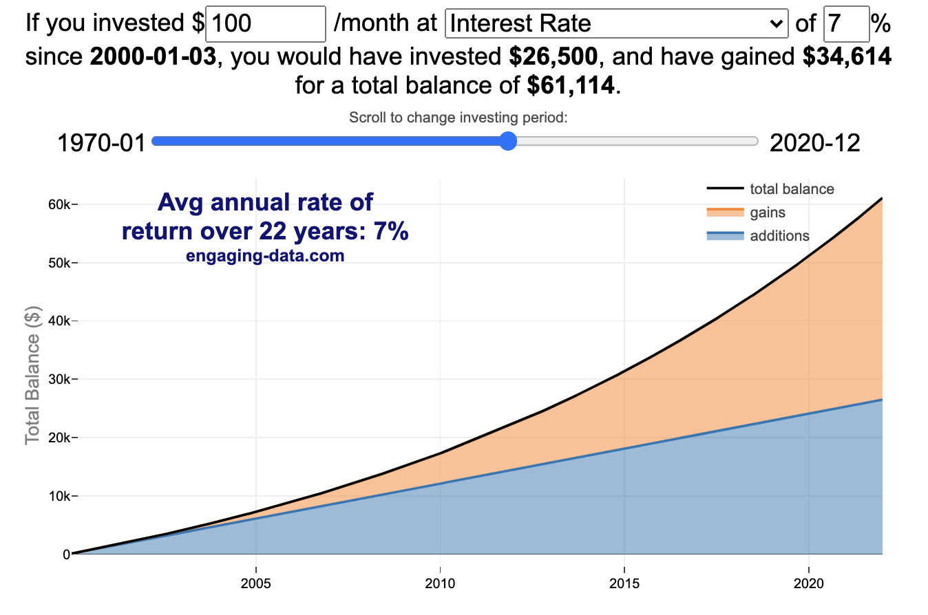
Calculating Returns from Periodic Investments
Visualizing Market Returns
Understanding Market Timing
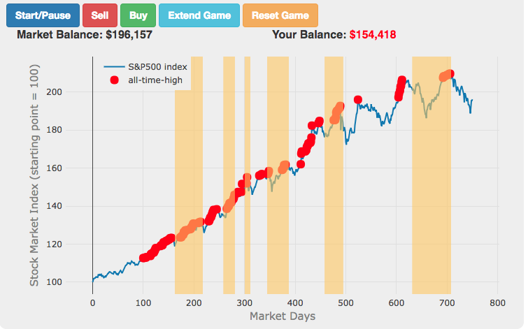
Market Timing Game
How difficult is it to time the stock market?
Income Taxes
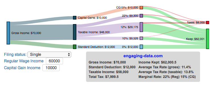
Income Tax Bracket Calculator
Tax bracket calculator to visualize how income and capital gains taxed
Data Sources and Tools:
See the individual tool to learn more about how it was made.
California Rainfall Totals

How do current California rainfall and precipitation totals compare with Historical Averages?
If you are lookin at this visualization, it’s likely winter in California and that means the rainy season (snowy in the mountains). I wanted to visualize how the current year compares with historical levels for this time of year. I used data for California rainfall totals from the California Department of Water Resources. Other California water-related visualizations include reservoir levels in the state as well.
There are three sets of stations that are tracked in the data and these plots:
- Northern Sierra 8-station index
- Tulare Basin 6-station index
- San Joaquin 5-station index
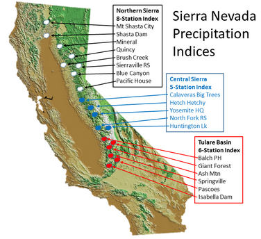
These stations are tracked because they provide important information about the state’s water supply (most of which originates from the Sierra Nevada Mountains). Data from the CDEC website appears to be updated at around 8:30am PST each day.
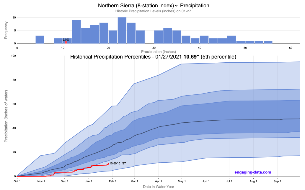
The visualization consists of two primary graphs both of which show the range of historical values for precipitation. The top graph is a histogram of water year precipitation totals on the specified date (in blue) as well as the precipitation total for the current water year in red.
The second graph shows the percentiles of precipitation over the course of the historical water year, spreading out like a cone from the start of the water year (October 1). You can see the current water year plotted on this to show how it compares to historical values. It also shows the present precipitation level and its percentile within the historical data for the day of the water year.
You can hover (or click) on the graph to audit the data a little more clearly.
Sources and Tools
Data is downloaded from the California Data Exchange Center website of the California Department of Water Resources using a python script. The data is processed in javascript and visualized here using HTML, CSS and javascript and the open source Plotly javascript graphing library.
How much wealth do the world’s richest billionaires have?
This dataviz compares how rich the world’s top billionaires are, showing their wealth as a treemap. The treemap is used to show the relative size of their wealth as boxes and is organized in order from largest to smallest.
User controls let you change the number of billionaires shown on the graph as well as group each person by their country or industry. If you group by country or industry, you can also click on a specific grouping to isolate that group and zoom in to see the contents more clearly. Hovering over each of the boxes (especially the smaller ones) will give you a popup that lets you see their name, ranking and net worth more clearly.
The popup shows how much total wealth the top billionaires control and for context compare it to the wealth of a certain number of households in the US. The comparison isn’t ideal as many of the billionaires are not from the US, but I think it still provides a useful point of comparison.
This visualization uses the same data that I needed in order to create my “How Rich is Elon Musk?” visualization. Since I had all this data, I figured I could crank out another related graph.
Sources and Tools:
Data from Bloomberg’s Billionaire’s index is downloaded regularly using a python script. Data on US household net worth is from DQYDJ’s net worth percentile calculator.
The treemap is created using the open-source Plotly javascript visualization library, as well as HTML, CSS and Javascript code to create interactivity and UI.
Using up our carbon budget
How much more CO2 can we emit if we want to keep the global temperature rise below 1.5°C or 2°C?
Every bit of CO2 we release is one step closer to using up our carbon budget.
Click on the animate button (or use the slider) to see how we have used up our carbon budget to limit global warming to 1.5°C or 2°C.
Climate change is the result of greenhouse gases such as CO2 and methane from human activities. The amount of CO2 and other greenhouse gases in the atmosphere determines how much of the incoming solar radiation is trapped as heat. Since CO2 is the most common greenhouse gas and very long lived in the atmosphere, there’s a good correlation between the total amount of human CO2 emissions and the amount of warming that the earth will experience. This leads to the concept of a carbon budget.
What is the carbon budget?
For every ton of CO2 that is emitted into the atmosphere about half a ton becomes part of the atmosphere for the long term, assuming there’s no massive new program to remove CO2 from the atmosphere. And there’s a direct correlation between the atmospheric concentration of CO2 and the earth’s temperature. Scientists tend to look at milestones of 2°C or 1.5°C when thinking about potential future warming. There is some uncertainty, but the total amount of human CO2 emissions that will lead to a 1.5°C warming from pre-industrial levels is around 2200 billion metric tonnes of CO2 plus or minus a few hundred billion tons (or 460 billion metric tonnes from 2020). This unit is also written as GtCO2 or gigatonnes of CO2. The values for the budget for 2°C warming are 1310 GtCO2 from 2020 or 2993 GtCO2 from pre-industrial levels.
Shown below is a graph from the Carbon Brief that shows the uncertainty in estimates for the remaining carbon budget (from 2018) before having a 50% chance of exceeding 1.5°C warming. As you can see there’s a fairly large range.
Update: The article’s author Zeke Hausfather pointed me to an updated article with newer IPCC estimates for the carbon budget of these two warming milestones. I have updated the code to account for these two new values.
What may happen at 1.5 degrees of warming?
1.5°C (2.7°F) doesn’t sound like alot, but there are some pretty serious potential consequences that we’ll be dealing with. These include increasing the amount or frequency of the following:
- extreme heatwaves
- droughts
- extreme storms and precipitation events
- loss of wildlife and biodiversity
- sea level rise
- and impacts of human health
This NASA article has much more info on the specific issues related to this temperature rise. Ideally we’d keep warming to under 1.5°C but it looks likely that we may exceed 2°C unless we take fairly dramatic action to reduce or CO2 emissions from fossil fuel combustion and use cleaner/lower-carbon sources of energy, like renewables and nuclear power.
From 1750 to 2020, humans have emitted approximately 1683 GtCO2. The IPCC estimates that 460 GtCO2 would put us at 1.5°C warming and 1310 GtCO2 would put us at 2°C warming. These values give us an estimated total carbon budget of 2143 GtCO2 for 1.5°C and 2993 GtCO2 for 2°C warming.
You can really see how we are getting close to using up all of our 1.5°C carbon budget and the speed at which we are using it up, especially in the last few decades.
Sources and Tools:
Annual emissions data is from the Global Carbon Project. The visualization was made using the plotly.js open source graphing library and HTML/CSS/Javascript code for the interactivity and UI.
Visualizing the Orbit of the International Space Station (ISS)
Where is the International Space Station currently? And what pattern does it make as it orbits around the Earth?
This visualization shows the current location of the International Space Station (ISS), actually the point above the Earth that the station is closest to. It is approximately 260 miles (420 km) above the Earth’s surface The station began construction in 1998 and had its first long term residents in 2000.
The visualization can also show the animated future orbital path of the ISS using ephemeris calculations, which makes a nice, cool pattern over an approximately 3.9 day cycle, where it starts to repeat. The animation allows you to view the orbital patterns on the globe (orthographic projection) or a mercator or equirectangular projection.
One of the cooler features is to drag and rotate the globe view while the orbital paths are being drawn. You can also adjust the speed of the orbit as well as keep the ISS centered in your view while the globe spins around underneath it. If you select the “rotate earth” checkbox, it becomes apparent that the ISS is in a circular orbit around the earth and that the pattern being made is simply a function of the earth’s rotation underneath the orbit.
This visualization only shows the approximate location of the ISS as there are several confounding factors that are not represented here. The speed of the ISS changes somewhat over time as the station experiences a small amount of atmospheric drag, which slows the station over time. But it still goes over 7000 meters per second or about 17000 miles per hour. As it slows, its orbit decays so it falls closer to earth and it experiences even more atmospheric drag. Occasionally, the station is boosted up to a higher orbit to counteract this decay. Secondly the earth is not a perfect sphere and this also causes the calculations to be only approximately correct.
Some other cool facts about the International Space Station:
- the angle the orbit makes relative to the equator is 51.6 degrees (i.e. this means the highest and lowest latitudes it will reach are 51.6 degrees North and South and doesn’t orbit over the poles
- the circular orbit around the earth makes a sin wave pattern on 2D map projections (shown on the mercator and equirectangular projections
- one orbit takes about 90 minutes. This means there are approximately 16 orbits per day and astronauts aboard the ISS will see 16 sunrises and sunsets
Other cool space-related orbital art can be seen at the inner planet spirographs.
Here are a couple of images showing the final pattern made by the ISS on different map projections.
Sources and Tools:
I used the satellite.js javascript package and the ISS TLE file to calculate the position of the ISS.
The visualization was made using the d3.js open source graphing library and HTML/CSS/Javascript code for the interactivity and UI.
Visualizing Olympic Sports
See all 339 Olympic Events in the Tokyo 2020/2021 Olympics
It had always seemed like the most decorated US Olympians tended to be swimmers, so I wanted to see how all the various events are distributed across the different types of sports. Each sport (like swimming) has a number of individual events and are show in a treemap as a collection of boxes. And indeed swimming does have the most individual events of any of the sports in the 2020/2021 Olympics.
I also wanted to see how you can categorize the different Olympic events, so I looked at several different dimensions, which are color coded:
- Athlete Gender – Events are categorized into Men’s, Women’s, Mixed and Open Events. Mixed is when a specified number of Men and Women are in an event (i.e. one man and one woman) while Open events can be either Men or Women.
- Team vs Individual – Events are categorized into whether the competitors are individuals or a team (more than one individual)
- Competition Type – Events are categorized into the type of competition, such as a Race (competitors are performing simultaneously to see who finishes first), Individual (where the competitor performs the event by themselves), Opponent (where the competition is one opponent vs another) or Mixed (where there’s some combination of these types)
- How winner are Determined – Events are categorized by the type of scoring: Timed (including all races), Judged, Scored (either in ball sports such as soccer or tennis, or in fighting sports like boxing and wrestling), Completion (where each competitor attempts to complete a jump or lift and the winner is the one who can complete the highest level), Distance (jumping and throwing events) and Hybrid (a combination of these types).
The sports with the largest number of individual events is swimming, then track, cycling, and field. Some the fighting sports have many individual events but they are all exclusive categories (i.e. you can’t compete in two different boxing or wrestling events).
Sources and Tools:
I grabbed a list of Olympic sports from Wikipedia and manually coded the information about gender, competition type and other factors. The visualization uses the plotly.js open source graphing library and HTML/CSS/Javascript code for the interactivity and UI.
Early Retirement Calculators and Tools
Interested in Early Retirement or FIRE (Financial Independence to Retire Early)?
Here are some interactive and educational planning tools that I developed to help you understand the concepts of FIRE and calculate how long it will take to achieve retirement and how likely you are to survive retirement. Click on the tools below to try them out.
Financial Independence Calculators
Regardless of where you are on your path to FIRE, there are several types of tools that are useful:
Planning to get to retirement

How long and how safe will your retirement be?
Rich, Broke or Dead? Will your Money Last Through Early Retirement?
Simulating retirement portfolio survival probability and human longevity
Determining the appropriate withdrawal rate (i.e. is 4% best?)
Understanding portfolio simulations and historical cycles
Interactive tool lets you explore the concept of historical simulations and understand how to determine a safe withdrawal rate
Tracking Progress to Retirement Target
Financial freedom calculator / calendar
Track your progress to retirement by calculating days of “freedom”, the number of days your savings could support you per year
These tools all focus on the concept of FIRE. FIRE is the concept that revolves around saving and investing to achieve Financial Independence (FI) and to potentially Retire Early (RE). One of the core concepts is that once you can save up enough money, you can retire by withdrawing a fraction of this money annually to cover your living expenses. Other important topics related to this core concept have to do with reducing spending so you can save money and investing so your money can grow and sustain your retirement over many decades.
Other visualizations and tools related to Financial Independence
These tools relate to taxes and stock market returns.
Calculating Returns from Periodic Investments
Visualizing Market Returns
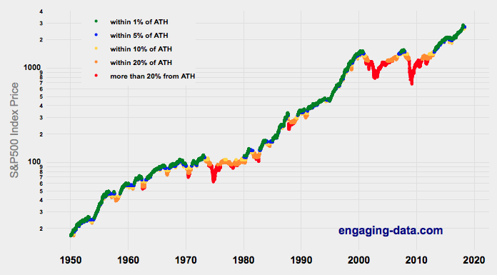
Understanding Market Timing
How difficult is it to time the stock market?
Market Timing Game
Income Taxes
Tax bracket calculator to visualize how income and capital gains taxed
Income Tax Bracket Calculator
Data Sources and Tools:
See the individual tool to learn more about how it was made.
California Rainfall Totals
How do current California rainfall and precipitation totals compare with Historical Averages?
If you are lookin at this visualization, it’s likely winter in California and that means the rainy season (snowy in the mountains). I wanted to visualize how the current year compares with historical levels for this time of year. I used data for California rainfall totals from the California Department of Water Resources. Other California water-related visualizations include reservoir levels in the state as well.
There are three sets of stations that are tracked in the data and these plots:
- Northern Sierra 8-station index
- Tulare Basin 6-station index
- San Joaquin 5-station index
These stations are tracked because they provide important information about the state’s water supply (most of which originates from the Sierra Nevada Mountains). Data from the CDEC website appears to be updated at around 8:30am PST each day.
The visualization consists of two primary graphs both of which show the range of historical values for precipitation. The top graph is a histogram of water year precipitation totals on the specified date (in blue) as well as the precipitation total for the current water year in red.
The second graph shows the percentiles of precipitation over the course of the historical water year, spreading out like a cone from the start of the water year (October 1). You can see the current water year plotted on this to show how it compares to historical values. It also shows the present precipitation level and its percentile within the historical data for the day of the water year.
You can hover (or click) on the graph to audit the data a little more clearly.
Sources and Tools
Data is downloaded from the California Data Exchange Center website of the California Department of Water Resources using a python script. The data is processed in javascript and visualized here using HTML, CSS and javascript and the open source Plotly javascript graphing library.
Recent Comments