Posts for Tag: reservoirs
Visualizing California’s Water Storage – Reservoirs and Snowpack
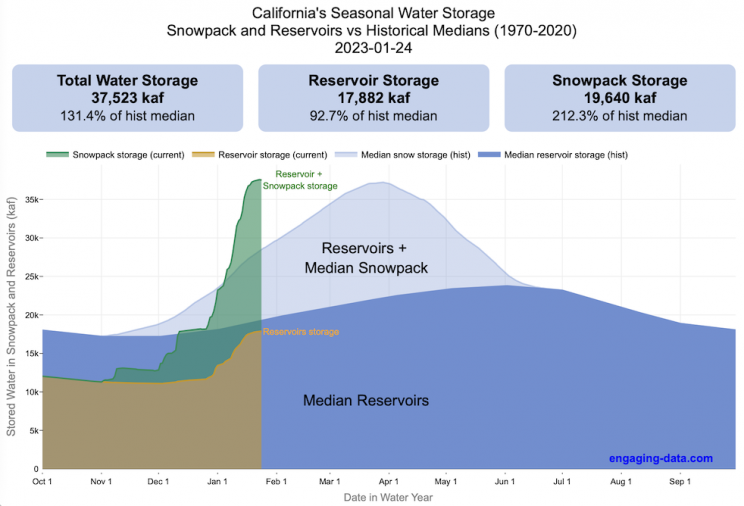
How much water is stored in California’s snowpack and reservoirs?
California’s snow pack is essentially another “reservoir” that is able to store water in the Sierra Nevada mountains. Graphing these things together can give a better picture of the state of California’s water and drought.
The historical median (i.e. 50th percentile) for snow pack water content is stacked on top of the median for reservoirs storage (shown in two shades of blue). The current water year reservoirs is shown in orange and the current year’s snow pack measurement is stacked on top in green. What is interesting is that the typical peak snow pack (around April 1) holds almost as much water (about 2/3 as much) as the reservoirs typically do. However, the reservoirs can store these volumes for much of the year while the snow pack is very seasonal and only does so for a short period of time.
Snowpack is measured at 125 different snow sensor sites throughout the Sierra Nevada mountains. The reservoir value is the total of 50 of the largest reservoirs in California. In both cases, the median is derived from calculating the median values for each day of the year from historical data from these locations from 1970 to 2021.
I’ve been slowly building out the water tracking visualizations tools/dashboards on this site. And with the recent rains (January 2023), there has been quite a bit of interest in these visualizations. One data visualization that I’ve wanted to create is to combine the precipitation and reservoir data into one overarching figure.
Creating the graph
I recently saw one such figure on Twitter by Mike Dettinger, a researcher who studies water/climate issues. The graph shows the current reservoir and snowpack water content overlaid on the historic levels. It is a great graph that conveys quite a bit of info and I thought I would create an interactive version of these while utilizing the automated data processing that’d I’d already created to make my other graphs/dashboards.
Time for another reservoirs-plus-snowpack storage update….LOT of snow up there now and the big Sierra reservoirs (even Shasta!) are already benefitting. Still mostly below average but moving up. Snow stacking up in UCRB. @CW3E_Scripps @DroughtGov https://t.co/2eZgNArahy pic.twitter.com/YEH4IYKlnH
— Mike Dettinger (@mdettinger) January 15, 2023
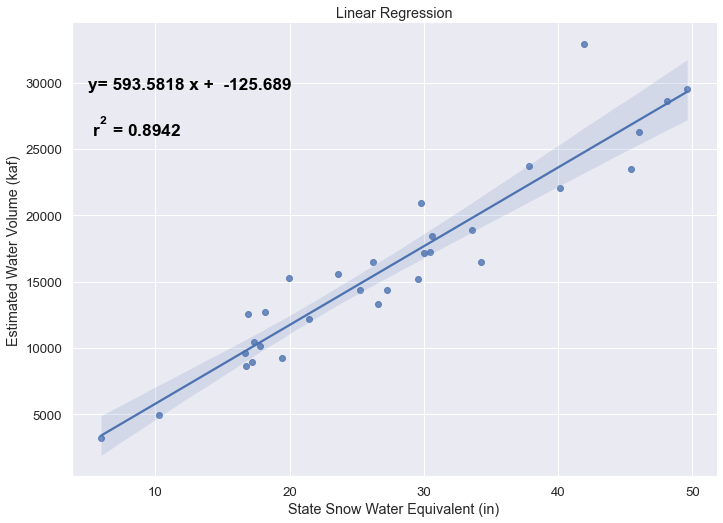
The challenge was to convert inches of snow water equivalent into a total volume of water in the snowpack, which I asked Mike about. He pointed me to a paper by Margulis et al 2016 that estimates the total volume of water in the Sierra snowpack for 31 years. Since I already had downloaded data on historical snow water equivalents for these same years, I could correlate the estimated peak snow water volume (in cubic km) to the inches of water at these 120 or so Sierra snow sensor sites. I ran a linear regression on these 30 data points. This allowed me to estimate a scaling factor that converts the inches of water equivalent to a volume of liquid water (and convert to thousands of acre feet, which is the same unit as reservoirs are measured in).
This scaling factor allows me to then graph the snowpack water volume with the reservoir volumes.
See my snowpack visualization/post to see more about snow water equivalents.
My numbers may differ slightly from the numbers reported on the state’s website. The historical percentiles that I calculated are from 1970 until 2020 while I notice the state’s average is between 1990 and 2020.
You can hover (or click) on the graph to audit the data a little more clearly.
Sources and Tools
Data is downloaded from the California Data Exchange Center website of the California Department of Water Resources using a python script. The data is processed in javascript and visualized here using HTML, CSS and javascript and the open source Plotly javascript graphing library.

Interactive California Reservoir Levels Dashboard
How much water is in California’s reservoirs?
Check out my new Colorado river reservoirs visualization.
I also added the ability to select specific reservoirs to display on the graph and share a custom URL which will point those selected reservoirs (click on “list” button on top right of dashboard).
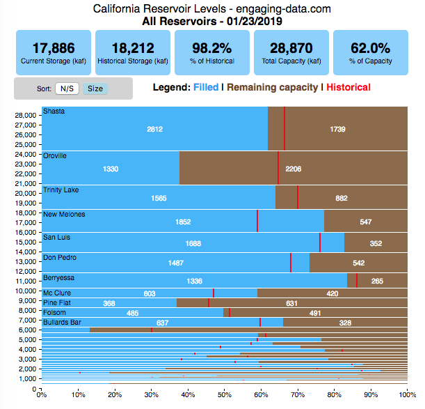
If you are reading this, it’s probably the winter rainy season in California again, and time to check on the status of the water in the California reservoirs. I previously made a “bar graph” showing the overall level of water in the major California reservoirs. This dashboard provides a bit more detail on the state of each of the reservoirs while also showing an aggregate total. It updates hourly using data from the California Department of Water Resources (DWR) website, giving an up-to-date picture of California reservoir levels.
This is a marimekko (or mekko) graph which may take some time to understand if you aren’t used to seeing them. Each “row” represents one reservoir, with bars showing how much of the reservoir is filled (blue) and unfilled (brown). The height of the “row” indicates how much water the reservoir could hold. Shasta is the reservoir with the largest capacity and so it is the tallest row. The proportion of blue to brown will show how full it is, while the red line shows the historical level that reservoir is typically at for this date of the water year. The blue line indicates the reservoir’s water level one year ago today. There are many very small reservoirs (relative to Shasta) so the bars will be very thin to the point where they are barely a sliver or may not even show up.
Instructions:
If you are on a computer, you can hover your cursor over a reservoir and the dashboard at the top will provide information about that individual reservoir. If you are on a mobile device you can tap the reservoir to get that same info. It’s not possible to see or really interact with the tiniest slivers. The main goal of this visualization is to provide a quick overview of the status of the main reservoirs in the state and how they compare to historical levels.
You can sort the mekko graph by size – largest at the top to smallest at the bottom – or by reservoir location, from north to south.
If you click on the “list” button in the top right of the dashboard, it will show a list of the reservoirs (in order of size from largest to smallest) and you can check which ones you would like to display. You can also share a custom URL by clicking the “Save URL” button which will put the custom URL into the URL bar of your browser which you can then copy and share. You can also use it to monitor only the reservoirs you are most interested in.
Units are in kaf, thousands of acre feet. 1 kaf is the amount of water that would cover 1 acre in one thousand feet of water (or 1000 acres in water in 1 foot of water). It is also the amount of water in a cube that is 352 feet per side (about the length of a football field). Shasta is very large and could hold about 3.5 cubic kilometers of water at full (but not flood) capacity.
Data and Tools
The data on water storage comes from the California Department of Water Resources’ (DWR) Data Exchange Center. Python is used to extract the data from this page hourly and wrangle the data in to a clean format. Visualization was done in javascript and specifically the D3.js visualization library. It was my first time using D3 and it took me a long time to get up to speed. It takes a fair amount of work to make graphs compared to other more plug-and-play libraries but its very customizable, which is a plus. It was the only tool that I could find that would allow me to make a vertical marimekko graph.

How Fast Are California Reservoirs Filling Up?
Update: I added a date slider to let you scrub through dates as well as the ability to pause the animation.
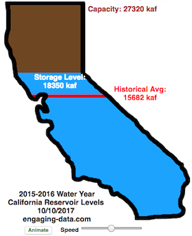
In my California water levels visualization, I presented a “bar graph” showing the amount of water currently in California’s reservoirs. However, I thought it’d be interesting to see how this has changed over the course of the last few months, since the state has gotten alot of rain and snow recently.
This visualizations “animates” the graph for recent history (going back to October 1, 2015) showing how the recent rains (or lack thereof) has been caused the levels of the reservoirs in California to rise (and fall).
The historical average represents a daily average reservoir level. It changes for each day of the water year to represent seasonality of precipitation and runoff.
Click the “animate” button below the figure and you can use the slider to change the speed of animation as it cycles through the days. I added a Date slider which lets you scrub through all the dates and animate from different points. (more…)
How Much Water is in California Reservoirs? – Current and Historical Visualization
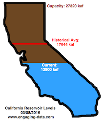
**Check out the new reservoirs dashboard**
California has had an issue with drought, especially for the past few years now. Recently, 2016-2017’s El Nino weather patterns has brought a significant amount of rain to the state and helped alleviate some, but not all, of the major issues.
I’ve been very curious to understand how the rain storms we experience are lessening the impact of the drought, and whether one wet season (like 2016-2017) can really “get the state out of a drought”. One way to assess this is to look at the status of California reservoirs.
Visualizing California’s Water Storage – Reservoirs and Snowpack
How much water is stored in California’s snowpack and reservoirs?
California’s snow pack is essentially another “reservoir” that is able to store water in the Sierra Nevada mountains. Graphing these things together can give a better picture of the state of California’s water and drought.
The historical median (i.e. 50th percentile) for snow pack water content is stacked on top of the median for reservoirs storage (shown in two shades of blue). The current water year reservoirs is shown in orange and the current year’s snow pack measurement is stacked on top in green. What is interesting is that the typical peak snow pack (around April 1) holds almost as much water (about 2/3 as much) as the reservoirs typically do. However, the reservoirs can store these volumes for much of the year while the snow pack is very seasonal and only does so for a short period of time.
Snowpack is measured at 125 different snow sensor sites throughout the Sierra Nevada mountains. The reservoir value is the total of 50 of the largest reservoirs in California. In both cases, the median is derived from calculating the median values for each day of the year from historical data from these locations from 1970 to 2021.
I’ve been slowly building out the water tracking visualizations tools/dashboards on this site. And with the recent rains (January 2023), there has been quite a bit of interest in these visualizations. One data visualization that I’ve wanted to create is to combine the precipitation and reservoir data into one overarching figure.
Creating the graph
I recently saw one such figure on Twitter by Mike Dettinger, a researcher who studies water/climate issues. The graph shows the current reservoir and snowpack water content overlaid on the historic levels. It is a great graph that conveys quite a bit of info and I thought I would create an interactive version of these while utilizing the automated data processing that’d I’d already created to make my other graphs/dashboards.
Time for another reservoirs-plus-snowpack storage update….LOT of snow up there now and the big Sierra reservoirs (even Shasta!) are already benefitting. Still mostly below average but moving up. Snow stacking up in UCRB. @CW3E_Scripps @DroughtGov https://t.co/2eZgNArahy pic.twitter.com/YEH4IYKlnH
— Mike Dettinger (@mdettinger) January 15, 2023
The challenge was to convert inches of snow water equivalent into a total volume of water in the snowpack, which I asked Mike about. He pointed me to a paper by Margulis et al 2016 that estimates the total volume of water in the Sierra snowpack for 31 years. Since I already had downloaded data on historical snow water equivalents for these same years, I could correlate the estimated peak snow water volume (in cubic km) to the inches of water at these 120 or so Sierra snow sensor sites. I ran a linear regression on these 30 data points. This allowed me to estimate a scaling factor that converts the inches of water equivalent to a volume of liquid water (and convert to thousands of acre feet, which is the same unit as reservoirs are measured in).
This scaling factor allows me to then graph the snowpack water volume with the reservoir volumes.
See my snowpack visualization/post to see more about snow water equivalents.
My numbers may differ slightly from the numbers reported on the state’s website. The historical percentiles that I calculated are from 1970 until 2020 while I notice the state’s average is between 1990 and 2020.
You can hover (or click) on the graph to audit the data a little more clearly.
Sources and Tools
Data is downloaded from the California Data Exchange Center website of the California Department of Water Resources using a python script. The data is processed in javascript and visualized here using HTML, CSS and javascript and the open source Plotly javascript graphing library.
Interactive California Reservoir Levels Dashboard
How much water is in California’s reservoirs?
Check out my new Colorado river reservoirs visualization.
I also added the ability to select specific reservoirs to display on the graph and share a custom URL which will point those selected reservoirs (click on “list” button on top right of dashboard).
If you are reading this, it’s probably the winter rainy season in California again, and time to check on the status of the water in the California reservoirs. I previously made a “bar graph” showing the overall level of water in the major California reservoirs. This dashboard provides a bit more detail on the state of each of the reservoirs while also showing an aggregate total. It updates hourly using data from the California Department of Water Resources (DWR) website, giving an up-to-date picture of California reservoir levels.
This is a marimekko (or mekko) graph which may take some time to understand if you aren’t used to seeing them. Each “row” represents one reservoir, with bars showing how much of the reservoir is filled (blue) and unfilled (brown). The height of the “row” indicates how much water the reservoir could hold. Shasta is the reservoir with the largest capacity and so it is the tallest row. The proportion of blue to brown will show how full it is, while the red line shows the historical level that reservoir is typically at for this date of the water year. The blue line indicates the reservoir’s water level one year ago today. There are many very small reservoirs (relative to Shasta) so the bars will be very thin to the point where they are barely a sliver or may not even show up.
Instructions:
If you are on a computer, you can hover your cursor over a reservoir and the dashboard at the top will provide information about that individual reservoir. If you are on a mobile device you can tap the reservoir to get that same info. It’s not possible to see or really interact with the tiniest slivers. The main goal of this visualization is to provide a quick overview of the status of the main reservoirs in the state and how they compare to historical levels.
You can sort the mekko graph by size – largest at the top to smallest at the bottom – or by reservoir location, from north to south.
If you click on the “list” button in the top right of the dashboard, it will show a list of the reservoirs (in order of size from largest to smallest) and you can check which ones you would like to display. You can also share a custom URL by clicking the “Save URL” button which will put the custom URL into the URL bar of your browser which you can then copy and share. You can also use it to monitor only the reservoirs you are most interested in.
Units are in kaf, thousands of acre feet. 1 kaf is the amount of water that would cover 1 acre in one thousand feet of water (or 1000 acres in water in 1 foot of water). It is also the amount of water in a cube that is 352 feet per side (about the length of a football field). Shasta is very large and could hold about 3.5 cubic kilometers of water at full (but not flood) capacity.
Data and Tools
The data on water storage comes from the California Department of Water Resources’ (DWR) Data Exchange Center. Python is used to extract the data from this page hourly and wrangle the data in to a clean format. Visualization was done in javascript and specifically the D3.js visualization library. It was my first time using D3 and it took me a long time to get up to speed. It takes a fair amount of work to make graphs compared to other more plug-and-play libraries but its very customizable, which is a plus. It was the only tool that I could find that would allow me to make a vertical marimekko graph.
How Fast Are California Reservoirs Filling Up?
Update: I added a date slider to let you scrub through dates as well as the ability to pause the animation.
In my California water levels visualization, I presented a “bar graph” showing the amount of water currently in California’s reservoirs. However, I thought it’d be interesting to see how this has changed over the course of the last few months, since the state has gotten alot of rain and snow recently.
This visualizations “animates” the graph for recent history (going back to October 1, 2015) showing how the recent rains (or lack thereof) has been caused the levels of the reservoirs in California to rise (and fall).
The historical average represents a daily average reservoir level. It changes for each day of the water year to represent seasonality of precipitation and runoff.
Click the “animate” button below the figure and you can use the slider to change the speed of animation as it cycles through the days. I added a Date slider which lets you scrub through all the dates and animate from different points. (more…)
How Much Water is in California Reservoirs? – Current and Historical Visualization
**Check out the new reservoirs dashboard**
California has had an issue with drought, especially for the past few years now. Recently, 2016-2017’s El Nino weather patterns has brought a significant amount of rain to the state and helped alleviate some, but not all, of the major issues.
I’ve been very curious to understand how the rain storms we experience are lessening the impact of the drought, and whether one wet season (like 2016-2017) can really “get the state out of a drought”. One way to assess this is to look at the status of California reservoirs.
Recent Comments