Posts for Tag: map
What kinds of vehicles do Americans drive?
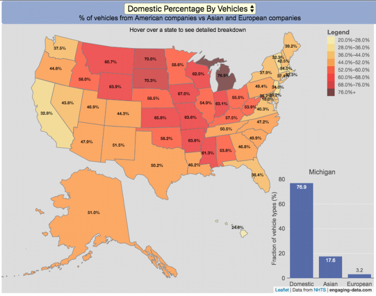
Americans are known for loving cars and driving quite a bit. Drivers in the United States own more cars and drive more than those in any other country. So what kinds of vehicles do Americans drive? This visualization looks at the types of vehicles (by body type and country of origin) across the 50 States and Washington DC.
You can view two different attributes about the types of vehicles in use in the United States:
- Body type of passenger vehicles
- Manufacturer/Brand region of origin
The different categories of passenger vehicles include:
- Cars – includes sedans, hatchbacks, wagons and sports cars
- Pickup trucks
- SUVs
- Vans – includes Minivans and full-size vans
Classification of the vehicles manufacturer (US, Asia or Europe) is based on the company’s headquarters and not the place of vehicle manufacturing. So a Toyota here is an Asian vehicle even if it was assembled in Mississippi.
It is pretty interesting to see the regional differences in vehicle types (cars vs trucks and SUVs) and vehicle brand (domestic vs foreign). Michigan, especially, stands out with their very high domestic ownership. It makes sense as Detroit is the home of the big three US auto manufacturers (Ford, GM and Chrysler). And I hear there’s a very strong culture of owning American cars there (and employee, friends and family discounts as well).
The data is derived from a survey by the US Department of Transportation called the National Household Travel Survey (NHTS) released in 2017. The following is a quote from the NHTS webpage:
The National Household Travel Survey (NHTS) is the source of the Nation’s information about travel by U.S. residents in all 50 States and Washington, DC. This inventory of travel behavior includes trips made by all modes of travel (i.e., private vehicle, public transportation, pedestrian, and cycling) and for all purposes (e.g., travel to work, school, recreation, and personal/family trips). It provides information to assist transportation planners and policymakers who need comprehensive data on travel and transportation patterns in the United States.
Data and Tools:
Data, as stated before, comes from the US Department of Transportation’s National Household Travel Survey (NHTS). That data was processed to identify vehicle characteristics by state and plotted using javascript and the open-source leaflet map library.

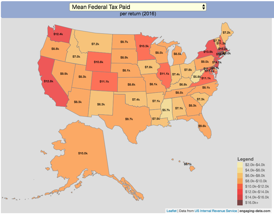
How Much Does Each State Pay In Taxes?

Given that tax day has just passed, I thought it would be good to check out some data on taxes. The IRS provides a great resource on tax data that I’ve only just gotten into. I think I’ll be able to do more with this in the future. This one looks at how taxes paid varies by state and presents it as a choropleth map (coloring states based on certain categories of tax data).
You can choose from a number of different categories:
- Mean Federal Tax Paid
- Mean Adjusted Gross Income
- Mean State/Local Tax
- Mean Combined (Fed/State/Local) Tax
- Percent Income from Dividends and Capital Gains
- Percent of Returns with Itemized Deductions
- Number of Tax Returns
- Mean Federal Tax Rate
- Mean State/Local Tax Rate
- Mean Combined (Fed/State/Local) Rate
- Total Federal Tax Liability
I may add more categories in the future, so if you have ideas of tax data you want to see visualized let me know and I’ll see what I can do.
For other tax-related tools and visualizations see my tax bracket calculator and visualization of marginal tax rates.
**Click Here to view other financial-related tools and data visualizations from engaging-data**
Data and Tools:
Data on tax returns by state is from the IRS website in an excel format. The map was made using the leaflet open source mapping library. Data was compiled in excel and calculations made using javascript.
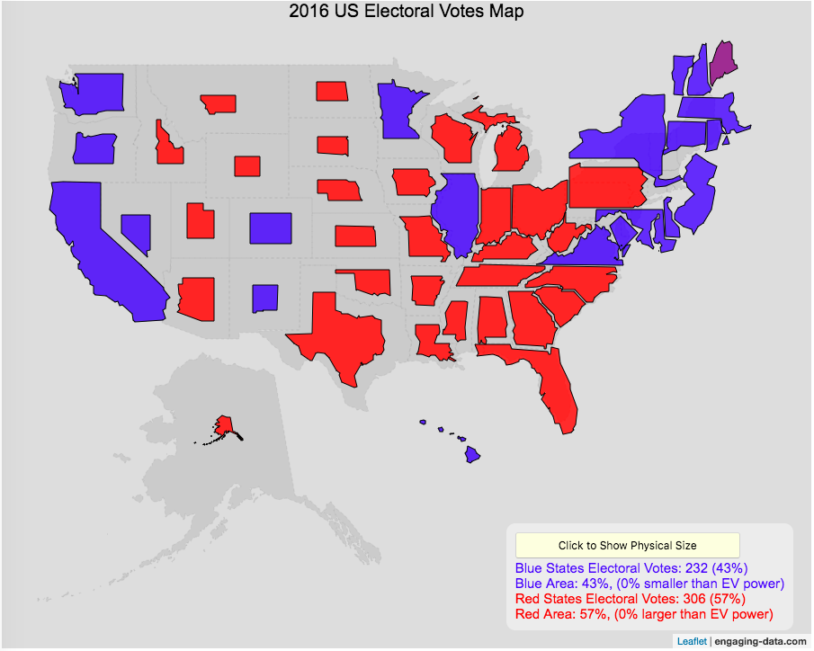
Sizing the States Based On Electoral Votes
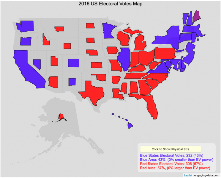
Electoral Vote maps give more visual power to states with large areas but few electoral votes
This map shows the electoral outcome of the 2016 and 2020 US Presidential Election and is color coded red if the state was won by Donald Trump (R) and blue if the state was won by Hilary Clinton or Joe Biden. When looking at the map, red states tend to be larger in area than blue states, but also generally have lower populations. This gives a misleading impression that the electoral share is “redder” than it actually is. For 2016, we can see that Trump won 306 electoral votes or (57% of the total electoral votes), but the map is shaded such that 73% of the area of the US is colored red. Similarly, Clinton won 232 electoral votes, but the map is shaded such that only 27% of the map is colored blue. For 2020, we can see that Biden won 306 electoral votes or (57% of the total electoral votes), but the map is shaded such that 38% of the area of the US is colored blue. Trump won 232 electoral votes, but the map is shaded such that 62% of the map is colored red.
The map shrinks the states with low electoral votes relative to its area and increases the size of states with large numbers of electoral votes relative to its area. On average blue states grow as they are under-represented visually, while red states tend to shrink quite a bit because they are over-represented visually. Alaska is the state that shrinks the most and DC and New Jersey are the areas that grow the most in the new map.
I think this gives a more accurate picture of how the states voted because it also gives a sense of the relative weight of those states votes.
Data and Tools:
Data on electoral votes is from Wikipedia. The map was made using the leaflet open source mapping library. Data was compiled and calculations on resizing states were made using javascript.
Electric Vehicle Sales By State
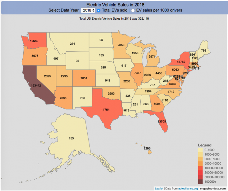
Where are electric vehicles being sold in the United States?
Electric vehicles are any vehicle that can be plugged in to recharge a battery that provides power to move the vehicle. Two broad classes are battery electric vehicles (BEVs) which only have batteries as their power source and plug-in hybrid electric vehicles (PHEVs) which have an alternative or parallel power source, typically a gasoline engine. PHEVs are built so that when the battery is depleted, the car can still run on gasoline and operate like a hybrid vehicle similar to a regular Toyota Prius (which is not plugged in at all).
Electric vehicles (EVs) have been sold in the US since 2011 (a few commercial models were sold previous to that but not in any significant numbers) and some conversions were also available. Since then, the number of EVs sold has increased pretty significantly. I wanted to look at the distribution of where those vehicles were located. What is interesting is that California accounts for around 50% of the electric vehicles sold in the United States. Other states have lower rates of EV adoption (in some cases much, much lower). There are many reasons for this, including beneficial policies, public awareness, a large number of potential early adopters and a mild climate. Even so, the EV heatmap of California done early shows that sales are mostly limited to the Bay Area, and LA areas.
The map shows data for total electric vehicle sales by state for years 2016, 2017 or 2018 and also the number of EV sales per 1000 licensed drivers (this is all people in the state with a drivers license, not drivers of EVs). If you hover over a state, you can see both data points for that state.
It will be interesting to see how the next generation of electric vehicles continues to improve, lower in price and become more popular with drivers outside of early adopters.
Click here to see other Energy-Related visualizations
Data and Tools:
Data on electric vehicle sales is from the Auto Alliance website. Licensed driver data was downloaded from the US Department of Transportation’s Bureau of Transportation Statistics website. The map was made using the leaflet open source mapping library. Data was compiled and calculated using javascript.

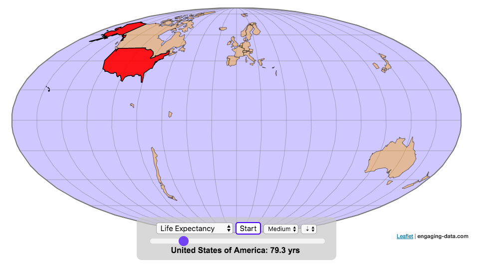
Assembling the World Country-By-Country

Watch the world assemble country-by-country based on a specific statistic
This map lets you watch as the world is built-up one country at a time. This can be done along the following statistical dimensions:
- Country name
- Population – from United Nations (2017)
- GDP – from United Nations (2017)
- GDP per capita
- GDP per area
- Land Area – from CIA factbook (2016)
- Population density
- Life expectancy – from World Health Organization (2015)
- or a random order
These statistics can be sorted from small to large or vice versa to get a view of the globe and its constituent countries in a unique and interesting way. It’s a bit hypnotic to watch as the countries appear and add to the world one by one.
You can use this map to display all the countries that have higher life expectancy than the United States:
select “Life expectancy”, sort from “high to low” and use the scroll bar to move to the United States and you’ll get a picture like this:
or this map to display all the countries that have higher population density than the United States:
select “Population density, sort from “high to low” and use the scroll bar to move to the United States and you’ll get a picture like this:

I hope you enjoy exploring the countries of the world through this data viz tool. And if you have ideas for other statistics to add, I will try to do so.
Data and tools: Data was downloaded primarily from Wikipedia: Life expectancy from World Health Organization (2015) | GDP from United Nations (2017) | Population from United Nations (2017) | Land Area from CIA factbook (2016)
The map was created with the help of the open source leaflet javascript mapping library
World Population Distribution by Latitude and Longitude
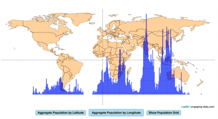
How is population distributed by latitude and longitude
This interactive map shows how population is distributed by latitude or longitude. It animates the creation of a bar graph by shifting population from its location on the map to aggregate population levels by latitude or longitude increments. Each “block” of the bar graph represents 1 million people. Population is highest in the northern hemisphere at 25-26 degrees North latitude and 77-78 degrees East Longitude.
Instructions:
It should be relatively explanatory. Press the “Aggregate Population by Latitude” button to make a plot of population by line of latitude (i.e. rows of the map).
Press the “Aggregate Population by Longitude” button to make a plot of population by line of longitude (i.e. columns of the map). To see the population distributed across the map, press the “Show Population Grid” button.
This map was inspired by some mapping work done by neilrkaye on twitter and reddit.
Data Sources and Tools:
This map projection is an equirectangular projection. Data on population density comes from NASA’s Socioeconomic Data and Applications Center (SEDAC) site and is displayed at the 1 degree resolution. This interactive visualization is made using the awesome leaflet.js javascript library.

What kinds of vehicles do Americans drive?
Americans are known for loving cars and driving quite a bit. Drivers in the United States own more cars and drive more than those in any other country. So what kinds of vehicles do Americans drive? This visualization looks at the types of vehicles (by body type and country of origin) across the 50 States and Washington DC.
You can view two different attributes about the types of vehicles in use in the United States:
- Body type of passenger vehicles
- Manufacturer/Brand region of origin
The different categories of passenger vehicles include:
- Cars – includes sedans, hatchbacks, wagons and sports cars
- Pickup trucks
- SUVs
- Vans – includes Minivans and full-size vans
Classification of the vehicles manufacturer (US, Asia or Europe) is based on the company’s headquarters and not the place of vehicle manufacturing. So a Toyota here is an Asian vehicle even if it was assembled in Mississippi.
It is pretty interesting to see the regional differences in vehicle types (cars vs trucks and SUVs) and vehicle brand (domestic vs foreign). Michigan, especially, stands out with their very high domestic ownership. It makes sense as Detroit is the home of the big three US auto manufacturers (Ford, GM and Chrysler). And I hear there’s a very strong culture of owning American cars there (and employee, friends and family discounts as well).
The data is derived from a survey by the US Department of Transportation called the National Household Travel Survey (NHTS) released in 2017. The following is a quote from the NHTS webpage:
The National Household Travel Survey (NHTS) is the source of the Nation’s information about travel by U.S. residents in all 50 States and Washington, DC. This inventory of travel behavior includes trips made by all modes of travel (i.e., private vehicle, public transportation, pedestrian, and cycling) and for all purposes (e.g., travel to work, school, recreation, and personal/family trips). It provides information to assist transportation planners and policymakers who need comprehensive data on travel and transportation patterns in the United States.
Data and Tools:
Data, as stated before, comes from the US Department of Transportation’s National Household Travel Survey (NHTS). That data was processed to identify vehicle characteristics by state and plotted using javascript and the open-source leaflet map library.
How Much Does Each State Pay In Taxes?
Given that tax day has just passed, I thought it would be good to check out some data on taxes. The IRS provides a great resource on tax data that I’ve only just gotten into. I think I’ll be able to do more with this in the future. This one looks at how taxes paid varies by state and presents it as a choropleth map (coloring states based on certain categories of tax data).
- Mean Federal Tax Paid
- Mean Adjusted Gross Income
- Mean State/Local Tax
- Mean Combined (Fed/State/Local) Tax
- Percent Income from Dividends and Capital Gains
- Percent of Returns with Itemized Deductions
- Number of Tax Returns
- Mean Federal Tax Rate
- Mean State/Local Tax Rate
- Mean Combined (Fed/State/Local) Rate
- Total Federal Tax Liability
I may add more categories in the future, so if you have ideas of tax data you want to see visualized let me know and I’ll see what I can do.
For other tax-related tools and visualizations see my tax bracket calculator and visualization of marginal tax rates.
**Click Here to view other financial-related tools and data visualizations from engaging-data**
Data and Tools:
Data on tax returns by state is from the IRS website in an excel format. The map was made using the leaflet open source mapping library. Data was compiled in excel and calculations made using javascript.
Sizing the States Based On Electoral Votes
Electoral Vote maps give more visual power to states with large areas but few electoral votes
This map shows the electoral outcome of the 2016 and 2020 US Presidential Election and is color coded red if the state was won by Donald Trump (R) and blue if the state was won by Hilary Clinton or Joe Biden. When looking at the map, red states tend to be larger in area than blue states, but also generally have lower populations. This gives a misleading impression that the electoral share is “redder” than it actually is. For 2016, we can see that Trump won 306 electoral votes or (57% of the total electoral votes), but the map is shaded such that 73% of the area of the US is colored red. Similarly, Clinton won 232 electoral votes, but the map is shaded such that only 27% of the map is colored blue. For 2020, we can see that Biden won 306 electoral votes or (57% of the total electoral votes), but the map is shaded such that 38% of the area of the US is colored blue. Trump won 232 electoral votes, but the map is shaded such that 62% of the map is colored red.
The map shrinks the states with low electoral votes relative to its area and increases the size of states with large numbers of electoral votes relative to its area. On average blue states grow as they are under-represented visually, while red states tend to shrink quite a bit because they are over-represented visually. Alaska is the state that shrinks the most and DC and New Jersey are the areas that grow the most in the new map.
I think this gives a more accurate picture of how the states voted because it also gives a sense of the relative weight of those states votes.
Data and Tools:
Data on electoral votes is from Wikipedia. The map was made using the leaflet open source mapping library. Data was compiled and calculations on resizing states were made using javascript.
Electric Vehicle Sales By State
Where are electric vehicles being sold in the United States?
Electric vehicles are any vehicle that can be plugged in to recharge a battery that provides power to move the vehicle. Two broad classes are battery electric vehicles (BEVs) which only have batteries as their power source and plug-in hybrid electric vehicles (PHEVs) which have an alternative or parallel power source, typically a gasoline engine. PHEVs are built so that when the battery is depleted, the car can still run on gasoline and operate like a hybrid vehicle similar to a regular Toyota Prius (which is not plugged in at all).
Electric vehicles (EVs) have been sold in the US since 2011 (a few commercial models were sold previous to that but not in any significant numbers) and some conversions were also available. Since then, the number of EVs sold has increased pretty significantly. I wanted to look at the distribution of where those vehicles were located. What is interesting is that California accounts for around 50% of the electric vehicles sold in the United States. Other states have lower rates of EV adoption (in some cases much, much lower). There are many reasons for this, including beneficial policies, public awareness, a large number of potential early adopters and a mild climate. Even so, the EV heatmap of California done early shows that sales are mostly limited to the Bay Area, and LA areas.
The map shows data for total electric vehicle sales by state for years 2016, 2017 or 2018 and also the number of EV sales per 1000 licensed drivers (this is all people in the state with a drivers license, not drivers of EVs). If you hover over a state, you can see both data points for that state.
It will be interesting to see how the next generation of electric vehicles continues to improve, lower in price and become more popular with drivers outside of early adopters.
Click here to see other Energy-Related visualizations
Data and Tools:
Data on electric vehicle sales is from the Auto Alliance website. Licensed driver data was downloaded from the US Department of Transportation’s Bureau of Transportation Statistics website. The map was made using the leaflet open source mapping library. Data was compiled and calculated using javascript.
Assembling the World Country-By-Country
Watch the world assemble country-by-country based on a specific statistic
- Country name
- Population – from United Nations (2017)
- GDP – from United Nations (2017)
- GDP per capita
- GDP per area
- Land Area – from CIA factbook (2016)
- Population density
- Life expectancy – from World Health Organization (2015)
- or a random order
These statistics can be sorted from small to large or vice versa to get a view of the globe and its constituent countries in a unique and interesting way. It’s a bit hypnotic to watch as the countries appear and add to the world one by one.
You can use this map to display all the countries that have higher life expectancy than the United States:
select “Life expectancy”, sort from “high to low” and use the scroll bar to move to the United States and you’ll get a picture like this:
or this map to display all the countries that have higher population density than the United States:
select “Population density, sort from “high to low” and use the scroll bar to move to the United States and you’ll get a picture like this:
I hope you enjoy exploring the countries of the world through this data viz tool. And if you have ideas for other statistics to add, I will try to do so.
Data and tools: Data was downloaded primarily from Wikipedia: Life expectancy from World Health Organization (2015) | GDP from United Nations (2017) | Population from United Nations (2017) | Land Area from CIA factbook (2016)
The map was created with the help of the open source leaflet javascript mapping library
World Population Distribution by Latitude and Longitude
How is population distributed by latitude and longitude
This interactive map shows how population is distributed by latitude or longitude. It animates the creation of a bar graph by shifting population from its location on the map to aggregate population levels by latitude or longitude increments. Each “block” of the bar graph represents 1 million people. Population is highest in the northern hemisphere at 25-26 degrees North latitude and 77-78 degrees East Longitude.
Instructions:
It should be relatively explanatory. Press the “Aggregate Population by Latitude” button to make a plot of population by line of latitude (i.e. rows of the map).
Press the “Aggregate Population by Longitude” button to make a plot of population by line of longitude (i.e. columns of the map). To see the population distributed across the map, press the “Show Population Grid” button.
This map was inspired by some mapping work done by neilrkaye on twitter and reddit.
Data Sources and Tools:
This map projection is an equirectangular projection. Data on population density comes from NASA’s Socioeconomic Data and Applications Center (SEDAC) site and is displayed at the 1 degree resolution. This interactive visualization is made using the awesome leaflet.js javascript library.
Recent Comments