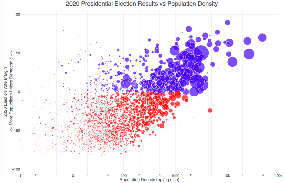
How do 2020 presidential election results correlate with population density?
The visualization I made about county election results and comparing land area to population size was very popular around the time of the 2020 presidential election. As the counties were represented by population, it was clear that democratic-leaning areas on that map tended to grow in size, while republican-leaning areas tended to shrink. This raised the question of exactly how population density correlates with election results.
Hover over (or click on) the bubbles to see information about the county.
It’s clear there is a very strong correlation between the vote margin and population density. Vote margin is the percentage amount that one candidate beat the other candidate by in the county (0% means a tie while 50% means that one candidate got 75% and the other got 25% of the voteshare). Population density is calculated as people per square mile in the county and is shown in the graph on a log scale, where each major grid line is 10 time greater than the previous one. This is done because there is one to two orders of magnitude difference in the densest counties (in New York City) and even moderately dense counties. There are also several counties with population density below 1 person per square mile (several in Alaska because of the size of their counties) but these are excluded from the graph.
Richmond County, NY (i.e. the Borough of Staten Island) is the densest county (17th densest) in the country that Trump won. The densest counties favored Biden quite heavily as he won 45 of the 50 densest counties in the country, which also tend to have a fairly high population.
This second graph is a histogram that specifically categorizes counties into discreet bins by population density. Note that they are on a log scale as well. You can toggle the graph to show the number of counties won by each candidate or the number of votes won in each of the population density bins. The black line shows the percentage of counties (or votes) won by the democratic candidate (Joe Biden) in each of those bins.
Hover over (or click on) the bars to see information about each county bin.
It’s pretty clear in these graphs that low population density areas clearly favor the republican while the denser areas favor the democrat.
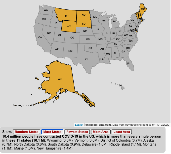
The number of US coronavirus cases is equal to the population of several states put together.
click on the buttons below to see a new set of states.
The number of Americans who have contracted the Coronavirus keeps going up with little indication of slowing down. This is an amazingly large number of cases is the highest in the world and I wanted to visualize how many people this actually is.
While the number of US COVID-19 cases is very large, comparing these number to the size of the populations in several states helps to provide more context. The visualization shows a random collection of states whose total population is equal to the latest coronavirus numbers. If you click the button you can see a different set of states that have a population equal to the current number of coronavirus cases.
The graph is updated daily using data from covidtracking.com. It’s important to note that the number of people with COVID-19 is an underestimate as many coronavirus cases are asymptomatic (i.e. people don’t get sick or show any symptoms) and the positivity rate of tests is quite high.
Stay safe out there: stay away from people and wear your mask!
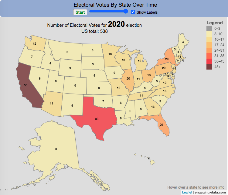
How many electoral votes did each state have across two centuries of elections?
This animation shows the number of electoral votes each state had during each of the 59 presidential elections in US history between 1788 and 2020. It’s interesting to see the number of US states and their relative population sizes (in terms of electoral votes) over many different presidential elections. The population is counted every 10 years in the census so if a presidential election occurs between a census, it likely will not see any difference in numbers of electoral votes, unless something else happens (such as addition of a new state to the country).
Instructions
You can use the slider to control the election year to focus on a specific election and toggle the animation by hitting the Start/Stop button. Hovering over each state will tell you the number of electoral votes and the percentage of the total number of electoral votes in that election.
In the elections during and immediately after the US Civil War, we also see some states whose electoral votes for president are not counted (shown in purple). Wyoming, the state with the lowest population in the US, has the highest number of electoral votes per person in the state, while the three most populous states, California, Florida and Texas have the least number of electoral votes per person. Wyoming has four times the number of electors per capita than these 3 states have (i.e. accounting for their population sizes). That will be the subject of another map dataviz.
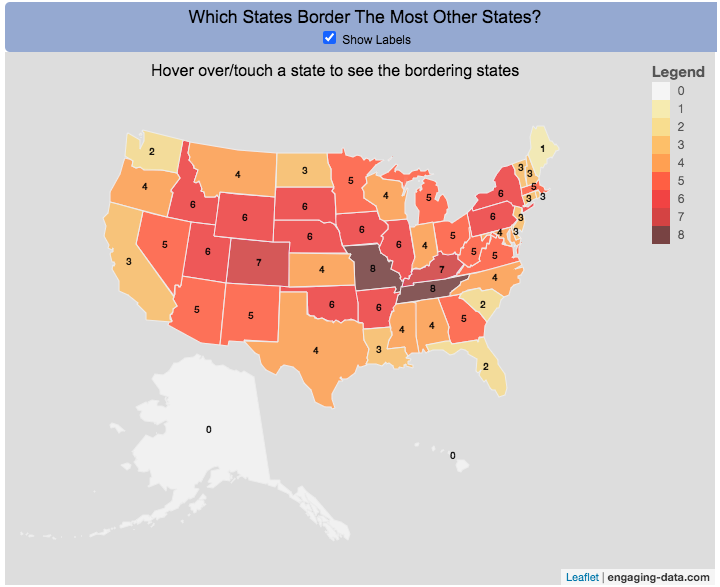
Interactive Choropleth of the Number of States That Border Each State
This is a fun little map that shows the number of states that border each state. I’m working on improving the interactivity of maps and this was a good project to try this with. The base map is a choropleth map which color codes each state by the number of states it shares a border with. If you hover over (or touch on mobile) a state, it will highlight the state and show you (and list) the bordering states.
It’s important to note that officially New York and Rhode Island share a water border (between Rhode Island and Long Island, NY) and that Michigan and Minnesota also share a border (in Lake Superior).
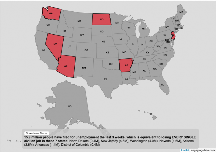
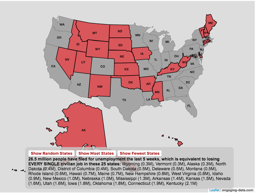
The number of Americans who have recently filed for unemployment due to the coronavirus pandemic is equal to the entire labor force of several states put together.
click on the button below to see a new set of states.
A record 16 million Americans just filed for unemployment due to the coronavirus pandemic at the end of March and early April 2020. This is an amazingly large number of people and I wanted to visualize how many people this actually is. For context, the US Department of Labor statistics states that in February 2020 (before the pandemic hit the United State) there were 164.2 million workers in the Civilian Labor Force.
The Bureau of Labor Statistics (BLS) site defines “Civilian Labor Force” as such:
“The labor force includes all people age 16 and older who are classified as either employed and unemployed, as defined below. Conceptually, the labor force level is the number of people who are either working or actively looking for work.”
This basically means that approximately 10% of the entire workforce of people (both employed and unemployed in Feb 2020) are now out of a job. While 10% is a large, unprecedented number in our lifetimes, comparing these number to the size of the workforce in several states helps to provide more context. The visualization shows a random collection of states whose total labor force is equal to the latest unemployment numbers. If you click the button you can see a different set of states that have the same total labor force.
Predictions are that the number of unemployed will grow as the shutdowns and social distancing measures to contain the virus continue through April and into May. I will update this graph to reflect new numbers as they come out.
And we can only hope that people will be able to manage these tough economic times until we contain the virus and the economy rebounds.
Stay safe out there: stay away from people and wash your hands!
The coronavirus (SARS-CoV-2) is literally affecting the entire globe right now and changing the way we live our lives here in the US and all over the world.
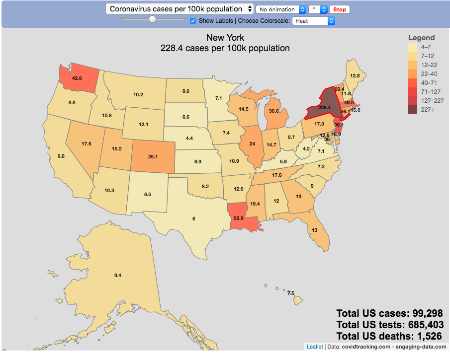
There are quite a number of different coronavirus-related dataviz out there, but as we shelter-in-place I wanted to add a map that looked at a number of different metrics that tell us about the coronavirus pandemic by US states and look at those metrics on a population basis.
There are a number of data sources that I’ve found that publish data about the coronavirus and the resulting disease (Covid-19) in the United States:
This map is based on the data compiled from covidtracking.com, partly because it has a good API and also lists testing, cases and deaths. The data I’ve included on the map is:
Numbers of coronavirus cases – i.e. tested positive for virus
Numbers of coronavirus tests administered
Numbers of deaths due to coronavirus
Each of these is also calculated per 100,000 population in the state:
Numbers of coronavirus cases per 100k people- i.e. tested positive for virus
Numbers of coronavirus tests administered per 100k people
Numbers of deaths due to coronavirus per 100k people
These latter metrics are important because numbers of cases or deaths can be obscured by small or large populations but per capita data (or per 100k capita data) can point out interesting outliers.
It is important to note that the data is far from perfect. There is probably significant underreporting of tests, cases and deaths. The data is a collection for the various local and state agencies that are working hard to deal with the medical, social and political ramifications of the pandemic, while also collecting data. We don’t know how many Americans have coronavirus because of lack of testing.
Also important is that the number of positive cases is a function of how much testing is taking place so cases does not necessarily represent the exact prevalence of the virus, though there will probably be good correlation between cases and actual coronavirus infections. Luckily it sounds like tests are becoming more widely available so hopefully those numbers will go up sharply.
For more information about the virus and the disease and data collection, you can find good information on the CDC website.


Recent Comments