Posts for Tag: geography
US County Electoral Map – Land Area vs Population
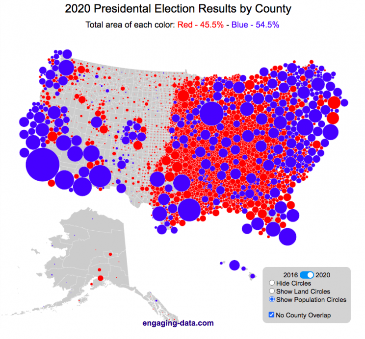
County-level Election Results from 2024, 2020 and 2016
The interface has been updated and you can now also zoom in and look at a specific state’s election results.
Click here to view a visualization that looks more explicitly at the correlation between population density and votes by county.
This interactive map shows the election results by county and you can display the size of counties based on their land area or population size.
Previously, I created a map (cartogram) that showed the state by state electoral results from the Presidential Election by scaling the size of the states based on their electoral votes. The idea for that map was that by portraying a state as Red or Blue, your eye naturally attempts to determine which color has a greater share of the total. On a normal election map, Red states dominate, especially because a number of larger, less populated states happen to vote Republican. That cartogram changed the size of the states so that large states with low population, and thus low electoral votes tended to shrink in size, while smaller states with moderate to larger populations tended to grow in size. Thus, when your eyes attempt to discern which color prevails, the comparison is more accurate and attempts to replicate the relative ratio of electoral votes for each side.
This map looks at the 2024, 2020 and 2016 presidential election results, county by county. An interesting thing to note is that this view is even more heavily dominated by the color red, for the same reasons. Less densely populated counties tend to vote republican, while higher density, typically smaller counties tend to vote for democrats. As a result, the blue counties tend to be the smaller ones so blue is visually less represented than it should be based on vote totals. More than 75% of the land area is red, when looking at the map based on land areas, while shifting to the population view only about 46% of the map is red. Neither of these percentages is exactly correct because each county is colored fully red or blue and don’t take into account that some counties are won by a large percentage and some are essentially tied. However, the population number is certainly closer to reality as Trump won about 48.8% of the votes that went to either Trump or Clinton.
Instructions
This tool should be relatively straightforward to use. Just click around and play with it.
The map has a few different options for display:
- Hide Circles – just shows the county map
- Show land circles – where the area of the circle matches the area of the county itself, though obviously shaped like a circle. The counties are colored red or blue depending on whether Trump or Harris (in 2024), Biden (in 2020) or Clinton (in 2016) won more votes in that county vs Donald Trump (2024, 2020 and 2016).
- Show population circles – where the area of the circle matches the relative population of the county itself. More populated counties will grow larger while less populated counties will shrink. The counties are colored red or blue depending on whether Trump or Biden or Clinton won more votes in that county.
- Selecting the No County Overlap button will spread out all of the circles so you can see them all. The total displayed area of the county circles is the same in either land and population view, though if the circles are overlapping, you may see less total colors.
- Selecting the Color by Margin button will color the each county circle by the amount that a candidate won the county. If the vote margin is small, the county will be colored light blue or red, whereas if a county strongly favors one candidate, it will be colored darker red or blue.
- Selecting the Allow State Zoom button let you zoom into and only show the counties of a specific state. Just click on the state to zoom in (and back out).
Visualization notes
This was my second attempt at using d3 to generate visualizations. I typically use leaflet to do web-based mapping but I wanted the power of d3 which has functions for the circles to prevent overlapping. This map was inspired by Karim Douieb’s cool visualization of 2016 election results. I modified it in a number of different ways to try to make it more interactive and useful.
This visualization does not actually simulate the collisions between the circles on your browser. It is a bit computationally taxing and causes my computer fan to turn on after awhile. So instead I ran the simulation on my computer and recorded the coordinates for where each circle ended up for each category. Then your browser is simply using d3 transitions to shift positions and sizes of the circles between each of the maps, which is simpler, though with 3142 counties, it can still tax the computer occasionally.
Data and Tools
County level election data for 2016 is from MIT Election Lab. The 2020 county level data is downloaded from the New York Times county election data API and processed using a python script. 2024 county data is from the NYTimes as well by individual state (e.g. Maine) Population data used is for 2018. The visualization was created using d3 javascript visualization library.

Where on Earth is all the water? From the solar system to living things
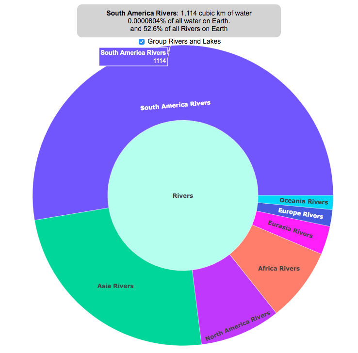
Earth is known as the blue planet, because it’s covered with quite a bit of water. But do you know where all that water on Earth is located? This interactive visualization will show the various amounts of water in its many forms on Earth: Oceans, Lakes, Rivers, Ice, Groundwater, etc….
If you hover over a part of the circular, sunburst graph, it will show you the amount of water that is in each of the various forms shown. If the label for that form is bolded, you can click on it and see further subdivisions beyond that broad category. For example, if you click on Oceans, it will show you how the water in the oceans is distributed among the five main oceans on Earth. As you move towards more focused views on the graph, you can click on the center of the circle to move back out to larger categories and see the big picture again.
As you can see, most of the water on Earth is found in a salty form, and most of that is in the oceans. It can be hard to click through to see freshwater lakes and rivers, as you have to be very precise to expand the “Surface Water” wedge, when you are looking at all “Freshwater”.
Even smaller, on that same visualization, is the “Living things” wedge is basically invisible. You can further explore the details of the living things category by clicking on the button that appears on the freshwater graph.
Checking the Group Rivers and Lakes checkbox will group rivers by continent and lakes by major groups.
It is interesting to see how much water there is on Earth (about 1.4 billion cubic kilometers of water), but how little of it is non-salty, liquid freshwater at the surface (about 100,000 cubic kilometers, though that is still quite a lot) but it only makes up about 0.008% of all water on Earth. That means for every 10,000 gallons of water on Earth, only one of those gallons is freshwater in a lake or river that we can easily access.
It is also believed that there is more water deep in the Earth’s interior (i.e. the mantle) than on the surface or near-subsurface, but estimates of that are highly uncertain and are not included in this graph.
If you click out past Earth’s water to look at water in the solar system, the estimates shown in this visualization are only including liquid water and do not include estimates of ice (which I haven’t been able to find estimates of). The amount of water in living things is estimated assuming that the ratio of organic carbon to liquid water is more or less the same across all different types of living things (i.e. viruses, bacteria, fungi, plants, animals, etc.). This isn’t a great assumption but the estimates, which come from estimates of the dry carbon weight of these organisms, vary across many orders of magnitude so being off in liquid water weight/volume by a factor of two or so isn’t a huge problem.
Tools and Data Sources
The sunburst chart is made using the open source, javascript Plot.ly graphing library. Data on water distributions is primarily from Wikipedia – Distribution of Water – List of Rivers by Discharge – List of Lakes – Weight of Living Biomass – Extra-terrestrial water estimates

Greenhouse gas emissions from airplane flights
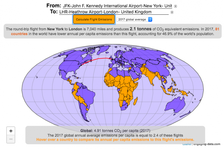
Traveling by airplane produces significant greenhouse gas emissions
Flying in an airplane is likely the most greenhouse gas intensive activity you can do. In a few short hours, you can can travel thousands of miles across the continent or ocean. It takes a large amount of fossil-fuel energy (oil) to lift an 80+ ton airplane off the ground and propel it at 600 miles per hour through the air. Every hour of travel (in a Boeing 737) consumes around 750 gallons of jet fuel.
Even when dividing the fuel usage across all of the passengers (and cargo) of an aircraft, airplane travel consumes a significant amount of fuel per passenger. The fuel economy is estimated to be about the same as a fairly efficient hybrid car driven by one person (60-70 passenger miles per gallon). However, because you can go 10 times faster and much further more easily than you would in a car, airline travel can, on an absolute basis, emit larger amounts of greenhouse gases. In fact, an individual passenger’s share of emissions from a single airplane flight can exceed the annual average greenhouse gas emissions per capita from a number of countries (and the global average).
The following flight calculator and data visualization shows the miles and emissions produced per passenger by a airplane trip that you can specify. Choose two airports that you are interested in and click the “Calculate Flight Emissions” button to see the emissions associated with a round-trip flight between these two cities. The map will show you the flight route and also shows you the countries in the world where this one single round-trip flight produces more emissions per passenger than the average resident does in one year from all sources (annual per capita emissions).
In addition to individual countries, the tool also compares the flight’s per passenger emissions to the global average emissions per capita in 2017 (4.91 tonnes) and the emissions required to achieve a 22℃ climate stabilization in 2030 (3.08 tonnes) and in 2050 (1.37 tonnes). These 2030 and 2050 numbers are based on an International Energy Agency scenario.
Calculations of Airplane Emissions
The emissions calculated by this calculator are based on calculations from myclimate.org, a non-profit environmental organization.
The fuel consumption of a jet depends on the size of the aircraft and distance traveled, but takeoff and climbing to cruising altitude are particularly fuel-intensive. On shorter flights, the takeoff and initial climb will constitute a greater proportion of the total flight time so fuel consumption per mile will be higher than on longer (e.g. international) flights.
The detailed methodology is described in more detail in this document.
In addition to emissions of CO2 from the burning of jet fuel, jets also emit other gases (including methane, NOx, and water vapor) which can also contribute to warming (also known as “radiative forcing”). Because the emissions are occurring at high altitude, these gases can have different impacts than those at lower altitude. A number of studies have estimated the impact of these other gases can significantly contribute to the overall radiative forcing and have somewhere between 1.5 and 3 times the impact that the CO2 alone would. A number of studies, including the myclimate calculator use a factor of 2 to account for these non-CO2 gases and their warming impact, and that is what is used in this calculator as well.
Unlike cars, trucks and trains, it is much harder to power airplanes with batteries and electricity and producing low-carbon jet fuels from biomass is proving very challenging.
In order to achieve climate stabilization at 2 degrees C, global emissions need to basically go to zero over the next 40 years. With a growing global population, this means that the allowable emissions per person will shrink rapidly over these coming decades.
Ultimately, while aviation is a small part of global greenhouse gas emissions, it is a larger part of emissions in richer countries (i.e. if you are reading/viewing this post). And there are many in these richer countries who fly a disproportionate amount and therefore contribute a disproportionate amount of emissions. Hopefully, putting airplane travel in this context can help us better understand the impact of our actions and choices and maybe even change behavior for some.
Tools and Data Sources
The calculator estimates flight emissions based on the myclimate carbon footprint calculator. Data for CO2 emissions by country was downloaded from the European Commissions’s Emissions Database for Global Atmospheric Research. The map was built using the leaflet open-source mapping library in javascript.

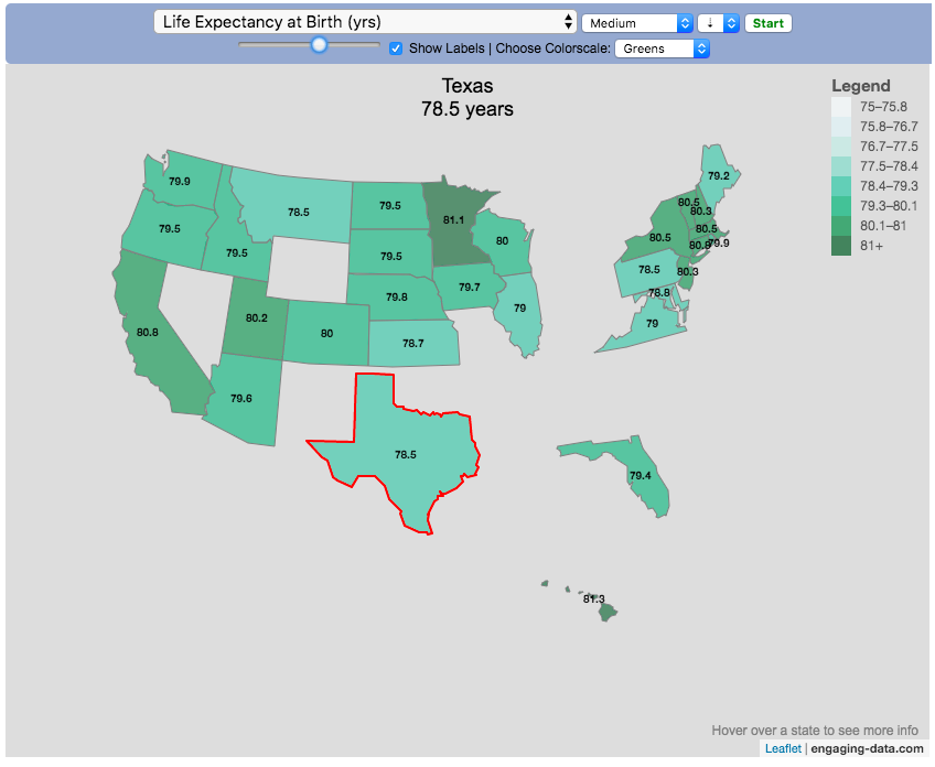
Assembling the USA state-by-state with state-level statistics

Watch the United States assemble state by state based on statistics of interest
Based on earlier popularity of the country-by-country animation, this map lets you watch as the world is built-up one state at a time. This can be done along a large range of statistical dimensions:
Name (alphabetical)
abbreviation
Date of entry to the United States
State Population (2018)
Population per Electoral Vote (2018)
Population per House Seat (2018)
Land Area (square miles)
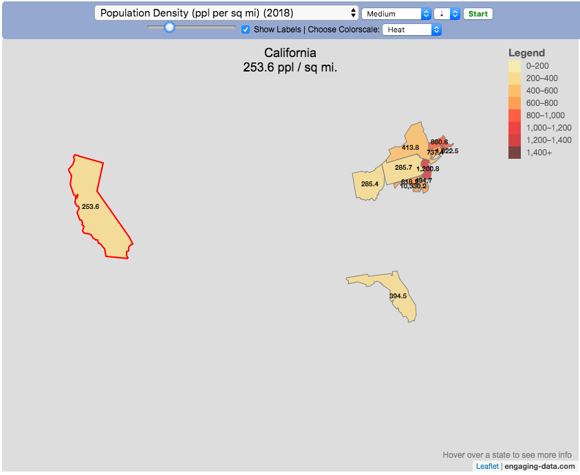
Population Density (ppl per sq mi) (2018)
State’s Highest Point
Highest Elevation (ft)
Mean Elevation (ft)
State’s Lowest Point
Lowest Point (ft)
Life Expectancy at Birth (yrs)
Median Age (yrs)
Percent with High School Education
Percent with Bachelor’s Degree
Residential Electricity Price (cents per kWh) (2018)
Gasoline Price ($/gal) Regular unleaded (2019)
State Gross Domestic Product GDP ($Million) (2018)
GDP per capita ($/capita)
Number of Counties (or subdivisions)
Average Daily Solar Radiation (kWh/m2)
Birth rate (per thousand population)
Avg Age of Mother at Birth
Annual Precipitation (in/yr)
Average Temperature (deg F)
These statistics can be sorted from small to large or vice versa to get a view of the US and its constituent states plus DC in a unique and interesting way. It’s a bit hypnotic to watch as the states appear and add to the country one by one.
You can use this map to display all the states that have higher life expectancy than the Texas:
select “Life expectancy”, sort from “high to low” and use the scroll bar to move to the Texax and you’ll get a picture like this:
or this map to display all the states that have higher population density than California:
select “Population density, sort from “high to low” and use the scroll bar to move to the United States and you’ll get a picture like this:
I hope you enjoy exploring the United States through a number of different demographic, economic and physical characteristics through this data viz tool. And if you have ideas for other statistics to add, I will try to do so.
Data and tools: Data was downloaded from a variety of sources:
- Population https://en.wikipedia.org/wiki/List_of_states_and_territories_of_the_United_States_by_population
- Admission to union https://simple.wikipedia.org/wiki/List_of_U.S._states_by_date_of_admission_to_the_Union
- Educational attainment https://nces.ed.gov/programs/digest/d18/tables/dt18_104.88.asp
- Highest points https://geology.com/state-high-points.shtml
- Life expectancy https://en.wikipedia.org/wiki/List_of_U.S._states_and_territories_by_life_expectancy
- Median Age http://www.statemaster.com/graph/peo_med_age-people-median-age
- Land area https://statesymbolsusa.org/symbol-official-item/national-us/uncategorized/states-size
- Mean elevation https://www.census.gov/library/publications/2011/compendia/statab/131ed/geography-environment.html
- Electricity price https://www.chooseenergy.com/electricity-rates-by-state/
- Gasoline price https://gasprices.aaa.com/state-gas-price-averages/
- GDP https://www.bea.gov/data/gdp/gdp-state
- Sunlight North America Land Data Assimilation System (NLDAS) Daily Sunlight (insolation) for years 1979-2011 on CDC WONDER Online Database, released 2013. Accessed at http://wonder.cdc.gov/NASA-INSOLAR.html on Jun 14, 2019 1:37:15 PM
- Births United States Department of Health and Human Services (US DHHS), Centers for Disease Control and Prevention (CDC), National Center for Health Statistics (NCHS), Division of Vital Statistics, Natality public-use data 2007-2017, on CDC WONDER Online Database, October 2018. Accessed at http://wonder.cdc.gov/natality-current.html on Jun 14, 2019 1:53:58 PM
- Precipitation North America Land Data Assimilation System (NLDAS) Daily Precipitation for years 1979-2011 on CDC WONDER Online Database, released 2013. Accessed at http://wonder.cdc.gov/NASA-Precipitation.html on Jun 26, 2019 3:30:40 PM
- Temperature http://www.usa.com/rank/us–average-temperature–state-rank.htm
The map was created with the help of the open source leaflet javascript mapping library
What are the highest mountains on Earth? Measuring from sea level vs center of earth
The Highest Mountains On Earth Depend On How You Measure “High”
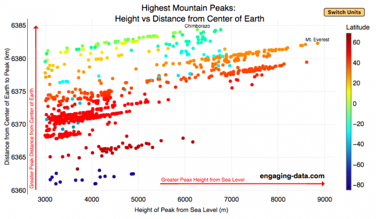
Mount Everest is famous for being the highest mountain on Earth. The peak is an incredible 8,848 meters (29,029 ft) above sea level. But that is only one way to measure the height of a mountain. Chimborazo, a mountain in Ecuador, holds the distinction for the mountain whose peak is the furthest from the center of the Earth. How is that possible? This is because the Earth is not a perfect sphere. Rather, due to the spinning of the Earth around it’s axis, the centrifugal force causes the equator to bulge out slightly. This flattened shape is called an oblate spheroid and makes the radius of the earth at the equator about 22 km (about 0.3%) larger than the radius to the poles. Mountains close to the equator will “start” further away from the center of the earth, than those at higher latitudes.
This graph plots over 800 of the highest mountains on Earth with their peak height above sea level on the x-axis and their peak distance from the center of the earth on the y-axis. Each point represents one mountain. The colors of the plots correspond to the latitude of the mountain. These mountains range from 3000 meters in height to 9000 meters in height. You can hover over a data point (or click on mobile) to get more information about the mountain. You can also switch from metric to imperial units with the button on the graph.
For a given mountain range at a certain latitude, you can see that as the mountain heights above sea level increases, so does their distance from the center of the Earth. Mountains in the southern hemisphere are colored in blue, those around the equator are green and yellow, and those in the northern hemisphere are red and orange. The mountains with the highest peaks above sea level are shown on the right side of the graph in red and orange (mostly in the Himalaya), with Mt Everest as the right most point on the graph (nearly 9000 meters tall).
Mountains with peaks the greatest distance from the center of the earth are found near the equator in light green/yellow and are found at the top of the graph. You’ll notice that a number of these mountains are higher than Mt Everest when looking at the distance from the center of the earth.
The Himalayas are the “highest” mountains on earth if you are measuring height from sea level, while the Andes are the “highest” if you measure from the center of the earth.
Calculating Distance from Earth’s Center to Mountain Peak
The distance from the center of the Earth is calculated from the following formula:
$$D_{mountain} = H_{mountain} + R_{lat}$$
where $D_{mountain}$ is the distance from center of earth to the top of the mountain, $H_{mountain}$ is the mountain height above sea-level and $R_{lat}$ is the radius of earth at the mountain’s latitude. The height is data that was downloaded from a list of mountain heights.
and the radius of the earth for a given latitude is calculated using the formula:
$$R_{lat}=\sqrt{a^2cos(lat)^2+b^2sin(lat)^2\over acos(lat)^2+bsin(lat)^2)}$$
where $a$ and $b$ are the equatorial and polar radii (6378.137 km and 6356.752 km respectively).
Earth Radius Calculator
Here is a calculator for determining the radius of Earth at a given latitude:
You can use this to calculate the distance from the center of the earth to sea level at your latitude.
Data and Tools:
Data on the heights of over 800 mountain peaks over 3000 meters in height was downloaded from Wikipedia. There ended up being alot of google searching and data cleaning to get it into suitable format for plotting. The calculations were made with javascript and plotted using plotly, the open source javascript graphing library.

Visualizing The Growth of Atmospheric CO2 Concentration
The current CO2 concentration in the atmosphere is over 400 parts per million (ppm). This has grown about 46% since pre-industrial levels (~280 ppm) in the early 1800s. The growing concentration of CO2 is a big concern because it is the most prevalent greenhouse gas, which is increasing the temperature of the planet and leading to substantial changes in the Earth’s climate patterns.
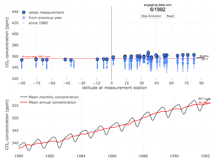
This graph visualizes the growth in CO2 concentration in the atmosphere (mainly from CO2 emissions due to human activities, such as burning fossil fuels for energy production, deforestation and other industrial processes). The graph starts at 1980 when CO2 concentration in the atmosphere was around 340ppm. It has grown significantly since then.
One of the interesting aspects of CO2 concentration is that it is not identical all around the globe, as it takes awhile for the atmosphere to mix. The graph shows geographic differences in CO2 concentration as well as seasonal ups and downs, that underly an overall growing trend in annual average (mean) concentration.
Seasonal trends in CO2 concentration occur due to differences in the amount of plant growth across different months. Spring and summer plant growth in the northern hemisphere causes a significant amount of photosynthesis, and CO2 absorption, relative to the fall and winter. This plant growth causes a very large amount of CO2 to be absorbed by plants and a noticeable reduction in the amount of CO2 in the atmosphere. The southern hemisphere spring and summer (northern hemisphere fall and winter) aren’t as obvious because there is much less land in the southern hemisphere and the land that is there is close to the tropics and green all year round.
CO2 concentration can change by about 4-5 ppm due to the “breathing” of plants, which is pretty significant. The total weight of CO2 in the atmosphere is about 3 trillion tonnes of CO2, so 4-5 ppm is about 1% of this or 30 billion tons of CO2 removed by plant life each spring/summer.
Data and Tools:
Data comes from the US National Oceanic and Atmospheric Administration (NOAA). Data was downloaded using an automated python script and the graphs were made using javascript and the open-sourced Plot.ly javascript engine.
US County Electoral Map – Land Area vs Population
County-level Election Results from 2024, 2020 and 2016
The interface has been updated and you can now also zoom in and look at a specific state’s election results.
Click here to view a visualization that looks more explicitly at the correlation between population density and votes by county.
This interactive map shows the election results by county and you can display the size of counties based on their land area or population size.
Previously, I created a map (cartogram) that showed the state by state electoral results from the Presidential Election by scaling the size of the states based on their electoral votes. The idea for that map was that by portraying a state as Red or Blue, your eye naturally attempts to determine which color has a greater share of the total. On a normal election map, Red states dominate, especially because a number of larger, less populated states happen to vote Republican. That cartogram changed the size of the states so that large states with low population, and thus low electoral votes tended to shrink in size, while smaller states with moderate to larger populations tended to grow in size. Thus, when your eyes attempt to discern which color prevails, the comparison is more accurate and attempts to replicate the relative ratio of electoral votes for each side.
This map looks at the 2024, 2020 and 2016 presidential election results, county by county. An interesting thing to note is that this view is even more heavily dominated by the color red, for the same reasons. Less densely populated counties tend to vote republican, while higher density, typically smaller counties tend to vote for democrats. As a result, the blue counties tend to be the smaller ones so blue is visually less represented than it should be based on vote totals. More than 75% of the land area is red, when looking at the map based on land areas, while shifting to the population view only about 46% of the map is red. Neither of these percentages is exactly correct because each county is colored fully red or blue and don’t take into account that some counties are won by a large percentage and some are essentially tied. However, the population number is certainly closer to reality as Trump won about 48.8% of the votes that went to either Trump or Clinton.
Instructions
This tool should be relatively straightforward to use. Just click around and play with it.
The map has a few different options for display:
- Hide Circles – just shows the county map
- Show land circles – where the area of the circle matches the area of the county itself, though obviously shaped like a circle. The counties are colored red or blue depending on whether Trump or Harris (in 2024), Biden (in 2020) or Clinton (in 2016) won more votes in that county vs Donald Trump (2024, 2020 and 2016).
- Show population circles – where the area of the circle matches the relative population of the county itself. More populated counties will grow larger while less populated counties will shrink. The counties are colored red or blue depending on whether Trump or Biden or Clinton won more votes in that county.
- Selecting the No County Overlap button will spread out all of the circles so you can see them all. The total displayed area of the county circles is the same in either land and population view, though if the circles are overlapping, you may see less total colors.
- Selecting the Color by Margin button will color the each county circle by the amount that a candidate won the county. If the vote margin is small, the county will be colored light blue or red, whereas if a county strongly favors one candidate, it will be colored darker red or blue.
- Selecting the Allow State Zoom button let you zoom into and only show the counties of a specific state. Just click on the state to zoom in (and back out).
Visualization notes
This was my second attempt at using d3 to generate visualizations. I typically use leaflet to do web-based mapping but I wanted the power of d3 which has functions for the circles to prevent overlapping. This map was inspired by Karim Douieb’s cool visualization of 2016 election results. I modified it in a number of different ways to try to make it more interactive and useful.
This visualization does not actually simulate the collisions between the circles on your browser. It is a bit computationally taxing and causes my computer fan to turn on after awhile. So instead I ran the simulation on my computer and recorded the coordinates for where each circle ended up for each category. Then your browser is simply using d3 transitions to shift positions and sizes of the circles between each of the maps, which is simpler, though with 3142 counties, it can still tax the computer occasionally.
Data and Tools
County level election data for 2016 is from MIT Election Lab. The 2020 county level data is downloaded from the New York Times county election data API and processed using a python script. 2024 county data is from the NYTimes as well by individual state (e.g. Maine) Population data used is for 2018. The visualization was created using d3 javascript visualization library.
Where on Earth is all the water? From the solar system to living things
Earth is known as the blue planet, because it’s covered with quite a bit of water. But do you know where all that water on Earth is located? This interactive visualization will show the various amounts of water in its many forms on Earth: Oceans, Lakes, Rivers, Ice, Groundwater, etc….
If you hover over a part of the circular, sunburst graph, it will show you the amount of water that is in each of the various forms shown. If the label for that form is bolded, you can click on it and see further subdivisions beyond that broad category. For example, if you click on Oceans, it will show you how the water in the oceans is distributed among the five main oceans on Earth. As you move towards more focused views on the graph, you can click on the center of the circle to move back out to larger categories and see the big picture again.
As you can see, most of the water on Earth is found in a salty form, and most of that is in the oceans. It can be hard to click through to see freshwater lakes and rivers, as you have to be very precise to expand the “Surface Water” wedge, when you are looking at all “Freshwater”.
Even smaller, on that same visualization, is the “Living things” wedge is basically invisible. You can further explore the details of the living things category by clicking on the button that appears on the freshwater graph.
Checking the Group Rivers and Lakes checkbox will group rivers by continent and lakes by major groups.
It is interesting to see how much water there is on Earth (about 1.4 billion cubic kilometers of water), but how little of it is non-salty, liquid freshwater at the surface (about 100,000 cubic kilometers, though that is still quite a lot) but it only makes up about 0.008% of all water on Earth. That means for every 10,000 gallons of water on Earth, only one of those gallons is freshwater in a lake or river that we can easily access.
It is also believed that there is more water deep in the Earth’s interior (i.e. the mantle) than on the surface or near-subsurface, but estimates of that are highly uncertain and are not included in this graph.
If you click out past Earth’s water to look at water in the solar system, the estimates shown in this visualization are only including liquid water and do not include estimates of ice (which I haven’t been able to find estimates of). The amount of water in living things is estimated assuming that the ratio of organic carbon to liquid water is more or less the same across all different types of living things (i.e. viruses, bacteria, fungi, plants, animals, etc.). This isn’t a great assumption but the estimates, which come from estimates of the dry carbon weight of these organisms, vary across many orders of magnitude so being off in liquid water weight/volume by a factor of two or so isn’t a huge problem.
Tools and Data Sources
The sunburst chart is made using the open source, javascript Plot.ly graphing library. Data on water distributions is primarily from Wikipedia – Distribution of Water – List of Rivers by Discharge – List of Lakes – Weight of Living Biomass – Extra-terrestrial water estimates
Greenhouse gas emissions from airplane flights
Traveling by airplane produces significant greenhouse gas emissions
Flying in an airplane is likely the most greenhouse gas intensive activity you can do. In a few short hours, you can can travel thousands of miles across the continent or ocean. It takes a large amount of fossil-fuel energy (oil) to lift an 80+ ton airplane off the ground and propel it at 600 miles per hour through the air. Every hour of travel (in a Boeing 737) consumes around 750 gallons of jet fuel.
Even when dividing the fuel usage across all of the passengers (and cargo) of an aircraft, airplane travel consumes a significant amount of fuel per passenger. The fuel economy is estimated to be about the same as a fairly efficient hybrid car driven by one person (60-70 passenger miles per gallon). However, because you can go 10 times faster and much further more easily than you would in a car, airline travel can, on an absolute basis, emit larger amounts of greenhouse gases. In fact, an individual passenger’s share of emissions from a single airplane flight can exceed the annual average greenhouse gas emissions per capita from a number of countries (and the global average).
The following flight calculator and data visualization shows the miles and emissions produced per passenger by a airplane trip that you can specify. Choose two airports that you are interested in and click the “Calculate Flight Emissions” button to see the emissions associated with a round-trip flight between these two cities. The map will show you the flight route and also shows you the countries in the world where this one single round-trip flight produces more emissions per passenger than the average resident does in one year from all sources (annual per capita emissions).
In addition to individual countries, the tool also compares the flight’s per passenger emissions to the global average emissions per capita in 2017 (4.91 tonnes) and the emissions required to achieve a 22℃ climate stabilization in 2030 (3.08 tonnes) and in 2050 (1.37 tonnes). These 2030 and 2050 numbers are based on an International Energy Agency scenario.
Calculations of Airplane Emissions
The emissions calculated by this calculator are based on calculations from myclimate.org, a non-profit environmental organization.
The fuel consumption of a jet depends on the size of the aircraft and distance traveled, but takeoff and climbing to cruising altitude are particularly fuel-intensive. On shorter flights, the takeoff and initial climb will constitute a greater proportion of the total flight time so fuel consumption per mile will be higher than on longer (e.g. international) flights.
The detailed methodology is described in more detail in this document.
In addition to emissions of CO2 from the burning of jet fuel, jets also emit other gases (including methane, NOx, and water vapor) which can also contribute to warming (also known as “radiative forcing”). Because the emissions are occurring at high altitude, these gases can have different impacts than those at lower altitude. A number of studies have estimated the impact of these other gases can significantly contribute to the overall radiative forcing and have somewhere between 1.5 and 3 times the impact that the CO2 alone would. A number of studies, including the myclimate calculator use a factor of 2 to account for these non-CO2 gases and their warming impact, and that is what is used in this calculator as well.
Unlike cars, trucks and trains, it is much harder to power airplanes with batteries and electricity and producing low-carbon jet fuels from biomass is proving very challenging.
In order to achieve climate stabilization at 2 degrees C, global emissions need to basically go to zero over the next 40 years. With a growing global population, this means that the allowable emissions per person will shrink rapidly over these coming decades.
Ultimately, while aviation is a small part of global greenhouse gas emissions, it is a larger part of emissions in richer countries (i.e. if you are reading/viewing this post). And there are many in these richer countries who fly a disproportionate amount and therefore contribute a disproportionate amount of emissions. Hopefully, putting airplane travel in this context can help us better understand the impact of our actions and choices and maybe even change behavior for some.
Tools and Data Sources
The calculator estimates flight emissions based on the myclimate carbon footprint calculator. Data for CO2 emissions by country was downloaded from the European Commissions’s Emissions Database for Global Atmospheric Research. The map was built using the leaflet open-source mapping library in javascript.
Assembling the USA state-by-state with state-level statistics
Watch the United States assemble state by state based on statistics of interest
Based on earlier popularity of the country-by-country animation, this map lets you watch as the world is built-up one state at a time. This can be done along a large range of statistical dimensions:
These statistics can be sorted from small to large or vice versa to get a view of the US and its constituent states plus DC in a unique and interesting way. It’s a bit hypnotic to watch as the states appear and add to the country one by one.
You can use this map to display all the states that have higher life expectancy than the Texas:
select “Life expectancy”, sort from “high to low” and use the scroll bar to move to the Texax and you’ll get a picture like this:
or this map to display all the states that have higher population density than California:
select “Population density, sort from “high to low” and use the scroll bar to move to the United States and you’ll get a picture like this:
I hope you enjoy exploring the United States through a number of different demographic, economic and physical characteristics through this data viz tool. And if you have ideas for other statistics to add, I will try to do so.
Data and tools: Data was downloaded from a variety of sources:
- Population https://en.wikipedia.org/wiki/List_of_states_and_territories_of_the_United_States_by_population
- Admission to union https://simple.wikipedia.org/wiki/List_of_U.S._states_by_date_of_admission_to_the_Union
- Educational attainment https://nces.ed.gov/programs/digest/d18/tables/dt18_104.88.asp
- Highest points https://geology.com/state-high-points.shtml
- Life expectancy https://en.wikipedia.org/wiki/List_of_U.S._states_and_territories_by_life_expectancy
- Median Age http://www.statemaster.com/graph/peo_med_age-people-median-age
- Land area https://statesymbolsusa.org/symbol-official-item/national-us/uncategorized/states-size
- Mean elevation https://www.census.gov/library/publications/2011/compendia/statab/131ed/geography-environment.html
- Electricity price https://www.chooseenergy.com/electricity-rates-by-state/
- Gasoline price https://gasprices.aaa.com/state-gas-price-averages/
- GDP https://www.bea.gov/data/gdp/gdp-state
- Sunlight North America Land Data Assimilation System (NLDAS) Daily Sunlight (insolation) for years 1979-2011 on CDC WONDER Online Database, released 2013. Accessed at http://wonder.cdc.gov/NASA-INSOLAR.html on Jun 14, 2019 1:37:15 PM
- Births United States Department of Health and Human Services (US DHHS), Centers for Disease Control and Prevention (CDC), National Center for Health Statistics (NCHS), Division of Vital Statistics, Natality public-use data 2007-2017, on CDC WONDER Online Database, October 2018. Accessed at http://wonder.cdc.gov/natality-current.html on Jun 14, 2019 1:53:58 PM
- Precipitation North America Land Data Assimilation System (NLDAS) Daily Precipitation for years 1979-2011 on CDC WONDER Online Database, released 2013. Accessed at http://wonder.cdc.gov/NASA-Precipitation.html on Jun 26, 2019 3:30:40 PM
- Temperature http://www.usa.com/rank/us–average-temperature–state-rank.htm
The map was created with the help of the open source leaflet javascript mapping library
What are the highest mountains on Earth? Measuring from sea level vs center of earth
The Highest Mountains On Earth Depend On How You Measure “High”
Mount Everest is famous for being the highest mountain on Earth. The peak is an incredible 8,848 meters (29,029 ft) above sea level. But that is only one way to measure the height of a mountain. Chimborazo, a mountain in Ecuador, holds the distinction for the mountain whose peak is the furthest from the center of the Earth. How is that possible? This is because the Earth is not a perfect sphere. Rather, due to the spinning of the Earth around it’s axis, the centrifugal force causes the equator to bulge out slightly. This flattened shape is called an oblate spheroid and makes the radius of the earth at the equator about 22 km (about 0.3%) larger than the radius to the poles. Mountains close to the equator will “start” further away from the center of the earth, than those at higher latitudes.
This graph plots over 800 of the highest mountains on Earth with their peak height above sea level on the x-axis and their peak distance from the center of the earth on the y-axis. Each point represents one mountain. The colors of the plots correspond to the latitude of the mountain. These mountains range from 3000 meters in height to 9000 meters in height. You can hover over a data point (or click on mobile) to get more information about the mountain. You can also switch from metric to imperial units with the button on the graph.
For a given mountain range at a certain latitude, you can see that as the mountain heights above sea level increases, so does their distance from the center of the Earth. Mountains in the southern hemisphere are colored in blue, those around the equator are green and yellow, and those in the northern hemisphere are red and orange. The mountains with the highest peaks above sea level are shown on the right side of the graph in red and orange (mostly in the Himalaya), with Mt Everest as the right most point on the graph (nearly 9000 meters tall).
Mountains with peaks the greatest distance from the center of the earth are found near the equator in light green/yellow and are found at the top of the graph. You’ll notice that a number of these mountains are higher than Mt Everest when looking at the distance from the center of the earth.
The Himalayas are the “highest” mountains on earth if you are measuring height from sea level, while the Andes are the “highest” if you measure from the center of the earth.
Calculating Distance from Earth’s Center to Mountain Peak
The distance from the center of the Earth is calculated from the following formula:
$$D_{mountain} = H_{mountain} + R_{lat}$$
where $D_{mountain}$ is the distance from center of earth to the top of the mountain, $H_{mountain}$ is the mountain height above sea-level and $R_{lat}$ is the radius of earth at the mountain’s latitude. The height is data that was downloaded from a list of mountain heights.
and the radius of the earth for a given latitude is calculated using the formula:
$$R_{lat}=\sqrt{a^2cos(lat)^2+b^2sin(lat)^2\over acos(lat)^2+bsin(lat)^2)}$$
where $a$ and $b$ are the equatorial and polar radii (6378.137 km and 6356.752 km respectively).
Earth Radius Calculator
Here is a calculator for determining the radius of Earth at a given latitude:
You can use this to calculate the distance from the center of the earth to sea level at your latitude.
Data and Tools:
Data on the heights of over 800 mountain peaks over 3000 meters in height was downloaded from Wikipedia. There ended up being alot of google searching and data cleaning to get it into suitable format for plotting. The calculations were made with javascript and plotted using plotly, the open source javascript graphing library.
Visualizing The Growth of Atmospheric CO2 Concentration
The current CO2 concentration in the atmosphere is over 400 parts per million (ppm). This has grown about 46% since pre-industrial levels (~280 ppm) in the early 1800s. The growing concentration of CO2 is a big concern because it is the most prevalent greenhouse gas, which is increasing the temperature of the planet and leading to substantial changes in the Earth’s climate patterns.
This graph visualizes the growth in CO2 concentration in the atmosphere (mainly from CO2 emissions due to human activities, such as burning fossil fuels for energy production, deforestation and other industrial processes). The graph starts at 1980 when CO2 concentration in the atmosphere was around 340ppm. It has grown significantly since then.
One of the interesting aspects of CO2 concentration is that it is not identical all around the globe, as it takes awhile for the atmosphere to mix. The graph shows geographic differences in CO2 concentration as well as seasonal ups and downs, that underly an overall growing trend in annual average (mean) concentration.
Seasonal trends in CO2 concentration occur due to differences in the amount of plant growth across different months. Spring and summer plant growth in the northern hemisphere causes a significant amount of photosynthesis, and CO2 absorption, relative to the fall and winter. This plant growth causes a very large amount of CO2 to be absorbed by plants and a noticeable reduction in the amount of CO2 in the atmosphere. The southern hemisphere spring and summer (northern hemisphere fall and winter) aren’t as obvious because there is much less land in the southern hemisphere and the land that is there is close to the tropics and green all year round.
CO2 concentration can change by about 4-5 ppm due to the “breathing” of plants, which is pretty significant. The total weight of CO2 in the atmosphere is about 3 trillion tonnes of CO2, so 4-5 ppm is about 1% of this or 30 billion tons of CO2 removed by plant life each spring/summer.
Data and Tools:
Data comes from the US National Oceanic and Atmospheric Administration (NOAA). Data was downloaded using an automated python script and the graphs were made using javascript and the open-sourced Plot.ly javascript engine.
Recent Comments