Archive for the ‘Environment’ Category:
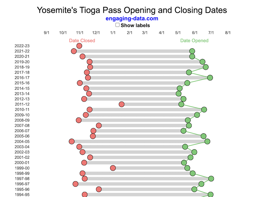
Tioga Pass (Yosemite) Opening Dates
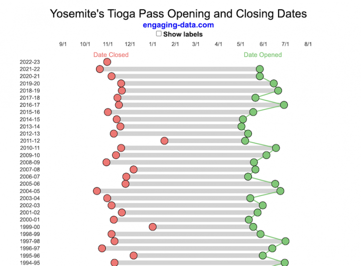
When does Tioga Pass in Yosemite typically open?
The graph shows the closing and opening dates of Tioga pass in Yosemite National Park for each winter season from 1933 to the present. Tioga pass is a mountain pass on State Highway 120 in California’s Sierra Nevada mountain range and one of the entrances to Yosemite NP. The pass itself peaks at 9945 ft above sea level. Each winter it gets a ton of snow, but also with a great deal of variability, which really affects when it can be plowed and the road reopened.
Our family likes to go to Yosemite in June after the kids school lets out and sometimes Hwy 120 and Tioga Pass can often be closed at this time, which limits which areas of the park you can visit. So I often look at data on when the road has opened before and thought it would be a good thing to visualize.
You can toggle the labels on the graph that show the dates of opening and closing as well as the number of days that the pass was closed each winter. Hovering (or clicking) on the circles on the graph will give you a pop up which gives you the exact date.
Data and Tools
The data comes from the US National Park Service for most recent data as well as Mono Basin Clearinghouse for earlier data going back to 1933. Data was organized and compiled in MS Excel. Visualization was done in javascript and specifically the plotly visualization library.
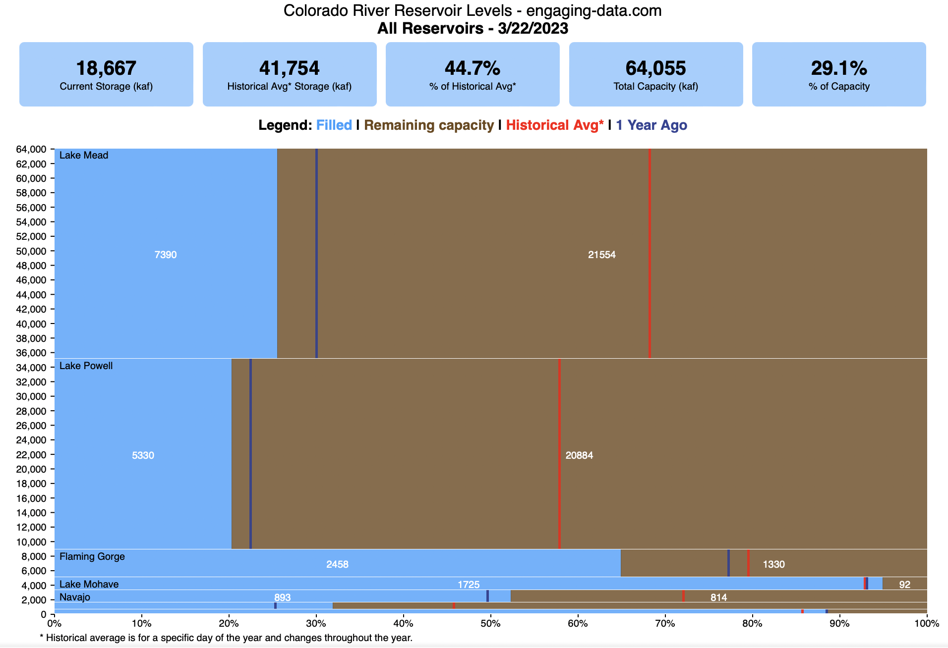
Colorado River Reservoir Levels
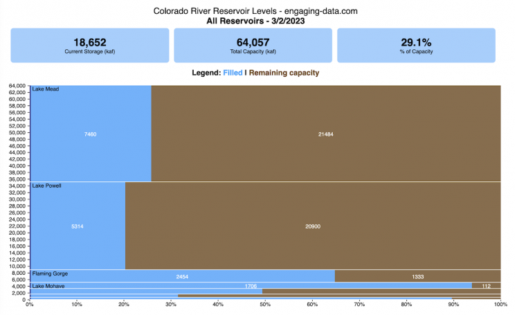
How much water is in the main Colorado River reservoirs?
Check out my California Reservoir Levels Dashboard
I based this graph off of my California Reservoir marimekko graph, because many folks were interested in seeing a similar figure for the Colorado river reservoirs.
This is a marimekko (or mekko) graph which may take some time to understand if you aren’t used to seeing them. Each “row” represents one reservoir, with bars showing how much of the reservoir is filled (blue) and unfilled (brown). The height of the “row” indicates how much water the reservoir could hold. Lake Mead is the reservoir with the largest capacity (at almost 29,000 kaf) and so it is the tallest row. The proportion of blue to brown will show how full it is. As with the California version of this graph, there are also lines that represent historical levels, including historical median level for the day of the year (in red) and the 1 year ago level, which is shown as a dark blue line. I also added the “Deadpool” level for the two largest reservoirs. This is the level at which water cannot flow past the dam and is stuck in the reservoir.
Lake Mead and Lake Powell are by far the largest of these reservoirs and also included are several smaller reservoirs (relative to these two) so the bars will be very thin to the point where they are barely a sliver or may not even show up.
Historical Data
Historical data comes from https://www.water-data.com/ and differs for each reservoir.
- Lake Mead – 1941 to 2015
- Lake Powell – 1964 to 2015
- Flaming Gorge – 1972 to 2015
- Lake Mohave – 1952 to 2015
- Lake Navajo – 1969 to 2015
- Blue Mesa – 1969 to 2015
- Lake Havasu – 1939 to 2015
The daily data for each reservoir was captured in this time period and median value for each day of the calendar year was calculated and this is shown as the red line on the graph.
Instructions:
If you are on a computer, you can hover your cursor over a reservoir and the dashboard at the top will provide information about that individual reservoir. If you are on a mobile device you can tap the reservoir to get that same info. It’s not possible to see or really interact with the tiniest slivers. The main goal of this visualization is to provide a quick overview of the status of the main reservoirs along the Colorado River (or that provide water to the Colorado).
Units are in kaf, thousands of acre feet. 1 kaf is the amount of water that would cover 1 acre in one thousand feet of water (or 1000 acres in water in 1 foot of water). It is also the amount of water in a cube that is 352 feet per side (about the length of a football field). Lake Mead is very large and could hold about 35 cubic kilometers of water at full (but not flood) capacity.
Data and Tools
The data on water storage comes from the US Bureau of Reclamation’s Lower Colorado River Water Operations website. Historical reservoir levels comes from the water-data.com website. Python is used to extract the data and wrangle the data in to a clean format, using the Pandas data analysis library. Visualization was done in javascript and specifically the D3.js visualization library.
Visualizing California’s Water Storage – Reservoirs and Snowpack
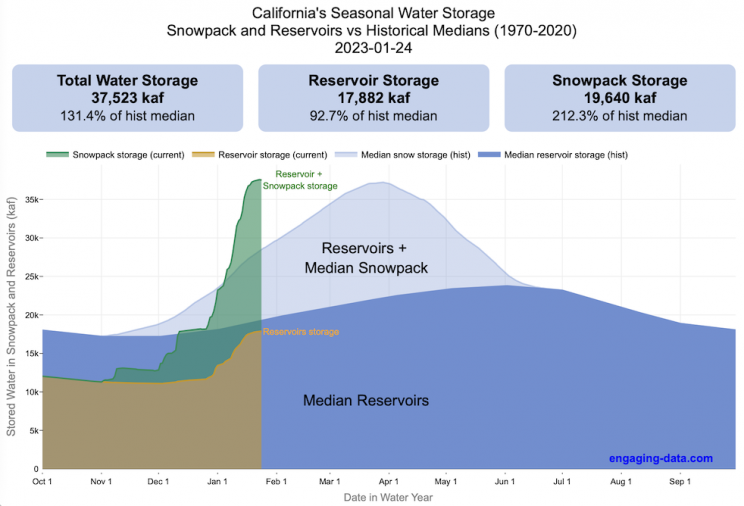
How much water is stored in California’s snowpack and reservoirs?
California’s snow pack is essentially another “reservoir” that is able to store water in the Sierra Nevada mountains. Graphing these things together can give a better picture of the state of California’s water and drought.
The historical median (i.e. 50th percentile) for snow pack water content is stacked on top of the median for reservoirs storage (shown in two shades of blue). The current water year reservoirs is shown in orange and the current year’s snow pack measurement is stacked on top in green. What is interesting is that the typical peak snow pack (around April 1) holds almost as much water (about 2/3 as much) as the reservoirs typically do. However, the reservoirs can store these volumes for much of the year while the snow pack is very seasonal and only does so for a short period of time.
Snowpack is measured at 125 different snow sensor sites throughout the Sierra Nevada mountains. The reservoir value is the total of 50 of the largest reservoirs in California. In both cases, the median is derived from calculating the median values for each day of the year from historical data from these locations from 1970 to 2021.
I’ve been slowly building out the water tracking visualizations tools/dashboards on this site. And with the recent rains (January 2023), there has been quite a bit of interest in these visualizations. One data visualization that I’ve wanted to create is to combine the precipitation and reservoir data into one overarching figure.
Creating the graph
I recently saw one such figure on Twitter by Mike Dettinger, a researcher who studies water/climate issues. The graph shows the current reservoir and snowpack water content overlaid on the historic levels. It is a great graph that conveys quite a bit of info and I thought I would create an interactive version of these while utilizing the automated data processing that’d I’d already created to make my other graphs/dashboards.
Time for another reservoirs-plus-snowpack storage update….LOT of snow up there now and the big Sierra reservoirs (even Shasta!) are already benefitting. Still mostly below average but moving up. Snow stacking up in UCRB. @CW3E_Scripps @DroughtGov https://t.co/2eZgNArahy pic.twitter.com/YEH4IYKlnH
— Mike Dettinger (@mdettinger) January 15, 2023
The challenge was to convert inches of snow water equivalent into a total volume of water in the snowpack, which I asked Mike about. He pointed me to a paper by Margulis et al 2016 that estimates the total volume of water in the Sierra snowpack for 31 years. Since I already had downloaded data on historical snow water equivalents for these same years, I could correlate the estimated peak snow water volume (in cubic km) to the inches of water at these 120 or so Sierra snow sensor sites. I ran a linear regression on these 30 data points. This allowed me to estimate a scaling factor that converts the inches of water equivalent to a volume of liquid water (and convert to thousands of acre feet, which is the same unit as reservoirs are measured in).
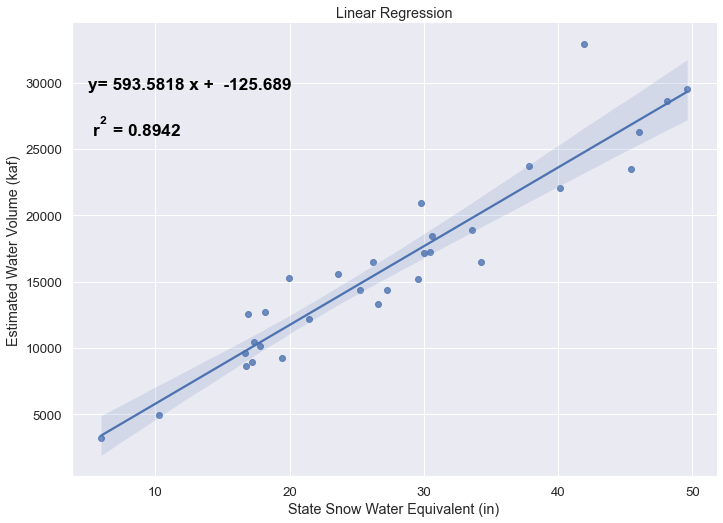
This scaling factor allows me to then graph the snowpack water volume with the reservoir volumes.
See my snowpack visualization/post to see more about snow water equivalents.
My numbers may differ slightly from the numbers reported on the state’s website. The historical percentiles that I calculated are from 1970 until 2020 while I notice the state’s average is between 1990 and 2020.
You can hover (or click) on the graph to audit the data a little more clearly.
Sources and Tools
Data is downloaded from the California Data Exchange Center website of the California Department of Water Resources using a python script. The data is processed in javascript and visualized here using HTML, CSS and javascript and the open source Plotly javascript graphing library.

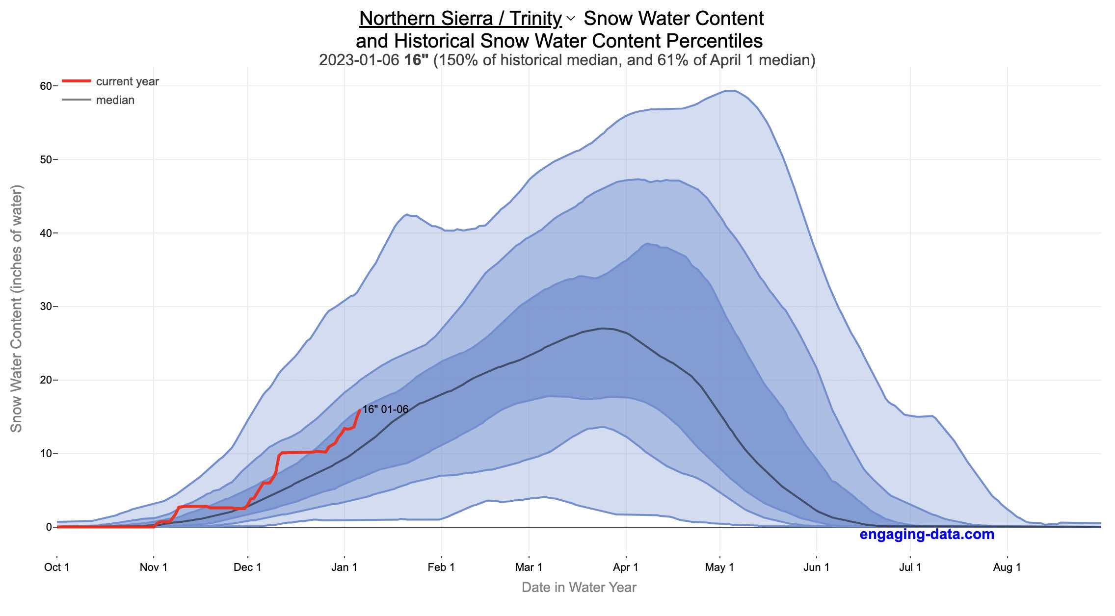
California Snowpack Levels Visualization
How does the current California snowpack compare with Historical Averages?
If you are looking at this it’s probably winter in California and hopefully snowy in the mountains. In the winter, snow is one of the primary ways that water is stored in California and is on the same order of magnitude as the amount of water in reservoirs.
When I made this graph of California snowpack levels (Jan 2023) we’ve had quite a bit of rain and snow so far and so I wanted to visualize how this year compares with historical levels for this time of year. This graph will provide a constantly updated way to keep tabs on the water content in the Sierra snowpack.
Snow water content is just what it sounds like. It is an estimate of the water content of the snow. Since snow can have be relatively dry or moist, and can be fluffy or compacted, measuring snow depth is not as accurate as measuring the amount of water in the snow. There are multiple ways of measuring the water content of snow, including pads under the snow that measure the weight of the overlying snow, sensors that use sound waves and weighing snow cores.
I used data for California snow water content totals from the California Department of Water Resources. Other California water-related visualizations include reservoir levels in the state as well.
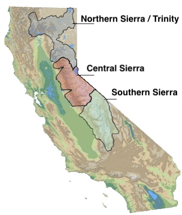
There are three sets of stations (and a state average) that are tracked in the data and these plots:
- Northern Sierra/Trinity – (32 snow sensors)
- Central Sierra – (57 snow sensors)
- Southern Sierra – (36 snow sensors)
- State-wide average – (125 snow sensors)
Here is a map showing these three regions.
These stations are tracked because they provide important information about the state’s water supply (most of which originates from the Sierra Nevada Mountains). Winter and spring snowpack forms an important reservoir of water storage for the state as this melting snow will eventually flow into the state’s rivers and reservoirs to serve domestic and agricultural water needs.
The visualization consists of a graph that shows the range of historical values for snow water content as a function of the day of the year. This range is split into percentiles of snow, spreading out like a cone from the start of the water year (October 1) ramping up to the peak in April and then converging back to zero in summertime. You can see the current water year plotted on this in red to show how it compares to historical values.
My numbers may differ slightly from the numbers reported on the state’s website. The historical percentiles that I calculated are from 1970 until 2022 while I notice the state’s average is between 1990 and 2020.
You can hover (or click) on the graph to audit the data a little more clearly.
Sources and Tools
Data is downloaded from the California Data Exchange Center website of the California Department of Water Resources using a python script. The data is processed in javascript and visualized here using HTML, CSS and javascript and the open source Plotly javascript graphing library.
Using up our carbon budget
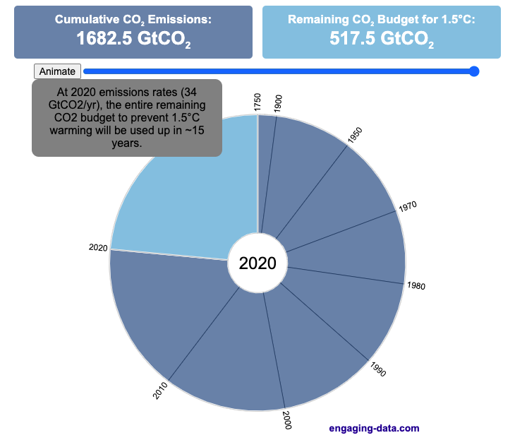
How much more CO2 can we emit if we want to keep the global temperature rise below 1.5°C or 2°C?
Every bit of CO2 we release is one step closer to using up our carbon budget.
Click on the animate button (or use the slider) to see how we have used up our carbon budget to limit global warming to 1.5°C or 2°C.
Climate change is the result of greenhouse gases such as CO2 and methane from human activities. The amount of CO2 and other greenhouse gases in the atmosphere determines how much of the incoming solar radiation is trapped as heat. Since CO2 is the most common greenhouse gas and very long lived in the atmosphere, there’s a good correlation between the total amount of human CO2 emissions and the amount of warming that the earth will experience. This leads to the concept of a carbon budget.
What is the carbon budget?
For every ton of CO2 that is emitted into the atmosphere about half a ton becomes part of the atmosphere for the long term, assuming there’s no massive new program to remove CO2 from the atmosphere. And there’s a direct correlation between the atmospheric concentration of CO2 and the earth’s temperature. Scientists tend to look at milestones of 2°C or 1.5°C when thinking about potential future warming. There is some uncertainty, but the total amount of human CO2 emissions that will lead to a 1.5°C warming from pre-industrial levels is around 2200 billion metric tonnes of CO2 plus or minus a few hundred billion tons (or 460 billion metric tonnes from 2020). This unit is also written as GtCO2 or gigatonnes of CO2. The values for the budget for 2°C warming are 1310 GtCO2 from 2020 or 2993 GtCO2 from pre-industrial levels.
Shown below is a graph from the Carbon Brief that shows the uncertainty in estimates for the remaining carbon budget (from 2018) before having a 50% chance of exceeding 1.5°C warming. As you can see there’s a fairly large range.
Update: The article’s author Zeke Hausfather pointed me to an updated article with newer IPCC estimates for the carbon budget of these two warming milestones. I have updated the code to account for these two new values.
What may happen at 1.5 degrees of warming?
1.5°C (2.7°F) doesn’t sound like alot, but there are some pretty serious potential consequences that we’ll be dealing with. These include increasing the amount or frequency of the following:
- extreme heatwaves
- droughts
- extreme storms and precipitation events
- loss of wildlife and biodiversity
- sea level rise
- and impacts of human health
This NASA article has much more info on the specific issues related to this temperature rise. Ideally we’d keep warming to under 1.5°C but it looks likely that we may exceed 2°C unless we take fairly dramatic action to reduce or CO2 emissions from fossil fuel combustion and use cleaner/lower-carbon sources of energy, like renewables and nuclear power.
From 1750 to 2020, humans have emitted approximately 1683 GtCO2. The IPCC estimates that 460 GtCO2 would put us at 1.5°C warming and 1310 GtCO2 would put us at 2°C warming. These values give us an estimated total carbon budget of 2143 GtCO2 for 1.5°C and 2993 GtCO2 for 2°C warming.
You can really see how we are getting close to using up all of our 1.5°C carbon budget and the speed at which we are using it up, especially in the last few decades.
Sources and Tools:
Annual emissions data is from the Global Carbon Project. The visualization was made using the plotly.js open source graphing library and HTML/CSS/Javascript code for the interactivity and UI.

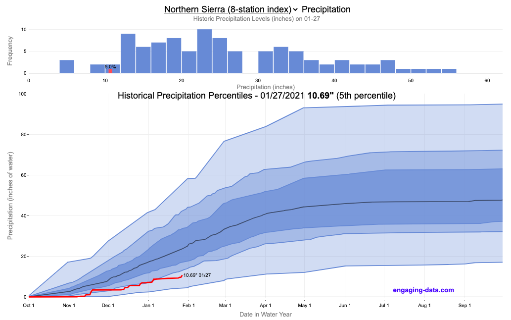
California Rainfall Totals

How do current California rainfall and precipitation totals compare with Historical Averages?
If you are lookin at this visualization, it’s likely winter in California and that means the rainy season (snowy in the mountains). I wanted to visualize how the current year compares with historical levels for this time of year. I used data for California rainfall totals from the California Department of Water Resources. Other California water-related visualizations include reservoir levels in the state as well.
There are three sets of stations that are tracked in the data and these plots:
- Northern Sierra 8-station index
- Tulare Basin 6-station index
- San Joaquin 5-station index
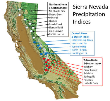
These stations are tracked because they provide important information about the state’s water supply (most of which originates from the Sierra Nevada Mountains). Data from the CDEC website appears to be updated at around 8:30am PST each day.
The visualization consists of two primary graphs both of which show the range of historical values for precipitation. The top graph is a histogram of water year precipitation totals on the specified date (in blue) as well as the precipitation total for the current water year in red.
The second graph shows the percentiles of precipitation over the course of the historical water year, spreading out like a cone from the start of the water year (October 1). You can see the current water year plotted on this to show how it compares to historical values. It also shows the present precipitation level and its percentile within the historical data for the day of the water year.
You can hover (or click) on the graph to audit the data a little more clearly.
Sources and Tools
Data is downloaded from the California Data Exchange Center website of the California Department of Water Resources using a python script. The data is processed in javascript and visualized here using HTML, CSS and javascript and the open source Plotly javascript graphing library.
Recent Comments