Archive for the ‘Energy’ Category:
Wildfire smoke impacts solar panel generation

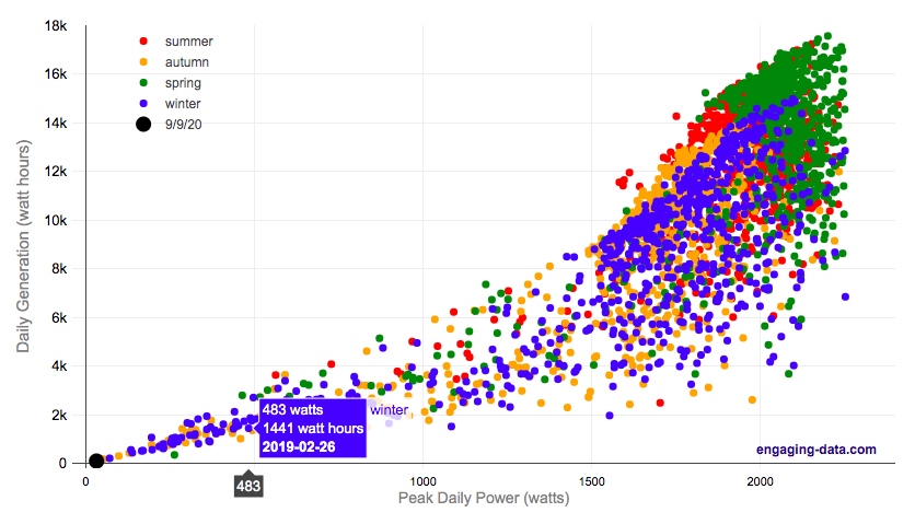
On September 9th, 2020, the entire San Francisco Bay Area, we had a crazy combination of wildfire smoke and low clouds that darkened the sky and turned everything orange. At 9am, it looked like it was nighttime and at noon, it was so dark, that it looked like dusk.
Here is a plot of 8+ years of solar panel generation from our panels. If you click on the legend, you can toggle whether that data is shown. Total generation for the day was only 93 watt hours (as opposed to a summer median of 13300 watt hours, 13.3 kWh) and peak power was only 32 watts (vs a median summer peak of 2000 watts (2.0 kW)).
The solar generation was even worse than the next worst day in winter (typically when it rains all day). Clicking on the legend will toggle whether certain seasons are shown and you can view how solar generation varies by season.
Here is a google image search of photos showing the crazy, apocalyptic scenes with the orange color.
Source and Tools:
Data on solar generation is downloaded from our solar panel inverter provider (enphase) and cleaned with a python script. Graph is made using the plotly open source javascript library.
Renewable Electricity Generation in US is Now Greater Than Coal

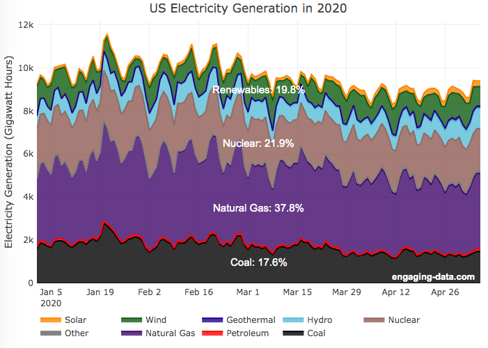
A remarkable thing is happening in the United States and in other places around the world. Partly due to the coronavirus pandemic and partly due to changes in natural gas and renewable energy prices, renewable electricity is now a larger fraction of the US electricity grid than coal. As of early May 2020, the fraction of coal generation of US electricity is about 18% while renewables (hydroelectric, wind, solar and geothermal) account for nearly 20%.
For the entire year of 2019, coal accounted for about 24.2% of US electricity generation, while renewables accounted for 17%.4. And in 2018, coal was 28.4% and renewables were 16.8%. When you include nuclear (not technically a renewable resource, but zero emissions of greenhouse gases), about 42% of US electricity generation in 2020 comes from zero carbon sources, while fossil fuels make up the remaining 68%.
This is good news because renewables produce little to no pollution that contributes to urban air quality, health issues and climate change. Coal is by far the worst electricity generation source when it comes to air pollution that impacts human health and climate change. So this shift away from coal and towards renewables is very good news.
Here’s the same graph but showing instead the fraction of electricity from each source (you can hover over the graph to get daily values).
Source and Tools
Data is downloaded from the US Department of Energy’s Energy Information Agency (EIA).. The graph is made using the open source, javascript Plot.ly graphing library.
What kinds of vehicles do Americans drive?
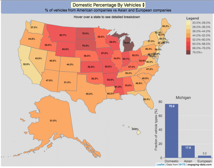
Americans are known for loving cars and driving quite a bit. Drivers in the United States own more cars and drive more than those in any other country. So what kinds of vehicles do Americans drive? This visualization looks at the types of vehicles (by body type and country of origin) across the 50 States and Washington DC.
You can view two different attributes about the types of vehicles in use in the United States:
- Body type of passenger vehicles
- Manufacturer/Brand region of origin
The different categories of passenger vehicles include:
- Cars – includes sedans, hatchbacks, wagons and sports cars
- Pickup trucks
- SUVs
- Vans – includes Minivans and full-size vans
Classification of the vehicles manufacturer (US, Asia or Europe) is based on the company’s headquarters and not the place of vehicle manufacturing. So a Toyota here is an Asian vehicle even if it was assembled in Mississippi.
It is pretty interesting to see the regional differences in vehicle types (cars vs trucks and SUVs) and vehicle brand (domestic vs foreign). Michigan, especially, stands out with their very high domestic ownership. It makes sense as Detroit is the home of the big three US auto manufacturers (Ford, GM and Chrysler). And I hear there’s a very strong culture of owning American cars there (and employee, friends and family discounts as well).
The data is derived from a survey by the US Department of Transportation called the National Household Travel Survey (NHTS) released in 2017. The following is a quote from the NHTS webpage:
The National Household Travel Survey (NHTS) is the source of the Nation’s information about travel by U.S. residents in all 50 States and Washington, DC. This inventory of travel behavior includes trips made by all modes of travel (i.e., private vehicle, public transportation, pedestrian, and cycling) and for all purposes (e.g., travel to work, school, recreation, and personal/family trips). It provides information to assist transportation planners and policymakers who need comprehensive data on travel and transportation patterns in the United States.
Data and Tools:
Data, as stated before, comes from the US Department of Transportation’s National Household Travel Survey (NHTS). That data was processed to identify vehicle characteristics by state and plotted using javascript and the open-source leaflet map library.

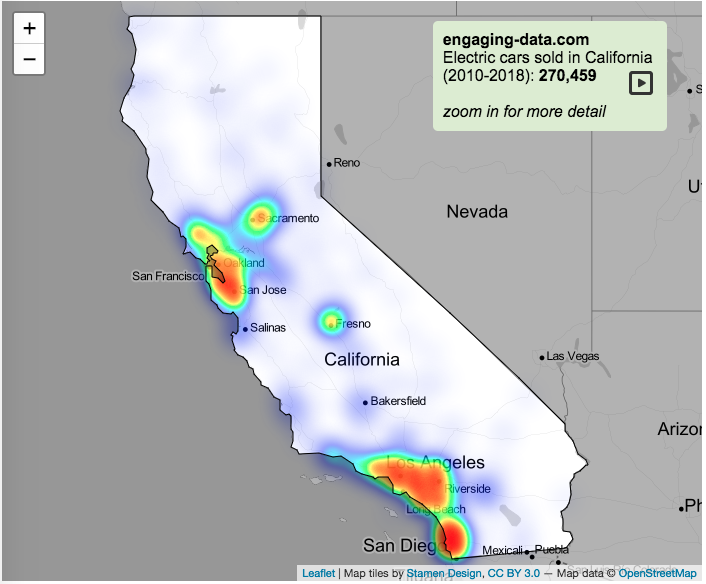
Electric Vehicle Sales By State
Where are electric vehicles being sold in the United States?
Electric vehicles are any vehicle that can be plugged in to recharge a battery that provides power to move the vehicle. Two broad classes are battery electric vehicles (BEVs) which only have batteries as their power source and plug-in hybrid electric vehicles (PHEVs) which have an alternative or parallel power source, typically a gasoline engine. PHEVs are built so that when the battery is depleted, the car can still run on gasoline and operate like a hybrid vehicle similar to a regular Toyota Prius (which is not plugged in at all).
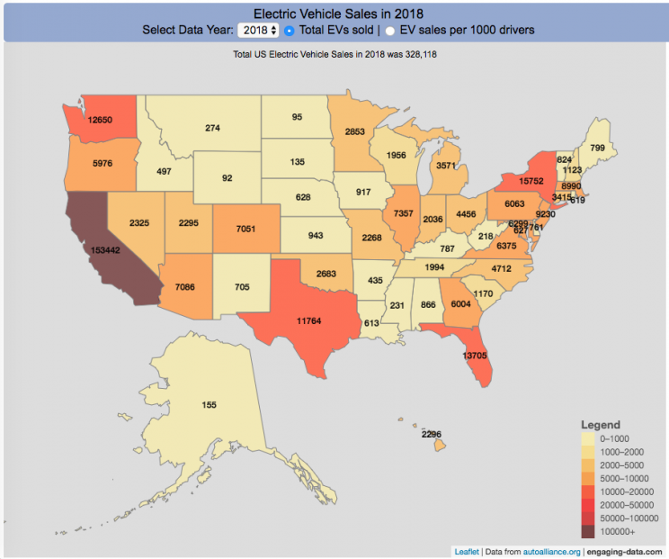
Electric vehicles (EVs) have been sold in the US since 2011 (a few commercial models were sold previous to that but not in any significant numbers) and some conversions were also available. Since then, the number of EVs sold has increased pretty significantly. I wanted to look at the distribution of where those vehicles were located. What is interesting is that California accounts for around 50% of the electric vehicles sold in the United States. Other states have lower rates of EV adoption (in some cases much, much lower). There are many reasons for this, including beneficial policies, public awareness, a large number of potential early adopters and a mild climate. Even so, the EV heatmap of California done early shows that sales are mostly limited to the Bay Area, and LA areas.
The map shows data for total electric vehicle sales by state for years 2016, 2017 or 2018 and also the number of EV sales per 1000 licensed drivers (this is all people in the state with a drivers license, not drivers of EVs). If you hover over a state, you can see both data points for that state.
It will be interesting to see how the next generation of electric vehicles continues to improve, lower in price and become more popular with drivers outside of early adopters.
Click here to see other Energy-Related visualizations
Data and Tools:
Data on electric vehicle sales is from the Auto Alliance website. Licensed driver data was downloaded from the US Department of Transportation’s Bureau of Transportation Statistics website. The map was made using the leaflet open source mapping library. Data was compiled and calculated using javascript.

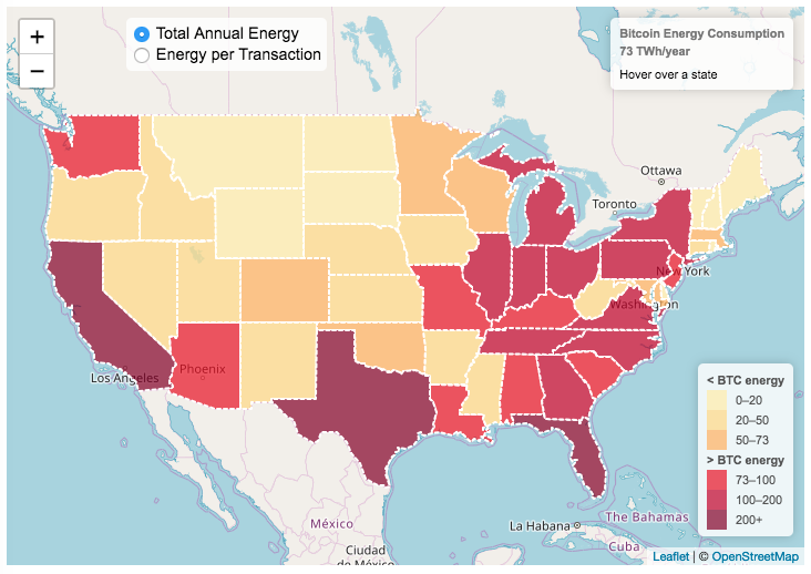
Bitcoin Energy Consumption – Does It Consume More Electricity Than Your State?

This visualization looks at the staggeringly high energy use of Bitcoin and puts it into context: comparing it to electricity usage of US states. Unfortunately for Bitcoin, high energy usage is an intended feature of the system, rather than an unintended consequence. This is because mining is an increasingly energy intensive process, based upon increasingly computationally intensive calculations that are performed on high powered computers and graphical processing units.
Currently, 28 out of 50 states plus the District of Columbia all have lower electricity consumption than estimated annual bitcoin electricity consumption (~73 TWh per year). These states are highlighted in variations of yellow. This is approximately equal to the average annual electricity usage across all US States. States with higher electricity consumption than bitcoin are highlighted in shades of red.
When dividing the total energy use (73 TWh) by the current number of transactions (93 million), we get an average energy consumption of 783 kWh per transaction. Click on the “Energy per Transaction” button to see this visualization. What’s crazy is that a transaction is simply a transfer of bitcoin between “wallets”, recording the transaction, and a validation of the process. There’s no good reason why verifying digital transactions should take this much energy, except that it was built into the fundamental process of validating and mining bitcoin. 783 kWh is larger than the monthly per capita electricity consumption in 10 US states. It could also drive you and your family over 2000 miles in an electric car (e.g. Tesla Model S).
I’m not expert enough in this area to know how much more energy consumption will rise into the future, but if crypto advocates’ predictions come true and bitcoin is used extensively, millions of transactions will occur per hour instead of per year and the price of bitcoin may rise much higher than it currently is. If the price rises, then miners will be willing to expend more energy to “mine” the more valuable bitcoin. Needless to say, this sounds like a very bad idea from an energy consumption and sustainability standpoint.
Data and Tools:
State energy data comes from the US Department of Energy. Estimates of Bitcoin energy use come from Digiconomist’s Bitcoin Energy Consumption Index. The choropleth map is visualized using javascript and the Leaflet.js library with Open Street Map tiles.
Recent Comments