Archive for the ‘Energy’ Category:
Solar (Sun) Intensity By Location and Time
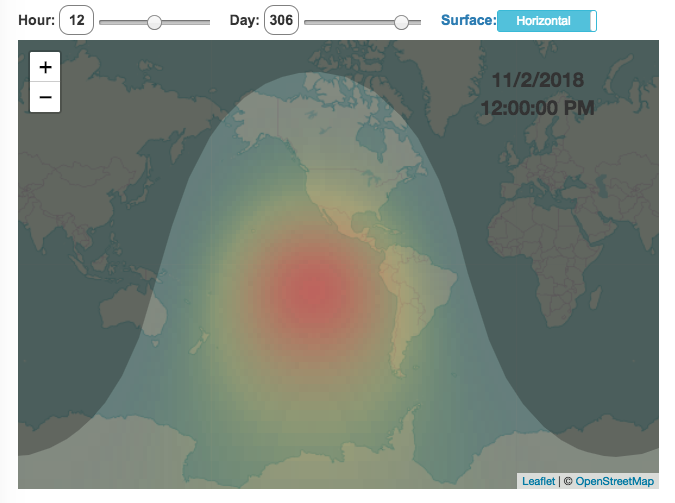
This visualization shows the amount of solar intensity (also called solar insolation and measured in watts per square meter) all across the globe as a function of time of day and day of year. This is an idealized calculation as it does not take into account reductions in solar intensity due to cloud cover or other things that might block the sun from reaching the earth (e.g dust and pollution).
As would be expected, the highest amount of solar intensity occurs on the globe right where the sun is overhead and as the angle of the sun lowers, the solar intensity declines. This is why the area around the equator and up through the tropics is so sunny, the sun is overhead here the most. If you click on the map you should see a popup of the intensity of sunlight at that location.
As the earth rotates over the course of a day, the angle of the sun changes and eventually the angle is so low, the sun is blocked by the horizon (this is sunset).
Instructions
- The default is to show the sunlight intensity for the current date and time but you can change it by moving the sliders for hour or day.
- You can also toggle between the orientation of the surface that you measure the sunlight on. The default shows the intensity of sunlight on a horizontal surface. The other option shows the intensity on a surface that is oriented to face the sun (i.e. perpendicular)
Again, the intensity will depend on the angle it makes with the sun and so it depends on your location on earth (i.e. latitude). Latitudes around the equator will receive more sunlight because their angle is closer to perpendicular.
Shifting through the days of the year, you can start to see the cause of the seasons as the amount of sunlight changes and more or less sunlight goes to each of the northern and southern hemispheres.
Calculations and Tools:
The calculations for solar intensity are based on equations from “Renewable and Efficient Electric Power Systems” by Gilbert Masters Chapter 7. Calculations were made using javascript and visualized using the Leaflet.js library with Open Street Map tiles.
This was a fun project for me to learn online mapping tools and programming.

Tesla Model 3 Sales Tracker
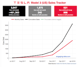
Tesla has been building innovative and industry-leading battery-powered cars for about a decade, starting with the Roadster, and then the Model S and Model X. The company unveiled the Model 3 (their first mass-market electric car with 220 miles of range, priced at “$35,000″), in early 2017 and hundreds of thousands of people put down a $1000 deposit within a few days. Overall, the number of these pre-orders total about half a million! It was impressive for a car most people have not driven or even seen.
The company also has had optimistic timeframes for producing and shipping these vehicle: they had originally estimated production rates of 5000 cars/week by the end of 2017 and 10,000 cars/week(!) in 2018. That’s Civic or Camry levels. These have since been delayed due to reports of “production hell” in scaling up mass production for the vehicles. Given the unprecedented demand and production challenges as Tesla transitions from niche automaker to mass-market production, I thought it would be worthwhile to track the sales of Model 3s as they are built and shipped to customers with the Model 3 Sales Tracker. Average sales price has been far above the $35,000 price initially announced. Production has reportedly passed 5000 cars/week intermittently, if not continuously, in the summer of 2018.
Recent Comments