Posts for Tag: money
Understanding Tax Brackets: Interactive Income Tax Visualization and Calculator
Please check out the newer version of this visualization
How is your income distributed across tax brackets?
I previously made a graphical visualization of income and marginal tax rates to show how tax brackets work. That graph tried to show alot of info on the same graph, i.e. the breakdown of income tax brackets for incomes ranging from $10,000 to $3,000,000. It was nice looking, but I think several people were confused about how to read the graph. This Sankey graph is a more detailed look at the tax breakdown for one specific income. You can enter your (or any other) profile and see how taxes are distributed across the different brackets. It can help (as the other tried) to better understand marginal and average tax rates. This tool only looks at US Federal Income taxes and ignores state, local and Social Security/Medicare taxes.
– Use this button to generate a URL that you can share a specific set of inputs and graphs. Just copy the URL in the address bar at the top of your browser (after pressing the button).
Instructions for using the visual tax calculator:
- Select filing status: Single, Married Filing Jointly or Head of Household. For more info on these filing categories see the IRS website
- Enter your regular income and capital gains income. Regular income is wage or employment income and is taxed at a higher rate than capital gains income. Capital gains income is typically investment income from the sale of stocks or dividends and taxed at a lower rate than regular income.
- Move your cursor or click on the Sankey graph to select a specific link. This will give you more information about how income in a specific tax bracket is being taxed.
**Click Here to view other financial-related tools and data visualizations from engaging-data**
As seen with the marginal rates graph, there is a big difference in how regular income and capital gains are taxed. Capital gains are taxed at a lower rate and generally have larger bracket sizes. Generally, wealthier households earn a greater fraction of their income from capital gains and as a result of the lower tax rates on capital gains, these household pay a lower effective tax rate than those making an order of magnitude less in overall income.
Tax Brackets By Year
This table lets you choose to view the thresholds for each income and capital gains tax bracket for the last few years. You can see that tax rates are much lower for capital gains in the table below than for regular income.
For those not visually inclined, here is a written description of how to apply marginal tax rates. The first thing to note is that the income shown here in the graphs is taxable income, which simply speaking is your gross income with deductions removed. The standard deduction for 2018 range from $12,000 for Single filers to $24,000 for Married filers.
- If you are single, all of your regular taxable income between 0 and $9,525 is taxed at a 10% rate. This means that your all of your gross income below $12,000 is not taxed and your gross income between $12,000 and $21,525 is taxed at 10%.
- If you have more income, you move up a marginal tax bracket. Any taxable income in excess of $9,525 but below $38,700 will be taxed at the 12% rate. It is important to note that not all of your income is taxed at the marginal rate, just the income between these amounts.
- Income between $38,700 and $82,500 is taxed at 24% and so on until you have income over $500,000 and are in the 37% marginal tax rate . . .
- Thus, different parts of your income are taxed at different rates and you can calculate an average or effective rate (which is shown in the summary table).
- Capital gains income complicates things slightly as it is taxed after regular income. Thus any amount of capital gains taxes you make are taxed at a rate that corresponds to starting after you regular income. If you made $100,000 in regular income, and only $100 in capital gains income, that $100 dollars would be taxed at the 15% rate and not at the 0% rate, because the $100,000 in regular income pushes you into the 2nd marginal tax bracket for capital gains (between $38,700 and $426,700).
Data and Tools:
Tax brackets and rates were obtained from the IRS website and calculations were made using javascript and code modified from the Sankeymatic plotting website.
Compound Interest and Stock Returns Calculator
Calculate returns on regular, periodic investments
This calculator lets you visualize the value of investing regularly. It lets you calculate the compounding from a simple interest rate or looking at specific returns from the stock market indexes or a few different individual stocks.
Instructions
- Enter the amount of money to be invested monthly
- Choose to use an interest rate (and enter a specific rate) or
- Choose a stock market index or individual stock
- Use the slider to change the initial starting date of your periodic investments – You can go as far back as 1970 or the IPO date of the stock if it is later than that.
- Use the “Generate URL to Share” button to create a special URL with the specific parameters of your choice to share with others – the URL will appear in your browser’s address bar.
You can hover over the graph to see the split between the money you invested and the gains from the investment. In most cases (unless returns are very high), initially the investments are the large majority of the total balance, but over time the gains compound and eventually, it is those gains rather than the initial investments that become the majority of the total.
Some of the tech stocks included in the dropdown list have very high annualized returns and thus the gains quickly overtake the additions as the dominant component of the balance and you can make a great deal of money fairly quickly.
It becomes clearer as you move the slider around, that longer investing time periods are the key to increasing your balance, so building financial prosperity through investing is generally more of a marathon and not really a sprint. However, if you invest in individual stocks and pick a good one, you can speed up that process, though it’s not necessarily the most advisable way to proceed. Lots of people underperform the market (i.e. index funds) or even lose money by trying to pick big winners.
Understanding the Calculations
Calculating compound returns is relatively easy and is just a matter of consecutively multiplying the return. If the return is 7% for 5 years, that is equal to multiplying 1.07 five times, i.e. 1.075 = 1.402 (or a 40.2% gain).
In this case, we are adding additional investments each month but the idea is the same. Take the amount of money (or value of shares) and multiply by the return (>1 if positive or <1 for negative returns) after each period of the analysis.
Sources and Tools:
Stock and index monthly data is downloaded from Yahoo! finance is downloaded regularly using a python script.
The graph is created using the open-source Plotly javascript visualization library, as well as HTML, CSS and Javascript code to create interactivity and UI.

How much wealth do the world’s richest billionaires have?
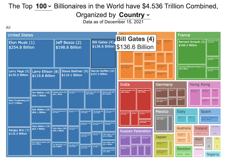
This dataviz compares how rich the world’s top billionaires are, showing their wealth as a treemap. The treemap is used to show the relative size of their wealth as boxes and is organized in order from largest to smallest.
User controls let you change the number of billionaires shown on the graph as well as group each person by their country or industry. If you group by country or industry, you can also click on a specific grouping to isolate that group and zoom in to see the contents more clearly. Hovering over each of the boxes (especially the smaller ones) will give you a popup that lets you see their name, ranking and net worth more clearly.
The popup shows how much total wealth the top billionaires control and for context compare it to the wealth of a certain number of households in the US. The comparison isn’t ideal as many of the billionaires are not from the US, but I think it still provides a useful point of comparison.
This visualization uses the same data that I needed in order to create my “How Rich is Elon Musk?” visualization. Since I had all this data, I figured I could crank out another related graph.
Sources and Tools:
Data from Bloomberg’s Billionaire’s index is downloaded regularly using a python script. Data on US household net worth is from DQYDJ’s net worth percentile calculator.
The treemap is created using the open-source Plotly javascript visualization library, as well as HTML, CSS and Javascript code to create interactivity and UI.

How Rich is Elon Musk? – Visualization of Extreme Wealth
See related visualization: How much wealth do the world’s richest billionaires have?
Visualizing Elon Musk net worth in 2024
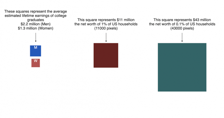
This visualization attempts to represent how much money Elon Musk, the richest person in the world, has. It gives context on this extreme amount of wealth by showing other very large sums of money that are somehow less than his net worth.
Each pixel on the screen represents a very modest amount of money (from $ 500 to $ 4000). As you scroll to the right, you will start to understand how incredibly large one billion dollars is, let alone hundreds of billions. You can change the amount of scrolling needed to get to the end of the visualization by selecting the amount represented by one pixel in the drop down menu.
This visualization was inspired heavily by a similar visualization made by Matt Korostoff for Jeff Bezos (when he was the richest person in the world) called “Wealth shown to scale”.
If you have any ideas about other items that could be added to the money chart, please leave them in the comments, and I will see if I can add it.
Mega-billionaires such as Musk or Jeff Bezos are not just extremely rich, the wealth they possess is unimaginably large. There are some extremely rich folks shown in the visualization who can buy pretty much whatever they could ever possibly need and yet their wealth is closer to that of the average person than they are to that of Elon Musk.
Sources and Tools:
The full list of data sources for the various money amounts are listed below. Most data is from 2021 though networth data for billionaires is updated regularly. The visualization was made using HTML, CSS and Javascript code to create interactivity and UI. Data from Bloomberg’s Billionaire’s index , which is the source of Musk’s (and others) estimated wealth, is updated regularly.
Full List of Data Sources:
- Cost of a supertanker’s worth of oil (at $70/barrel): https://en.wikipedia.org/wiki/Oil_tanker
- Cost of a Boeing 777-200ER Airplane: https://en.wikipedia.org/wiki/Boeing_777
- Lebron James and Cristiano Ronaldo Net Worth: https://wealthygorilla.com/top-20-richest-athletes-world/
- Tiger Woods Net Worth: https://wealthygorilla.com/top-20-richest-athletes-world/
- It’s alot of money, but we’ve still got a long way to go:
- Cost of building the Burj Khalifa (world’s tallest building in Dubai): https://en.wikipedia.org/wiki/Burj_Khalifa
- Total Ad Revenue for CNN, Fox News and MSNBC: https://www.pewresearch.org/journalism/fact-sheet/cable-news/
- Ophrah Winfrey Net Worth: https://www.celebritynetworth.com/richest-celebrities/actors/oprah-net-worth/
- Tuition for all 280,000 University of California Students: https://www.ucop.edu/operating-budget/_files/rbudget/2021-22-budget-detail.pdf
- One 40-Foot Shipping Container Full of $100 Bills: self-calculation
- Net Worth of Bottom 33% of Americans: https://dqydj.com/average-median-top-net-worth-percentiles/
- George Lucas Net Worth: https://www.bloomberg.com/billionaires/
- Cost of 2020 Tokyo Olympics: https://www.usnews.com/news/business/articles/2021-08-06/tokyo-olympics-cost-154-billion-what-else-could-that-buy
- Annual Budget of the US Department of Energy: https://en.wikipedia.org/wiki/United_States_Department_of_Energy
- Worldwide Box Office Revenue for Marvel Cinematic Universe (2008-2021): https://www.the-numbers.com/movies/franchise/Marvel-Cinematic-Universe#tab=summary
- Total Amount Spent of Gasoline in the State of Texas in one year: https://www.eia.gov/state/seds/data.php?incfile=/state/seds/sep_fuel/html/fuel_mg.html&sid=US
- Size of Harvard University’s Endowment: https://www.thecrimson.com/article/2021/10/15/endowment-returns-soar-2021/
- Annual Budget of the US Department of Transportation: https://en.wikipedia.org/wiki/United_States_Department_of_Transportation
- Total Gross State Product of Hawaii in 2021: https://en.wikipedia.org/wiki/List_of_states_and_territories_of_the_United_States_by_GDP
- Warren Buffet Net Worth: https://www.bloomberg.com/billionaires/
- State of Texas Operating Budget: https://en.wikipedia.org/wiki/List_of_U.S._state_budgets
- Total Value of all National Football League (NFL) Teams: https://www.profootballnetwork.com/nfl-franchise-values/
- Total Annual Income of 2 Million Residents of Silicon Valley (San Jose-Sunnyvale-Santa Clara CA Metro Area): https://censusreporter.org/profiles/31000US41940-san-jose-sunnyvale-santa-clara-ca-metro-area/
- Total Dollar Value of All US Agricultural Production: https://www.ers.usda.gov/data-products/ag-and-food-statistics-charting-the-essentials/ag-and-food-sectors-and-the-economy/
- Bill Gates Net Worth: https://www.bloomberg.com/billionaires/
- Total Tesla Revenue Since Founding (2008-2021): https://www.statista.com/statistics/272120/revenue-of-tesla/
- Annual Advertising Revenue for Google: https://www.cnbc.com/2021/05/18/how-does-google-make-money-advertising-business-breakdown-.html
- Total Amount Spent on US Residential Electricity In A Year: https://www.eia.gov/state/seds/data.php?incfile=/state/seds/sep_fuel/html/fuel_pr_es.html&sid=US
- Jeff Bezos Net Worth: https://www.bloomberg.com/billionaires/
- Annual Federal Taxes paid in Florida: https://en.wikipedia.org/wiki/Federal_tax_revenue_by_state
- Global Electric Vehicle Market Size in 2020: https://www.globenewswire.com/en/news-release/2021/09/06/2291730/0/en/Electric-Vehicle-Market-Size-Is-Anticipated-to-Grow-USD-1-318-22-Billion-in-2028-at-a-CAGR-of-24-3.html
- Value (i.e. Market Capitalization) of Walt Disney Company: https://www.google.com/finance/quote/DIS:NYSE
- Annual Revenue of Toyota Motor Corporation: https://money.cnn.com/quote/financials/financials.html?symb=TM
- Annual Health Care Expenditures for the entire State of California: https://www.kff.org/other/state-indicator/health-care-expenditures-by-state-of-residence-in-millions/?currentTimeframe=0&sortModel=%7B%22colId%22:%22Location%22,%22sort%22:%22asc%22%7D
- Total Annual Income for 100,000 Average US Households: https://www.census.gov/library/publications/2021/demo/p60-273.html
- Cost of one Gerald Ford Class Aircraft Carrier: https://en.wikipedia.org/wiki/Gerald_R._Ford-class_aircraft_carrier
- Cost to Build California High Speed Rail System: https://en.wikipedia.org/wiki/California_High-Speed_Rail
- Inflation Adjusted Cost of NASA’s Apollo Program: https://www.forbes.com/sites/alexknapp/2019/07/20/apollo-11-facts-figures-business/
- Total Annual Housing and Utilities Expenditures For All 6.6 Million Households in Los Angeles Metro Area: https://www.bls.gov/cex/tables/geographic/mean/cu-msa-west-2-year-average-2020.pdf
- Annual Amount Spent on the Purchase of iPhones: https://www.businessofapps.com/data/apple-statistics/
- Annual Aggregate Salaries of US Workers in 2023 (various occupations): BLS Website: https://www.bls.gov/oes/current/oes_nat.htm
- Consumer Purchases: BEA Website: https://apps.bea.gov/
- Welfare Spending: Pew Research: https://www.pewresearch.org/short-reads/2023/07/19/what-the-data-says-about-food-stamps-in-the-u-s/
- Market Cap or Revenue for large companies : Stock Analysis: https://stockanalysis.com/list/sp-500-stocks/
- Elon Musk Net Worth: https://www.bloomberg.com/billionaires/

Early Retirement Calculators and Tools
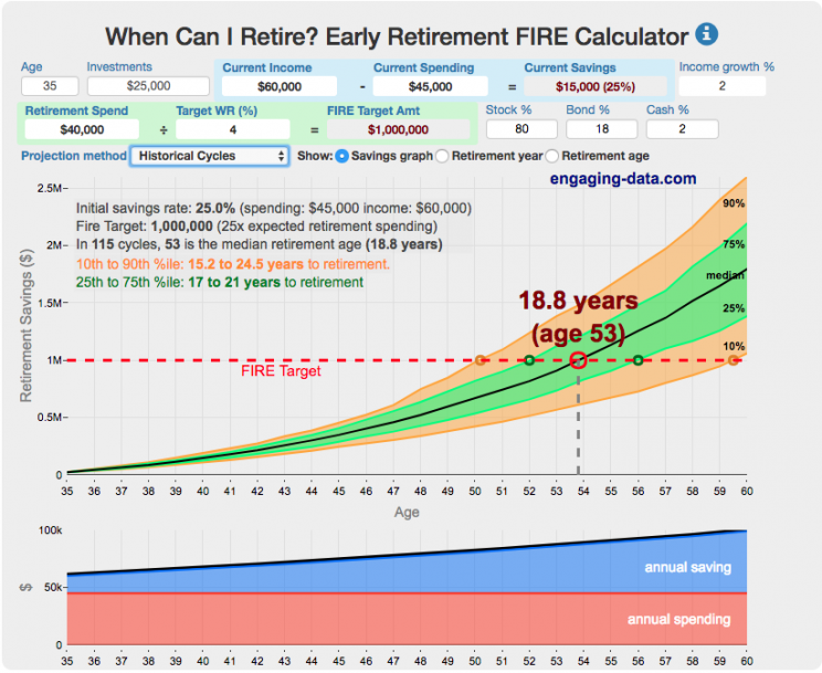
Interested in Early Retirement or FIRE (Financial Independence to Retire Early)?
Here are some interactive and educational planning tools that I developed to help you understand the concepts of FIRE and calculate how long it will take to achieve retirement and how likely you are to survive retirement. Click on the tools below to try them out.
Financial Independence Calculators
Regardless of where you are on your path to FIRE, there are several types of tools that are useful:
Planning to get to retirement
How long and how safe will your retirement be?
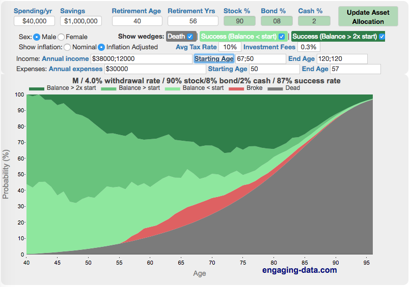
Rich, Broke or Dead? Will your Money Last Through Early Retirement?
Simulating retirement portfolio survival probability and human longevity
Determining the appropriate withdrawal rate (i.e. is 4% best?)
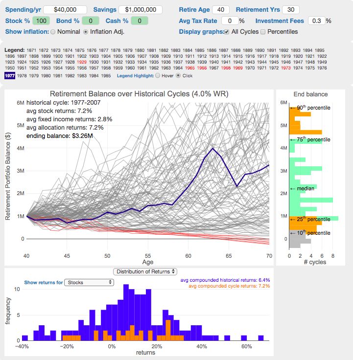
Understanding portfolio simulations and historical cycles
Interactive tool lets you explore the concept of historical simulations and understand how to determine a safe withdrawal rate
Tracking Progress to Retirement Target
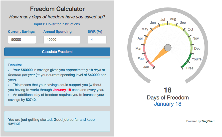
Financial freedom calculator / calendar
Track your progress to retirement by calculating days of “freedom”, the number of days your savings could support you per year
These tools all focus on the concept of FIRE. FIRE is the concept that revolves around saving and investing to achieve Financial Independence (FI) and to potentially Retire Early (RE). One of the core concepts is that once you can save up enough money, you can retire by withdrawing a fraction of this money annually to cover your living expenses. Other important topics related to this core concept have to do with reducing spending so you can save money and investing so your money can grow and sustain your retirement over many decades.
Other visualizations and tools related to Financial Independence
These tools relate to taxes and stock market returns.
Calculating Returns from Periodic Investments
Visualizing Market Returns
Understanding Market Timing
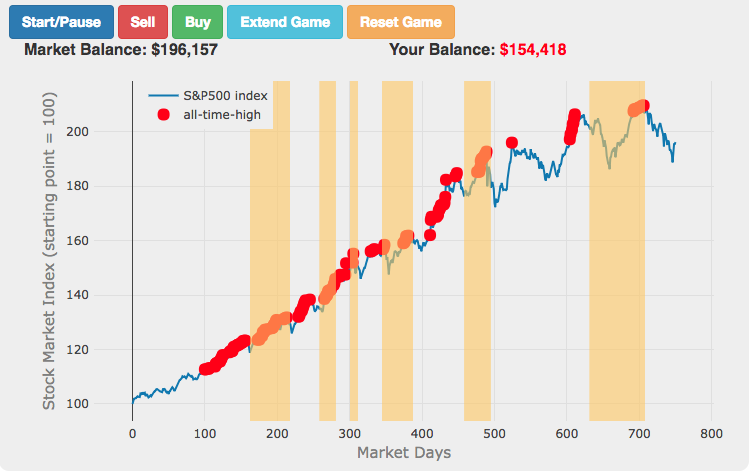
Market Timing Game
How difficult is it to time the stock market?
Income Taxes
Income Tax Bracket Calculator
Tax bracket calculator to visualize how income and capital gains taxed
Data Sources and Tools:
See the individual tool to learn more about how it was made.
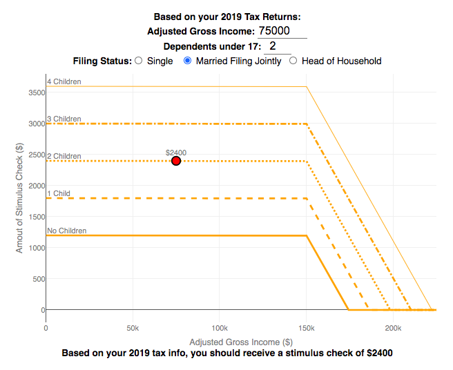
Stimulus Check Calculator (Late 2020 & Early 2021)

How much money can you expect in your stimulus check?
Updated to include the $1400 stimulus payment per adult and dependent in March 2021.
Use this stimulus check calculator to figure out how much you will receive in your thrid stimulus check.
On December 21, 2020, Congress passed a $900 billion dollar stimulus package in response to the COVID pandemic. The bill authorizes economic assistance to Americans in the amount of $600 per person subject to income limits. It also includes expanded unemployment benefits, rental assistance and an extension to the eviction ban. This calculator helps you calculate the amount of stimulus check that you can expect to receive based on your 2019 tax return filing status, adjusted gross income and number of dependents under 17.
Changing the inputs to the calculator, will show you how your expected stimulus check amount will change. The graph shows for a giving filing status (single, married filing jointly or head of household) how the stimulus check amount will change as a function of income and number of children. You can share a URL with specific parameters included
Sounds like some checks may even get to folks at the end of December and many more will get them in January 2021.
On March 5, congress passed the American Rescue Plan which includes $1400 payments for all Americans. The phase out of this stimulus check is different in that over a $10000 range the stimulus goes from 100% to 0% at the phase out threshold, no matter how many dependents you have. This changes things significantly as you’ll see in the calculator.
Sources and Tools:
The stimulus check calculator is made using javascript and the plotly open source graphing library. It is based on news reports of the expected stimulus amounts and income thresholds.
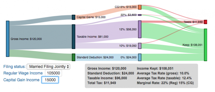
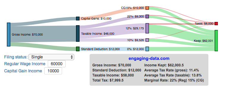
Understanding Tax Brackets: Interactive Income Tax Visualization and Calculator
Please check out the newer version of this visualization
How is your income distributed across tax brackets?
I previously made a graphical visualization of income and marginal tax rates to show how tax brackets work. That graph tried to show alot of info on the same graph, i.e. the breakdown of income tax brackets for incomes ranging from $10,000 to $3,000,000. It was nice looking, but I think several people were confused about how to read the graph. This Sankey graph is a more detailed look at the tax breakdown for one specific income. You can enter your (or any other) profile and see how taxes are distributed across the different brackets. It can help (as the other tried) to better understand marginal and average tax rates. This tool only looks at US Federal Income taxes and ignores state, local and Social Security/Medicare taxes.
– Use this button to generate a URL that you can share a specific set of inputs and graphs. Just copy the URL in the address bar at the top of your browser (after pressing the button).
- Select filing status: Single, Married Filing Jointly or Head of Household. For more info on these filing categories see the IRS website
- Enter your regular income and capital gains income. Regular income is wage or employment income and is taxed at a higher rate than capital gains income. Capital gains income is typically investment income from the sale of stocks or dividends and taxed at a lower rate than regular income.
- Move your cursor or click on the Sankey graph to select a specific link. This will give you more information about how income in a specific tax bracket is being taxed.
**Click Here to view other financial-related tools and data visualizations from engaging-data**
As seen with the marginal rates graph, there is a big difference in how regular income and capital gains are taxed. Capital gains are taxed at a lower rate and generally have larger bracket sizes. Generally, wealthier households earn a greater fraction of their income from capital gains and as a result of the lower tax rates on capital gains, these household pay a lower effective tax rate than those making an order of magnitude less in overall income.
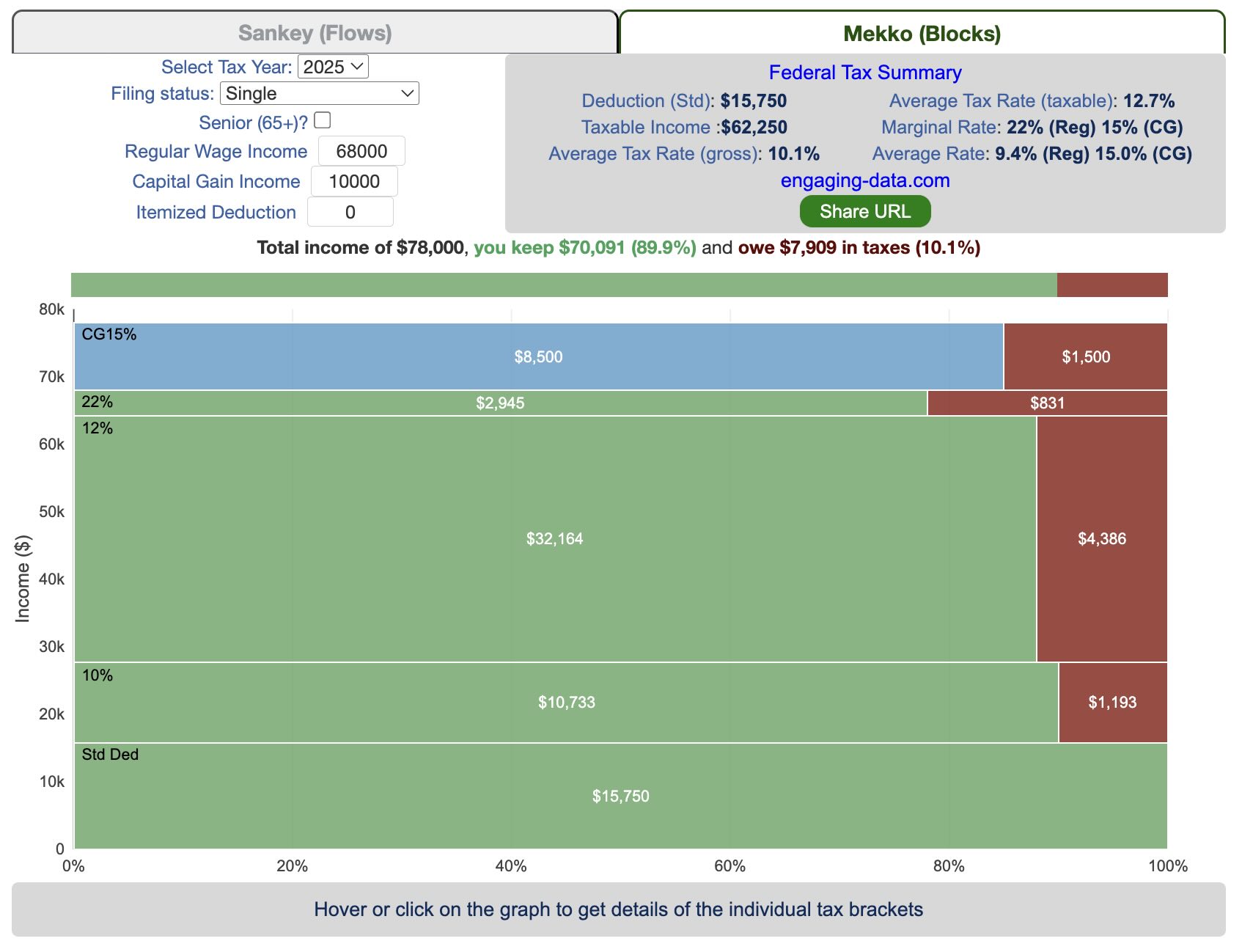
Tax Brackets By Year
This table lets you choose to view the thresholds for each income and capital gains tax bracket for the last few years. You can see that tax rates are much lower for capital gains in the table below than for regular income.
- If you are single, all of your regular taxable income between 0 and $9,525 is taxed at a 10% rate. This means that your all of your gross income below $12,000 is not taxed and your gross income between $12,000 and $21,525 is taxed at 10%.
- If you have more income, you move up a marginal tax bracket. Any taxable income in excess of $9,525 but below $38,700 will be taxed at the 12% rate. It is important to note that not all of your income is taxed at the marginal rate, just the income between these amounts.
- Income between $38,700 and $82,500 is taxed at 24% and so on until you have income over $500,000 and are in the 37% marginal tax rate . . .
- Thus, different parts of your income are taxed at different rates and you can calculate an average or effective rate (which is shown in the summary table).
- Capital gains income complicates things slightly as it is taxed after regular income. Thus any amount of capital gains taxes you make are taxed at a rate that corresponds to starting after you regular income. If you made $100,000 in regular income, and only $100 in capital gains income, that $100 dollars would be taxed at the 15% rate and not at the 0% rate, because the $100,000 in regular income pushes you into the 2nd marginal tax bracket for capital gains (between $38,700 and $426,700).
Data and Tools:
Tax brackets and rates were obtained from the IRS website and calculations were made using javascript and code modified from the Sankeymatic plotting website.
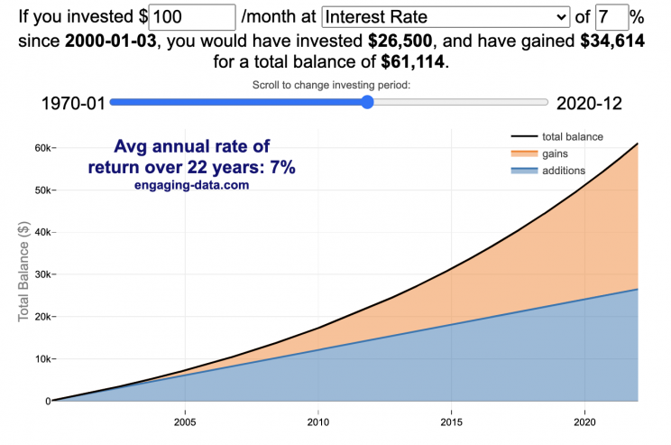
Compound Interest and Stock Returns Calculator
Calculate returns on regular, periodic investments
This calculator lets you visualize the value of investing regularly. It lets you calculate the compounding from a simple interest rate or looking at specific returns from the stock market indexes or a few different individual stocks.
Instructions
- Enter the amount of money to be invested monthly
- Choose to use an interest rate (and enter a specific rate) or
- Choose a stock market index or individual stock
- Use the slider to change the initial starting date of your periodic investments – You can go as far back as 1970 or the IPO date of the stock if it is later than that.
- Use the “Generate URL to Share” button to create a special URL with the specific parameters of your choice to share with others – the URL will appear in your browser’s address bar.
You can hover over the graph to see the split between the money you invested and the gains from the investment. In most cases (unless returns are very high), initially the investments are the large majority of the total balance, but over time the gains compound and eventually, it is those gains rather than the initial investments that become the majority of the total.
Some of the tech stocks included in the dropdown list have very high annualized returns and thus the gains quickly overtake the additions as the dominant component of the balance and you can make a great deal of money fairly quickly.
It becomes clearer as you move the slider around, that longer investing time periods are the key to increasing your balance, so building financial prosperity through investing is generally more of a marathon and not really a sprint. However, if you invest in individual stocks and pick a good one, you can speed up that process, though it’s not necessarily the most advisable way to proceed. Lots of people underperform the market (i.e. index funds) or even lose money by trying to pick big winners.
Understanding the Calculations
Calculating compound returns is relatively easy and is just a matter of consecutively multiplying the return. If the return is 7% for 5 years, that is equal to multiplying 1.07 five times, i.e. 1.075 = 1.402 (or a 40.2% gain).
In this case, we are adding additional investments each month but the idea is the same. Take the amount of money (or value of shares) and multiply by the return (>1 if positive or <1 for negative returns) after each period of the analysis.
Sources and Tools:
Stock and index monthly data is downloaded from Yahoo! finance is downloaded regularly using a python script.
The graph is created using the open-source Plotly javascript visualization library, as well as HTML, CSS and Javascript code to create interactivity and UI.
How much wealth do the world’s richest billionaires have?
This dataviz compares how rich the world’s top billionaires are, showing their wealth as a treemap. The treemap is used to show the relative size of their wealth as boxes and is organized in order from largest to smallest.
User controls let you change the number of billionaires shown on the graph as well as group each person by their country or industry. If you group by country or industry, you can also click on a specific grouping to isolate that group and zoom in to see the contents more clearly. Hovering over each of the boxes (especially the smaller ones) will give you a popup that lets you see their name, ranking and net worth more clearly.
The popup shows how much total wealth the top billionaires control and for context compare it to the wealth of a certain number of households in the US. The comparison isn’t ideal as many of the billionaires are not from the US, but I think it still provides a useful point of comparison.
This visualization uses the same data that I needed in order to create my “How Rich is Elon Musk?” visualization. Since I had all this data, I figured I could crank out another related graph.
Sources and Tools:
Data from Bloomberg’s Billionaire’s index is downloaded regularly using a python script. Data on US household net worth is from DQYDJ’s net worth percentile calculator.
The treemap is created using the open-source Plotly javascript visualization library, as well as HTML, CSS and Javascript code to create interactivity and UI.
How Rich is Elon Musk? – Visualization of Extreme Wealth
See related visualization: How much wealth do the world’s richest billionaires have?
Visualizing Elon Musk net worth in 2024
This visualization attempts to represent how much money Elon Musk, the richest person in the world, has. It gives context on this extreme amount of wealth by showing other very large sums of money that are somehow less than his net worth.
Each pixel on the screen represents a very modest amount of money (from
This visualization was inspired heavily by a similar visualization made by Matt Korostoff for Jeff Bezos (when he was the richest person in the world) called “Wealth shown to scale”.
If you have any ideas about other items that could be added to the money chart, please leave them in the comments, and I will see if I can add it.
Mega-billionaires such as Musk or Jeff Bezos are not just extremely rich, the wealth they possess is unimaginably large. There are some extremely rich folks shown in the visualization who can buy pretty much whatever they could ever possibly need and yet their wealth is closer to that of the average person than they are to that of Elon Musk.
Sources and Tools:
The full list of data sources for the various money amounts are listed below. Most data is from 2021 though networth data for billionaires is updated regularly. The visualization was made using HTML, CSS and Javascript code to create interactivity and UI. Data from Bloomberg’s Billionaire’s index , which is the source of Musk’s (and others) estimated wealth, is updated regularly.
Full List of Data Sources:
- Cost of a supertanker’s worth of oil (at $70/barrel): https://en.wikipedia.org/wiki/Oil_tanker
- Cost of a Boeing 777-200ER Airplane: https://en.wikipedia.org/wiki/Boeing_777
- Lebron James and Cristiano Ronaldo Net Worth: https://wealthygorilla.com/top-20-richest-athletes-world/
- Tiger Woods Net Worth: https://wealthygorilla.com/top-20-richest-athletes-world/
- It’s alot of money, but we’ve still got a long way to go:
- Cost of building the Burj Khalifa (world’s tallest building in Dubai): https://en.wikipedia.org/wiki/Burj_Khalifa
- Total Ad Revenue for CNN, Fox News and MSNBC: https://www.pewresearch.org/journalism/fact-sheet/cable-news/
- Ophrah Winfrey Net Worth: https://www.celebritynetworth.com/richest-celebrities/actors/oprah-net-worth/
- Tuition for all 280,000 University of California Students: https://www.ucop.edu/operating-budget/_files/rbudget/2021-22-budget-detail.pdf
- One 40-Foot Shipping Container Full of $100 Bills: self-calculation
- Net Worth of Bottom 33% of Americans: https://dqydj.com/average-median-top-net-worth-percentiles/
- George Lucas Net Worth: https://www.bloomberg.com/billionaires/
- Cost of 2020 Tokyo Olympics: https://www.usnews.com/news/business/articles/2021-08-06/tokyo-olympics-cost-154-billion-what-else-could-that-buy
- Annual Budget of the US Department of Energy: https://en.wikipedia.org/wiki/United_States_Department_of_Energy
- Worldwide Box Office Revenue for Marvel Cinematic Universe (2008-2021): https://www.the-numbers.com/movies/franchise/Marvel-Cinematic-Universe#tab=summary
- Total Amount Spent of Gasoline in the State of Texas in one year: https://www.eia.gov/state/seds/data.php?incfile=/state/seds/sep_fuel/html/fuel_mg.html&sid=US
- Size of Harvard University’s Endowment: https://www.thecrimson.com/article/2021/10/15/endowment-returns-soar-2021/
- Annual Budget of the US Department of Transportation: https://en.wikipedia.org/wiki/United_States_Department_of_Transportation
- Total Gross State Product of Hawaii in 2021: https://en.wikipedia.org/wiki/List_of_states_and_territories_of_the_United_States_by_GDP
- Warren Buffet Net Worth: https://www.bloomberg.com/billionaires/
- State of Texas Operating Budget: https://en.wikipedia.org/wiki/List_of_U.S._state_budgets
- Total Value of all National Football League (NFL) Teams: https://www.profootballnetwork.com/nfl-franchise-values/
- Total Annual Income of 2 Million Residents of Silicon Valley (San Jose-Sunnyvale-Santa Clara CA Metro Area): https://censusreporter.org/profiles/31000US41940-san-jose-sunnyvale-santa-clara-ca-metro-area/
- Total Dollar Value of All US Agricultural Production: https://www.ers.usda.gov/data-products/ag-and-food-statistics-charting-the-essentials/ag-and-food-sectors-and-the-economy/
- Bill Gates Net Worth: https://www.bloomberg.com/billionaires/
- Total Tesla Revenue Since Founding (2008-2021): https://www.statista.com/statistics/272120/revenue-of-tesla/
- Annual Advertising Revenue for Google: https://www.cnbc.com/2021/05/18/how-does-google-make-money-advertising-business-breakdown-.html
- Total Amount Spent on US Residential Electricity In A Year: https://www.eia.gov/state/seds/data.php?incfile=/state/seds/sep_fuel/html/fuel_pr_es.html&sid=US
- Jeff Bezos Net Worth: https://www.bloomberg.com/billionaires/
- Annual Federal Taxes paid in Florida: https://en.wikipedia.org/wiki/Federal_tax_revenue_by_state
- Global Electric Vehicle Market Size in 2020: https://www.globenewswire.com/en/news-release/2021/09/06/2291730/0/en/Electric-Vehicle-Market-Size-Is-Anticipated-to-Grow-USD-1-318-22-Billion-in-2028-at-a-CAGR-of-24-3.html
- Value (i.e. Market Capitalization) of Walt Disney Company: https://www.google.com/finance/quote/DIS:NYSE
- Annual Revenue of Toyota Motor Corporation: https://money.cnn.com/quote/financials/financials.html?symb=TM
- Annual Health Care Expenditures for the entire State of California: https://www.kff.org/other/state-indicator/health-care-expenditures-by-state-of-residence-in-millions/?currentTimeframe=0&sortModel=%7B%22colId%22:%22Location%22,%22sort%22:%22asc%22%7D
- Total Annual Income for 100,000 Average US Households: https://www.census.gov/library/publications/2021/demo/p60-273.html
- Cost of one Gerald Ford Class Aircraft Carrier: https://en.wikipedia.org/wiki/Gerald_R._Ford-class_aircraft_carrier
- Cost to Build California High Speed Rail System: https://en.wikipedia.org/wiki/California_High-Speed_Rail
- Inflation Adjusted Cost of NASA’s Apollo Program: https://www.forbes.com/sites/alexknapp/2019/07/20/apollo-11-facts-figures-business/
- Total Annual Housing and Utilities Expenditures For All 6.6 Million Households in Los Angeles Metro Area: https://www.bls.gov/cex/tables/geographic/mean/cu-msa-west-2-year-average-2020.pdf
- Annual Amount Spent on the Purchase of iPhones: https://www.businessofapps.com/data/apple-statistics/
- Annual Aggregate Salaries of US Workers in 2023 (various occupations): BLS Website: https://www.bls.gov/oes/current/oes_nat.htm
- Consumer Purchases: BEA Website: https://apps.bea.gov/
- Welfare Spending: Pew Research: https://www.pewresearch.org/short-reads/2023/07/19/what-the-data-says-about-food-stamps-in-the-u-s/
- Market Cap or Revenue for large companies : Stock Analysis: https://stockanalysis.com/list/sp-500-stocks/
- Elon Musk Net Worth: https://www.bloomberg.com/billionaires/
Early Retirement Calculators and Tools
Interested in Early Retirement or FIRE (Financial Independence to Retire Early)?
Here are some interactive and educational planning tools that I developed to help you understand the concepts of FIRE and calculate how long it will take to achieve retirement and how likely you are to survive retirement. Click on the tools below to try them out.
Financial Independence Calculators
Regardless of where you are on your path to FIRE, there are several types of tools that are useful:
Planning to get to retirement

How long and how safe will your retirement be?
Rich, Broke or Dead? Will your Money Last Through Early Retirement?
Simulating retirement portfolio survival probability and human longevity
Determining the appropriate withdrawal rate (i.e. is 4% best?)
Understanding portfolio simulations and historical cycles
Interactive tool lets you explore the concept of historical simulations and understand how to determine a safe withdrawal rate
Tracking Progress to Retirement Target
Financial freedom calculator / calendar
Track your progress to retirement by calculating days of “freedom”, the number of days your savings could support you per year
These tools all focus on the concept of FIRE. FIRE is the concept that revolves around saving and investing to achieve Financial Independence (FI) and to potentially Retire Early (RE). One of the core concepts is that once you can save up enough money, you can retire by withdrawing a fraction of this money annually to cover your living expenses. Other important topics related to this core concept have to do with reducing spending so you can save money and investing so your money can grow and sustain your retirement over many decades.
Other visualizations and tools related to Financial Independence
These tools relate to taxes and stock market returns.
Calculating Returns from Periodic Investments
Visualizing Market Returns
Understanding Market Timing
How difficult is it to time the stock market?
Market Timing Game
Income Taxes
Tax bracket calculator to visualize how income and capital gains taxed
Income Tax Bracket Calculator
Data Sources and Tools:
See the individual tool to learn more about how it was made.
Stimulus Check Calculator (Late 2020 & Early 2021)
How much money can you expect in your stimulus check?
Updated to include the $1400 stimulus payment per adult and dependent in March 2021.
Use this stimulus check calculator to figure out how much you will receive in your thrid stimulus check.
On December 21, 2020, Congress passed a $900 billion dollar stimulus package in response to the COVID pandemic. The bill authorizes economic assistance to Americans in the amount of $600 per person subject to income limits. It also includes expanded unemployment benefits, rental assistance and an extension to the eviction ban. This calculator helps you calculate the amount of stimulus check that you can expect to receive based on your 2019 tax return filing status, adjusted gross income and number of dependents under 17.
Changing the inputs to the calculator, will show you how your expected stimulus check amount will change. The graph shows for a giving filing status (single, married filing jointly or head of household) how the stimulus check amount will change as a function of income and number of children. You can share a URL with specific parameters included
Sounds like some checks may even get to folks at the end of December and many more will get them in January 2021.
On March 5, congress passed the American Rescue Plan which includes $1400 payments for all Americans. The phase out of this stimulus check is different in that over a $10000 range the stimulus goes from 100% to 0% at the phase out threshold, no matter how many dependents you have. This changes things significantly as you’ll see in the calculator.
Sources and Tools:
The stimulus check calculator is made using javascript and the plotly open source graphing library. It is based on news reports of the expected stimulus amounts and income thresholds.
Recent Comments