Posts for Tag: data
US County Electoral Map – Land Area vs Population
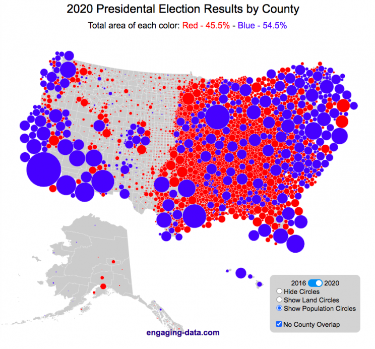
County-level Election Results from 2024, 2020 and 2016
The interface has been updated and you can now also zoom in and look at a specific state’s election results.
Click here to view a visualization that looks more explicitly at the correlation between population density and votes by county.
This interactive map shows the election results by county and you can display the size of counties based on their land area or population size.
Previously, I created a map (cartogram) that showed the state by state electoral results from the Presidential Election by scaling the size of the states based on their electoral votes. The idea for that map was that by portraying a state as Red or Blue, your eye naturally attempts to determine which color has a greater share of the total. On a normal election map, Red states dominate, especially because a number of larger, less populated states happen to vote Republican. That cartogram changed the size of the states so that large states with low population, and thus low electoral votes tended to shrink in size, while smaller states with moderate to larger populations tended to grow in size. Thus, when your eyes attempt to discern which color prevails, the comparison is more accurate and attempts to replicate the relative ratio of electoral votes for each side.
This map looks at the 2024, 2020 and 2016 presidential election results, county by county. An interesting thing to note is that this view is even more heavily dominated by the color red, for the same reasons. Less densely populated counties tend to vote republican, while higher density, typically smaller counties tend to vote for democrats. As a result, the blue counties tend to be the smaller ones so blue is visually less represented than it should be based on vote totals. More than 75% of the land area is red, when looking at the map based on land areas, while shifting to the population view only about 46% of the map is red. Neither of these percentages is exactly correct because each county is colored fully red or blue and don’t take into account that some counties are won by a large percentage and some are essentially tied. However, the population number is certainly closer to reality as Trump won about 48.8% of the votes that went to either Trump or Clinton.
Instructions
This tool should be relatively straightforward to use. Just click around and play with it.
The map has a few different options for display:
- Hide Circles – just shows the county map
- Show land circles – where the area of the circle matches the area of the county itself, though obviously shaped like a circle. The counties are colored red or blue depending on whether Trump or Harris (in 2024), Biden (in 2020) or Clinton (in 2016) won more votes in that county vs Donald Trump (2024, 2020 and 2016).
- Show population circles – where the area of the circle matches the relative population of the county itself. More populated counties will grow larger while less populated counties will shrink. The counties are colored red or blue depending on whether Trump or Biden or Clinton won more votes in that county.
- Selecting the No County Overlap button will spread out all of the circles so you can see them all. The total displayed area of the county circles is the same in either land and population view, though if the circles are overlapping, you may see less total colors.
- Selecting the Color by Margin button will color the each county circle by the amount that a candidate won the county. If the vote margin is small, the county will be colored light blue or red, whereas if a county strongly favors one candidate, it will be colored darker red or blue.
- Selecting the Allow State Zoom button let you zoom into and only show the counties of a specific state. Just click on the state to zoom in (and back out).
Visualization notes
This was my second attempt at using d3 to generate visualizations. I typically use leaflet to do web-based mapping but I wanted the power of d3 which has functions for the circles to prevent overlapping. This map was inspired by Karim Douieb’s cool visualization of 2016 election results. I modified it in a number of different ways to try to make it more interactive and useful.
This visualization does not actually simulate the collisions between the circles on your browser. It is a bit computationally taxing and causes my computer fan to turn on after awhile. So instead I ran the simulation on my computer and recorded the coordinates for where each circle ended up for each category. Then your browser is simply using d3 transitions to shift positions and sizes of the circles between each of the maps, which is simpler, though with 3142 counties, it can still tax the computer occasionally.
Data and Tools
County level election data for 2016 is from MIT Election Lab. The 2020 county level data is downloaded from the New York Times county election data API and processed using a python script. 2024 county data is from the NYTimes as well by individual state (e.g. Maine) Population data used is for 2018. The visualization was created using d3 javascript visualization library.

Planetary Art – Inner Planet Orbital Spirograph
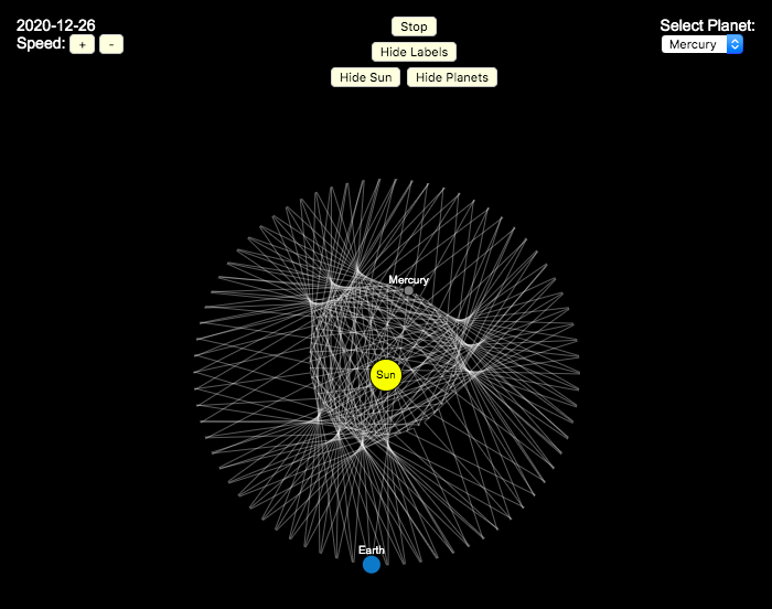
Earlier, I had made a visualization showing that Mercury is the closest planet to Earth (on average) and not Venus or Mars. To make that, I downloaded a bunch of NASA ephemeris (orbital) data. I realized I could use the same data to make some cool orbital art inspired by a spirograph – a planetary spirograph.
Basically, you get to choose a planet and the visualization will draw a line connecting that planet and Earth every few days. These lines will then build up into a cool pattern over 40 earth years of orbital cycles. Each planet (Mercury, Venus and Mars) has a different orbital period around the sun than Earth does and as a result, interesting patterns emerges.
Orbital periods of the four inner rocky planets:
- Mercury: 88 days
- Venus: 225 days
- Earth:365 days
- Mars: 687 days
Also evident is that the orbits of some of the planets are not quite circular so the pattern isn’t quite centered on the sun. Venus has the most regular pattern, creating a distinctive 5-lobed design. The other planets also have visually stunning patterns, though they do not repeat perfectly over time.
You can change the planets using the drop down menu as well as change the speed of the spirograph, and hide the planets and the sun.
Data and Tools:
I had thought about simulating the planets but there are plenty of tools out there that generate this orbital data so instead just downloaded 40 years of ephemeris data (data related to positions of astronomical bodies) from NASA website.. I processed the data using javascript and drew the picture using HTML canvas tools.

How do Americans Spend Money? US Household Spending Breakdown by Household Composition

How much do US households spend and how does it change with household composition?
This visualization is one of a series of visualizations that present US household spending data from the US Bureau of Labor Statistics. This one looks at the marital status and presence of children in the household.
- US Household spending by income group
- US Household spending by age of primary resident
- US Household spending by education level
- US Household spending by household composition (marital and children status)
This visualization focuses on how spending varies with the household composition (marital status and presence of children).
I obtained data from the US Bureau of Labor Statistics (BLS), based upon a survey of consumer households and their spending habits. This data breaks down spending and income into many categories that are aggregated and plotted in a Sankey graph.
One of the key factors in financial health of an individual or household is making sure that household spending is equal to or below household income. If your spending is higher than income, you will be drawing down your savings (if you have any) or borrowing money. If your spending is lower than your income, you will presumably be saving money which can provide flexibility in the future, fund your retirement (maybe even early) and generally give you peace of mind.
Instructions:
- Hover (or on mobile click) on a link to get more information on the definition of a particular spending or income category.
- Use the dropdown menu to look at averages for different groups of households based on the education level of the primary resident. This data breaks households into the following groups:
- All
- Single person households (and other households) – Unfortunately BLS lumps single households with other categories that don’t fit into the remaining three categories (i.e. non-married couple households).
- Single parent households
- Married couples with no children
- Married couples with children
The composition of households and income change as the marital status of and presence of children in the household changes, which in turn affects spending totals and individual categories.
As stated before, one of the keys to financial security is spending less than your income. We can see that on average, income tends to increase the larger the number of children and adults in the household. Married couples with children have the highest incomes and greatest spending, but they also save the most money.
Households with a single occupant (and also single parent households) have lower incomes than married couples and on average need to borrow or draw down on savings to live their lifestyle.
How does your overall spending compare with those that have the same household composition as you? How about spending in individual categories like housing, vehicles, food, clothing, etc…?
Probably one of the best things you can do from a financial perspective is to go through your spending and understand where your money is going. These sankey diagrams are one way to do it and see it visually, but of course, you can also make a table or pie chart (Honestly, whatever gets you to look at your income and expenses is a good thing).
The main thing is to understand where your money is going. Once you’ve done this you can be more conscious of what you are spending your money on, and then decide if you are spending too much (or too little) in certain categories. Having context of what other people spend money on is helpful as well, and why it is useful to compare to these averages, even though the income level, regional cost of living, and household composition won’t look exactly the same as your household.
**Click Here to view other financial-related tools and data visualizations from engaging-data**
Here is more information about the Consumer Expenditure Surveys from the BLS website:
The Consumer Expenditure Surveys (CE) collect information from the US households and families on their spending habits (expenditures), income, and household characteristics. The strength of the surveys is that it allows data users to relate the expenditures and income of consumers to the characteristics of those consumers. The surveys consist of two components, a quarterly Interview Survey and a weekly Diary Survey, each with its own questionnaire and sample.
Data and Tools:
Data on 2017 consumer spending was obtained from the BLS Consumer Expenditure Surveys, and aggregation and calculations were done using javascript and code modified from the Sankeymatic plotting website. I aggregated many of the survey output categories so as to make the graph legible, otherwise there’d be 4x as many spending categories and all very small and difficult to read.
Cumulative CO2 emissions calculator
CO2 emissions are the primary contributor to our current ‘climate crisis’. Because of buildup of heat-trapping nature of CO2 and other greenhouse gases in the atmosphere, temperatures are rising and weather and precipitation patterns are changing. Changes in climate will have profound impacts on both natural systems and our human landscapes.
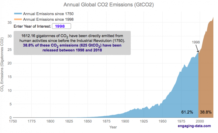
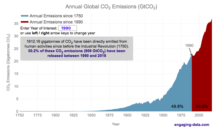
Significant emissions of CO2 really started in the industrial revolution. This is when humans really started using significant quantities of non-renewable energy sources, mainly fossil fuels such as coal and later natural gas and oil. The increase in the burning of hydrocarbon energy sources for powering factories and transportation lead to growing CO2 emissions. The following graph shows the annual emissions of CO2 since 1750, before the start of the industrial revolution. In this period of 269 years, humans have emitted 1600 billion tonnes of CO2 (1600 gigatonnes). One incredible fact is that due to rapid growth in population and energy use per capita over time, we are emitting more and more CO2 each year and that humans have emitted as much in the last 28 years than in the 240 years prior to that.
Calculate CO2 emissions since <insert date>
Instructions
The interactive visualization lets you enter any year between 1750 and 2021 and it will show the relative proportion of human CO2 before and after that year.
You can also use the left and right arrow keys to change the year up and down
If you hover over the graph you can see the annual and cumulative emission for each individual year in the graph
If you want to share the visualization with a specific year highlighted, you can add the following to the URL “?yr=yyyy” where yyyy is the four digit year (e.g. https://engaging-data.com/most-emissions-last-30-years/?yr=1980).
The global median age is around 30 years old (i.e. half the people on earth were born after 1989). This means that more than half of the earth’s population has seen the global cumulative CO2 emissions double in their lifetime. Also very striking is that in my children’s lifetimes (around a decade), humanity has added nearly 1/5 of all human produced CO2 ever to the atmosphere.
Notes: Emissions are in units of gigatonnes of CO2. To convert to gigatons of carbon, another common unit of measuring carbon emissions, divide by 3.666.
Data source and Tools
Annual emissions data is from the Global Carbon Project. The data is processed in javascript and plotted using the open-source, javascript plotting library, Plotly.
Where on Earth is all the water? From the solar system to living things
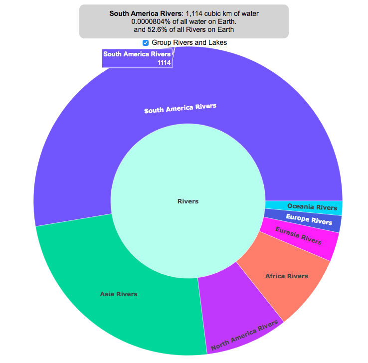
Earth is known as the blue planet, because it’s covered with quite a bit of water. But do you know where all that water on Earth is located? This interactive visualization will show the various amounts of water in its many forms on Earth: Oceans, Lakes, Rivers, Ice, Groundwater, etc….
If you hover over a part of the circular, sunburst graph, it will show you the amount of water that is in each of the various forms shown. If the label for that form is bolded, you can click on it and see further subdivisions beyond that broad category. For example, if you click on Oceans, it will show you how the water in the oceans is distributed among the five main oceans on Earth. As you move towards more focused views on the graph, you can click on the center of the circle to move back out to larger categories and see the big picture again.
As you can see, most of the water on Earth is found in a salty form, and most of that is in the oceans. It can be hard to click through to see freshwater lakes and rivers, as you have to be very precise to expand the “Surface Water” wedge, when you are looking at all “Freshwater”.
Even smaller, on that same visualization, is the “Living things” wedge is basically invisible. You can further explore the details of the living things category by clicking on the button that appears on the freshwater graph.
Checking the Group Rivers and Lakes checkbox will group rivers by continent and lakes by major groups.
It is interesting to see how much water there is on Earth (about 1.4 billion cubic kilometers of water), but how little of it is non-salty, liquid freshwater at the surface (about 100,000 cubic kilometers, though that is still quite a lot) but it only makes up about 0.008% of all water on Earth. That means for every 10,000 gallons of water on Earth, only one of those gallons is freshwater in a lake or river that we can easily access.
It is also believed that there is more water deep in the Earth’s interior (i.e. the mantle) than on the surface or near-subsurface, but estimates of that are highly uncertain and are not included in this graph.
If you click out past Earth’s water to look at water in the solar system, the estimates shown in this visualization are only including liquid water and do not include estimates of ice (which I haven’t been able to find estimates of). The amount of water in living things is estimated assuming that the ratio of organic carbon to liquid water is more or less the same across all different types of living things (i.e. viruses, bacteria, fungi, plants, animals, etc.). This isn’t a great assumption but the estimates, which come from estimates of the dry carbon weight of these organisms, vary across many orders of magnitude so being off in liquid water weight/volume by a factor of two or so isn’t a huge problem.
Tools and Data Sources
The sunburst chart is made using the open source, javascript Plot.ly graphing library. Data on water distributions is primarily from Wikipedia – Distribution of Water – List of Rivers by Discharge – List of Lakes – Weight of Living Biomass – Extra-terrestrial water estimates

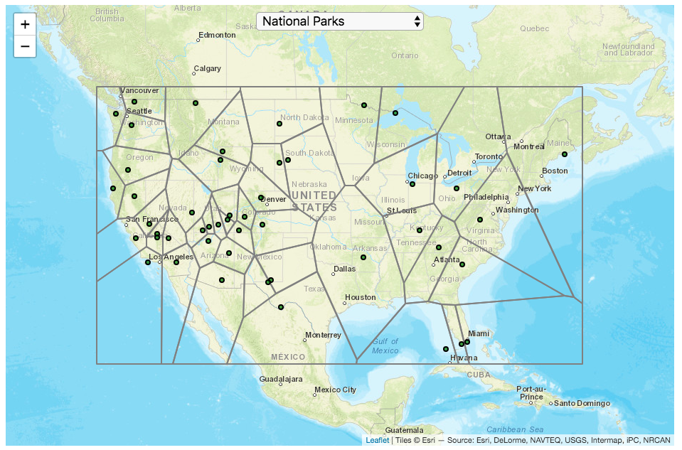
National Park Service Voronoi Map

This map divides up the Continental United States into different regions depending on which National Park (or other National Park Service site) is closest to it. It is based on a straight-line (‘as the crow flies’) distance between locations rather than along road networks. It is an example of a Voronoi Diagram, which is subdivided into different regions based upon the distance between points of interest. Everything within a subregion is closer to the point defining the region than any other point.
Hover over the circle points to see the name of the park. The map has a dropdown menu that lets you choose between the following types of locations in the National Park Service:
- National Parks
- National Historic Sites
- National Memorial Sites
- National Monuments
- National Seashores/Lakeshores
- National Recreation Areas
- National Battlefields
- National Military Sites
- National Scenic Areas
For National Parks, there is a high concentration of National Parks in the Western US, especially around the Southwestern US and running up the Pacific Coast. As a result, in these areas, the Voronoi regions are fairly small. The Southwest is also home to a high concentration of National Monuments. There are only few parks in the Eastern US and so the Voronoi regions are correspondingly large. Looking at National Historic Sites, the situation is flipped somewhat, with a high concentration of historic sites in the eastern US, and specifically the Northeast.
Let me know in the comments which park you are closest to and which park you last visited.
Tools and Data Sources
Locations of each of the National Park Service sites comes from the National Park Service. The map was created using the Leaflet javascript mapping library and the Voronoi diagram using the Turfjs javascript, geospatial analysis library.
US County Electoral Map – Land Area vs Population
County-level Election Results from 2024, 2020 and 2016
The interface has been updated and you can now also zoom in and look at a specific state’s election results.
Click here to view a visualization that looks more explicitly at the correlation between population density and votes by county.
This interactive map shows the election results by county and you can display the size of counties based on their land area or population size.
Previously, I created a map (cartogram) that showed the state by state electoral results from the Presidential Election by scaling the size of the states based on their electoral votes. The idea for that map was that by portraying a state as Red or Blue, your eye naturally attempts to determine which color has a greater share of the total. On a normal election map, Red states dominate, especially because a number of larger, less populated states happen to vote Republican. That cartogram changed the size of the states so that large states with low population, and thus low electoral votes tended to shrink in size, while smaller states with moderate to larger populations tended to grow in size. Thus, when your eyes attempt to discern which color prevails, the comparison is more accurate and attempts to replicate the relative ratio of electoral votes for each side.
This map looks at the 2024, 2020 and 2016 presidential election results, county by county. An interesting thing to note is that this view is even more heavily dominated by the color red, for the same reasons. Less densely populated counties tend to vote republican, while higher density, typically smaller counties tend to vote for democrats. As a result, the blue counties tend to be the smaller ones so blue is visually less represented than it should be based on vote totals. More than 75% of the land area is red, when looking at the map based on land areas, while shifting to the population view only about 46% of the map is red. Neither of these percentages is exactly correct because each county is colored fully red or blue and don’t take into account that some counties are won by a large percentage and some are essentially tied. However, the population number is certainly closer to reality as Trump won about 48.8% of the votes that went to either Trump or Clinton.
Instructions
This tool should be relatively straightforward to use. Just click around and play with it.
The map has a few different options for display:
- Hide Circles – just shows the county map
- Show land circles – where the area of the circle matches the area of the county itself, though obviously shaped like a circle. The counties are colored red or blue depending on whether Trump or Harris (in 2024), Biden (in 2020) or Clinton (in 2016) won more votes in that county vs Donald Trump (2024, 2020 and 2016).
- Show population circles – where the area of the circle matches the relative population of the county itself. More populated counties will grow larger while less populated counties will shrink. The counties are colored red or blue depending on whether Trump or Biden or Clinton won more votes in that county.
- Selecting the No County Overlap button will spread out all of the circles so you can see them all. The total displayed area of the county circles is the same in either land and population view, though if the circles are overlapping, you may see less total colors.
- Selecting the Color by Margin button will color the each county circle by the amount that a candidate won the county. If the vote margin is small, the county will be colored light blue or red, whereas if a county strongly favors one candidate, it will be colored darker red or blue.
- Selecting the Allow State Zoom button let you zoom into and only show the counties of a specific state. Just click on the state to zoom in (and back out).
Visualization notes
This was my second attempt at using d3 to generate visualizations. I typically use leaflet to do web-based mapping but I wanted the power of d3 which has functions for the circles to prevent overlapping. This map was inspired by Karim Douieb’s cool visualization of 2016 election results. I modified it in a number of different ways to try to make it more interactive and useful.
This visualization does not actually simulate the collisions between the circles on your browser. It is a bit computationally taxing and causes my computer fan to turn on after awhile. So instead I ran the simulation on my computer and recorded the coordinates for where each circle ended up for each category. Then your browser is simply using d3 transitions to shift positions and sizes of the circles between each of the maps, which is simpler, though with 3142 counties, it can still tax the computer occasionally.
Data and Tools
County level election data for 2016 is from MIT Election Lab. The 2020 county level data is downloaded from the New York Times county election data API and processed using a python script. 2024 county data is from the NYTimes as well by individual state (e.g. Maine) Population data used is for 2018. The visualization was created using d3 javascript visualization library.
Planetary Art – Inner Planet Orbital Spirograph
Earlier, I had made a visualization showing that Mercury is the closest planet to Earth (on average) and not Venus or Mars. To make that, I downloaded a bunch of NASA ephemeris (orbital) data. I realized I could use the same data to make some cool orbital art inspired by a spirograph – a planetary spirograph.
Basically, you get to choose a planet and the visualization will draw a line connecting that planet and Earth every few days. These lines will then build up into a cool pattern over 40 earth years of orbital cycles. Each planet (Mercury, Venus and Mars) has a different orbital period around the sun than Earth does and as a result, interesting patterns emerges.
Orbital periods of the four inner rocky planets:
- Mercury: 88 days
- Venus: 225 days
- Earth:365 days
- Mars: 687 days
Also evident is that the orbits of some of the planets are not quite circular so the pattern isn’t quite centered on the sun. Venus has the most regular pattern, creating a distinctive 5-lobed design. The other planets also have visually stunning patterns, though they do not repeat perfectly over time.
You can change the planets using the drop down menu as well as change the speed of the spirograph, and hide the planets and the sun.
Data and Tools:
I had thought about simulating the planets but there are plenty of tools out there that generate this orbital data so instead just downloaded 40 years of ephemeris data (data related to positions of astronomical bodies) from NASA website.. I processed the data using javascript and drew the picture using HTML canvas tools.
How do Americans Spend Money? US Household Spending Breakdown by Household Composition
How much do US households spend and how does it change with household composition?
This visualization is one of a series of visualizations that present US household spending data from the US Bureau of Labor Statistics. This one looks at the marital status and presence of children in the household.
- US Household spending by income group
- US Household spending by age of primary resident
- US Household spending by education level
- US Household spending by household composition (marital and children status)
This visualization focuses on how spending varies with the household composition (marital status and presence of children).
I obtained data from the US Bureau of Labor Statistics (BLS), based upon a survey of consumer households and their spending habits. This data breaks down spending and income into many categories that are aggregated and plotted in a Sankey graph.
One of the key factors in financial health of an individual or household is making sure that household spending is equal to or below household income. If your spending is higher than income, you will be drawing down your savings (if you have any) or borrowing money. If your spending is lower than your income, you will presumably be saving money which can provide flexibility in the future, fund your retirement (maybe even early) and generally give you peace of mind.
Instructions:
- Hover (or on mobile click) on a link to get more information on the definition of a particular spending or income category.
- Use the dropdown menu to look at averages for different groups of households based on the education level of the primary resident. This data breaks households into the following groups:
- All
- Single person households (and other households) – Unfortunately BLS lumps single households with other categories that don’t fit into the remaining three categories (i.e. non-married couple households).
- Single parent households
- Married couples with no children
- Married couples with children
The composition of households and income change as the marital status of and presence of children in the household changes, which in turn affects spending totals and individual categories.
As stated before, one of the keys to financial security is spending less than your income. We can see that on average, income tends to increase the larger the number of children and adults in the household. Married couples with children have the highest incomes and greatest spending, but they also save the most money.
Households with a single occupant (and also single parent households) have lower incomes than married couples and on average need to borrow or draw down on savings to live their lifestyle.
How does your overall spending compare with those that have the same household composition as you? How about spending in individual categories like housing, vehicles, food, clothing, etc…?
Probably one of the best things you can do from a financial perspective is to go through your spending and understand where your money is going. These sankey diagrams are one way to do it and see it visually, but of course, you can also make a table or pie chart (Honestly, whatever gets you to look at your income and expenses is a good thing).
The main thing is to understand where your money is going. Once you’ve done this you can be more conscious of what you are spending your money on, and then decide if you are spending too much (or too little) in certain categories. Having context of what other people spend money on is helpful as well, and why it is useful to compare to these averages, even though the income level, regional cost of living, and household composition won’t look exactly the same as your household.
**Click Here to view other financial-related tools and data visualizations from engaging-data**
Here is more information about the Consumer Expenditure Surveys from the BLS website:
The Consumer Expenditure Surveys (CE) collect information from the US households and families on their spending habits (expenditures), income, and household characteristics. The strength of the surveys is that it allows data users to relate the expenditures and income of consumers to the characteristics of those consumers. The surveys consist of two components, a quarterly Interview Survey and a weekly Diary Survey, each with its own questionnaire and sample.
Data and Tools:
Data on 2017 consumer spending was obtained from the BLS Consumer Expenditure Surveys, and aggregation and calculations were done using javascript and code modified from the Sankeymatic plotting website. I aggregated many of the survey output categories so as to make the graph legible, otherwise there’d be 4x as many spending categories and all very small and difficult to read.
Cumulative CO2 emissions calculator
CO2 emissions are the primary contributor to our current ‘climate crisis’. Because of buildup of heat-trapping nature of CO2 and other greenhouse gases in the atmosphere, temperatures are rising and weather and precipitation patterns are changing. Changes in climate will have profound impacts on both natural systems and our human landscapes.
Significant emissions of CO2 really started in the industrial revolution. This is when humans really started using significant quantities of non-renewable energy sources, mainly fossil fuels such as coal and later natural gas and oil. The increase in the burning of hydrocarbon energy sources for powering factories and transportation lead to growing CO2 emissions. The following graph shows the annual emissions of CO2 since 1750, before the start of the industrial revolution. In this period of 269 years, humans have emitted 1600 billion tonnes of CO2 (1600 gigatonnes). One incredible fact is that due to rapid growth in population and energy use per capita over time, we are emitting more and more CO2 each year and that humans have emitted as much in the last 28 years than in the 240 years prior to that.
Calculate CO2 emissions since <insert date>
Instructions
The global median age is around 30 years old (i.e. half the people on earth were born after 1989). This means that more than half of the earth’s population has seen the global cumulative CO2 emissions double in their lifetime. Also very striking is that in my children’s lifetimes (around a decade), humanity has added nearly 1/5 of all human produced CO2 ever to the atmosphere.
Notes: Emissions are in units of gigatonnes of CO2. To convert to gigatons of carbon, another common unit of measuring carbon emissions, divide by 3.666.
Data source and Tools
Annual emissions data is from the Global Carbon Project. The data is processed in javascript and plotted using the open-source, javascript plotting library, Plotly.
Where on Earth is all the water? From the solar system to living things
Earth is known as the blue planet, because it’s covered with quite a bit of water. But do you know where all that water on Earth is located? This interactive visualization will show the various amounts of water in its many forms on Earth: Oceans, Lakes, Rivers, Ice, Groundwater, etc….
If you hover over a part of the circular, sunburst graph, it will show you the amount of water that is in each of the various forms shown. If the label for that form is bolded, you can click on it and see further subdivisions beyond that broad category. For example, if you click on Oceans, it will show you how the water in the oceans is distributed among the five main oceans on Earth. As you move towards more focused views on the graph, you can click on the center of the circle to move back out to larger categories and see the big picture again.
As you can see, most of the water on Earth is found in a salty form, and most of that is in the oceans. It can be hard to click through to see freshwater lakes and rivers, as you have to be very precise to expand the “Surface Water” wedge, when you are looking at all “Freshwater”.
Even smaller, on that same visualization, is the “Living things” wedge is basically invisible. You can further explore the details of the living things category by clicking on the button that appears on the freshwater graph.
Checking the Group Rivers and Lakes checkbox will group rivers by continent and lakes by major groups.
It is interesting to see how much water there is on Earth (about 1.4 billion cubic kilometers of water), but how little of it is non-salty, liquid freshwater at the surface (about 100,000 cubic kilometers, though that is still quite a lot) but it only makes up about 0.008% of all water on Earth. That means for every 10,000 gallons of water on Earth, only one of those gallons is freshwater in a lake or river that we can easily access.
It is also believed that there is more water deep in the Earth’s interior (i.e. the mantle) than on the surface or near-subsurface, but estimates of that are highly uncertain and are not included in this graph.
If you click out past Earth’s water to look at water in the solar system, the estimates shown in this visualization are only including liquid water and do not include estimates of ice (which I haven’t been able to find estimates of). The amount of water in living things is estimated assuming that the ratio of organic carbon to liquid water is more or less the same across all different types of living things (i.e. viruses, bacteria, fungi, plants, animals, etc.). This isn’t a great assumption but the estimates, which come from estimates of the dry carbon weight of these organisms, vary across many orders of magnitude so being off in liquid water weight/volume by a factor of two or so isn’t a huge problem.
Tools and Data Sources
The sunburst chart is made using the open source, javascript Plot.ly graphing library. Data on water distributions is primarily from Wikipedia – Distribution of Water – List of Rivers by Discharge – List of Lakes – Weight of Living Biomass – Extra-terrestrial water estimates
National Park Service Voronoi Map
This map divides up the Continental United States into different regions depending on which National Park (or other National Park Service site) is closest to it. It is based on a straight-line (‘as the crow flies’) distance between locations rather than along road networks. It is an example of a Voronoi Diagram, which is subdivided into different regions based upon the distance between points of interest. Everything within a subregion is closer to the point defining the region than any other point.
Hover over the circle points to see the name of the park. The map has a dropdown menu that lets you choose between the following types of locations in the National Park Service:
- National Parks
- National Historic Sites
- National Memorial Sites
- National Monuments
- National Seashores/Lakeshores
- National Recreation Areas
- National Battlefields
- National Military Sites
- National Scenic Areas
For National Parks, there is a high concentration of National Parks in the Western US, especially around the Southwestern US and running up the Pacific Coast. As a result, in these areas, the Voronoi regions are fairly small. The Southwest is also home to a high concentration of National Monuments. There are only few parks in the Eastern US and so the Voronoi regions are correspondingly large. Looking at National Historic Sites, the situation is flipped somewhat, with a high concentration of historic sites in the eastern US, and specifically the Northeast.
Let me know in the comments which park you are closest to and which park you last visited.
Tools and Data Sources
Locations of each of the National Park Service sites comes from the National Park Service. The map was created using the Leaflet javascript mapping library and the Voronoi diagram using the Turfjs javascript, geospatial analysis library.
Recent Comments