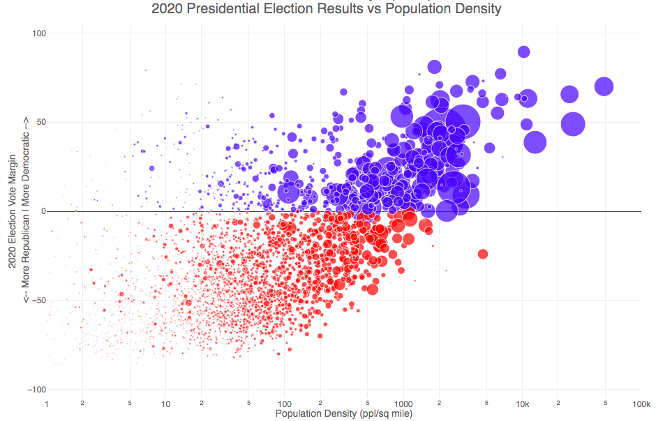
How do 2020 presidential election results correlate with population density?
The visualization I made about county election results and comparing land area to population size was very popular around the time of the 2020 presidential election. As the counties were represented by population, it was clear that democratic-leaning areas on that map tended to grow in size, while republican-leaning areas tended to shrink. This raised the question of exactly how population density correlates with election results.
Hover over (or click on) the bubbles to see information about the county.
It’s clear there is a very strong correlation between the vote margin and population density. Vote margin is the percentage amount that one candidate beat the other candidate by in the county (0% means a tie while 50% means that one candidate got 75% and the other got 25% of the voteshare). Population density is calculated as people per square mile in the county and is shown in the graph on a log scale, where each major grid line is 10 time greater than the previous one. This is done because there is one to two orders of magnitude difference in the densest counties (in New York City) and even moderately dense counties. There are also several counties with population density below 1 person per square mile (several in Alaska because of the size of their counties) but these are excluded from the graph.
Richmond County, NY (i.e. the Borough of Staten Island) is the densest county (17th densest) in the country that Trump won. The densest counties favored Biden quite heavily as he won 45 of the 50 densest counties in the country, which also tend to have a fairly high population.
This second graph is a histogram that specifically categorizes counties into discreet bins by population density. Note that they are on a log scale as well. You can toggle the graph to show the number of counties won by each candidate or the number of votes won in each of the population density bins. The black line shows the percentage of counties (or votes) won by the democratic candidate (Joe Biden) in each of those bins.
Hover over (or click on) the bars to see information about each county bin.
It’s pretty clear in these graphs that low population density areas clearly favor the republican while the denser areas favor the democrat.
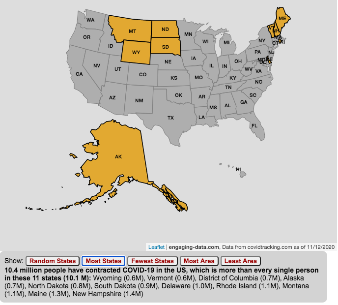
The number of US coronavirus cases is equal to the population of several states put together.
click on the buttons below to see a new set of states.
The number of Americans who have contracted the Coronavirus keeps going up with little indication of slowing down. This is an amazingly large number of cases is the highest in the world and I wanted to visualize how many people this actually is.
While the number of US COVID-19 cases is very large, comparing these number to the size of the populations in several states helps to provide more context. The visualization shows a random collection of states whose total population is equal to the latest coronavirus numbers. If you click the button you can see a different set of states that have a population equal to the current number of coronavirus cases.
The graph is updated daily using data from covidtracking.com. It’s important to note that the number of people with COVID-19 is an underestimate as many coronavirus cases are asymptomatic (i.e. people don’t get sick or show any symptoms) and the positivity rate of tests is quite high.
Stay safe out there: stay away from people and wear your mask!
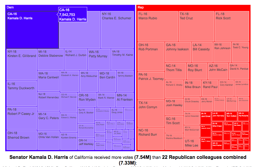
Each state has two senators in the Senate, even though there is a great disparity in the populations of the states. This was a compromise that the framers of the Constitution dealt with in creating the framework of the US government. While the US House of Representatives is based on proportional representation, the Senate was designed to have two senators per state regardless of population. This leads to some interesting variations in the number of votes that some senators get relative to other senators (and how many people they represent).
Graph of Total Votes for Each Current Senator (2014, 2016 and 2018)
This graph is called a treemap and shows the total number of votes cast for the winner of each senate race of the current sitting senators. They are shown in order from largest to smallest vote totals, where the area of the rectangle is proportional to the number of votes. The treemap can be organized by party if desired. This graph does not show the number of votes that their opponents got.
If you hover over (click, on mobile) one of the boxes in the treemap, you can compare the number of votes received by that senator to the number of senators that received the same number of votes combined. This helps highlight the disparities in the representation of voters in large states in the Senate relative to that of voters in states with low populations.
For example, Kamala Harris, Democratic senator of my home state of California, received 7.5 million votes when she won her senate race in 2016. This large number of votes is larger than the combined votes for 22 of her Republican colleagues in small states. This is even more impressive since, as noted before, she ran against another Democrat Loretta Sanchez, in the election.
Note that some of the recently elected senators shown in the table are no longer serving in the Senate:
John McCain’s seat is currently held by Martha McSally
Johnny Isakson’s seat is currently held by Kelly Loeffler
Because of the large variation in population sizes and a tendency for more populous states to vote for democrats, Democratic Senators received many more votes in their elections than their Republican colleagues did, despite having fewer numbers. The 47 Democratic (and Independent) senators received a total of 67.5 million votes while the 53 Republican senators received 59.5 million votes.
Graph of Margin of Victory over Opposing Party for Each Current Senator (2014, 2016 and 2018)
This graph shows a slightly different set of data. Instead of total votes for the winning candidate, it shows the vote margin (i.e. the number of votes the winner received vs the opponent of a different party). The reason I specify it this way is that the two Democratic California senators defeated other democrats to win their elections (i.e. no republican was on the ballot in the general election because no republican got enough votes in the primary). This comparison is interesting because not only do some senators receive very few votes (because they live in small states), but they may only win by a small margin over their opponents. Comparing margins of victory, shows how few votes it would take to “flip” a Senate seat between the two parties.
If you take Kamala Harris’s margin of victory over Republicans to be her vote total (7.5 million votes) since there was no Republican running against her, her margin of victory is greater than the margin of victory of 43 of her Republican Senate colleagues combined.
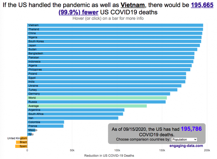
The US coronavirus death rate is quite high compared to other countries (on a population-corrected basis)
US coronavirus deaths have surpassed 300,000. Many of these deaths could have been avoided if swift action had been taken in February and March, as many other countries did. This graph shows an rough estimate of the number of US deaths that could have been avoided if the US had acted similar to other countries.
This graph takes the rate of coronavirus deaths by country (normalized to their population size) and imagines what would happen if the US had had that death rate, instead of its own. It then applies that reduction (or increase) in death rate to the total number of deaths that the US has experienced. The US death rate is about 600/million people in September 2020 and if a country has a death rate of 60/million people, then 90% of US deaths (about 180,000 people) could have been avoided if the US had matched their death rate. The government response to the pandemic is one of several important factors that determine the number of cases and deaths in a country. This means proper messaging about the need to wear masks and socially distance as well as providing payments to citizens and business to help them during the economic shutdown. Other important factors can include the overall health of the population, the population structure (i.e. age distribution of population), ease of controlling borders to prevent cases from entering the country, presence of universal or low-cost health care system, and relative wealth and education of the population.
The graph lets you compare the potential reduction in US deaths when looking at 30 different countries. You can choose those 30 countries based on total population, GDP or GDP per capita. These give somewhat different sets of countries to compare death rates, which is an indication of the effectiveness of the coronavirus response.
A valid criticism of this graph is that testing and data collection is very different in each of the countries shown and the comparisons are not always valid. This is definitely a problem with all coronavirus data but for the most part, the very large differences between death rates would still exist even if data collection were totally standardized. Some of the data from the poorest countries is less reliable, because they have less testing capabilities.
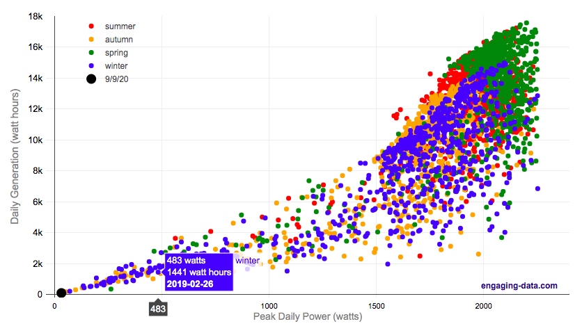
On September 9th, 2020, the entire San Francisco Bay Area, we had a crazy combination of wildfire smoke and low clouds that darkened the sky and turned everything orange. At 9am, it looked like it was nighttime and at noon, it was so dark, that it looked like dusk.
Here is a plot of 8+ years of solar panel generation from our panels. If you click on the legend, you can toggle whether that data is shown. Total generation for the day was only 93 watt hours (as opposed to a summer median of 13300 watt hours, 13.3 kWh) and peak power was only 32 watts (vs a median summer peak of 2000 watts (2.0 kW)).
The solar generation was even worse than the next worst day in winter (typically when it rains all day). Clicking on the legend will toggle whether certain seasons are shown and you can view how solar generation varies by season.
Source and Tools:
Data on solar generation is downloaded from our solar panel inverter provider (enphase) and cleaned with a python script. Graph is made using the plotly open source javascript library.
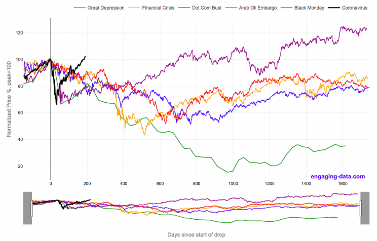
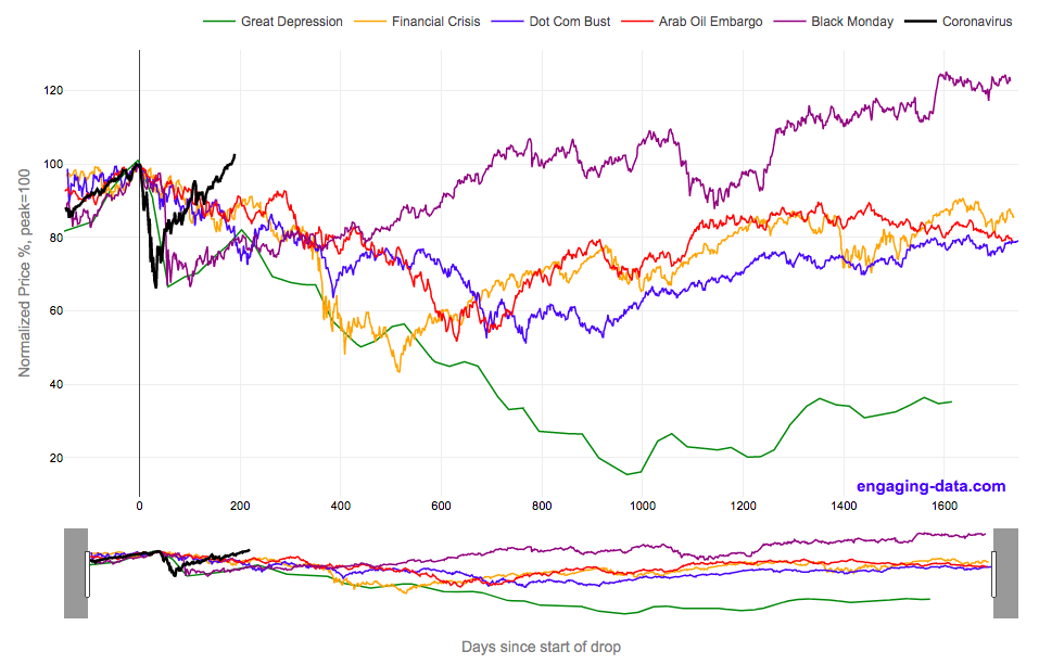
2020’s stock market drop was unprecedented for the speed of the drop and also the speed of the recovery
This graph shows the stock market drops from the 2020 and other bear markets normalized so that the peak is at 100% at day 0. This lets you see the severity and duration of different bear markets from the Great Depression (1929), the Dot Com Bust (2000), and the Financial Crisis (2008) and other drops over 30%.
The coronavirus pandemic has significantly disrupted the global economy. Q2 GDP in the United States declined at an annualized rate of 32% and US unemployment reaching 15% due to coronavirus induced business shutdowns.
However, the stock market drop (represented by the S&P500 index) in late February and early March 2020 has somewhat surprisingly rebounded and reached a new all-time-high in August 2020, even as unemployment and GDP output has continued to falter. There certainly seems to be a disconnect between the fundamentals of the economy and the stock market.
Will the recovery in the stock markets continue or will it begin to align more closely with the fundamentals of the economy?
There are many proposed reasons why this disconnect is happening. The Federal Reserve actions to increase liquidity and prop up the stock market. The heavy weighting of tech in the S&P500 and the pandemic’s boost to many tech company’s business (i.e. Amazon, Zoom, Apple). Whatever the reason, the question of whether the market can continue at this pace or will have a correction is important and one to watch.
Data for the S&P500 price is daily from 1950 onward but before 1950, the data I had available was on a monthly basis. I interpolated this monthly data to create daily data, so not all the data is 100% accurate for any given day before 1950. Data for 2020 will continue to be updated daily.


Recent Comments