Archive for the ‘Maps’ Category:
Zip Code Map of the United States
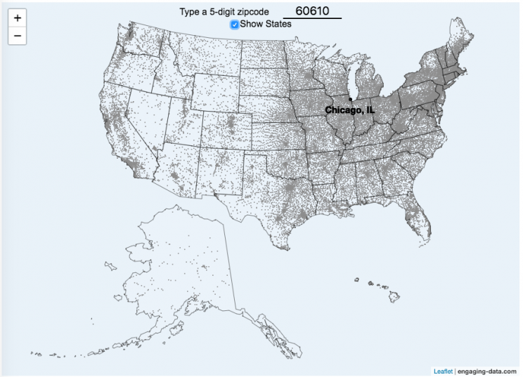
This zip code map of the United States visualizes over 42,000 zip codes in the 50 states. Zip codes are five digit postal codes used for mail delivery in the US. The points on the map show the geographic center of each zip code. The interactive visualization lets you type in a zip code and will show you where that zip code lies on the map. As you begin to type in the zip code, the map will highlight all the zip codes that begin with those numbers.
For example, if you type in “0”, you will highlight all zip codes that start with the zero in the Northeastern US. This will represent about 10% of the zip codes in the US. When you type in another number, it will narrow down the zip codes that begin with those two digits (approximately 1% of zip codes). It will progressively narrow down the number of zip codes as you type in more numbers, until you get to a full 5 digit zip code that represents 1 out of almost 43,000 zip codes (0.002% of zip codes). The map will then tell you the name of the city that that zip code is in.
You can explore how zip codes are distributed across the US by typing in different 1 and 2 digit numbers. You can also click on the check box to show or hide the outlines of the states.
Sources and Tools:
Zip code data was downloaded from opendatasoft.com. And the visualization was created using javascript and the open source leaflet javascript mapping library.
Assembling the USA state-by-state with state-level statistics

Watch the United States assemble state by state based on statistics of interest
Based on earlier popularity of the country-by-country animation, this map lets you watch as the world is built-up one state at a time. This can be done along a large range of statistical dimensions:
These statistics can be sorted from small to large or vice versa to get a view of the US and its constituent states plus DC in a unique and interesting way. It’s a bit hypnotic to watch as the states appear and add to the country one by one.
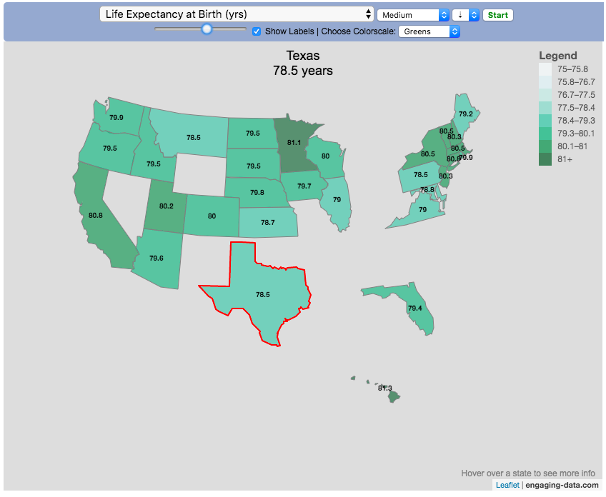
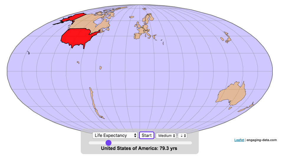
You can use this map to display all the states that have higher life expectancy than the Texas:
select “Life expectancy”, sort from “high to low” and use the scroll bar to move to the Texax and you’ll get a picture like this:
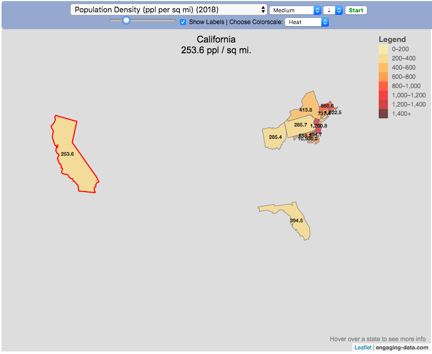
or this map to display all the states that have higher population density than California:
select “Population density, sort from “high to low” and use the scroll bar to move to the United States and you’ll get a picture like this:
I hope you enjoy exploring the United States through a number of different demographic, economic and physical characteristics through this data viz tool. And if you have ideas for other statistics to add, I will try to do so.
Data and tools: Data was downloaded from a variety of sources:
- Population https://en.wikipedia.org/wiki/List_of_states_and_territories_of_the_United_States_by_population
- Admission to union https://simple.wikipedia.org/wiki/List_of_U.S._states_by_date_of_admission_to_the_Union
- Educational attainment https://nces.ed.gov/programs/digest/d18/tables/dt18_104.88.asp
- Highest points https://geology.com/state-high-points.shtml
- Life expectancy https://en.wikipedia.org/wiki/List_of_U.S._states_and_territories_by_life_expectancy
- Median Age http://www.statemaster.com/graph/peo_med_age-people-median-age
- Land area https://statesymbolsusa.org/symbol-official-item/national-us/uncategorized/states-size
- Mean elevation https://www.census.gov/library/publications/2011/compendia/statab/131ed/geography-environment.html
- Electricity price https://www.chooseenergy.com/electricity-rates-by-state/
- Gasoline price https://gasprices.aaa.com/state-gas-price-averages/
- GDP https://www.bea.gov/data/gdp/gdp-state
- Sunlight North America Land Data Assimilation System (NLDAS) Daily Sunlight (insolation) for years 1979-2011 on CDC WONDER Online Database, released 2013. Accessed at http://wonder.cdc.gov/NASA-INSOLAR.html on Jun 14, 2019 1:37:15 PM
- Births United States Department of Health and Human Services (US DHHS), Centers for Disease Control and Prevention (CDC), National Center for Health Statistics (NCHS), Division of Vital Statistics, Natality public-use data 2007-2017, on CDC WONDER Online Database, October 2018. Accessed at http://wonder.cdc.gov/natality-current.html on Jun 14, 2019 1:53:58 PM
- Precipitation North America Land Data Assimilation System (NLDAS) Daily Precipitation for years 1979-2011 on CDC WONDER Online Database, released 2013. Accessed at http://wonder.cdc.gov/NASA-Precipitation.html on Jun 26, 2019 3:30:40 PM
- Temperature http://www.usa.com/rank/us–average-temperature–state-rank.htm
The map was created with the help of the open source leaflet javascript mapping library
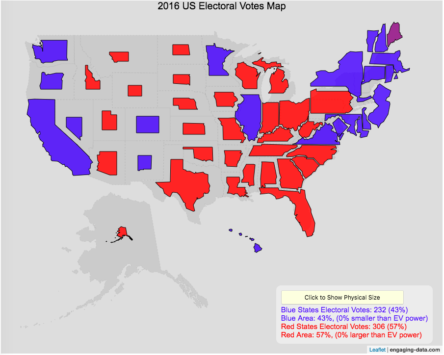
Sizing the States Based On Electoral Votes
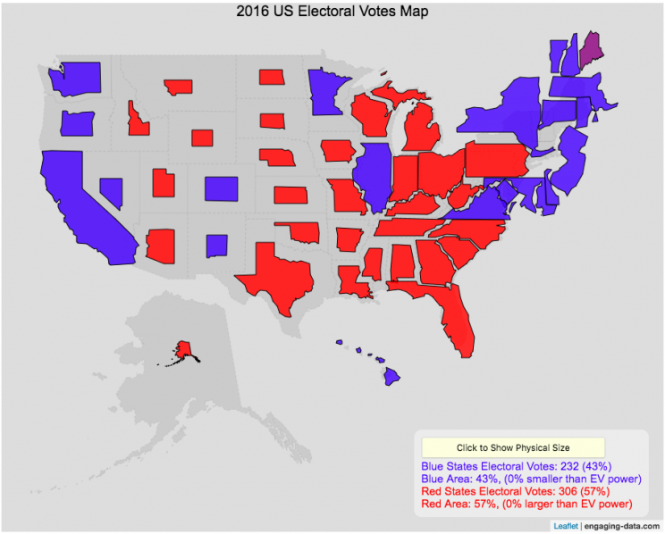
Electoral Vote maps give more visual power to states with large areas but few electoral votes
This map shows the electoral outcome of the 2016 and 2020 US Presidential Election and is color coded red if the state was won by Donald Trump (R) and blue if the state was won by Hilary Clinton or Joe Biden. When looking at the map, red states tend to be larger in area than blue states, but also generally have lower populations. This gives a misleading impression that the electoral share is “redder” than it actually is. For 2016, we can see that Trump won 306 electoral votes or (57% of the total electoral votes), but the map is shaded such that 73% of the area of the US is colored red. Similarly, Clinton won 232 electoral votes, but the map is shaded such that only 27% of the map is colored blue. For 2020, we can see that Biden won 306 electoral votes or (57% of the total electoral votes), but the map is shaded such that 38% of the area of the US is colored blue. Trump won 232 electoral votes, but the map is shaded such that 62% of the map is colored red.
The map shrinks the states with low electoral votes relative to its area and increases the size of states with large numbers of electoral votes relative to its area. On average blue states grow as they are under-represented visually, while red states tend to shrink quite a bit because they are over-represented visually. Alaska is the state that shrinks the most and DC and New Jersey are the areas that grow the most in the new map.
I think this gives a more accurate picture of how the states voted because it also gives a sense of the relative weight of those states votes.
}, 150); }
function reloadiframes(){ document.getElementById('mapframe').contentWindow.location.reload(); }
window.addEventListener("orientationchange", function() { reloadiframes(); resizemap(); mobilewarn(); }, false);
function mobilewarn(){ w=window.innerWidth; if (w<600){ document.getElementById('mobilewarning').innerHTML="On mobile devices, visualizations are best viewed in landscape mode."; } else { document.getElementById('mobilewarning').innerHTML=""; } } mobilewarn();
Data and Tools:
Data on electoral votes is from Wikipedia. The map was made using the leaflet open source mapping library. Data was compiled and calculations on resizing states were made using javascript.
Assembling the World Country-By-Country

Watch the world assemble country-by-country based on a specific statistic
This map lets you watch as the world is built-up one country at a time. This can be done along the following statistical dimensions:
- Country name
- Population – from United Nations (2017)
- GDP – from United Nations (2017)
- GDP per capita
- GDP per area
- Land Area – from CIA factbook (2016)
- Population density
- Life expectancy – from World Health Organization (2015)
- or a random order
These statistics can be sorted from small to large or vice versa to get a view of the globe and its constituent countries in a unique and interesting way. It’s a bit hypnotic to watch as the countries appear and add to the world one by one.
You can use this map to display all the countries that have higher life expectancy than the United States:
select “Life expectancy”, sort from “high to low” and use the scroll bar to move to the United States and you’ll get a picture like this:
or this map to display all the countries that have higher population density than the United States:
select “Population density, sort from “high to low” and use the scroll bar to move to the United States and you’ll get a picture like this:

I hope you enjoy exploring the countries of the world through this data viz tool. And if you have ideas for other statistics to add, I will try to do so.
Data and tools: Data was downloaded primarily from Wikipedia: Life expectancy from World Health Organization (2015) | GDP from United Nations (2017) | Population from United Nations (2017) | Land Area from CIA factbook (2016)
The map was created with the help of the open source leaflet javascript mapping library
function resizemap(){ //this function is called from the javascript from within the iframe after the contents of iframe are loaded (and after an additional 150ms delay) setTimeout(function (){ mm = document.getElementById('molleweide'); mm.height = mm.contentWindow.document.body.scrollHeight+20+"px";
mobilewarn();
}, 150); }
function reloadiframes(){ document.getElementById('molleweide').contentWindow.location.reload(); }
window.addEventListener("orientationchange", function() { reloadiframes(); resizemap(); mobilewarn(); }, false);
function mobilewarn(){ w=window.innerWidth; if (w<600){ document.getElementById('mobilewarning').innerHTML="On mobile devices, visualizations are best viewed in landscape mode."; } else { document.getElementById('mobilewarning').innerHTML=""; } } mobilewarn();
World Population Distribution by Latitude and Longitude
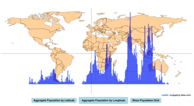
How is population distributed by latitude and longitude
This interactive map shows how population is distributed by latitude or longitude. It animates the creation of a bar graph by shifting population from its location on the map to aggregate population levels by latitude or longitude increments. Each “block” of the bar graph represents 1 million people. Population is highest in the northern hemisphere at 25-26 degrees North latitude and 77-78 degrees East Longitude.
Instructions:
It should be relatively explanatory. Press the “Aggregate Population by Latitude” button to make a plot of population by line of latitude (i.e. rows of the map).
Press the “Aggregate Population by Longitude” button to make a plot of population by line of longitude (i.e. columns of the map). To see the population distributed across the map, press the “Show Population Grid” button.
This map was inspired by some mapping work done by neilrkaye on twitter and reddit.
Data Sources and Tools:
This map projection is an equirectangular projection. Data on population density comes from NASA’s Socioeconomic Data and Applications Center (SEDAC) site and is displayed at the 1 degree resolution. This interactive visualization is made using the awesome leaflet.js javascript library.

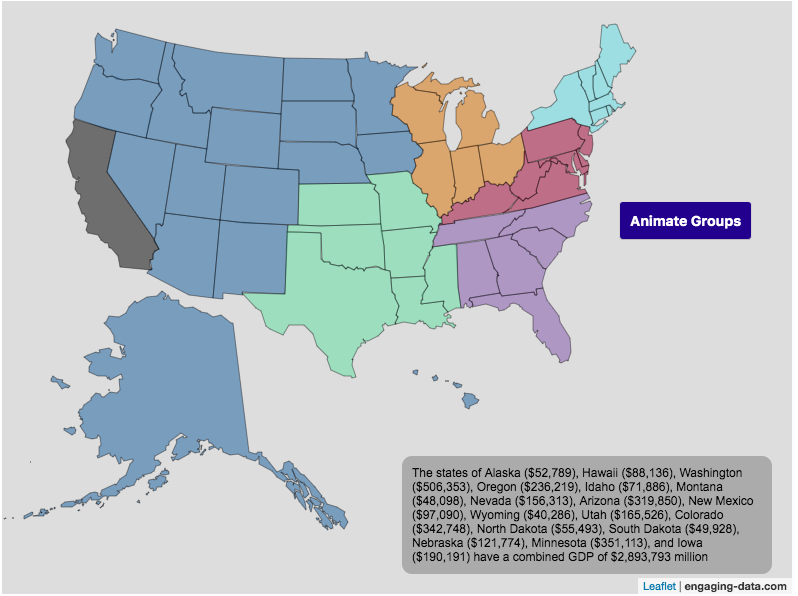
Size of California Economy Compared to Rest of US
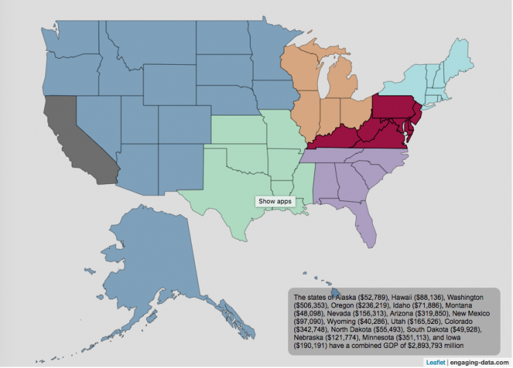
California is one of the world’s largest economies (as measured by gross domestic product), currently ranking 5th in the world (if it were judged as it’s own country). This map divides the rest of the US economy into 6 more or less equal parts (each the size of California’s) and they are all within about 10% of each other.
Instructions:
You can hover over a state with your cursor to get more information about the GDP of that state and the group of states that equal California’s economy.
Gross domestic product is a measurement of the size of a region’s economy. It is the sum of gross value added from all entities in the region or state. It measures the monetary value of the goods produced and services provided in a year.
The main sectors of the California economy are agriculture, technology, tourism, media (movies and TV) and trade. Some of the world’s largest and most famous companies contribute to the California economy, like Apple, Google, Facebook, Disney, and Chevron.
Data and Tools:
Data for state level GDP is obtained from Wikipedia for the year 2017. The map data is processed in javascript and then plotted using the leaflet.js mapping library.
Recent Comments