Posts for Tag: visualization
Real Country Sizes Shown on Mercator Projection (Updated)
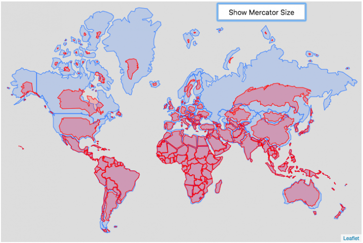
Hover or click on a country to see how much it shrinks from the Mercator projection size.
Check out some other engaging and interactive map dataviz:
I remember as a child thinking that Alaska was as large as 1/2 of the continental US. Later, however, I learned that while it is the largest state, it is actually only about 1/5 the size of the lower 48 states. My son has also remarked that Greenland is very big. And while it is very big, it’s nowhere near the size of the continent of Africa.
The map above shows the distortion in sizes of countries due to the mercator projection. Pressing on the button animates the country ‘shrinking’ to its actual size or ‘growing’ to the size shown on the mercator projection. It was inspired by a similar animation that I saw on reddit and decided I wanted to try to build the same thing.
The mercator projection is a commonly used projection on computer maps because it has perpendicular latitude and longitude lines (forming rectangles). It is formed by projecting the globe onto a cylinder A variant of the was adopted by Google maps, which helped establish it as the informal standard for web-based maps (although Google maps now also uses a globe view, instead of a map projection when zooming out to a very wide view).
Areas far from the equator are distorted in terms of their distances and are shown much larger than they actually are. This is one of the major issues with a projection of a globe onto a cylinder area. This is why Greenland, Russia and Canada shrink so much in height and width in the animation, they are fairly high in latitude in the Northern Hemisphere. Also important is that the closer you are to the poles, the more the distortion when a country is shown on the Mercator projection. Since longitude lines converge at the poles, but are parallel on a Mercator, the closer a part of a country is to the poles, the more that part will get stretched wider relative to a part of a country that is not as close to the poles. As a clear example, see what happens to the southern part of Australia, relative to the northern end. Similarly, the latitude lines also get further apart on a Mercator projection, while on a globe they stay equidistant. This means that the parts of countries that are nearer the poles will get taller, i.e. stretched out from a north-south perspective relative to parts of countries that are further from the poles. You can see this clearly in the northern ends of Russsia and Greenland, where the tops get smushed down.
This next graph shows each country plotted with their actual land area and apparent land area as shown on a Mercator projection. The further the countries are from the 1:1 line the greater the overestimate of their size from the Mercator (also color coded to be red). It is a logarithmic plot showing many different orders of magnitude in country size. The table also shows the top 10 countries whose size is overestimated (and the difference in land area in square kilometers or as a percentage reduction from the size in the Mercator projection).
As it shows, Greenland is the country that has the largest percent difference between its apparent size in a Mercator projection and it’s real size (it’s only about 1/4 of the apparent size). And Russia is the country with the largest absolute difference between these two sizes.
This is the original graph that keeps the shape of the countries exactly the same and just scales the size. This is incorrect because as you move towards the poles the distances between longitude lines decreases. As a result the tops (northern ends) of countries will shrink more than the bottoms (southern ends) of countries in the Northern Hemisphere and vice versa in the Southern Hemisphere.
Old map that changes sizes but incorrectly preserves the Mercator shape

Calculations:
I calculated the area in two ways, one assuming latitude and longitude are rectangular coordinates (i.e. Mercator projection) and the other was the actual area.
The new coordinates needed to draw the “real size” of the countries are derived by calculating the distance between the center of the country and each of the coordinates in the country’s shapefile. As you move towards the poles on a globe, the distance between longitude lines decreases as a function (cosine) of latitude. In a mercator projection, the longitude lines are shown as equi-distant regardless of latitude. In this calculation, we create a new set of coordinates by calculating the distance between the center of the polygon and each set of coordinates and change the coordinates to reflect the shrinking of distance between longitude lines as you head towards the poles.
In the previous version of this animation, I calculated the latitude and longitude coordinates for the outline of the “real” size by modifying the original latitude and longitude by the ratio of these two areas to draw the new smaller, “real” country size.
Data and tools: This visualization was made using the Leafletjs javascript mapping library and country shapefiles (converted to geojson).
Current Bay Area Air Quality
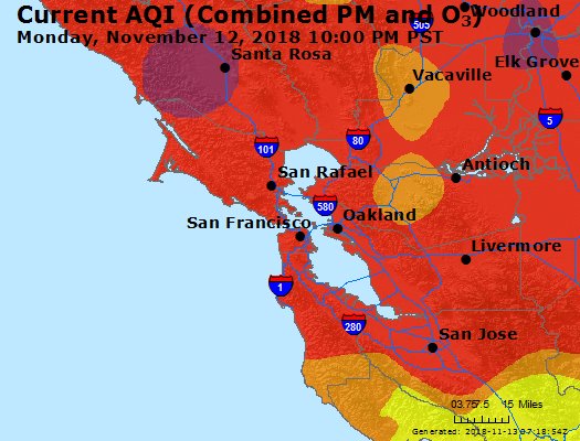
Fires are once again raging in California and air quality in one of the most populated metropolitan areas in the country (the San Francisco Bay Area) is quite poor. This map show current air quality in the Bay Area. For more information see the EPA’s Air Quality website.

AQI colors
EPA has assigned a specific color to each AQI category to make it easier for people to understand quickly whether air pollution is reaching unhealthy levels in their communities. For example, the color orange means that conditions are "unhealthy for sensitive groups," while red means that conditions may be "unhealthy for everyone," and so on.
For more information and additional maps see the EPA’s Air Quality website.
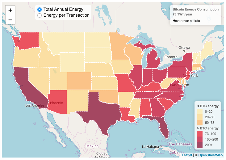
Bitcoin Energy Consumption – Does It Consume More Electricity Than Your State?

This visualization looks at the staggeringly high energy use of Bitcoin and puts it into context: comparing it to electricity usage of US states. Unfortunately for Bitcoin, high energy usage is an intended feature of the system, rather than an unintended consequence. This is because mining is an increasingly energy intensive process, based upon increasingly computationally intensive calculations that are performed on high powered computers and graphical processing units.
Currently, 28 out of 50 states plus the District of Columbia all have lower electricity consumption than estimated annual bitcoin electricity consumption (~73 TWh per year). These states are highlighted in variations of yellow. This is approximately equal to the average annual electricity usage across all US States. States with higher electricity consumption than bitcoin are highlighted in shades of red.
When dividing the total energy use (73 TWh) by the current number of transactions (93 million), we get an average energy consumption of 783 kWh per transaction. Click on the “Energy per Transaction” button to see this visualization. What’s crazy is that a transaction is simply a transfer of bitcoin between “wallets”, recording the transaction, and a validation of the process. There’s no good reason why verifying digital transactions should take this much energy, except that it was built into the fundamental process of validating and mining bitcoin. 783 kWh is larger than the monthly per capita electricity consumption in 10 US states. It could also drive you and your family over 2000 miles in an electric car (e.g. Tesla Model S).
I’m not expert enough in this area to know how much more energy consumption will rise into the future, but if crypto advocates’ predictions come true and bitcoin is used extensively, millions of transactions will occur per hour instead of per year and the price of bitcoin may rise much higher than it currently is. If the price rises, then miners will be willing to expend more energy to “mine” the more valuable bitcoin. Needless to say, this sounds like a very bad idea from an energy consumption and sustainability standpoint.
Data and Tools:
State energy data comes from the US Department of Energy. Estimates of Bitcoin energy use come from Digiconomist’s Bitcoin Energy Consumption Index. The choropleth map is visualized using javascript and the Leaflet.js library with Open Street Map tiles.
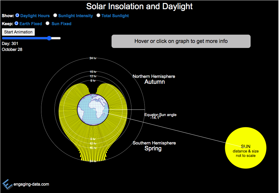
Solar (Sun) Intensity By Location and Time
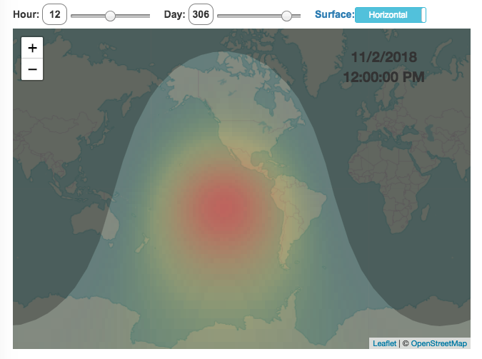
This visualization shows the amount of solar intensity (also called solar insolation and measured in watts per square meter) all across the globe as a function of time of day and day of year. This is an idealized calculation as it does not take into account reductions in solar intensity due to cloud cover or other things that might block the sun from reaching the earth (e.g dust and pollution).
As would be expected, the highest amount of solar intensity occurs on the globe right where the sun is overhead and as the angle of the sun lowers, the solar intensity declines. This is why the area around the equator and up through the tropics is so sunny, the sun is overhead here the most. If you click on the map you should see a popup of the intensity of sunlight at that location.
As the earth rotates over the course of a day, the angle of the sun changes and eventually the angle is so low, the sun is blocked by the horizon (this is sunset).
Instructions
- The default is to show the sunlight intensity for the current date and time but you can change it by moving the sliders for hour or day.
- You can also toggle between the orientation of the surface that you measure the sunlight on. The default shows the intensity of sunlight on a horizontal surface. The other option shows the intensity on a surface that is oriented to face the sun (i.e. perpendicular)
Again, the intensity will depend on the angle it makes with the sun and so it depends on your location on earth (i.e. latitude). Latitudes around the equator will receive more sunlight because their angle is closer to perpendicular.
Shifting through the days of the year, you can start to see the cause of the seasons as the amount of sunlight changes and more or less sunlight goes to each of the northern and southern hemispheres.
Calculations and Tools:
The calculations for solar intensity are based on equations from “Renewable and Efficient Electric Power Systems” by Gilbert Masters Chapter 7. Calculations were made using javascript and visualized using the Leaflet.js library with Open Street Map tiles.
This was a fun project for me to learn online mapping tools and programming.

Age Calculator and Life Visualization
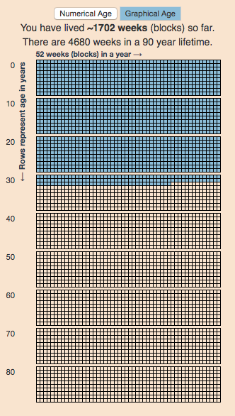
This is a simple age calculator that calculates your age down to the second.
The age calculator should be relatively self-explanatory, just enter your birthdate into the tool. You can also enter the time of birth (if you want to), otherwise it will assume you were born at midnight.
There are two options for viewing your “age”.
- The first (“Numerical Age“) is a table that shows the number of years, months, days, hours, minutes and seconds since you were born. It also shows how long it will be until your next birthday. You can also use the Start Clock button to see your age change each second.
- The second (“Graphical age“) is a figure that shows your age in the context of a 90 year lifespan. Each block shown is one week and there are 52 weeks (blocks) in a year (row) and 10 years (rows) per decade (group of blocks).
This visualization is based on the the very interesting Wait But Why post “Your Life in Weeks” by Tim Urban. It’s a bit humbling to see your life laid out in this way, and to think about how you will spend the (hopefully many) remaining weeks of your life.
You can click the URL button to create a URL that is based on the your birthday (so you don’t have to type it in again). Just copy the URL in the address bar at the top of your browser (after pressing the button) to share with others.
Programming: this program was written in javascript and uses the moment.js library to simplify the date calculations.


Real Country Sizes Shown on Mercator Projection (Updated)
Hover or click on a country to see how much it shrinks from the Mercator projection size.
Check out some other engaging and interactive map dataviz:

I remember as a child thinking that Alaska was as large as 1/2 of the continental US. Later, however, I learned that while it is the largest state, it is actually only about 1/5 the size of the lower 48 states. My son has also remarked that Greenland is very big. And while it is very big, it’s nowhere near the size of the continent of Africa.
The map above shows the distortion in sizes of countries due to the mercator projection. Pressing on the button animates the country ‘shrinking’ to its actual size or ‘growing’ to the size shown on the mercator projection. It was inspired by a similar animation that I saw on reddit and decided I wanted to try to build the same thing.
The mercator projection is a commonly used projection on computer maps because it has perpendicular latitude and longitude lines (forming rectangles). It is formed by projecting the globe onto a cylinder A variant of the was adopted by Google maps, which helped establish it as the informal standard for web-based maps (although Google maps now also uses a globe view, instead of a map projection when zooming out to a very wide view).
Areas far from the equator are distorted in terms of their distances and are shown much larger than they actually are. This is one of the major issues with a projection of a globe onto a cylinder area. This is why Greenland, Russia and Canada shrink so much in height and width in the animation, they are fairly high in latitude in the Northern Hemisphere. Also important is that the closer you are to the poles, the more the distortion when a country is shown on the Mercator projection. Since longitude lines converge at the poles, but are parallel on a Mercator, the closer a part of a country is to the poles, the more that part will get stretched wider relative to a part of a country that is not as close to the poles. As a clear example, see what happens to the southern part of Australia, relative to the northern end. Similarly, the latitude lines also get further apart on a Mercator projection, while on a globe they stay equidistant. This means that the parts of countries that are nearer the poles will get taller, i.e. stretched out from a north-south perspective relative to parts of countries that are further from the poles. You can see this clearly in the northern ends of Russsia and Greenland, where the tops get smushed down.
This next graph shows each country plotted with their actual land area and apparent land area as shown on a Mercator projection. The further the countries are from the 1:1 line the greater the overestimate of their size from the Mercator (also color coded to be red). It is a logarithmic plot showing many different orders of magnitude in country size. The table also shows the top 10 countries whose size is overestimated (and the difference in land area in square kilometers or as a percentage reduction from the size in the Mercator projection).
As it shows, Greenland is the country that has the largest percent difference between its apparent size in a Mercator projection and it’s real size (it’s only about 1/4 of the apparent size). And Russia is the country with the largest absolute difference between these two sizes.
This is the original graph that keeps the shape of the countries exactly the same and just scales the size. This is incorrect because as you move towards the poles the distances between longitude lines decreases. As a result the tops (northern ends) of countries will shrink more than the bottoms (southern ends) of countries in the Northern Hemisphere and vice versa in the Southern Hemisphere.
Old map that changes sizes but incorrectly preserves the Mercator shape
Calculations:
I calculated the area in two ways, one assuming latitude and longitude are rectangular coordinates (i.e. Mercator projection) and the other was the actual area.
The new coordinates needed to draw the “real size” of the countries are derived by calculating the distance between the center of the country and each of the coordinates in the country’s shapefile. As you move towards the poles on a globe, the distance between longitude lines decreases as a function (cosine) of latitude. In a mercator projection, the longitude lines are shown as equi-distant regardless of latitude. In this calculation, we create a new set of coordinates by calculating the distance between the center of the polygon and each set of coordinates and change the coordinates to reflect the shrinking of distance between longitude lines as you head towards the poles.
In the previous version of this animation, I calculated the latitude and longitude coordinates for the outline of the “real” size by modifying the original latitude and longitude by the ratio of these two areas to draw the new smaller, “real” country size.
Data and tools: This visualization was made using the Leafletjs javascript mapping library and country shapefiles (converted to geojson).
Current Bay Area Air Quality
Fires are once again raging in California and air quality in one of the most populated metropolitan areas in the country (the San Francisco Bay Area) is quite poor. This map show current air quality in the Bay Area. For more information see the EPA’s Air Quality website.
AQI colors
EPA has assigned a specific color to each AQI category to make it easier for people to understand quickly whether air pollution is reaching unhealthy levels in their communities. For example, the color orange means that conditions are "unhealthy for sensitive groups," while red means that conditions may be "unhealthy for everyone," and so on.
For more information and additional maps see the EPA’s Air Quality website.
Bitcoin Energy Consumption – Does It Consume More Electricity Than Your State?
This visualization looks at the staggeringly high energy use of Bitcoin and puts it into context: comparing it to electricity usage of US states. Unfortunately for Bitcoin, high energy usage is an intended feature of the system, rather than an unintended consequence. This is because mining is an increasingly energy intensive process, based upon increasingly computationally intensive calculations that are performed on high powered computers and graphical processing units.
Currently, 28 out of 50 states plus the District of Columbia all have lower electricity consumption than estimated annual bitcoin electricity consumption (~73 TWh per year). These states are highlighted in variations of yellow. This is approximately equal to the average annual electricity usage across all US States. States with higher electricity consumption than bitcoin are highlighted in shades of red.
When dividing the total energy use (73 TWh) by the current number of transactions (93 million), we get an average energy consumption of 783 kWh per transaction. Click on the “Energy per Transaction” button to see this visualization. What’s crazy is that a transaction is simply a transfer of bitcoin between “wallets”, recording the transaction, and a validation of the process. There’s no good reason why verifying digital transactions should take this much energy, except that it was built into the fundamental process of validating and mining bitcoin. 783 kWh is larger than the monthly per capita electricity consumption in 10 US states. It could also drive you and your family over 2000 miles in an electric car (e.g. Tesla Model S).
I’m not expert enough in this area to know how much more energy consumption will rise into the future, but if crypto advocates’ predictions come true and bitcoin is used extensively, millions of transactions will occur per hour instead of per year and the price of bitcoin may rise much higher than it currently is. If the price rises, then miners will be willing to expend more energy to “mine” the more valuable bitcoin. Needless to say, this sounds like a very bad idea from an energy consumption and sustainability standpoint.
Data and Tools:
State energy data comes from the US Department of Energy. Estimates of Bitcoin energy use come from Digiconomist’s Bitcoin Energy Consumption Index. The choropleth map is visualized using javascript and the Leaflet.js library with Open Street Map tiles.
Solar (Sun) Intensity By Location and Time
This visualization shows the amount of solar intensity (also called solar insolation and measured in watts per square meter) all across the globe as a function of time of day and day of year. This is an idealized calculation as it does not take into account reductions in solar intensity due to cloud cover or other things that might block the sun from reaching the earth (e.g dust and pollution).
As would be expected, the highest amount of solar intensity occurs on the globe right where the sun is overhead and as the angle of the sun lowers, the solar intensity declines. This is why the area around the equator and up through the tropics is so sunny, the sun is overhead here the most. If you click on the map you should see a popup of the intensity of sunlight at that location.
As the earth rotates over the course of a day, the angle of the sun changes and eventually the angle is so low, the sun is blocked by the horizon (this is sunset).
Instructions
- The default is to show the sunlight intensity for the current date and time but you can change it by moving the sliders for hour or day.
- You can also toggle between the orientation of the surface that you measure the sunlight on. The default shows the intensity of sunlight on a horizontal surface. The other option shows the intensity on a surface that is oriented to face the sun (i.e. perpendicular)
Again, the intensity will depend on the angle it makes with the sun and so it depends on your location on earth (i.e. latitude). Latitudes around the equator will receive more sunlight because their angle is closer to perpendicular.
Shifting through the days of the year, you can start to see the cause of the seasons as the amount of sunlight changes and more or less sunlight goes to each of the northern and southern hemispheres.
Calculations and Tools:
The calculations for solar intensity are based on equations from “Renewable and Efficient Electric Power Systems” by Gilbert Masters Chapter 7. Calculations were made using javascript and visualized using the Leaflet.js library with Open Street Map tiles.
This was a fun project for me to learn online mapping tools and programming.
Age Calculator and Life Visualization
This is a simple age calculator that calculates your age down to the second.
The age calculator should be relatively self-explanatory, just enter your birthdate into the tool. You can also enter the time of birth (if you want to), otherwise it will assume you were born at midnight.
- The first (“Numerical Age“) is a table that shows the number of years, months, days, hours, minutes and seconds since you were born. It also shows how long it will be until your next birthday. You can also use the Start Clock button to see your age change each second.
- The second (“Graphical age“) is a figure that shows your age in the context of a 90 year lifespan. Each block shown is one week and there are 52 weeks (blocks) in a year (row) and 10 years (rows) per decade (group of blocks).
This visualization is based on the the very interesting Wait But Why post “Your Life in Weeks” by Tim Urban. It’s a bit humbling to see your life laid out in this way, and to think about how you will spend the (hopefully many) remaining weeks of your life.
You can click the URL button to create a URL that is based on the your birthday (so you don’t have to type it in again). Just copy the URL in the address bar at the top of your browser (after pressing the button) to share with others.
Programming: this program was written in javascript and uses the moment.js library to simplify the date calculations.
Recent Comments