Posts for Tag: money
Size of California Economy Compared to Rest of US
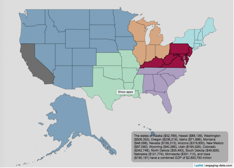
California is one of the world’s largest economies (as measured by gross domestic product), currently ranking 5th in the world (if it were judged as it’s own country). This map divides the rest of the US economy into 6 more or less equal parts (each the size of California’s) and they are all within about 10% of each other.
Instructions:
You can hover over a state with your cursor to get more information about the GDP of that state and the group of states that equal California’s economy.
Gross domestic product is a measurement of the size of a region’s economy. It is the sum of gross value added from all entities in the region or state. It measures the monetary value of the goods produced and services provided in a year.
The main sectors of the California economy are agriculture, technology, tourism, media (movies and TV) and trade. Some of the world’s largest and most famous companies contribute to the California economy, like Apple, Google, Facebook, Disney, and Chevron.
Data and Tools:
Data for state level GDP is obtained from Wikipedia for the year 2017. The map data is processed in javascript and then plotted using the leaflet.js mapping library.
How do Americans Spend Money? US Household Spending Breakdown by Income Group
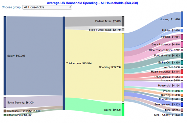
How much do US households spend?
This visualization is one of a series of visualizations that present US household spending data from the US Bureau of Labor Statistics. This one looks at the income of the household.
- US Household spending by income group
- US Household spending by age of primary resident
- US Household spending by education level of primary resident
- US Household spending by household composition
One of the key factors in financial health of an individual or household is making sure that household spending is equal to or below household income. If your spending is higher than income, you will be drawing down your savings (if you have any) or borrowing money. If your spending is lower than your income, you will presumably be saving money which can provide flexibility in the future, fund your retirement (maybe even early) and generally give you peace of mind.
I obtained data from the US Bureau of Labor Statistics (BLS), based upon a survey of consumer households and their spending habits. This data breaks down spending and income into many categories that are aggregated and plotted in a Sankey graph.
Instructions:
- Hover (or on mobile click) on a link to get more information on the definition of a particular spending or income category.
- Use the dropdown menu to look at averages for different groups of households based on income. This data breaks households into quintiles (groups of 20%) by income. The lowest quintile group is the group of 20% of households with the lowest income (and spend on average ~$25,500/yr).
As stated before, one of the keys to financial security is spending less than your income. We can see that on average, those in the lowest quintiles may be borrowing or drawing down on savings to live their lifestyle, while those in the highest quintiles are saving money and contributing to wealth. This fairly high level of borrowing/drawing on savings from the lowest quintile households may be deceptive because it includes seniors who are drawing down savings that were built up specifically for this purpose, and college students who are borrowing to go to school. These groups generally don’t have significant incomes.
How does your overall spending compare with those in your income group? How about spending in individual categories like housing, vehicles, food, clothing, etc…?
Probably one of the best things you can do from a financial perspective is to go through your spending and understand where your money is going. These sankey diagrams are one way to do it and see it visually, but of course, you can just make a table or pie chart or whatever.
The main thing is to understand where your money is going. Once you’ve done this you can be more conscious of what you are spending your money on, and then decide if you are spending too much (or too little) in certain categories. Having context of what other people spend money on is helpful as well, and why it is useful to compare to these averages, even though the income level, regional cost of living, and household composition won’t look exactly the same as your household.
**Click Here to view other financial-related tools and data visualizations from engaging-data**
Here is more information about the Consumer Expenditure Surveys from the BLS website:
The Consumer Expenditure Surveys (CE) collect information from the US households and families on their spending habits (expenditures), income, and household characteristics. The strength of the surveys is that it allows data users to relate the expenditures and income of consumers to the characteristics of those consumers. The surveys consist of two components, a quarterly Interview Survey and a weekly Diary Survey, each with its own questionnaire and sample.
Data and Tools:
Data on consumer spending was obtained from the BLS Consumer Expenditure Surveys, and aggregation and calculations were done using javascript and code modified from the Sankeymatic plotting website. I aggregated many of the survey output categories so as to make the graph legible, otherwise there’d be 4x as many spending categories and all very small and difficult to read.
Tax Brackets v2.0: Interactive Income Tax Visualization and Calculator
How is your income distributed across tax brackets?
This updated visualization is a detailed look at the breakdown how taxes are applied to your income across each of the tax brackets. The previous version of this visualization was a Sankey graph and this new version combines the sankey view with a mekko (or marimekko) graph view. It should help you to better understand marginal and average tax rates. This tool only looks at US Federal Income taxes and ignores state, local and Social Security/Medicare taxes.
**Click Here to view other financial-related tools and data visualizations from engaging-data**
Instructions for using the visual tax calculator:
- Tax Year: Select year from list of years as bracket sizes and deduction changes by year
- Select filing status: Single, Married Filing Jointly or Head of Household. For more info on these filing categories see the IRS website
- Senior checkbox Seniors are eligible for additional standard deduction and from 2025-2028 eligible for additional deduction even if you itemize
- Enter your regular income and capital gains income. Regular income is wage or employment income and is taxed at a higher rate than capital gains income. Capital gains income is typically investment income from the sale of stocks or dividends and taxed at a lower rate than regular income.
- Move your cursor or click on the Sankey graph to select a specific link. This will give you more information about how income in a specific tax bracket is being taxed.
- Itemized deduction Enter the amount of itemized deductions you have including: state and local (property) taxes, mortgage interest, charitable contributions and medical expenses above 7.5% of your AGI
- Share URL Click on the share button to generate a custom URL that will share a graph with your specific numbers in it. The link is copied to your clipboard and placed into the URL bar.
Interpreting the tax visualization graphs
Both the sankey and mekko graphs help you easily the size each of these tax brackets and the fraction of income in that bracket that you can keep and the fraction going to taxes. Also shown is the split of the regular income vs capital gains and how capital gains is “stacked” on top of the regular income.
The mekko graph is a stacked horizontal bar graph where the height of each bar is proportional to the size of the tax bracket and the bar is split into two parts: a keep and a tax portion. This makes it clear the progressive nature of the tax code, initial tax brackets are taxed at the lowest amounts and as you fill up more tax brackets, the tax rate, and the amount of money you must give to the government, increases.
As seen with the marginal rates graph, there is a big difference in how regular income and capital gains are taxed. Capital gains are taxed at a lower rate and generally have larger bracket sizes. Generally, wealthier households earn a greater fraction of their income from capital gains and as a result of the lower tax rates on capital gains, these household pay a lower effective tax rate than those making an order of magnitude less in overall income.
Also shown is a summary bar graph that shows the split in your total income into a part that you keep and the other that owed to taxes, i.e. your average tax rate.
How Do Tax Brackets Work
This is a written description of how to apply marginal tax rates. The income you have is split across various tax brackets, which by analogy can be thought of as buckets where once you fill one up, the additional money goes into another bucket, until that is filled up and so on until all your income is distributed across these brackets. The last brackets are open-ended so they are of infinite size.
You start with your deductions which changes based on your filing status, age and if you have itemized deductions. You fill this up first and you can think of this as the 0% tax bracket. Then any additional income goes into the 10% bracket where 10% of this income goes to taxes. This proceeds then onto the 12%, 22% and so on brackets.
The default example is described here for tax year 2025
- If you are single, your standard deduction is $15,750 and you pay no taxes on this money. After that, all of your regular taxable income up to $11,925 is taxed at a 10% rate. This means that your all of your gross income below $15,750 is not taxed and your gross income between $15,750 and $27,675 is taxed at 10%.
- If you have more income, you move up a marginal tax bracket. The next $36,550 in additional taxable income will be taxed at the 12% rate. It is important to note that not all of your income is taxed at the marginal rate, just the income in this bracket these amounts.
- The next $48,900 is taxed at 22% and so on until you have income over $500,000 and are in the 37% marginal tax rate . . . In the default case, you only have $3,775 instead of $48,900 so this portion is taxed at 22%.
- Thus, different parts of your income are taxed at different rates. If you have additional income that puts you into a higher tax bracket, that only affects the added income. This is the approach you would use to calculate an average or effective rate (which is shown in the summary table).
- Capital gains income complicates things slightly as it is taxed after regular income. Thus any amount of capital gains taxes you make are taxed at a rate that corresponds to starting after you regular income. If you made $100,000 in regular income, and only $100 in capital gains income, that $100 dollars would be taxed at the 15% rate and not at the 0% rate, because the $100,000 in regular income pushes you into the 2nd marginal tax bracket for capital gains (between $48,350 and $533,400).
- if the 0% capital gains rate threshold is at $48,350, then any regular income you have will take away from this 0% bracket size. If you have $48,000 in regular taxable income after your deduction, then you will be left with only $350 in 0% capital gains bracket space and the remainder of your capital gains will be taxed in the next bracket, 15%.
Tax Brackets By Year
This table lets you choose to view the thresholds for each income and capital gains tax bracket for the last few years. You can see that tax rates are much lower for capital gains in the table below than for regular income.
Data and Tools:
Tax brackets and rates were obtained from the IRS website and calculations were made using javascript, CSS and HTML. The sankey graph was made using code modified from the Sankeymatic plotting website and the mekko graph was made using the Plotly javascript open source library.

Visual Guide to Understanding Marginal Tax Rates
What is a marginal tax rate?
There is a fair amount of confusion about what a marginal tax rate is and how it affects how much tax you would owe the government on a certain amount of income. These graphs are here to help you better understand the difference between a marginal and average tax rate and to easily calculate these rates for specific examples in the US context. This tool only looks at US Federal Income taxes and ignores state, local and Social Security/Medicare taxes.
Marginal tax rates are the rate at which an additional dollar of income will be taxed at. There are different tax brackets (each with its own marginal rate) depending on which dollar of income you are looking at. This is very different from the Average (or effective) tax rate that is the result of applying these marginal tax rates across all of your income.
**Click Here to view other financial-related tools and data visualizations from engaging-data**
Instructions for using the visual tax calculator:
- Select filing status: Single, Married Filing Jointly or Head of Household. For more info on these filing categories see the IRS website
- Select percentage of regular income vs capital gains income. Regular income is wage or employment income and is taxed at a higher rate than capital gains income. Capital gains income is typically investment income from the sale of stocks or dividends and taxed at a lower rate than regular income.
- Move your cursor or click on the graph to select a specific income Make sure you note that the x-axis is a logarithmic-scale, meaning that income grows exponentially as you move to the right.
- Choose your graph preference One graph (Individual Tax Brackets) shows the individual tax brackets and how much of your income is taxed at the different marginal rates. The other graph (Aggregate Rates) shows the net result of applying the different rates to get your effective rate.
One of the most interesting things is to vary the proportion of regular income vs capital gains taxes. Generally, wealthier households earn a greater fraction of their income from capital gains and as a result of the lower tax rates on capital gains, these household pay a lower effective tax rate than those making an order of magnitude less in overall income.
Here are two tables that lists the marginal tax brackets in the United States in 2019 that form the basis of the calculations in the calculator. 2018’s numbers are pretty similar.
US Tax Brackets and Rates for 2019
Rate
Single
Taxable Income Over
Married Filing Joint
Taxable Income Over
Heads of Households
Taxable Income Over
10%
$0
$0
$0
12%
$9,700
$19,400
$13,850
22%
$39,475
$78,950
$52,850
24%
$84,200
$168,400
$84,200
32%
$160,725
$321,450
$160,700
35%
$204,100
$408,200
$204,100
37%
$510,300
$612,350
$510,300
You can see that tax rates are much lower for capital gains in the table below than for regular income (table above).
Capital Gains Brackets for 2019
Single
Capital Gains Over
Married Filing Jointly
Capital Gains Over
Heads of Households
Capital Gains Over
0%
$0
$0
$0
15%
$39,375
$78,750
$52,750
20%
$434,550
$488,850
$461,700
For those not visually inclined, here is a written description of how to apply marginal tax rates. The first thing to note is that the income shown here in the graphs is taxable income, which simply speaking is your gross income with deductions removed. The standard deduction for 2019 range from $12,200 for Single filers to $24,400 for Married filers.
- If you are single, all of your regular taxable income between 0 and $9,700 is taxed at a 10% rate. This means that your all of your gross income below $12,200 is not taxed and your gross income between $12,200 and $21,900 is taxed at 10%.
- If you have more income, you move up a marginal tax bracket. Any taxable income in excess of $9,700 but below $39,475 will be taxed at the 12% rate. It is important to note that not all of your income is taxed at the marginal rate, just the income between these amounts.
- Income between $39,475 and $84,200 is taxed at 24% and so on until you have income over $510,300 and are in the 37% marginal tax rate . . .
- Thus, different parts of your income are taxed at different rates and you can calculate an average or effective rate (which is shown in the aggregate rates graph).
- Capital gains income complicates things slightly as it is taxed after regular income. Thus any amount of capital gains taxes you make are taxed at a rate that corresponds to starting after you regular income. If you made $100,000 in regular income, and only $100 in capital gains income, that $100 dollars would be taxed at the 15% rate and not at the 0% rate, because the $100,000 in regular income pushes you into the 2nd marginal tax bracket for capital gains (between $39,375 and $434,550).
Data and Tools:
Tax brackets and rates were obtained from the IRS website and calculations were made using javascript and plotted using the plot.ly open source javascript plotting library.
Bitcoin Energy Consumption – Does It Consume More Electricity Than Your State?

This visualization looks at the staggeringly high energy use of Bitcoin and puts it into context: comparing it to electricity usage of US states. Unfortunately for Bitcoin, high energy usage is an intended feature of the system, rather than an unintended consequence. This is because mining is an increasingly energy intensive process, based upon increasingly computationally intensive calculations that are performed on high powered computers and graphical processing units.
Currently, 28 out of 50 states plus the District of Columbia all have lower electricity consumption than estimated annual bitcoin electricity consumption (~73 TWh per year). These states are highlighted in variations of yellow. This is approximately equal to the average annual electricity usage across all US States. States with higher electricity consumption than bitcoin are highlighted in shades of red.
When dividing the total energy use (73 TWh) by the current number of transactions (93 million), we get an average energy consumption of 783 kWh per transaction. Click on the “Energy per Transaction” button to see this visualization. What’s crazy is that a transaction is simply a transfer of bitcoin between “wallets”, recording the transaction, and a validation of the process. There’s no good reason why verifying digital transactions should take this much energy, except that it was built into the fundamental process of validating and mining bitcoin. 783 kWh is larger than the monthly per capita electricity consumption in 10 US states. It could also drive you and your family over 2000 miles in an electric car (e.g. Tesla Model S).
I’m not expert enough in this area to know how much more energy consumption will rise into the future, but if crypto advocates’ predictions come true and bitcoin is used extensively, millions of transactions will occur per hour instead of per year and the price of bitcoin may rise much higher than it currently is. If the price rises, then miners will be willing to expend more energy to “mine” the more valuable bitcoin. Needless to say, this sounds like a very bad idea from an energy consumption and sustainability standpoint.
Data and Tools:
State energy data comes from the US Department of Energy. Estimates of Bitcoin energy use come from Digiconomist’s Bitcoin Energy Consumption Index. The choropleth map is visualized using javascript and the Leaflet.js library with Open Street Map tiles.
Rich, Broke or Dead? Post-Retirement FIRE Calculator: Visualizing Early Retirement Success and Longevity Risk
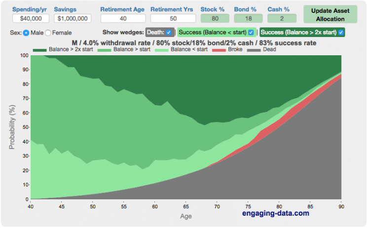
Update: June 2025 – bug fix in how tax rate on additional income is applied. If you have a lot of additional income, your success rate will likely go down.
Updated Shiller returns and inflation dataset through beginning of 2024
Rich, Broke or Dead?
One of the key issues with retiring is ensuring that the money you have saved will not be exhausted during your retirement. This is also known as Longevity Risk and is especially important if you want to retire early, since your retirement could be 50 years long (or more). This interactive post-retirement fire calculator and visualization looks at the question of whether your retirement savings can last long enough to support your retirement spending and combines it with average US life expectancy values to get a fuller picture of the likelihood of running out of money before you die.
It helps to answer the question: If I start out with $X dollars at the beginning of my retirement, will I run out of money before I die?
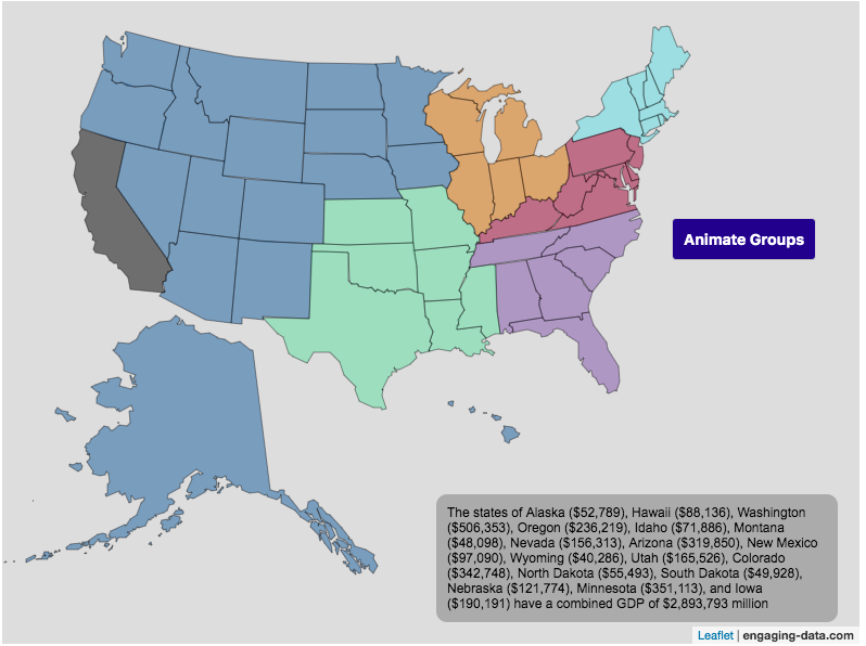
Size of California Economy Compared to Rest of US
California is one of the world’s largest economies (as measured by gross domestic product), currently ranking 5th in the world (if it were judged as it’s own country). This map divides the rest of the US economy into 6 more or less equal parts (each the size of California’s) and they are all within about 10% of each other.
Instructions:
You can hover over a state with your cursor to get more information about the GDP of that state and the group of states that equal California’s economy.
Gross domestic product is a measurement of the size of a region’s economy. It is the sum of gross value added from all entities in the region or state. It measures the monetary value of the goods produced and services provided in a year.
The main sectors of the California economy are agriculture, technology, tourism, media (movies and TV) and trade. Some of the world’s largest and most famous companies contribute to the California economy, like Apple, Google, Facebook, Disney, and Chevron.
Data and Tools:
Data for state level GDP is obtained from Wikipedia for the year 2017. The map data is processed in javascript and then plotted using the leaflet.js mapping library.
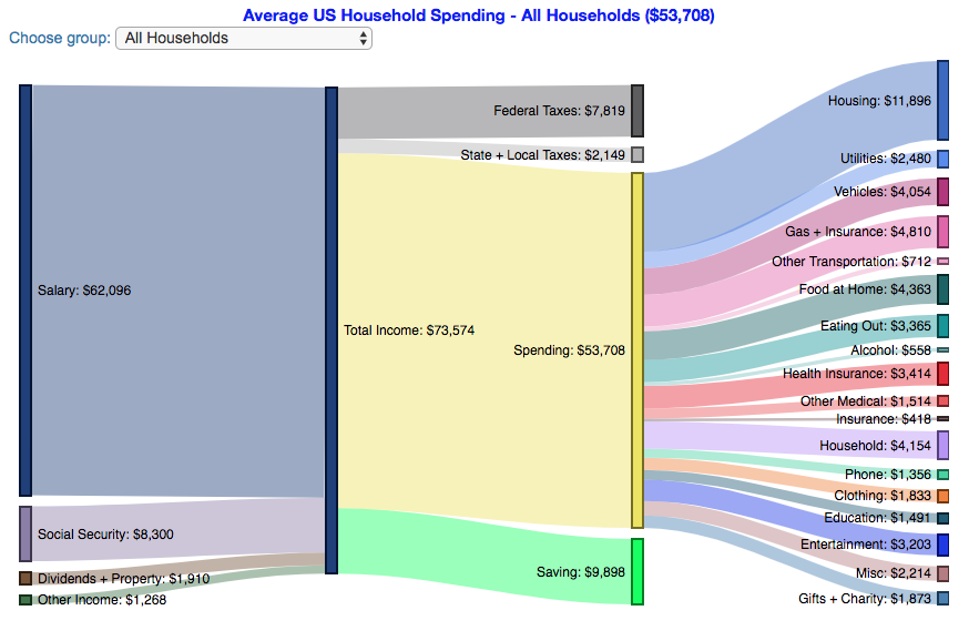
How do Americans Spend Money? US Household Spending Breakdown by Income Group
How much do US households spend?
This visualization is one of a series of visualizations that present US household spending data from the US Bureau of Labor Statistics. This one looks at the income of the household.
- US Household spending by income group
- US Household spending by age of primary resident
- US Household spending by education level of primary resident
- US Household spending by household composition
One of the key factors in financial health of an individual or household is making sure that household spending is equal to or below household income. If your spending is higher than income, you will be drawing down your savings (if you have any) or borrowing money. If your spending is lower than your income, you will presumably be saving money which can provide flexibility in the future, fund your retirement (maybe even early) and generally give you peace of mind.
I obtained data from the US Bureau of Labor Statistics (BLS), based upon a survey of consumer households and their spending habits. This data breaks down spending and income into many categories that are aggregated and plotted in a Sankey graph.
Instructions:
- Hover (or on mobile click) on a link to get more information on the definition of a particular spending or income category.
- Use the dropdown menu to look at averages for different groups of households based on income. This data breaks households into quintiles (groups of 20%) by income. The lowest quintile group is the group of 20% of households with the lowest income (and spend on average ~$25,500/yr).
As stated before, one of the keys to financial security is spending less than your income. We can see that on average, those in the lowest quintiles may be borrowing or drawing down on savings to live their lifestyle, while those in the highest quintiles are saving money and contributing to wealth. This fairly high level of borrowing/drawing on savings from the lowest quintile households may be deceptive because it includes seniors who are drawing down savings that were built up specifically for this purpose, and college students who are borrowing to go to school. These groups generally don’t have significant incomes.
How does your overall spending compare with those in your income group? How about spending in individual categories like housing, vehicles, food, clothing, etc…?
Probably one of the best things you can do from a financial perspective is to go through your spending and understand where your money is going. These sankey diagrams are one way to do it and see it visually, but of course, you can just make a table or pie chart or whatever.
The main thing is to understand where your money is going. Once you’ve done this you can be more conscious of what you are spending your money on, and then decide if you are spending too much (or too little) in certain categories. Having context of what other people spend money on is helpful as well, and why it is useful to compare to these averages, even though the income level, regional cost of living, and household composition won’t look exactly the same as your household.
**Click Here to view other financial-related tools and data visualizations from engaging-data**
Here is more information about the Consumer Expenditure Surveys from the BLS website:
The Consumer Expenditure Surveys (CE) collect information from the US households and families on their spending habits (expenditures), income, and household characteristics. The strength of the surveys is that it allows data users to relate the expenditures and income of consumers to the characteristics of those consumers. The surveys consist of two components, a quarterly Interview Survey and a weekly Diary Survey, each with its own questionnaire and sample.
Data and Tools:
Data on consumer spending was obtained from the BLS Consumer Expenditure Surveys, and aggregation and calculations were done using javascript and code modified from the Sankeymatic plotting website. I aggregated many of the survey output categories so as to make the graph legible, otherwise there’d be 4x as many spending categories and all very small and difficult to read.
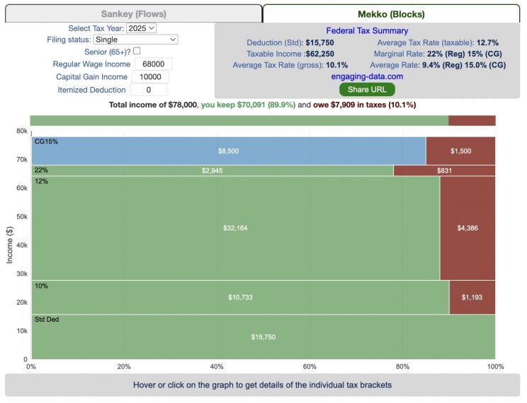
Tax Brackets v2.0: Interactive Income Tax Visualization and Calculator
How is your income distributed across tax brackets?
This updated visualization is a detailed look at the breakdown how taxes are applied to your income across each of the tax brackets. The previous version of this visualization was a Sankey graph and this new version combines the sankey view with a mekko (or marimekko) graph view. It should help you to better understand marginal and average tax rates. This tool only looks at US Federal Income taxes and ignores state, local and Social Security/Medicare taxes.
**Click Here to view other financial-related tools and data visualizations from engaging-data**
Instructions for using the visual tax calculator:
- Tax Year: Select year from list of years as bracket sizes and deduction changes by year
- Select filing status: Single, Married Filing Jointly or Head of Household. For more info on these filing categories see the IRS website
- Senior checkbox Seniors are eligible for additional standard deduction and from 2025-2028 eligible for additional deduction even if you itemize
- Enter your regular income and capital gains income. Regular income is wage or employment income and is taxed at a higher rate than capital gains income. Capital gains income is typically investment income from the sale of stocks or dividends and taxed at a lower rate than regular income.
- Move your cursor or click on the Sankey graph to select a specific link. This will give you more information about how income in a specific tax bracket is being taxed.
- Itemized deduction Enter the amount of itemized deductions you have including: state and local (property) taxes, mortgage interest, charitable contributions and medical expenses above 7.5% of your AGI
- Share URL Click on the share button to generate a custom URL that will share a graph with your specific numbers in it. The link is copied to your clipboard and placed into the URL bar.
Interpreting the tax visualization graphs
Both the sankey and mekko graphs help you easily the size each of these tax brackets and the fraction of income in that bracket that you can keep and the fraction going to taxes. Also shown is the split of the regular income vs capital gains and how capital gains is “stacked” on top of the regular income.
The mekko graph is a stacked horizontal bar graph where the height of each bar is proportional to the size of the tax bracket and the bar is split into two parts: a keep and a tax portion. This makes it clear the progressive nature of the tax code, initial tax brackets are taxed at the lowest amounts and as you fill up more tax brackets, the tax rate, and the amount of money you must give to the government, increases.
As seen with the marginal rates graph, there is a big difference in how regular income and capital gains are taxed. Capital gains are taxed at a lower rate and generally have larger bracket sizes. Generally, wealthier households earn a greater fraction of their income from capital gains and as a result of the lower tax rates on capital gains, these household pay a lower effective tax rate than those making an order of magnitude less in overall income.
Also shown is a summary bar graph that shows the split in your total income into a part that you keep and the other that owed to taxes, i.e. your average tax rate.
How Do Tax Brackets Work
This is a written description of how to apply marginal tax rates. The income you have is split across various tax brackets, which by analogy can be thought of as buckets where once you fill one up, the additional money goes into another bucket, until that is filled up and so on until all your income is distributed across these brackets. The last brackets are open-ended so they are of infinite size.
You start with your deductions which changes based on your filing status, age and if you have itemized deductions. You fill this up first and you can think of this as the 0% tax bracket. Then any additional income goes into the 10% bracket where 10% of this income goes to taxes. This proceeds then onto the 12%, 22% and so on brackets.
The default example is described here for tax year 2025
- If you are single, your standard deduction is $15,750 and you pay no taxes on this money. After that, all of your regular taxable income up to $11,925 is taxed at a 10% rate. This means that your all of your gross income below $15,750 is not taxed and your gross income between $15,750 and $27,675 is taxed at 10%.
- If you have more income, you move up a marginal tax bracket. The next $36,550 in additional taxable income will be taxed at the 12% rate. It is important to note that not all of your income is taxed at the marginal rate, just the income in this bracket these amounts.
- The next $48,900 is taxed at 22% and so on until you have income over $500,000 and are in the 37% marginal tax rate . . . In the default case, you only have $3,775 instead of $48,900 so this portion is taxed at 22%.
- Thus, different parts of your income are taxed at different rates. If you have additional income that puts you into a higher tax bracket, that only affects the added income. This is the approach you would use to calculate an average or effective rate (which is shown in the summary table).
- Capital gains income complicates things slightly as it is taxed after regular income. Thus any amount of capital gains taxes you make are taxed at a rate that corresponds to starting after you regular income. If you made $100,000 in regular income, and only $100 in capital gains income, that $100 dollars would be taxed at the 15% rate and not at the 0% rate, because the $100,000 in regular income pushes you into the 2nd marginal tax bracket for capital gains (between $48,350 and $533,400).
- if the 0% capital gains rate threshold is at $48,350, then any regular income you have will take away from this 0% bracket size. If you have $48,000 in regular taxable income after your deduction, then you will be left with only $350 in 0% capital gains bracket space and the remainder of your capital gains will be taxed in the next bracket, 15%.
Tax Brackets By Year
This table lets you choose to view the thresholds for each income and capital gains tax bracket for the last few years. You can see that tax rates are much lower for capital gains in the table below than for regular income.
Data and Tools:
Tax brackets and rates were obtained from the IRS website and calculations were made using javascript, CSS and HTML. The sankey graph was made using code modified from the Sankeymatic plotting website and the mekko graph was made using the Plotly javascript open source library.
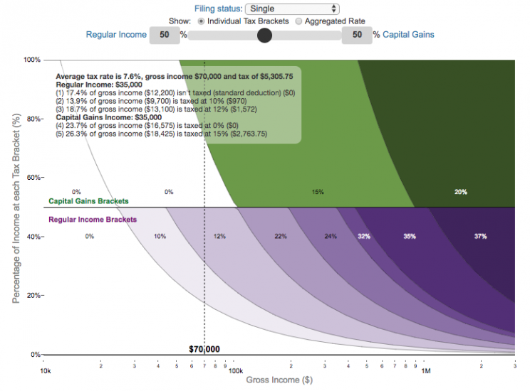
Visual Guide to Understanding Marginal Tax Rates
What is a marginal tax rate?
There is a fair amount of confusion about what a marginal tax rate is and how it affects how much tax you would owe the government on a certain amount of income. These graphs are here to help you better understand the difference between a marginal and average tax rate and to easily calculate these rates for specific examples in the US context. This tool only looks at US Federal Income taxes and ignores state, local and Social Security/Medicare taxes.
Marginal tax rates are the rate at which an additional dollar of income will be taxed at. There are different tax brackets (each with its own marginal rate) depending on which dollar of income you are looking at. This is very different from the Average (or effective) tax rate that is the result of applying these marginal tax rates across all of your income.
**Click Here to view other financial-related tools and data visualizations from engaging-data**
Instructions for using the visual tax calculator:
- Select filing status: Single, Married Filing Jointly or Head of Household. For more info on these filing categories see the IRS website
- Select percentage of regular income vs capital gains income. Regular income is wage or employment income and is taxed at a higher rate than capital gains income. Capital gains income is typically investment income from the sale of stocks or dividends and taxed at a lower rate than regular income.
- Move your cursor or click on the graph to select a specific income Make sure you note that the x-axis is a logarithmic-scale, meaning that income grows exponentially as you move to the right.
- Choose your graph preference One graph (Individual Tax Brackets) shows the individual tax brackets and how much of your income is taxed at the different marginal rates. The other graph (Aggregate Rates) shows the net result of applying the different rates to get your effective rate.
Here are two tables that lists the marginal tax brackets in the United States in 2019 that form the basis of the calculations in the calculator. 2018’s numbers are pretty similar.
| Rate | Single Taxable Income Over |
Married Filing Joint Taxable Income Over |
Heads of Households Taxable Income Over |
|---|---|---|---|
| 10% | $0 | $0 | $0 |
| 12% | $9,700 | $19,400 | $13,850 |
| 22% | $39,475 | $78,950 | $52,850 |
| 24% | $84,200 | $168,400 | $84,200 |
| 32% | $160,725 | $321,450 | $160,700 |
| 35% | $204,100 | $408,200 | $204,100 |
| 37% | $510,300 | $612,350 | $510,300 |
You can see that tax rates are much lower for capital gains in the table below than for regular income (table above).
| Single Capital Gains Over |
Married Filing Jointly Capital Gains Over |
Heads of Households Capital Gains Over |
|
|---|---|---|---|
| 0% | $0 | $0 | $0 |
| 15% | $39,375 | $78,750 | $52,750 |
| 20% | $434,550 | $488,850 | $461,700 |
For those not visually inclined, here is a written description of how to apply marginal tax rates. The first thing to note is that the income shown here in the graphs is taxable income, which simply speaking is your gross income with deductions removed. The standard deduction for 2019 range from $12,200 for Single filers to $24,400 for Married filers.
- If you are single, all of your regular taxable income between 0 and $9,700 is taxed at a 10% rate. This means that your all of your gross income below $12,200 is not taxed and your gross income between $12,200 and $21,900 is taxed at 10%.
- If you have more income, you move up a marginal tax bracket. Any taxable income in excess of $9,700 but below $39,475 will be taxed at the 12% rate. It is important to note that not all of your income is taxed at the marginal rate, just the income between these amounts.
- Income between $39,475 and $84,200 is taxed at 24% and so on until you have income over $510,300 and are in the 37% marginal tax rate . . .
- Thus, different parts of your income are taxed at different rates and you can calculate an average or effective rate (which is shown in the aggregate rates graph).
- Capital gains income complicates things slightly as it is taxed after regular income. Thus any amount of capital gains taxes you make are taxed at a rate that corresponds to starting after you regular income. If you made $100,000 in regular income, and only $100 in capital gains income, that $100 dollars would be taxed at the 15% rate and not at the 0% rate, because the $100,000 in regular income pushes you into the 2nd marginal tax bracket for capital gains (between $39,375 and $434,550).
Data and Tools:
Tax brackets and rates were obtained from the IRS website and calculations were made using javascript and plotted using the plot.ly open source javascript plotting library.
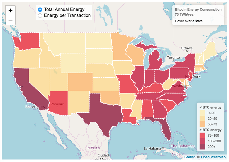
Bitcoin Energy Consumption – Does It Consume More Electricity Than Your State?
This visualization looks at the staggeringly high energy use of Bitcoin and puts it into context: comparing it to electricity usage of US states. Unfortunately for Bitcoin, high energy usage is an intended feature of the system, rather than an unintended consequence. This is because mining is an increasingly energy intensive process, based upon increasingly computationally intensive calculations that are performed on high powered computers and graphical processing units.
Currently, 28 out of 50 states plus the District of Columbia all have lower electricity consumption than estimated annual bitcoin electricity consumption (~73 TWh per year). These states are highlighted in variations of yellow. This is approximately equal to the average annual electricity usage across all US States. States with higher electricity consumption than bitcoin are highlighted in shades of red.
When dividing the total energy use (73 TWh) by the current number of transactions (93 million), we get an average energy consumption of 783 kWh per transaction. Click on the “Energy per Transaction” button to see this visualization. What’s crazy is that a transaction is simply a transfer of bitcoin between “wallets”, recording the transaction, and a validation of the process. There’s no good reason why verifying digital transactions should take this much energy, except that it was built into the fundamental process of validating and mining bitcoin. 783 kWh is larger than the monthly per capita electricity consumption in 10 US states. It could also drive you and your family over 2000 miles in an electric car (e.g. Tesla Model S).
I’m not expert enough in this area to know how much more energy consumption will rise into the future, but if crypto advocates’ predictions come true and bitcoin is used extensively, millions of transactions will occur per hour instead of per year and the price of bitcoin may rise much higher than it currently is. If the price rises, then miners will be willing to expend more energy to “mine” the more valuable bitcoin. Needless to say, this sounds like a very bad idea from an energy consumption and sustainability standpoint.
Data and Tools:
State energy data comes from the US Department of Energy. Estimates of Bitcoin energy use come from Digiconomist’s Bitcoin Energy Consumption Index. The choropleth map is visualized using javascript and the Leaflet.js library with Open Street Map tiles.
Rich, Broke or Dead? Post-Retirement FIRE Calculator: Visualizing Early Retirement Success and Longevity Risk
Update: June 2025 – bug fix in how tax rate on additional income is applied. If you have a lot of additional income, your success rate will likely go down.
Updated Shiller returns and inflation dataset through beginning of 2024
Rich, Broke or Dead?
One of the key issues with retiring is ensuring that the money you have saved will not be exhausted during your retirement. This is also known as Longevity Risk and is especially important if you want to retire early, since your retirement could be 50 years long (or more). This interactive post-retirement fire calculator and visualization looks at the question of whether your retirement savings can last long enough to support your retirement spending and combines it with average US life expectancy values to get a fuller picture of the likelihood of running out of money before you die.
It helps to answer the question: If I start out with $X dollars at the beginning of my retirement, will I run out of money before I die?
Recent Comments