Posts for Tag: interactive
Electric Vehicle Sales By State
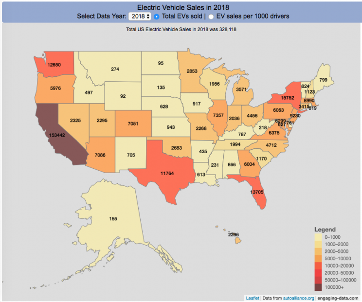
Where are electric vehicles being sold in the United States?
Electric vehicles are any vehicle that can be plugged in to recharge a battery that provides power to move the vehicle. Two broad classes are battery electric vehicles (BEVs) which only have batteries as their power source and plug-in hybrid electric vehicles (PHEVs) which have an alternative or parallel power source, typically a gasoline engine. PHEVs are built so that when the battery is depleted, the car can still run on gasoline and operate like a hybrid vehicle similar to a regular Toyota Prius (which is not plugged in at all).
Electric vehicles (EVs) have been sold in the US since 2011 (a few commercial models were sold previous to that but not in any significant numbers) and some conversions were also available. Since then, the number of EVs sold has increased pretty significantly. I wanted to look at the distribution of where those vehicles were located. What is interesting is that California accounts for around 50% of the electric vehicles sold in the United States. Other states have lower rates of EV adoption (in some cases much, much lower). There are many reasons for this, including beneficial policies, public awareness, a large number of potential early adopters and a mild climate. Even so, the EV heatmap of California done early shows that sales are mostly limited to the Bay Area, and LA areas.
The map shows data for total electric vehicle sales by state for years 2016, 2017 or 2018 and also the number of EV sales per 1000 licensed drivers (this is all people in the state with a drivers license, not drivers of EVs). If you hover over a state, you can see both data points for that state.
It will be interesting to see how the next generation of electric vehicles continues to improve, lower in price and become more popular with drivers outside of early adopters.
Click here to see other Energy-Related visualizations
Data and Tools:
Data on electric vehicle sales is from the Auto Alliance website. Licensed driver data was downloaded from the US Department of Transportation’s Bureau of Transportation Statistics website. The map was made using the leaflet open source mapping library. Data was compiled and calculated using javascript.

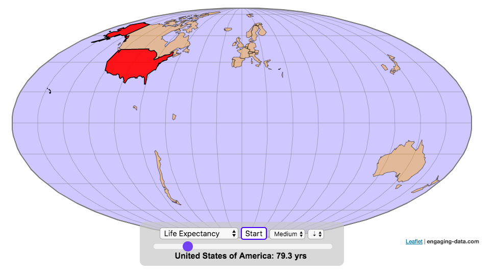
Assembling the World Country-By-Country

Watch the world assemble country-by-country based on a specific statistic
This map lets you watch as the world is built-up one country at a time. This can be done along the following statistical dimensions:
- Country name
- Population – from United Nations (2017)
- GDP – from United Nations (2017)
- GDP per capita
- GDP per area
- Land Area – from CIA factbook (2016)
- Population density
- Life expectancy – from World Health Organization (2015)
- or a random order
These statistics can be sorted from small to large or vice versa to get a view of the globe and its constituent countries in a unique and interesting way. It’s a bit hypnotic to watch as the countries appear and add to the world one by one.
You can use this map to display all the countries that have higher life expectancy than the United States:
select “Life expectancy”, sort from “high to low” and use the scroll bar to move to the United States and you’ll get a picture like this:
or this map to display all the countries that have higher population density than the United States:
select “Population density, sort from “high to low” and use the scroll bar to move to the United States and you’ll get a picture like this:

I hope you enjoy exploring the countries of the world through this data viz tool. And if you have ideas for other statistics to add, I will try to do so.
Data and tools: Data was downloaded primarily from Wikipedia: Life expectancy from World Health Organization (2015) | GDP from United Nations (2017) | Population from United Nations (2017) | Land Area from CIA factbook (2016)
The map was created with the help of the open source leaflet javascript mapping library
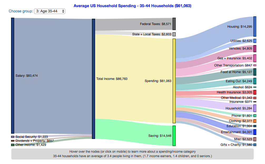
How do Americans Spend Money? US Household Spending Breakdown by Age

How much do US households spend and how does it change with age?
This visualization is one of a series of visualizations that present US household spending data from the US Bureau of Labor Statistics. This one looks at the age of the primary resident.
- US Household spending by income group
- US Household spending by age of primary resident
- US Household spending by education level of primary resident
- US Household spending by household composition
This visualization focuses on the age of the primary resident. This is defined in the BLS documentation as the person who is first mentioned when the survey respondent is asked who in the household rents or owns the home.
I obtained data from the US Bureau of Labor Statistics (BLS), based upon a survey of consumer households and their spending habits. This data breaks down spending and income into many categories that are aggregated and plotted in a Sankey graph.
One of the key factors in financial health of an individual or household is making sure that household spending is equal to or below household income. If your spending is higher than income, you will be drawing down your savings (if you have any) or borrowing money. If your spending is lower than your income, you will presumably be saving money which can provide flexibility in the future, fund your retirement (maybe even early) and generally give you peace of mind.
Instructions:
- Hover (or on mobile click) on a link to get more information on the definition of a particular spending or income category.
- Use the dropdown menu to look at averages for different groups of households based on the age of the primary resident. This data breaks households into groups (under 25, 25-34, 35-44, 45-54, 55-64, 65-75 and over 75). The composition of households and income change as the age of the primary resident changes, which in turn affects spending totals and individual categories.
As stated before, one of the keys to financial security is spending less than your income. We can see that on average, income tends to increase with the household primary age up to the 45-54 group, then declines from there.
The youngest group (under 25) tends to borrow or draw down on savings to live their lifestyle, while the same is true of the over 75 age group. This is probably because seniors tend to draw down savings that were built up specifically for this purpose, and college students borrow to go to school. Social security also makes up a big portion of income for the older age groups.
How does your overall spending compare with those in your income group? How about spending in individual categories like housing, vehicles, food, clothing, etc…?
Probably one of the best things you can do from a financial perspective is to go through your spending and understand where your money is going. These sankey diagrams are one way to do it and see it visually, but of course, you can just make a table or pie chart or whatever.
The main thing is to understand where your money is going. Once you’ve done this you can be more conscious of what you are spending your money on, and then decide if you are spending too much (or too little) in certain categories. Having context of what other people spend money on is helpful as well, and why it is useful to compare to these averages, even though the income level, regional cost of living, and household composition won’t look exactly the same as your household.
**Click Here to view other financial-related tools and data visualizations from engaging-data**
Here is more information about the Consumer Expenditure Surveys from the BLS website:
The Consumer Expenditure Surveys (CE) collect information from the US households and families on their spending habits (expenditures), income, and household characteristics. The strength of the surveys is that it allows data users to relate the expenditures and income of consumers to the characteristics of those consumers. The surveys consist of two components, a quarterly Interview Survey and a weekly Diary Survey, each with its own questionnaire and sample.
Data and Tools:
Data on consumer spending was obtained from the BLS Consumer Expenditure Surveys, and aggregation and calculations were done using javascript and code modified from the Sankeymatic plotting website. I aggregated many of the survey output categories so as to make the graph legible, otherwise there’d be 4x as many spending categories and all very small and difficult to read.
World Population Distribution by Latitude and Longitude
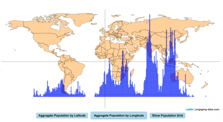
How is population distributed by latitude and longitude
This interactive map shows how population is distributed by latitude or longitude. It animates the creation of a bar graph by shifting population from its location on the map to aggregate population levels by latitude or longitude increments. Each “block” of the bar graph represents 1 million people. Population is highest in the northern hemisphere at 25-26 degrees North latitude and 77-78 degrees East Longitude.
Instructions:
It should be relatively explanatory. Press the “Aggregate Population by Latitude” button to make a plot of population by line of latitude (i.e. rows of the map).
Press the “Aggregate Population by Longitude” button to make a plot of population by line of longitude (i.e. columns of the map). To see the population distributed across the map, press the “Show Population Grid” button.
This map was inspired by some mapping work done by neilrkaye on twitter and reddit.
Data Sources and Tools:
This map projection is an equirectangular projection. Data on population density comes from NASA’s Socioeconomic Data and Applications Center (SEDAC) site and is displayed at the 1 degree resolution. This interactive visualization is made using the awesome leaflet.js javascript library.

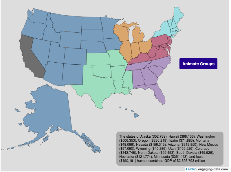
Size of California Economy Compared to Rest of US
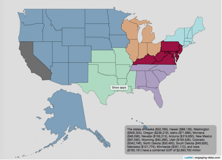
California is one of the world’s largest economies (as measured by gross domestic product), currently ranking 5th in the world (if it were judged as it’s own country). This map divides the rest of the US economy into 6 more or less equal parts (each the size of California’s) and they are all within about 10% of each other.
Instructions:
You can hover over a state with your cursor to get more information about the GDP of that state and the group of states that equal California’s economy.
Gross domestic product is a measurement of the size of a region’s economy. It is the sum of gross value added from all entities in the region or state. It measures the monetary value of the goods produced and services provided in a year.
The main sectors of the California economy are agriculture, technology, tourism, media (movies and TV) and trade. Some of the world’s largest and most famous companies contribute to the California economy, like Apple, Google, Facebook, Disney, and Chevron.
Data and Tools:
Data for state level GDP is obtained from Wikipedia for the year 2017. The map data is processed in javascript and then plotted using the leaflet.js mapping library.
Estimating pi (π) using Monte Carlo Simulation
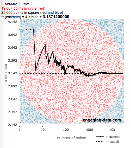
This interactive simulation estimates the value of the fundamental constant, pi (π), by drawing lots of random points to estimate the relative areas of a square and an inscribed circle.
Pi, (π), is used in a number of math equations related to circles, including calculating the area, circumference, etc. and is widely used in geometry, trigonometry and physics.
This app estimates the value of pi by comparing the area of a square and an inscribed circle. The areas are calculated by randomly placing dots into the square and then counting how many of them are also inside the circle. If you do this enough times, you will get a rough ratio of the relative areas of the two shapes. These points are plotted on the graph (red if the fall inside the circle and blue if the fall outside).
Also shown on the graph is the value of our estimate of pi as the simulation progresses, from a few points to many thousands, to millions of points. We can see that when we have only a few points, the value may not be very accurate but as the number of points increases the value of our estimate gets closer to the true value. Running the simulation will add and plot 1 million points. After the first 100 points are added, the rate at which points are added increases. You’ll notice this as the speed at which dots fills up the square increases and because the plot is shown with a logarithmic x-axis.
Here is the math:
Length of side of square: $2 \times r$
radius of circle: $r$
Area of square: $A_{square} = 4r^2$
Area of circle: $A_{circle} = \pi r^2$
The ratio of areas is $A_{circle}/A_{square} = \pi r^2 / 4r^2 = \pi / 4$
Solving for pi: $\pi = 4 \times A_{circle}/A_{square} \approx 4 \times N_{dots_{circle}}/N_{dots_{square}}$
So pi is estimated as 4 times the ratio of dots in the circle vs square
Tools:
This was programmed in javascript, canvas and plotted using the open source plotly javascript plotting library.

Electric Vehicle Sales By State
Where are electric vehicles being sold in the United States?
Electric vehicles are any vehicle that can be plugged in to recharge a battery that provides power to move the vehicle. Two broad classes are battery electric vehicles (BEVs) which only have batteries as their power source and plug-in hybrid electric vehicles (PHEVs) which have an alternative or parallel power source, typically a gasoline engine. PHEVs are built so that when the battery is depleted, the car can still run on gasoline and operate like a hybrid vehicle similar to a regular Toyota Prius (which is not plugged in at all).
Electric vehicles (EVs) have been sold in the US since 2011 (a few commercial models were sold previous to that but not in any significant numbers) and some conversions were also available. Since then, the number of EVs sold has increased pretty significantly. I wanted to look at the distribution of where those vehicles were located. What is interesting is that California accounts for around 50% of the electric vehicles sold in the United States. Other states have lower rates of EV adoption (in some cases much, much lower). There are many reasons for this, including beneficial policies, public awareness, a large number of potential early adopters and a mild climate. Even so, the EV heatmap of California done early shows that sales are mostly limited to the Bay Area, and LA areas.
The map shows data for total electric vehicle sales by state for years 2016, 2017 or 2018 and also the number of EV sales per 1000 licensed drivers (this is all people in the state with a drivers license, not drivers of EVs). If you hover over a state, you can see both data points for that state.
It will be interesting to see how the next generation of electric vehicles continues to improve, lower in price and become more popular with drivers outside of early adopters.
Click here to see other Energy-Related visualizations
Data and Tools:
Data on electric vehicle sales is from the Auto Alliance website. Licensed driver data was downloaded from the US Department of Transportation’s Bureau of Transportation Statistics website. The map was made using the leaflet open source mapping library. Data was compiled and calculated using javascript.
Assembling the World Country-By-Country
Watch the world assemble country-by-country based on a specific statistic
- Country name
- Population – from United Nations (2017)
- GDP – from United Nations (2017)
- GDP per capita
- GDP per area
- Land Area – from CIA factbook (2016)
- Population density
- Life expectancy – from World Health Organization (2015)
- or a random order
These statistics can be sorted from small to large or vice versa to get a view of the globe and its constituent countries in a unique and interesting way. It’s a bit hypnotic to watch as the countries appear and add to the world one by one.
You can use this map to display all the countries that have higher life expectancy than the United States:
select “Life expectancy”, sort from “high to low” and use the scroll bar to move to the United States and you’ll get a picture like this:
or this map to display all the countries that have higher population density than the United States:
select “Population density, sort from “high to low” and use the scroll bar to move to the United States and you’ll get a picture like this:
I hope you enjoy exploring the countries of the world through this data viz tool. And if you have ideas for other statistics to add, I will try to do so.
Data and tools: Data was downloaded primarily from Wikipedia: Life expectancy from World Health Organization (2015) | GDP from United Nations (2017) | Population from United Nations (2017) | Land Area from CIA factbook (2016)
The map was created with the help of the open source leaflet javascript mapping library
How do Americans Spend Money? US Household Spending Breakdown by Age
How much do US households spend and how does it change with age?
This visualization is one of a series of visualizations that present US household spending data from the US Bureau of Labor Statistics. This one looks at the age of the primary resident.
- US Household spending by income group
- US Household spending by age of primary resident
- US Household spending by education level of primary resident
- US Household spending by household composition
This visualization focuses on the age of the primary resident. This is defined in the BLS documentation as the person who is first mentioned when the survey respondent is asked who in the household rents or owns the home.
I obtained data from the US Bureau of Labor Statistics (BLS), based upon a survey of consumer households and their spending habits. This data breaks down spending and income into many categories that are aggregated and plotted in a Sankey graph.
One of the key factors in financial health of an individual or household is making sure that household spending is equal to or below household income. If your spending is higher than income, you will be drawing down your savings (if you have any) or borrowing money. If your spending is lower than your income, you will presumably be saving money which can provide flexibility in the future, fund your retirement (maybe even early) and generally give you peace of mind.
Instructions:
- Hover (or on mobile click) on a link to get more information on the definition of a particular spending or income category.
- Use the dropdown menu to look at averages for different groups of households based on the age of the primary resident. This data breaks households into groups (under 25, 25-34, 35-44, 45-54, 55-64, 65-75 and over 75). The composition of households and income change as the age of the primary resident changes, which in turn affects spending totals and individual categories.
As stated before, one of the keys to financial security is spending less than your income. We can see that on average, income tends to increase with the household primary age up to the 45-54 group, then declines from there.
The youngest group (under 25) tends to borrow or draw down on savings to live their lifestyle, while the same is true of the over 75 age group. This is probably because seniors tend to draw down savings that were built up specifically for this purpose, and college students borrow to go to school. Social security also makes up a big portion of income for the older age groups.
How does your overall spending compare with those in your income group? How about spending in individual categories like housing, vehicles, food, clothing, etc…?
Probably one of the best things you can do from a financial perspective is to go through your spending and understand where your money is going. These sankey diagrams are one way to do it and see it visually, but of course, you can just make a table or pie chart or whatever.
The main thing is to understand where your money is going. Once you’ve done this you can be more conscious of what you are spending your money on, and then decide if you are spending too much (or too little) in certain categories. Having context of what other people spend money on is helpful as well, and why it is useful to compare to these averages, even though the income level, regional cost of living, and household composition won’t look exactly the same as your household.
**Click Here to view other financial-related tools and data visualizations from engaging-data**
Here is more information about the Consumer Expenditure Surveys from the BLS website:
The Consumer Expenditure Surveys (CE) collect information from the US households and families on their spending habits (expenditures), income, and household characteristics. The strength of the surveys is that it allows data users to relate the expenditures and income of consumers to the characteristics of those consumers. The surveys consist of two components, a quarterly Interview Survey and a weekly Diary Survey, each with its own questionnaire and sample.
Data and Tools:
Data on consumer spending was obtained from the BLS Consumer Expenditure Surveys, and aggregation and calculations were done using javascript and code modified from the Sankeymatic plotting website. I aggregated many of the survey output categories so as to make the graph legible, otherwise there’d be 4x as many spending categories and all very small and difficult to read.
World Population Distribution by Latitude and Longitude
How is population distributed by latitude and longitude
This interactive map shows how population is distributed by latitude or longitude. It animates the creation of a bar graph by shifting population from its location on the map to aggregate population levels by latitude or longitude increments. Each “block” of the bar graph represents 1 million people. Population is highest in the northern hemisphere at 25-26 degrees North latitude and 77-78 degrees East Longitude.
Instructions:
It should be relatively explanatory. Press the “Aggregate Population by Latitude” button to make a plot of population by line of latitude (i.e. rows of the map).
Press the “Aggregate Population by Longitude” button to make a plot of population by line of longitude (i.e. columns of the map). To see the population distributed across the map, press the “Show Population Grid” button.
This map was inspired by some mapping work done by neilrkaye on twitter and reddit.
Data Sources and Tools:
This map projection is an equirectangular projection. Data on population density comes from NASA’s Socioeconomic Data and Applications Center (SEDAC) site and is displayed at the 1 degree resolution. This interactive visualization is made using the awesome leaflet.js javascript library.
Size of California Economy Compared to Rest of US
California is one of the world’s largest economies (as measured by gross domestic product), currently ranking 5th in the world (if it were judged as it’s own country). This map divides the rest of the US economy into 6 more or less equal parts (each the size of California’s) and they are all within about 10% of each other.
Instructions:
You can hover over a state with your cursor to get more information about the GDP of that state and the group of states that equal California’s economy.
Gross domestic product is a measurement of the size of a region’s economy. It is the sum of gross value added from all entities in the region or state. It measures the monetary value of the goods produced and services provided in a year.
The main sectors of the California economy are agriculture, technology, tourism, media (movies and TV) and trade. Some of the world’s largest and most famous companies contribute to the California economy, like Apple, Google, Facebook, Disney, and Chevron.
Data and Tools:
Data for state level GDP is obtained from Wikipedia for the year 2017. The map data is processed in javascript and then plotted using the leaflet.js mapping library.
Estimating pi (π) using Monte Carlo Simulation
This interactive simulation estimates the value of the fundamental constant, pi (π), by drawing lots of random points to estimate the relative areas of a square and an inscribed circle.
Pi, (π), is used in a number of math equations related to circles, including calculating the area, circumference, etc. and is widely used in geometry, trigonometry and physics.
This app estimates the value of pi by comparing the area of a square and an inscribed circle. The areas are calculated by randomly placing dots into the square and then counting how many of them are also inside the circle. If you do this enough times, you will get a rough ratio of the relative areas of the two shapes. These points are plotted on the graph (red if the fall inside the circle and blue if the fall outside).
Also shown on the graph is the value of our estimate of pi as the simulation progresses, from a few points to many thousands, to millions of points. We can see that when we have only a few points, the value may not be very accurate but as the number of points increases the value of our estimate gets closer to the true value. Running the simulation will add and plot 1 million points. After the first 100 points are added, the rate at which points are added increases. You’ll notice this as the speed at which dots fills up the square increases and because the plot is shown with a logarithmic x-axis.
Here is the math:
Length of side of square: $2 \times r$
radius of circle: $r$
Area of square: $A_{square} = 4r^2$
Area of circle: $A_{circle} = \pi r^2$
The ratio of areas is $A_{circle}/A_{square} = \pi r^2 / 4r^2 = \pi / 4$
Solving for pi: $\pi = 4 \times A_{circle}/A_{square} \approx 4 \times N_{dots_{circle}}/N_{dots_{square}}$
So pi is estimated as 4 times the ratio of dots in the circle vs square
Tools:
This was programmed in javascript, canvas and plotted using the open source plotly javascript plotting library.
Recent Comments